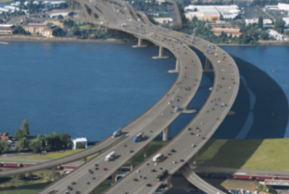
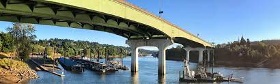
Portland is weighing whether to spend as much as $1.45 billion dollars widening a mile-long stretch of the I-5 freeway at the Rose Quarter near downtown. We’ve dug deeply into this idea at City Observatory, and we’ve published more than 50 commentaries addressing various aspects of the project over the past four years. Here’s a synopsis:
Traffic congestion
Traffic is declining at the Rose Quarter: ODOT growth projections are fiction. December 22, 2022. ODOT’s own traffic data shows that daily traffic (ADT) has been declining for 25 years, by -0.55 percent per year. The ODOT modeling inexplicably predicts that traffic will suddenly start growing through 2045, growing by 0.68 percent per year. ODOT’s modeling falsely claims that traffic will be the same regardless of whether the I-5 freeway is expanded, contrary to the established science of induced travel. These ADT statistics aren’t contained in the project’s traffic reports, but can be calculated from data contained in its safety analysis. ODOT has violated its own standards for documenting traffic projections, and violated national standards for maintaining integrity of traffic projections.
The black box: Hiding the facts about freeway widening. November 28, 2022. State DOT officials have crafted an Supplemental Environmental Assessment that conceals more than it reveals. The Rose Quarter traffic report contains no data on “average daily traffic” the most common measure of vehicle travel. Three and a half years later and ODOT’s Rose Quarter’s Traffic Modeling is still a closely guarded secret. The new SEA makes no changes to the regional traffic modeling done for the 2019 EA, which was done 7 years ago in 2015. The report misleadingly cites “volume to capacity ratios” without revealing either volumes or capacities.
Wider freeways don’t reduce congestion. March 4, 2019. The best argument that highway planners can muster for the Rose Quarter freeway widening is that it might somehow relieve congestion by reducing the number of crashes, but when they widened a stretch of I-5 just north of the Rose Quarter a decade ago, crashes not only didn’t decrease, crash rates actually went up.
Rose Quarter freeway widening won’t reduce congestion, March 2, 2019. Wider urban freeways have never reduced congestion, due to “induced demand” a problem so predictable, that experts call it “the fundamental law of road congestion.” Even the experts from ODOT and the Portland Bureau of Transportation concede that the freeway widening will do nothing to reduce daily “recurring” traffic congestion.
Backfire: How widening freeways can make traffic congestion worse, February 26, 2019. It’s an article of faith among highway builders and boosters that adding more capacity will make freeways flow more smoothly. But in reality, widening a road or intersection at one point simply funnels more vehicles into the next bottleneck more quickly–which can lead a road to become congested even faster. That’s what’s happened on I-5 Northbound in Portland, where the I-5 bridge over the Columbia River carry fewer vehicles in the peak hour now because improvements to the freeway and intersections have overwhelmed the bridge bottleneck.
Congestion pricing is a better solution for the Rose Quarter, March 26, 2019. Congestion pricing on I-5 would dramatically reduce congestion, improve freight and transit travel times, and do so at far lower cost than freeway widening, according to . . . the Oregon Department of Transportation. Pricing has been approved by the state Legislature, but ODOT has violated NEPA by failing to include any mention of it in the Rose Quarter Environmental Assessment.
How tax evasion fuels traffic congestion in Portland, March 15, 2019. A big part of traffic congestion on I-5 and I-205 as they cross the Columbia River is due to Washington residents shopping in Oregon to evade Washington’s high retail sales tax (Oregon has none). Vancouver residents evade $120 million in sales tax per year by shopping in Oregon, but account for between 10 and 20 percent of all traffic across the river.
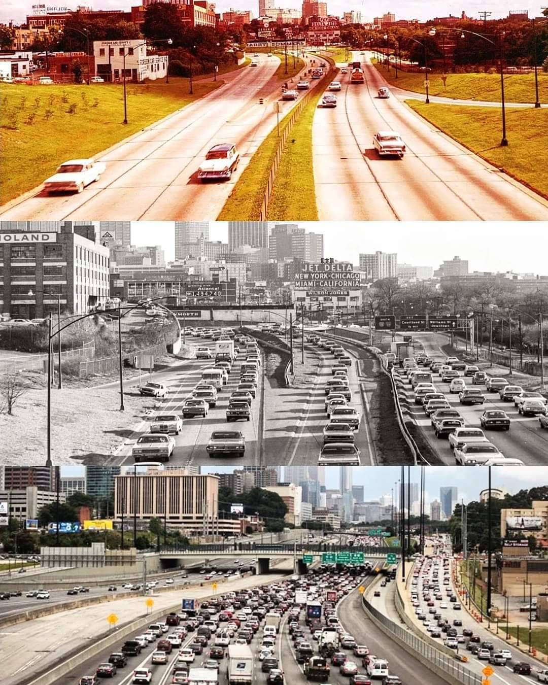
Reducing congestion: Katy didn’t, December 27, 2016. Add as many lanes as you like in an urban setting and you’ll only increase the level of traffic and congestion. That’s the lesson of Houston’s Katy Freeway, successively widened to a total of 23 lanes, at a cost of billions, but with the latest widening, travel times on the freeway are now slower than before it was expanded.
ODOT’s I-5 Rose Quarter “Improvement”: A million more miles of local traffic. December 7, 2022. ODOT’s proposed relocation of the I-5 Southbound off-ramp at the Rose Quarter will add 1.3 million miles of vehicle travel to local streets each year. Moving the I-5 on ramp a thousand feet further south creates longer journeys for the 12,000 cars exiting the freeway at this ramp each day. The new ramp location requires extensive out-of-direction travel for all vehicles connecting to local streets. With more miles driven on local streets, and more turning movements at local intersections, hazards for all road users, but especially persons biking and walking, increase substantially.
Flat Earth Sophistry. December 30, 2022. The science of induced travel is well proven, but state DOTs are in utter denial. Widening freeways not only fails to reduce congestion, it inevitably results in more vehicle travel and more pollution. The Oregon Department of Transportation has published a technical manual banning the consideration of induced travel in Oregon highway projects.
Safety
The Rose Quarter’s Big U-Turn: Deadman’s Curve? November 15, 2022.
The redesign of the I-5 Rose Quarter project creates a hazardous new hairpin off-ramp from a Interstate 5. Is ODOT’s supposed “safety” project really creating a new “Deadman’s Curve” at the Moda Center? Bike riders will have to negotiate on Portland’s busy North Williams bikeway will have to negotiate two back-to-back freeway ramps that carry more than 20,000 cars per day.
ODOT: Our Rose Quarter “safety” project will increase crashes. November 19, 2022. A newly revealed ODOT report shows the redesign of the I-5 Rose Quarter project will:
- creates a dangerous hairpin turn on the I-5 Southbound off-ramp
- increase crashes 13 percent
- violate the agency’s own highway design standards
- result in trucks turning into adjacent lanes and forcing cars onto highway shoulders
- necessitate a 1,000 foot long “storage area” to handle cars exiting the freeway
- require even wider, more expensive freeway covers that will be less buildable
ODOT’s safety lie is back, bigger than ever. October 18, 2022. Oregon DOT is using phony claims about safety to sell a $1.45 billion freeway widening project.People are regularly being killed on ODOT roadways and the agency claims that it lacks the resources to fix these problems. Meanwhile, it proposes to spend billions of dollars widening freeways where virtually no one is killed or injured and labels this a “safety” project. A wider I-5 freeway will do nothing to improve road safety in Portland.
Oregon DOT admits it lied about I-5 safety. March 17, 2020. Oregon’s Department of Transportation concedes it was lying about crashes on I-5 at the Rose Quarter. For year’s ODOT falsely claimed that I-5 at the Rose Quarter was the ‘highest crash location in Oregon.” After repeatedly pointing out this lie, we finally got ODOT to retract this from their website.
Safety: Using the big lie to sell wider freeways, March 19, 2019. ODOT claims that the I-5 Rose Quarter is the state’s “#1 crash location.” But that’s not true. Other Portland area ODOT roads, including Barbur Boulevard, Powell Boulevard and 82nd Avenue have crash rates that are as much as 3 times higher, and worse, these streets cause fatalities, which the freeway doesn’t. Crying “safety” is a calculated, “Big Lie” marketing gimmick, that would spend half a billion dollars on a roadway that contributes nothing to the state’s growing traffic death toll.
Safety last: What we’ve learned from “improving” the I-5 freeway, March 21, 2019. ODOT has also “improved” freeway interchanges south of Portland as well. It improved the Woodburn interchange in 2015, hoping to reduce crashes–but they increased instead. The interchange had two serious crashes, producing extensive delays in February 2019.
Carbon and pollution
Whitewashing the freeway widening. June 4, 2020. A so-called “peer review” panel was kept in the dark about critiques of the highway department’s flawed projections This is a thinly veiled attempt to whitewash flawed analysis. These are the products of a hand-picked, spoon-fed group, asked by ODOT to address only a narrow and largely subsidiary set of questions and told to ignore fundamental issues.
Widening I-5 at the Rose Quarter will increase greenhouse gases. January 26, 2021. Adding more freeway capacity at the Rose Quarter will thousands of tons to the region’s greenhouse gas emissions. freeways—including additional ramps and “auxiliary lanes”—induce additional car travel which increases greenhouse gas emissions.
- The I-5 Rose Quarter project will add approximately 33,000 vehicles per day to I-5 traffic, according to ODOT’s own estimates
- These 33,000 vehicles will directly add 56,000 daily vehicle miles of travel and indirectly add 178,000 daily vehicle miles of travel.
- Additional vehicle travel will directly produce between 8,000 tons of greenhouse gas emission per year; and with induced travel outside the project a total increase of 35,000 tons of greenhouse gas emissions per year.
Here’s what’s wrong with Oregon DOT’s Rose Quarter pollution claims. December 10, 2021. 10 reasons not to believe phony DOT claims that widening highways reduces pollution
Climate concerns crush Oregon highway funding bill, March 6, 2015. In 2015, a pending highway finance bill was killed when the Oregon Department of Transportation admitted it had provided estimates of carbon reductions that were wildly exaggerated and could not be verified. With a track record of producing carbon emission estimates that falsely flatter its preferred projects, should anyone trust the estimates contained in the Rose Quarter Environmental Assessment?
Widening the I-5 Freeway will add millions of miles of vehicle travel, March 4, 2019. The University of California Davis has a calculator for estimating the effects of added freeway capacity on travel; it suggests that Rose Quarter freeway widening will produce 10 to 17 million additional miles of travel per year in Portland, as well as 5 to 8 thousand additional tons of carbon emissions per year.
Urban Myth Busting: Congestion, Idling and Carbon Emissions, July 6, 2017. The Rose Quarter project makes unsubstantiated claims that it will reduce carbon emissions, by reducing the number of cars idling in traffic; but the published scientific literature on the subject shows that gains from reduced idling due to capacity increases are more than offset by the increase in emissions due to induced travel demand.
Bike and pedestrian infrastructure and freeway covers
More proof of ODOT’s Rose Quarter Freeway coverup. June 16, 2021. Newly revealed documents show its roadway is vastly wider than needed for traffic, and also makes “buildable” freeway covers prohibitively expensive. If you really want just two additional lanes, you can do so much more cheaply and with less environmental destruction. The reality is ODOT is planning a 10 lane freeway at the Rose Quarter, and is lying about the covers and the project’s real cost and environmental impact.
ODOT reneges on Rose Quarter cover promises. November 14, 2022.
The Rose Quarter I-5 Revised Environmental Assessment shows that ODOT is already reneging on its sales pitch of using a highway widening to heal Portland’s Albina Neighborhood. It trumpeted “highway covers” as a development opportunity, falsely portraying them as being covered in buildings and housing—something the agency has no plans or funds to provide.The covers may be only partially buildable, suitable only for “lightweight” buildings, and face huge constraints. ODOT will declare the project “complete” as soon as it does some “temporary” landscaping. The covers will likely be vacant for years, unless somebody—not ODOT—pays to build on them. ODOT isn’t contributing a dime to build housing to replace what it destroyed, and its proposed covers are unlikely to ever become housing because they’re too expensive and unattractive to develop.
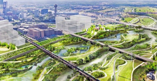
Distorted Images: Freeway widening is bad for pedestrians, March 14, 2019. ODOT has produced a handful of computer-generated renderings to show how its massive freeway widening project would affect surface streets in Northeast Portland. They’re carefully composed to exaggerate some features and conceal others. If you look closely, you can see how the plan is to round off corners at key intersections–speeding car traffic and increasing danger to pedestrians. In addition, ODOT illustrations show dozens of pedestrians and just a handful of cars on this busy city street: proportions that are off by a factor of 200 in showing the real world relationship of cars to people in this space.
The great freeway cover-up, December 13, 2017. ODOT’s freeway widening plans call for two over-sized freeway overpasses to be built (primarily to deal with construction staging in a dense urban environment). While it claims that the overpasses can be developed as public space, they’re too fragmented, noisy and hostile (thanks to thousands of fast moving cars on every side) to be useable public space.
The death of Flint Street, May 12, 2017. The proposed Rose Quarter freeway widening would demolish the existing Flint Avenue overpass, a low speed neighborhood street that runs parallel to a busy North-South couplet, and provides an important bike route with a gentle grade, and limited auto-traffic. *
Diverging Diamond Blues, December 19, 2017. A key element of the local street plan for the proposed Rose Quarter freeway widening project is turning a portion of North Williams Avenue into a miniature “diverging diamond” interchange–with traffic traveling on the wrong (left-hand) side of a two-ways street. This disorienting design is inherently pedestrian hostile. *
Equity and neighborhood effects
How a freeway destroyed a neighborhood, and may again, March 18, 2019. In 1962, construction of I-5 devastated Portland’s historically African-American Albina neighborhood. Population declined by nearly two-thirds in the three decades after the freeway was built, as the area shifted from a residential area with local-serving businesses, to an auto-dominated landscape. The neighborhood has only started to rebound in recent years, and more auto traffic will likely undermine the area’s attractiveness.
The toxic flood of cars, not just the freeway, crushed Albina. September 16, 2020. Restorative Justice & A Viable Neighborhood. What destroyed the Albina community? What will it take to restore it? It wasn’t just the freeway, it was the onslaught of cars, that transformed Albina into a bleak and barren car-dominated landscape.
Getting real about restorative justice in Albina. April 26, 2021. Drawings don’t constitute restorative justice. ODOT shows fancy drawings about what might be built, but isn’t talking about actually paying to build anything. Just building the housing shown in its diagrams would require $160 million to $260 million. Even that would replace only a fraction of the housing destroyed by ODOT highway building in Albina.
Taking Tubman: ODOT’s plan to build a freeway on school grounds. April 13, 2021. ODOT’s proposed I-5 Rose Quarter project would turn a school yard into a freeway. The widened I-5 freeway will make already unhealthy air even worse. Pollution from high volume roads has been shown to lower student achievement. ODOT also proposes to build sound walls in Tubman’s school yard.
How ODOT destroyed Albina: The untold story. March 22, 2021. I-5 wasn’t the first highway that carved up Portland’s historically black Albina Neighborhood. Seventy years ago, ODOT spent the equivalent of more than $80 million in today’s dollars to cut the Albina neighborhood off from the Willamette River. ODOT’s highways destroyed housing and isolated Albina, lead to a two-thirds reduction in population between 1950 and 1970. Demolishing neighborhoods for state highways is ODOT’s raison d’etre.
How ODOT destroyed Albina: The I-5 Meat Axe. March 30, 2021. Interstate 5 “Meat Axe” slashed through the Albina Neighborhood in 1962. This was the second of three acts by ODOT that destroyed housing and isolated Albina. Building the I-5 freeway led to the demolition of housing well-outside the freeway right of way, and flooded the neighborhood with car traffic, ending its residential character and turning into an auto-oriented landscape of parking lots, gas stations and car dealerships.
How ODOT destroyed Albina, part 3: The Fremont Bridge ramps. April 7, 2021. ODOT’s Fremont Bridge wiped out multiple blocks of the Albina neighborhood. A freeway you’ve never heard of leveled dozens of blocks in North and Northeast Portland. The stub of a proposed “Prescott Freeway” still scars the neighborhood.
Why do poor school kids have to clean up rich commuter’s pollution?, March 6, 2019. Portland’s Tubman Middle School, built more than a decade before the I-5 freeway sliced through the neighborhood would get an even larger dose of air pollution when the widened freeway is moved closer to classrooms. The school’s students–disproportionately low income and children of color, have had to see public school monies–more than $12 million–spent to clean up the school’s air; commuters on I-5, disproportionately white and higher income, paid nothing toward’s these costs.
Freeway-widening grifters: Woke-washing, fraud and incompetence. September 20, 2021. The Oregon Department of Transportation’s glossy mailer to sell its $1.25 billion I-5 Rose Quarter Freeway widening project is a cynical, error-ridden marketing ploy. ODOT doesn’t show or tell about its wider freeway and more traffic, but instead tries to sell the project based on buildings it won’t contribute any money for building. ODOT sent an expensive mailer to thousands of Portland households studded with nearly two-dozen typographical errors.
Housing reparations for Northeast Portland, April 16, 2018. When it built the I-5 freeway in the 1960s, through the heart of Portland’s African-American neighborhood, it demolished–and never replaced–more than 300 homes. It outlandishly claims that a wider freeway will somehow redress that damage, but it could make a much better start by spending about $140 million to rebuild the housing it demolished.
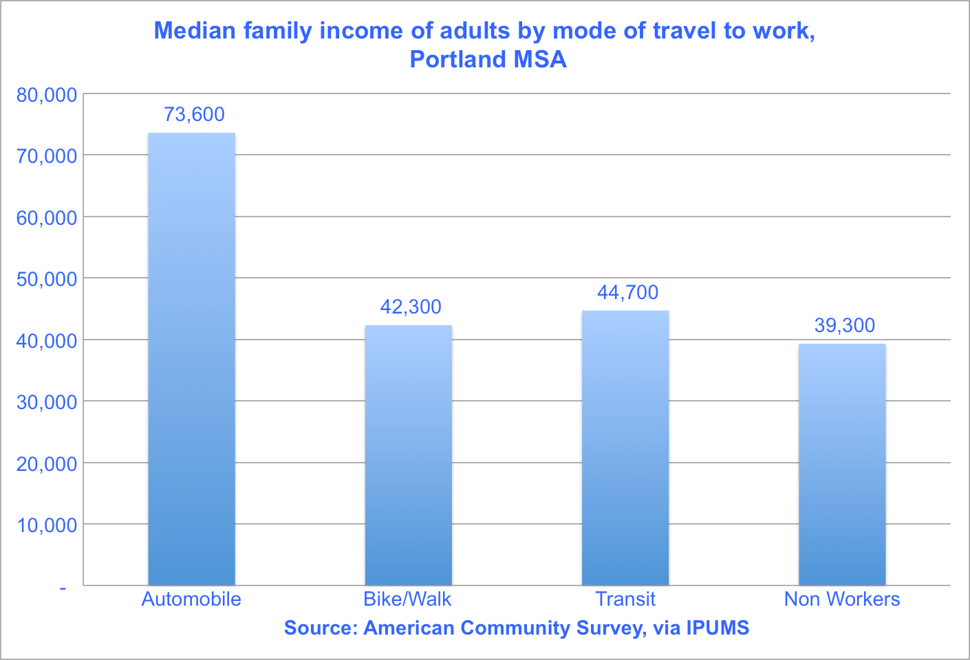
Freeway widening for whomst? March 6, 2019. There’s a profound demographic disparity between those who benefit from I-5 freeway widening and those who bill bear its costs. Beneficiaries are disproportionately, out-of-state commuters; single occupancy peak hour commuters from Vancouver Washington earn an average of more than $82,000, 50 percent more than those who live in North and Northeast Portland and who commute by bike, transit or walking, and more than double the income of those households in the area who don’t own cars.
Concealing facts and lying to sell freeway widening
An open letter to the Oregon Transportation Commission. March 18, 2021.
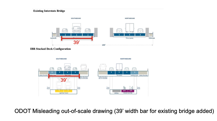
For years, the Oregon Department of Transportation has concealed its plans to build a ten lane freeway through Portland’s Rose Quarter. We’ve documented how ODOT concealed the actual width of its proposed freeway from the public, in violation of the letter and spirit of the National Environmental Policy Act. We’re calling on the state to do a full environmental impact statement that assesses the impact of the project they actually intend to build.
The Black Box: Hiding the facts about freeway widening, March 12, 2019. The most basic metric for understanding a road project is something called “Average Daily Traffic” or ADT, a count of the total number of vehicles that use a stretch of roadway on a typical day. That’s an essential input for estimating congestion, air pollution, carbon emissions and assessing safety. But it’s also one statistic that you won’t find anywhere in the Rose Quarter freeway widening project’s Environmental Assessment or its Traffic Technical Report: all the ADT numbers have been suppressed. It’s like a financial report that has no dollar amounts. Leaving out basic traffic data keeps the public in the dark about key elements of the project.
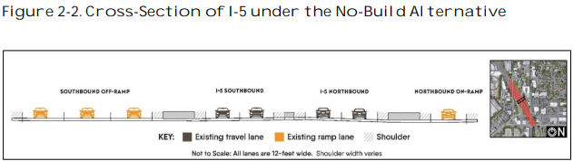
Why won’t ODOT tell us how wide their freeway is? December 1, 2022. After more than three years of public debate, ODOT still won’t tell anyone how wide a freeway they’re planning to build at the Rose Quarter. ODOT’s plans appear to provide for a 160-foot wide roadway, wide enough to accommodate a ten lane freeway, not just two additional “auxiliary” lanes. ODOT is trying to avoid NEPA, by building a wide roadway now, and then re-striping it for more lanes after it is built. The agency has utterly failed to examine the traffic, pollution and safety effects of the ten-lane roadway they’ll actually build.
Orwellian Freeway Widening, March 5, 2019. Don’t call it widening the freeway, it’s an “improvement” project. And those aren’t freeway lanes that are being added? They’re harmless “auxiliary lanes.” The Oregon Department of Transportation is torturing logic, common sense and the English language as it relentlessly markets its plans to widen I-5 and the Rose Quarter.
More Orwell from the Oregon Department of Transportation, April 2, 2019. We have always been at war with EastAsia. Within 24 hours ODOT took two entirely different positions regarding the Columbia River Crossing, first denying it had any connection to the proposed $500 million Rose Quarter Freeway widening project, and then saying it was integral to the plans for the freeway widening. Similarly, ODOT first denied the existence of any engineering plans or drawings for the freeway-widening, and then, when pressed conceded that they existed, then ultimately under legal threat, producing 33 gigabytes of such plans. Willfully lying about and concealing key facts about the project is a violation of NEPA and of the public trust.
National transportation experts to Portland: You’re doing it wrong, March 25, 2019. The nation’s leading experts on urban transportation–Janette Sadik-Khan, Robin Chase, Jennifer Keesmaat and others–have some choice words about freeway widening for Portland: Don’t!
ODOT’s real agenda: Massive freeways at the Rose Quarter and Columbia River
The Hidden Rose Quarter MegaFreeway, March 13, 2019. Though its promoted as just adding a couple of “auxiliary lanes” the Rose Quarter project calls for building a massive 126 foot right of way through Northeast Portland, enough to fit a full eight-lane freeway. Once the $500 million is spent at the Rose Quarter, it will only take a few hours with a paint truck to create a much wider freeway.
There’s a $3 billion bridge hidden in the Rose Quarter Project EA, March 27, 2019. Hidden in the plans for the Rose Quarter project is the assumption that Portland will also build an $3 billion, 12-lane wide freeway across the Columbia River–in fact, the Rose Quarter project is needed chiefly to deal with induced demand from this project.
Why won’t ODOT tell us how wide their freeway is? December 1, 2022. After more than three years of public debate, ODOT still won’t tell anyone how wide a freeway they’re planning to build at the Rose Quarter. ODOT’s plans appear to provide for a 160-foot wide roadway, wide enough to accommodate a ten lane freeway, not just two additional “auxiliary” lanes. ODOT is trying to avoid NEPA, by building a wide roadway now, and then re-striping it for more lanes after it is built. The agency has utterly failed to examine the traffic, pollution and safety effects of the ten-lane roadway they’ll actually build.
Revealed: ODOT’s Secret Plans for a 10-Lane Rose Quarter Freeway. February 24, 2021. For years, ODOT has been planning to build a 10 lane freeway at the Rose Quarter, not the 6 lanes it has advertised. Three previously undisclosed files show ODOT is planning for a 160 foot wide roadway at Broadway-Weidler, more than enough for a 10 lane freeway with full urban shoulders. ODOT has failed to analyze the traffic, environmental and health impacts from an expansion to ten lanes; not disclosing these reasonably foreseeable impacts is a violation of the National Environmental Policy Act (NEPA).
Calculating induced demand at the Rose Quarter. February 1, 2021. Widening I-5 at the Rose Quarter in Portland will produce an addition 17.4 to 34.8 million miles of vehicle travel and 7.8 to 15.5 thousand tons of greenhouse gases per year. These estimates come from a customized calibration of the induced travel calculator to the Portland Metropolitan Area.
Congestion Pricing: ODOT is disobeying an order from Governor Brown. February 8, 2021. More than a year ago, Oregon Governor Kate Brown directed ODOT to “include a full review of congestion pricing” before deciding whether or not to do a full environmental impact statement for the proposed I-5 Rose Quarter Freeway widening project. ODOT simply ignored the Governor’s request, and instead is delaying its congestion pricing efforts, and proceeding full speed ahead with the Rose Quarter with no Environmental Impact Statement that would include pricing. ODOT has produced no analysis of the effects of pricing as part of its Rose Quarter environmental review, and has said “congestion pricing was not considered.”
Cost Overruns
ODOT: Exploding whales and cost overruns. March 9, 2020. ODOT’s I-5 Rose Quarter freeway project which was estimated to cost $450 million in 2017, had its pricetag nearly doubled to $795 million in 2020.
Another exploding whale: ODOT’s freeway widening cost triples. September 16, 2021. It now looks like Oregon DOT’s I-5 Rose Quarter $450 million freeway widening project will cost more than $1.25 billion. The project’s estimated cost has nearly tripled in just four years, and still has further cost overrun risk. Even OTC commissioners question whether it’s worth more than a billion dollars to widen a 1.5 mile stretch of freeway. The Oregon DOT has experienced massive cost-overruns on all of its largest construction projects, and has systematically concealed and understated the frequency and scale of cost overruns.
* – Two features of the I-5 Rose Quarter project that we criticized in 2019 have been changed: The project no longer proposes to demolish the Flint Avenue overpass, and no longer proposes to construct a “diverging diamond” interchange.


 If the past is any guide, the agency will draw pictures of a ten-lane bridge,


 Litman points to this chart from the Frontier Group showing how Department of Transportation and Department of Energy forecasts have consistently over-estimated the growth in driving in the US (forecasts are colored lines; actual is black). With this as their future worldview, it’s little wonder that planning gets biased in favor of accommodating an assumed surge in automobile travel. As Litman writes:


 Property overvaluation as a proportion of the total fair market value of all properties.


 What these data suggest is that cycling is less about weather or topography than it is about demographics and cultural attitudes towards cycling. As Tyndall concludes:


 That’s long been understood, but there’s by a technical criticism that it may be the low density of places that “causes” more car ownership, rather than the other way around. This paper tackles that issue by using an instrumental variables methodology that proxies the establishment of car manufacturing facilities for car ownership, and finds that causality runs from car ownership to lower density (the advent of more car manufacturing explains the decline in density.) While that analysis is convincing, it is very likely the case that, over time, as car ownership increases and density declines, that there is also a feedback loop from lower density to more car ownership: as land uses become more dispersed due to car ownership, more households are forced to acquire cars to maintain access in the face of falling density, and this in turn triggers further declines in density. Now, decades after widespread adoption of cars in advanced economies, it may be impossible (and pointless) to try and fully separate cause and effect. The key finding of this study, however, is that in lower income nations, more widespread car ownership is likely to lead to further declines in population density in cities, which in turn will increase their carbon footprint, and make it all the more difficult to fight climate change.


 Cheap gas prices depress transit ridership, encourage more driving, lead consumers to buy less efficient vehicles and more SUVs, and undercut efforts to encourage transport electrification. US gas prices are still only about half of what they are in most European countries.


 Harris, Jeffrey, “The Coronavirus Epidemic Curve is Already Flattening in New York City” National Bureau of Economic Research Working Paper No. 26917, April 2020.


 Source: Mordechay & Ayscue


 Data for 50 largest US metro areas, 1990 (orange), 2012 (brown)


