The Urban Institute has released an updated set of estimates that purport to measure which US cities are the most inclusive. The report is conceptually flawed, and actually gets its conclusions backwards, classifying some of the nation’s most exclusive places as “inclusive.”
We all want our cities to be more inclusive. While it’s an agreed upon goal, measuring inclusiveness turns out to be difficult and complicated. A set of measures developed by the Urban Institute in 2018, and updated late last year, unfortunately paint a picture of inclusion that is misleading and incorrectly portrays wealthy suburban enclaves as inclusive. In this commentary, we present our analysis of the problems with the Urban Institute’s measures of inclusion, published at its website “Measuring Inclusion in America’s Cities.”
If we’re going to make real progress in addressing community inequities in the US, we need a system for defining and measuring “inclusiveness,” both so we can identify those places that are doing well, and which need most to improve, as well as to to learn from more successful places about what policies and practices support inclusion, and to enable everyone to measure their progress toward greater inclusion over time. Absent such definitions and metrics, it’s difficult to figure out what works, and what doesn’t. While well intended, the metrics offered by the Urban Institute are actually a step in the wrong direction, obscuring our understanding of which places are most inclusive, and what policies it would take to expand inclusion.
Two years ago, when this ranking system was first published, we released a five-part review and critique of its approach, definitions and conclusions. We found:
- The Urban Institute’s definitions rest on the conceptually flawed idea that cities that are more homogenous are more inclusive; in fact, homogeneity is usually a sign of exclusion, not inclusion. This leads the report to get inclusion backwards and classify some of the nation’s most exclusive suburban enclaves as “inclusive.”
- The Urban Institute methodology ignores metropolitan context, treating racially homogenous cities in segregated metro areas “inclusive.” For example, both the city of Detroit and several of its suburbs are rated as highly inclusive, even though the metropolitan area is among the nation’s most racially and economically segregated.
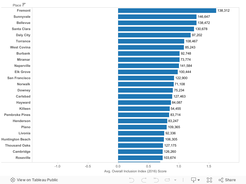
- The Urban Institute methodology classifies a series of high income suburban cities with restrictive zoning policies as inclusive. Urban Institute claims that the nation’s most “inclusive cities” are a series of high income enclaves in the nation’s large metro areas, such as Naperville, IL, Bellevue, WA, Plano, TX and Sunnyvale, CA; all places with median family incomes of over $100,000.
- City boundaries are an inappropriate and misleading basis for estimating inclusiveness; because of their widely varying size and composition, municipalities are a poor choice for computing and comparing equitable outcomes.
- City boundaries change over time; The Urban Institute did not adjust its estimates over time to account for annexations and mergers, treating growth through annexation as an indicator of economic prosperity.
If you take the Urban Institute report literally—which you shouldn’t—you will believe that the nation’s most inclusive communities are mostly a bunch of the toniest suburbs in the nation’s large metro areas—Sunnyvale, CA, Plano, TX, Bellevue, WA, Torrance, CA, Naperville, IL and Carlsbad, CA—all places with median family incomes in excess of $100,000 per year. Here we’ve taken the Urban Institute’s latest data, which ranks cities from most inclusive to least inclusive. Median family incomes are shown for each city.
The problem is that instead of measuring inclusivity, UI’s metrics actually measure homogeneity. They look only at the demographics within a city’s boundaries, and rate a place highly if all its residents have similar levels of income, poverty, employment and homeownership. It’s true that there are very small differences in homeownership, employment, and poverty by race in many expensive suburbs, but that’s because their high home prices exclude low income people generally, and assure if people of color live there, they too have high incomes and high rates of homeownership and low rates of poverty and unemployment.
Similarly, that’s also why some very economically distressed places get rated highly for inclusion—if all or nearly all residents are equally poor, their measured disparities are small. But while these places are homogenous, they’re not inclusive. In fact, just the opposite. High income suburbs exclude by having extremely high housing costs, and those high housing costs are created and enforced by local land use policies, especially single family zoning. Low income cities exclude by having too few amenities or opportunities to retain households with high incomes: When middle and upper income households move away, a neighborhood of concentrated poverty is more homogenous, and by the Urban Institute formulation, “more inclusive.” We think that’s just backwards.
To its credit, the Urban Institute makes all of the data and formulas it used for ranking cities easily available. They present detailed city level data on population, income, employment poverty, racial and economic segregation, and other key demographic indicators. But this is a case of negative synergy: the end product (the composite inclusiveness measure computed by Urban Institute) is less informative than sum of its parts (all of the data points). The ranking system actually conceals and misrepresents the inclusiveness (or exclusiveness) of cities, rather than providing useful and accurate information.
As a consequence, the report is a poor guide, both to who’s doing well in achieving inclusion, and what cities (and policies) might be thought of as means to advance inclusion.
As we’ve stressed at City Observatory, building more inclusive metropolitan areas, and in particular, reducing the amount of racial/ethnic and economic segregation is critical to building a more equitable nation. Unfortunately, the metrics and conclusions offered in this report about which places are inclusive are simply wrong, and consequently provide no useful guidance to local or national leaders about the way forward.
The Urban Institute Report: Measuring Inclusion
In 2018, the Urban Institute released its report, “Measuring Inclusion in America’s Cities.” The study presented a series of metrics of racial disparities, income disparities and economic performance of the nation’s 274 largest cities, and examining how these have changed over time. It aims to benchmark where cities stand on inclusion, understand how inclusion relates to economic growth, and provide lessons for policy makers.
We’ve taken a close look at the report, and while well-documented and certainly well-intended, we’re concerned that some of the metrics it offers and some of the findings it presents make an already tortuously difficult policy area even more confusing.
The paradoxical relationship between inclusion and equality
Paradoxically, at the very local level equality is fundamentally at odds with inclusion
On its face, it seems like defining inclusion would be simple. It ought to be the absence of disparities in a community. But the reality its much more complicated. Measured economic disparities in a city can be very small, if for example, everyone is rich or everyone is poor.
Urban Institute’s report measures two different dimensions of inclusion, racial inclusion and economic inclusion. In the case of racial inclusion, they look at segregation (whether the white and non-white residents of a particular live in different or similar neighborhoods), and whether there are disparities in educational attainment and home-ownership between whites and non-whites. They also look at the total fraction of the population of a city that is non-white.
In almost every case, the Urban Institute report defines inter-group disparities as an indicator of a lack of inclusion. If, for example, homeownership rates differ greatly between persons of color and whites, that suggests an area isn’t inclusive.
With each of these measures, cities score highest if they have very little inter-group variation. If white and non-white incomes, unemployment rates, and homeownership rates are very similar, the Urban Institute defines an city as “inclusive.” For example, if everyone in a community is high income, regardless of race or ethnicity, then it is “inclusive.” Similarly, if everyone in a community is low income, regardless of race or ethnicity, then it is also “inclusive.”
There’s some merit to this idea, but it’s really focusing on “equality” rather than “inclusion.” It’s entirely possible for a community to be “equal” without at all being inclusive. In fact, communities that are exclusive tend to be highly equal. If, for example, you have a community where all housing costs at least $500,000 and there are no apartments, it’s unlikely that you will have many poor, or unemployed, or renters. And it may be that there are very limited economic disparities between residents of different racial and ethnic groups (everyone who can afford to live in such a community, regardless of race or ethnicity, almost certainly has a high income).
Conversely, very inclusive places, where people of widely varying incomes reside, almost by definition have high levels of inequality. A community composed of equal measures rich and poor, homeowners and renters, and with a wide variety of housing sizes and types, including mansions and public housing, will have larger measured disparities in incomes, in homeownership rates, in poverty and so on. It’s a seeming paradox: a place that is truly diverse and inclusive, whether measured by income or race and ethnicity, by definition needs to unequal.
This is not the first time this issue has arisen: We’ve pointed out that applying a broad standard of equality to small geographic areas produces a kind of weird parallax effect: places that have low levels of measure income disparity tend to be homogenous (usually all rich, or all poor), meaning that they are either exclusive or failing. The geography of inequality is anti-fractal: high levels of measured inequality at small geographies mean exactly the opposite of what they mean at large geographies.
The bottom line is that a truly inclusive place may in fact have high levels of measured disparity. As a result, there’s an important conceptual flaw in metrics that focus solely on the localized presence of disparities to discuss inclusion.
To summarize:
- Cities don’t generate income distributions among their populations, so much as they include (or exclude) different income groups. City inequality is not a linear microcosm of national income inequality.
- Highly equal cities are almost always either exclusive suburban enclaves (that achieve homogeneity by rigid zoning limits that exclude the poor) or impoverished cities that have been abandoned by upper and middle income households, leaving them homogeneous but poor. (For example, many of Urban’s Institute’s “most inclusive cities” are suburbs like Bellevue, Naperville and Santa Clara–among the wealthiest 20 cities in the US; while Detroit and Cleveland are also highly ranked for inclusiveness.
- Small geographies, neighborhoods/cities that have high levels of measured income inequality (90/10 ratio, Gini Index) are generally much more inclusive than comparable geographies that with lower levels of measured inequality. Rich and poor living closer together produces more measured inequality, but also means greater inclusion.
We want to stress that we have enormous respect for the researchers at the Urban Institute: over the years we’ve learned tremendously from their work. We and everyone who cares about cities has a huge debt for their scholarship and advocacy. They’ve provided powerful evidence of the huge economic and human toll continuing racial and economic disparities in their report “The Cost of Segregation.” Our own report on concentrated poverty Lost in Place, draws liberally from the canonical work by Urban Institute scholars. The critique presented here is meant to advance our shared understanding of how we can build more inclusive cities. We conferred with the authors of the report in 2018 after it was released and shared these concerns with them. The analysis presented here remains solely the responsibility of City Observatory.
