Earlier this week, we introduced the Storefront Index, a measure of the location and clustering of customer-facing retail and service businesses. A primary use of the index is to identify places that have the concentration of retail activity that we generally associate with a vibrant neighborhood commercial area, and that can support a high level of walkability.
It’s also possible to construct the Storefront Index at different points in time to measure the growth or change in neighborhood commercial activity. For example, we presented data for Portland’s Alberta Street commercial neighborhood in 1997 and 2014. This neighborhood is situated in Northeast Portland, which has historically been home to some of the city’s lowest income households, and which has had a high share of the region’s African-American population.
The data show the substantial growth in storefront businesses over that time period.
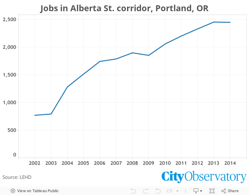
As we noted in our report, storefronts are not important simply as commercial destinations or focal points for pedestrian activity. These retail and service businesses are an important source of jobs. To explore the connection between storefronts and jobs, we gathered data from the Census Bureau’s LEHD program for this same neighborhood. LEHD uses administrative records to provide very geographically detailed (block-by-block) estimates of the number of persons employed throughout the U.S. These data show a dramatic increase in local jobs over this time period. Firms on and near Alberta Street employed about 650 workers in 2002; by 2014 that had nearly tripled to 1,838. (We excluded the administration sector from these tabulations to exclude employment reported by local temporary help and employment leasing firms whose employees actually work outside the local neighborhood).
In the case of Alberta Street, the flourishing of the local storefront businesses has been associated with a significant increase in local employment—not just in retail and services businesses, but in a wide range of other sectors. Tracking the presence of storefronts over time can be an indicator not just of a neighborhood’s sidewalk vitality, but employment strength.
1. This week, we were proud to release City Observatory’s latest report: The Storefront Index. The Storefront Index maps and tallies every “storefront” business in the 51 largest US metropolitan areas, showing where clusters of customer-facing retailers create vibrant, flourishing neighborhood and regional commercial districts. The analysis highlights the importance of this kind of amenity in building healthy neighborhoods and cities, and is a valuable tool for community advocates, planners, businesspeople, and map geeks alike. Click here to find an interactive map for your city.
2. To illustrate the connection between storefronts and the street-level vitality of public spaces, we went off of a February Washingtonian article by Greater Greater Washington contributor Dan Reed about two adjacent public parks in central DC. One, Farragut Square, is usually full of people, while the other, Franklin Square, often lies mostly empty, just a few blocks away. Reed suggests in his article that one reason is the larger number of retail outlets on Farragut Square, which draw people through and around the park, some of whom also stop and enjoy the scenery on a park bench or patch of grass. The Storefront Index allows you to easily see this difference, confirming a quick on-the-ground impression, and offering a tool for identifying other likely “hot” and “cold” public spaces.
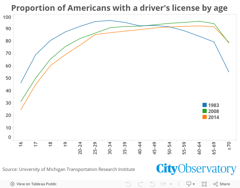
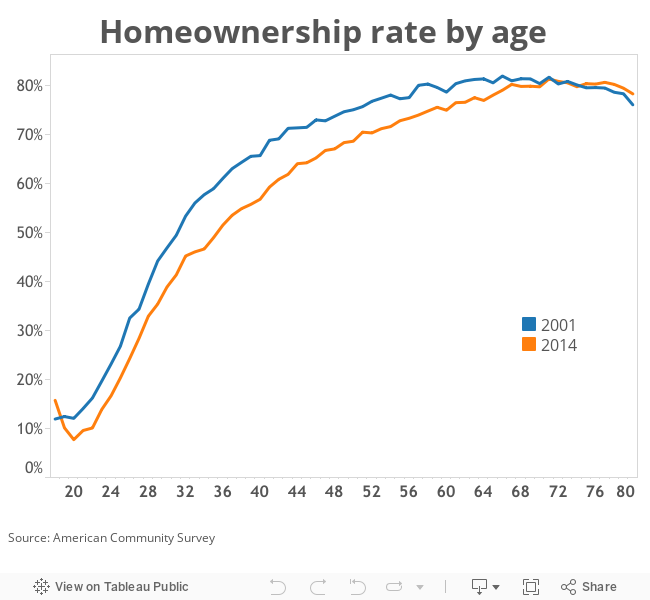
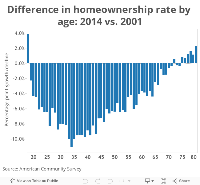
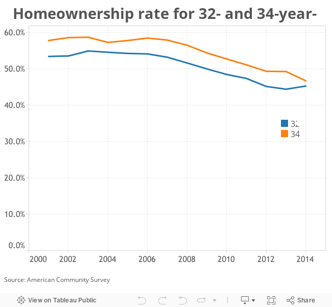
3. Although the current Storefront Index is based off a point-in-time database of businesses, we hope to expand this to allow stakeholders and researchers to see how neighborhood commercial districts have changed over time. To demonstrate the power of this possibility, we performed a historical analysis on one corridor, Alberta St. in Portland, OR. The Index shows dramatic growth of storefronts in the area between 1997 and 2014; further data from the Census shows that total jobs in the area has increased from under 800 to nearly 2,500 between 2002 and 2014. 4. Are Millennials back into buying cars? Some recent report have claimed so—but, as with homebuying, a closer look shows that young adults today remain much less likely to take out auto loans or have driver’s licenses than previous generations at at the same age. In fact, every age group up to 50 has driver’s licenses at a lower rate than a few decades ago; for those aged 25-29, the license rate has declined from over 95 percent to 85 percent since 1983. Again, while counter-intuitive takes on Millennials’ urban living habits might make good clickbait—and ring sonorously in the ears of real estate agents and car companies—the fact is that today’s young adults really are significantly less likely to own homes or have a driver’s license than previous generations.
The week’s must reads
1. We tend to focus on local policymakers, but it’s worth listening to this interview with Obama HUD Secretary, and former San Antonio mayor, Julián Castro at theNew Yorker—what does the White House think are the major challenges for urban policy? How does it propose to deal with them? “I couldn’t think of any American city that has dealt well with that issue of gentrification and displacement. People in the neighborhoods want some of those amenities and some investment…and then you reach a tipping point where people can’t afford to live in that neighborhood…. The inconclusive part of this is there hasn’t been enough research on what happens to the residents who are displaced. Do we know definitively that on net the impact is negative?”
2. While progressive slogans have focused on “the one percent,” Thomas Edsall at the New York Times says that more attention should be paid to the top twenty percent of earners. Going off of new research on economic segregation from Kendra Bischoff and Sean Reardon, he argues that the geographic separation of the “truly advantaged” has profound effects on opportunity and politics. Edsall says this kind of segregation is especially dangerous when it puts the economic self-interest of egalitarian-minded wealthy people at odds with their professed values.
3. What is the intersection of urban planning and gender? A conference in Detroit looked to investigate that question, as reported in the Huffington Post. Speakers argued that in many cases, women interact with cities differently—for example, placing a higher priority on safety in public places, or having different trip patterns, as a result of having disproportionate responsibility for things like child care. With women underrepresented in urban leadership positions (less than 20 percent of US mayors are women), there has been an increase in organizing to broaden understanding of these issues.
New knowledge
1. Bloomberg entered every ZIP code in America into Amazon’s new same-day delivery service to map where the company is and isn’t offering the product—andthe resulting maps show some disturbing racial patterns. Even if, as seems plausible, these results came from a race-neutral algorithm, they demonstrate the dangerous power of racial and economic segregation: by sorting demographics with greater purchasing power into certain neighborhoods, they make it more likely that ostensibly race-blind policies will actually perpetuate discrimination. Some patterns seem particularly egregious, as with Boston’s predominantly black Roxbury neighborhoods, which is excluded from same day service despite being completely surrounded by neighborhoods that are included.
2. Previously, we’ve covered ways in which neighborhoods and segregation can affect the educational outcomes of children. But a study led by Laura Tach at Cornell University finds that neighborhoods have effects on the educational progress of adults, too. Recipients of affordable housing support in Philadelphia were randomly assigned to homes in various neighborhoods and, as a part of the program, were required to enroll in secondary education. People assigned to homes in block groups with higher levels of poverty and violence made less progress in getting college credits than those assigned to wealthier and safer areas.
3. As covered in CityLab, a new study looks at how, when, and why transit services affect property values. The meta-study of 60 earlier papers finds that the connection between new public transit lines or stations and increased property values isn’t as automatic as sometimes claimed. A number of factors help determine the impact, including the extent to which the new service actually improves access to the region’s jobs and amenities; the ease of other transport options, including traffic congestion and parking prices; and the land use around stations, with denser, mixed-use development and public spaces increasing values. This adds to the growing body of evidence that concentrated poverty amplifies the negative effects of poverty across generations.
The Week Observed is City Observatory’s weekly newsletter. Every Friday, we give you a quick review of the most important articles, blog posts, and scholarly research on American cities.
Our goal is to help you keep up with—and participate in—the ongoing debate about how to create prosperous, equitable, and livable cities, without having to wade through the hundreds of thousands of words produced on the subject every week by yourself.
If you have ideas for making The Week Observed better, we’d love to hear them! Let us know at jcortright@cityobservatory.org, dkhertz@cityobservatory.org, or on Twitter at @cityobs.
1. When we measure segregation, we almost always use Census numbers that reflect where people live—ie, where their homes are. But people don’t spend all day in their homes, so a team of researchers used Twitter data from Louisville, KY to figure out where they spend their days. The results are a fascinating look at the asymmetry of segregation and neighborhood isolation: while residents of the lower-income, predominantly black West End ranged all over the city, residents of the wealthier, whiter side of town nearly entirely avoided the West End.
2. This week, the USDOT is releasing its new road performance metrics. While they may seem like the kind of wonkish details that only an engineer could love, anyone who cares about the livability and accessibility of their communities ought to be paying close attention, since the performance measures that state and local governments have to hit will help determine whether our roads are amenable to walking, biking, and transit service, or force nearly everyone into cars. Unfortunately, the new standards fail on several counts, including relying on a measure of congestion that rewards building empty roads and discounts the benefits of shorter commutes. The rules also represent a major missed opportunity to address climate change. Another option would have been to build measures that focus on reducing total driving and commute times, and take into account transit travel time.
3. Marijuana policy is sometimes dismissed as a novelty issue. Butdecriminalization and legalization actually have serious implications for urban policy for several reasons, from tax revenue, to economic development and industry clustering, to cultural signaling and Tiebout sorting, to spatially biased policing with implications for equity and economic mobility. Drug policy is one arena where state and local governments could use their positions as policy laboratories to find a better balance.
4. This week, City Observatory released a new, easy-to-share infographic that summarizes research by ourselves and others on neighborhood change. The big takeaways: over the last 40 years, neighborhoods with poverty rates over twice the national average have been much more likely to remain poor and lose significant population than they have been to gentrify. Along with our report, “Lost in Place,”which has interactive maps and tools to show how your city has changed since 1970, we hope this infographic will be useful for communicating the data on neighborhood change.
The week’s must reads
1. “NIMBY,” or “Not In My Backyard,” is a well-known epithet against people who agree that some kind of development—apartments, or schools, or shops—should gosomewhere, but not in their neighborhood. But now the New York Times covers the rise of self-described YIMBYs: people organizing and advocating for more housing development, in their backyards and elsewhere. The piece profiles Sonja Trauss of the San Francisco Bay Area Renters Federation, who has become one of the national leaders of the movement. If there’s going to be the political will to address America’s “shortage of cities,” people like Trauss may play a major role in building it.
2. We’ve been advocates of more big-picture reimaginings of federal housing policy—and this week, we’re joined by Demos’ Matt Breunig, commenting on an essay inDemocracy Journal by Peter Dreier that suggests creating an entitlement housing allowance through the Earned Income Tax Credit. Breunig, on the other hand, points out that a yearly lump sum may not be the best way of distributing benefits for a cost that renters face monthly. See our pieces about this sort of low-income housing entitlement with vouchers or tax credits.
3. This week, San Francisco became the first US city to require that all new housing in buildings that are 10 or fewer stories include solar panels. Unfortunately, as Vox explains, this is a much less effective anti-greenhouse emissions policy than just allowing more housing to begin with. Because people in dense, transit- and walking-friendly cities like San Francisco are much more efficient in their energy usage, increasing the number of people who live in them has major environmental dividends. Vox estimates that the carbon benefits of the solar panel mandate is about a third of the carbon benefits of allowing 10,000 units of new housing in the city.
New knowledge
1. Children do worse on academic tests if there has been a homicide in their neighborhood within the last week. Building on that finding, NYU sociologist Patrick Sharkey has found a strong link between counties with high levels of violent crime and lower levels of economic mobility, even holding other factors constant. The effects are sensitive enough that children growing up in a place during periods of relatively low crime did better as adults than children who grew up in the same places during periods of higher crime. This study adds an important piece to our understanding of how place affects the long-term outcomes of its residents.
2. The Chicago-based Center for Neighborhood Technology has released perhapsthe most comprehensive, easy-to-use transit database yet. Called “AllTransit,” it combines original analysis of transit access and quality with well-organized aggregation of existing data on ridership, service, and demographics. The tool is designed for use by policymakers and advocates to see where transit is and isn’t working—and how it may be creating opportunity, or failing to do so, for different people in different parts of a region. Anyone trying to understand the landscape of sustainable transportation in the US should check it out.
3. Are American cities no longer eating up as many acres of farmland as they used to? That’s the question posed by Issi Romem at buildzoom. Romem finds that the number of square miles consumed by new urban (or perhaps “suburban” is the better term) developments has stayed remarkably steady over the last several decades. But that evenness hides major variations at the metropolitan level: while some regions, like Atlanta, are growing in physical area even more rapidly, others, like the Bay Area, have seen growth come nearly to a halt. There’s a lot to unpack here, from the physical growth that far outstrips population growth in places like Cleveland or Atlanta, to the unfortunate reality that most US cities that add enough housing to keep prices low do so by adding low-density subdivisions on the urban fringe. (It’s also worth noting that this analysis ignores the higher transportation costs associated with that kind of sprawling development.) It’s important to recognize that almost no US city have land use plans that facilitate density where it’s most demanded. If we allow for more density and “missing middle” housing, we wouldn’t need to choose between “expansive” and “expensive” cities.
The Week Observed is City Observatory’s weekly newsletter. Every Friday, we give you a quick review of the most important articles, blog posts, and scholarly research on American cities.
Our goal is to help you keep up with—and participate in—the ongoing debate about how to create prosperous, equitable, and livable cities, without having to wade through the hundreds of thousands of words produced on the subject every week by yourself.
If you have ideas for making The Week Observed better, we’d love to hear them! Let us know at jcortright@cityobservatory.org, dkhertz@cityobservatory.org, or on Twitter at @cityobs.
Hot on the heels of claims that Millennials are buying houses come stories asserting that Millennials are suddenly big car buyers. We pointed out the flaws in the home-buying story earlier this month, and now let’s take a look at the car market.
The Chicago Tribune offered up a feature presenting “The Four Reasons Millennials are buying cars in big numbers,” assuring us that millennials just “got a late start” in car ownership, but are now getting credit cards, starting families and trooping into auto dealerships “just like previous generations.”
Similar stories have appeared elsewhere. The Portland Oregonian chimed in: “Millennials are becoming car owners after all.”
We pointed out that several of these stories rested on comparing different sized birth year cohorts (a 17-year group of so-called Gen Y with an 11-year group of so-called Gen X). After applying the highly sophisticated statistical technique known as “long division” to estimate the number of cars purchased per 1,000 persons in each generation, we showed that Gen Y was about 29 percent less likely than Gen X to purchase a car.
More generally though, we know that there’s a relationship between age and car-buying. Thirty-five-year-olds are much more likely to own and buy cars than 20-year-olds. So as Millennials age out of their teen years and age into their thirties, it’s hardly surprising that the number of Millennials who are car owners increases. But the real question—as we pointed out with housing—is whether Millennials are buying as many cars as did previous generations.
The answer is no.
Auto industry analysts at the National Automobile Dealer’s Association—who have a very strong stake in the outcome—are pretty glum about sales prospects of the Millennial generation. NADA’s economist Steven Szakaly predicts it will take four Millennials to equal the sales impact of a single Boomer. This is due to a combination of factors, including Millennials’ weaker income and job prospects, and lower propensity to drive and own cars. Its also the case that waiting longer to buy one’s first car means that one is likely to own fewer cars over a lifetime, and as with housing there’s no evidence that young adults are catching up to previous generations as they age.
As we said last year, the real gold standard for intergenerational comparisons would be to look at the rate of car ownership for different generations when they were at the same point in their life-cycle, i.e., look at the car buying habits of Boomers when they were in late twenties and early thirties (during the seventies and eighties), and compare them with the habits of Gen X (25-34 in the nineties) and Millennials (25-34 from 2005 onward). Alas, we don’t have that data.
But we do have another indicator: the fraction of young adults who have drivers licenses.
Michael Sivak and Brandon Schoettle at the University of Michigan’s Transportation Research Institute analyzed US DOT data, and found big declines in the rate at which young adults get driver’s licenses. At every age up to 50 years old, a smaller fraction of U.S. adults is getting a driver’s license than a few decades ago. Today, only about 60 percent of 18-year-olds have a licence, compared with about 80 percent in the 1980s. Even among those in their late twenties and early thirties the licensing rate is down 10 or more percentage points from earlier decades. And the declines appear to be persisting and continuing as time goes on: Between 2008 and 2014, the rate of licensing declined from 82.0 percent to 76.7 percent among 20 to 25-year-olds.
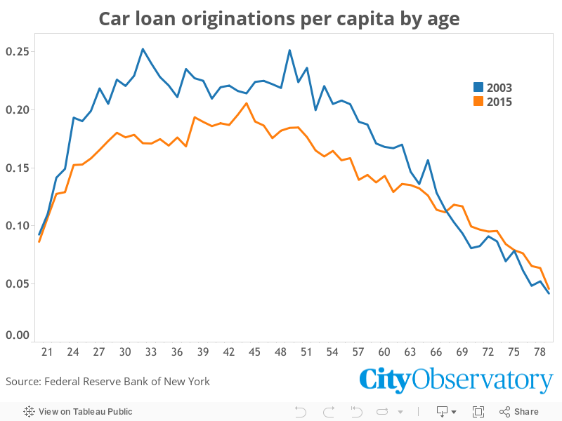
Another bit of evidence comes from financial markets. The Federal Reserve Bank of New York studied credit records to determine what fraction of persons in each age group took out an auto loan. While the total volume of automobile lending declined sharply between 2003 and 2015, the decline was most pronounced among younger age groups. Lenders made about 25 auto loans per 100 persons in their mid thirties in 2003, but only about 17 loans per 100 the same age cohort in 2015. Only those 65 or older are more likely to take out a car loan today than in 2003.
When it comes to America’s much storied romance with the car, it’s apparent that ardor has cooled, especially among Millennials. We’re buying fewer cars, we’re taking out fewer car loans, we’re waiting longer to get a driver’s license, and fewer of us are ultimately doing so.
In the last several years, marijuana legalization has gone from a fringe issue treated as a joke or third rail to a mainstream, enacted policy in parts of the country. Broadly, the change seems to be driven by growing recognition of the general failure and costs of the drug war; growing understanding and acceptance of the medical uses of marijuana; and generational culture change.
In 2012, Colorado and Washington became the first states to fully legalize marijuana for all purposes for adults over age 21; in 2014, Alaska and Oregon followed. A number of cities, including Washington, DC, and New York City, have decriminalized cannabis, giving out tickets rather than arresting offenders.
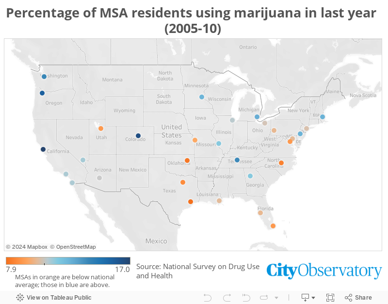
Metropolitan area-level survey data from the US Substance Abuse and Mental Health Services Administration, collected between 2005 and 2010, before any of the full legalization measures passed, suggests that it’s no accident that these are the regions that are leading on the issue. Seattle, Portland, and Denver were all among the metropolitan areas with the greatest reported use of marijuana in the last year, ranging from 13.9 percent in Seattle to 16.5 percent in Denver. (No Alaska metropolitan area was included in the survey.) By contrast, the national average was 10.7 percent.
California, home to the city with the highest reported use—San Francisco, at 17 percent—hasn’t fully legalized marijuana, but it has legalized it for medical purposes, with rather lax standards for receiving a prescription. Meanwhile, the metro areas with the lowest reported use tend to be in the Plains or Southeast (with the notable exceptions of Atlanta and Nashville), with Houston registering the lowest rate of marijuana use, at 7.9 percent.
At City Observatory, we generally focus on issues of urban planning, housing, and transportation, but there are a number of reasons for policymakers and stakeholders to treat marijuana legalization as more than a novelty.
Perhaps the most appealing for the straightedge lawmaker is simply cash. In the last fiscal year, Colorado collected nearly $70 million in tax revenue from marijuana sales—versus just $42 million from alcohol sales. Next door, the Grand Canyon Institute has estimated that a similar measure could collect $62 million a year in tax revenue for Arizona. Nor is the benefit limited to the public sector; far from it—the medical marijuana industry in California is now selling $2.7 billion a year. In fact, there’s already evidence that early-adopter states are creating path dependencies that may anchor a potentially massive industry in their jurisdictions. Companies that developed industry-specific knowledge and skills in Colorado, for example, are now in prime position to capitalize on states that legalized marijuana later.
There is also a kind of Tiebout sorting issue to think about. State and local policies like marijuana legalization can serve as signals about a place’s values and cultural profile for potential migrants and businesses, even those who aren’t most directly affected by the policy itself. The most recent example is the law passed in North Carolina that, among other things, required transgender residents to use bathrooms according to the gender on their birth certificate. The law set off such an intense backlash, including threats of economic boycotts, that the state’s governor began trying to soften some of its provisions less than a month after its passage. Indiana’s “Religious Freedom Restoration Act,” which permitted discrimination by private businesses on the grounds of sexual orientation, cost the state at least $60 million in convention business alone. With businesses increasingly chasing high-value employees, state and local officials may want to watch to see if marijuana legalization has any effect on the location choices of this cohort of the “young and restless,” or others. (Of course, part of Tiebout sorting is that people have different preferences—so perhaps this is an argument against legalization for places looking to attract or retain more socially conservative, or older, residents.)
Finally, the connection between the war on drugs and economic opportunity has been well explored by researchers and advocates. People who are arrested, even for nonviolent drug possession offenses, find themselves at a severe disadvantage in future employment searches. Moreover, studies have shown that arrests for drug possession are concentrated in low-income neighborhoods, and neighborhoods whose residents are primarily people of color, even when drug use is no higher in these communities than elsewhere. In other words, drug arrests act as a drag on opportunity with a strong economic, social, and spatial bias—with direct implications for those who are concerned about the intersection of urban geography and inequality.
Obviously, we’re still a long way from figuring out the ideal drug policy—but there’s an increasing consensus that the status quo isn’t it. Marijuana is one front on which cities’ and states’ often-heralded, sometimes-overblown status as policy laboratories could bear real fruit.
One of City Observatory’s major reports is “Lost in Place,” which chronicles the change in high-poverty neighborhoods since 1970. In it, you’ll find a rich array of data at the neighborhood level showing how and where concentrated poverty grew.
We know it’s a complex and wonky set of data, so we’ve worked with our colleagues at Brink Communication to develop a compact graphic summary of some of our key findings. We’re proud to present that here. And like all material on City Observatory, it’s available for your free use under a Creative Commons-Attribution license, so feel free to incorporate it in your own presentations, email, and social media to help explain the processes of neighborhood change in your city.
You might find it especially useful paired with more local-specific content from “Lost in Place,” such as these interactive city-by-city, neighborhood-by-neighborhood maps. Further down this page, you can also find an interactive dashboard with full statistics for your city, including trends in high-poverty, low-poverty, rebounding, and “fallen star” neighborhoods, and the total number of people living in high-poverty neighborhoods from 1970 to 2010.
Click the thumbnail below for the full infographic. We’ve also included some further narrative context below.
Click for full infographic.
Neighborhood change has been a hot topic in many American cities—and, increasingly, on the national stage—for a number of years. At City Observatory, we’re especially interested in shifting community demographics as they relate to economic and racial integration, which have been shown to have profound impacts on people’s class mobility, longevity, and more.
But while most of the focus has been on gentrification—the process of middle- and upper-income people moving into lower-income neighborhoods—our own research shows that low-income communities are much more likely to suffer from the opposite problem: increasing poverty and severe population decline. Three-quarters of neighborhoods with a poverty rate twice the national average in 1970 still had very high levels of poverty in 2010, and had lost an average of 40 percent of their population. That represents a much larger number of people who have been “displaced” by a lack of opportunity or high-quality public services than have been displaced by gentrification.
Our perceptions of neighborhood change are often shaped by those places that are experiencing the greatest pace of change. The data in “Lost in Place”—available for all of the nation’s 50 largest metro areas—lets anyone look to see how poverty has changed and spread in their city since 1970. And our new infographic helps explain the major components of change. We invite you to use these tools to explore and discuss the process of neighborhood change in your city.
We’ve just gotten our first look at the new US Department of Transportationperformance measurement rule for transportation systems. The rule (nearly three years in gestation, since the passage of the MAP-21 Act) is USDOT’s attempt to establish performance measures to guide investment and operation of the nation’s urban transportation system. One of the criticisms—fair, in our view—of the nation’s transportation system is that there are few, if any, quantitative standards against which performance can be measured, and against which the merits and results of alternative policies and investments can be judged. The new DOT standards aim to do just that. In the next few weeks, we’ll all have an opportunity to weigh in on whether these standards help address this problem.
Standards like these may seem like technocratic trivia. But we’ve routinely witnessed obscure and seemingly innocuous rules of thumb about things like road width or parking requirements end up profoundly shaping our cities—and often in ways we don’t like. Getting these performance measures right can help push transportation investment in a direction that supports more successful cities. Getting them wrong runs the risk of repeating past mistakes. The proposed rules are voluminous, running to more than 400 pages in all—and incredibly detailed. So it will take some time to dig into them. But at first glance, we have some reactions. We’ll take a closer look in the days ahead, and revise and extend our comments as we (andothers) go through the minutiae here.
Two key words: “Excessive” and “Expectations”
Initially, we’re focusing on three standards that the USDOT is proposing apply to metropolitan areas of a million or more population. The USDOT has also proposed separate standards for travel time reliability and freight that we’ll look at in a future post.
Briefly, the standards are outlined in the following table and further analyzed below. They deal with total hours of excessive delay, and the share of the Interstate system or national highway system where travel times don’t exceed 150 percent of a locally established “expectation.”
Performance Measures for Large Metropolitan Areas
Objective
Indicator
Standard
Reference
Congestion
Annual hours of excessive delay per capita
Time in excess of what trips would take at 35 MPH for freeways; 15 MPH for other roads
490.507(b)(1)
Interstate Performance
Percent of peak hour travel times that meet expectations
Not more than 150% of locally set expected travel time
490.507(b)(2)
National Highway System Performance
Percent of peak hour travel times that meet expectations
Not more than 150% of locally set expected travel time
490.707
Implementing these performance measures will require a heavy reliance on technology and a substantial investment. USDOT believes that it will be able to use speed data collected from vehicle telemetry, including cell phones to determine performance for individual street segments. While the technology is promising—it does have some limitations—an analysis of the performance of HOT lanes was flawed because it couldn’t distinguish between vehicles traveling in the tolled and free lanes. USDOT estimates that complying with the data collection and reporting requirements of this rule will cost states and local governments $165 to 224 million over the next decade.
Congestion: “Excessive hours of delay”
The core measure of whether a metropolitan area is making progress in addressing its congestion problem is what USDOT calls “annual hours of excessive delay per capita.” This congestion measure essentially sets a baseline of 35 mph for freeways and 15 pmh for other roads. If cars are measured to be traveling more slowly than these speeds, the additional travel time is counted as delay. The measure calls for all delay hours to be summed and then divided by the number of persons living in the urbanized portion of a metropolitan area.
The proposed measure is, in some senses, an improvement over other measures (like the Texas Transportation Institute’s Travel Time Index) that compute delay based on free flow traffic speeds (which in many cases exceed the posted speed limit). But despite its more realistic baseline, this measure suffers from a number of problems:
—This is all about vehicle delay, not personal delay. So a bus with 40 or 50 passengers has its vehicle delay weighted the same amount according to this metric as a single occupancy vehicle.
—This ignores the value of shorter trips. As long as you are traveling faster than 15 miles per hour or 35 on freeways, no matter how long your trip is, the system is deemed to be performing well.
Interstate and National Highway System performance: “Peak hour travel times meet expectations”
If “meets expectations” sounds a bit squishy for a federal planning standard, it’s because it is.
Under the rule, state DOTs or Metropolitan Planning Organizations (MPOs) would establish “expectations” for how long (or how fast) trips would take on each segment of a metropolitan area’s major freeways and highways. Segments which experienced peak hour travel times that were 50 percent more than these “expected” travel times would be deemed to be congested. The metric would track the share of a region’s highway segments that didn’t experience this level of congestion-related delay.
The pivotal policy question here is what are “expected” travel times. Here the USDOT simply punts: It’s up to state DOTs or metropolitan planning organizations to make this call. As the DOT says: “Under this proposed approach, FHWA does not plan to approve or judge the Desired Peak Period Travel time levels or the policies that will lead to the establishment of these levels.”
In effect, this means that performance metrics are likely to vary widely from place to place. These performance measures beg the essential question of what constitutes a reasonable expectation of travel times. As we’ve pointed out, it’s a regular occurrence in daily life that Americans have come to tolerate very different levels of delay for the same service at different times, for example, when they order their morning coffee, as we documented in the Cappuccino Congestion Index. In our first reading, it’s also not clear whether states and MPOs can adjust expectations over time. It’s an interesting question: Should we adjust our expectations as conditions change, or once established, should “expected” travel times be an unchanging baseline against which performance is measured?
Credit: Daniel Lobo, Flickr
The “expectations” terminology begs a larger question as well: congestion reduction measures are seldom free. It costs money to expand capacity, improve transit, or implement other measures that might reduce travel times at the peak hour. The big question is whether the value commuters attach to such potential travel time savings come anywhere close to being commensurate with the cost of achieving expectations. Because USDOT offers no guidance or guidelines as to what might constitute reasonable expectations for travel times, and because they’re unmoored from any standard of cost effectiveness, this performance standard is likely to be of limited usefulness.
In addition, the “peak hour travel times meet expectations” measure is, of course, a variant of the classic travel time index that we—and others—have long critiqued. One of its chief problems is the denominator. In this case, the denominator is the size of a region’s highway system (in DOT parlance “segment length”.) The indicator is the percent of Interstate (or NHS) roadways that aren’t congested. So—at least in theory—if a region expands its “segment length” by building new, under-utilized highway capacity, it can improve the ratio of uncongested to congested roads—thus improving its performance. Conversely, a metropolitan area that doesn’t increase the segment length of its Interstate (or NHS system) in the face of increasing travel seems likely to see a decline in its rated performance. As a result, this measure seems to impart a strong “build, baby, build” bias to the indicators.
DOT whiffed on greenhouse gases
Despite some hopes that the White House and environmentalists had prevailed on the USDOT to tackle transportation’s contribution to climate change as part of these performance measures, there’s nothing with any teeth here. Instead—in a 425 page proposed rule—there are just six pages (p. 101-106) addressing greenhouse gas emissions that read like a bad book report and a “dog-ate-my-homework” excuse for doing nothing now. Instead, DOT offers up a broad set of questions asking others for advice on how they might do something, in some future rulemaking, to address climate change.
Three ideas for what DOT might have done
Make VMT per capita a core measure. Vehicle Miles Traveled (VMT) per capita is strongly correlated with important transportation system outcomes. It’s correlated with total system costs, costs to households, greenhouse gas emissions, crashes, injuries and fatalities.
Shift from excess travel time to total travel time. A total travel time measure, which recognizes the value of shorter trips, even when they occur at somewhat lower speeds better recognizes the economic and environmental value of more compact development patterns. Implement a “total travel time” measure that computes total travel time per resident, and gives equal weight to measures that reduce the distance of trips and the need for travel, especially at the peak hour, when it will have the greatest effects on congestion.
Establish a separate methodology for transit delays. How much additional time do transit riders incur from transit systems that don’t have average running speeds of some reference number (like DOTs 35 MPH for freeways and 15 MPH) for roads, or locally established expectations. The amount of this delay could easily be calculated from transit system operating records and ridership counts.
Our objective in writing about these standards is to encourage others to take a close look, and help provide a robust discussion of this important policy. We invite your comments and corrections—and we’ll update and add to this post as we learn more about the rule. Stay tuned.
1. More than half of commuters to jobs in classically suburban DuPage County, outside Chicago, say they’d like to walk, bike, or take transit—but nearly 90 percent of them drive anyway. What’s going on? A closer look finds that decades of avowedly auto-centric planning has led to a situation in which nearly all housing and employment growth has been directed to highways, and prohibited near one of the county’s 26 rail stations. As a result, not driving is usually time-consuming, uncomfortable, and dangerous, so even people who would rather not get in their car every day are forced to do so.
2. We’ve sounded this alarm before, but if you’ve read an article about how rents in your city have changed dramatically in just a month or two, it may have been bogus. Another round of pieces about apartment listing service Abodo’s “rent reports” ignore obvious absurdities, including the fact that Abodo claims rents in Portland, OR, grew 14 percent in February in a single month, and then declined seven percent the very next month. These “reports” are in fact just averages of the listing companies’ databases, which are heavily skewed to higher-end apartments and make no effort to correct for random noise in availabilities from month to month. Readers should ignore them, and reporters should know better than to quote them.
3. Place matters for your economic opportunities—and also for your life expectancy. A new study from Raj Chetty et al, whose previous groundbreaking research linked local conditions to intergenerational economic mobility, finds correlations between life expectancy, especially for the low income, and a range of local variables. It ties longer life to greater population density, higher home values, more immigrants, more local government spending, and more college graduates—all indicators of high-quality urban spaces. These findings are exploratory, and don’t yet control for other factors, but point towards further research into how where we live affects our life chances.
4. The growth of upwardly mobile college graduates in many urban centers around the country has led, in some cases, to an overcorrection of the old conventional wisdom: after decades in which cities were synonyms for neighborhoods with disproportionate numbers of lower-income people, people of color, and immigrants, cities are increasingly associated with people who are wealthier and whiter. But it’s important not to confuse the direction of change with actual levels: as a new Pew study underscores, whites and people with higher incomes remainunder-represented in cities and urban behaviors like public transit ridership. It’s important to keep that in mind when evaluating the equity impacts of urban policy.
The week’s must reads
1. America’s GDP is more than 13 percent below where it could be if not for the exclusionary effects of high housing prices in our most productive cities. The Economist considers what might be done to remedy that, and rounds up policy ideas like TILTs (essentially impact fees paid directly to neighbors of new development), moving development decisions from hyper-local neighborhoods (where everyone wants new development “somewhere else”) to the broader city, where neighborhoods can negotiate over their fair share; or even state or federal override of exclusionary, anti-density local laws.
2. Despite its reputation as a world-class melting pot, New York is by some measures one of the most segregated cities in the US. The New York Times considers what that means for Mayor Bill de Blasio’s big housing reforms, including a policy—already the subject of a lawsuit—that gives preference for low-income inclusionary zoning units to local residents, which critics say perpetuates segregation in neighborhoods with a large majority of white residents.
3. Eighty percent of the energy in every gallon of gas is wasted. More than 50,000 Americans die prematurely every year because of vehicle pollution, and more than 3,000 die every month from traffic accidents. The average car owner pays $12,544 a year in loan payments, gas, insurance, and maintenance—for a machine that sits idle 92 percent of the time. Cars and trucks are responsible for more than 80 percent of transportation-related greenhouse gas emissions, playing a key role in global climate change. At The Atlantic, Edward Humes argues these and other issues make our reliance on cars insane.
New knowledge
1. Housing policy has been implicated in everything from climate change to intergenerational mobility to longevity, and now an Urban Institute paper links it to school attendance. Surveying the research literature, as well as doing their own analysis, they find that housing conditions like high levels of lead, as well as housing instability and frequent moving, were highly correlated with chronic absenteeism among students, which in turn is correlated with poor academic outcomes. Concentrated poverty, and its associated problems, are also implicated.
2. They paved over paradise, but they didn’t stop there. New satellite imagery shows how much hard pavement has been added to the DC metro area at Greater Greater Washington. GGW‘s David Alpert points out that more hardscape isn’t always a bad thing—sometimes, it means more density in places that desperately need it, especially in a rapidly growing city. But much of the new pavement represents parking lots and roads far away from the homes and jobs of the central city.
3. A bill has been introduced in Illinois to tax drivers per mile driven—but even if you live elsewhere, this primer from Chicago’s Metropolitan Planning Council is worth reading for a rundown of why and how such a tax might work. A big issue for the state is that the growing vehicle fuel efficiency means declining revenue, without any corresponding decline in infrastructure needs. The plan would offer a few options to drivers, including flat fees and GPS trackers that would precisely measure travel distances. Potentially, these trackers could be used to price congestion, charging more for driving at peak times and locations, and helping to keep roads relatively open. Social equity issues, as well as administration costs, are also challenges. (Oregon already has a pilot VMT tax program—read more here.)
The Week Observed is City Observatory’s weekly newsletter. Every Friday, we give you a quick review of the most important articles, blog posts, and scholarly research on American cities.
Our goal is to help you keep up with—and participate in—the ongoing debate about how to create prosperous, equitable, and livable cities, without having to wade through the hundreds of thousands of words produced on the subject every week by yourself.
If you have ideas for making The Week Observed better, we’d love to hear them! Let us know at jcortright@cityobservatory.org, dkhertz@cityobservatory.org, or on Twitter at @cityobs.
In cities, you’ll sometimes hear people talk about a “daytime population”: not how many people live in a place, but how many gather there regularly during their waking hours. So while 1.6 million people may actually live in Manhattan, there are nearly twice that many people on the island during a given workday.
Most studies on segregation deal with what you might call the “nighttime population,” or actual locations of residence. And of course, that kind of segregation has been shown to have significant negative effects. But it’s also in large part a matter of convenience: the Census means that we have detailed data on where people live. It’s harder to get data on where they happen to spend their time when they’re not at home.
But a fascinating study asks whether, and how, waking mobility affects patterns of segregation. The authors—Taylor Shelton, Ate Poorthuis, and Matthew Zook—used geotagged Twitter and Foursquare data in Louisville, KY to determine whether users likely lived in that city’s West End (predominantly black) or East End (predominantly white). Then they mapped the ratio of the number of tweets by East End residents to the number of tweets by West End residents all across the city.
The results are striking: While the West End is visible as a block of nearly solid purple, indicating virtually no tweets from East End residents, Louisville’s East End appears as various splotches of orange, grey, and purple—indicating a much greater mix of East and West End residents.
The implication is that West End residents, who are mostly black, are much more likely to cross boundaries of segregation than East End residents, who are mostly white. In part, that may be a matter of necessity, as the wealthier East End has more jobs, stores and services.
But it also fits in a pattern of racial stigma and avoidance described by other studies as well. What’s ironic here is that while racial segregation is often described as a limitation on the movement of the disadvantaged population—and in many important ways, from health outcomes to employment, it is—in terms of physical mobility, it turns out that the driver of the West End’s isolation isn’t that West Enders never leave, but that East Enders never visit.
A view of 9th Street, which divides the East and West Ends of Louisville, KY. Credit: Google Maps
That dovetails with research by Ed Glaeser, who suggests that since around 1970, the persistence of “nighttime” residential segregation has been driven primarily by whites’ decisions to avoid neighborhoods that have a significant black population, and to leave their own neighborhoods when blacks move in. It also resonates with research from Robert Sampson, who found a significant stigma attached to predominantly black neighborhoods, and Maria Krysan, who found that while blacks’ knowledge about predominantly white neighborhoods in Chicago depended on their distance and economic class, whites were much more likely to describe themselves as knowing nothing about black neighborhoods, regardless of other factors.
Shelton, Poorthuis, and Zook did find that a few specific activities could draw East End residents west: a cluster appeared near the Churchill Downs racetrack during horse racing season, but then disappeared when the season ended. In other words, while this is a hopeful sign that some kinds of activities clearly generate geographic crossover, these kinds of visits appeared to be to few or limited to have any wider spillover effects in increasing even daytime integration elsewhere in the West End.
That suggests the remedy for this kind of separation will have to go deeper than just an occasional event that draws people from around the city for a few hours. But this paper helps underscore that when we think about segregation, we need to think about more than just where people sleep at night.
For most of the 20th century, cities and their accoutrements were associated with immigrants, people of color, and relative economic deprivation. The very phrase “inner city” became a synonym of “poor,” and in certain contexts “urban” itself became a word that referred to people of color, especially black people.
The “great inversion” has challenged that narrative in recent years, as increasing numbers of disproportionately white, upwardly mobile college graduates have moved to downtowns and inner cities around the country. In fact, in analyzing recent Census data, Jed Kolko found evidence that white college graduates were among the only demographics becoming more urban in their living arrangements.
Credit: Paul Sableman, Flickr
This is all very valuable research—and captures a real phenomenon that has both promise and peril for American cities and suburbs. But there’s a danger in overcorrecting here. (For example, Matt Yglesias’ headline at Vox—“America’s urban renaissance is only for the rich”—sort of skirts that line.) Specifically, while the direction of change is that cities are becoming relatively wealthier and whiter, the actual levels of these populations mean that in most cities, residents are still disproportionately lower-income, foreign-born, and black or brown.
The danger in overcorrecting the conventional wisdom is that we discount the ways in which cities offer important lifelines to people with fewer resources or who are historically disadvantaged. A good example is public transit, and the vastly lower transportation costs that people who live in places with viable transit systems (and the ability to walk or bike for many trips) can enjoy, freeing up household budgets for other necessities. If we imagine that the typical transit rider is a white creative class worker in Brooklyn or the North Side of Chicago, we might discount that redistributive, progressive effect of transit service, and decline to pursue it as a policy goal.
But a recent Pew survey hits home just how far we have to go before the prototypically urban experience of riding the bus or subway becomes a disproportionately white, upper-income phenomenon. Pew asked respondents how often they used public transportation, and published the results with various demographic breakdowns.
The results clearly show that public transit use in America remains disproportionately not the province of whites or upper-income people. Just seven percent of whites—compared to 23 percent of black people and 15 percent of Hispanics—reported using transit at least once a week. A quarter of immigrants took public transit weekly, as opposed to just nine percent of native-born Americans. And those with incomes under $30,000 a year were by far the most likely to be regular riders (15 percent), compared with those making between $30,000 and $75,000 (eight percent) or more (10 percent).
While change makes headlines, actual levels matter too. Cities are, in fact, becoming wealthier and whiter; suburbs are becoming more economically and ethnically diverse. But at least so far, the effect has been to diversify both, rather than lead to a total demographic flip. Cities and “urban lifestyles,” including the use of public transit, are very far from actually being disproportionately wealthy and white, despite the impression you might get in parts of New York or San Francisco.
There aren’t many economists whose research findings are routinely reported in the New York Times and Washington Post. But Raj Chetty—and his colleagues around the country—have a justly earned reputation for clearly presented analyses with detailed findings and direct policy relevance. Last year, they released the most detailed study yet on how place affects intergenerational mobility. And the paper they released Monday is the latest to draw a link between the qualities of urban spaces and the most profound issues of opportunity—in this case, life expectancy.
The bulk of the paper concerns the relationship between longevity and income, and has been well-reportedelsewhere. It highlights patterns that anyone following issues of inequality in the US would have long suspected to be true—that life expectancy is strongly correlated with income, and that the gap in life expectancy between high- and low-income people has grown—but which are now confirmed, in detail, in hard numbers.
But because Chetty et al also analyzed their data by commuting zone (akin to a metropolitan area) and county, we can also draw important conclusions about the link between place and life expectancy, just as their earlier research linked place and economic opportunity. And it appears that strong urban environments can boost their residents’ longevity—especially for the low-income.
Before exploring the details, an important note: the Chetty paper takes only a first-pass, high-level look at correlations between geographic variables and life expectancy. This analysis shows the simple and direct relationship between each tested variable and life expectancy—but doesn’t measure any interactions among variables. And the standard caveat applies: correlation doesn’t prove causation. Still, by examining the correlation between selected local characteristics and life expectancy, we can begin to answer some of our questions about what aspects of place affect this aspect of quality of life.
Credit: Chetty et al
Here we’ve reproduced a key chart from Chetty’s paper, which shows the correlation between a series of regional characteristics and the life expectancy of people in the bottom income quartile.
Credit: Chetty et al
Dots correspond to the point estimate, lines represent the 95 percent confidence interval of the estimate. Positive values indicate that life expectancy increases with increases in the local characteristic; negative values indicate that life expectancy decreases as the value of the local characteristic increases.
We can split these findings into three categories:
Confirming the obvious. places where people smoke more and where obesity is more prevalent have shorter life expectancies; places where people exercise more have longer life expectancies. Regional variations in key health behaviors are reflected directly in the life expectancy of the poor.
Little evidence for the expected. Chetty et al looked at the role of a range of health care measures, the presence of social capital, and the role of inequality and of unemployment and found that regional variations in these characteristics had weak, if any correlation with regional variations in life expectancy.
Unexpected importance of place. Strikingly, poor people tend to live longer in places with more immigrants, more expensive housing, higher local government spending, more density, and a better educated population. Consider each of the five characteristics in the category “Other Variables” at the bottom of Chetty, et al’s Figure 8.
What these data show are a string of strong positive correlations. Places with more immigrants have longer life expectancy for the poor. The same holds for places with more expensive housing: here, too, the poor live longer. The poor also live longer in places with high levels of government spending, more density, and a better educated population. Taken together, these correlations suggest the importance of positive spillover effects from healthy urban places. Large cities tend to have higher levels of density. The most successful cities tend to attract more immigrants, have more expensive housing, and a better educated population. These data suggest that the poor have longer life expectancies in thriving cities.
The authors explain that their data make a strong case for a relationship between cities and greater longevity of the poor:
. . . the strongest pattern in the data was that low-income individuals tend to live longest (and have more healthful behaviors) in cities with highly educated populations, high incomes, and high levels of government expenditures, such as New York, New York, and San Francisco, California. In these cities, life expectancy for individuals in the bottom 5% of the income distribution was approximately 80 years. In contrast, in cities such as Gary, Indiana, and Detroit, Michigan, the expected age at death for individuals in the bottom 5% of the income distribution was approximately 75 years. Low-income individuals living in cities with highly educated populations and high incomes also experienced the largest gains in life expectancy during the 2000s.
As noted, these correlations don’t show causation; some of the effect may have something to do with those—like immigrants—who self-select to move to cities. But the strength of these correlations (and their absence for other variables like access to medical care) signals a need for further scrutiny.
There’s long been a good body of circumstantial evidence to support the proposition that cities are healthier. We know the people in cities and denser environments tend to walk more, a key factor associated with longevity. They also tend to drive less, and suffer less from the toll of crashes and the sedentary life styles associated with car dependent living.
“Live long and prosper” was Spock’s famous admonition in Star Trek. Together with the earlier research on the connections between place and inter-generatinal mobility, this new work highlighting the role of community characteristics in influencing life expectancy signals that successful cities may be an important contributor to realizing those twin goals.
Hey reporters! We know you love rankings, especially ones that show some measure of widely shared pain, like traffic congestion or rent increases.
And some people, armed with a database and an infographic are more than happy to feed your hunger for this type of analysis.
But please: Stop using Abodo’s rent numbers. They’re wrong. They’re meaningless.
We’ve documented why these numbers are wrong. Abodo computes an average based on the apartments contained in its listings database. But Abodo has only a partial, un-represenative, and constantly changing sample of the marketplace. They don’t cover all apartments, and their monthly estimates are biased by composition effects: the apartments included in their sample in one month aren’t necessarily comparable to the apartments listed in their sample in the next month, and so changes in average prices reflect not overall inflation, but the different kinds of apartments that are for rent each month. As a result, Abodo rental inflation estimates fluctuate wildly from month to month.
Here’s a classic case of why you should ignore them:
Abodo said that in March, 2016, Portland, Oregon had the highest level of rent increases in the country, up 14 percent from February.
Then, the next month, Abodo reported that rents in April 2016 in Portland were down seven percent over the previous month, and this represented the fifth biggest decline in the nation.
And Colorado Springs, according to Abodo, showed exactly the reverse trajectory: it was one of the ten biggest losers in March 2016 (down 10 percent compared to February), but then had the fifth biggest increase in April (up 13 percent).
There’s nothing real or meaningful about either of these data points, or about the precipitous (and utterly absurd) changes they seem to imply. If you take Abodo at face value—and clearly no one should—Portland’s rental price inflation problem essentially disappeared in the last four weeks. And Colorado Springs when from catastrophic free-fall to boom in the same brief time period.
Abodo’s listings driven rent estimates are essentially a random number generator when used to calculate month-over-month changes in rental price inflation. Shame on Abodo for producing them in the first place. And shame on any journalist who credulously repeats them.
Acoustical engineers talk about a “signal-to-noise” ratio. What we have here is almost all noise and no signal.
Housing affordability and rental price inflation are real issues, but they’re not ones that Abodo’s data sheds any light upon. There are lots of reliable sources of data on rent levels and on rent inflation. We’ve set about compiling a friendly user’s guide to these data. So reporters, if you care about helping people understand what’s going on in the local housing market, please use these, or similar, resources.
More than half of workers in DuPage County, outside Chicago, say they’d like to get to work without a car. But nearly 90 percent of them drive anyway. What’s going on?
First, a little context.
Your city probably has a DuPage County—if not by name, by profile. Beginning about 15 miles due west of Chicago’s Loop, DuPage boomed in the last several decades of the 20th century, filling the spaces in between 19th century railroad suburbs with low-density subdivisions and office parks, and growing from just 150,000 people in 1950 to nearly a million in 2010. Today, it’s home to a disproportionately affluent slice of the region (median household income is $80,000, as compared to just over $60,000 for the metro area), as well as some of the Chicago region’s largest employment centers outside of downtown, including Fortune 500 companies like Ace Hardware and (for the moment, anyway) McDonald’s.
In other words, DuPage County is more or less a poster child for affluent, “successful” postwar sprawl. That said, its relative economic position to Chicago’s core has been declining recently, as a result both of the growing job base and high-income population of the center city and the growing ethnic and economic diversity of DuPage itself. Thus the poll of DuPage workers, commissioned by the county’s economic development arm, to see what the county might do to attract and keep jobs from fleeing to downtown Chicago or elsewhere.
So why don’t people who say they’d like to take transit actually do it?
It’s not that DuPage doesn’t have transit services. It’s actually pretty transit-rich for suburban America: three Metra commuter rail lines, with 26 stations, pass through the county; a handful of bus lines also criss-cross the area.
A Metra train in Wheaton, IL. Credit: Wikimedia Commons
But for those transit services to be useful for commuting, they have to actually go where people are going—their homes and jobs. And a closer look shows that they don’t.
Back in 1950, development in DuPage County was focused around the commuter rail lines. If you lived in DuPage, you probably lived within a relatively short distance of rail transit—which gave you access not just to the city, but to every other community on your line.
Note that the lines marked “highway” were planned, not existing, highways in 1950.
Since then, however, planners and developers assumed that virtually everyone would use a car to get around, and so the overwhelming majority of the hundreds of thousands of jobs and homes that DuPage County has added in the last several decades have been built too far from rail stations to be accessible. Instead, they’ve been focused along highways and wide arterials built with little to no consideration of transit, walking, or biking.
We can see the effects easily in maps. A population density map of DuPage County shows that there’s no strong correlation between where people live and where Metra stations (the white circles) are.
Nor does the bus network help that much. For one thing, the spread-out nature of development means that no one bus line can have easy access to many homes or businesses either—and even someone who steps out of a bus relatively close to their destination has to navigate roads and parking lots that aren’t designed for walking. Partly as a result, the buses simply don’t come that often: at best, every 15 minutes at rush hour, which may be on the edge of acceptability for show-up-and-go service in the afternoon or late in the evening, but is a burden for someone who really needs to be on time for a job. Other buses come much less frequently, even at rush hour.
This is where you wait for the bus in the jobs-rich I-88 corridor in DuPage.
So someone who wanted to commute to their job in DuPage County by transit would discover 26 rail stations which are probably within walking distance of neither their home nor their job, and a network of buses that aren’t much better, most of which come too infrequently to be reliable for very time-sensitive trips like a commute, and which require getting to and from stops that are located on roads that are hostile or dangerous for walking.
In other words, the decisions of planners and developers over the last several decades have created a land use pattern that essentially locks in transportation choices for all future residents, who are now stuck commuting in ways they say they’d rather not. And DuPage, like other car-dependent suburbs around the country, may be losing some of its economic base as a result.
One response to this, of course, is that for most of the 20th century, car-dependent development is what people wanted. If people wanted to live or work near transit stations, then developers would have built homes and offices there. Which: maybe! But if that’s the case, then it’s odd that basically every municipality in DuPage County has taken the step of legally restricting developers from doing so. Nearly every suburb prohibits apartments, offices, and most other space-efficient commercial uses outside a radius of just two or three blocks from their train station. And even within that radius, density is restricted and discouraged with parking requirements and other rules.
This kind of multifamily building, common in the city, is just a few blocks from suburban Elmhurst, IL’s downtown Metra station. It was built probably only a few years before the adoption of zoning codes that made this sort of construction illegal, and enforced a low-density development pattern on the area. Credit: Google Streetview
And, of course, over the decades, the federal, state, and local governments have invested billions of dollars in highways and road widening, without which most of the development of the last half-century would have been impossible. The size and nature of the public investment prompted a complementary set of private investments that was utterly, and in some ways irrevocably, dependent on auto travel. In fact, nearly the only people who do commute to work by public transit in DuPage are the ones living near Metra stations.
The point is not that, absent these policies, there would have been no new subdivisions far from transit. Nor is it that the right outcome would be for every Metra station to be a little mini-Loop.
Rather, these policies exist on a spectrum—a sliding scale of how many people and jobs will be within walking distance of high-quality transit, on streets amenable to traveling on outside of a car—and we happen to have chosen one extreme, with the result that 90 percent of people drive to work. Including, at a minimum, four out of five people who say they’d prefer not to.
The problem with that isn’t just that some of those urban Millennials aren’t enjoying their preferred lifestyle. It’s that hundreds of thousands of people—including people of modest means—are forced to pay thousands of dollars more in transportation costs every year. And that people who really can’t drive, because they can’t pay for the costs of owning a car, or because they’re too young or old or have some physical disability, are shut out of full participation in society, or forced to waste hours of their days on inefficient transit.
These outcomes, as a result of changing land use patterns, take decades to unfold, and neither DuPage nor the rest of the Chicago region—which looks pretty similar, outside downtown—is going to slide the scale back towards a more balanced transportation system immediately. But lots of little decisions add up.
1. Even in a relatively dense city like Chicago, large amounts of off-street parking goes unused daily. A new report from the Center for Neighborhood Technology documents the over-supply of residential parking, and lays the blame on municipal parking requirements that force developers to build parking lots or garages even when they don’t believe their tenants need them. With a single stall of parking costing up to $37,000, this is especially burdensome for affordable housing developers, whose buyers are especially unlikely to even own a car, but it can also add to market-rate prices, and encourage car ownership by forcing everyone to pay for parking whether they drive or not.
2. The argument that misguided zoning laws are behind many of our urban problems—from housing shortages and rising rents to low-density, car-dependent sprawl—is no longer such a fringe argument. But it’s worth digging into the other kinds of urban policies that lead to environmentally and socially unsustainable neighborhoods. A useful place to do that is Houston, which has created some picture-perfect sprawl without a formal zoning code. In some cases, that’s because they’ve replicated some zoning staples, like parking requirements, outside a zoning code per se. But there are also issues like street widths and block lengths that create an inherently pedestrian-hostile environment, and encourage car-dependent neighborhoods.
3. Millennials are buying more homes as they get older—but at every age, they’re buying fewer homes than previous generations. We get into the difference between lifecycle and generational change, and why the fact that people are more likely to buy a home at 35 than 25 doesn’t mean that today’s 35-year-olds are as likely to buy a home as 35-year-olds ten or fifteen years ago. In fact, homebuying is down among virtually every age cohort except those over 70, with profound consequences for the housing market.
4. A recent challenge to hackers to use public data to reimagine Staten Island, NY’s bus network demonstrates both the promise and the limitations of data-driven urban planning. At City Observatory, we obviously believe in the power of data—and grassroots-led action—to improve our communities and cities. But we also need to be aware of what data doesn’t tell us: in this case, how much of the trip patterns being analyzed are a result of the existing structure of the bus system; what might happen in a more radical reimagining of Staten Island’s transportation landscape; and how hidden priorities and assumptions draw borders around our plans.
The week’s must reads
1. Last summer, the Supreme Court’s opinion upholding “disparate impact” claims under the Fair Housing Act made front page headlines; last month, one of the first such cases since the opinion was handed down against Yuma, Arizona. At CityLab,Kriston Capps writes about how a court deemed that city’s zoning laws discriminatory—in particular, the rejection of a developer’s request to reduce minimum lot sizes for his development from 8,000 square feet to 6,000 amidst racially charged rhetoric from nearby homeowners. Yuma is far from the only city to engage in large-lot zoning; this is a decision that potentially implicates many other municipalities.
2. At first glance, this isn’t a story with much relevance to the US: Toronto isplanning to loosen commercial use requirements in its postwar suburban apartment towers. Of course, the vast majority of US metro areas don’t have many suburban towers—but the basic idea applies anyway. Just like the Canadian highrises, US suburbs are held back economically by large single-use districts, where residents are unable to walk to neighborhood retail or everyday services, or start home businesses to bring in some income with low overhead.
3. Massachusetts has taken a major step towards more inclusionary housing policy, with a state legislator introducing a bill that would require every municipality to zone some of its land for multifamily residential buildings. As Vox‘s Matthew Yglesias writes, such a law would put Massachusetts in a small collection of North American governments, including Washington state, Oregon, and the province of Ontario, that force cities to allow some amount of denser, urban housing. Such a policy not only creates room for more housing infill without pushing sprawl further into the countryside, but can help integrate exclusionary neighborhoods.
New knowledge
1. The face of American debt is increasingly a young graduate with student loans—or perhaps a family who bought their first home during the real estate bubble of the last decade and is still underwater. But a new report from the New York Federal Reserve suggests that the age cohort with the fastest-growing debt loads is over 50, increasing roughly 60 percent between 2003 and 2015. (Some, but not most, of that increase is a result of population growth.) In the wake of the Great Recession, credit standards have tightened, and (with the exception of student loans) younger people are borrowing less. Conversely, older adults are carrying greater debt into their retirement years—perhaps reflecting the lingering effects of the housing bust.
2. Income segregation is one of the most important indicators for cities because of its established link to intergenerational economic mobility. Using the latest American Community Survey, Sean Riordan of Stanford and Kendra Bischoff of Cornell find that neighborhood-level income segregation—which their previous research showed had been growing substantially from the 1980s through 2007—continued to grow from 2007 to 2012. The changes varied by metropolitan area, and, not surprisingly, were strongly correlated with changes in income inequality. The growth of income segregation also appears to be picking up steam: after growing by 4.5 percentage points on a per-decade basis from 1970 to 2007, it grew at a 6.4 percentage point per decade pace from 2007 to 2012. Unlike previous studies that have emphasized the “secession of the rich,” Riordan and Bischoff find that the growth of income segregation from 2007 to 2012 was driven largely by increased sorting among working- and middle-class households, rather than the very wealthy or very poor.
3. Another study, this one in The Lancet, finds that urban neighborhoods are good for your health. Comparing behavior across several cities, from Baltimore to Bogotá, researchers found the residents of more urban neighborhoods walked an average of 90 minutes more per week than residents of more car-dependent communities. Indicators of more physical activity included residential density, a greater number of intersections, public transit, and mixed land use patterns.
The Week Observed is City Observatory’s weekly newsletter. Every Friday, we give you a quick review of the most important articles, blog posts, and scholarly research on American cities.
Our goal is to help you keep up with—and participate in—the ongoing debate about how to create prosperous, equitable, and livable cities, without having to wade through the hundreds of thousands of words produced on the subject every week by yourself.
If you have ideas for making The Week Observed better, we’d love to hear them! Let us know at jcortright@cityobservatory.org, dkhertz@cityobservatory.org, or on Twitter at @cityobs.
A Hollywood staple of the 1930s and 1940s was the story of a plucky band of young kids—usually led by Mickey Rooney and Judy Garland—who, their dreams of making it on Broadway dashed by some plot twist, decide to stage a show of their own. They would find a barn or a warehouse, sing and dance and tell a few jokes on a makeshift stage, and then some theatrical bigshot standing in the wings would snap his fingers—and in the final scene, we’d see Mickey and Judy opening on the Great White Way.
If they remade one of those movies today, the plot would be nearly the same, but would undoubtedly revolve around software.
Case in point: Last month, New York University’s Rudin Center and the Transit Center hosted a one-day hackathon to come up with ideas for improving bus service on Staten Island. Like many places, transit routes on the island are mostly a slightly evolved hodge-podge based on historical streetcar lines, with service levels and timetables that have changed incrementally over the years. New York City’s fifth borough is its most suburban, and its residents have long average commutes, and a wide range of destinations, including Manhattan, Brooklyn and New Jersey.
The Hackathon was held March 5 and drew a solid cadre of laptop-wielding, data-infused programmers, who labored all day to produce a software and presentations to show how the buses could indeed be better. The competition’s $2,000 Grand Prize went to Sri Kanajan for a map the visualized the concentration of bus trip origins and destinations.
Credit: Sri Kanajan
While colorful and interesting, the map is chiefly a restatement of the problem, rather than a proposed solution. It’s useful to have a data-driven, visual representation of the Staten Island origins (dispersed) and Manhattan destinations (concentrated, mostly in the financial district and Midtown), of current bus riders. And, from all accounts, the hackathon generated a healthy discussion of the key problems that need to be addressed in improving transit service.
In our view, anything that gets people talking about buses is generally a good thing. Buses are the underappreciated work-horses of the public transit system, and anything we do that gets them running more efficiently can produce widespread benefits. Case in point: Houston’s rearrangement of its bus routes to implement a gridded, timed-transfer system, providing more frequent service to the most heavily patronized destinations.
And we’re the last ones to argue that only expensive experts can have good ideas. It’s often very productive to have bright outsiders with a fresh perspective re-frame questions and brainstorm new ideas. But at some point—and optimizing transit routes is one of them—a level of expertise and practical experience that even the best programmer isn’t going to deduce from even the biggest data—at least not in the first attempt.
But maybe the bigger problem is that there’s a certain tyranny in the limitations of existing data: current transit ridership data reflects, in part, the pattern and quality of the current service system. There’s some necessary risk-taking and abstraction to apply the lessons from experience in say, other cities, in order to be able to imagine the potential opportunities of a service model for which there is no current local exemplar. In addition, the organizers of the hackathon decreed that all proposals for rearranging transit service had to be “cost-neutral”—a condition that begs the question of what level of resources ought to be devoted to bus service (an especially ironic issue, given the billion-dollar-plus price tag of other New York City transit investments like the $1.4 billion Fulton Center and $4 billion Calatrava WTC station).
The blinders clamped on by the limits of existing data or institutionally siloed problem definitions isn’t just the province of plucky volunteers. Last month we pointed out that design firm IDEO’s efforts to reimagine transportation on behalf of one of its corporate clients was plagued with a fundamental failure to correctly (and broadly define the problem) which led them to overlook thinking about the important roles that urban form and location choices could play in addressing transportation needs.
A couple of years back, a Brooklyn based startup, then called “Significance Labs,” proudly unveiled its smartphone app to enable the poor to prepare applications for food stamps, trumpeting it as a way for the poor to more readily access nutrition benefits. Its founder, a former Facebook and Linkedin veteran, said he wanted to extend SNAP to the “80 percent of the poor” who own smartphones. It would help them cope with the ordeal of applying for SNAP benefits. Next City related their business plan:
“We’ve all been annoyed at some point by navigating government services like waiting in line at the DMV, or filing taxes or applying for a passport,” says Chen. “For low-income Americans, it’s no longer just an annoyance, it’s a necessity. The system, despite being more important for these Americans, isn’t any easier for them.”
Never mind that according to Pew, aggregate smartphone for the entire population was 68 percent in 2015 (and considerably lower for the poor). People who are poor, and who have difficulty getting SNAP benefits are pretty much the least likely among us to own and use smartphones. There’s precious little evidence that the application process is a very big barrier to accessing SNAP benefits: eligible non-recipients are disproportionately elderly and disabled or lack language skills—barriers that seldom correlate strongly with smartphone ownership, much less use.
What’s especially egregious is the implication that it is the “app” that’s solving the hunger or poverty problem. The secret sauce here is not the app, but the dollar value of SNAP benefits. And the problem with SNAP benefits is not that there isn’t an app, but that Congress has been steadily whittling away at the population eligible for benefits and reducing the value of the benefits themselves. Defining this as primarily a technology problem distracts attention from this central issue.
More generally, it’s far from clear that privately developed apps are necessarily a good way to provide access to public services. (While there are plenty of useful, free apps—Google maps has seamlessly integrated transit directions in most cities, thanks to the widespread adoption of open data standards for transit schedules). One article praising Easy Food Stamps called it a “Turbo Tax” for the SNAP program. Turbo Tax has certainly simplified the process of filing one’s taxes, for a price. But the company has also fiercely defended its turf: lobbying Congress to prevent the IRS from offering automatic simple and free tax preparation services, something that could replace the 1040EZ form.
At some point, this kind of techno-centrism is more than just tone-deaf. Blogger Alex Payne diagnosed this particular behavior in claims that BitCoin—the cybercurrency—would help the un-banked poor:
Silicon Valley has a seemingly endless capacity to mistake social and political problems for technological ones, and Bitcoin is just the latest example of this selective blindness. The underbanked will not be lifted out of poverty by conducting their meager daily business in a cryptocurrency rather than a fiat currency.
Open data, apps and technology are all important tools for addressing a range of problems. We really ought to use technology to broaden the audience and inject fresh perspectives into a wide range of discussions. But we shouldn’t let our fascination with technology lead us to believe that there are cheap and easy solutions to complex problems. Technology is usually a complement to, and not a substitute for resources, programs and investments. Open tech needs to be viewed as a way of expanding the discussion, bringing in new perspectives and widening the range of considered alternatives, rather than being treated as a panacea.
So let’s definitely hack away. But if you’re looking to figure out a real challenge for programmers, here’s a thought: instead of spending a billion dollars widening I-75 in Detroit, let’s have a freeway hackathon.
Another column from Paul Krugman today on the ways that US-style zoning laws are detrimental to economic opportunity is a pleasant reminder that the role of building regulations in broader questions of inequality is no longer such a fringe issue. Particularly in places with the greatest “shortage of cities”—where the gap between available housing and the demand for it is greatest, and prices are, as a result, most out of whack—the basic idea that zoning is one of the main drivers of that shortage is increasingly well understood, even if not everyone agrees with it.
But while these regressive, environmentally and socially unsustainable regulations often get reduced to “zoning,” there’s a lot more going on in American cities than that. Take, for example, Houston, which is famous (in its way) for being the only major US city without comprehensive zoning. It’s a frequent comeback for those who claim that zoning and regulation is behind American urban sprawl: If that’s so, then how do you explain Houston, which combines a lack of zoning with picture-perfect urban sprawl?
Houston City Hall, where they don’t write zoning codes. Credit: Wikimedia Commons
The answer is illuminating in two directions. First, Houston is a case study in how non-zoning regulations can produce sprawl. But it also shows how Houston’s lack of traditional zoning really does open up some windows that don’t exist in other places—and what the consequences are in practice. This post will focus on the first direction; we’ll dive into the second in a later post.
You might divide Houston’s non-zoning regulations into two buckets. The first are regulations that essentially reproduce zoning without the name. These have been covered well by a number of people, including Michael Lewyn in 2005, Chris Berry in 2001, and more recently, Zillow’s Sklyar Olsen. (There’s also a good amount of discussion in William Fischel’s Zoning Rules!) A big one is that neighborhoods can establish private covenants that regulate building density, form, and use—and the city of Houston will sue to enforce them, rather than requiring private individuals who are party to the covenant to sue. Essentially, Houston enforces private zoning codes with public money and resources.
Houston also directly regulates the built environment in ways that most cities do within a zoning code. Up until 1998, the city mandated that homes be built on lots no smaller than 5,000 square feet—well over the minimums that predominate in older, denser cities. (Since then, the city has relaxed the minimum lot area requirements in some places, with consequences that are worth exploring in another post.) Similarly, minimum parking regulations are a staple of American zoning; Houston’s are no different even if they appear outside a comprehensive zoning code. One-bedroom apartments must have 1.33 parking spaces available; single family homes must have two. In a special case of backwardness, bars must have ten parking spaces for every thousand square feet of floor area. As elsewhere, the result of all of this is to a) create a built environment in which surface parking lots are common, pushing buildings farther apart and making walking both more burdensome and less pleasant; and b) force tenants and customers to effectively pre-pay for the major costs of car use, making the price difference between driving and not much smaller, and inducing more people to drive.
More interesting for our purposes here, however, are regulations beyond the scope of normal “zoning”—that is, the use and form of buildings. These regulations aren’t necessarily unusual, but they go beyond the question of directly regulating buildings, to regulating the spaces in between. For example, street widths: Houston’s planning department suggests that major arterials ought to be at least 100 feet wide, a size that makes crossing anywhere but at a signalized intersection virtually impossible, and generally precludes a pedestrian-oriented street that is safe and pleasant to walk along. On these streets, intersections are also supposed to be no less than 600 feet apart, roughly twice the length recommended for a high-quality pedestrian environment—and especially harmful when it’s dangerous to cross the street without a traffic light.
Especially when combined with parking requirements, the effect of these non-zoning regulations is to create streets that look like this:
For reasons of both comfort and practicality, this is not a street that very many people will choose to interact with outside of a car. The sidewalks are wedged between fast-moving cars and parking lots; to get to any of the businesses that line the street, a pedestrian will have to navigate spaces designed for cars, which is unpleasant, time-consuming, and dangerous. Because the city code requires plentiful off-street parking, because the street width has been optimized for car travel, and because private covenants generally enforce the separation of commercial and residential areas, the distance between these shops and most people’s homes is likely to be too far to walk anyway. And because transit use generally involves some walking from a stop to your final destination, it will be greatly discouraged as well.
Given a transportation environment that has discouraged all non-car modes, developers will end up building housing far from jobs and amenities, assuming that their buyers will drive. In this way, auto-oriented arterials function in a similar way to highways: they reduce the costs (financial, time, and otherwise) of driving, increase the costs of other modes, and encourage sprawl.
That creates both environmental and social unsustainability, pushing people to rely on emissions-heavy, and personally expensive, transportation. As work from the Center for Neighborhood Technology has shown, people who live in more car-dependent neighborhoods can pay significantly more for transportation, often to the point that it crowds out other necessities. Even where housing is affordable, then, the total location costs of that housing, including transportation, might not be. And people who cannot drive at all—either because they cannot afford to own a car, or because they are not physically able—are left to rely on public transit that is almost necessarily impractical, because of the physical layout of streets.
While zoning is the most common land use tool, and while it is fairly characterized as being a big contributor to sprawling development patterns throughout the country, it’s only one example of the kind of regulation that leads to sprawl. Houston’s combination of parking requirements, prescribed street widths, and the public enforcement of private covenants accomplishes the same sprawling results. So while these sorts of street regulations don’t directly enforce the kind of low-density housing that we criticize zoning for, they do strongly encourage it. They deserve a place in our conversations about housing accessibility, and access to opportunity, in Houston and beyond.
It’s been debunked, right? Though we’ve long been told that millennials want to live in cities, renting rather than owning, and biking instead of driving, a new round of articles are here to tell us that all of that is a myth: as soon as they find their financial footing, young people are buying homes in the suburbs just like previous generations.
These latest claims about housing are based on a new National Association of Realtors study. Based on its annual surveys of recent homebuyers, the NAR reports that millennials now make up 35 percent of those who had purchased homes in the past year, up from 32 percent in 2014, and 31 percent in 2013.
But, if you’ll forgive the paraphrase, these numbers—they do not mean what the NAR thinks they mean.
The basic problem is that the NAR—and other, similar reports (for example, about car-buying habits)—are confusing lifecycle effects with generational effects. Lifecycle effects describe how people’s behavior changes predictably as they get older. A generational effect describes how a cohort of people born at a certain time are different from another cohort of people born at a different time: so, for example, how a millennial behaves at age 25, compared to how previous generations—gen x-ers or boomers—behaved at age 25.
Life Cycle vs. Generational Effects
So when the NAR reports that millennials are buying more homes as they get older, we have to ask if this is a lifecycle effect or a generational one. After all, even if millennials are less likely to buy homes compared to earlier generations, it would be very strange if millennials bucked the well-established lifecycle effect of being more likely to buy a home in their 30s compared to their 20s.
The NAR statistics about market share can’t answer this question, because they compare the home buying habits of 18- to 33-year-olds in 2013 with 20- to 35-year-olds in 2015. For market share to remain the same across these samples, the 34- and 35-year-olds added in 2015 would probably have to buy homes at the same rates as the 18- and 19-year-olds who were dropped. But people in their mid-30s have always bought more homes than people just out of high school, and that lifecycle effect doesn’t signal any shift away from the underlying generational decline in homebuying.
In effect, all the NAR has proven is that, when they are older, millennials buy more homes than when they were younger. But as we’ll show below, at any given age, millennials are still less likely to be homeowners than previous generations at the same age.
Comparing Millennials to Previous Generations
To check for generational change, you have to compare identical age cohorts over time. And if you do that, it’s clear that millennials are, in fact, less likely to buy a home than earlier generations. Homeownership for every cohort under age 65 is depressed well below historic levels, especially for people now in their thirties, and this decline continuing, not reversing.
This chart shows how homeownership rates have varied by age for two years: 2001 and 2014. You can see that in both years, homeownership rates increase steeply in the for persons in their late 20s and early 30s, and then grow more slowly as people age into their 50s or 60s.
But it’s also clear that at every age below 60, homeownership rates are now significantly lower than they were in 2001. If we chart the difference itself, it looks like this:
For those aged 21 to 60, homeownership rates have fallen by six to 10 percentage points since 2001. The biggest declines have been for those in their thirties. (Note, too, that while some accounts make sharp distinctions between generations, this chart shows how continuous and consistent is the relationship between age and the decline in housing tenure, with the behavior of the oldest millennials flowing into that of the youngest gen-Xers.)
To distinguish between a lifecycle change and generational change, it can also be helpful to focus on a single age group over a long period of time. In the following chart, we look at the homeownership rates of 32-year-old and 34-year-old heads of household in each year from 2001 to 2014.
There are two obvious takeaways. First, 34-year-olds are more likely to be homeowners than 32-year-olds (the blue line is higher than the red line). Second, over time, the homeownership rate of both 34-year-olds and 32-year-olds has gone down (both lines slope down to the right). Again: This signals a generational change in home buying tendencies. Both 32- and 34-year-olds are less likely in 2014 (by a wide margin) to be homeowners than they were in 2001. And if there were evidence that in the last few years millennial home buying tendencies were reverting to those of previous generations, it would show up here, as a reversal or upswing in these lines. But they continue to slope down, indicating that homeownership, far from rebounding to historic patterns, is continuing to become less common among this generation than its predecessors.
We can use the change in age-specific home-ownership propensities to compute how many fewer millennials own homes today than would have been the case if they had behaved as previous generations did. To do this, we multiply the 2001 home-ownership rate for each age group by the number of household heads in 2014, and compare the the predicted number of homeowners in each age group with the actual number reported by the census. The calculation is shown in the following table. In all, we estimate that there are 1.7 million fewer millennial home-owning households today than would have been the case if homeownership were as prevalent today as it was in 2001.
“Just delaying” homeownership results in big change in real estate
Finally, there’s a statistical claim being made here that Millennials are just like other generations in their home buying habits and preferences, they’re just buying homes and moving to the suburbs later in life. There are two problems with this argument. First, a one- or two-year change in the average age of first home purchase significantly reduces the number of homeowners permanently. It automatically means that those who own homes will be homeowners for about 2.5 to 3 percent less of their lifetime—over the whole population, over several decades that translates into a permanent decline in the homeownership rate. Second, the implication is that somehow, though they wait longer to buy their first home, eventually, they’ll catch up to historic levels of homeownership . . . someday. But there’s no evidence for this “catch up” theory—in fact, homeownership levels are dropping for everyone up through about age 60. American’s are both delaying homeownership until they’re older, and buying fewer homes over their lifetimes—which together represent a huge change in how US housing markets work.
Far from debunking the story about Millennial home-buying habits being different, the latest data confirm that serious, long-term changes are afoot. We’re well past the dark days of the 2009 recession. The economy has been growing again for six years, and home buying rates at all ages remain depressed well below historic levels—no more so that for those Millennials in their mid-30’s who are fully ten-points less likely to be homeowners than the Gen-Xers of 2001 were in their mid 30s.
Data Notes:
These data are taken from the American Community Survey for the years indicated. There are many different definitions of what constitutes the “millennial” generation: for these tabulations we follow NARs definition of those born between 1980 and 2000.
1. Have we reached “peak Millennial”? One researchers argues that because new births peaked in 1990, today’s 26-year-olds represent the high water mark of a youth-led urban renaissance. But a closer look shows that’s not the case: the US Census predicts that we have a number of years until we’ve reached the top of the youth wave, demographically—and foresees a plateau, rather than a peak. Moreover, it appears that the preference among young adults for city living is increasing, which could boost their urban numbers even without a demographic swell.
2. Growing up in a mixed-income neighborhood can have serious benefits for children when they reach their adult years—and a new study reveals how previous research has actually understated those effects. A new paper shows that previous studies on the “Moving to Opportunity” experiment that gave public housing residents vouchers to move to lower-poverty neighborhoods had a hidden bias that suggested the benefits of moving were smaller than they really were. The real takeaway, though, is not about “mobility” programs per se, but about the importance of economic integration in general—as other research that measured the opposite dynamic, the growth of middle- or upper-income households near existing public housing, has shown.
3. Fact: College students in Detroit are more likely to stick around town after graduation than their peers in Austin, Texas. Does that mean the Motor City is winning the fight against “brain drain,” and Austin’s boom isn’t all it’s cracked up to be? Not really. It turns out that these differences have more to do with the kinds of higher education institutions in each city than the cities themselves. In some places, universities effectively function as export industries, producing far more graduates than their region can absorb, and shipping them all over the state, country, or even world. By looking at the numbers a different way—new local grads produced per capita—we can get a better handle on the “brain drain” story.
4. What would a well-functioning housing voucher program look like? In some places, tensions over the higher rents some housing authorities are willing to pay to try to improve vouchers’ pro-integration power have provoked a backlash. But differentiating rents by local markets may be key to using vouchers to create more mixed-income communities. They also highlight the importance of committing serious funding behind housing affordability efforts.
The week’s must reads
1. Who’s moving to cities, and who isn’t? The release of new 2015 county population figures has set off another round of demographic analysis about the changing profile of urban America. For two perspectives, check out Jed Kolko, who argues that the urban renaissance has been demographically limited; and Tony Dutzik, who says that the urban/suburban divide matters less than what demographic and lifestyle trends mean for resource and energy consumption—and sustainability. Look for our thoughts next week.
2. You often hear it in arguments against bike or bus lanes: If they’re so important, why do they look empty? David Levinson helpfully answers that question with some simple math and geometry. It turns out that even equally utilized car and bike lanes will leave the car lanes looking much busier—simply because each car takes up much more space than a bike (or, per person, than a bus!). On a typical block, a bike lane with one cyclist is getting about as much throughput given the space it takes up as a car lane with eight vehicles.
3. A new report from the Urban Institute uses a unique combination of data from credit reporting agencies and the American Community Survey to assess the credit situation of the nation’s renters and homeowners. The report, by UI’s Wei Li and Laurie Goodman, and entitled “Comparing Credit Profiles of American Renters and Owners,” clearly shows the impact of the housing bust on the credit standing of rental households. They report that 19 million current renters used to be homeowners, and that about a quarter of these lost their homes to foreclosure; the bulk of foreclosed former homeowners are between 36 and 55. The outlook going forward isn’t at all favorable: by their count, some 64 million renters have credit scores below 650, which is generally the threshold for qualifying for mortgage financing.
New knowledge
1. When do we have too much parking? A new report from Chicago’s Center for Neighborhood Technology says the answer is “now.” Sending teams out to parking garages in residential buildings built to the city’s legal requirements, CNT found utilization rates of just one parked car for every three apartments—and even less for buildings near rapid transit stations. Why does that matter? Building parking costs money and takes up space, which could be used to add more housing without taking up any more space. Ironically, for below-market housing, parking requirements can be especially onerous, even though their low-income tenants are less likely to even own a car.
2. What determines if someone moves to a big city? A new paper suggests that a big part of the answer is self-confidence. In part because highly skilled people are most able to take advantage of the wage premiums of cities, people who rate their own abilities highly are disproportionately likely to move to large urban areas. Unfortunately, that also means that high-ability people without that self-confidence are less likely to move. That gives those with the confidence to move early a boost in their careers, even over relatively more skilled people who didn’t move, or moved later in their lives. For more, see CityLab.
3. As economic segregation becomes a larger problem, a new report from Brookings (also covered in CityLab) shows that concentrated poverty is at higher levels than before the recession. The number of people living in high-poverty neighborhoods has increased by over five million, to about 14 million in 2010-2014 American Community Survey figures. Sun Belt and Great Lakes metropolitan areas were hardest hit, the Brookings figures show. And while concentrated poverty grew faster in percentage terms in the suburbs, overall levels of concentrated poverty remain much higher in city centers, with 25.5 percent of low-income people living in high-poverty neighborhoods there versus 7.1 percent in suburbs. These figures underline the importance of actively pursuing economic integration policies.
The Week Observed is City Observatory’s weekly newsletter. Every Friday, we give you a quick review of the most important articles, blog posts, and scholarly research on American cities.
Our goal is to help you keep up with—and participate in—the ongoing debate about how to create prosperous, equitable, and livable cities, without having to wade through the hundreds of thousands of words produced on the subject every week by yourself.
If you have ideas for making The Week Observed better, we’d love to hear them! Let us know at jcortright@cityobservatory.org, dkhertz@cityobservatory.org, or on Twitter at @cityobs.
There’s not enough parking in Chicago: it’s an article of faith among many drivers, and has been a key assumption in many of the city’s planning efforts. But a new report from the Chicago-based Center for Neighborhood Technology finds that one of those efforts, mandatory off-street parking requirements for residential buildings, is causing an over-supply of parking, with serious consequences for affordability and transportation.
A view of Chicago’s Edgewater neighborhood, with parking land use highlighted in teal. Credit: Center for Neighborhood Technology
Repeating a methodology used by CNT in Seattle’s King County, Washington, San Francisco, and Washington, DC, researchers went into parking garages attached to residential buildings in the middle of the night, when most people should be home and parking use should be highest. (Full disclosure: I interned for CNT last year, and contributed to the literature review for the report.) They found that, on average, only half the required parking spots in the typical building were actually occupied. Overall, zoning required two parking places per three units, but the survey revealed there was just one parking spot in use for every three units; the city’s zoning law requires one spot per unit for most new buildings.
This oversupply varied by the kind of units and location of the building. Expectedly, units near rapid transit stations used fewer parking spaces—though, crucially, the same was true of units near high-quality bus service, as defined by average frequencies of no more than 15 minutes. Perhaps less expectedly, buildings with larger, family-sized units actually had a greater oversupply of parking than buildings with studios and one-bedroom units. The family-sized buildings used an average of 0.54 parking spaces per unit—but supplied 0.85 spaces.
Credit: Center for Neighborhood Technology
While 0.31 empty parking spaces per unit may not sound like a big deal, it is. One reason is simply cost: each stall in a parking garage can cost up to $37,000 to build. Even surface parking spaces can cost up to $4,200—and require extra land, or impose significant opportunity costs by reducing the number of housing units than can fit on a parcel. That’s a problem for market-rate developments, where parking has been found to add 10 percent to prices in San Francisco.
But it can be an even bigger burden for affordable housing developers, who need to delicately balance different funding sources to make up the gap between the cost of building and the below-market prices they charge. The tens of thousands of additional financing dollars per unit that parking requirements can impose can kill or drastically scale back a project. That’s all the more ironic, since low-income residents are even less likely to own a car. In fact, even in market-rate developments, forcing every tenant to effectively pay for the construction and maintenance of off-street parking requires people who don’t own cars—who are disproportionately low-income, the elderly, and people with disabilities—to subsidize those who do.
But the presence of off-street parking also affects behavior. As we’ve written before, getting the price right matters when it comes to transportation; by making everyone pay up front for off-street parking whether they use it or not, parking requirements makes the effective difference in cost between parking and not parking a car at your home zero. As a result, more people own cars than would if paying was actually connected to use. In fact, residents of neighborhoods with parking minimums are 28 percent more likely to drive to work, imposing costs in terms of congestion, public safety, and carbon emissions on the rest of society.
The report closes with a “policy toolkit” for municipalities to reform their parking requirements. They include simple fixes, like just lowering the requirements, or even establishing parking maximums—but also other approaches, like shared parking districts that allow different uses with different peak times to share the same parking supply, or credits for carshare spaces, transit accessibility, or other factors that are likely to reduce the need for parking. Anyone looking for a blueprint to reform their city’s parking policies to improve affordability and accessible transit ought to take a look.
Every day, tens of millions of Americans waste tens of thousands of hours stuck waiting on the side of streets for car traffic to get out of their way. We estimate that the annual value of time lost waiting to walk totals $25 billion annually.
Today, City Observatory announces the launch of our latest data product: the Pedestrian Pain Index (PPI). Following the techniques developed over the past thirty years by the highway-oriented Texas Transportation Institute (TTI), PPI uses similar methods and assumptions —to calculate the amount of time pedestrians lose each year having to wait their turn to cross streets to allow cars to proceed.
Credit: Billie Grace Ward, Flickr
We attribute 100 percent of pedestrian wait time as “delay” due to automobiles for two reasons. First, our methodology mirrors exactly that used by the TTI, which counts traffic delay as any slowdown in traffic below the level that motorists enjoy at so-called “free flow speeds,” even if the free flow speed is higher than the posted speed limit. Second—and perhaps more importantly—pedestrians are only forced to wait at intersections because of vehicle traffic. In pedestrian-only environments, there is no need for “Don’t Walk” signs. In that sense, traffic lights and crosswalks are not walking infrastructure—in places without cars like inside shopping malls or in Venice, Italy, there is no need to have signals to tell people when they can walk or paint lines to show people where they can walk.
There’s little question that walking has been made a second-class form of transportation—and that pedestrians regularly feel the pain of being subordinated to automobiles. One of the best examples is “beg buttons” can delay law-abiding pedestrians up to a minute and a half in order to cross a city street—a point illustrated by Gizmodo.
Here’s how we came up with our PPI estimate. According to data tabulated by John Pucher and his colleagues from the the most recent National Household Transportation Survey, the typical American spends about 112 hours walking about 37.7 miles per year. We estimate that out of a typical walk, a pedestrian spends about five percent of their time waiting for traffic, either as they cross the street an un-signaled location, or waiting for a traffic signal. Our five percent estimate corresponds to waiting about 55 seconds during the average 18.5 minutes that each American walks on a daily basis. For those in low-traffic, low-density areas, these 55 seconds will likely be an overestimate; in urban settings with traffic lights on most corners—where a disproportionate share of walking occurs—55 seconds will be an underestimate.
We multiply our daily delay estimate of 55 seconds per person by 365 days and by the roughly 300 million Americans five years of age or older to come up with an estimate of about 1.6 billion hours of pedestrian delay experienced by Americans annually. Valuing that delay at $15 per hour—a figure somewhat lower than that used in studies of automobile congestion delay—produces a total estimate of $25.2 billion in time lost in pedestrian pain waiting for automobiles.
Credit: michael brooking, Flickr
The Pedestrian Pain Index is a first, rough approximation of the time lost by pedestrians due to automobile traffic. Constructing this index is complicated by the fact that, unlike the case for automobile travel, we have very limited data on walking travel. As Tom Vanderbilt put it in Slate, “Walking in America is a bit like sex: Everybody’s doing it, but nobody knows how much.” It’s a classic instance of the old adage “if you don’t count it, it doesn’t count.” Lacking any data about pedestrians in most settings, the costs and consequences of land use and engineering decisions on walking are simply invisible——and therefore ignored.
Traffic engineers have begun to recognize that the waits imposed on by signals on pedestrians impose major costs and discourage people from walking. The National Association of City Transportation Officials (NACTO) writes in the Urban Street Design Guide:
Long signal cycles, compounded over multiple intersections, can make crossing a street or walking even a short distance prohibitive and frustrating. This discourages walking altogether, and makes streets into barriers that separate destinations, rather than arteries that stitch them together.
According to the 2012 National Traffic Signal Report Card (yes, there really is such a thing: it gives us a D+), the United States has about 311,000 traffic signals (about 1 for every 1,000 Americans), with an estimated replacement cost of about $83 billion. Most of these signals control pedestrian travel, as well as vehicles. Pedestrians face delays not just at traffic signals, but when crossing roads at un-signalized intersections, and when crossing mid-block (as is frequently necessitated by the serpentine, uninterrupted roadways found in most US suburbs).
Those of you who regard this as a bit of early April data-whimsy, think again. If anything, the estimates presented here profoundly understate the costs travel time costs that our auto-centric transportation system imposes on those who would like to walk. Recent national survey data collected by Jennifer Dill and her colleagues at Portland State University show that walking is a highly valued form of transportation. Two-thirds of Americans of all ages agreed or strongly agreed with the statement “I like walking.” Younger Americans preferred walking to driving, with the share of Millennials saying they like to walk outpacing those who agreed they liked driving by 12 percentage points.
Significantly, the most commonly cited barrier to walking (identified by two-thirds of the entire sample) was the relative remoteness of destinations——and destinations are more remote because they are scaled to the size of automobile market-sheds, and because parking requirements (coupled with bans on mixed use zoning) mean that it is uneconomical or illegal to build communities that are convenient for walking. The growing demand for walkable communities, coupled with their relatively short supply is one of the key reasons that values for walkable residential and commercial areas have been rising faster than for auto-dependent locations.
Credit: annshi, Flickr
Like last year’s Cappuccino Congestion Index, the Pedestrian Pain Index illustrated that armed with a modicum of data and a few assumptions, one can easily craft an impressive (or at least impressive sounding) estimate of the dollar cost of some delay that we face in our lives. But being able to monetize delay is not the same thing as saying it’s worth spending scarce public resources to remedy.
In a complex, crowded, and interconnected world, no system can be designed so that no user ever experiences a moment of delay. While it is possible to tally and monetize the value of time spent waiting, that doesn’t necessarily mean that the problem is a serious one, it would be—dare we say it “foolish”—to insist we ought to spend scarce public resources to lessen what are in many cases mostly private costs. That’s something to remember the next time you hear anyone quoting impressive sounding numbers from the Texas Transportation Institute—or anyone else—about the billions and billions lost to traffic congestion.
As Jane Jacobs so eloquently described it in The Death and Life of American Cities, much of the essence of urban living is reflected in the “sidewalk ballet” of people going about their daily errands, wandering along the margins of public spaces (streets, sidewalks, parks and squares) and in and out of quasi-private spaces (stores, salons, bars, boutiques, bars and restaurants).
Clusters of these quasi-private spaces, which are usually neighborhood businesses, activate a streetscape, both drawing life from and adding to a steady flow of people outside.
In an effort to begin to quantify this key aspect of neighborhood vitality, we’ve developed a new statistical indicator—the Storefront Index (click to see the full report)—that measures the number and concentration of customer-facing businesses in the nation’s large metropolitan areas. We’ve computed the Storefront Index by mapping the locations of hundreds of thousands of everyday businesses: grocery and hardware stores, beauty salons, bookstores, bars and restaurants, movie theatres and entertainment venues, and then identifying significant clusters of these businesses—places where each storefront business is no more than 100 meters from the next storefront.
The result is a series of maps, available for the nation’s 51 largest metropolitan areas, that show the location, size, and intensity of neighborhood business clusters down to the street level. Here’s an example for Washington, DC. On this map, each dot represents one storefront business. This maps shows storefront businesses throughout the metropolitan area. In downtown Washington, there is a high concentration of storefronts; as one moves further out towards the suburbs, the number of storefronts diminishes, and storefronts are increasingly found arrayed only along major arterials, with a few satellite city centers (like Alexandria).
The Storefront Index helps illuminate the differences in the vibrancy of the urban core in different metropolitan areas. Here we’ve constructed identically scaled maps of the Portland and St. Louis metropolitan areas, zoomed in on their central business districts. The light colored circle represents a three-mile buffer around the center of downtown. In Portland, there are about 1,700 storefront businesses in this three-mile buffer—with substantial concentrations downtown, and in the close-in residential neighborhoods nearby. St. Louis has only about 400 storefront businesses in a similar area, with a smaller concentration of storefront businesses in its center, and fewer and less dense commercial districts in nearby neighborhoods.
The Storefront Index is one indicator of the relative size and robustness of the active streetscape in and around city centers. As this table shows, there’s considerable variation among US metropolitan areas in the number of storefront businesses with three miles of the center of downtown. New York and San Francisco have the densest concentrations of storefront businesses in their urban cores.
We also use the Storefront Index to track change over time, looking at the growth of businesses and street level activity in a rebounding neighborhood in Portland. There’s also strong evidence to suggest that concentrations of storefront businesses provide a conducive environment for walking. We’ve overlaid the storefront index clusters on a heat map of Walk Scores for selected metropolitan areas to explore the relationship between these two measures. While Walk Score includes destinations like parks and schools, as well as businesses, it also measures walkability from the standpoint of home-based origins, while our Storefront Index shows the concentration of commercial destinations.
City Observatory has developed the Storefront Index as a freely available tool for urbanists and city planners to use in their communities. The index material is licensed under a Creative Commons Attribution license (as is all City Observatory material), and a shape file containing storefront index information is available here.
As Jane Jacobs so eloquently described it in The Death and Life of American Cities, much of the essence of urban living is reflected in the “sidewalk ballet” of people going about their daily errands, wandering along the margins of public spaces (streets, sidewalks, parks and squares) and in and out of quasi-private spaces (stores, salons, bars, boutiques, bars and restaurants).
Clusters of these quasi-private spaces, which are usually neighborhood businesses, activate a streetscape, both drawing life from and adding to a steady flow of people outside.
In an effort to begin to quantify this key aspect of neighborhood vitality, we’ve developed a new statistical indicator—the Storefront Index (click to see the full report)—that measures the number and concentration of customer-facing businesses in the nation’s large metropolitan areas. We’ve computed the Storefront Index by mapping the locations of hundreds of thousands of everyday businesses: grocery and hardware stores, beauty salons, bookstores, bars and restaurants, movie theatres and entertainment venues, and then identifying significant clusters of these businesses—places where each storefront business is no more than 100 meters from the next storefront.
The result is a series of maps, available for the nation’s 51 largest metropolitan areas, that show the location, size, and intensity of neighborhood business clusters down to the street level. Here’s an example for Washington, DC. On this map, each dot represents one storefront business. This maps shows storefront businesses throughout the metropolitan area. In downtown Washington, there is a high concentration of storefronts; as one moves further out towards the suburbs, the number of storefronts diminishes, and storefronts are increasingly found arrayed only along major arterials, with a few satellite city centers (like Alexandria).
The Storefront Index helps illuminate the differences in the vibrancy of the urban core in different metropolitan areas. Here we’ve constructed identically scaled maps of the Portland and St. Louis metropolitan areas, zoomed in on their central business districts. The light colored circle represents a three-mile radius around the center of downtown. In Portland, there are about 1,700 storefront businesses in this three-mile circle—with substantial concentrations downtown, and in the close-in residential neighborhoods nearby. St. Louis has only about 400 storefront businesses in a similar area, with a smaller concentration of storefront businesses in its center, and fewer and less dense commercial districts in nearby neighborhoods.
The Storefront Index is one indicator of the relative size and robustness of the active streetscape in and around city centers. As this table shows, there’s considerable variation among US metropolitan areas in the number of storefront businesses with three miles of the center of downtown. New York and San Francisco have the densest concentrations of storefront businesses in their urban cores.
We also use the Storefront Index to track change over time, looking at the growth of businesses and street level activity in a rebounding neighborhood in Portland. There’s also strong evidence to suggest that concentrations of storefront businesses provide a conducive environment for walking. We’ve overlaid the storefront index clusters on a heat map of Walk Scores for selected metropolitan areas to explore the relationship between these two measures. While Walk Score includes destinations like parks and schools, as well as businesses, it also measures walkability from the standpoint of home-based origins, while our Storefront Index shows the concentration of commercial destinations.
City Observatory has developed the Storefront Index as a freely available tool for urbanists and city planners to use in their communities. The index material is licensed under a Creative Commons Attribution license (as is all City Observatory material), and shapefiles containing storefront index information is available here.
Yesterday, we introduced our latest report, The Storefront Index, which aims to quantify and map one aspect of a neighborhood’s vibrant street life—customer-facing businesses—in every neighborhood in the 51 largest metropolitan areas in the country. The Washington Post wrote more about it here.
To illustrate one way the Storefront Index can help illuminate urban planning issues on the ground, take February’sWashingtonian article by Greater Greater Washington contributor Dan Reed about a seeming mystery: why are some parks full of people while others are empty?
The article focuses on Farragut Square and Franklin Square in downtown DC. The two spaces are just a few blocks from each other, and are both adjacent to office buildings and a Metro stop, but according to Reed, Farragut is “full of people—eating, strolling, sitting on the immaculate grass,” while Franklin is “desolate.”
The well-used Farragut Square. Credit: Karen Rustad, Flickr
Reed makes a number of hypotheses about why that is, including the design of Franklin Square’s paths and its size. But he also notes that Farragut Square is surrounded by ground-floor businesses, while Franklin Square has only a few on one side. Our Storefront Index map illustrates the issue:
The stores around Farragut Square help keep a steady stream of people dropping by to get lunch or buy a newspaper, some of whom will stop to talk to a colleague they run into, or take a seat in the park to eat or read. At Franklin Square, there’s little to generate that kind of foot traffic—and because people generally like to congregate in places where there are other people, that becomes a self-reinforcing cycle.
As Jane Jacobs observed decades ago, when they work well, urban spaces are a dynamic and symbiotic mix of the public and private: public spaces like parks and squares and sidewalks provide places for walking and sitting and being in public. Shops, restaurants, and bars—particularly when they are clustered together—stimulate the hustle and bustle that conveys a sense of activity, interest and safety that helps activate the public realm.
In this case, Reed found an underused space in his daily life, and realized that the different concentration of businesses could be part of the problem. The Storefront Index can be useful in cases like this to quickly and clearly demonstrate to people who aren’t familiar with these spaces how their commercial character differs.
But planners and active neighbors can also use the Storefront Index to identify public spaces that may not be used to their full potential by looking for parks and squares with few storefront businesses around them. As we update the Index over the coming years, they will also be able to see how changing numbers and locations of storefront businesses track perceptions or data about street life and neighborhood vibrancy.