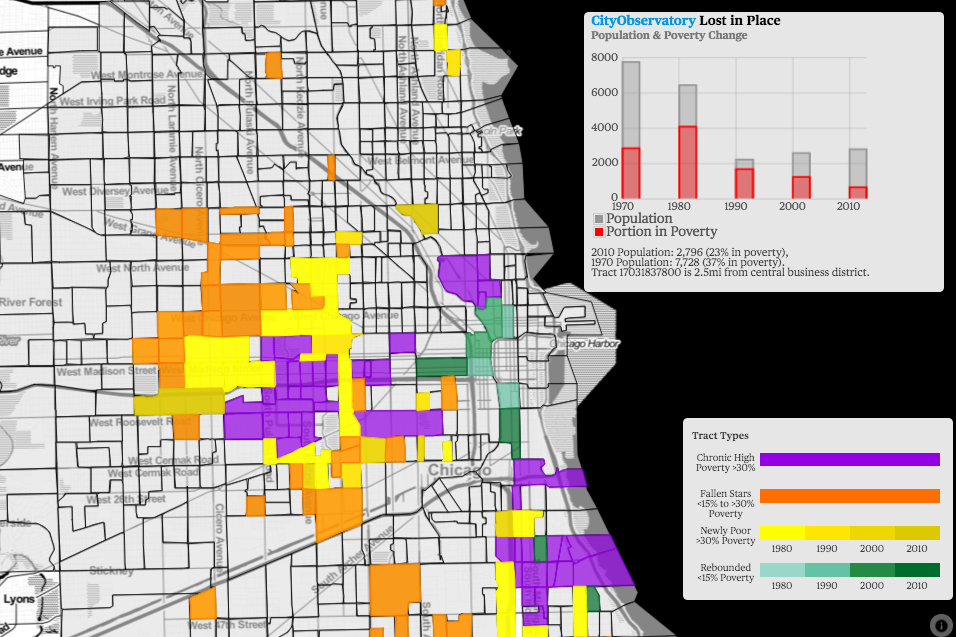
One of City Observatory’s major reports is “Lost in Place,” which chronicles the change in high-poverty neighborhoods since 1970. In it, you’ll find a rich array of data at the neighborhood level showing how and where concentrated poverty grew.
We know it’s a complex and wonky set of data, so we’ve worked with our colleagues at Brink Communication to develop a compact graphic summary of some of our key findings. We’re proud to present that here. And like all material on City Observatory, it’s available for your free use under a Creative Commons-Attribution license, so feel free to incorporate it in your own presentations, email, and social media to help explain the processes of neighborhood change in your city.
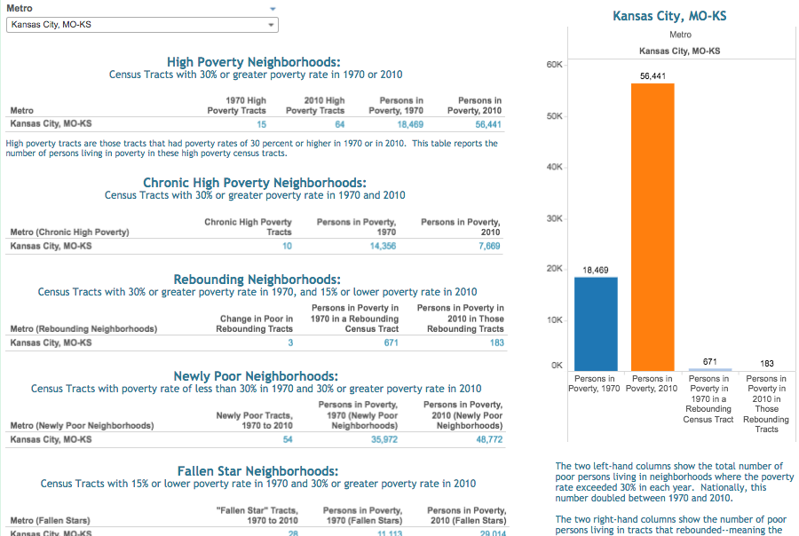
You might find it especially useful paired with more local-specific content from “Lost in Place,” such as these interactive city-by-city, neighborhood-by-neighborhood maps. Further down this page, you can also find an interactive dashboard with full statistics for your city, including trends in high-poverty, low-poverty, rebounding, and “fallen star” neighborhoods, and the total number of people living in high-poverty neighborhoods from 1970 to 2010.
Click the thumbnail below for the full infographic. We’ve also included some further narrative context below.
Neighborhood change has been a hot topic in many American cities—and, increasingly, on the national stage—for a number of years. At City Observatory, we’re especially interested in shifting community demographics as they relate to economic and racial integration, which have been shown to have profound impacts on people’s class mobility, longevity, and more.
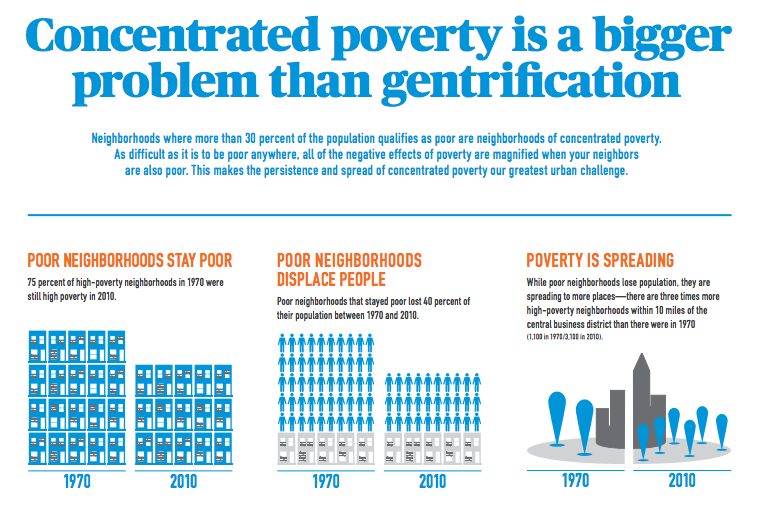
But while most of the focus has been on gentrification—the process of middle- and upper-income people moving into lower-income neighborhoods—our own research shows that low-income communities are much more likely to suffer from the opposite problem: increasing poverty and severe population decline. Three-quarters of neighborhoods with a poverty rate twice the national average in 1970 still had very high levels of poverty in 2010, and had lost an average of 40 percent of their population. That represents a much larger number of people who have been “displaced” by a lack of opportunity or high-quality public services than have been displaced by gentrification.
Our perceptions of neighborhood change are often shaped by those places that are experiencing the greatest pace of change. The data in “Lost in Place”—available for all of the nation’s 50 largest metro areas—lets anyone look to see how poverty has changed and spread in their city since 1970. And our new infographic helps explain the major components of change. We invite you to use these tools to explore and discuss the process of neighborhood change in your city.
