Our seven most popular posts of 2017

Affordable housing and sensible transportation were our most-read features

#7 – Urban myth busting: How building more high income housing helps affordability.  One of the predictable lamentations about the housing market is that developers are always building new structures for middle and upper income households, and nothing for the poor. That observation fuels an argument that more new high-end construction somehow makes all housing less affordable.. But building housing for higher income households increases the supply, and means that these households are less likely to compete with everyone else for other housing. This indirect effect is how high income housing actually helps affordability.

#6 – How luxury housing becomes affordable. Housing is a long-lived asset. Most new housing is built for the higher end of the market (see #7, above), but as it ages, it tends to become relatively less attractive. It’s hard to imagine, but many of the apartments built in the 1920s or 1960s were built for the relatively affluent. Today, these older buildings make up the core of every cities more affordable units. This process of depreciation and filtering turns once luxury housing into affordable units, but whether older units become more affordable depends significantly on whether we build enough new units (even for those with higher incomes) to allow this filtering process to proceed.

#5 – The end of the housing supply debate. Some affordable housing advocates are conceding–grudgingly–that increased housing supply will improve affordability and lessen displacement. A recent article in Shelterforce calls for an emphasis on “trickle up” housing–building more publicly subsidized affordable units at the low end of the market, because these units are twice as effective in reducing displacement as building new market-rate units. Given the great expense of new affordable units (up to $700,000 in the Bay Area, for example), we think that’s actually a strong argument for pushing more market rate housing.  The evidence suggests that two new high-priced market rate units have basically the same impact in reducing displacement as one additional “affordable” unit. Moreover, the policies that facilitate more market rate housing (more land zoned for apartments, lessened parking requirements, faster approval processes) would also lower the cost of building more affordable housing.

#4 – Signs of the times. A year ago, the only thing scarcer in deep blue Portland Oregon than “Trump for President” lawn signs were “For Rent” signs. What a difference a year makes: a quick survey of Portland neighborhoods shows “For Rent” signs popping up like mushrooms after the first fall rains the in Pacific Northwest. As supply catches up with demand, more apartments (especially older ones) are becoming vacant. It’s the first signal that more supply is going to ease the city’s affordability problems. Rents–which were rising at double digit rates in 2016–are actually down slightly over the past twelve months.

#3 – Carmageddon strikes Atlanta.  A fire that led to the collapse of a section of I-85 in Atlanta produced the predictable claims of carmaggedon. It seems obvious that eliminating a stretch of freeway (in car-dependent Atlanta, of all places) that carried more than 250,000 cars per day would wreak havoc on the region’s transportation system. Some news outlooks predicted months of travel chaos. But travel patterns quickly adapted to the changed roadway system–just days after the collapse (and with the roadway still out of commission) traffic in most of the Atlanta region was back to normal (still not great, but normal for Atlanta). It’s a reminder that traffic isn’t an inexorable tide, but the result of the malleable decisions of humans, who as it turns out are pretty good at adapting to change.

#2 – Going faster doesn’t make you happier. The implication of most of the metrics that guide highway planning is that faster is better. But are cities with faster moving traffic better for their residents? We use data from the National Household Travel Survey that compare the relative speeds of travel in different cities and survey data on satisfaction with the local transportation system to explore this question. What we find is that there’s essentially no correlation between travel speeds and citizen satisfaction with the local transportation system. If anything, the relationship is negative: places with faster travel speeds have lower satisfaction. In contrast, we find that longer commute distances have a strong negative correlation with satisfaction. It’s not how fast you drive, its how far you have to travel.

#1 – Don’t demonize driving, just stop subsidizing it. There’s a fair case to be made that cars and driving cause lots of problems, in economic terms, they have significant negative externalities (crashes, congestion, pollution, sprawl, etc.) That doesn’t lead us to want to declare a war on cars. Cars have many important advantages (speed, comfort, privacy, convenience). What we ought to insist upon, however, is that cars and their drivers pay the full costs for the systems they use and the damage they do. If we didn’t subsidize cars and driving so heavily, the negative effects would be far smaller, and we’d all be better off.


Diverging diamond blues

A key design element of the supposedly pedestrian friendly Rose Quarter freeway cover is a pedestrian hostile diverging diamond interchange

One of the main selling points of the plan to spend nearly half a billion dollars widening the Interstate freeway near downtown Portland is the claim that the improvements will somehow make this area safer for pedestrians. Much of the attention has been devoted to a plan to partially cover the freeway and state and city officials say the covers would provide more space for bike lanes and wider sidewalks.  While that sounds promising, in practice the covers are really just a slightly wider set of highway overpasses chiefly dedicated to moving cars, and with badly fragmented and un-usable public spaces. The covers/widened overpasses are part of a re-design of the on-ramps and approaches to Interstate 5, including a re-working of the local street system.

The centerpiece of that redesign is a miniature version of a diverging diamond interchange.  Currently, two one-way couplets, one going East-West (N.E. Broadway and N.E. Weidler) and the other going North-South (Vancouver Avenue and Williams Avenue) intersect atop the freeway, and also lead directly to freeway on-ramps and off-ramps. This arrangement produces a high number of left turn movements at this pair of intersecting streets.  In an effort to reduce turning movements and speed the flow of auto traffic, the engineers are proposing a double diamond arrangement, which converts a block long portion of N. Williams Avenue into a two-way street, with traffic running on the left-hand side of the the road (i.e. the opposite of the usual American pattern). This reverse-flow two-way street is the central feature of the larger of the two “covers” over the freeway, further emphasizing that these are hardly recreational green space but are an auto-dominated zone.

Here’s an overview of the project.

Proposed Rose Quarter Street Plan (City of Portland)


And here’s a detailed view of the diverging diamond feature.  The two reverse direction lanes are separated by an island which contains a two-way bike and pedestrian path (shown in green).  The purpose of the diverging diamond is to straighten the approach routes to the freeway’s on-ramps and speed automobile traffic.  Notice that the radius of curvature of the corners from eastbound NE Weidler onto the northbound couplet and from westbound NE Broadway onto the southbound couplet have been increased to allow higher speed turns than normal city blocks.

Detail of proposed Rose Quarter street plan (City of Portland)

This arrangement is hostile to pedestrian and bike movements for a number of reasons.  For east-west traffic, the number of crossings is increased:  pedestrians have to cross from one side of the couplet, first to the center island, and then across the other side of the couplet.  For both of these crossings, traffic is moving in the opposite direction of every other two-way street in the city.  In other diverging diamond installations, engineers have put down pavement markings to warn pedestrians that traffic is coming from an unexpected direction. (These and several following illustrations are drawn from a North Carolina State University study of diverging diamond interchanges published by the Transportation Research Board.)

Bastian Schroeder, NC State University, Observations of Pedestrian Behavior and Facilities at Diverging Diamond Interchanges

For pedestrians and bikes going north/south on Williams, they’ll be channeled onto a narrow island between two opposing lanes of traffic, with both lanes serving as accelerating lanes for vehicles entering the freeway northbound and southbound.  The southbound portion of the couplet consists entirely of vehicles getting on the freeway. The higher speeds at turns and on these “on-ramp” streets are particularly dangerous to pedestrians. That’s an identified problem with the diverging diamond approach.

Bastian Schroeder, NC State University, Observations of Pedestrian Behavior and Facilities at Diverging Diamond Interchanges

As they’re getting ready to accelerate to freeway speeds, drivers may not be looking for pedestrians. Schroeder’s study of diverging diamonds reports that vehicles accelerating to freeway speeds are unlikely to yield:

Our colleague Chuck Marohn at Strong Towns took a close look at arguments that the diverging diamond creates a pedestrian friendly setting. In his view, that’s a claim that would only fool a highway engineer. He’s got a video walk-through of a diverging diamond in Missouri that shows how hostile these intersections are to foot-traffic. His conclusion:  the diverging diamond is an “apostasy when it comes to pedestrians and pedestrian traffic.”

Despite claims that the Rose Quarter freeway widening project is designed to improve pedestrian access and knit together this neighborhood’s fragmented street grid, pretty much the opposite is happening here.  Introducing a diverging diamond into the landscape is plainly designed to move more cars faster. It creates a more difficult and disorienting crossing for pedestrians and hems in the area’s principal North-South bike route between two reverse-direction roadways that are essentially freeway on-ramps. Its wider turns and straighter freeway approaches encourage cars to go faster, and make drivers less likely to yield to pedestrians. If Portland is really interested in making this area more hospitable to pedestrians, this almost certainly isn’t the way to do it.

Reference:

Bastian Schroeder, Ph.D., P.E. Director of Highway Systems, NC State University, Institute for Transportation Research and Education, Observations of Pedestrian Behavior and Facilities at Diverging Diamond Interchanges. (2015)

How the g-word poisons public discourse on making cities better

We’re pleased to publish this guest post from Akron’s Jason Segedy.  It originally appeared on his blog Notes from the Underground. Drawing on his practical experience in a rust-belt city, he offers a compelling new insight on the casual way that “gentrification” is invoked in serious discussions about the future of our cities.

By Jason Segedy

Gentrification (noun) – the process by which people of (often modest) means who were once castigated for abandoning the city are now castigated for returning to the city

Gentrification. It is a word that we hear with increasing frequency in contemporary discussions about American cities. But what does that word really mean? And, even more importantly, what does it mean in the context of the region that I live in and love – the Rust Belt?

Does gentrification mean the displacement of the poor – pushed aside to make way for the affluent? Or does it mean reinvestment in economically distressed neighborhoods that haven’t seen any significant investment in decades?

It is important to be clear about the meaning of this increasingly ambiguous term, because what needs to happen in the vast majority of urban neighborhoods in the legacy cities of the Rust Belt is far less ambiguous.

Despite over 50 years of well-intended social programs, concentrated generational poverty, entrenched socioeconomic segregation, and the resulting lack of social and economic opportunity for urban residents, still remain the biggest challenges for the older industrial cities of this region. 

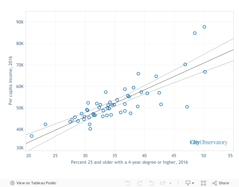
As Joe Cortright says, in his brilliant piece, Cursing the Candle, “Detroit’s problem is not inequality, it’s poverty…The city has a relatively high degree of equality at a very low level of income.”

And, as the Brookings Institution’s Alan Berube says, “It’s hard to imagine that the city will do better over time without more high-income individuals.”

High poverty rates in cities like Akron, Buffalo, Cleveland, and Detroit, are partially due to regional economic conditions and structural economic challenges related to deindustrialization.

But, overwhelmingly, concentrated poverty in these cities is due to private disinvestment in the urban core, made manifest by upper and middle-class flight to the suburbs, socioeconomic and racial segregation, and the loss of neighborhood retail and basic services. Today, the geographic disparities in household income between the central city and the surrounding suburbs remain profound.

In Akron, Buffalo, Cleveland, and Detroit, respectively, 24%, 31%, 35%, and 36% of the population lives in poverty, as compared to 14%, 14%, 15%, and 15% in these cities’ respective metropolitan areas. Keep in mind that these metropolitan area figures include the core city – meaning that poverty rates in the remainder of the metro area are even lower.

Gentrification is a hot topic of conversation in coastal cities, like New York, Washington, and San Francisco, with expensive living costs that are also home to influential journalists.

Writing about gentrification is becoming a cottage industry for many pundits and urban policy wonks. Many of the pieces that have been penned on the topic are important, thought-provoking, and well-reasoned.

But as more and more people in the Rust Belt read these accounts, and take them out of their geographic context, alarm over gentrification (particularly on the left) is steadily growing in metropolitan areas and housing markets where it should be the least of our urban policy concerns.

In the eastern Great Lakes region, with its low-cost of living, depressed housing markets, and surfeit of vacant and abandoned properties, most of the changes that are being held out as disturbing examples of gentrification, and are provoking hand-wringing in places like Buffalo, Cleveland, and Detroit, simply amount to the return of the middle class (with a sprinkling of the truly affluent) to several small pockets of the city.

The degree to which these fledgling positive examples of private reinvestment in long-neglected neighborhoods have truly taken root and have begun to influence regional housing markets is still uncertain. As for documented cases of low-income residents being uprooted and displaced by spiraling housing costs – these have proven even more elusive.

While it can be unclear whether the return of middle class and affluent residents to a neighborhood will really do anything to improve economic conditions for the poor, it is an ironclad certainty that a continued lack of socioeconomic diversity, and its concomitant concentrated poverty, will improve nothing and help no one in these cities – the poor most of all.

For 50 years now, people, jobs, and economic opportunities have steadily left our cities for the suburbs. The status-quo in our region is, indisputably, one of widespread, entrenched urban poverty, geographically separated from (predominately suburban) economic opportunity.

Yet, even the earliest signs of neighborhood revitalization, and nascent attempts at building new housing and opening small businesses in these cities are frequently opposed by people who are convinced that they are acting in the name of social justice.

Sincere as these anti-gentrification sentiments might be, I believe that they are harmful, and, if allowed to derail incipient efforts to reinvest in urban neighborhoods, simply serve to ensure that the existing dynamic of socioeconomic segregation will remain unchanged.

In many cases, the very people who claim to be fighting the current unjust system are inadvertently perpetuating it. Gentrification alarmists have yet to come to grips with the fact that their position usually serves to reinforce the existing, highly inequitable, situation.

Many critics of Rust Belt gentrification are holding cities to an unreasonable standard, and placing them in an impossible situation.

If much of the city remains poor and run-down, this is proof that the city does not care, and is not trying hard enough.

If, on the other hand, parts of the city begin to attract new residents and investment, this is proof that the city does not care, and is not trying hard enough.

Heads I win. Tails you lose.

Sometimes, it seems that the only thing that people dislike more than the status-quo, is doing anything substantive to change it.

In Akron, 81% of the people who work in the city, and earn over $40,000 per year (hardly a king’s ransom), live outside of the city. It is unclear how Akronites living in poverty will be better off if these people remain in the suburbs.

Let’s get concrete. If you are a well-educated, middle, or upper income person (and if you’re reading this, you probably are), and you live in an economically diverse urban neighborhood, is your presence a bad thing for your community?

Should you move, instead, to a suburban community that is likely to be highly-segregated and economically homogeneous?

If you are an entrepreneur starting-up in the urban core, should you decide to open your business somewhere else? And how, precisely, will doing that help the community that you are leaving behind?

When middle class people return to urban neighborhoods, they have some disposable income, which helps create markets for retail and small business, that, in turn, provide basic services and job opportunities for the urban poor.

This means that urban residents who are struggling to get by may no longer need to over-extend themselves to purchase a car, or endure long and inconvenient bus rides to access entry-level jobs and basic services in far-flung suburbs, but instead may be able to save time and money by walking to businesses in their own neighborhoods.

With the return of middle and upper income residents, business districts and housing markets, long dormant, may begin to approach at least minimum levels of functionality and attractiveness to prospective entrepreneurs, investors, and residents.

For existing urban homeowners, the gradual rise in property values, in areas with extremely depressed and artificially low home prices, often means the difference between a house ultimately being rehabilitated, or it beginning a tortuous cycle of neglect and decline, culminating in demolition.

This is especially important in the legacy cities of the eastern Great Lakes, where low property values and a glut of vacant and abandoned properties, rather than financially crippling housing costs, are the largest real estate challenge. And, unlike superstar cities on the coasts, cities in this region still have large percentages of households that are comprised of working-class homeowners living in single-family homes.

Take it from someone like me, who lives in a city with 96,000 housing units, where only 16 single-family homes were built last year, while nearly 500 were torn down, and where the median value of an owner-occupied house is $78,000.

To be sure, the return of new housing, small businesses, and more affluent residents is not a panacea, and there may be legitimate concerns, at some point, about how people moving back to the city might result in rising rents and higher property taxes for existing residents.

But in the end, I have yet to see a proven model for improving economic conditions in an urban neighborhood that is predicated on ensuring that concentrated poverty remains. Maintaining the status-quo in urban neighborhoods, in the name of opposing gentrification, will do nothing to help the poorest and most vulnerable residents.

Cities typically begin to rebound with small successes in individual neighborhoods, attracting new housing and jobs, and eventually building upward and outward from there – setting the stage for further incremental investment by the private sector.

If we urbanists truly believe that socioeconomically and ethnically diverse neighborhoods are as important as is often claimed, we cannot panic every time a new house is built, a new person moves in, or a new business opens. These are overwhelmingly good things for neighborhoods and cities that have seen precious little investment for decades.

Should we remain vigilant, and work together, in a cross-sector manner, to help ensure that the rising tide is actually lifting all the boats?

Absolutely.

Should we double-down on the status-quo in our region – one of entrenched poverty and racial segregation, because we are afraid of what any type of socioeconomic change could mean for a neighborhood?

Absolutely not.

Squelching private investment in the urban core is the wrong solution to the wrong problem. It will only serve to ensure that lower income, middle income, and upper income people continue to live apart in separate and unequal enclaves, and it will make social and economic conditions in our urban neighborhoods worse, rather than better.

If we are really serious about breaking down barriers in our neighborhoods, and celebrating socioeconomic diversity, then we have to come to grips with what that means and what that looks like.

Yes, it is complicated, and messy, but it is simply not good enough anymore to say that the status-quo is unacceptable.

We need more than words. We need to act. We need to fight the correct enemy. We need to do more than curse the darkness. We need to light a candle.

We don’t need more top-down economic silver bullets. We need collaborative, incremental change – person-by-person, neighborhood-by-neighborhood, informed by humility, prudence, sensitivity, wisdom, and love for our neighbors.

Working together, we can become a much better-connected, more cohesive, coherent, and equitable place. The only people who can stop us from becoming that place are we ourselves.

It’s not enough anymore to be against something. It’s time to be for something.

Jason Segedy is the Director of Planning and Urban Development for the City of Akron, Ohio. Segedy has worked in the urban planning field for the past 22 years, and is an avid writer on urban planning and development issues, blogging at Notes from the Underground. A lifelong resident of Akron’s west side, Jason is committed to the city, its people, and its neighborhoods. His passion is creating great places and spaces where Akronites can live, work, and play. 

Are the young leaving cities?

The so-called “peak millennial” conjecture.  Is it right? What does it mean? Should I care?

Time has published an article, based largely on the research of UCLA demographer Dowell Myers, proclaiming that US cities are hitting “peak millennial.” We’ve been critical of the peak millennial claims in the past. The gist of Myers argument is that we’ve seen the high water mark for the effect of millennials on urban growth, and that like previous generations, they’re going to decamp to the suburbs, and this whole “back to the city” movement will be over.

The key factoids in the Time article are the observations that the number of millennials in three cities–Boston, Chicago and Los Angeles–have declined between 2015 and 2016 according to the latest American Community Survey tabulations.

Time’s headline shouts the claim that the young are leaving cities

These Cities Have Already Reached ‘Peak Millennial’ as Young People Begin to Leave

We’re told that:

Millennials flocked to U.S. cities over the past decade, but in some places, the migration appears to be reversing . . . Myers says it’s only a matter of time before millennials head to the suburbs for more space.

What this seems to suggest is that young people have somehow become disenchanted with cities.

As we’ve pointed out, there’s a problem with equating “millennials” and “young people.”  In the past decade or so, all of the 20-somethings in the United States were millennials, and most of the millennials were 20-somethings, so it wasn’t far off the mark to use to two terms interchangeably.  But, inexorably, time and the aging process are moving millennials out of the “young people” category. And that’s really what these numbers show:  the oldest millennials (per Myers definition) are now 36; in 2007 the oldest were just 27.  There’s never been any question that there is a life-cycle effect: 36 year olds tend to be much more likely than 27 year olds to live in suburbs rather than cities.

Shifting definitions:  What’s a millennial? Who’s young?

The Time Magazine article quotes data gathered by Myers using  a definition of millennial as those born between 1980 and 1996, a definition he attributes to Gallup. But that’s a different definition than Myers used in the paper he published last year on peak millennials, where he said millennials were those born over a full two-decade period.

“A practical definition of birth years between 1980 and 1999 is adopted here . . .”

It’s probably inconsequential to the analysis, but is an indicator of how arbitrary the generational label “millennial” is that even a single author uses different dates to define the beginning and end of the generation in successive analyses.

In our view, looking at a single generation (or birth cohort) however defined at different points in time inherently confuses life cycle changes with generational shifts.  Our preferred  approach is to look at people in a specific age group, recognizing that successive birth cohorts are aging in and aging out of particular age groups all the time.  This approach tells us whether young adults today are behaving differently than young adults of earlier generations.  Comparing a single birth cohort’s location at two different years is really just recapitulating what we already know about life cycle tendencies rather than telling us anything about generational shifts.

To avoid muddling the picture with life-cycle effects, it makes more sense to look at the detailed data on US population by age group, and how the number of persons in each age group will change over time. The Census Bureau predicts these numbers based on birth and death rates and estimates of net international migration. abstracting from the relatively minor effects of international migration and mortality on this age group, all of the people who are and will be young adults are here (in the US) and we can be quite confident of how many there will be in each age group in the years ahead.  Focusing on prime age young adults — those 25 to 34 years old (a definition we’ve used consistently in our research for the past decade or more), we can expect a continued increase in their numbers well in to the next decade. These estimates show the number of 25 to 34 year olds plateauing, but not declining in the mid-2020s.

Picked Cherries?  Millennials are still increasing in many cities.

The Time article makes much of the fact that there are slightly fewer millennials in 2016 in Boston, Chicago and Los Angeles than there were in 2015. But that’s a small sample.  Is it typical?  Myers notes that over the past year, Boston recorded a slight decline in its millennial population (after a solid decade of increases). There’s a pretty obvious reason why this would be the case: Boston’s demographic profile is significantly skewed by college students.  It’s no surprise that Boston had more “millennials” when they were in the 18 to 34 age range in 2014, than they do in 2016 when they are in the 20-36 age range:  when you excluded 18 and 19 year olds from your sample in a city with a high fraction of college students, you’re going to get a lower total..

We selected three other cities (San Francisco, Seattle and Portland) to see if the same trends held for these places, which have been leading attractors of millennials.  We didn’t have immediate access to the IPUMS version of the ACS data for 2016, so instead we obtained data for 20 to 36 year olds from the Census Bureau’s American Fact Finder application from the same survey. Census tabulates data by five year age group; so we interpolated values for 35 and 36 year olds.  This analysis shows that the millennial population (defined as those born between 1980 and 1996) was still increasing in those three cities, after a decade in which the count of persons in this demographic had doubled in those same cities:

What’s the policy implication?

The subtext of the “millennials moving out” finding is that somehow the urban revival is drawing to a close. Those millennials, once enamored of cities, will wise up, and like previous generations move to the suburbs, ending the urban revival. But as we’ve pointed out, at every age, people in this generation are more likely to live in cities than were people earlier generations. For example, in 1980, 25 to 34 year olds were about 10 percent more likely that all adults to live in close-in urban neighborhoods; in 2010 they were about 50 percent more likely. Our finding has been confirmed by a number of academic studies (Diamond, Edlund, Sviatchi & Machado, Couture and Handbury).

In addition, if anything, the movement of now somewhat older young adults out of cities is indicative of our shortage of cities, and our failure to keep up with the high demand for urban living. Housing production is constrained in markets like Los Angeles and Boston, and the great demand of young adults to live in these cities is driving up rents. The slight decline in the count of aging millennials in some cities is less an indicator of generational disenchantment with urban living, than it is an indicator of the failure of our policies to build more housing in the kinds of neighborhoods Americans increasingly value. The number of 25 to 34 year olds in the US will continue to increase through the middle of the next decade and remain stable thereafter. Will we build the housing to accomodate them?


Is inequality over?

After a long, slow recovery, wages are finally rising for the lowest-paid workers, but we’re no where close to rectifying our inequality problem; in fact, it’s going to get worse.

The very smart Jed Kolko, who now writes for labor market website Indeed, offers some keen insights from the latest Bureau of Labor Statistics data. According to Kolko, “The labor market made impressive gains this past year. October 2017 was the 85th consecutive month of job growth. So far in 2017, monthly job growth has averaged 169,000—down modestly from previous years, but more than we’d expect after so many years of recovery and expansion.” The highlight of Kolko’s latest report is the impressive wage gains in the last four quarters for the lowest income workers. Whether measured by educational attainment or wage level, those at the bottom recorded higher wage increases than those at the top.

In a bout of premature triumphalism, Steve LeVine at Axios, is ready to call the whole inequality issue over and done with.

Income inequality — the stubborn curse of the current era and, many think, a key factor in the global uprising against establishment powers — appears to be on a solid decline in the U.S., according to a new report.

While the recent gain in wages for the lowest paid workers is definitely good news, it is hardly the reversal of America’s yawning income gap.  Far from it.  Not only does a single sparrow not make a spring, there’s plenty of evidence that the inequality problem is not only not going away, but that it’s likely to get worse.  There are four reasons why:

First, the wage gains for low income workers so far are small

it would take a decade or more of such performances to offset the widening in wage inequality that’s happened in just the last decade or so. The tale of the tape comes from the Economic Policy Institute, which uses Census data to track cumulative changes in real hourly wages since 2000 by income group.  Those in the 90th percentile have seen a nearly 16 percent increase in real wages, while those in the bottom 10 percent have seen just a 2 percent increase in real wages. In the past year, real wages for the least skilled (per Kolko’s analysis of BLS data) have outpaced those of higher skilled workers by about 1 percent.  So we’d have to see these gains, year-in and year-out, between now and about 2030, just to get back to the level of wage inequality we had in 2000.

EPI‘s headline finding has it exactly right: “More broadly shared wage growth from 2015 to 2016 does little to reverse decades of rising inequality.”

Second: Wages aren’t all income

Inequality is actually a much bigger issue that the variation in wages between high skill and low skill workers.  Wages are just one component of income.  Other forms of income (dividends, interest, rent, business profits) are all much more unequally distributed than wages, and it’s been these latter forms of income, per Thomas Piketty and others, that have fueled much of the growth in inequality. Aggregated across all forms of income, the gains over the last third of a century have been heavily skewed to those at the top, as we reported at City Observatory a few months back.

Third, The Fed is likely to break up the game

In a macroeconomic sense, the gains that the lowest income workers are seeing is the long-awaited result of more than eight years of economic growth. The recovery from the Great Recession (which actually began exactly 10 years ago, in December 2007, according to the NBER), has been slow. Higher skilled and higher income workers have seen the best employment and wage gains throughout the recovery. It’s only as the national unemployment rate has finally fallen below five percent that lower income workers are starting to see similar results. But its very much an open question as to whether a skittish Federal Reserve Board–the one that sees incipient inflation around every corner–is willing to continue to allow the economy to grow.  It’s already started raising interest rates, and promises to raise them further in the coming year. That will likely slow the economy, and with it, curb the gains that the least well-off workers have enjoyed in the past couple of years.

Fourth, The new tax bill is about to make inequality far worse.

You can’t talk about inequality without talking about the tax system. One major source of the growth in inequality has been the differential taxation of high income households and non-wage income. Since 1980, in the US effective tax rates have been slashed for the highest income households and for the kinds of income and wealth they hold, including property, stocks, bonds and estates. (That’s why the difference between the red line “pre-tax” line  and the blue “post tax” line in the chart above is so small).  And if the tax plan currently before Congress moves forward, that’s going to get dramatically worse.  The trillion dollar plus tax cut goes overwhelmingly to those at the top of the income spectrum. Vox has an analysis showing the average tax cut by income group in 2025:

Moreover, the tax cuts will undoubtedly trigger a big increase in the deficit, which will likely be used as an excuse for shredding of the social safety net, with cuts to Medicare, Medicaid, Social Security, and other programs that ameliorate the effects of income and wealth inequality.

In sum, it’s a very good thing that the labor market has finally recovered to the point where the lowest income workers are enjoying a small increase in their wages. But that’s hardly a justification for calling America’s decades-in-the-making income inequality chasm closed. It’s still dauntingly large and promises to get even worse.


The great freeway cover-up

Concrete covers are just a thinly-veiled gimmick for selling wider freeways

As you’ve read at City Observatory, and elsewhere (CityLab, Portland Mercury, Willamette Week), Portland is in the midst of a great freeway war. The Oregon Department of Transportation is proposing to widen a mile-long stretch of Interstate 5 opposite downtown Portland from 4 lanes to 6, at a cost currently estimated at just under half a billion dollars. There’s notable opposition to this idea, which flies in the face of the city’s stated aims of reducing greenhouse gas emissions and promoting Vision Zero.

One of the chief selling points of the project is the claim that it will “cover” the Interstate 5 freeway. Calling it a cover conjures up visions of a roadway completely obscured from public view, and topped by a bucolic public space.What that immediately calls to mind, especially for those in the Pacific Northwest is Seattle’s “Freeway Park” constructed over Interstate 5 in the city’s downtown. It provides public space in the form of nearly five acres of tree-shaded, lawns, plaza’s and stairways.

Seattle’s Freeway Park (Dazzling Places.com).

But what’s actually being proposed for Interstate 5 is less of thick, verdant freeway-obscuring park and more of a skimpy concrete g-string. When you look closely at the project’s own illustrations, its apparent that the covers are actually just slightly oversized overpasses, with nearly all of their surface area devoted to roadway.

Each of the covers is bisected by one more of the four principal arterials that cross over the Interstate 5 freeway in the project area.  One cover carries N. Vancouver Avenue over the freeway; the other carries N. Williams, NE Broadway and NE Weidler.  Each of these streets is a heavily traveled automobile thoroughfare in its own right, so these covers are mostly devoted to carrying cars, not providing public space.

The clearest way to appreciate the absurdity of describing these covers as public space is to map them and subtract out the portion of the covers that is devoted to roadway. Portland’s Jim Howell, a long time transit advocate has done just that.  What you really have is seven irregular trapezoids, hemmed in on nearly every side by roads or the freeway itself.  Here’s Howell’s diagram:

These are the pieces of the “Lids” available for development (Jim Howell)


For reference, Portland’s celebrated small city blocks are about 200 feet on a side; so none of the areas offered up here is much more than about a quarter of block of useful space. These remnants are hardly the site of any viable public space, and certainly not places where anyone, surrounded by car traffic, is likely to linger. In fact, they greatly resemble existing orphan land near the current I-5 freeway interchange, owned by the  Oregon Department of Transportation, and not improved in any way, or even maintained:

Weed-choked. litter-strewn triangles: a model for freeway “covers” ODOT property at I-5, NE Broadway & Williams (Jim Howell photo)

These tiny fragments don’t work as a public space, and can’t ever be made to be an actual public space, because they that was never the intention: The “covers” exist only to provide a deceptive talking point to help sell a freeway widening project. Plus, enveloped in freeway noise and pollution, and surrounded by fast moving car dominated arterials and freeway ramps, this will be a supremely hostile environment for pedestrians and cyclists. Anyone familiar with the Oregon Department of Transportation knows what a low priority it attaches to pedestrian improvements urban streets it controls. A few blocks East of this project, on Martin Luther King Boulevard, ODOT refused to add pedestrian improvements to a traffic island being landscaped to include a memorial to the civil rights leader.

These covers can’t support the Albina Vision

Project advocates have also seemed to conflate the freeway widening project with a speculative redevelopment scheme called the Albina Vision, which so far consists almost entirely of the following rendering, which shows entire area between the freeway and the Willamette River, including the parking lots surrounding the region’s two principal arenas–the Moda Center and the under-used Memorial Coliseum–being redeveloped into high rise apartments and offices, along with vast new public spaces. (Where the money would come from to pay for such a project hasn’t been identified).

The project’s rendering has neatly made both the Interstate 5 freeway and its extensive on- and off-ramps disappear under a welter of new high rises, details very much at odds with the project proposed by the Oregon Department of Transportation.

The Long History of Using Misleading Images to Sell Urban Highways

It’s tempting to imagine that a “cover” could magically erase the scar created by running a multi-lane freeway through an urban neighborhood. Using this kind of illusion  and creatively mis-representing the visual impact of a new construction has a long history in the world of selling highways. Robert Moses famously skewed the illustrations of his proposed Brooklyn Battery Bridge (which would have obliterated much of lower Manhattan and Battery Park); we turn the microphone over to Moses’ biographer Robert Caro, from The Power Broker

Moses announcement had been accompanied by an “artist’s rendering” of the bridge that created the impression that the mammoth span would have about as much impact on the lower Manhattan Landscape as an extra lamppost. This impression had been created by “rendering” the bridge from directly overhead—way overhead—as it might be seen by a high flying and myopic pigeon. From this bird’s eye view, the bridge and its approaches, their height minimized and only their flat roadways really visible, blended inconspicuously into the landscape. But in asking for Board of Estimate approval, Moses had to submit to the board the actual plans for the bridge. . . .

The proposed bridge anchorage in Battery Park, barely visible on Moses’ rendering, would be a solid mass of stone and concrete equal in size to a ten-story office building. The approach ramp linking the bridge to the West Side Highway, a ramp depicted on the rendering as a narrow path through Battery Park, would actually be a road wider than Fifth Avenue, a road supported on immense concrete piers, and it would cross the entire park—the entire lower tip of Manhattan Island—and curve around the west side of the island almost to Rector Street at heights ranging up to a hundred feet in the air. Not only would anchorage and piers obliterate a considerable portion of Battery Park, they—and the approach road—would block off much of the light not only from what was left of the park but also from the lower floors of every large office building they passed; because the approach ramp was really an elevated highway that would dominate the entire tip of Manhattan, it would depress real estate values throughout the entire area.

If Portland wants to have more green space, less impact from the Interstate 5 freeway, and something resembling the higher level of density depicted in the Albina Vision, it shouldn’t squander half a billion dollars widening the freeway and creating badly fragmented, noisy and unusable trapezoids of concrete on a pair of oversized over-passes. Instead, it ought to ask how half a billion dollars could be invested to make this neighborhood, the city and the region a better place in which to live.


The death of Flint Street

A proposed freeway widening project will tear out one of Portland’s most used bike routes

At City Observatory, were putting a local Portland-area proposed freeway widening project under a microscope, in part because we think it reveals some deep-seated biases in the way transportation planning takes place, not just in Portland, but in many cities. Today we turn our attention to plans to tear out a key  local street which serves as a major bikeway in North Portland as part of the Interstate 5 Rose Quarter Freeway widening project.

A quick refresher:  I-5 is the main North-South route through Portland, and the Oregon Department of Transportation is proposing spending at least $450 million to widen the roadway from 4 lanes to 6 in a one-mile stretch in North Portland, opposite downtown. A growing coalition of community groups has organized to fight the project as wasteful, ineffective and at odds with the region’s climate change and Vision Zero goals.

One of the supposed rationales for the project is that it will “knit together” the fabric of community that was rent asunder by the original construction of the Interstate 5 freeway in the 1960s. (The freeway runs adjacent to areas that then had the largest concentration of African Americans in Portland). The freeway includes several over-sized multi-street overpasses that the project grandly describes as “covers” over the freeway.

While the project touts the so-called covers, it downplays the fact that one element of the project is eliminating the current over-crossing that carries N. Flint Street over I-5. Flint street is a two-lane, two-way neighborhood street that runs parallel to the busier N. Williams/N. Vancouver couplet that funnels traffic on and off I-5.  The plan for widening the freeway calls for tearing down the Flint street overpass–and not replacing it.

Disconnecting the street grid

City officials have repeatedly claimed that a key purpose of the project is to knit together a community split apart by freeway construction, in part by improving bike and pedestrian links.  Portland Bureau of Transportation Manager Art Pearce  told the Oregonian:

“We see the Rose Quarter project as really reconnecting the central city,” said Art Pearce, the Transportation Bureau’s manager for projects and planning. “It has the potential to reconnect the area, make it more of a destination … and having more of the bike and pedestrian streets people have come to expect in other parts of Portland.”

But this project does nothing of the kind, and if anything, severs an important local street. This point was made strongly by long-time local transportation advocate Jim Howell of AORTA (the Association of Oregon Rail and Transit Advocates), in his testimony to the City Council on November 30, 2017.  Howell noted that “Flint Street is not going to be replaced, it will be lost to the neighborhood.  This  is one of the major North-South routes through the neighborhood, it’s been there since it was platted as the City of Albina.” (Howell’s illustration, produced below, shows the overpasses to be replaced by covers or lids (white rectangles) and on the right, the current Flint Street overpass (marked with red x’s) which will be eliminated.

X-ing out North Flint Street (Courtesy, Jim Howell, AORTA)

And this corridor is one of Portland’s busiest, and fastest growing bike routes.  In total, about 10,000 bikes per day travel north and south through this project area–a  five-fold increase from 2001 levels, according to city bike counts. North Flint street, with its two-way traffic, lower volumes and slower speeds, is an attractive route for many of these cyclists. While the city doesn’t have street level counts, it appears that a majority of South bound cyclists use N. Flint Street to cross the freeway and reach the Broadway Bridge across the Willamette River: City of Portland bike counts show that 56 percent of south-bound morning peak hour trips on N. Williams Avenue turn on N. Russell (a takes them to N. Flint Street).  In addition, N. Flint Street is home to the Harriet Tubman middle school, which though currently vacant, is scheduled to be re-opened to serve students from North and Northeast Portland. The project is proposing a steeply graded new extension of N. Hancock Street that would run East to West as a partial substitute for Flint Street.

If this project goes forward, Flint Street will dead-end at the new, wider freeway.  Rather that “connecting” the community better, the project actually disconnects it. It’s coming to be recognized that a grid of local streets better manages traffic flow and enables pedestrian safety. And this project is a step backwards, concentrating more vehicle movements as well as more bicycles on main arterial streets, and eliminating a slower-speed, local serving street.

Why amputate Flint Street?

Given Portland’s reputation (mostly well-deserved) for progressive policy on transportation, you might think that the city would have a clear rationale for killing Flint Street. But according to the discussion at last week’s Portland City Council meeting, the Director of the city’s transportation bureau didn’t know what it was. After Howell and other presenters questioned the claim that the project would “re-connect the neighborhood,” City Commissioner Amanda Fritz asked Portland Bureau of Transportation Director Leah Treat why the city had eliminated Flint Street. Treat didn’t know.  Here’s their colloquy, (which was repeated for the record due to a glitch in the city’s closed caption hearing system–we report both versions here):

November 30 Meeting at 1:44:11

Commissioner Amanda Fritz “I was wondering about the taking out the Flint; What’s the rationale was behind that?”

Portland Bureau of Transportation Director Leah Treat: “I can’t answer that; I’ll have to get back to you on that.”

November 30 Meeting at 1:45:25

Fritz:  “My question was, do you know what the rationale was for taking out Flint?”

Treat:  “I don’t; I’ll will get back to you and follow up on that.”

Portland transportation bureau director Leah Treat (Portland City Council video)


To put this in context:  the Rose Quarter freeway widening project is the largest transportation investment in the central city contemplated in the City’s current land use plan. It’s being sold as somehow reconnecting the community and benefiting cyclists and pedestrians. And yet, when asked the simple question as to why a city street is being removed and displacing a major bike thoroughfare, the city’s Director of transportation has no idea of what the rationale for this step is.

This is a bureau that regularly agonizes over the loss of a handful of parking spaces and which has detailed and copious justifications for road diets when they are implemented. But in the case of a $450 million freeway widening project, they don’t immediately know, when asked, why their amputating a key local street as part of an initiative which is supposedly all about re-connecting the neighborhood. Given the objective and the stakes, Portlander’s deserve a clear and compelling answer to that question.

A constant state of change: turnover in business establishments

Churn means that lots of businesses, even large ones, aren’t around forever

Many of our discussions of the economy are based on simple, and often largely static mental models of the economy. In a good year, a local economy might add 2 or 3 percent to its job total, and the total number of businesses might change by even a smaller amount. But those aggregate numbers conceal a huge and continuous amount of change, both as workers move from business to business, and as businesses themselves wax and wane.

Economist Joseph Schumpeter famously coined the term “creative destruction” to describe the process by which economic improvement is the combined result of the continual formation of new firms and the death of older ones. That process is not generally revealed by our conventional economic statistics.

Any time an individual business fails, it seems like a harbinger of economic decline. Journalists are particularly prone to inflate the demise of a particular enterprise into a signal of widespread dislocation. Last week, The New Yorker wrote of “The inflated promise of the food hall,” noting that several gourmet food firms who had succeeded in one venue, found boutique food halls in other locations too costly or unprofitable.

Of more than a dozen current and former tenants I’ve spoken to, however, many have discovered that food halls are not the artisanal promised lands they seem to be.

No doubt a dozen interviews is a lot of ground for a journalist, but it may not be indicative of an entire industry. The restaurant business is a famously trendy and volatile sector of the economy, with new establishments opening and older ones closely on a weekly basis. The overall trend in this industry for the past decade has been one of steady growth, but that’s something that one can confirm only by looking at the data, and by consciously looking past the demise of many once fashionable establishments. We’ve added 50,000 restaurants nationally in the past five years, according to the Bureau of Labor Statistics:

A recent reminder of how volatile the economy actually is, and how much churn there is at the level of even fairly large establishments comes from a paper that uses data from the Equal Employment Opportunity Commission (EEOC) to examine patterns of racial segregation in the workplace. (The paper–”Population processes and establishment-level racial employment segregation” is worth a read in its own right, but for today we’ll focus on one sidelight raised in this report.  There’s a statutory requirement that business establishments with 50 or more employees provide an annual report to the EEOC on the race and ethnicity of their employees, so that the Commission can gauge compliance with fair employment laws. The EEOC data provide a useful longitudinal database of “large” establishments in the US. (In the vernacular of employment statistics an “establishment” is a single physical location of a particular business, like a particular store or factory; each McDonalds or Starbucks location would, for example, be a separate establishment).

You might think that these larger businesses are more likely to survive, year-to-year than all businesses, particularly smaller ones. In general large businesses are less likely to fail in any particular year. But what these data highlight is that the exit of large establishments from the EEOC rolls is surprisingly common. (What this means is that these business locations have gone from above the reporting threshold to below the threshold; some may have failed or closed, but most have probably down-sized.)

In most years, 20,000 to 30,000 establishments are aded to the EEOC rolls, with more added in times of robust economic growth (2000), than at other times. But there’s also a fairly rapid and consistent decay in these numbers in the following years.  On average, half or more of the establishments added to the EEOC reporting rolls in one year no longer appear five years later.  For example, in 1980, more than 25,000 new establishments were aded; by 1985, fewer than 10,000 of these were still reporting to EEOC.  There’s further attrition as time passes. The are clear cyclical effects (1985 is down from 1980; 2005 is down from 2000, following recessions), but the same decay pattern holds for each successive wave of business establishments that achieves the level of employment that requires reporting.

These data are a reminder that individual business establishments–even ones with more than 50 employees–often have a relatively short life-span. We shouldn’t be surprised when we see business establishments, even relatively large ones, down-size or go out of business completely. It’s strong evidence for the continuing importance of the kind of churn and creative destruction that Schumpeter said underlies economic dynamics.

The Week Observed, December 15, 2017

What City Observatory did this week

1. Is inequality over? There was some good news from the labor market this month. According to an analysis by Jed Kolko, low wage workers saw their earnings increase slightly faster than all other workers over the past year. That’s a welcome change from the trend of growing wage inequality.  It’s not, as some commentators argue, the end of the inequality issue. The growing wage divide in the US is the product of decades long decline for lower wage workers, and won’t be erased by a single year’s improvement (which has come only after eight years of steady economic growth). We show how large the gap has become, and note that the growing skittishness of the Federal Reserve about tight labor markets, coupled with the huge increase in inequality built into the Republican tax plan will likely cause inequality to get worse in the years ahead.

2. The Great Freeway coverup. Covering or capping a freeway sounds like a great way to minimize its impact and create new urban space. But in Portland, freeway covers (really, slightly wider overpasses) are being used as cynical PR to help sell a widened freeway. Just as Robert Moses used deceptive graphics to help minimize the negative impacts of his massive projects, highway officials are creating the false impression that covers will create viable public spaces. Instead, what’s proposed are small and badly fragmented plots of land, bounded by busy arterials and overwhelmed by the noise and pollution from the freeway.

ODOT property adjacent to I-5, NE Broadway & Williams (Jim Howell photograph)

3. The Talent Dividend, Updated. For years, we’ve been advocates of the talent dividend: the idea that city economic success stems from better educating local residents. It’s long been the case that the educational attainment of the population has been the single most important determinant of metropolitan income. We update that statistical analysis with the latest data from the newly released 2016 American Community Survey.  Each 1 percentage point increase in the four-year college attainment rate of a metropolitan area is associated with a $1,250 increased in metro area per capita income. There’s no more important or effective means of improving a city’s economy than bolstering the educational level of its population.

Must read

1. Is the nuclear family the cause of our problems? Software engineer turned full-time mom Nicole Sallak Anderson relates her terror at discovering the utter daytime aloneness of life in the typical American suburb in a Medium essay entitled: Pretty Birds in Pretty Cages: Could the Nuclear Family Be the Reason We’re All Miserable? Walking around her subdivision, she encounters no other humans, and can even scream at top of her lungs without drawing attention. Everyone’s commuted to work, gone to school or shopping, or is ensconced in their separate large-lot homes. Her key point is that we’ve turned child-raising from a collective community or multi-generational family endeavor to a kind of maternal sole-proprietorship. She puts the blame on the nuclear family, but we can’t help noticing that its the economically segregated, single-use, single-family subdivision that’s really closely correlated with most of her complaints. If there were different sizes, types and prices of housing in the neighborhood, more density, stores, cafes and shops to walk to, and a more age- and income-diverse population living nearby, her experience would be different.

2. How Elon Musk really feels about transit. What with his electric cars, hyperloop dreams, and now claims of advanced tunneling technology, Elon Musk is the darling of the techno-fanboy community. In an interview in Wired, he tells us how he feels about mass transit. If you’re looking for a careful, comprehensive theoretical critique of the current modes of travel, you will likely be disappointed. Mass transit, Musk says, “sucks.” “It’s a pain in the ass,” he continued. “That’s why everyone doesn’t like it. And there’s like a bunch of random strangers, one of who might be a serial killer, OK, great. And so that’s why people like individualized transport, that goes where you want, when you want.” For a company that can’t even figure out how to store the relative handful of cars driven by its own employees, its difficult to imagine how they’ll solve urban transportation problems at scale for anyone other than the very wealthy:

3. The artisanal landlord. You may think we are recommending this article just for its clever title, which all though it would be enough, is not the reason. Besides wordsmithing, what you’ll find here is a thoughtful and engaging analysis of the contribution of small scale landlords to the rental housing supply in Vancouver, British Columbia. Nathan Lauster, who teaches sociology and researches housing at the University of British Columbia, notes that while Vancouver has much less purpose-built rental housing than Seattle, it has nearly the same fraction of renters. The reason: much of Vancouver’s multi-family housing gets built as condominiums, and is privately/individually owned, but then is rented out. Lauster estimates that a third of condos are rented out, and that Vancouver’s rental housing stock is also increased by “secondary suites”–i.e. basement apartments, subdivided single-family homes, and granny flats (in Canadian: “laneway cottages”). As much as half of Vancouver’s rental housing is owned and managed by these very small scale artisanal landlords. We frequently talk about “missing middle” housing like duplexes and smaller apartments buildings; historically, these have been the kinds of properties owned by small-scale, mom and pop landlords. Whether this kind of rental housing gets built, and continues to be offered for rent, probably depends on how conducive the legal and regulatory environment is to the amateur, artisanal landlords.

New knowledge

Craiglist and the US housing market.  Geoff Boeing of the University of California, Berkeley has assembled data from Craigslist to measure rental housing markets across the US. Craigslist has become the de facto listing service for rental housing. Boeing and his colleagues have scraped rental listings data from their website to develop price indices for major US markets.  Their work is summarized in this heatmap showing relative rent levels:

This creative use of big data offers some real advantages over other sources of information. It picks up many smaller scale “mom and pop” rentals that are unlikely to be captured by commercial real estate databases that include only larger and professionally managed properties. In addition, Craigslist data can be measured in real time, potentially providing a much more timely indicator of rental trends. Those advantages aside, there’s still one issue with any market listing: some units may be rented without ever being listed on Craigslist (especially if there rents are low), and there’s an embedded survivorship bias to rental listings: underpriced units get snapped up quickly, while overpriced ones linger on the database, with the result that an estimate of rent levels computed from any snapshot of listings is likely to skew somewhat higher than prices actually paid. Still, that’s a minor quibble, and the Boeing data are a great addition to our understanding of local rental markets, and a model of how to harness Internet based data to generate a new perspective.


In the news

In their piece the “Best, Worst, Most of 2017” Transit Center named our piece “Pollyanna’s Ride-Sharing Breakthrough” as having the best lede and title of the year.

The Salt Lake Tribune cites some of the key findings from our Young and Restless report in an article on efforts to attract and retain talented young workers in Salt Lake City.

The Week Observed, December 22, 2017

What City Observatory did this week

1. Should cities be worried about “Peak Millennial?”  Time magazine highlighted data from three cities where the count of millennials has declined in the past year, according to the American Community Survey. To some, it seems to be a harbinger that the young are growing disenchanted with city living. We challenge that interpretation. The focus on millennials (those born from 1980 to 1996, at least in this tabulation) misses the point that the number of young adults in the US (ages 25-34 will increase through the middle of the next decade and remain stable thereafter. The focus on millennials confuses lifecycle effects with true generational change. Our work and other studies confirm that young adults, especially those with college degrees, are much more likely that previous generations to choose city living.

2. Diverging diamond blues. Portland’s proposed half-billion dollar freeway widening project is pitched as a way of improving the pedestrian experience in the city’s Rose Quarter area. But one of the central design elements of the re-worked street system is a miniature “diverging diamond” interchange, which flip-flops the direction of traffic on a two way street (so cars are traveling on the left rather than the right side of the road). The purpose of the diverging diamond is to give cars a faster, straighter route to leaving the freeway. The combined result of these changes is the opposite of traffic calming: street crossings are made wider, with faster turn movements, plus pedestrians will be put in an environment where cars are coming from the opposite direction they expect. It’s hardly a recipe for pedestrian comfort or safety.

3. How the “G-word” is poisoning discussions of how to improve our cities. We offer a guest post from Akron planner Jason Segedy examining the way the term gentrification is invoked in the context of rustbelt cities. Especially in these struggling cities, he argues, “gentrification critics are holding cities to an unreasonable standard, and placing them in an impossible situation. If much of the city remains poor and run-down, this is proof that the city does not care, and is not trying hard enough. If, on the other hand, parts of the city begin to attract new residents and investment, this is proof that the city does not care, and is not trying hard enough.  Heads I win. Tails you lose.” It’s time to figure out a way to talk about change that doesn’t make the perfect the enemy of the good, or at least the somewhat better.

Must read

1. The B-School case against Uber. Uber and its chief rival Lyft continue to grow, with more rides, riders, drivers and total sales.  But the latest financial reports from Uber show that its still losing money, more than 1.5 billion in the latest quarter. Writing in Forbes, Len Sherman makes the case that there are irremediable flaws in the ride-hailing business model: it’s not becoming more productive as is grows, and its improvements in margin are coming primarily from squeezing driver compensation. The hoped for first mover advantages and network effects that the company and its investors were counting on to produce long-term monopoly-like profits, don’t appear to be materializing. At best, its locked in a fiercely competitive duopoly with Lyft that ensures profit-sapping competition for drivers on the one hand, and customers on the other. Uber can sustain continuing losses as long as its store of investor capital holds out, but as that dwindles, the future of this firm, and the future of the ride-hailing industry are unclear.

2. Five immutable laws of affordable housing. As we near the end of the year many of our colleagues are reflecting on the best work they published in 2017. Inexplicably, we missed this gem published at Strong Towns. Milwaukee’s Spencer Gardner describes what can fairly be regarded as the five immutable laws of affordable housing.  We’ve reprinted them here in brief, but read the entire article to get a solid explanation. You’ll also find some useful thoughts on what it will take to make housing more affordable.

  1. Developers don’t pay the costs of construction; tenants and buyers do.
  2. Housing demand is regional.
  3. If your zoning and building code mandates expensive housing, housing will be expensive.
  4. Affordable housing isn’t affordable if your transportation costs are too high.
  5. Today’s affordable housing was the last generation’s luxury housing.

3. Demolitions aren’t shrinking the supply of affordable housing. One of the most frequently repeated arguments by opponents of new housing is that demolitions somehow reduce the supply of affordable housing and in their place build unaffordable units. A new study from Eve Bachrach, Paavo Monkkonen, and Michael Lens of the UCLA Luskin School tests that theory by looking at a random sample of developments in Los Angeles over the past three years. They find that, contrary to popular belief, post-demolition, these sites had both more total housing units and more affordable housing. Most of the demolitions are of single family homes, which are replaced with multi-family units, augmenting the housing supply.  They conclude that demolitions are so small in scale as not to be having a significant negative effect on the supply of so-called “naturally occurring affordable housing.”

New knowledge

When did your city reach its peak ranking compared to other US cities?.  Peak Charleston came in 1790, peak Buffalo was 1850, peak Minneapolis was 1890, peak Cleveland was 1920. Using historical census data and contemporary and consistent metropolitan area definitions, blogger peakbagger has shown how different cities have moved in and out, and up and down on the list of the nation’s 20 largest metropolitan areas over the past 220 years.  You see clearly the westward shift in population and the waxing and waning of industries and technologies.  Many cities that were historically important (Providence, Salem, Richmond and Albany) haven’t cracked the top 20 since the Civil War.  The sunbelt cities-Dallas, Houston, Atlanta, Phoenix– only show up starting in the 1940s and later. In addition to a spaghetti chart showing the shifting ranks, you’ll also find decade by decade rankings and population estimates for the top 20 US metro areas.


In the news

Dan Horrigan, Mayor of Akron, cited our essay “Cursing the Candle” in his Beacon-Journal Op-Ed on his vision for the city’s future growth and revival.

The Salt Lake Tribune cites some of the key findings from our Young and Restless report in an article on efforts to attract and retain talented young workers in Salt Lake City.

The Week Observed, December 8, 2017

What City Observatory did this week

1. The death of Flint Street. In Portland, a $450 million dollar freeway widening project is being sold as a way to “re-connect” a community that was divided by freeway construction half a century ago. But there’s a problem with that claim. Part of the project is eliminating one key local street that’s been there since the area was platted in the 1800s, and which today serves as a heavily used segment of the city’s bike network. When asked last week as to why N. Flint Street was being amputated as part of the freeway widening project–the biggest transportation investment contemplated in Portland’s city center–the city’s transportation director simply didn’t know what the rationale was.

2. Constant change: Turnover in business establishments. It’s natural to think of businesses, particularly larger ones, as long-lived. But as economist Joseph Schumpeter famously observed decades ago, the process of economic growth is one of creative destruction. A recent study sheds some light on the frequency of turnover among largish business establishments. In the US, places that employ 50 or more employees are required to report annually on the racial, gender and ethnic composition of their workforces, and the movement of establishments in and out of that 50 employee threshold is an indicator of how much churn there is in the economy. Over most of the past three decades, about half of the new business establishments that filed in one year were no longer on the register 5 years later–a strong indication of the volatility of the business world.

Must read

1. Public schools shouldn’t undermine walkability.  Streetsblog writes another chapter in the long running story of how school siting and development decisions conflict with smart urbanism. Angie Schmidt describes how Decatur, Georgia is building a new elementary school in the as part of to redevelop an underutilized warehousing area as a more vibrant neighborhood (a good thing).  Unfortunately,the plan devotes devote most of the site to parking space for buses and the staff’s cars (not so good).  The result:  they’re tying up a big chunk of valuable land just a five minute walk from the city’s new Avondale MARTA rail station. The site actually devotes more land to parking that similar schools in more suburban locations.

2. High Streets for All.  It’s a decidedly English term, high street, but it captures the notion of a pedestrian scaled main street with shops, restaurants and public spaces that are at the heart of urban living. A new report from the London School of Economics catalogs the ways that a vibrant, thriving high street creates the kind of environment that promotes the well-being, social interaction, and economic opportunities of city residents.  While the focus is on London neighborhoods–most of which you’ve not heard of–the principles and insights have equal force on both sides of the Atlantic.

3. Declining population in some of Seattle’s most desirable neighborhoods. We’ve all heard stories of how Seattle is in the midst of its biggest population boom since the Gold Rush years (they’re true), but ironically, population is stagnant or actually declining in many of the city’s most desirable neighborhoods. Sightline Institute’s Dan Bertolet marshalls the data. The combination of strict single family zoning in most of the city’s privately owned land, coupled with declining household sizes, especially in higher income neighborhoods, means that actually fewer people live in places like Denny-Blaine, Madrona, and Leschi. Because these neighborhoods hold fewer people, those who might like to live their have to reside further away, adding to sprawl, reducing walkability, and cutting people off from opportunity. The solution? Look for ways to add “gentle density” like accessory dwelling units throughout single family areas, and find at more places that can be upzoned for multi-family dwellings.

New knowledge

A new measure of school performance. One of the most robust correlations in public life is the link between local incomes and kids test scores. Kids who live in wealthier cities or neighborhoods generally have higher test scores than those who live in lower income areas. But a new study, tapping data from the standardized tests used to implement the No Child Left Behind law, sheds new light on how effective schools are in boosting the measured achievement of their students over time. It turns out that many schools in poor neighborhoods actually do a better job than their richer counterparts in lifting student achievement over time. The study was done by Sean Reardon and his colleagues at Stanford, and draws on another trove of big data: this time 11 million test score results from 11,000 school districts around the nation.  The New York Times has a powerful interactive graphic illustrating the study’s findings for the nation’s school districts. For example, Chicago Public Schools (which are poorer on average than those nationally), start out with third graders lagging about a year-and-a-half behind the typical third grader nationally. But by the time they reach 8th grade, these Chicago students have closed about two-thirds of the gap with the national average, and are only about six months behind.

What that means is that their schools have essentially accelerated their learning, compared to the average amount of progress made in schools nationally. Nationally, many relatively poor school districts rank considerably higher in raising student achievement over time than do relatively rich school districts. (Hat tip to the estimable Emily Badger and her colleagues at NYT Upshot).

In the news

Inga Saffron, the architecture critic for the Philadelphia Inquirer cited our commentary “Inclusionary zoning has a scale problem,” in her column discussing Philadelphia’s proposed inclusionary housing requirements.

The Portland Mercury quotes the testimony of City Observatory Director Joe Cortright in an article about Portland’s plans to move forward with congestion pricing.


The Week Observed, December 1, 2017

What City Observatory did this week

1. Uber and Lyft: A dynamic duo(poly)? The continued growth of the ride-hailing industry has been something we’ve followed closely. New data show that in most major markets across the country, Lyft has been gaining market share at the expense of industry leader Uber. This rivalrous duopoly has important benefits for consumers, even if it falls short of a highly contested market with many competitors.

2. Where should affordable housing be built?  Is it better to build affordable housing in low income neighborhoods, or higher income neighborhoods? Our colleague Daniel Hertz explores the conflicting arguments here. To be sure, there is some evidence of externalities associated with building low income housing in higher income neighborhoods, but the data show these effects are small and geographically limited. Building more affordable housing in low income neighobrhoods often perpetuates the concentration of poverty, which has been shown to have detrimental long-term effects on economic mobility.

3. Remember: There’s no such thing as a “Free” way. There’s growing interest around the nation, in New York, Chicago, Los Angeles and Portland, to name a few, to implement road pricing. While paying a price to use the road seems like an added burden, it isn’t, because despite their name, freeways aren’t free.  Un-priced roads in urban environments trigger excessive demand, and as a result we end up rationing road space according to desperation and traveler tolerance for delay. Pricing can encourage some travelers with flexibility to travel at other times, choose different modes or routes, or travel to other destinations, reducing traffic flows enough to provide all travelers with better service. Congestion pricing can be a win-win that makes the road system perform better for users, and save billions by avoiding the need to construct additional capacity.

Must read

1. How segregation leads to racist voting by whites.  Writing at Vox, Ryan Enos explores how neighborhood and community level racial and ethnic change can trigger racist voting patterns by whites. Using both observational data and experiments, he shows that the expansion of groups of “others” is associated with more in-group attitudes and actions. Integration appears to be a key antidote to this phenomenon: when racial and ethnic groups are more interspersed at the neighborhood level, the suspicions and animosities abate, and with them voting patterns are less polarized.

2. More hidden bias against pedestrians and in favor of cars. Our must reads are invariably articles on the web, but this week, our must read is a tweet from Don Kostelec. He flags a major inconsistency between the way the National Highway Traffic Safety Administration reports the role of alcohol in deaths of pedestrians and motorists. Its data show the number of drivers killed with a blood alcohol level of 0.08%, but reports as pedestrians killed with blood alcohol levels of just 0.01%. As he points out, that’s the level you’d have after a couple of tablespoons of cough syrup. The effect is to greatly magnify the “drinking while walking” scourge as a contributor to traffic deaths. As Don tweets: “Great bias here by & reason to be skeptical when you see reports blaming pedestrians with alcohol in their bloodstream. They use 0.01 BAC (a dose of cough syrup) for pedestrians vs. 0.08 BAC (a few beers) for drivers.”

3. Stockholm’s lesson on congestion pricing: seeing is believing. There’s natural reluctance to want to pay for something that you think is free, and so little wonder that there’s resistance to implementing urban congestion pricing. But in practice, once the congestion pricing system is up and running, and people see that pricing means shorter, surer travel times and less congestion, they recognize they’re getting value for money. Transit Center hosted Stockholm Transportation Director Jonas Eliasson who explained the evolution of public perception about pricing from its rocky start in 2006, to its widespread acceptance today.  Now, some 70 percent of the city’s population support the system.  The message to US cities: Just do it!

New knowledge

The Urban Institute has a wide ranging report with recommendations for restoring the economic fortunes of the rust belt. Entitled “Building Ladders of Opportunity for Young People in the Great Lakes States,” the report assembles research on public finance, demographics, education, criminal justice and economic development to identify steps that will improve the well being of residents of this region. The breadth of the report makes it clear this will be no easy task. Its critical that the public sector do a better job with education beginning with more early childhood education and buttressed with neo-natal visitations, child health insurance and paid family leave. Making these new investments will be challenging, in large part due to the costs associated with an aging population, including increasing demands for health care and unfunded pension costs.

In the news

Writing in the Washington Examiner,  “In defense of gentrification” Michael Barone cites our work looking at the patterns of income distribution within different cities.

The National Real Estate Investor named our piece on the high cost of affordable housing one of its ten must read articles last week.


The Talent Dividend: Updated

Educational attainment explains two-thirds of the variation in economic success among metropolitan areas.

Each additional percentage point increase in the four-year college attainment rate increases metro per capita income by $1,250

For a long time, we’ve been exponents of what we call “The Talent Dividend,” the idea that raising a metro area’s educational attainment is the key to raising productivity, living standards and incomes. Our core metric for assessing the importance of a well-educated population is to look at the relationship between per capita incomes and the four-year college attainment rate.

We’ve been tracking these data, and today we’re updating them to reflect the latest information from the Census Bureau’s just-released 2016 American Community Survey.  We’ve paired this information with the Bureau of Economic Analysis’ estimates of per capita income in each metropolitan area for 2016. The following chart plots the relationship between per capita personal income (on the vertical axis) and the fraction of the adult population who have completed at least a four-year college degree (on the horizontal axis).  Each dot on the chart represents one of the nation’s metropolitan areas with at least 1 million population (53 of them, according to the 2015 Census tabulations).  You can mouse-over a dot to see the corresponding metropolitan area and its educational attainment rate and per capita income.

As you’ll immediately notice, there’s a strong, positive correlation between educational attainment and per capita income.  The metro areas with the highest levels of education have the highest levels of per capita personal income.  Cities like San Francisco, Boston and Washington have the highest levels of per capita income and the best-educated populations. Cities like Riverside and Las Vegas have low levels of educational attainment and correspondingly lower levels of per capita income. The coefficient of deterimination of the two variables–a statistical measure of the strength of the relationship–is .67, which suggests we can explain two-thirds of the variation in per capita personal income among metropolitan areas, simply by knowing what fraction of their adult population has a four-year degree. Most cities lie close the to regression line; a few outliers have plausible explanations for their over or under performance. San Francisco and San Jose lie far above the regression line, and are super-charged (and expensive) high performers.  Raleigh and Austin have incomes lower than their educational attainment would predict, but also have populations that skew very young, and therefore have lower incomes.

This chart tells you the most important thing you need to know about urban economic development in the 21st century: if you want a successful economy, you have to have a talented population. Cities with low levels of educational attainment will find it difficult to enjoy higher incomes; cities with higher levels of educational attainment can expect greater prosperity. As Ed Glaeser succinctly puts it: “At the local level fundamentally the most important economic development strategy is to attract and train smart people.” And critically, because smart people are the most mobile, building the kind of city that people want to live in is a key for anchoring talent in place. And, importantly, the economic research shows that the benefits of higher educational attainment don’t just accrue to those with a better education: people with modest education levels have higher incomes and lower unemployment rates if they live in metro areas with higher average levels of education.

The data presented here imply that a 1 percentage point increase in the four-year college attainment rate is associated with about a $1,250 per year increase in average incomes in a metropolitan area, an increment we refer to as the Talent Dividend.  This cross-sectional relationship suggests that if a metropolitan area were to improve its educational attainment by one percentage point on a sustained basis, that it would see a significant increase in its income.

Over time, the strength of this relationship, and the size of the talent dividend effect has been increasing.  When we computed the relationship using 2010 data, the correlation coefficient was .60 and the size of the talent dividend was $860 (in current dollars).  These data suggest that educational attainment has become even more powerful in determining economic success than just a few years ago.

Education is a stronger predictor of economic success today than ever before. That’s true for individuals, for private businesses, for communities, and for metropolitan economies.  The better educated you are, the more likely you are to be prosperous in a knowledge-based economy. Not only do well-paid and fast growing technology jobs go disproportionately to the better educated, but better educated workers tend to be more adaptable and more innovative, which better prepares them to cope with a changing economy.  The policy lessons for city leaders are clear: a successful economy depends on doing a great job of educating your population, starting with your children, and also building a community that smart people will choose to live in.