Coronavirus in L.A. County: Separating Fact from Fiction

Are cities the latest victim of coronavirus?

Editor’s Note:  City Observatory is pleased to publish this guest commentary by Anthony Dedousis of Abundant Housing LA.

Some elected officials and journalists have drawn a link between urban density and the spread of COVID-19. A few anti-urban pundits have gone further, arguing that suburban living patterns are reducing the spread of COVID-19, and using the pandemic as a justification for opposing new apartments in cities.

Reality is more complicated (isn’t it always?) Many dense cities, like Seoul, Taipei, and San Francisco, have experienced relatively few cases of COVID-19, and in the United States, suburbs and rural areas are experiencing some of the nation’s most acute outbreaks. 

Nevertheless, living patterns and socioeconomic makeup of cities seem to play a role in the pandemic’s spread. Researchers at Harvard found that counties with high rates of poverty and household overcrowding experienced higher COVID-19 case rates. In Chicago, ProPublica found that neighborhoods with large black and Latino populations were most impacted by COVID-19’s spread. 

To better understand these factors, I’ve analyzed COVID-19 case rates and socioeconomic indicators for individual cities within Los Angeles County, and among neighborhoods of the City of Los Angeles. I find that COVID-19 case rates are associated with poverty and household overcrowding, and that urban density is, at best, a weak predictor of COVID-19 cases. The link between COVID-19, poverty, and household overcrowding also helps to explain why the disease disproportionately afflicts communities of color.

A quick note: the analysis is limited to cities and neighborhoods with 20 or more COVID-19 cases as of May 7, 2020. I used COVID-19 data from the LA County Department of Public Health, and socioeconomic data from the USC Neighborhood Data for Social Change. Here’s a link to the combined dataset and R code.

First, I calculated the average COVID-19 case rate across quintiles of L.A. County localities, based on the share of the population living below the poverty line. The poorer the neighborhood group, the higher the COVID-19 rate.

There’s a similar trend for the share of households living in overcrowded conditions (defined as a household with more than one adult per room, not counting the kitchen or bathrooms). Localities with the highest share of households living in overcrowded conditions have the highest COVID-19 rates. This makes sense: COVID-19 spreads easily among family members living in close quarters, and people living in overcrowded conditions are likelier to be poor.

Finally, when we analyze neighborhoods’ housing density (the number of housing units per square mile), we can see that the densest areas are not experiencing the highest COVID-19 rates. The most dense quintile has roughly the same COVID-19 case rate as the middle density quintile. This calls the “density = COVID” narrative into question.

Next, I mapped COVID-19 case rates (darker red means higher COVID case rates): 

COVID-19 cases per 1,000 residents

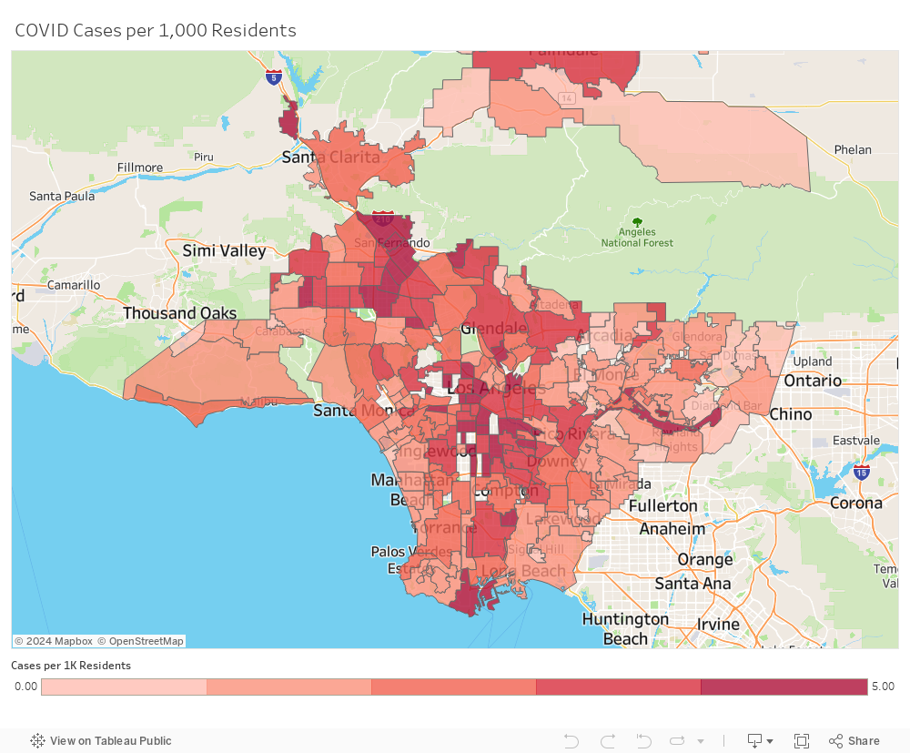
Although we don’t have data for every locality, we can observe “COVID clusters” in:

  • The north San Fernando Valley, especially in the Sylmar, Pacoima, Panorama City, and Van Nuys neighborhoods of Los Angeles
  • Central Los Angeles, especially in the Westlake, East Hollywood, and Pico-Union neighborhoods
  • South Los Angeles, especially in the South-Central, Vermont Square, and Florence-Firestone neighborhoods

When we compare this map to a map showing overcrowding rates by locality, we observe very similar patterns. Neighborhoods in the north San Fernando Valley, Central LA, and South LA have the highest rates of overcrowding and the highest COVID-19 case rates.

Similar patterns appear when we compare COVID rates to neighborhood poverty rates. The COVID clusters generally appear in localities with high poverty levels, although there are certainly poor neighborhoods that have relatively low COVID rates.


What about housing density? By comparing the COVID map to a map of housing density (more housing-dense areas appear darker green), we see that density does not neatly align with COVID-19 case rates. It is true that housing-dense parts of Central LA, like Westlake and East Hollywood, have high COVID-19 case rates, and that suburban, spread-out areas in the San Gabriel Valley have low COVID-19 incidence.

But neighborhoods in South LA and the San Fernando Valley are epicenters of the pandemic, despite not being very dense. And some relatively housing-dense areas, like Santa Monica and Venice, have low COVID-19 case rates. It’s a more complicated relationship than “more housing equals more COVID”.

Next, to illustrate how poverty and overcrowding are associated with COVID-19 incidence, I graphed L.A. County localities on a scatterplot (poverty rate is on the x-axis; overcrowding rate is on the y-axis), and colored the dots based on the locality’s COVID-19 incidence (green means low case rate; yellow means moderate; red means high). This shows that neighborhoods with high COVID-19 incidence tend to have high overcrowding and high poverty rates.

Finally, like any self-respecting data nerd, I ran a regression to estimate the extent to which the combination of these variables — household overcrowding, poverty rate, minority groups’ population share, and housing density — predict a locality’s COVID-19 case rate:

These results indicate that poverty, household overcrowding, and race are strong predictors of a neighborhood or city’s vulnerability to COVID-19. Housing density does not have a clear causal relationship with the COVID-19 case rate.

Additionally:

  • A 1-percentage point increase in a locality’s poverty rate is associated with a 1.5% increase in the COVID-19 case rate.
  • A 1-percentage point increase in a locality’s overcrowding rate is associated with a 1.7% increase in the COVID-19 case rate.
  • A 1-percentage point increase in a locality’s minority group population share is associated with a 0.5% decrease in the COVID-19 case rate. (This was surprising to me, since black and Latino communities, which experience higher rates of poverty than average, have been hard-hit by COVID-19. The model may have already accounted for this by including poverty and overcrowding as variables.)

Finally, I’d offer three observations based on this research, to help policymakers respond more effectively to the immediate emergency, and improve urban life for everyone post-coronavirus:

  • Low-income and minority communities need more health resources. Free COVID-19 testing and space for patients to quarantine should be made widely available in low-income and minority communities, and resourcing for community health centers and local hospitals in poor neighborhoods must improve. 
  • More housing means less overcrowding. California’s housing shortage impacts low-income communities the most; when renters are unable to afford adequate homes, they are forced into overcrowded living situations. More apartments in more neighborhoods can lower rents and relieve overcrowding.
  • Neighborhoods need more public space. With people spending more time outside as a break from sheltering at home, L.A.’s lack of green space and pedestrian space has become more acutely noticeable. New parks, more bike lanes, and wider sidewalks will help accommodate greater demand for outdoor space.  

Anthony Dedousis (@anthonydedousis) is director of policy and research for Abundant Housing L.A., a pro-housing education and advocacy organization serving Southern California.

City Beat: Why Portland is not like NYC when it comes to Covid

Once again, there’s a naive and unsubstantiated association between urbanism and the pandemic

Portland and Multnomah County have some of the lowest rates of Covid-19 cases of any large metro area

The big drivers of Covid-19 susceptibility are poverty, housing over-crowding and a lack of health care.

Like many states, Oregon is starting to re-open.  Governor Kate Brown has approved re-opening of 34 of the state’s counties, but the two most populous (Multnomah and Washington) are still under stay-at-home orders.  As the Oregonian’s Ted Sickinger reports, Multnomah County, home to the City of Portland, still hasn’t even submitted an application to re-open, and it may be weeks, rather than days before it does.

In his article, Sickinger likens Multnomah County to New York City:

Indeed, Multnomah County is Oregon’s New York City, uniquely important to its economic health, and uniquely vulnerable to a fast-spreading coronavirus outbreak, experts say. It has the most people. The most density. The most long-term care facilities. The most daycares and schools. The most vulnerable populations. The most people using shared spaces like offices and public transit.
The health care sector, where employees are perhaps most susceptible to infection, is the county’s No. 1 employer. And it is home to half the hospital beds in the state.

To be sure, Portland (and Multnomah County) are the state’s biggest city and biggest county, and consequently have more people, and more of just about everything else, than other cities and counties in Oregon. But that really begs the question of how serious the disease is.  When you look at the data on the prevalence of Covid-19 in Oregon, and in other states, its apparent that Multnomah County is nothing like New York City.

Portland (Not New York City, not uniquely vulnerable to Covid-19).

We’ve been following the nationwide data on Covid very closely at City Observatory, (for example: here, and also looking at the county level data in Oregon.

While in a large and diverse county like Multnomah, scaling up to do contract tracing may be a challenge, but in many ways, this story creates or amplifies some misperceptions about the pandemic in Oregon, and more generally in cities.

First, Marion County (home to the capital, Salem), not Multnomah County, is the worst hit county in the state.  Marion County has more than twice as many cases of Covid-19 per capita as Multnomah County.  Multnomah is not “uniquely vulnerable”– it ranks third statewide in cases per capita (behind Marion and Umatilla), and has rates that are roughly comparable to Washington County (126 per 100,000 and 110 per 100,000.)

Second, Portland looks nothing like New York City when it comes to Covid.   That’s true in absolute terms:  the New York City metro area’s rate is 2,300 cases per 100,000 population, 15 times higher than Multnomah County.  It’s also true in relative terms, the New York City metro rate is about 4.5 times higher than the US rate (less than 500 cases per 100,000 population).  Multnomah County is not a wide outlier from the statewide average: the Multnomah County prevalence  is less than 50 percent higher than the statewide rate (126 per 100K, vs. about 87 per 100K).

Third, there’s virtually no evidence to support the notion that density is a significant contributor to Covid risk.  This is true globally (the densest cities like Tokyo, Taipei, Singapore and Hong Kong) have some of the lowest rates of infection (far lower than Portland).  Its also true in North America (Vancouver, BC and San Francisco have very low rates of infection—Vancouver’s is lower than in any large US metro area).  It’s also true within big metro areas like New York—Covid is worse in the suburbs (Westchester and Rockland Counties) and within the city limits, is higher in lower density neighborhoods.

What does explain Covid is not density, but poverty, inadequate access to medical care and housing over-crowding.  Which is why the Navajo Nation, one of the least densely settled parts of the US has an even higher rate of infection that New York City.

Also, what the Oregonian article largely omits the much higher prevalence of Covid among the state’s Latino population, which is a big contributor to high rates in Marion, Polk, Washington, and Umatilla counties, as well as Multnomah.  According to OHA data, Latinos account for at least 30 percent of all Covid cases in Oregon, and have a rate of infection that is more than double the statewide average.  The Latino population is more vulnerable to the disease because they have lower incomes, are more likely to live in crowded housing, have less access to health care, and are more likely to be “essential workers” who have to work and who can’t telecommute.

Multnomah is the most populous county in the state, but the claim that it is “uniquely vulnerable” and the implication that density is a contributor isn’t correct.

And, for the record, when we look at large metro areas in the US (population 1 million or more, 53 of them) Portland has the second lowest rate of cases (behind only Sacramento) and the lowest rate of increase in new cases.  If you zero-in on the largest urban county in each of these 53 metro areas, only 2 have lower rates than Multnomah County:  Bexar (San Antonio) and Sacramento.

There are good reasons to be prudent in opening up after long weeks of Stay-at-home orders.  While the logistics of implementing test and trace may be tougher in a big urban area, just because of the number of people who need to be hired and trained and the (somewhat) greater cultural and linguistic diversity of the city, that’s no reason to repeat baseless claims that the pandemic is driven by density, or that a large metro area is somehow “uniquely” susceptible to the virus.


Is the pandemic worse in cities or suburbs?

Using county-level data, it depends on who’s classification system you use

Counties may not be the right basis for diagnosing the contributors to Covid.

One of the oft-repeated claims in the pandemic is the notion that cities and density are significant contributors to the risk of being infected with the Covid-19 virus. Some of this, we have argued, is based on a deep-seated (and wrong-headed) prejudice associating cities with communicable diseases (the “teeming tenement” meme).  But beyond base beliefs, what does the data show?

Because in the United States, the public health function is administered chiefly through counties, the nationwide data on the prevalence of Covid-19 cases and deaths is reported county-by-county.  And analysts (ourselves included) have used this county-level data to plot the prevalence of the disease in different parts of the country.  Our approach has been to aggregate data to the metropolitan level for the nation’s largest metro areas, based on the understanding that county units vary widely across the nation, and that the the labor, commuting and economic markets formed by metro areas are probably a more robust basis for comparing the extent of the disease nationwide.

As we noted earlier, several very good analysts, including Bill Frey at the Brookings Institution, Jed Kolko of Indeed and Bill Bishop at the Daily Yonder, have used the county-level data to look at the comparative prevalence of the disease in cities as compared to suburbs.  The style of their analyses is similar:  They look at county-level data, and classify counties as either urban, or some flavor of suburban or exurban.  They then aggregate the data for all the similarly classified counties across the nation, and compute prevalence rates (reported cases or deaths divided by population).  Jed Kolko’s analysis provides a representative example.

Translating with the Rosetta Stone

The challenge in interpreting their results comes from the fact that each of the three analysts uses a different system for classifying counties based on “urbanness,” as we explored in our earlier commentary on this subject.  We concluded that there was no right or ideal way to provide decide such a classification of counties, and noted that the three methods differ substantially in both the number of places (and people) classified as “urban” and also in which counties fall into which bins.

To illustrate the practical differences between the different definitions, we created a kind of Rosetta Stone (with data graciously provided by each of the three authors).  Let’s take a look at the city/suburb split using each of the three definitions. For this exercise, we use the USA data county level data on Covid Cases as of May 12.  As we usually do at City Observatory, our focus is on the 53 metropolitan areas in the US with a population of one million or more.

Covid-19 prevalence

The following table illustrates Covid-19 prevalence aggregated by each of the three classification systems.  The table shows the total population living in each county classification, the total number of reported cases in those counties, and computes the rate of cases (per 100,000) population.

Urban/Suburban Population, Covid-19 Cases, and Rate per 100,000,
May 12, 2020, (Metropolitan Areas with 1 million or more population).

Population Cases Rate
Brookings
1-Urban Core 99,667,019 780,762 783
2-Mature Suburb 61,943,681 178,381 288
3-Emerging Suburb 14,308,473 27,413 192
4-Exurb 5,253,680 11,915 227
NonMetro 118,497 259 219
Total, Large Metros 181,291,350 998,730 551
Kolko
1-Urban 75,949,521 622,889 820
2-SuburbanHigh 69,104,197 274,372 397
3-SuburbanLow 36,237,632 101,469 280
Total, Large Metros 181,291,350 998,730 551
Yonder
1-Central counties 90,665,117 439,086 484
2-Suburban Counties 86,288,760 551,678 639
3-Exurban 4,218,976 7,707 183
4-Rural Adjacent to Large MSA 118,497 259 219
Total, Large Metros 181,291,350 998,730 551

As you can see, one gets a very different impression of whether city or suburb rates are higher depending on which classification one uses.  Overall, the prevalence rate across categories is 551 cases per 100,000.  But the Kolko and Brookings classifications imply that the average prevalence is about twice as high in cities as in suburbs, while the Yonder classification implies the reverse, that the rate is about 30 percent higher in suburbs than in cities.

Outside of New York

The New York City metropolitan area has been the epicenter of the pandemic, and has accounted for a disproportionate share of reported cases and deaths.  Because of that concentration of cases, and the region’s large (nearly 20 million) population), it could be that this single metro area skews the totals.  In addition, there are significant differences in how the three typologies classify counties in the New York metropolitan area.  For example, the Brookings and Kolko methods classify Westchester and Nassau counties as “urban” while Yonder classifies those counties, and also Queens County, as suburban.

To filter out the effects of New York’s direct contribution to the pandemic, and to sidestep the disagreements about how to classify counties there, we construct a second table aggregating the data for the remaining 52 large metropolitan areas.  First, its worth noting that the aggregate rate of reported cases per 100,000 population drops about 40 percent, to about 354 cases per 100,000.

Urban/Suburban Population, Covid-19 Cases, and Rate per 100,000,
May 12, 2020, (Metropolitan Areas with 1 million or more population, excluding New York metro)

Population Cases Rate
Brookings
1-Urban Core 82,235,306 376,890 458
2-Mature Suburb 60,420,138 159,745 264
3-Emerging Suburb 14,042,865 25,657 183
4-Exurb 5,197,900 11,482 221
NonMetro 118,497 259 219
Total, Large Metros 162,014,706 574,033 354
Kolko
1-Urban 61,770,791 289,436 469
2-SuburbanHigh 65,521,033 199,860 305
3-SuburbanLow 34,722,882 84,737 244
Total, Large Metros 162,014,706 574,033 354
Yonder
1-Central counties 84,227,331 308,054 366
2-Suburban Counties 73,505,682 258,446 352
3-Exurban 4,163,196 7,274 175
4-Rural Adjacent to Large MSA 118,497 259 219
Total, Large Metros 162,014,706 574,033 354

Excluding New York shifts the apparent city/suburb balance in each of the three classification systems.  Brookings reports essentially the same relative gap between city and suburban rates (with city rates about double those in mature suburbs).  In the data that exclude the New York metro, Kolko still reports a higher prevalence of Covid in suburbs than in cities, although by a smaller margin (50 percent higher in cities, rather than nearly double).  The Yonder tabulation now reports a higher rate of prevalence in urban counties than suburban ones, although by a relatively small margin (366 in cities vs 352 in suburbs).

In the end, we’d recommend that anyone interested in understanding the geography of the pandemic closely read the work of Kolko, Frey and Bishop–they’re all smart analysts who paint vivid pictures with the data.  But as this analysis makes clear, drawing clear lines between urban and suburban counties is more of an art than a science, and its useful to understand the different definitions in order to be able to make sense of the conclusions. Even with the best efforts,  it is hard to use highly aggregated county data to make a clear cases about whether the pandemic is much worse in cities than in suburbs.  The devil is very much in the definitional details, as the range of estimates presented here illustrates.

In addition, it may help to look at the issue from different perspectives. As our own analysis comparing city and suburban rates within metropolitan areas shows, it matters a great deal more whether you are in a metro area with a high rate of infections, than whether you are in a city or suburb of any given metro area.  Its also clearly the case that within metros, city and suburban rates are highly correlated, and that when the virus was spreading rapidly, the average suburb was only about six days or so behind its central city in the prevalence of the virus.  Plus, when more detailed data becomes available, such as zip code level tabulations of cases and deaths, we may be able to more carefully discern the differences between cities and their suburbs.


City Beat: No evidence that people are fleeing to the suburbs

Today’s misleading and incomplete take on cities:   

There isn’t any evidence that people are fleeing cities for the suburbs; plus it wouldn’t help them avoid the virus if they did.

We’ve addressed the claim that the pandemic will lead to an exodus from cities before; today we’ll tackle another iteration.

The New York Times adds another “fleeing the city to avoid the virus” story.

On May 8, the Times published this story, saying “some” New Yorkers are looking to move out of the city due the perceived hassle and risk of coping with the pandemic. The story consists of a handful of profiles of people moving (or thinking about moving), and a bit of “anecdata” from a moving company and a realtor.

The story omits several things:

People are always moving out of (and in to) New York City. Even in the boomiest of boom times, some people are leaving. That’s always been true, and always will be true.

It’s a popular journalistic trope to find one or two such people, relate their lamentations, and then pronounce based on these stories, that city X or neighborhood Y is “over.”

What the data show for New York is that it always experiences “domestic net migration.”  Migration statistics are compiled by the census, which looks at people who lived in one US location in one year, and a different US location the second year.  What these data leave out are international in-migrants, who are particularly important for places like New York, which is an international gateway into the US.

New York’s population has grown over the last decade, with very slight declines in the past couple of years.  The big factor now limiting New York’s growth (and that of many other cities) is not a decline in the perceived value of urban living, but the limited supply and high cost of urban housing in the face of growing demand. The problem is a shortage of cities, not a disenchantment with urban living.

There’s one more thing to keep in mind regarding the pandemic:  Not only is their precious little evidence here or globally that density is a key factor in susceptibility to the pandemic, the New York Times’ own data show that in the New York metropolitan area, the prevalence of Covid-19 has actually been higher in the suburbs than in New York City.  Suburban Rockland and Westchester counties have rates of infection that are roughly 50 percent higher than in New York City:

Source: New York Times Covid-19 Data, May 11, 2020

A careful analysis by the Furman Center shows that within the city, the problem is worst in the lowest density neighborhoods. So even if you’re fearful of this (or future) pandemics, fleeing to the suburbs won’t be any kind of “escape.”

Like many stories, this one simply reinforces the long-time anti-urban “teeming tenements” viewpoint, while providing little actual data on either the risks of the pandemic, or the actual patterns or causes of migration.

Also from City Observatory on Cities and Covid-19:

City Beat is City Observatory’s occasional feature pushing back on stories in the popular media that we think are mistakenly beating up on cities.

Don’t make “equity” the enemy of improving cities for people

Invoking concerns about equity to block providing more street space for people is destructive 

A cautionary tale from Chicago, with some keen insight from Greg Shill.

Let’s begin by stipulating one thing:  There’s much about American cities, and our transportation system, that is deeply inequitable to low income households and people of color. Our auto-dependent system makes those who can’t drive or choose not to drive or own cars at-best second class citizens.  The burden of crashes and pollution falls more heavily on low income households. Subsidizing car storage (“parking”) and urban freeways systematically benefits those with means, while the infrastructure of walking, cycling and transit, is chronically under-funded and under-provided.  We have a lot of work to do to make this system fairer.

That said, invoking concerns about “equity” as a reason not to move ahead with aggressively re-allocating public space to favor pedestrians, cyclists, and those who just want to enjoy urban space, rather than speed through it in a vehicle, especially in the midst of a pandemic, is a tragic mistake.  Yet that’s exactly what we see happening.  Today’s example is drawn from Chicago, but we see versions of this particular story playing out in many places.


Chicago Sun-Times.

A little context:  Like many cities (Oakland is a leader, New York, Portland and many others are following), Chicago is looking for ways to create more public space so that people can travel on foot and by bicycle, as well as exercise during the pandemic. The need for social distancing is bumping up against the paltry amounts of space available for cyclists and pedestrians in many urban neighborhoods. So cities are creating “Slow Streets” and reallocating roadway for walking and cycling. Streetsblog Chicago has had great reporting on the city’s public space issues, the proposed changes and public reactions.

Chicago’s leading transportation advocacy group, the Active Transportation Alliance, expressed qualms.  Let’s turn the microphone over to Iowa law professor Greg Shill—author of the powerful essay “Should Law Subsidize Driving“— who tweeted about this last week. (We contacted Shill and asked him to allow us to share a somewhat longer version of his remarks, along with an edited version of these tweets at City Observatory; what follows is reprinted with his permission).

Nearly six weeks ago, the Active Transportation Alliance, whose mission is to “make walking, biking, and transit safe” and foster “easy options for getting around Chicagoland,” took the position that it was going to suspend any advocacy for active transportation space at the very time that it’s most needed. Chicago is now one of the only cities in the country not to expand public space amid the social distancing imperatives of COVID-19. While Oakland, a much smaller city, has begun rolling out over 70 miles of slow streets, Chicago has actually shrunk the available space for transportation and recreation, for example by closing the bike and walk path along Lake Michigan. This makes 6’ social distancing virtually impossible in many public places.

It’s a scandal, if not a secret, that the poorest areas of Chicago have the least public space. It’s frustrating to see a reform-minded organization (one I belong to, by the way) advocate for upholding the status quo, but it’s perverse that they’re doing it in the name of equity. Especially in areas starved for public space, the public right of way is not allocated fairly or safely. Yet ATA has failed to challenge the mayor’s misguided policy that freezes it in place. With demand for active transportation surging, ATA should embrace its own mission of expanding public space now more than ever, to help Chicagoans to stay safe and healthy during the pandemic.

In this case, the Active Transportation Alliance is explaining why they don’t support expanding sidewalks for essential workers and others who need to get around during COVID. In the past, they’ve acknowledged insufficient focus on equity, but in trying to fix that they made it worse.

The ATA has a good record in general, but by deploying “equity” as a rationale for opposing the expansion of even a single Chicago sidewalk during the pandemic, they’re making a mockery of it. Chicago is now behind every other city. This does not advance equity one whit.

The gist of the ATA statement is “we won’t advocate for *recreational* space while people are dying,” which of course misses the point. It’s stunning to see a reformist organization argue streets in poor neighborhoods must stay dangerous because “equity.”

Even if one believes, against the evidence, that road diets and other streets enhancements cause gentrification because people bid up surrounding real estate, the best way to break that cycle is to advocate for improvements everywhere. No scarcity, no premium.

At least, that would be the principled way to promote equity. The unprincipled way is to insist that underserved, dangerous neighborhoods with dirty air stay that way because that will keep newcomers out. Cutting off your nose to spite your face is not equity.

Shill wasn’t alone in expressing dismay that equity concerns were being used to block action.  Writing at Streetsblog Chicago, Courtney Cobbs acknowledges that ATA has dialed back its criticism of the planned improvements, but finds their support at best lukewarm. Where, she asks, is the equity analysis of not moving forward to make more space for people:

The advocacy group then states that before residents of Chicago neighborhoods or suburbs launch campaigns for open streets in their communities, they need to ask themself a long list of equity-related questions to help make sure the program wouldn’t have any unintended consequences or do harm, which is certainly an important goal. . . .

I don’t necessarily disagree with that line of questioning. But in that lengthy list, ATA raises lots of potential equity impacts of doing open streets. I wonder, has the advocacy group interrogated the possible social justice consequences of maintaining the status quo — that is, not creating more space for safe walking and biking during the pandemic — in the same way?

Too often, we make the perfect the enemy of the better by raising minor or illusory equity concerns about a proposed positive change, while turning a blind eye to the profound inequities embedded in the status quo–inequities that will be unmitigated, if not worsened, by the failure to take the first steps, if only small ones, in the right direction. As we’ve written at City Observatory, there are many profoundly inequitable aspects of our current transportation system that simply go unquestioned, and whose negative effects are vastly greater.

As another famous Chicagoan, former Mayor Rahm Emanuel once said, “A crisis is a terrible thing to waste.” The need to address the misallocation of public space to vehicles is long overdue. Organizations like the Chicago’s ATA labor long and hard to turn public attention to this issue. Now, when American’s are getting out of their cars and onto the public streets, and parks in unprecedented numbers is a unique opportunity for everyone to contemplate a fundamentally different (and ultimately, much more equitable) way of sharing the public realm. Those who wait for the perfect moment, will spend their entire careers waiting.


Oregon DOT: The master of three-card monte

The highway department’s claims it doesn’t have enough for maintenance are a long-running con

You’ve all seen the classic street con three-card monte. All you have to do to double your money is follow one of three cards that the dealer is sliding around the on the surface of the little table.  No matter how closely you track the cards, when the shuffling stops, and the dealer asks you to pick one, you can be sure that its not the one you thought it would be. It’s a sucker bet, and you always lose.

Casino.org

But there’s another street hustler out there, who thinks the guy with a cardboard box and a handful of playing cards is a penny-ante player. If you really want to see how the three-card monte con works, there’s no one more masterful than the Oregon Department of Transportation.

The game they play is “find the money to fix potholes.” Everyone agrees we need to maintain the very expensive investment we’ve made in our roads and bridges (that, ostensibly is why we pay the “user fees” that go into the state highway fund).  But no matter how much money goes into the fund—and the 2017 Legislature passed the biggest fee and tax hike in Oregon’s transportation history—the agency just seems to come up short when it comes to money for maintenance.

ODOT has been working this hustle for a long time (we’ll provide a bit of history in a moment). When it comes to finances the agency is very adept and shuffling the cards—and the money—so that no matter where you look, the money is elsewhere.  The latest iteration of the three-card monte was dealt up by Oregon DOT director Kris Stricker, who announced that the agency doesn’t have sustainable funding to maintain the state’s roadways—in spite of the fact that its been less than three years since the Legislature passed a massive funding bill. Here’s the Oregonian’s coverage:

“Many will wonder how ODOT can face a shortfall of operating funding after the recent passage of the largest transportation investment package in the state’s history,” Kris Strickler, the agency’s director, said in a Wednesday email to employees, stakeholders and other groups, citing the 2017 Legislature’s historic $5.3 billion transportation bill. “The reality is that virtually all of the funding from HB 2017 and other recent transportation investment packages was directed by law to the transportation system rather than to cover the agency’s operating costs and maintenance.”

Now keep in mind that the agency got $5 billion in new revenue, and because the agency is marching ahead with several large construction projects (and borrowing billions to pay for them), that won’t leave enough to pay for repairs and agency operations.

But let’s be clear: That’s no accident. ODOT made decisions that created this problem.  It understated the costs of big construction projects, and financed them in a way that automatically puts the repair dollars at risk. It told the Legislature that the I-5 Rose Quarter freeway widening would cost $450 million (and its price tag has since ballooned to nearly $800 million and could, according to the agency, easily top a billion dollars).  These overruns will be paid for with money that could have been used to repair roads. ODOT is also choosing to pay for these projects by issuing debt secured by its gas tax revenues, and the covenants it makes with bondholders mean that if gas tax revenues go down (and they’re in free-fall now, due to the pandemic), that bond repayments get first priority, and all of the cuts fall on operations and maintenance.

And that’s not all. Not only has the agency chosen to paint itself into this budgetary corner, it also routinely takes money that could be used for maintenance and plows it into big capital projects.

As we’ve pointed out, ODOT has a long series of cost-overruns on its major projects.  When a project goes over budget, the agency has to find the money from somewhere—and it always does. A good part of the dark arts of transportation finance consist of figuring out ways to take money in one pot and as the saying goes “change its color” so that it can be placed in a different pot. Two of its favorite tactics are “unanticipated revenue” and “savings.”

Here’s how they work.  Sometimes the agency will budget money for a project, and it will cost less than expected (or be scaled back).  Then those moneys are now “savings” and are free to be reallocated for other purposes.  The “unanticipated funding” is even more obscure.  ODOT can adopt a slightly more pessimistic revenue outlook at some point (by assuming for example that Congress lets the federal highway trust fund go broke); when that doesn’t happen the revenue outlook is re-adjusted upward accordingly and voila—there’s “unexpected revenue.” But notice that because the agency is responsible for estimating revenues and costs, it can easily choose to overestimate costs (to produce “savings”) or under-estimate revenues (to produce “unexpected revenue.”)

ODOT is currently employing both of these strategies to magically fund the widening of I-205—a project that the Legislature did not provide funding for. Here’s a slide from ODOT’s December, 2018 briefing on the project:

Most of these funds (regional flexible funds, “reallocated savings,” “unanticipated federal revenue” and especially the “operation program funds,”) could all otherwise be used to pay for ODOT operations and maintenance—but instead they’re being used here to fund a capital construction project.

That’s not an isolated example: the agency uses lots of funds that can be applied to potholes and repairs to finance new construction.  In the case of the Columbia River Crossing, millions for project planning came from federal “Interstate Maintenance Discretionary (IMD)” funds that can be used for the repair, repaving and upkeep of Interstate freeways throughout the state.

Here’s the thing: nothing stops ODOT from using “unanticipated revenue” or “savings” to pay for repairs.  Even when the savings are in programs that are nominally dedicated to capital construction, the agency could use the savings to offset other capital construction costs paid from its more flexible funds, and shift those second-hand savings into repairs.  But it doesn’t do so.  Like sleight of hand in three-card monte, the budgetary legerdemain always works in the dealer’s favor.

Nothing new:  A long-running con

Anyone who has followed ODOT for any period of time knows that these tactics are dog-eared pages in its playbook.  Consider the two biggest projects the agency has pushed since 2000, the $360 million, five-mile long re-routing of US 20 between Corvallis and Newport, and the failed effort to build the $3 billion Columbia River Crossing. In both cases the agency used or proposed financial sleight-of-hand to come up with the needed money.

Pioneer Mountain-Eddyville US 20

Originally, the Pioneer Mountain-Eddyville project was supposed to cost about $100 million, but through a prolonged serious of ODOT blunders, it ended up costing about $360 million.  The agency found the money to pay for the cost-overruns from a combination of “savings” and “unanticipated revenue.”  Here’s how they filled the last bit of the shortfall, according to ODOT’s own documents:

December 5, 2012 Memorandum from Matt Garrett to the Oregon Transportation Commission
(US_20_PME_12_19_2012_OTC.pdf)

Most of the needed funds came from “unanticipated Map-21 funds,” with the balance coming from OTIA three modernization “savings”–OTIA 3 being a program to repair highway bridges.  So when it wants to, ODOT manages to find money which could otherwise be used for maintenance and use it to cover the costs of capital construction.

The Columbia River Crossing

Consider the agency’s last proposed megaproject. In 2013, it sought legislative approval to go ahead with the $3 billion project, even though the state of Washington had pulled out—and taken its money and responsibility for covering half of all project costs with it.  ODOT came to the Legislature asking for approval to incur debt for the project, and assured the Legislature that it had on hand all the money it needed to pay for Oregon’s share–initially $450 million, but with liability for vastly more–without the need to raise taxes.  ODOT looked into its budget found “unanticipated revenue,” as reported by the Associated Press in its article “Bill proposes bridge debt but no funding source

SALEM, Ore. (AP) — A bill approving a new Interstate 5 bridge over the Columbia River would authorize $450 million in bonds to pay for Oregon’s share, but it doesn’t say how the state would pay off the debt over the coming decades.  Paying down the bridge debt would cost roughly $30 million per year.  In the short term, the Oregon Department of Transportation can use unanticipated federal transportation dollars to cover the debt, lawmakers said. But after that money runs out in two to three years, the state would have to approve a new revenue source — such as a gas tax or vehicle fees — or reduce the amount of money available for other road projects. [Emphasis added].

Legislative leaders took ODOT’s word that there was money.  House Speaker Tina Kotek’s spokesperson repeated ODOT assurances that the capital construction costs for the project could be paid out of ODOT’s existing revenue.  Here’s Willamette Week, quoting Jared Mason-Gere of the speaker’s office in 2013:

“Speaker Kotek believes the committee structure this session allowed for a full and open consideration of the I-5 Bridge Replacement Project, while still moving swiftly enough to move the project forward. The committee considered the same elements of the bill the Ways and Means Committee would have, and worked closely with the Legislative Fiscal Office. The funding already exists in an agency budget. LFO has verified that the funds are available in the ODOT budget, and that they will not impact other existing projects. [Emphasis added].

So, when the agency wants to take on a huge mega-project, future budget considerations—even on the order of hundreds of millions of dollars which would directly reduce the agency’s ability to pay for future operations and maintenance—are no obstacle. Plus, in the case of the CRC (as with today’s Rose Quarter freeway widening and the Pioneer Mountain-Eddyville project) the revenue hit isn’t limited to the projected cost, but also includes a massive and undisclosed liability for cost overruns, which then directly impact operations and maintenance. The lack of budgetary flexibility to pay for operations and repairs today is a direct result of choices like this in the past to use or commit

Sell potholes, spend on megaprojects

If you’re a highway engineer, nothing is more boring that fixing potholes, and nothing is more glamorous than a giant new bridge or highway. While department leaders consistently swear that they’re committed to maintaining the system, whenever they get a chance, they either plan for giant projects for which they have no money, or low-ball the estimates on capital construction, knowing they’ll use their fiscal magic down the road.

The real giant, unfunded liability for ODOT is big new construction projects.  The cost of the Rose Quarter project, which ODOT confidently told the Legislature would be just $450 million, has already ballooned to nearly $800 million, and could exceed a billion dollars if promised buildable covers are included.  ODOT has said nothing about how these vast overruns would be paid for.

Meanwhile, ODOT is moving full speed ahead with plans for a revived Columbia River Crossing (now re-branded as “I-5 Bridge Replacement”). In its last iteration, the price tag for this project was north of $3 billion, and at this point ODOT has no money in its budget for its share of these costs.  But it has allocated $9 million in planning funds to revive the project.

Paying Lip Service to maintenance, Paying interest on debt

ODOT officials talk a good game when it comes to the importance of maintenance.  And while they apparently blame the Legislature for telling them to spend money on capital construction rather than fixing potholes, its sales pitch consisted of telling the public how much it cared about maintenance:

Here’s the agency’s current deputy director, Travis Brouwer, speaking to OPB, in April, 2017 as the Legislature was considering a giant road finance bill.:

Of course, patching potholes are far from the only thing ODOT has to spend money on. So how does the agency decide what to prioritize? According to ODOT assistant director Travis Brouwer, basic maintenance and preservation are a top priority.

“Oregonians have invested billions of dollars in the transportation system over generations and we need to keep that system in good working order,” he said. “Generally, we prioritize the basic fixing the system above the expansion of that system.”

Back in 2017, the Oregon Department of Transportation put out a two-page “Fact Sheet” on the new transportation legislation.  It’s first paragraph stressed that most of ODOT’s money would be for maintaining the existing system:

Generally, meaning, unless we decide to build shiny new projects—which they do.  Make no mistake:  When it comes to one of the agency’s pet mega-projects, there’s always money lying around, and if there isn’t, they’ll pretend like there is and charge full speed ahead, maxing out the credit cards to generate the cash.

In 2000, the agency was essentially debt-free.  Since then, the share of State Highway Fund revenues spent on debt service has gone from 1 percent to more than 25 percent—and an increasing share of that debt burden is to pay off the costs of mega-projects. And, by definition, these debt obligations have first call on ODOT’s revenue, so the very act of debt-financing capital construction is a direct cause for the shortfall in funding for maintenance.

So, for example, look at recent decline in state gas tax revenues because of the decline in driving during the Covid-19 pandemic.  The way ODOT has chosen to structure its finances, the budget shortfall lands disproportionately on operations and maintenance.  The debt-cycle neatly provides a mechanism to implement a “bait and switch” strategy.

In three-card Monte, no matter which card you pick, ODOT will never have enough money for maintenance, but it will always be plowing money into big construction projects, and planning for even more.

What is urban?

Shape of the urban/suburban divide:  Views differ

There’s a lot of debate about the relative merits and performance of cities and suburbs. You’ll read that the migration to cities has come to a halt, that suburbs are growing faster than cities or that cities have a higher rate of Covid-19 infections than suburbs.

All those statements hinge on being able to draw neat, clearly understandable lines between what constitutes a city and a suburb. As is so often the case, the conceptual differences may be clear, but drawing lines, in practice, is fraught with confusion and complexity. And this matters because where one draws these lines has a big impact on what kind of numerical answers one gets.

Today we’ll take a look at three widely used urban/suburban definitions, developed by three different researchers–all of whom we greatly respect and admire. What we find is that, as the saying goes, they’re all over the map. Consequently, a degree of care and caution is needed in interpreting data that make “urban vs. suburban” claims based on county data.

Geography and data availability necessarily straight-jacket any analyst looking to craft a solid picture contrasting cities and suburbs. Cities are political subdivisions (municipalities, or ‘places” in Census parlance). But the geographies that compose cities are defined by local law and custom, and vary widely from state to state and around the country. The principal city is nearly all of the metropolitan area in Jacksonville or Phoenix, but is just a fragment of a much larger metropolitan area in Atlanta or Miami.

While one can get a much finer look at geography by cobbling together customized and uniformly defined clusters of census tracts, these data are available in the form of five-year pooled estimates (the latest being from the 2014-2018 versions of the American Community Survey).  For those interested in the most recent data, that’s frustratingly old. Two researchers at Harvard’s Joint Center for Housing Studies devoted an entire paper to the question, but there analysis focuses on slicing the urban/suburban divide within counties, so we don’t explore it further here.

The most convenient and timely data is county level estimates published by the Census Bureau.  It annually estimates the population of every county in the US, along with the components of population change (births, deaths, migration), and estimates the age structure as well.  Because the sample size is larger for counties than for census tracts, the Census Bureau also produces annual tabulations of the American Community Survey for counties. And of interest today, Covid-19 data are generally reported on a county-level by public health authorities.

As a result of the convenience of data availability, and the fact that the entire nation is divided into about 3,200 counties (or county-like units), analysts routinely tap census data to describe geographic trends.

Within the past few weeks, three terrific analysts, Bill Frey of the Brookings Institution, Jed Kolko of Indeed and Bill Bishop of the Daily Yonder, have been using these county level data to look at the relative prevalence of Covid-19 across the nation’s geography–from central cities and suburbs of large metro areas, to smaller metros, to rural areas.

Conceptual differences

There are a variety of ways to characterize the “urban-ness” of a place.  One is centrality:  is a county at the center of a metropolitan region. Another is density:  how many people per square mile live in a county?  One can also look at how developed an area is:  is a county mostly developed to some minimum level of density, or is much of it relatively lightly developed or undeveloped?  The three definitions presented here lean on different concepts:  Brookings uses a measure of urban development, Kolko looks at weighted population density and Yonder emphasizes centrality.  These different underlying concepts lead to differing categorizations of counties as urban or suburban.

Our focus–as it usually is at City Observatory–is on the nation’s 53 largest metropolitan areas, all those with a million or more population.  Although their taxonomies cover the whole gamut of metro and rural areas, we’re most interested in here, in where each of these researcher’s has used county boundaries to partition these large metro areas into “urban” and “suburban” components.

In all, about 181 million Americans live in one of the 53 largest US metro areas.  How many of them live in urban as opposed to suburban locations?  Each of these methods proposes to answer that question but they come up with answers that are quantitatively and compositionally quite different.  Of the 181 million people living in these large metro areas in 2018, depending on the definition one chooses, the number that in “urban” counties are about 76 million (Kolko), 91 million (Yonder) or 100 million (Brookings).

Classification of Counties in Metro Areas with Population of 1,000,000 or more.

Brookings Counties Population
1-Urban Core 96 99,667,019
2-Mature Suburb 111 61,943,681
3-Emerging Suburb 77 14,308,473
4-Exurb 121 5,253,680
NonMetro 4 118,497
Grand Total 409 181,291,350
Kolko
1-Urban 55 75,949,521
2-SuburbanHigh 91 69,104,197
3-SuburbanLow 263 36,237,632
Grand Total 409 181,291,350
Yonder
1-Central counties 59 90,665,117
2-Suburban Counties 238 86,288,760
3-Exurban 108 4,218,976
4-Rural Adjacent to Large MSA 4 118,497
Grand Total 409 181,291,350

That might not seem like such a large discrepancy, until you find that each of the definitions designate distinctly different sets of counties counties as urban.  Overall, the three methodologies agree on 21 counties in the 53 largest metropolitan areas are urban.  These counties are home to less than half of the people labeled as living in “urban” areas under any of the three definitions. These common counties work out to a little bit more than half of the people counted as living in “urban” areas by Kolko, and less than half of the people counted as  urban by Brookings and Yonder.  So these are largely differences in kind, rather than degree.

Comparing different definitions

One way to illustrate the differences among these three definitions is via a Venn diagram showing where these definitions coincide and where they differ.  The red (upper left) circle shows Kolko; the yellow circle on the right shows Yonder, and Brookings is the pale green circle on the bottom.

Urban county definitions, Large metro areas, Total population in millions (Number of counties).

The are where the three circles overlap shows that the three rubrics agree that 21 counties are “urban,” these contain about 41.3 million people.  Conversely, if you add together all of the counties that at least one of the three methods categorize as urban, you find that 62 counties, with a total population of 132.8 million are “urban.”

Remarkably, when classifying counties as urban or suburban in each of the 53 most populous metropolitan areas, the three methods are in complete agreement on what constitute the “urban” counties in only four metro areas:  Cleveland, Milwaukee, Pittsburgh and San Jose.

Two of the three methods imply that almost a third of large US metro areas have no counties that qualify as “urban.”  The Brookings and Kolko methods find that 16 metro areas, including Austin, Charlotte, Cincinnati, Kansas City, Memphis, Nashville, Oklahoma City, Phoenix, Raleigh and San Antonio, have no counties that are “urban”.  Kolko characterizes the most populous county in each of these metro areas as “high density suburban,” while Brookings generally classifies them as “mature suburbs.”

It’s interesting to see what two out of the three sources says is “urban” that the other one leaves out:

Brookings and Kolko agree on 26 counties (with 21.8 million people, that Yonder leaves out of its definition.  These are mostly populous counties in large Eastern Metros, Queens, and Nassau Counties in New York

Brookings and Yonder agree on 13 counties with 16.9 million people, that don’t meet Kolko’s criteria, chiefly because they’re not dense enough.

Yonder and Kolko agree on 7 counties with 11.3 million people.  The difference here is that the Brookings methodology says that five large MSAs in the West—  Las Vegas, Portland, Sacramento, Seattle and San Diego—have no urban counties–classifying their densest, most central county as “mature suburban.” In contrast, both Kolko and Yonder identify the central county in each metro as urban.

Each method has its own unique choices–counties it classified as urban that were not classified urban by either other source.  Kolko had just one such county.  Brookings had 35 counties that it alone designated as urban (mostly the second and third most populous counties in a metro area).  Yonder had 19 counties that were designated urban only by its methodology–reflecting its rule of designating the most populous county in each metro as “central.”

A Rosetta Stone

For our own use, and with the hope that it may be of some utility to other researchers, we’ve crafted a kind of Rosetta Stone illustrating these three different definitions of urban and suburban counties.  We’ve shown, side-by-side how each of these three method’s classifies each county in the nation’s 53  most populous metropolitan areas.

Rosetta_County.xlsx

This Excel file identifies the name and FIPS Code of each metro area, the name and FIPS code of each constituent county in that area, and the population of that county in 2018. In three separate columns, we show how the county is classified by Brookings, Kolko and Yonder.  We’ve also appended Kolko’s estimates of the tract-weighted population density of these counties (a key metric in his classification system).

At a minimum, if you’re interested to see how your metropolitan area is parsed among these different definitions, you can use this as a reference.  We also hope it lets researchers more easily decode and compare statistics compiled

There is no “right” definition

The purpose of this comparison is not to prove any one definition is superior to the others, but rather to illustrate the complexity and ambiguity of using county-level data to make strong statements about what constitutes “urban” and “suburban.”  As a practical matter,  the lumpiness and varying size of county units makes them a problematic choice for drawing these boundaries. Is none of King County Washington (which includes all of Seattle), urban?  Should single county metropolitan areas (San Diego and Las Vegas) be classified as core or suburban?  These are questions about which reasonable people can disagree, but in the interests of transparency, we offer up our Rosetta Stone so that people can use these data with a clear understanding of the difficult choices their authors made.

References

Jed Kolko, How suburban are big US cities? , FiveThirtyEight.Com, May 2015.

William Frey, Even before coronavirus, census shows US cities growth stagnating.

Bill Bishop, Major City growth slows, but that doesn’t mean a rural rebound,

Acknowledgements:  City Observatory is grateful to Jed Kolko, Bill Frey and Bill Bishop for graciously sharing their worksheets showing their classification systems. City Observatory is responsible for any errors in this analysis.


Postcards from the edges: Density is not Destiny

There’s a meme equating density with Covid-19 risk. 

Two polar cases shows that density (or lack thereof) has little to do with the spread of the pandemic.

Many, including New York’s Governor, have been quick to blame density for the spread of Covid-19.  Last month, we looked at data for one of North America’s densest cities—Vancouver, British Columbia—and found that it had a lower rate of reported cases per capita than nearly all large US metro areas.  Today we check back in on the progress of the pandemic in Vancouver compared to similar American cities. And we also take a quick look on the area with the highest rate of Covid-19 cases in the US—and its one of the nation’s most rural areas, not a dense city at all.

There’s little question that the fact that the New York metropolitan area has had the highest rate of reported cases per capita has colored perceptions.  People might naturally assume that because New York is our densest city, and Coronavirus hit hardest there, that there was some connection.  It turns out however, that within the New York metro area, rates of reported cases are actually higher in the suburbs (including Rockland and Westchester counties) than in the five boroughs of New York City.  It’s also the case that in the city itself, the hardest hit neighborhoods actually are much less dense than those least affected.

A Postcard from the Navajo Nation

Photo: Salt Lake Tribune

While New York has dominated the awful statistics and headlines of the pandemic, today, the hardest hit area in the US is far away, and far different:  the Navajo Nation.  In the past week, New York’s rate of infection has been surpassed by that on the Navajo Nation, one of America’s least densely settled areas.  The nation covers an area larger than Ireland spread across three states—Arizona, New Mexico and Utah—and consists overwhelmingly of very low density housing.  But its rate has grown to more than 2,449  cases per 100,000 population even higher than New York City’s 2,300.

The underlying problems in the Navajo Nation are not density, but rather poverty, a lack of health care, and housing over-crowding. Interestingly, these same factors were identifies as correlates of Covid prevalence rates within New York City by a Furman Center analysis of zip-code case data.

A Postcard from Vancouver

As we pointed out last month, if you think that the Coronavirus is spread by density, riding public transit, and tight connections to China, then you’d have to believe that Vancouver, British Columbia would be squarely in the cross-hairs of the pandemic. Vancouver is one of the five densest cities in North America, has a much higher than average transit ridership, and a large Chinese immigrant population.  But when we looked in April, its rate of Covid-19 cases per capita was lower than in just about any large US metro area, and lower than in nearby Seattle or Portland (and Portland ranked 50th of the 53 large US metro areas for Covid cases per capita).

Vancouver has some of the most dense place in North America, and still, the lowest incidence of Covid-19. (Photo:  Global News)

Metro Vancouver is the densest city in Canada, with a density of more than 5,000 residents per square kilometer.  It’s the fifth densest large city in North America, and  in the US, only San Francisco and New York have higher densities.. Two-thirds of its residents live in multi-family housing.  In addition, Vancouver is a global gateway city with substantial tourist and business travel, close ties to Asia, and a large immigrant Chinese population.  Metro Vancouver has more than a quarter million residents who were born in China or Hong Kong. A high fraction of its residents use the city’s excellent transit system. A recent city report shows that a majority of all trips were made by walking, cycling or transit.

Last month, we reported that through mid-April, Vancouver had reported about 45 cases of Covid-19 per 100,000 population, noticeably lower than the 54 per 100,000 in Portland and a fraction of the 200 cases per 100,000 in Seattle. But as we know, the virus doesn’t stand still, and some places that initially avoided the pandemic—like the Twin cities—have simply experienced an outbreak later than other places.

Here we’ve updated  number of cases through early May, as reported by the New York Times (for US cities) and  by the British Columbia Center for Disease Control (BCCDC).  In each case, we’ve adjusted for population by calculating the cumulative number of reported cases per 100,000 population.  Data for Portland and Seattle are for their respective US metropolitan areas; BC data is for the two provincial health authorities–Vancouver Coastal and Fraser–that serve the Vancouver Area.  Data are for May 11.

Reported Covid-19 Cases per Capita, Selected Cities

Though the number of cases has increased since April, Vancouver’s reported cases per 100,000 is still substantially lower than in both its American neighbors.  In fact, metro Vancouver has a lower reported rate of Covid-19 cases than any of the 53 US metropolitan areas with a million or more population. Vancouver is in the same region, and roughly the same size as Portland and Seattle.  And it is far denser, and yet it has performed the best of the three in fighting the spread of the Corona virus.  It should be pretty compelling evidence that density is not a determining factor of whether one is vulnerable to the pandemic or not.

The Navajo Nation, with a population of just 174,000, has had twice as many cases (more than 4,000), than the Vancouver metropolitan area (population 3 million).  These two post-cards from the edge, one from an extremely low density place with the highest rate of reported cases per capita, and the other from and extremely high density place, with a lower rate of cases per capita than any large US metropolitan area, should give pause to anyone asserting that urban density is an important driver of the pandemic.

Hogan photo:  Navajo Nation.


The Week Observed, May 29, 2020

What City Observatory did this week

1. LA Covid correlates with overcrowding and poverty, not density. City Observatory is pleased to publish a guest analysis and commentary from Abundant Housing LA’s Anthony Dedousis.  Los Angeles County has released detailed geographic data on the incidence of the Covid-19 pandemic, and Anthony offers a series of charts, maps and a regression analysis that explore the common characteristics that are related to the the outbreak. He finds that poverty and housing overcrowding are positively correlated with the prevalence of Covid-19 cases within LA County.  But like other studies that have looked at neighborhood geographies, he finds essentially no correlation between the housing density and Covid-19 cases.

2. City Beat: Pushing back on the claim that a city is “uniquely vulnerable” to the pandemic.  We look closely at a recent Portland Oregonian article claiming that Multnomah County, home Portland, is somehow “uniquely vulnerable” to the Coronavirus, because of its size, diversity and density. While its clear than the area’s large population and greater diversity than the rest of the state makes the hiring of culturally adept contact tracers a larger and somewhat more complex task, there’s little to indicate Portland’s underlying problem is worse or different than elsewhere in the state. Multnomah County’s rate of cases per capita is about half that of the Salem area, and is only slightly higher than in adjacent suburban Washington County. Most egregious, the article asserts (without any evidence) that Portland’s density makes Covid-19 worse.

Must read

1. Henry Grabar, writing at Slate, warns cities not to repeat their errors of the past in kowtowing to the automobile. Sure, we have some work to do to get transit systems back on their feet in a post-Covid world, but cars aren’t the solution:

Another carpocalypse is looming as coronavirus shutdowns ease. Traffic is rebounding but mass transit is not—and won’t for some time, if the experience of cities in Asia and Europe are any guide. Once again, city leaders will be under enormous pressure to accommodate drivers.

We’ve been down this road before: For most of the 20th century, planners were convinced that faster, bigger roads and ample free parking would halt “decentralization” and save the centers where people worked. The results speak for themselves: Cities with overgrown highway networks and plenty of parking are, contrary to theory, now the ones that few people want to come to. Cities cannot beat suburbs at their own game. But they can destroy themselves in the process.

2. The prescription for avoiding the next pandemic (and saving the planet) is to clean up urban transportation.  In an Op-Ed for the Boston Globe, Dr. Gaurab Basu, makes an explicit connection between the coronavirus, climate change and the deeply unfair characteristics of our current transportation system.  Low income people are not only poorly served by our auto-dominated transport system and feeble mass transit, they also bear the brunt of its negative health and environmental effects. Low income communities, are, for example, disproportionately exposed to fine particulates from vehicle exhaust and tire wear, and the respiratory problems that creates make them more susceptible to Covid-19:  As Dr. Basu eloquently puts it:

My oath as a doctor is to first do no harm. But our transportation system does active harm to my patients by polluting the air and destabilizing the climate. We need to stop describing the big problems of our time, and instead act with conviction to solve them.

3. Coronavirus is not a reason to abandon cities.  Aaaron Gordon writes at Vice, in a post-covid world public policy will be critical to the future of cities. While (as noted elsewhere in today’s Week Observed) the density argument is essentially a red herring, the pandemic itself creates an unsettled and changeable political environment in which we’ll be seeking solutions that give us an assurance that we won’t be susceptible to future breakouts. For some, that’s framed as an “escape to the suburbs.”  The danger is that, as in the past, public policy will be tilted in a way that hurts cities.  Gordon notes:

Just as the widespread abandonment of American cities in the 20th century was the result of very clear policy choices made at all levels of government that incentivized people on nearly every level to buy a house in the suburbs, so too will whatever happens with American cities next be the result of people responding to incentives put before them, not a vast array of individual choices about how they feel about density. Much of this rests on the federal government’s shoulders, but cities and states have leeway to determine their own futures.

New Knowledge

A close look at housing density and Covid-19 in New York.  The Citizens Housing and Planning Council, a non-profit advocacy group in New York has compiled a terrific analysis of pandemic data for New York, compared to surrounding jurisdictions and other cities worldwide.
The report carefully teases out the important differences between building density and housing over-crowding, which are frequently elided or ignored in many press accounts. It has a zip-code level regression analysis looking at the correlation between housing overcrowding and rates of Covid-19 cases in New York: there is a positive correlation between overcrowding (which itself is closely associated with poverty) and Covid cases.  You’ll also find a detailed examination of the numbers of cases in institutional settings (like nursing homes and jails) which account for a disproportionate share of Covid cases and deaths.
While the report has a litany of statistics, and links to underlying studies, we especially appreciate the direct and graphic style it uses to communicate its conclusions:

While much of our attention is now focused–appropriately–on working to reduce the number of new cases daily, cities everywhere will want to do the kind of careful analytical work presented here to help give their citizens and government officials a clearer idea of what factors do—and do not—increase a city’s vulnerability to pandemics.

Citizens Housing and Planning Council, Density and Covid-19 in New York, May 2020,
https://chpcny.org/wp-content/uploads/2020/05/CHPC-Density-COVID19-in-NYC.pdf

In the News

Strong Towns republished our commentary, Postcards from the Edges, noting that the Navajo Nation, with some of the most sparsely inhabited areas of the country has a higher rate of Covid-19 cases per capita than New York City.

The Hillsboro (Ohio) Times-Gazette, quotes City Observatory Director Joe Cortright’s commentary, “Density isn’t Destiny”  in its article discussing the pandemic.

The Week Observed, May 22, 2020

What City Observatory this week

1. Postcards from the Edges:  Looking at the relationship between density and the pandemic. There’s a widely circulating meme associating urban density with the spread of the Covid-19 virus, undoubtedly because people know that the virus has hit New York City particularly hard, and well, it is America’s densest city.  There’s plenty of data to suggest that density is at best a minor factor, but two edge cases point up the shortcomings of the “density=pandemic” theory.

The first comes from the tragic explosion of Covid infections and deaths in the Navajo Nation, which now has the unfortunate distinction of having even more cases per capita than New York, despite being one of the most sparsely populated parts of the continent. Meanwhile, in contrast, our second postcard is of Vancouver, British Columbia, one of the continents five densest cities.  We’ve updated our earlier analysis, and it shows that metro Vancouver has a lower rate of reported Covid-19 cases than any US metro area with a million or more population.

2.  A Rosetta Stone for county-based city/suburb definitions. One of the most widely and frequently available sources of detailed geographical data for the US is gathered for the nation’s counties. Because it covers the entire nation and is a manageable and slowly changing set of boundaries, county data is handy for quickly analyzing nationwide geographic patterns of activity. Several very good scholars have used these county-level data sets to compare the growth and performance of urban and suburban areas. But as we explore, classifying any given county as urban, suburban, rural or some in-between category is anything but easy and unambiguous. This commentary lays out the differences for urban/rural classification systems used by the Brookings Institution, the Daily Yonder and Indeed economist Jed Kolko.  Our results show that there are wide differences among these three quite reasonable approaches in counting which counties are urban, and how many people live there.  For those who use county data, we also present a side-by-side translation of the three different definitions as applied to the nation’s largest metro areas, a kind of Rosetta Stone for interpreting the varied claims that are made about trends in urban, suburban and rural America.

3.  Is the pandemic worse in cities?  Hard to tell from county data. In the Corona-Virus pandemic we’ve all become much more county-centric than we realize.  Because health data, like the number of reported cases and deaths due to the pandemic are collected by County Health Departments, these 3,000 or so varied government units have become the underlying geography for analyzing the virus. As we’ve noted, some analysts have tried to characterize the urban/suburban incidence of the pandemic by aggregating this county level data, using one of the three rubrics we examined in our previous commentary.  We use our Rosetta Stone crosswalk to better illuminate the varying conclusions that these different analysts make about the geographic patterns of the pandemic.

Must read

1. Why cities are more resilient in the face of disease.  Writing at The Conversation, epidemiologist Catherine Brinkley takes the long view of cities as a technology for coping with disease.  When earlier epidemics, like yellow fever and cholera struck cities, we actually didn’t turn tale and leave, but instead remade our cities in ways that made them healthier for everyone. In the late 19th Century, cities invested in parks, to provide clean air, and freely available outdoor recreation to the masses, with the result that disease declined and health improved. Its now the case that in general, cities are healthier than suburban and rural areas, both because they facilitate a more active, healthier lifestyle; they also reduce car travel, which lowers the number of injuries and fatalities (something we’re seeing around the country in the pandemic). In addition, cities have been more resilient than lower density areas in coping with and recovering from past pandemics:

Yet while dense major cities are more likely entry points for disease, history shows suburbs and rural areas fare worse during airborne pandemics – and after. According to the Princeton evolutionary biologist Andrew Dobson, when there are fewer potential hosts – that is, people – the deadliest strains of a pathogen have better chances of being passed on. This “selection pressure” theory explains partly why rural villages were hardest hit during the 1918 Spanish flu pandemic. Per capita, more people died of Spanish flu in Alaska than anywhere else in the country. Lower-density areas may also suffer more during pandemics because they have fewer, smaller and less well-equipped hospitals. And because they are not as economically resilient as large cities, post-crisis economic recovery takes longer.

2. Urban Density is not the problem.  State Senator Scott Wiener, and co-author physician Anthony Iton, writing in The Atlantic take head on the claims that density has worsened in Corona virus.  Wiener and Iton point out that San Francisco, the nation’s second densest city, has done a well-above average job of containing the pandemic’s spread.  They argue that most critics are incorrectly conflating housing over-crowding and higher urban densities.

But density and crowding are different things. Crowding is what happens when, due to a lack of sufficient housing, families and roommates are forced into tight quarters designed for a smaller number of inhabitants. That crowding can increase spread of contagion. Density in cities—where people can live in uncrowded homes near neighbors, services, and commercial corridors—doesn’t.

And in fact, our failure to allow more housing to be built in cities in the face of palpable demand, by limiting density, is what drives up housing prices and creates over-crowding.  So far from being the cause of the problem, higher density in cities is one key to lessening the over-crowding that is a demonstrable contributor to pandemics.

New Knowledge

Millennials and cities.  A new report from the Knight Foundation asked a nationally representative sample about Americans a series of questions about how attached they are to their communities.  While the overall study is an ambitious attempt to provide insights about what generates community attachment, the study asked a number of questions about how people inhabit metropolitan space.
A question that particularly caught our eye, asked: “How often do you spend time in the principal city at the heart of your metro area?” While its difficult to compare answers across metro areas (because principal cities are such widely varying portions of the metro areas they occupy), it is illuminating to look at the differences in the answers by the age of the respondent.  The Knight survey shows a very strong correlation between age and the amount of time spent in one’s “principal city.”   More than half of the youngest adult respondents (Millennials)  reported being in their principal city on a daily basis, compared with only a little over 40 percent of GenX adults, and fewer than a third of older adults.
The survey confirms a growing body of research that cities are particularly attractive for young adults.
Molly M. Scott, Robert L. Santos, Olivia Arena, Chris Hayes, and Alphonse Simon, Community Ties: Understanding what attaches people to the place where they live.  Urban Institute and Knight Foundation, May 2020.

In the News

The New York Times quoted City Observatory director Joe Cortright in its on-line May 20, op-ed article, “How will cities survive the Coronavirus?:

One of the industries most disrupted by the pandemic and related travel restrictions is travel and tourism.  KGW-TV interviewed City Observatory director Joe Cortright on the likely impact on local lodging taxes in Portland.


The Week Observed, May 15, 2020

What City Observatory did this week

1.  City Beat:  We push back on a New York Times story claiming that people are decamping New York City on account of pandemic fears. You can always find an anecdote about someone leaving New York (or any city, for that matter) because people are always moving out of and moving in to cities. In New York’s case, there’s been a net inflow over the past decade, something that isn’t shown when looking at figures on domestic net migration (which leave out the key role that international immigrants play in gateway cities like New York. Plus, the premise of the story is wrong:  the prevalence of Covid-19 is higher in New York’s suburbs than in the city proper; in suburban Westchester and Rockland counties, cases per capita are 50 percent higher than in the city.

2. Thank you, Google! We’re all trying to get a better handle on the pandemic, and how it is affecting our communities and the economy. In an effort to provide a better picture of how our behavior had changed, Google tapped its vast trove of location data to see where we were spending our time.  They published “Community Mobility Reports”–global and local estimates of the change in time spent at home, at work and at common destinations.  While we appreciated the information, we and others, were disappointed that Google provided only a set of PDF files, rather than machine-readable data. To their credit, Google’s fixed that, and now makes CSV files with its estimates available.  As we noted, these are aggregated to a large enough geographic level (counties) that there’s no danger that any individual’s privacy is at risk.  Get the data.

Must read

1. Density and Covid:  The evidence from Chinese cities. There’s a widespread belief that density is somehow either a cause or principal contributor to the spread of the Covid virus. But a new study from the World Bank looks at the data on prevalence rates in Chinese cities and finds that density played little or no role in the pandemic.  Indeed, some of the densest cities, such as Shanghai, Shenzen, and Beijing have among the lowest rates of reported cases.  The authors conclude that statistically there is essentially no correlation between density and incidence of Covid.  They also note that density provides some significant advantages in supporting anti-pandemic strategies:

Higher densities, in some cases, can even be a blessing rather than a curse in fighting epidemics.  Due to economies of scale, cities often need to meet a certain threshold of population density to offer higher-grade facilities and services to their residents.  For instance, in dense urban areas where the coverage of high-speed internet and door-to-door delivery services are conveniently available at competitive prices, it is easier for residents to stay at home and avoid unnecessary contact with others.

2.  New York Times editorial on the essential cities.  The Times has a strong editorial reminding us in the midst of this national emergency, that now is not the time to walk away from cities, but rather to rededicate ourselves to making them the engines of widely shared opportunity. Its widely understood that the effects of the pandemic have fallen most heavily on the poor and people of color. In large part, that aspect of the virus reveals some critical shortcomings in urban America.  In “The Cities We Need,” the Times’ editors make a case that will be familiar to City Observatory readers:

Our cities are broken because affluent Americans have been segregating themselves from the poor, and our best hope for building a fairer, stronger nation is to break down those barriers.

Even in good times, the economic segregation of our large cities cuts many people off from the American dream, and intensifies many of our key national problems, from crime, to traffic, to environmental degradation.  In bad times, these fault lines are magnified. The editorial calls for a strong re-dedication to building truly integrated cities, where people of all backgrounds have the ability to live in any part of a metropolitan area. Perhaps the only area where we might part company with the editorial is on this claim, that there is just one way to reduce segregation:

There can be no equality of opportunity in the United States so long as poor children are segregated in poor neighborhoods. And there is only one viable solution: building affordable housing in affluent neighborhoods.

It’s true that opening up exclusive residential enclaves to affordable housing is one step, but another is recognizing that the movement of at least some higher income people into low income areas, which is often tarred with the brush of gentrification, also mostly has the effect of promoting greater racial as well as economic integration. While people should be free to move to other places, simply abandoning low income neighborhoods is not an option that will help many cities, and especially their remaining residents. In the end, though, its hard not to agree with their conclusion:

Reducing segregation requires affluent Americans to share, but not necessarily to sacrifice. Building more diverse neighborhoods, and disconnecting public institutions from private wealth, will ultimately enrich the lives of all Americans — and make the cities in which they live and work a model again for the world.

3. Business closures due to Covid-19. As everyone knows, Yelp is many consumer’s indispensable guide to shopping, dining and personal services. Yelp’s business listings are updated on a regular basis to accurately reflect opening hours, and as many businesses shut down (either due to a decline in consumers, or ultimately, stay-at-home orders, this showed up in Yelp’s data,  That’s all helpfully tabulated and shown in an animated map:

New Knowledge

People started staying-at-home well before stay at home orders. The Opportunity Insight’s team, led by Raj Chetty, have compiled an array of private sector data to track the our behavior during the Covid-19 pandemic.  They have an impressive user-friendly dashboard that lets you quickly find data on changes in sales, employment and traffic in states and metro areas, as well as showing key indicators of the Corona virus, such as reported cases and deaths.  And they have an important finding:  People started commuting less, eating out less, and staying at home more, well before local and state governments started issuing formal stay-at-home orders.
Raj Chetty, John N. Friedman, Nathaniel Hendren, Michael Stepner, and the Opportunity Insights Team, Real-Time Economics: A New Platform to Track the Impacts of COVID-19 on People, Businesses, and Communities Using Private Sector Data, May 2020

In the News

GreenBiz republished our analysis of what we can learn about transportation demand management from the Covid pandemic.

The Week Observed, May 1, 2020

What City Observatory this week

Our updated analysis of the prevalence of Covid-19 in US metro areas.  It continues to be the case that the pandemic is most severe in the Northeast Corridor.  The New York Metro area is the epicenter, as everyone knows, but far less noticed are the very high rates of reported cases per capita in all of the metro areas from Boston to Washington.

The Northeast corridor accounts for six of the eight hardest hit metro areas based on cases per 100,000, and alarmingly, the area continues to have the some of the highest rates of increase.

We have full details on all metro areas with a million or more population.  The good news is that the curve is flattening.  The rate of growth in newly reported cases continues to decline. Averaged over the last week, the daily growth rate in reported cases has declined to about 3.5 percent.

Must read

1. The Pandemic shows what cars have done to cities. Stay-at-home orders have dramatically reduced driving around the country. In the process, the pandemic has given us all a taste of what our communities would be like if they weren’t so completely given over to expediting car travel and priveleging those who are driving through a place over those who occupy it.  Tom Vanderbilt

Moments of crisis, which disrupt habit and invite reflection, can provide heightened insight into the problems of everyday life pre-crisis. Whichever underlying conditions the pandemic has exposed in our health-care or political system, the lockdown has shown us just how much room American cities devote to cars. When relatively few drivers ply an enormous street network, while pedestrians nervously avoid one another on the sidewalks, they are showing in vivid relief the spatial mismatch that exists in urban centers from coast to coast—but especially in New York.

2. Don’t blame density for New York’s Covid-19 problems. Aaron Carr notes that its a politically convenient diversion for New York Governor Andrew Cuomo to blame the city’s high density for the elevated rate of reported cases in New York. Carr marshalls a variety of statistics to show that both compared to other, far denser cities around the world, there’s little relationship between density and prevalence of Covid-19.  The same also holds within New York:  some of the least dense parts of the region have the highest number of cases per capita. Other dense places that reacted more quickly, like San Francisco, have seen a far smaller impact from the pandemic.

3. Why New York City’s density is a good thing for health.  Writing at CityLab, Manhattan Institute’s Nicole Gelinas tackles the claim that density is somehow a bad thing for the health of a city’s residents.  She notes that on the eve of the pandemic, the city reported an increase in the life expectancy of its residents to 81.2 years, an increase a full year over the past decade.  The city has improved health for its residents in a variety of ways:  car crashes, air pollution and crime are down. But its also the case that density, including the fact that New Yorkers walk a great deal more than most Americans, is a big contributor to better health.  As Gelinas notes:

Even just basic exercise — walking home from the subway — keeps the average New Yorker healthier than most suburban Americans. Just 22 percent of adult New Yorkers are obese, according to the city’s health department, compared to the 42 percent rate for the U.S. as a whole, as reported by the CDC.

The high number of Covid cases and deaths in New York are particularly alarming, and unfortunately lead many to incorrect conclusions. It’s difficult, in the moment, to weigh all of the different aspects of city life objectively: imagine trying to convince people coming out of the first screening of “Jaws” to head straight to the beach. In the long run, though, its clear that cities make us healthier.

New Knowledge

Stay at Home saves lives—by reducing crash deaths. A study of road crash statistics in California confirms that the big declines in traffic that we’ve seen due to compliance with Stay-at-Home orders is producing a collateral benefit of reducing deaths and injuries from crashes. The Road Ecology Center at the University of California, Davis, has compiled crash data.  It finds that the number of total crashes and injury/fatal crashes declined by about half compared to levels recorded prior to the Stay-at-Home order.
Fraser Shilling and David Waetjen, Special Report(Update): Impact of COVID-19 Mitigation on California Traffic Crashes, Updated, April 13, 2020, Road Ecology Center, University of California, Davis.

In the News

Streetsblog quoted City Observatory director Joe Cortright in its article “We Shouldn’t Have To Say This: Expanding Sidewalks Does Not Spread COVID-19.”