What City Observatory this week
1. Postcards from the Edges: Looking at the relationship between density and the pandemic. There’s a widely circulating meme associating urban density with the spread of the Covid-19 virus, undoubtedly because people know that the virus has hit New York City particularly hard, and well, it is America’s densest city. There’s plenty of data to suggest that density is at best a minor factor, but two edge cases point up the shortcomings of the “density=pandemic” theory.
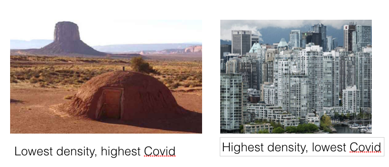
The first comes from the tragic explosion of Covid infections and deaths in the Navajo Nation, which now has the unfortunate distinction of having even more cases per capita than New York, despite being one of the most sparsely populated parts of the continent. Meanwhile, in contrast, our second postcard is of Vancouver, British Columbia, one of the continents five densest cities. We’ve updated our earlier analysis, and it shows that metro Vancouver has a lower rate of reported Covid-19 cases than any US metro area with a million or more population.
2. A Rosetta Stone for county-based city/suburb definitions. One of the most widely and frequently available sources of detailed geographical data for the US is gathered for the nation’s counties. Because it covers the entire nation and is a manageable and slowly changing set of boundaries, county data is handy for quickly analyzing nationwide geographic patterns of activity. Several very good scholars have used these county-level data sets to compare the growth and performance of urban and suburban areas. But as we explore, classifying any given county as urban, suburban, rural or some in-between category is anything but easy and unambiguous. This commentary lays out the differences for urban/rural classification systems used by the Brookings Institution, the Daily Yonder and Indeed economist Jed Kolko. Our results show that there are wide differences among these three quite reasonable approaches in counting which counties are urban, and how many people live there. For those who use county data, we also present a side-by-side translation of the three different definitions as applied to the nation’s largest metro areas, a kind of Rosetta Stone for interpreting the varied claims that are made about trends in urban, suburban and rural America.

3. Is the pandemic worse in cities? Hard to tell from county data. In the Corona-Virus pandemic we’ve all become much more county-centric than we realize. Because health data, like the number of reported cases and deaths due to the pandemic are collected by County Health Departments, these 3,000 or so varied government units have become the underlying geography for analyzing the virus. As we’ve noted, some analysts have tried to characterize the urban/suburban incidence of the pandemic by aggregating this county level data, using one of the three rubrics we examined in our previous commentary. We use our Rosetta Stone crosswalk to better illuminate the varying conclusions that these different analysts make about the geographic patterns of the pandemic.
Must read
1. Why cities are more resilient in the face of disease. Writing at The Conversation, epidemiologist Catherine Brinkley takes the long view of cities as a technology for coping with disease. When earlier epidemics, like yellow fever and cholera struck cities, we actually didn’t turn tale and leave, but instead remade our cities in ways that made them healthier for everyone. In the late 19th Century, cities invested in parks, to provide clean air, and freely available outdoor recreation to the masses, with the result that disease declined and health improved. Its now the case that in general, cities are healthier than suburban and rural areas, both because they facilitate a more active, healthier lifestyle; they also reduce car travel, which lowers the number of injuries and fatalities (something we’re seeing around the country in the pandemic). In addition, cities have been more resilient than lower density areas in coping with and recovering from past pandemics:
Yet while dense major cities are more likely entry points for disease, history shows suburbs and rural areas fare worse during airborne pandemics – and after. According to the Princeton evolutionary biologist Andrew Dobson, when there are fewer potential hosts – that is, people – the deadliest strains of a pathogen have better chances of being passed on. This “selection pressure” theory explains partly why rural villages were hardest hit during the 1918 Spanish flu pandemic. Per capita, more people died of Spanish flu in Alaska than anywhere else in the country. Lower-density areas may also suffer more during pandemics because they have fewer, smaller and less well-equipped hospitals. And because they are not as economically resilient as large cities, post-crisis economic recovery takes longer.
2. Urban Density is not the problem. State Senator Scott Wiener, and co-author physician Anthony Iton, writing in The Atlantic take head on the claims that density has worsened in Corona virus. Wiener and Iton point out that San Francisco, the nation’s second densest city, has done a well-above average job of containing the pandemic’s spread. They argue that most critics are incorrectly conflating housing over-crowding and higher urban densities.
But density and crowding are different things. Crowding is what happens when, due to a lack of sufficient housing, families and roommates are forced into tight quarters designed for a smaller number of inhabitants. That crowding can increase spread of contagion. Density in cities—where people can live in uncrowded homes near neighbors, services, and commercial corridors—doesn’t.
And in fact, our failure to allow more housing to be built in cities in the face of palpable demand, by limiting density, is what drives up housing prices and creates over-crowding. So far from being the cause of the problem, higher density in cities is one key to lessening the over-crowding that is a demonstrable contributor to pandemics.
New Knowledge
In the News
The New York Times quoted City Observatory director Joe Cortright in its on-line May 20, op-ed article, “How will cities survive the Coronavirus?:
 One of the industries most disrupted by the pandemic and related travel restrictions is travel and tourism. KGW-TV interviewed City Observatory director Joe Cortright on the likely impact on local lodging taxes in Portland.
