Does new construction lead to displacement?

A careful study of evictions in San Francisco says “No.”

There’s a widespread belief among some neighborhood activists that building new housing triggers displacement. We-and most economists are highly skeptical of that argument at the metropolitan level, but its at least theoretically possible that there could be some neighborhood effects, for example, that building a nice new building triggers a change in the perception of a neighborhood and makes the existing housing nearby more attractive and more valuable. (There’s the further un-stated assumption that this spillover effect more than offsets the downward pressure on prices from additional supply.)

If there was any place where one would expect to find this localized displacement it would be in the San Francisco. The city is famous for its extraordinarily expensive housing and the great difficulty with which new housing is approved. There are also many neighborhoods on the cusp of gentrification.

A recent study from the University of California’s Kate Pennington takes a close look at data on eviction notices in San Francisco to see whether new development leads to an increase in displacement nearby. Her overall finding is that new construction has no discernable statistical effect on the rate of evictions. Describing her findings on the effects of new market rate housing on nearby eviction rates, Pennington reports:

Each of these point estimates is a precisely estimated zero, no larger than 0.05 percentage points and always statistically indistinguishable from zero. This means that the monthly probability of an eviction notice being issued does not change due to the completion of new housing nearby

Pennington’s study is remarkably detailed and meticulous.  She gathers project-by-project and block-by-block data on new construction and inventories all of the eviction notices issued in San Francisco over the course of a decade.  She looks at eviction rates before, during and after construction of new housing, and disaggregates her analysis separately for market rate and affordable housing. She event separately analyzes more than 1,000 different housing projects to see if particular ones were associated with upticks in eviction activity.

Not surprisingly, the study has generated considerable controversy. Some anti-gentrification activists dispute the studies findings, claiming that the data is incomplete, and runs counter to their experiences.  Mission Local (a blog for the city’s Mission neighborhood) worries that:

. . . Pennington’s report could serve as a cudgel for the city’s YIMBY (Yes In My Back Yard) faction, which fervently advocates for a glut of new construction at all levels of affordability.

A key issue is whether legal eviction notices are a good proxy for displacement activity. Not all displacement is associated with eviction; some tenants are pressured or harassed by their landlords. But as Pennington argues, there’s little reason to believe that landlords prefer or are more likely to use these tactics rather than legal eviction procedures when new development occurs nearby.

If you were going to find a localized displacement effect as a result of new construction changing the character of a neighborhood and generating an upgrading spillover in adjacent properties, you would most likely find it in a city like San Francisco, where prices are high, supply is tightly constrained, and new development is occurring in dense urban neighborhoods. The fact that there’s almost no discernable impact of new construction on the rate of evictions is a strong signal that we ought to be focused much more on the price-ameliorating benefits of additional supply, and worrying a lot less about whether new construction causes displacement, even locally.

Kate Pennington, “The Impact of Housing Production on Legal Eviction in San Francisco,”  June 8, 2018

Why inclusive is so elusive, Part 5: Exclusive suburbs

Part 5. Are the nation’s richest suburbs really its most economically inclusive cities?

A statistical methodology that repeatedly flags high income suburbs as “inclusive” probably isn’t actually measuring inclusiveness.

(Editor’s note: This is the fifth in a five-part series examining a recent Urban Institute report that attempts to measure and rank the inclusiveness of U.S. cities. Be sure to read Part I, here, for a description of that report, and an overview of the issues it raises).

The Urban Institute’s report “Measuring Inclusion” tries to tease out the relationship between local economic performance and racial and economic inclusion. The report ranks the nation’s 274 largest cities based on measures of inclusion and economic growth, and flags several cities as “most inclusive.”  Upon closer inspection, though, the highest scoring cities turn out to be some of the nation’s wealthiest suburbs, places that are arguably, exclusive, rather than inclusive. That suggests that there’s either something wrong with our understanding of which kind of places are actually “inclusive,” or something wrong with the Urban Institute’s ranking system. We think its the latter.

A key claim of the Urban Institute report is that more inclusive cities are more prosperous. Here’s CityLab’s synopsis of the report’s findings:

One of their top-line findings: The ten cities faring the best on the inclusion metrics in 2013 were also flourishing economically. “There is a strong relationship between the economic health of a city and a city’s ability to support inclusion for its residents,” the authors write in the report.

What are these most economically inclusive places?  If you look at the Urban Institute report, there’s a clear answer: wealthy suburban enclaves.  Here are the cities that rank 1 through 10 on the list of the most inclusive cities in the United States. You’ll find the nation’s highest income city (Naperville Illinois) on the list, along with other recognizable upper-end suburbs like Torrance, California, Bellevue, Washington, and Overland Park Kansas.  None of the top ten “inclusive” cities, per Urban Institute, is the principal city of a metropolitan statistical area. Livonia is a suburb of Detroit, Fremont, a suburb of San Francisco, Bellevue a suburb of Seattle, Naperville, a suburb of Chicago, and so on.


On its face, it seems difficult to think of these places as “inclusive.”  In fact, a pretty good case could be made that they’re some of the most exclusive large cities in the US.  All but two of the ten rank among the top 20 in median family incomes. Plus, the price of living in these neighborhoods–which we’ve gleaned from the latest Census estimates of median home value–is extremely high, six of the ten “most inclusive” cities have a median home value of more than $600,000. Unsurprisingly, very few “working poor” people can afford to live in these places.

Urban Institute’s methodology, which ranks economic inclusion based on city-level economic segregation (do high income and low income city residents live in different neighborhoods), on median income, on the share of the working poor, the number of rent-burdened households, and the share of 16-19 year olds who are neither employer nor in school, are all skewed to detect high income households.These places all rank high on these measures, not because they are inclusive, but because they’re exclusive: the combination of single family zoning and expensive home prices and few apartments mean that few low income people can afford to live there. That’s why the fraction of the working poor population in these cities is so small.

The residents of these enclaves don’t enjoy success because they live in these cities, they live in these cities because they are economically successful. The combination of high housing prices and local land use restrictions means that the working poor simply don’t have the option to live in these cities. They score well on the Urban Institute Index not because they are economically inclusive, but because they are economically exclusive.


Why inclusive is so elusive, Part 4: Metropolitan context

Part 4. Are racially and economically homogeneous cities and suburbs in a segregated metro “inclusive?”

Looking only at disparities within cities misses the often far larger disparities across cities within in single metropolitan area.

(Editor’s note: This is the fourth in a five-part series examining a recent Urban Institute report measuring and ranking city-level inclusiveness. Please read part 1 for an introduction to the report, and an overview of the issues it raises.)

The Urban Institute’s “Measuring Inclusion” report looks at both racial inclusion and economic inclusion, and ranks US cities based on a series of factors. As we’ve suggested, cities are far from ideal units for measuring inclusion; city boundaries are varied, and in many cases were constructed to divide metropolitan areas by race; often times city policies produce exclusionary results.

In the Urban Institute report, racial inclusion is defined as a composite of a segregation index (confined to looking at segregation within city limits), and the disparity between people of color and whites in homeownership, educational attainment and poverty.  These measures ignore the level of indicators (whether education is high or low) and only look at differences between groups. So if whites and people of color have have similarly low levels of say educational attainment, a community is regarded as more inclusive.

Let’s just zero in on the Detroit metropolitan area. Keep in mind:  Metro Detroit is by one common measure–the black/white segregation index–the most segregated large metro areas in the US. Here’s the 2010 ranking of US metro areas from Brown University’s US 2010 project:

Source: Brown University, US2010.

According to the Urban Institute analysis, the City of Detroit is a paragon of racial inclusion (ranking 11th of 274 cities), and so too, are its suburban cities of Dearborn (49th) and Sterling Heights (43rd).  Detroit is 90.9 percent persons of color, and Dearborn is 12.4 percent persons of color (271st) and Sterling Heights 17.3 percent persons of color (264th). To look at these cities in isolation is to pretend that they are different worlds, not connected to one another in any meaningful way. But anyone with a casual familiarity with the politics of local government and racial history in the US will know that is parsing willfully blinds us to the underlying problem.

The broader region–Detroit and all its surrounding suburbs–is profoundly segregated, moreso than every other major metropolitan area in the US. You cannot find any central city with a share of persons of color differs more from that of its suburbs than Detroit. But to read the UI report, one would believe that both the City of Detroit, and its surrounding suburban cities are exemplars of racial inclusion among American cities, all ranking in the top 20 percent of American cities in racial inclusion.

What’s driving the high racial inclusion ranking for Detroit and many of its suburbs is the fact that there are very small racial gaps in poverty rates, educational attainment and homeownership. The City of Detroit ranks in the lowest 10 percent of US cities for the poverty gap, education gap, and homeownership gap. But this is only because the city’s population, regardless of race, is so poor, and because so many people with choices, regardless of race, have moved away, leaving a poor, but equal population. Detroit is inclusive in its immiseration.

Nor is this peculiar to Detroit: other industrial cities experiencing population losses, such as Gary, Indiana, and Camden New Jersey also score highly on Urban Institute’s measure of racial inclusion–16th and 13th respectively, again out of 274.

The disparity between metropolitan and principal city scores for segregation extends to economic segregation as well. Again, let’s focus on Detroit.  The City of Detroit, according to the Urban Institute report has the lowest level of income segregation of any of the principal cities in the 50 largest US metro areas. But the Detroit metropolitan area is one of the five most economically segregated large metropolitan areas, according to the data compiled by Reardon and Bischoff.
The city of Detroit scores well on economic segregation because it is uniformly poor. The Detroit metro area scores poorly on economic segregation because the region’s poverty is concentrated in the principal city, and its higher income households are concentrated in suburbs. Looking just at segregation within city limits conceals the region’s high level of economic segregation.

Overall, there’s actually very little correlation between principal city economic segregation and metropolitan economic segregation. As a result, city level data don’t serve as a proxy or parallel for regional economic polarization. Looking just at city level segregation data misses big variations in regional income segregation. The following chart shows principal city economic segregation from the Urban Institute report on the vertical axis and metropolitan economic segregation on the horizontal axis.  Larger values on both axes correspond to higher levels of economic segregation.

In our view the high racial and economic inclusion rankings that the Urban Institute report assigns to Detroit (and similar cities) are a clear sign that its methodology is not well-aligned with our understanding of what really constitutes inclusivity. Looking only within individual city boundaries, and ignoring the larger metropolitan context, especially the patterns of segregation among cities within a metropolitan area, produces a highly distorted view of which places are inclusive and which aren’t.

Why inclusive is so elusive, Part 3: Annexing growth

Part 3.  Do annexations and mergers constitute economic growth?

Not adjusting city job growth estimates for changes in city boundaries produces misleading estimates, especially when used for comparing and ranking cities.

(Editor’s note: This is part 3 of a part of a five-part series examining a recent Urban Institute report measuring and ranking city-level inclusiveness. Please read part 1 for an introduction to the report, and an overview of the issues it raises. In part 2, we argued that city boundaries are a poor basis for comparing different regions, and that city limits seldom capture the imprint of exclusion.  Today, we point out that changes to city boundaries over time make them a poor basis for gauging economic success, one pillar of the Urban Institute report.)

The Urban Institute’s recent report, Measuring Inclusion, focuses heavily on the relationship between economic growth and inclusiveness. Does economic growth promote inclusion? Is inclusiveness helpful for stimulating growth? These are clearly interesting and important questions.

Setting aside for a moment whether city boundaries correspond to functional economies (they mostly don’t), a critical question is whether data reported for cities is comparable over time. The problem is that city boundaries often change from year to year. Some cities, especially suburban ones, grow through the steady addition of land via annexation. More rarely, but more sizably, some cities merge with their surrounding counties to form a new, and much larger jurisdiction. And importantly for time-series analysis, there are wide variations among cities in the contribution of mergers and annexations to growth: Many cities are land-locked (surrounded by other jurisdictions), or are in state’s where annexation is difficult and rare; while other cities–edge suburbs, are continually in the process of growing via annexation.

Calculating employment growth rates without making allowance for the effects of boundary changes makes raw city growth data a very poor basis for comparing the economic health of cities over time. But, unfortunately, that’s exactly what the Urban Institute report does. Measuring Inclusion highlights four cities for case studies, based in part on their strong economic growth, measured using city boundaries.  But three of these four case study cities–Louisville, Columbus, Ohio, and Midland, Texas, have all expanded significantly via annexation in the years covered by this study. As a result, we believe that it’s problematic to draw any lessons from these cities about the connections, or lack thereof, between economic success and inclusion, which is at the heart of the Urban Institute report.

Louisville was a job growth laggard, not a world-beater (once you correct for the merger)

To get a sense of how this can affect the results, take a close look at the City of Louisville, which merged with surrounding Jefferson County in 2003.  The UI report indicates that employment in the City of Louisville chalked up an extraordinary 150 percent job growth between 2000 and 2013.  As Urban Institute reports, this was the fastest increase in employment in any city in the US, which resulted in Louisville having the fourth highest ranking on economic performance of any of the 274 cities UI examined.

But this growth was driven entirely by the merger. Comparing employment totals for the old city limits in 2000 with the expanded county-wide totals in 2013 recasts the merger into economic growth. It’s actually quite easy to correct for this by comparing growth rates for a standard geography–Jefferson County–in both 2000 and 2013. Below, we show the wage and salary employment totals reported by the Bureau of Economic Analysis for Jefferson County from 2000 to 2013. Rather than increasing by 151 percent, employment in the county actually decreased by 2.1% (falling by about 10,000, from 470,000 jobs in 2000 to 460,000 jobs in 2013).  Once we correct for this boundary change, Louisville’s supposed employment growth goes from 1st fastest to 241st (out of 274).


This also has a material effect on the city’s overall economic prosperity ranking. Rather than a positive z-score of 5.467, employment growth was -2.1 percent which translates into a is was  z-score of -.788, which in turn lowers the city’s composite economic health score. The Urban Institute report ranks Louisville fourth overall based on a combined z-score for job growth, unemployment rate, vacancy rates and median family income.  If we adjust just the job growth number to accurately reflect the decline in employment in Jefferson County, this lowers the overall economic health score from +1.29 to -.273; this lowers the Louisville economic health ranking from 4th highest to sub-par 185th (out of 274 cities studied).  This is important because the study classifies Louisville as having experienced a recovery between 2000 and 2013 (it actually declined), and then makes the city one of four success stories selected for further analysis in the report.

Annexations helped drive job growth in other case study cities

While Louisville’s city-county merger is the most dramatic example of how boundary changes can distort the meaningfulness and utility of raw employment growth rates, its clear that this affects a number of other cities as well. Two of the four other cities selected as examples of successful economic growth (Midland Texas and Columbus Ohio), have both had growth fueled by annexation. Midland, Texas has regularly annexed growing areas adjacent to its city boundaries.  The city’s annexation map shows a patchwork of annexations.

Columbus, Ohio, is another city that has expanded substantially by annexations. Since 2000, the city has added more than 8,500 acres through 400 annexations, expanding the total size of the city by about 6 percent. It’s much more difficult to tease out the contribution of annexations to job growth, but importantly, because some cities are annexing aggressively, while others aren’t, un-adjusted job data provide a poor basis for making cross-sectional comparisons.

In sum, municipal boundaries are a poor choice for assessing economic performance, both because cities are incommensurable units, and, as this brief examination shows, annexations and mergers can easily distort growth statistics. As a result, the economic performance statistics reported in the Urban Institute report Measuring Inclusion, don’t provide a reliable or accurate indication of which cities are economically successful, and consequently don’t provide any reasonable basis for drawing conclusions about the connections between racial or economic inclusivity and economic performance.

Why inclusive is so elusive, Part 2: The limits of city limits

Part 2. Are city boundaries the right way to measure inclusion?

Municipal boundaries produce a myopic and distorted view of inclusion; the boundaries themselves were often drawn to create exclusion

(Editor’s note: This is the second in a five-part series examining a recent Urban Institute report that attempts to measure and rank the inclusiveness of U.S. cities. Be sure to read Part I, here, for a description of that report, and an overview of the issues it raises).

The Urban Institute report “Measuring Inclusion” uses data for the nation’s cities, i.e. following municipal boundaries to define and measure economic and racial inclusion and economic performance. In our view this is a critical, and problematic choice, especially if we want to compare and rank different cities on these measures, which is the central premise of the Urban Institute report. For very good reason, the standard for most scholarship looking at issues of segregation, for example, is to look an entire metropolitan areas, because they are defined in a relatively consistent fashion.

Cities are incommensurable units, especially when it comes to describing their inclusiveness and economic performance. Some cities are the core of an urban area, while others are largely or entirely suburban. So for example, Atlanta and Austin are both cities, but so, too are Overland Park, Kansas, Scottsdale, Arizona, and Bellevue, Washington (all much wealthier and whiter suburban cities than the central cities in their metro areas). Some cities are isolated and rural while others are a small part of a much larger metropolitan area. Older central cities tend to be landlocked on all sides by surrounding suburbs.

A big part of the problem is that city boundaries are just the wrong units for assessing whether a region is achieving inclusive outcomes. We know that many cities–especially suburban ones–were formed and had their boundaries drawn specifically to achieve exclusionary ends. They include some people and exclude others. Looking only within city boundaries to assess inclusion means that you are effectively blinded to the way these boundaries themselves are a cause or contributor to racial and economic exclusion.

While much of the race and class gerrymandering of municipal boundaries is a settled historic fact, it remains a current topic. For example, consider the drama currently being played out in suburban Atlanta, where the wealthy neighborhood of Eagle’s Landing is looking to hive off into a separate city from Stockbridge, of which it is currently a part. Incomes in Eagle’s Landing average $126,000, almost double the rest of the current city of Stockbridge.

The Urban Institute’s measures look only at the racial and economic composition of a city, and not at all at the larger metro area in which it may be situated. Segregation indexes are constructed so that they aren’t influenced by the variations in the racial ethnic composition of different jurisdictions.

Metro areas, particularly when confined to specific size ranges, make better (though not perfect) units for comparison.  Their boundaries are set using a common rubric (tied to the commuting patterns of workers and the size of the labor market), and so they encompass entire functional regional economic units, rather than varied fragments of a regional economy.

A key part of the trouble with cities is that people are sorted among cities within a metropolitan area, not randomly, but by a combination of economic and political factors and personal choices. If rich people opt out of distressed central city neighborhoods, and only poor people remain, the measured inclusion of the central city increases, according to the Urban Institute methodology because the remaining residents are statistically more equal.

The bottom line is that using city boundaries as a lens for measuring inclusion will almost certainly produce a distorted picture. The pattern of city boundaries is an intrinsic aspect of the way exclusion is achieved and maintained in the US, and it is the sorting of people of different races, ethnicities and incomes into a region’s different cities that is a principal manifestation of exclusion and segregation. Municipal measures blind us to these fundamental facts.

Why inclusive is so elusive, Part I

Inclusiveness is a worthy policy goal, but in practice turns out to be devilishly hard to measure. A recent report from the Urban Institute shows some of the pitfalls: looking just within city boundaries ignores metropolitan context and gives a distorted picture of which places are inclusive.

(Editor’s note:  Over the next several days, City Observatory will be taking an in-depth look at a recent report from the Urban Institute that attempts to measure and rank the inclusiveness of US cities. “Inclusion” has become one of the most popular buzzwords in the urban realm right now. While it seems like the term is simple, and agreement over its merit–the idea of reducing unwarranted inter-group disparities–the practical business of defining and measuring it is not at all simple.)

Achieving a more inclusive nation,  more inclusive metropolitan areas, more inclusive cities, and more inclusive neighborhoods is a critical national priority.  Fifty years after the Fair Housing Act, America remains deeply divided by race, and there’s strong evidence that we’ve become more segregated by income. As we’ve stressed at City Observatory, concentrated poverty makes all of the pathologies of poverty worse. But this is not a simple problem, and is difficult and potentially misleading to characterize with seemingly obvious statistics relating inter-group disparities within cities. We think a recent Urban Institute report, Measuring Inclusion in America’s Cities, while well-intentioned, falls prey to some of the complexities of describing the nature of segregation and separation.

We want to stress that we have enormous respect for the researchers at the Urban Institute: over the years we’ve learned tremendously from their work. We and everyone who cares about cities has a huge debt for their scholarship and advocacy. They’ve provided powerful evidence of the huge economic and human toll continuing racial and economic disparities in their report “The Cost of Segregation.” Our own report on concentrated poverty Lost in Place, draws liberally from the canonical work by the Urban Institute. The critique presented here is meant to advance our shared understanding of how we can build more inclusive cities. We conferred with the authors of the report earlier this year and shared these concerns with them. The analysis presented here remains solely the responsibility of City Observatory.

Our analysis is divided into five parts. First, we address some of the broad conceptual issues in defining inclusiveness, and explore why disparities and inequality, particularly when measured for small geographies defy easy interpretation. Part one is presented in this commentary; future commentaries will address the other four issues. Second, we take a close look at the limits of city boundaries as a frame for measuring inclusion,arguing that the varied and fragmentary geography of cities is a poor lens for understanding actual  disparities,. Third, we explore a particular problem of using cities to measure change over time, showing that annexations and boundary changes easily confound measurement and comparisons. Fourth, we question whether racially homogenous cities in a deeply segregated metropolitan area can be regarded as meaningfully inclusive. Fifth, we ask whether it’s appropriate to rank some of the nation’s wealthiest suburbs as its “most inclusive” communities.

This post introduces the Urban Institute report, and considers discusses the difficult and often paradoxical connections between city inequality, diversity and inclusion.


If there’s a mantra in urban economic development, its all about inclusivity.

The Urban Institute Report:  Measuring Inclusion

Earlier this year, the Urban Institute released a new report, “Measuring Inclusion in America’s Cities.” The study is based on developing a series of metrics of racial disparities, income disparities and economic performance of the nation’s 274 largest cities, and examining how these have changed over time. It aims to benchmark where cities stand on inclusion, understand how inclusion relates to economic growth, and provide lessons for policy makers.

The report attracted predictable attention.  CityLab‘s article “America’s Most Inclusive Cities, Mapped,” called the report a “roadmap for a deliberate effort to mitigate the forces that have created unequal communities.”  Next City’s story, “Why it matters who get’s to shape a city’s economy,” reported that Urban Institute’s researchers had identified four cities–Louisville, Lowell, Midland and Columbus, OH, that had experienced “inclusive recoveries,” i.e. growth their economies and made progress on measures of racial and economic inclusion. As CityLab related:

 The ten cities faring the best on the inclusion metrics in 2013 were also flourishing economically. “There is a strong relationship between the economic health of a city and a city’s ability to support inclusion for its residents,” the authors write in the report.

We’ve taken a close look at the report, and while well-documented and certainly well-intended, we’re concerned that some of the metrics it offers and some of the findings it presents make an already tortuously difficult policy area even more confusing.

Part 1. What constitutes “inclusion?”

Paradoxically, at the very local level equality is fundamentally at odds with inclusion

On its face, it seems like defining inclusion would be simple. It ought to be the absence of disparities in a community. But the reality its much more complicated. Measured economic disparities in a city can be very small, if for example, everyone is rich or everyone is poor.

Urban Institute’s report measures two different dimensions of inclusion, racial inclusion and economic inclusion. In the case of racial inclusion, they look at segregation (whether the white and non-white residents of a particular live in different or similar neighborhoods), and whether there are disparities in educational attainment and home-ownership between whites and non-whites. They also look at the total fraction of the population of a city that is non-white.

In almost every case, the Urban Institute report defines inter-group disparities as an indicator of a lack of inclusion. If, for example, homeownership rates differ greatly between persons of color and whites, that suggests an area isn’t inclusive.

With each of these measures, cities score highest if they have very little inter-group variation.  If white and non-white incomes, unemployment rates, and homeownership rates are very similar, the Urban Institute defines an city as “inclusive.” For example, if everyone in a community is high income, regardless of race or ethnicity, then it is “inclusive.”  Similarly, if everyone in a community is low income, regardless of race or ethnicity, then it is also “inclusive.”

Equality is not the same as inclusivity

There’s some merit to this idea, but it’s really focusing on “equality” rather than “inclusion.”  It’s entirely possible for a community to be “equal” without at all being inclusive.  In fact, communities that are exclusive tend to be highly equal.  If, for example, you have a community where all housing costs at least $500,000 and there are no apartments, , it’s unlikely that you will have many poor, or unemployed, or renters. And it may be that there are very limited economic disparities between residents of different racial and ethnic groups (everyone who can afford to live in such a community, regardless of race or ethnicity, almost certainly has a high income).

Conversely, very inclusive places, where people of widely varying incomes reside, almost by definition have high levels of inequality. A community composed of equal measures rich and poor, homeowners and renters, and with a wide variety of housing sizes and types, including mansions and public housing, will have larger measured disparities in incomes, in homeownership rates, in poverty and so on. It’s a seeming paradox: a place that is truly diverse and inclusive, whether measured by income or race and ethnicity, by definition needs to unequal.

This is not the first time this issue has arisen: We’ve pointed out that applying a broad standard of equality to small geographic areas produces a kind of weird parallax effect: places that have low levels of measure income disparity tend to be homogenous (usually all rich, or all poor), meaning that they are either exclusive or failing. We wrestled with this issue in our own recent report America’s Most Diverse, Mixed Income Neighborhoods rather than labeling them racially or economically “inclusive,” we opted for neutral, statistical language “diverse” in the case of racial/ethnic characteristics, and “mixed income” in the case of economic characteristics.

The bottom line is that a truly inclusive place may in fact have high levels of measured disparity. As a result, there’s an important conceptual flaw in metrics that focus solely on the localized presence of disparities to discuss inclusion.  We think that’s a key reason to question the usefulness of the Urban Institute’s metrics. We’ll explore how this conceptual problem plays out across metropolitan areas, in central cities, and in suburbs, in the next posts in this series.

Let’s stop with the absurd surveys masquerading as serious research

No:  Eighty percent of today’s 8 to 23 year-olds won’t be buying houses in the next five years

At City Observatory, we get a regular stream of press releases and media advisories about the results of surveys and other market research, purporting to tell us the preferences of the American people. Some of what we get is carefully researched, thoughtfully presented, and genuinely useful–we really appreciate the insights we get from the likes of Zillow, Redfin, ApartmentList, Indeed, and BuildZoom. These companies have very smart researchers, undertake careful, disciplined research efforts, and are transparent about their data and method. Thanks to them, we have more detailed and more timely data on a range of markets, especially housing markets.

But some of it is abysmal, with sloppy and questionable “research” which is actually thinly-veiled self-promotion and click bait. We get entreaties from their media relations staff inviting us to share their surveys with our audience. The latest of these is a survey commissioned by real estate firm “Property Shark,” which purports to reveal generational trends in home-buying patterns.  Ordinarily, we’d just click “delete” and look the other way.  But this particular survey is so genuinely awful and demonstrably wrong, than we can’t help but call it out.

The study’s headline finding is that “Gen Z is keen on entering the real estate market as soon as possible – a whopping 83% of Gen Z plan to purchase a home within the next 5 years.”

Survey says . . . Absolutely nothing.

Let’s unpack that claim, shall we?

The definitions people use for different generations are a bit slippery, but this study says GenZ is persons born between 1995 and 2010.  That means that these people are between the ages of 8 and 23 today, and will be between the ages of 13 and 28 in 2023, i.e. five years from now.

There are several problems with this assertion.  First, it’s unclear how many 8 year-olds , or 12 year-olds or even 18 year-olds, actually have given serious thought to homeownership.  (And this is the group that the survey claims to have reached via Amazon’s mechanical turk; the press materials claim, in our view preposterously, that “Our survey sample size has a 3% margin of error and a 99% confidence level.”  That implies that they’ve got a statistically valid random sample of that entire age group.

Second, assuming that virtually no one under age 18 is financially or legally able to own a home, in order for this prediction to become true the homeownership rate for persons 18 and older would be 100 percent in just five years. (Even that wouldn’t get you to an 83 percent homeownership rate, because about 30 percent of the persons in this age group would be under 18 in 2023.)

Third, and perhaps most importantly, the current homeownership rate for persons aged under 25 to 34 is about 37  percent.  So if you believe this survey, you think that the homeownership rate for 13 to 28 year olds will be something like 80 percent in just five years.  This would be a pretty stupendous reversal: homeownership among 25 to 34 year olds has fallen 8 percentage points in the past decade. It would also mean that these very young people would have a higher homeownership rate than any other demographic group: Millennials, GenX or BabyBoomers.

If its headline finding is that wrong, it’s clear that we can safely ignore all of the survey’s other claims about what size house, neighborhood characteristics and home amenities these GenZers prefer. If a 16 year-old claims they’re going to be a homeowner in the next five years, you can be their estimate of the number of square feet that they’ll buy is even more unreliable that their ability to know whether they could even afford to own a home.

While this is a far more egregious example than most, it is emblematic of more common surveys that ask people whether they would “like” to own a home.  Obviously, and correctly, most people associate homeownership with wealth. Generalized questions about the desirability of homeownership may simply be surrogates for asking “would you like to be wealthy and successful.”  These kind of open-ended, aspirational questions seldom test this in any meaningful way by asking about trade-offs between alternatives.

We realize, of course, that we’ve played right into the hands of Property Shark’s media team. They’ll no doubt duly mark down our mention–and your eyeballs–as “earned media” for their website. But if they’re this cavalier about what they put out as “research,” then you would be well advised to discount heavily whatever else they might be telling you about real estate markets (and we suspect that they actually have some information of value to share). In the future, though, if they’re going to undertake the effort to do research and share it–and they actually want to enhance their reputation, rather than diminish it–they might want to take a few notes from the Zillows, Redfins and other’s we mentioned early on.  If they do, we’ll be happy to share–and praise–their work.


The limits of localism

Overselling localism is becoming an excuse to shed and shred federal responsibility

Our friend, and director of the Brookings Institution’s Metropolitan Policy Program, Amy Liu, weighs in with a timely commentary on the limits of localism. As regular readers of City Observatory will know, we’ve been concerned that the soaring rhetoric of those enamored of local solutions distracts attention from the way in which critical elements of the federal system are being dismantled. Chief among the proponents of localism have been Bruce Katz and Jeremy Nowak, authors of the book “The New Localism.”

Though she doesn’t mention Katz and Nowak by name (there is a link to an article they’ve written), Amy Liu lends her voice to those concerned about the limits of localism in her CityLab article “The limits of city power in the age of Trump.”  Her argument closely parallels the one we’ve made here:

. . . city boosterism can also go too far: Urging city leaders to go it alone celebrates a deep dysfunction in federalism—and it normalizes a self-destructive shift in politics and governance.

For instance, the Trump administration is using the narrative of increased local capacity to justify draconian cuts to federal support for cities, from transit programs, community development financing  to the entire Economic Development Administration.

We would hasten to add that likely cuts to social service programs, ranging from Food Stamps, to Medicare and Medicaid, and housing assistance will all amplify the problems faced by cities. In effect, the abdication of national responsibility for these core functions transforms these issues into “local” problems, ones that are disproportionately visited on some cities, and which in many cases are insoluble at the local level.

For reference, we’ve reproduced our original critique of The New Localism here.  We also invite our readers to read Bruce Katz and Jeremy Nowak’s response, which was published at CityLab.

We also want to take this opportunity to share with Bruce and the urbanist community our condolences for Jeremy’s passing. Jeremy was an intellectual force and an inspiration. He will be missed.

Why we’re skeptical of localism

As our name City Observatory suggests, we’re keen on cities. We believe they’re the right frame for tackling many of our most important problems, from concentrated poverty to housing affordability, from economic opportunity to more sustainable living. But enamored as we are of cities, we harbor no illusions that cities, by themselves, can solve our most pressing problems.

In the past year, a growing chorus of voices, disillusioned by growing polarization, has called for cities to be our saviors.

Take Richard Florida’s description of the latest of these “The New Localism.”

“In a time of national dysfunction and, frankly, gloom, our best hope for our society lies in our cities and metropolitan areas. That’s the message of the newly released book The New Localism, by Bruce Katz, the noted urbanist at the Brookings Institution, and Jeremy Nowak . . .”

In one of the oddest of imaginable odd couples, Florida himself co-authored a Daily Beast op-ed with perennial sparring partner Joel Kotkin, that called for us “To reunite America, liberate cities to govern themselves.”  The article effectively concedes that the divisions between the blue places and the red ones are irreconcilable, and each ought to be free to go its own way.

With control of the national government in the hands of a president of debatable competence and a Republican party seemingly intent on dismantling the federal government, it’s not surprising that many people are looking for reassuring alternatives. Hoping cities can save the day Is in many respects an effort to make a virtue of necessity. Katz and Nowak relate a litany of instances of Mayors and other civic leaders working above or across partisan and sectoral divides to tackle important problems their cities face.  Their approaches are refreshingly innovative, direct and often productive.

The productivity of these cities is equally attributable to the pragmatism of their leaders and the solidly blue political compositions of their polities. Large US cities are overwhelmingly blue. And to the extent you find Republicans in cities, they tend to be the most moderate kind. If you’re a Democrat, you find yourself wishing that all Republicans were like Mick Cornett or Michael Bloomberg.

There’s an understandable impulse in the face of growing national divisions and what for many was the shocking and unpleasant outcome of the 2016 national elections to retreat to a comforting cocoon of the like-minded. Blue cities will do all the things that a solidly Republican national government won’t do: respect LGBTQ rights, provide sanctuary for immigrants, denounce climate change, and tax themselves to pay for needed investments and public services. But withdrawing to the safety of agreeable blue localities cedes the important national battle at just the time when it needs to be contested.

It is well and good to celebrate the successes that mayors and local leaders are having. But transforming these heartening but small successes into a sweeping call for a new localism is misplaced when the fundamental functions of the national government are being steadily undermined. None of this works in a world in which the federal government is not simply rending holes in the safety net but knocking down its foundations.

We should remember that the federal government took on the roles it did almost entirely as a last resort. As Churchill reputedly remarked, “America can always be counted on to do the right thing, but only after it has exhausted all the other alternatives.”  While the rest of the world’s nation states adopted the trappings of modern social democracies, the U.S. was late to implement things like unemployment insurance, social security and universal health care. The New Deal, the Great Society and Obamacare were only enacted after various local and state programs to address these problems were simply overwhelmed.

What cities do badly or can’t do at all

Cities are not merely ill-equipped to tackle our major challenges on their own. Localism has an undeniable history of making many problems worse. Take two big issues of our time:  climate change and surging inequality. Mayors and cities can strike a pose and demonstrate effective tactics, but they lack the policy throw-weight to solve these problems.

Bravo for mayoral pledges to adhere to the Paris accords, but there’s precious little substance and sufficient scale. New York Mayor Bill de Blasio can sue the oil companies but is an ardent opponent of congestion pricing, a tangible, effective market-oriented step that would reduce the number one source of greenhouse gases. It’s almost impossible to imagine that we’ll take effective action to address climate change unless it’s done at a national level in cooperation with the rest of the world. Without a federally imposed carbon tax or cap and trade, localized efforts are likely simply to relocate the dirtiest pollution to the most permissive states.

Similarly, inequality—which has been dramatically worsened by changes to the federal tax code—dwarfs anything cities can do. Cities are constitutionally incapable of redistributing income because the wealthy have the option of exit (which they have regularly done.) Witness the exodus to suburban enclaves, a trend Robert Reich has termed the secession of the successful. Similarly, states and cities have been largely powerless to take on large corporations. Not only has globalization moved a considerable part of corporate earnings beyond the reach of state and local tax collectors (note Apple’s relocation of its profits to Ireland thanks to U.S. tax laws), but look at the way states and cities are falling over one another to offer tax holidays and subsidies to Amazon for its proposed HQ2.

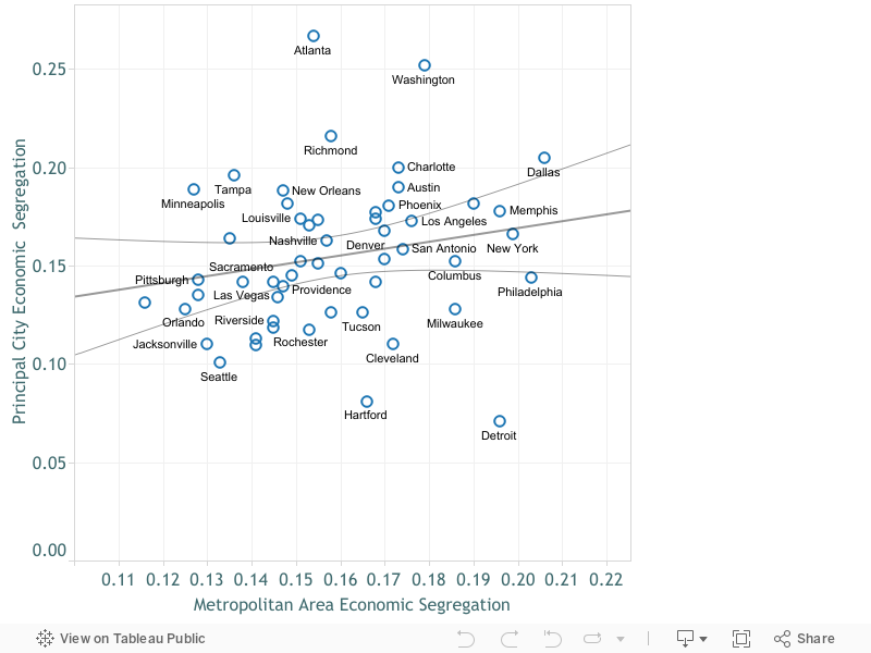
It’s also worth noting that a key aspect of localism that has been effectively exempt from federal control—local control of zoning and land use—has worsened the economic segregation of our nation’s metropolitan areas.  In sprawling metros, separate suburban cities have used the power of land use regulation to exclude apartments, directly contributing to the problem of concentrated poverty that intensifies and perpetuates the worst aspects of income inequality. Cities have been implicated in the nation’s housing affordability and segregation problems, but that’s hardly mentioned in Katz & Nowak. The word “segregation” appears only once in the book (page 40). The word “zoning” occurs on 8 pages. Housing affordability is mentioned just once (page 28).

The root of the problem here is too much localism. The most localized governments have the strongest incentives to exclude neighborhood groups within cities lobby against density. Suburbs within metropolitan areas do the same. Only larger units of government have the incentives and ability to challenge this kind of parochialism. Notably, two initiatives of the Obama administration–HUD’s affirmatively furthering fair housing rule and the Council of Economic Adviser’s critique of local zoning–represented important national steps pushing local governments to confront this issue. Both are going nowhere under the current administration.

Assume we have a can-opener: Cities can’t do this without a strong federal government.

The danger here is that these calls to renewed localism effectively aid and abet the ongoing efforts to systematically dismantle federal programs.  The clarion call to act locally diverts our political attention from the national stage and perhaps, unwittingly, becomes an excuse to stand by and watch these foundational programs be destroyed. Katz and Nowak briefly address this question of the federal role early in their book:

“. . . the devolution of power and problem solving to local levels is not an argument against the importance of federal and state governments.  . .  The federal government must do things that only it can do, including safeguarding national security, providing a stronger social safety net than it presently does, providing guarantees of constitutional protections and civil rights, making smart national infrastructure investments, protecting natural resources, protecting the integrity of markets and funding scientific research, innovation, and postsecondary education to keep the nation competitive.” (Katz & Nowak, page 10).

Oh, is that all? This caveat swallows the book’s premise. Localism will work brilliantly–provided we have an extraordinarily competent, generous, fair and functional federal government.

In effect, it’s a reprise of the classic economics joke about the physicist, chemist and economist, trapped on a desert island with cases of canned food but no way to open them. The chemist proposes evaporating seawater into a potent brine and letting the salt solution rust the cans open. Too slow, says the physicist, who works out the exact angle from which to drop the cans onto sharp coral and cause them to split open. The economist waves them both away and says, “I have a simpler, much more elegant solution.  Let me explain:  First, assume we have a can-opener . . ”

A competent, generous, fair and functional federal government is the can-opener.

One more point should be made: Many of the innovative city strategies celebrated in this book are directly dependent on the ability of mayors and city institutions to tap into federal largesse. Take Pittsburgh, heralded as an exemplar of local innovation. Katz and Nowak acknowledge that Carnegie Mellon and the University of Pittsburgh receive more than $1 billion in federal research funding annually (page 75). Cities looking to exploit an “eds and meds” strategy can’t do it without huge federal support in the form of research grants, student aid, Medicare, Medicaid and the Affordable Care Act. A federal government that defunds these programs—as seems likely because of the new tax reform law—will make it all but impossible for cities to innovate.

Laboratories, not factories

Katz and Nowak marshal an impressive list of inspiring local innovations from cities, such as Indianapolis, Chattanooga, Oklahoma City and St. Louis. Mayors and civic leaders in these places are generally pragmatic and entrepreneurial and are developing solutions that cut across partisan and ideological lines. Cities are, as the saying goes, the laboratories of democracy. But for the most part, they are the small-scale, bench-test laboratories for incubating ideas and showing that they can work at a municipal scale. Implementing these ideas at a national scale is essential to their success.

The key lesson of policy experimentation is that while ideas can be tested and refined at the state or local level, they ultimately need to be national in scope. States experimented with minimum wage laws, unemployment insurance, and old age pensions, but none of these were began to address our problems until extended nationwide in the New Deal.

For a long time, we could take the federal government more or less for granted.  There was no hope that it would ride to the rescue, but at least it would keep doing what it had always done: cashing social security checks, bankrolling medical care for the poor and aged, enforcing a minimum of civil rights everywhere, engaging seriously with the rest of the world on global issues. Now, every one of those fundamental roles is very much in jeopardy.  If the poor lose health care, are turned out of subsidized housing, see their education prospects dim, that will directly add to the costs burdening states and cities. The pressure to fill in for a diminished federal presence will greatly handicap local innovation.

Like Localism? Time to fight for an effective national government

If you care about cities and believe local initiative can lead to solutions, you need to be marching on Washington and fighting for a federal government that does its job well.  The hollowing out of the federal government now underway is the clearest threat to creative, effective localism. Ultimately, the magic of our federal system is that both national and local government have important and complementary roles to play. It’s not either/or. It is both/and. Innovative cities require a supportive federal government.

Rather than turning their backs on the federal government and national debates, cities and civic leaders ought to be pooling their energy and efforts to kindle a new dialog about how we appropriately divide responsibilities between national and local governments. We must insist that the national government do its job well and that it provide the room and in some cases some of the resources to help cities tackle problems at a more local level. We need a 21st century federalism that envisions strong and mutually supporting actions at both the national and local levels, not a retreat to homogenous but balkanized localities.


An affogato theory of transportation

Coffee and ice cream and jam (or traffic jams)

Just once, we are going to sugar-coat our commentary.

Affogato (1912Pike.com)

At City Observatory, we know that a lot of what we present is highly technical, especially when it comes to understanding the complex and dynamic problems of transportation. But when it comes to transportation policy, two of the most important lessons you can remember can be summarized in an analogy to a single beverage: the affogato.

The affogato, as you know, consists to two parts:  gelato and espresso.  You pour a freshly brewed espresso over a healthy dollop of gelato, and there you go.  To us, each of the ingredients of the affogato ties directly to a simple story about how transportation systems work.

Gelato:  The Ben and Jerry’s Theory of Traffic Congestion

The first part of our affogato theory is the gelato, or to American tastes, ice cream.  Here we have what we call our “Ben and Jerry’s Theory of Traffic Congestion,” which is inspired by this national ice cream chain’s annual practice of “Free Cone Day.” One day a year, the company gives away ice cream for free.  When they do, people are lined up around the block at Ben and Jerry’s stores.

Long queues for a “free” ice cream cones are exactly the same as traffic congestion. The reason that people are all waiting in line is because what they’re going to consume is way, way under-priced. Peak hour road delays occur because we don’t send price signals to consumers that its really expensive to provide road capacity at rush hour. And the Ben and Jerry’s model also tells us why state and city transportation agencies are chronically short of money: if you don’t charge people for your product, especially your most expensive product, you’re going to go broke pretty quickly. Free cone day only works because Ben and Jerry hold it one day a year:  your local highway department is trying to run free cone day every single day, with predictable results for traffic and their budget.

Espresso:  The Cappuccino Congestion Index

The second part of the affogato is the espresso, which in this case symbolizes our Cappuccino Congestion Index. Let me explain. Periodically, you’ll read scary sounding estimates of the economic costs of traffic congestion. Typically, they’re arrived at by computing how much longer a rush hour trip takes than one taken at say, 2 am, and then multiplying additional minutes of travel by some high value of travel time, and voila, you’re into the billions pretty quickly.

The troubles with this exercise, as we’ve pointed out before, are manifold, and we could point you to our 40 page critique of this research. But it’s simpler, and more memorable, we think, to point to the second part of our affogato analogy:  The Cappuccino Congestion Index.

If you’re like most Americans, you periodically, and often daily, patronize your local coffee shop for an espresso, a latte, or a cappuccino.  If you show up at say, 8:30 am or 10 am, its a virtual certainty you’re going to have to wait in line behind others who are also looking for their morning coffee fix. Using the same techniques that underlie the traffic congestion cost estimates, we were able to compute how much this cappuccino delay costs American coffee drinkers–it too, runs into the billions of dollars per year.

But just as with traffic congestion, there’s no feasible way that Starbucks (and your local coffee shops) will hire enough baristas and buy enough coffee machines and rent large enough storefronts that you’ll have a zero wait time during peak coffee consuming hours. And as a consumer you know that if you want your coffee at the same time as everyone else, you can expect to wait a couple of minutes.

It’s possible to compute how many minutes of time we spend waiting in lines (whether in our cars or not), and multiply that by a value of time and get very large numbers. But that doesn’t mean that there’s any feasible way to build enough capacity that we never encounter delays.

Transportation is a complex topic. But a couple of simple parables, one about free ice cream and the other about the every morning line at the coffee shop, tell us much of what we need to know about the economics of traffic congestion. Think about that the next time you order an affogato; you’ll probably have to stand in line for a while, but it’s worth the wait.


The Week Observed, September 14, 2018

What City Observatory did this week

1. The limits of localism. A number of urban luminaries, including Bruce Katz and Richard Florida have been urging that we pin our hopes for social and policy change on local governments. At City Observatory-enamored as we are of cities-we’ve been skeptical of that argument. This week, some of our concerns were echoed by the Brookings Institution’s Amy Liu, who in a CityLab commentary, argued that over-selling localism is being used as an excuse to dismantle or diminish critical federal programs.

2. Does new construction lead to displacement. A recent study from the University of California, Berkeley, looks to see whether the construction of new housing leads to higher rates of displacement in nearby areas. The study looks at block-by-block data for San Francisco on the construction of new apartments and the service of eviction notices. It finds essentially no connection between an uptick in construction and an increase in eviction notices. If there were ever a market where one would observe these kinds of highly localized effects on displacement, it would be San Francisco, where housing markets are tight, new apartments are expensive, and new construction is highly limited. Although evictions are a less than perfect proxy for displacement, this study is powerful evidence that there’s little if any connection between new buildings and neighborhood displacement.

Must read

1. Here come the Electric scooters. Vox has one of its comprehensive explainers, this one addressing the suddenly explosion of dockless electric scooters in cities around the country. Matt Yglesias describes the handiness of using a Bird scooter to quickly get from his DC office to Capitol Hill on a muggy August day. The timing is right for scooters: bikeshare systems and ridehailing have conditioned commuters to try new one-way ride solutions, and have proven the transaction, fleet-management and wayfinding technology. Electric batteries are now cheaper and more powerful. And a generation that rode Razors as kids already knows how (or remembers quickly) how to ride one. As Yglesias points out, scooters are yet another challenge to how we organize urban transportation, raising some new issues, but mostly the same old ones:

. . .as with so much else in urban politics, at the end of the day, the scooter controversy is on some level primarily about parking. Scooter haters don’t like the idea of sidewalks littered with parked scooters, and car drivers don’t like the idea of giving up more curbside space for dedicated lanes in which bikes and scooters can safely travel.

2. Not disruptive enough? While many decry the scooter scourge, Slate’s Henry Grabar argues that Lime, Bird and their rivals have collectively been too timid.  Unlike the ride-hail companies Lyft and Uber, which famously moved forward, often in technical or actual violation of local laws to the contrary-“better to seek forgiveness than permission”-the scooter firms have mostly dutifully deferred to local regulators. That means they’re moving too slowly, Grabar argues. San Francisco has imposed–and scooter firms are observing–a tight cap on scooter numbers. The result is that the availability of scooters is so sparse, and the area that they can cover so limited, that they’re unlikely to achieve the critical mass needed to be a viable, regular transportation option. A little more latitude to experiment–even if it’s messy and produces some failures, is a better way to create a more truly multi-modal transportation system.

New Knowledge

Using Yelp data to measure gentrification. There’s a new working paper from Ed Glaeser and two collaborators using big data to identify the correlates of neighborhood change.  The big data comes from Yelp’s business listings and reviews, and the measures of neighborhood change look at increases in resident education and changes int he age structure of the population. The study finds that zip code changes in neighborhood demographics, measured at the zip code level are correlated with increases in grocery stores, restaurants, bars and cafes. It also appears that increases in housing prices occur after increases in local businesses (consistent with our own finding that places with higher walkscores (a proxy for the concentration of businesses) experience higher home values. The study has been widely reported as showing that a Starbucks store opening leads to an increase in home prices, but its important to remember two things: correlation doesn’t equal causation, and its likely that Starbucks is pretty sophisticated in selecting neighborhoods and locations with very good growth prospects. One other sidelight of the study: despite the increase in cafes, bars and restaurants in these gentrifying neighborhoods, Glaeser et al report “little evidence of crowd-out of other categories of businesses.” This suggests that new businesses add to the neighborhood rather than replacing existing businesses.

Edward L. Glaeser, Hyunjin Kim, Michael Luca, Measuring Gentrification: Using YELP data to quantify neighborhood change. Working Paper 24952


The Week Observed, September 21, 2018

What City Observatory did this week

This week, we published five posts taking a critical look at how a recent Urban Institute report, Measuring Inclusiveness, illustrates the problems and pitfalls of defining and measuring “inclusion.”

1. Why inclusive is so elusive, Part 1: Parallax distortions in applying equality concepts to small geographies. It seems like it ought to be a simple thing to define and measure inclusiveness. While there’s widespread agreement that income inequality and broad disparities in group performance are a problem at a national level, its far from straightforward to apply those same measures to smaller areas like cities. It’s actually the case that a city or neighborhood is more inclusive if it has people from different income and racial and ethnic groups than if that same area is entirely homogenous along these dimensions. Statistically, inclusive areas will always be less equal. The Urban Institute report “Measuring Inclusiveness” fails to address this conundrum.

2. Part 2:  The limits of city limits.  The second part of our critique of the Urban Institute report “Measuring Inclusiveness” focuses on the use of city boundaries to assemble data on disparities.  Municipalities are poor units for comparison: they vary widely size and are often different fractions of metropolitan areas, from widely varying central cities, to suburbs of different incomes. More deeply, in many metropolitan areas, city boundaries were drawn to recognize or enforce racial and class divisions. Ignoring the intrinsic exclusion that’s baked in to city boundaries produces a myopic and inaccurate picture of racial and economic disparities. Most analysts examine entire metropolitan areas, which are defined consistently across the country, encompass entire labor and housing markets, and which overcome the limits of city limits.

3. Part 3: Does Annexation equal economic growth? The Urban Institute report attempted to identify cities with strong economies, in order to judge the relationship between inclusion and economic success. They ranked cities based on job growth between 2001 and 2013, but critically, did not adjust job growth figures to account for the effects of municipal annexations and jurisdictional mergers. For example, they scored Louisville, Kentucky as the nation’s fastest growing city, but that result was driven entirely by its merger with surrounding Jefferson County. Using a common boundary suggests that the city actually lost employment. Other highly ranked cities chosen for case studies, including Columbus, Ohio and Midland Texas, also grew substantially via annexation.  The fact that city boundaries shift over time for some cities and not for others means that city boundaries are a poor choice for ranking inter-regional job growth.

4.  Part 4:  Metropolitan Context. A key feature of the Urban Institute Measuring Inclusion report is that it only looks at data on disparities within cities. As a result, if nearly everyone in a city is rich (or nearly everyone is poor), there will be very small disparities within that city, and it will rank high on the report’s measure of inclusion. What this approach misses is the role that city boundaries play in codifying exclusion in metropolitan areas. That’s the reason nearly all studies of segregation look at entire metro areas, rather than just cities.

5.  Part 5:  Are expensive suburbs really America’s most inclusive cities? One of the startling claims in the Urban Institute’s Measuring Inclusion report is that of the ten most inclusive cities, nine are some of the nation’s toniest suburban cities, including Naperville, Illinois, Overland Park, Kansas and Bellevue Washington.  The reason these cities score well under the Urban Institutes rubric is that there are relatively small disparities across income groups or by race and ethnicity within these cities. But the reason they achieve these scores has everything to do with exclusion: These places mostly prohibit affordable housing alternatives (small lot residential and apartments), and are simply too expensive for lower income households. Those households of color who can afford housing in these places are demographically similar to white households. These places are equal, not because they’re inclusive, but because they’re exclusive.

Must read

1. The widely varying cost of affordable housing. We often hear anecdotes about the high cost of affordable housing projects in some constrained markets. The US Government Accountability Office (GA0) has a new audit that compares project costs among a dozen jurisdictions nationally. The cost of a typical (median) unit in the GAO study ranges from as little as $126,000 in Texas to more than $326,000 in California. GAO didn’t pinpoint all the reasons for the cost variance, but did not that larger projects tend to experience economies of scale. A project with 100 or more units, on average cost 85,000 per unit less than one with 37 or fewer units. More generally, GAO noted that there’s little effective oversight of the Low Income Housing Tax Credit program, either by the federal government or state agencies that dispense the credits. The highlighted several aspects of the program that are potentially susceptible to fraud or provide weak incentives to control costs.

2. Enrollments rising in DC schools. Demographic change has been sweeping the District of Columbia. For the past two decades, increasing numbers of young adults have moved into the District. Despite predictions that they would move to the suburbs in the fashion of previous generations, that’s not happening, and more and more young adults are starting families in the District, which is swelling enrollments at DC public schools. A new report from the DC Policy Center, “Will children of Millennials become future public school students,” projects that total K-12 enrollments in the district could increase almost 25 percent in the next decade, thanks to a combination of more young adults in the district, increased child-bearing, and a growing tendency of families to keep their kids in the DC schools. On this latter point, the data show that for all racial and ethnic groups that the “cohort continuation”–the tendency of kids born in the district to matriculate locally, has increased.

At City Observatory, we’ve charted the move of the young and restless to city centers. What’s happening in DC will increasingly affect other cities as well, making the quality of urban education a key to retaining the human capital that cities have gained in the past decade.

3. More evidence that new highway capacity just isn’t worth the cost. Ben Ross, writing at Streetsblog, has a detailed story about the sad financial picture for high occupancy toll lanes in the District of Columbia. The story points out that despite variable tolls that can be quite high, the toll lanes aren’t coming anywhere close to covering their costs of construction and operation. While this poses an existential threat to the private companies that built and operate the lanes, the Streetsblog story buries the lede:  As Ross notes,

These two facilities earned $169 million in toll revenues last year. This did not even cover operating costs and interest on loans taken out to pay for construction, let alone pay back principal on the loans or give Transurban a return on its investment. The loss last year, before taxes, was $64 million.

What that signals is that highway users don’t value the additional roadway capacity (even with faster speeds, thanks to tolling) enough to cover the costs of constructing and operating the roadways. Ross cites a University of Virginia study estimating that a toll rates of $1 to $1.50 per mile, road users have to value time savings at between $100 and $160 an hour to justify paying the toll to use the express lanes on I-95. And even this level of tolls doesn’t pay the cost of the roadway. This is strong economic evidence that we shouldn’t be spending more money widening roads, because users don’t value the benefits of additional roadways or faster travel at anything approaching the costs of providing them.

New (Non)Knowledge

Does anybody really know how many households there are in the US? This Week Observed feature is usually headlined “New Knowledge,” but this week we’ve retitled it, to reflect a recent analysis that reminds us of how little we actually know. Housing stats expert Tom Lawler, writing at the Calculated Risk economics blog, zeroes in on the significant discrepancies in official government estimates of the number of households in the US. Depending on which survey you take, you’ll see esitimates of anything from 118 million to 112 million US housheolds. And it isn’t just the total number that are in question: there are big variations across surveys in the age structure of the household population, with the Current Population Survey coming up with nearly 2 million more under 35 household heads than other sources. Comparisons to decennial census counts (the standard for benchmarking these things) suggests that the CPS significantly overstates households, while other surveys, like the American Community Survey slightly understate them. This is important because these data are used to frame the debate and make pronouncements about whether we’re ill-housed or over-housed.

In the News

The Eugene Weekly has a critical review of generous subsidies and lax oversight of the Enterprise Zone program in Oregon’s Lane County. It quotes City Observatory director Joe Cortright on the steady scope-creep that has diluted the value of the program.  Originally restricted to hard-hit areas, a combination of designating more zones, especially in urban areas, and continually adjusting zone boundaries has turned the program into an inefficient and poorly focused business subsidy.

Writing in the Washington Business Journal, Brookings Institution’s Amy Liu cites our analysis of the key factors likely to influence Amazon’s HQ2 location decision.

In his blog, Confessions of a Supply Side Liberal, University of Michigan economist Miles Kimball points his readers to our recent commentary, “If you want less displacement, build more housing.”

The Week Observed, September 28, 2018

What City Observatory did this week

Peaks, Valleys and Donuts: Visualizing cities in cross-section. The University of Virginia’s Demographics Research Group at the Weldon Cooper Center for Public Service has produced a powerful on-line tool for visualizing the spatial patterns of income, poverty, educational attainment and population growth and diversity across the metropolitan area. Their “Changing Shape of American Cities” website lets you compare the distribution of all these variables by distance from the center of the downtown. Its a powerful antidote to binary city v. suburb classifications and imprecise county-level data for showing how cities are structured and what’s driving local and metro growth. Check and see how your city stacks up against others. This chart, for example, shows the strong growth of well educated adults in city centers since 1980. In 1980 (orange) city centers were, on average, less well educated than the rest of the metropolitan area. In recent years (blue and brown lines), the educational attainment rate is highest in the center of the metro area, and educational attainment has a bi-modal distribution.

Must read

1. Just build more housing. Last week’s YIMBY-town was a national convening of many of the nation’s leading community activists fighting for increased housing supply as a way to promote affordability. The conference drew an outspoken critique from local anti-gentrification groups, asking YIMBY’s to pledge to subordinate supply expanding policies to the interests of local neighborhoods. An exasperated Matt Yglesias had some blunt advice for YIMBY activists: Don’t worry so much about placating a fringe of self-styled anti-gentrification activists. Yglesias writes:

As a matter of tactical politics, adding affordable housing advocates to the YIMBY coalition is certainly a good idea. But the level of obsession with this goal seems unwarranted by cold-eyed politics.

At the end of the day, if anti-gentrification activists had that much political clout, we wouldn’t see so much gentrification!

The real issue seems to be that most YIMBY people have left-wing political commitments, and their feelings are sincerely hurt when affordable housing advocates and organizers in communities of color don’t agree with them.

Building more housing everywhere, but especially in high demand cities has huge economic and equity benefits.

2. More on the high cost of parking. Last week, we highlighted a GAO report on the varying cost of building affordable housing in different cities (which ranged from $126,000 in Texas to $326,000 in California). CityLab‘s Kriston Capps wrote a great take on the study, and uncovered a hidden gem we’d missed: GAO gathered data on the cost of parking for affordable housing projects. Based on data from just two states, California and Arizona, (other state’s reporting systems don’t contain this information), cost of building parking for affordable housing added about $56,000 to the cost of a unit. It’s a grim reminder that providing affordable housing for cars takes a big bite out the resources that ought to be providing affordable housing for people.

3. Another look at rent control.  In November, California residents will be voting to repeal that state’s Costa-Hawkins law which limits the ability of local governments to impose rent control. While it seems like the merits of rent control have been debated over and over, there are some particularly devilish details, especially in California, where rent control laws interact with other provisions of the California Constitution, as San Francisco blogger Yonathan Randolph explains. In particular, rent regulations have to allow landlords to earn a fair return on their investment, but it appears that this applies only to previous investments, not prospective ones. As a result, there’s no constitutional requirement protecting additional or ongoing investments in property, which is likely to have a chilling effect both on maintenance and on new construction, which could easily reduce both the quality and quantity of the housing stock, worsening California’s housing shortage.


The Week Observed, September 7, 2018

What City Observatory did this week

1. An affogato theory of transportation. The combination of gelato and espresso is a special treat, and it also neatly captures two of our favorite parables about how transportation really works. The ice cream part focuses on Ben & Jerry’s annual free cone day, which regularly produces lines around the block to get ‘free’ ice cream. It’s an exacting metaphor for how we run our highway systems, and why they suffer from chronic congestion every day. The coffee part is our Cappuccino Congestion Index. It’s constructed in exactly the same way that highway congestion indexes are computed, by multiplying minutes spend waiting (in this case for coffee) by a value of time. It shows that in no area of life do we reasonably expect to avoid waiting in line when everyone else wants the same thing we do; and that even Starbucks can’t (and won’t find it economical) to build enough capacity to have zero delays and peak hours.

Affogato (1912Pike.com)

2. Quantifying Jane Jacobs: The City Observatory Storefront Index. Jane Jacobs famously mused about the the “sidewalk ballet” that enlivens city streets. What makes for walkable places? A lot of it has to do with a dense concentration of desirable or utilitarian destinations, from coffee shops and beauty salons, to hardware stores to groceries and restaurants. We’ve compiled and mapped a storefront index for each of the nation’s 50 largest metropolitan areas, identifying those places with a concentration of the 40 or so kinds of customer-facing retail and service businesses that people patronize on a regular basis.  The maps show which places have the kind of destination density that promotes walking. The maps and data are freely available through City Observatory.

3. Enough with phony surveys about housing demand. There’s a lot of really good data available for free from the likes of Zillow, Redfin, BuildZoom, and others, and its improving our understanding of local economies, and especially housing. But there’s a lot of dreck, too. This week, we take to task claims from a recent survey which purports to show that 80 percent of persons in GenZ plan are likely to buy a home in the next five years. Considering that the youngest members of Gen Z are now 8 years old, and at least a third of them will still be under 18 five years from now, and recognizing that the older GenY/Millennials have only managed a 37 percent homeownership rate, we can be utterly certain that this number is simply wrong.  While its an extreme example, it is representative of much survey research which asks poorly framed questions about homeownership.

Must read

1. Why Houston’s roads are among the nation’s most deadly.  The Houston Chronicle’s Dug Begley has an in-depth look at why Houston has the second highest traffic death toll of any of the nation’s largest metropolitan areas.  There are plenty of contributing factors: speeding and lax enforcement get a fair amount of blame. Safety gets a very low priority for spending resources, reports Begley:

Safety efforts are constrained by money and politics, experts say, notably at the state and local levels, where highway widening or mass transit mega-projects gobble up transportation money.

But a big cause is the fact that Houston is so auto-dependent. This gets reported as Houstonians having “long commutes” but the truth is that the region is so sprawled that residents have to drive long distances for almost all trips. Houston’s vehicle miles traveled (VMT) per capita is among the highest of any large metro area. And because they drive far, they like to drive fast–with predictable results for safety. While its a sad fact that fewer than half of the region’s 6,200 miles of roads have sidewalks, destinations are so spread out, and walking is so uncommon as to automatically be dangerous.

If your roads look like airport runways, speeding is likely to be a problem, and walking is risking your life.

2. Rosen on rent control. University of California economist Kenneth Rosen weighs in on the merits of rent control, an issue that will be before California voters in November. In a paper entitled “The Case for Preserving Costa-Hawkins: Three Ways Rent Control Reduces the Supply of Rental Housing,” Rosen reviews the economic literature on rent control and its applicability to California.  (The Costa-Hawkins Act, adopted in 1995, puts limits on the ability of cities to impose rent control in California, and would be repealed if voters approve Proposition 10). Chief among Rosen’s concerns:  rent control is likely to stifle investment in new apartments, and lead to the conversion of existing apartments to condominiums or non-residential uses. In addition, rent control tends to result in an inefficient allocation of housing, as households would would otherwise move to new housing choose to stay in rent controlled unit.  These impacts would tend to constrict the housing supply, further worsening California’s housing shortage. A key issue is whether local governments can credibly promise to not extend rent control to newly built rental housing. In effect, Proposition 10 shows such promises aren’t credible, as it repeals the existing prohibition on applying rent control to units built since 1995.

3. Burying the ‘User Pays’ Myth of the Highway Trust Fund. Writing at Eno Transportation Weekly, Jeff Davis has a detailed account of how Congress has systematically bankrupted the Highway Trust Fund. One of the most durable bits of folk wisdom about transportation economics is the idea that road users pay the costs of building and maintaining the road system. That’s always been wildly untrue: there are huge subsidies from the public at large to cover losses due to crashes and environmental impacts. Trucks alone are subsidized to the tune of $128 billion annually according to the congressional budget office. But the talisman of the “user pays” narrative  is the Highway ‘Trust’ Fund, which according to the Eno Transportation Foundation has gotten general fund bailouts of nearly $140 billion in the past decade.

The story has chapter and verse about how Congress systematically and repeatedly altered all the rules about the fund, allowing it to spend more than its revenues, to spend down its accumulated balances, and then–again and again–bail it out with “special” allocations of general funds.

New Knowledge

Minimum wage research. A new study from the University of California Berkeley’s Institute for Research on Labor and Employment looks at the wage and employment effects of local minimum wages. One of the concerns about higher local minimum wages is that they may lead to a reduction in employment opportunities, especially for low skill workers. The Berkeley study looks at six cities that set local minimum wages of $10 or more, and they focus on employment in the fast food industry, a sector where employment effects are most likely to be felt. The key takeaways: the minimum wage was associated with an increase in earnings, but produced no significant effect on employment. There is likely some level of minimum wage that will have a negative effect on employment, but the cities with the highest local minimum wages haven’t reached that level yet.

Sylvia Allegretto, Anna Godoey, Carl Nadler & Michael Reich, The New Wave of Local Minimum Wage Policies:  Evidence from Six Cities, September 6, 2016

In the News

In its CityLab University feature on “Induced Demand,” CityLab cited our analysis showing how expanding Houston’s 23-lane Katy Freeway actually produced even more traffic congestion.

ApartmentList.com cited our commentary “How luxury housing becomes affordable,” in their detailed analysis of filtering in the multi-family marketplace.

Quantifying Jane Jacobs

Our storefront index shows where there’s a density of destinations to enable walkability

As Jane Jacobs so eloquently described it in The Death and Life of American Cities, much of the essence of urban living is reflected in the “sidewalk ballet” of people going about their daily errands, wandering along the margins of public spaces (streets, sidewalks, parks and squares) and in and out of quasi-private spaces (stores, salons, bars, boutiques, bars and restaurants).

Clusters of these quasi-private spaces, which are usually neighborhood businesses, activate a streetscape, both drawing life from and adding to a steady flow of people outside.

In an effort to begin to quantify this key aspect of neighborhood vitality, we’ve developed a statistical indicator—the Storefront Index (click to see the full report)—that measures the number and concentration of customer-facing businesses in the nation’s large metropolitan areas. We’ve computed the Storefront Index by mapping the locations of hundreds of thousands of everyday businesses: grocery and hardware stores, beauty salons, bookstores, bars and restaurants, movie theatres and entertainment venues, and then identifying significant clusters of these businesses—places where each storefront business is no more than 100 meters from the next storefront.

The result is a series of maps, available for the nation’s 51 largest metropolitan areas, that show the location, size, and intensity of neighborhood business clusters down to the street level. Here’s an example for Washington, DC. On this map, each dot represents one storefront business. This maps shows storefront businesses throughout the metropolitan area. In downtown Washington, there is a high concentration of storefronts; as one moves further out towards the suburbs, the number of storefronts diminishes, and storefronts are increasingly found arrayed only along major arterials, with a few satellite city centers (like Alexandria).

SFI_DC_zoomedout

The Storefront Index helps illuminate the differences in the vibrancy of the urban core in different metropolitan areas. Here we’ve constructed identically scaled maps of the Portland and St. Louis metropolitan areas, zoomed in on their central business districts. The light colored circle represents a three-mile buffer around the center of downtown. In Portland, there are about 1,700 storefront businesses in this three-mile buffer—with substantial concentrations downtown, and in the close-in residential neighborhoods nearby. St. Louis has only about 400 storefront businesses in a similar area, with a smaller concentration of storefront businesses in its center, and fewer and less dense commercial districts in nearby neighborhoods.

SFI_PDX

SFI_StLouis

The Storefront Index is one indicator of the relative size and robustness of the active streetscape in and around city centers. As this table shows, there’s considerable variation among US metropolitan areas in the number of storefront businesses with three miles of the center of downtown. New York and San Francisco have the densest concentrations of storefront businesses in their urban cores.


Maps of the Storefront Index for the nation’s 51 largest metropolitan areas are available online here. You can drill down to specific neighborhoods to examine the pattern of commercial clustering at the street level.

We also use the Storefront Index to track change over time, looking at the growth of businesses and street level activity in a rebounding neighborhood in Portland. There’s also strong evidence to suggest that concentrations of storefront businesses provide a conducive environment for walking. We’ve overlaid the storefront index clusters on a heat map of Walk Scores for selected metropolitan areas to explore the relationship between these two measures. While Walk Score includes destinations like parks and schools, as well as businesses, it also measures walkability from the standpoint of home-based origins, while our Storefront Index shows the concentration of commercial destinations.

City Observatory has developed the Storefront Index as a freely available tool for urbanists and city planners to use in their communities. The index material is licensed under a Creative Commons Attribution license (as is all City Observatory material), and a shape file containing storefront index information is available here.

Peaks, valleys, and donuts: Visualizing cities in cross-section

Too often, the descriptions of urban form are reduced to excessively simple binary classifications (city v. suburb), or rely on data grouped by counties, which are maddeningly disparate units. County-level population data is bad at telling us much of anything about cities and housing preferences. Counties just contain too many multitudes – of built environments, of types of neighborhoods, of zoning regimes – and vary too much from place to place to be very useful in cross-metro comparisons.

It is possible to build a much more fine-grained and nuanced picture of the contours of urban areas, looking at variations in population, educational attainment, race and ethnicity and poverty as they vary across the landscape. One of our favorite examples of this kind of high-definition statistical analysis is Luke Juday’s “The Changing Shape of American Cities,” published by the University of Virginia’s Cooper Center for Public Service.

“The Changing Shape” includes a traditional PDF report, which emphasizes the emergence of what writer Aaron Renn has called “the new donut”: a wealthy core, surrounded by a ring of relatively low-income outer city neighborhoods and inner suburbs, surrounded by wealthy outer suburbs. That, of course, is very much worth reading.

But what really makes our hearts go pitter-patter is this:

Screen Shot 2015-04-21 at 10.30.44 PM

If you click over, you’ll see an interactive data presentation for over sixty metropolitan areas – as well as a handful of regional groupings – that shows how each region’s demographics change as you move further from the city center. As you move from left to right on the graphs, you literally travel through the city, beginning downtown and then following the trends mile by mile. The data illustrate the “new donut” phenomenon as well as anything I’ve seen, showing, for example, a steep peak in residents’ college attainment at the city center, then a deep trough, and a second peak several miles out. Here, for example, is the graph for college attainment, aggregated over eight Rust Belt cities – places you wouldn’t necessarily expect to be seeing lots of privileged people moving downtown:

Screen Shot 2015-04-21 at 9.52.18 PM

The purple line shows the data from 2012; just as dramatically, the orange line shows the data from 1990, back when American cities followed the “old donut” model: a poor inner city and wealthy suburbs.

What’s so valuable about this presentation of metropolitan data – as opposed to county, or even municipal, based analysis – is that it doesn’t require the historical accidents that are government boundaries to correspond with subtle and ever-changing social and economic geography. By simply showing what happens to, say, the proportion of residents living under the poverty line as we move mile by mile through a metropolitan area, we get a much better sense of a region’s shape than we do by drawing a handful of sharp lines and measuring how many people fall on one side, and how many on the other.

Juday’s work even gets past some of the issues of more sophisticated approaches to urban categorization. For example: Trulia’s Chief Economist, Jed Kolko, recently made an urban/suburban distinction based on whether most housing units in a given neighborhood were in multi-family or single family buildings. In America’s biggest, densest cities, that makes a lot of sense: most New York- or Chicago-area neighborhoods where most people live in single family homes are probably not considered very “urban” there.

But in a lot of other places, especially medium-sized cities away from the East Coast, that standard doesn’t necessarily apply. The Midtown district of Memphis, where I lived for a year, generally looks like this:

In other words, it’s mostly single family homes. But it’s also centrally located, and, in the Memphis area, is popular specifically for its centrality, relative density and walkability, and other “urban” amenities. Kolko’s criteria, though they sound perfectly reasonable at first blush, mischaracterize the role Midtown plays in Memphis – and the role that many other similar neighborhoods play in their regions across the country. Juday’s charts, on the other hand, easily register Midtown’s popularity among the young and well-educated as a close-in neighborhood.

Of course, no form of analysis is perfect. One thing that you can’t see in these visualizations is the phenomenon of the “favored quarter.” That is, demographic patterns tend not to form perfect concentric rings around a city center: more often than not, they’re a composite of rings and wedges, beginning downtown and moving out in one direction. That, too, has been well-presented by Radical Cartography, among others.

This map from Radical Cartography shows per capita income in Atlanta. The wealthy (pink) favored quarter is clearly visible to the north.

But that is a relatively small issue. “The Changing Shape of American Cities” is an excellent approach to urban demographics, and the fact that the data are publicly available to play around with in an interactive display means there should be many, many more insights to come from Juday’s work.