Lost in Place

Lost in Place: Why the persistence and spread of concentrated poverty–not gentrification–is our biggest urban challenge.

A close look at population change in our poorest urban neighborhoods over the past four decades shows that the concentration of poverty is growing and that gentrification is rare.

While media attention often focuses on those few places that are witnessing a transformation, there are two more potent and less mentioned storylines. The first is the persistence of chronic poverty. Three-quarters of 1970 high-poverty urban neighborhoods in the U.S. are still poor today. The second is the spread of concentrated poverty: three times as many urban neighborhoods have poverty rates exceeding 30 percent as was true in 1970 and the number of poor people living in these neighborhoods has doubled.

The result of these trends is that the poor in the nation’s metropolitan areas are increasingly segregated into neighborhoods of concentrated poverty. In 1970, 28 percent of the urban poor lived in a neighborhood with a poverty rate of 30 percent or more; by 2010, 39 percent of the urban poor lived in such high-poverty neighborhoods. The data, methodology and results of our study are spelled out in our full report, available in PDF format here. The highlights are as follows:

  • High poverty is highly persistent. Of the 1,100 urban census tracts with high poverty in 1970, 750 still had poverty rates double that of the national average four decades later.
  • Though poverty persisted, these high-poverty neighborhoods were not stable—in the aggregate they lost population, with chronic high-poverty neighborhoods losing 40 percent of their population over four decades.
  • Moreover, few high-poverty neighborhoods saw significant reductions in poverty. Between 1970 and 2010, only about 100 of the 1,100 high-poverty urban neighborhoods experienced a reduction in poverty rates to below the national average. These 100 formerly high-poverty census tracts accounted for about five percent of the 1970 high-poverty neighborhood population. In contrast to chronically high-poverty neighborhoods, which lost population, these “rebounding” neighborhoods recorded an aggregate 30 percent increase in population.
  • Urban high-poverty neighborhoods proliferated between 1970 and 2010. The number of high-poverty neighborhoods in the core of metropolitan areas has tripled and their population has doubled in the past four decades. A majority of the increase in high-poverty neighborhoods has been accounted for by “fallen stars”—places that in 1970 had poverty rates below 15 percent, but which today have poverty rates in excess of 30 percent.
  • The growth in the number of poor persons living in “fallen star” neighborhoods dwarfs the decrease in the poverty population in “rebounding” neighborhoods. Since 1970, the poor population in rebounding neighborhoods fell by 67,000 while the number of poor persons living in fallen star neighborhoods increased by 1.25 million.
  • The data presented here suggest an “up or out” dynamic for high-poverty areas. A few places have gentrified, experienced a reduction in poverty, and generated net population growth. But those areas that don’t rebound don’t remain stable: they deteriorate, lose population, and overwhelmingly remain high-poverty neighborhoods. Meanwhile, we are continually creating new high-poverty neighborhoods.

To be poor anywhere is difficult enough, but a growing body of evidence shows the negative effects of poverty are amplified for those who live in high-poverty neighborhoods—places where 30 percent or more of the population live below the poverty line. Quality of life is worse, crime is higher, public services are weaker, and economic opportunity more distant in concentrated poverty neighborhoods. Critically, concentrated poverty figures prominently in the inter-generational transmission of inequality: children growing up in neighborhoods of concentrated poverty have permanently impaired economic prospects.

Our analysis focuses on the 51 largest US metropolitan areas–all those with a population of 1 million or more in the latest Census. The following tables summarize, by metro area, the key variables in our research–the number of high poverty neighborhoods in 1970 and 2010, and the numbers of neighborhoods transitioning between various categories over time.

Listen to the author speak about the report on Think Out Loud, Oregon Public Broadcasting, December 9, 2014:

The Strong Towns Podcast also had the author on to speak about the report.


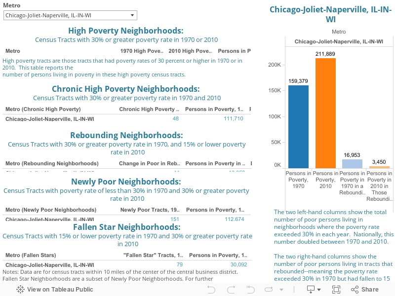
For people interested in tracking the performance of a single metropolitan area across all of our measures of concentrated poverty, we offer a Metro-level dashboard. You can select an individual metropolitan area and see how it performs on each of our indicators.

Finally, you can drill down to the level of individual census tracts to examine population change, and the change in the number of persons living in poverty in each metropolitan area covered in our report. (See the full-sized version here)

You can also see the findings in this easy-to-share infographic:

Click for full infographic.

Happy New Year from City Observatory

15534635544_199daf52aa_z

Those of us at City Observatory wish you all a Happy New Year.

Its been just three months since we launched in October, and its been a busy period for us.  We’ve released two major reports–Young and Restless and Lost in Place.

We’ve been gratified at the reception that this research has received with media coverage in the New York Times, Bloomberg, the Washington Post, Vox, and Time.

But we’re even more excited about the conversations that are proceeding on both these topics at cities around the country. We’ll continue to follow up on both these topics, giving you updated and in-depth research, and exploring the policy options cities have for tackling these challenges.

We’re just getting started.  We expect 2015 to be an even bigger year.  We’ve got several more research projects in the pipeline, starting with a close look at the health and prospects of city center economies–look for it early in the New Year.

We’ll also continue to regularly comment on current issues in cities, and share with you the latest data-driven insights, both from our work and from around the web, on what’s driving city success.

Finally, as the old year draws to a close, we want to acknowledge the strong support we’ve received from the John S. and James L. Knight Foundation in establishing City Observatory .

Wishing you all the best in 2015,


Joe, Patty & Dillon

The City Observatory Team


Photo courtesy of dickdavid and Flickr Creative Commons.

City Report: Lost in Place

Here’s a summary of our latest CityReport: Lost in Place: Why the persistence and spread of concentrated poverty–not gentrification–is our biggest urban challenge.

Lost in Place traces the history of high poverty neighborhoods in large US cities, and constructs a new view of the process of neighborhood change.  This article summarizes some of our key findings.  A complete guide to our report, including a PDF of the report narrative, sortable tables of metro area data and links to our neighborhood level maps are available here.

We were drawn to examine this question because of the concerns that are frequently raised suggesting that efforts to promote urban revitalization have the unintended negative consequence of making life worse for the urban poor. The argument is made that improving a neighborhood simply results in one population (wealthier, whiter) moving in and the existing residents (poorer persons of color) moving out, with the result that the poor are worse off than they were had no revitalization occurred. There are some well-known examples of places that are now very high income–like Chelsea in Manhattan–which were once poor neighborhoods.

But the question is seldom asked: How representative are these instances? And how prominently do they figure shaping the overall pattern and prevalence of urban poverty?

The term gentrification itself is fraught with discord. It is widely used and seldom precisely defined. In this study, we’ve set out to shed some light on the question by focusing on a single index of neighborhood well-being: the poverty rate. Despite its flaws, the poverty rate is a good marker of a neighborhood’s relative economic status over time. Moreover, critiques of gentrification flag its harm to the poor, so logically, we should find the most dramatic effects of gentrification in high poverty neighborhoods.

There are very good reasons we ought to be concerned about the plight of those living in high poverty neighborhoods. A growing body of social science research confirms that concentrated poverty magnifies all of the pathologies associated with poverty. Most troubling, new research shows that these effects make a major contribution to the intergenerational transmission of poverty: children growing up in neighborhoods of high poverty have permanently impaired life chances compared to otherwise identical children growing up in neighborhoods with low poverty.

Our data show that while striking when it happens, instances of gentrification of previously high-poverty neighborhoods are quite rare. Only about 5 percent of the poor living in urban high-poverty neighborhoods in 1970 would have found that their neighborhood saw its poverty rate decline to less than the national average four decades later.

Three-quarters of high-poverty neighborhoods were still places of high poverty four decades later. But they were far from stable; on average these chronically-poor neighborhoods lost 40 percent of their population over four decades. High-poverty neighborhoods are not stable or sustainable; they are in a steady process of decay. It’s an illusion to suggest that in the absence of gentrification, a poor neighborhood will remain the same.

Infographic

If we’re concerned about the poor and about concentrated poverty, our attention should be riveted to a much larger and more ominous trend: the growth of new neighborhoods of high poverty. Between 1970 and 2010, the number of urban neighborhoods with poverty rates exceeding 30 percent nearly tripled, to 3,100, and the number of poor persons living in these neighborhoods doubled from 2 million to 4 million.

A majority of these newly-poor neighborhoods were places that in 1970 had poverty rates below the national average–places we call “falling stars.” They were arguably middle class 40 years ago, and today are neighborhoods of high poverty.

The sheer scale of the spread of concentrated poverty emphasizes how modest the effect of gentrification has been on the location of the poor. The number of poor living in high-poverty neighborhoods that rebounded since 1970 declined by about 67,000. This is a good maximum estimate of the “displacement” associated with gentrification. Over the same time, the number of poor persons living in newly poor neighborhoods increased by 1,250,000. This suggests that at most, the relocation of the poor attributable to gentrification accounts for perhaps five percent of the increase of population living in concentrated poverty.

We’re coming to understand that place plays a big role in shaping economic opportunity. How we build our cities–and whether we allow concentrated poverty to persist and spread–will have a profound impact on whether future generations will continue to share the American dream.


For more information regarding economic opportunity, economic segregation, and concentrated poverty, go here, and to see the full report including metro-level dashboards and maps, go here.

Understanding Your City’s Distinctiveness Through Occupational Data

At City Observatory, we’ve come the conclusion that every city has its own unique characteristics that both define its identity and which play a key role in shaping its economic opportunities.  These distinctive traits don’t always shine through in conventional economic data, which leads us to look for the rare statistics that convey more nuance about every place.

One such data source is the Bureau of Labor Statistics Occupational Employment Statistics (OES).  The OES includes metropolitan-level estimates of the number of workers in occupational categories, as well as estimates of the range of pay levels.  It’s possible to use the occupational employment estimates to calculate a location quotient–a measure of specialization, which shows how much larger or smaller a share of a region’s employment base is made up of a particular occupation.  We used the OES data to identify the occupation in each metropolitan area with the highest location quotient–indicating the occupation in each metropolitan area that is the most disproportionately likely to be found in that region compared to all others.  Note that the occupation with the highest location quotient is not necessarily the most common occupation in the region, just the one that is more concentrated in that region than any other occupation, relative to the typical metropolitan area.

Occupations with high location quotients are indicators of a city’s knowledge specializations.   While it’s hard to measure knowledge directly, occupational data give us a window into where the most highly developed knowledge is located. These knowledge specializations have important economic development implications.  If you’re looking to grow a business and be successful, you want a pool of talented people who understand your industry, its technology, and its markets.  The occupational data shed light on the concentrations of specially talented workers.  The leading specializations for each of the nation’s largest metropolitan areas are shown here.


These data confirm many of our intuitive notions about the clustering of industries, knowledge, and occupations.  New York’s leading occupation is fashion designers, Los Angeles’s is media and communication workers.  Las Vegas is the leader for gaming workers, Washington for political scientists, and blue collar Milwaukee for foundry mold and coremakers.

It’s interesting to compare metro specializations to those for entire states.  We compared our results to those generated for states by the website Mental Floss who prepared “Which job is most unique to your state?” — a similar analysis of state occupational distinctiveness a couple of months ago.

Many cities share their principal occupational specialization with the state they are located in, but in other cases, there’s evidence of an urban-rural divide.  In Louisiana the most distinctive occupation is captains, mates and pilots of water vessels, while in New Orleans, its entertainers, performers, and sports workers. Oregon’s leading occupation is logging workers, but in metro Portland, the most specialized occupation is semiconductor processors.

Occupational data provide a rich source of insight into the knowledge, skills, and abilities of a region’s workers.  Those who want to explore the occupational approach to understanding city distinctiveness should read this paper by Ann Markusen and Greg Schrock.


How we build our cities: What’s at stake

Guest Commentary by Carol Coletta

It’s a glorious moment to be in the business of promoting the built environment. I use “built environment” to encompass the way we build our buildings, arrange our neighborhoods and public spaces, and interact with one another in place. We’re all consumers of place as individuals, and we are constantly aware of our surroundings. But there’s something bigger going on:

The evidence is mounting that the built environment is hugely important to the success of cities.

We should start by acknowledging this key fact: 64% of the most mobile people in our society – college-educated 25-34 year olds – say, first, they choose the city they want to live in, then they look for a job.

What this means is that quality of life is now more influential than having a job offer when people are deciding where to live. Livability seems to be the new competitive advantage.

Just to put a point on it: 25-34 college-educated year-olds make up the demographic all cities are fighting over.

Now, the built environment is not the whole of quality of life – for 25-34 year-olds or anybody else. But the built environment is a substantial part of how people value cities today.

Let me give you three powerful examples.

First: The growing strength of the center city. You can see evidence of it in cities everywhere.

Over the past four decades, there has been a steady increase in the relative preference of young adults (ages 25 to 34) for close-in neighborhoods – that’s the central business district in metropolitan areas and the 3-mile radius around it. In fact, college-educated young adults today are more than twice as likely to live in these close-in neighborhoods than are other Americans.

This is a 40-year trend that just keeps accelerating.

85% of millennials say they prefer urban-style living, and the numbers prove that they are acting on their preferences.

What is it about the built environment that makes the core city newly valuable to millennials? You know the profile: this part of the city is typically dense, walkable, bikeable, mixed use, mixed age, mixed-type building stock. These are the kinds of neighborhoods we forgot how to build for the past 50 years. Then all of a sudden, we woke up to a back to the future moment.

Now, jobs are following millennials (and increasingly boomers) to core cities. Companies like Google, Biogen, Coca Cola and Visa are moving their offices downtown to tap into the growing talent pool living in cities. It’s happening even in struggling cities like Detroit—where Quicken Loans is explicitly working to promote downtown revitalization.

It’s also true that since the recession, housing prices in America’s most walkable neighborhoods – the ones with higher WalkScores that have more daily destinations nearby — have recovered far more quickly than housing in neighborhoods where you have to drive to get to everything.

See the pattern here? These are no longer anecdotes. This is happening in cities all over the U.S.

The right built environment attracts and keeps mobile talent. The right built environment attracts jobs. And the right built environment adds real estate value.

But there are other ways the built environment Increases the value of cites.

Think about most neighborhoods in your community. They are probably like neighborhoods in Miami or in my hometown of Memphis. The rich live in enclaves, and poor people live in a different part of town. That’s the pattern in cities all over the U.S.

But new research is showing us how deadly that approach is to opportunity… specifically the opportunity to improve your economic status. It turns out that growing up poor in an economically segregated neighborhood significantly lowers the chance that you will improve your financial circumstances.

If zip code is destiny, then the American Dream is dead.

Having people of different incomes living in close proximity to one another and, in effect, sharing their lives in public as people in a community naturally do, results in far more upward mobility for people than does growing up in an economically segregated neighborhood.

Having a civic commons – libraries, parks, rec centers, and the like — that welcomes and delights people of different incomes augments and accelerates the advantages of economic integration. (This is not easy, by the way.)

Consider this: America is becoming ever more bifurcated by income – the rich are getting richer and there is more difference in the incomes earned by those with more and less education. People with less money and less education are getting stuck in place.

If the right built environment can help tackle that problem –delivering even a modicum of progress by bringing rich and poor people into closer physical proximity — that is significant, because today, we are going in the opposite direction.

The right built environment delivers more opportunity to Americans. That’s the second big value-add to cities.

There’s one more piece to the puzzle. The right built environment delivers the kind of engagement that actually moves cities forward.

You may know that Knight Foundation is built on the premise that informed and engaged communities are essential to strong democracies. And the sad fact about engagement is that we’re not doing a very good job of it in most of our communities.

How many of you have been to a public meeting lately?

How many of you enjoyed it? (Count the masochists.)

How many of you think it was a productive discussion about the future of your community?

Clearly, something is wrong here. I’ve run public meetings. I’ve participated in public meetings. I am on a public board that has publicly commented – twice – in each meeting. And it is mind numbing, right? There must be a better way.

Well, a few weeks ago, that better way revealed itself in a most unexpected way. I was interviewing the founders of modern day Portland – the people who became mayors, aides to mayors, state legislators, transit officials, and architects who led important citizen initiatives. They kept using the terms “civic involvement” and “citizen engagement”, and finally I stopped the conversation and asked, what do you mean specifically? What did that look like in Portland?

Their answer stopped me cold.

Here’s what they told me: “For too long, decisions about the future of Portland were made by a few people in the basement of a downtown hotel. We decided that we had to lure people out of the comfort of their living rooms and into public life so that they would engage in an ongoing conversation about the future of their city.”

That was their aim: Get Portlanders to live life in public.

To support that, they began changing policies to allow sidewalk cafes, music in parks, music in taverns, stop the building of expressways through neighborhoods… and you can see the result of that today in Portland: vibrant, compact neighborhoods demarcated by relatively narrow, slow through-streets filled with small commercial enterprises mixed with mid-rise housing.

It is so different from what you see in most American cities, and it all resulted from a desire to get and keep citizens engaged – continuously — in shaping the future of their city.

As the Portland experience shows, citizen engagement is not an event. It is not a process run by consultants. It’s a culture. It’s a constant. It is, crucially, an ongoing conversation about the future of the city. And the built environment, as Portland shows, either supports that kind of ongoing conversation by encouraging people to live life in public, or it discourages it. In fact, in too many places, the built environment actually makes such a conversation impossible.

So why are we surprised when the pitiful processes we create for “engagement” don’t work?

The good news is that we are building smarter and better today than we have in 50 years. The bad news is that we still get it wrong too often. When you get the built environment wrong, you have to live with your mistakes for a very long time.

So growing an engaged citizenry that understands what good design is, why it matters, and will advocate for it forcefully is urgent if we want our cities to be successful. We can’t win this one battle at a time. We can’t treat advocacy for good design as an event. We have to make it part of the culture – the “way we do things around here.” – the rule, not the exception… what we expect for our community.


Carol Coletta is Vice President and leads Community and National Initiatives for Knight Foundation.  You can follow her at @ccoletta.

Is your city or neighborhood poorer than 40 years ago?

We recently released our latest report, Lost in Place: Why the persistence and spread of concentrated poverty–not gentrification–is our biggest urban challenge. It speaks to a national trend that’s been largely ignored– that urban poor are being concentrated into poorer neighborhoods, and that those neighborhoods are increasing in number. We speak here about some of those implications, and here and here we provide references to what others are saying about gentrification and poverty; here we address economic segregation.

Neighborhood change is by definition a highly local process, and everyone wants to know how their city is performing:  What about their city? Their neighborhood?  Nationally, the number of high-poverty neighborhoods tripled, and the number of people in poverty in those neighborhoods have doubled, but this is not the pattern in every city. In Detroit, the numbers are even more staggering–the population living in poverty is more than 228,000, from less than 40,000 40 years previous.  A few places like Virginia Beach saw an actual decline in concentrated poverty.  Rebounding neighborhoods have been more common in some metros like New York and Chicago.

If you want to see the data for individual metros, we’ve created a city-specific dashboard. Just select the city of interest, and you’ll see a comprehensive set of indicators showing how your metro performed between 1970 and 2010.

As you look at individual cities, keep these overall trends in mind:

  • Most cities only had 1 or 2 “rebounding” neighborhoods, or neighborhoods that were previously high poverty, and by 2010 were below the national average rate of poverty (15%).
  • Nationally, the number of high-poverty tracts tripled.
  • Overall, the number of poor people in those high-poverty tracts doubled.
  • High-poverty neighborhoods that didn’t rebound weren’t stable: they lost, on average, 40 percent of their population over 40 years (both of poor and non-poor persons). This means most “chronic high poverty” neighborhoods saw a dramatic reduction in population by 2010.
  • The majority of the increase in those living in high poverty were in newly poor or “fallen star” neighborhoods. (Fallen stars are neighborhoods that had poverty rates below the national average in 1970, but have poverty rates of 30 percent or higher today).  The number of fallen stars exceeded the number of rebounding neighborhoods 12 to 1.

The process of neighborhood change is often difficult and disruptive, and poverty and gentrification are sensitive topics. Each city is different and has unique challenges; however, most cities follow the national trend of increasing concentrated poverty.  If we are serious about bettering the lives of the poor (and we should be), we need to carefully examine the data about change and look for solutions that are fully grounded in the facts of neighborhood change.

If you want to look at each city’s specific tract-level data, go to the report here and scroll to the maps. We will also be sharing an informational post about how these were made soon- check back in a couple days!


How distinct is your city?

Every city has its own unique characteristics. We know that industrial and occupational specializations can be measured using standard economic tools like location quotients. But some of the more intangible characteristics of cities are harder to measure. We’re always on the look out for new and interesting ways of discerning city distinctiveness. The Internet search engine Google provides one window into the way people think about cities.

Unless you’ve been using AOL out of spite, you’ve at least seen Google’s auto fill capability. As you start typing your query, Google tries to guess what you are searching for drawing on its database of the most common search queries.

Some have used this capability as a way to create a natural experiment on human perceptions. Renee diResta hit on the idea of using the Google auto fill function to tease out stereotypes of states. She Googled a state name, and let Google suggest answers, asking for example “Why is [California] so…?”. She noted which words Google suggested and tabulated the results for states. Nate Shivar then took up the mantle, looking at cities instead of states.

We thought this was extremely interesting– if unscientific — and could illustrate how different cities are perceived. Here are Nate Shivar’s results for 50 cities, which we’ve sorted according to the most commonly searched terms. The most Googled term was “expensive” (14 of 50 cities) followed by boring, dangerous, ghetto, and bad. Some search terms were idiosyncratic to a single city, such as “Why does Salt Lake City have such wide streets?” Some places, like Raleigh or Indianapolis registered only one or two descriptors; perhaps they don’t trigger any distinctive characterizations There were some that were clearly not about the city, like Why is Charlotte so uneasy about being on a ship? (Readers of The True Confessions of Charlotte Doyle will know why).

We built the following map to illustrate the geographic patterns of the most common city descriptors. In order to see where apparently the most “ghetto,” polluted or boring places are, all you have to do is click the drop down below for the description of your choice, and select “Y.” (As a side note, if you choose “N” for no, the map will show all of the places that Google users don’t describe as boring, bad, etc. To reset the map, just choose “All” for whatever descriptions you have selected.) To see what the top 4 descriptions are for each city, hover your mouse over the location.

Some of the more interesting observations are:

  • Apparently, Google searchers don’t worry about cities in the Western half of the country as being “bad” or “dangerous.”
  • Many Northern cities you expect to be cold are listed as such, but places like Atlanta and San Diego are seen –by the Google masses– as cold, too. (We didn’t add hot into the map, because there weren’t any surprises there.)
  • Either people simply expected their east coast (…and Midwest … and southern..) cities to be polluted, or one pocket in the West/Southwest — the cities Los Angeles, Denver, Phoenix and Salt Lake City– has particularly bad pollution problems. (While this may be true, big industrial cities like Pittsburgh don’t have people asking why they’re polluted, so we think some of this may be the surprise associated with a city like Denver being polluted.)
  • Concerns about racism are most frequently expressed in three cities: Boston, Philadelphia, and Cincinnati. Interestingly, none of these cities is among the most racially segregated, a group that is led by Detroit, Milwaukee and New York (detailed list is here)
  • With the exception of Minneapolis, if you want live cheaply, don’t live on a coast.
  • The more unusual descriptions follow: Jacksonville is smoky; Portland is white; Detroit is black; Tampa Bay is trashy; Philadelphia is either bad or great; Providence/Rhode Island is corrupt; and, apparently, Google often confuses Columbus — the city in Ohio — with the 15th century explorer.

Thanks very much to Nate Shivar investigating auto fill for cities. Based on his later revisions, like Providence and Rhode Island as a whole are synonymous to many, we updated the descriptions for this analysis. To dig in more to distinctiveness and our take on it, go here. For questions regarding this analysis or anything else, feel free to email info@cityobservatory.org.

Anti-Social Capital?

In his book Bowling Alone, Robert Putnam popularized the term “social capital.” Putnam also developed a clever series of statistics for measuring social capital. He looked at survey data about interpersonal trust (can most people be trusted?) as well as behavioral data (do people regularly visit neighbors, attend public meetings, belong to civic organizations?). Putnam’s measures try to capture the extent to which social interaction is underpinned by widely shared norms of openness and reciprocity.

It seems logical to assume that there are some characteristics of place which signify the absence of social capital. One of these is the amount of effort that people spend to protect their lives and property. In a trusting utopia, we might give little thought to locking our doors or thinking about a “safe” route to travel. In a more troubled community, we have to devote more of our time, energy, and work to looking over our shoulders and protecting what we have.

The presence of security guards in a place is arguably a good indicator of this “negative social capital.” Guards are needed because a place otherwise lacks the norms of reciprocity that are needed to assure good order and behavior. The steady increase in the number of security guards and the number of places (apartments, dormitories, public buildings) to which access is secured by guards indicates the absence of trust.

The number of security guards in the United States has increased from about 600,000 in 1980 to more than 1,000,000 in 2000 (Strom et al., 2010). These figures represent a steep increase from earlier years. In 1960, there were only about 250,000 guards, watchmen and doormen, according to the Census (which used a different occupational classification scheme than is used today).

This trend has led Sam Bowles and Arjun Jayadev to argue that we have become “one nation under guard” and that the growth of guard labor is symptomatic of growing inequality. The U.S. has the dubious distinction of employing a larger share of its workers as guards than other industrialized nations and there seems to be a correlation between national income inequality and guard labor.

Just as the U.S. has a higher fraction of security guards than other nations, some cities have more security guards than others. To understand these patterns, we’ve compiled Bureau of Labor Statistics data from the Occupational Employment Survey on private security guards. BLS defines security guards as persons who guard, patrol, or monitor premises to prevent theft, violence, or infractions of rules, and whom may operate x-ray and metal detector equipment. (The definition excludes TSA airport security workers).

This occupational data reports the number of security guards in every large metropolitan area in the country. Adjusting these counts by the size of the workforce in each metro area tells us which places have proportionately the most security guards– which are arguably the least trusting, and which places have the fewest security guards. This may be an indicator of higher levels of social trust.

Here are the data:

At the top of the list are Las Vegas and Miami. While the typical large metro area has about 9 security guards per 1,000 workers, these two cities have roughly twice as many (Las Vegas as 21 per 1,000; Miami 17 per 1,000. Washington D.C., with its high concentration of government offices, defense and intelligence agencies, and federal contractors, also has a high proportion of security guards.

At the other end of the spectrum are a number of cities in which security guards make up about one-third less of the workforce than in the typical metro area. At the bottom of the list are Minneapolis-St. Paul, Providence and Portland. (The Twin Cities and Portland also do well on most of Putnam’s measures of social capital)

It seems somewhat paradoxical, but the salaries paid to security guards get treated as a net contribution to gross domestic product. Yet, in many important senses, security guards don’t add to the overall value of goods and services so much as they serve to keep the ownership of those goods and services from being rearranged. As Nobel prize winning economist Douglass North has argued, we ought to view the cost of enforcing property rights as a “transaction cost.” In that sense, cities that require lots of guards to assure that property isn’t stolen or damaged and that residents, workers, or customers aren’t victimized, actually have higher costs of living and doing business than other places. These limits on easy interaction may stifle some of the key advantages to being in cities.

Gender Differences in Unemployment

To celebrate the Census Bureau’s release of the 5-year American Community Survey estimate, we decided to do a quick analysis of some of its information. So for some light Friday afternoon reading, we present you with an analysis of unemployment rates by gender throughout the country.

The 2009-2013 data spans the Great Recession and its aftermath, and as such much of its data reflects trends during that time. It has been widely noted that female unemployment rates were actually lower during the recession (although, men caught up at the end, and it’s important to note that lower unemployment rates don’t necessarily mean higher incomes). We decided to look at this phenomenon in the country’s 51 biggest metros to see if we could find any patterns. We also examined how poverty and the women’s share of the overall workforce intersected with gender differences in unemployment.

Our main findings were that generally, female unemployment rates were lower than male unemployment rates. Women experienced higher unemployment rates in the south, and where poverty rates were higher.. While higher unemployment rates were associated with higher poverty, this holds for both men and women. Finally, it is worth noting that female labor participation rates mean that even while women had higher employment rates than men, it is likely that any given metro had higher numbers of employed men than women. See the full analysis below:

Some technical details: We examined unemployment rates for those 16 and over. Poverty rate was defined as percentage of all people in the metro below the poverty level.

This was just one snapshot of the data the ACS has to provide- you can explore it more here — it has information on demographics, employment, housing, social characteristics, and much more.

Ten More you should read about Gentrification, Integration and Concentrated Poverty

Gentrification and neighborhood changes are hotly contested subjects.  In the past few years some very thoughtful and provocative work has been done that helps shed light on these issues.  Here we offer ten more of the more interesting arguments that have been put forward as a follow up to our previous post, as well as our report on gentrification and poverty.

  1. Myron Orfield and Thomas Luce looked at the racial composition of urban neighborhoods over the past three decades and conclude that contrary to widespread fears of gentrification, the data clearly show that once a neighborhood becomes predominantly non-white it virtually never reverts to predominantly white. Just two census tracts out of the nearly 1,500 that were predominantly non-white in 1980 became predominantly white in the next three decades, and only seven percent of them became diverse.
  2. Next Cities Sandy Smith outlines some of the strategies that cities are pursuing to minimize displacement of populations in those neighborhoods that are experiencing gentrification.
  3. Daniel Hartley’s study for the Cleveland Federal Reserve Bank of gentrifying neighborhoods shows that neighborhood upgrading is associated with economic improvements for existing residents, in the form of higher credit scores than otherwise similar residents living in neighborhoods that don’t experience gentrification.  Hartley studied credit scores in the gentrifying neighborhoods of 55 cities and found the numbers went up for original residents, whether they owned property or rented.
  4. In his new book, The Concentration of Poverty in the New Millenium, Paul Jargowsky presented data on the number of persons living in census tracts with extremely high rates of poverty (40 percent or greater).  His work shows that the biggest increases in concentrated poverty have been in the Midwest and in smaller to medium sized metropolitan areas.
  5. In their 2011 paper for the Brookings Institution, Alan Berube and Elizabeth Kneebone track the number of neighborhoods of extreme poverty (census tracts with poverty rates of 40 percent or higher) using data from the 2005-09 American Community Survey.  While concentrated poverty had eased during the 1990s, their analysis–The Re-Emergence of Concentrated Poverty: Metropolitan Trends in the 2000s–showed that it had increased substantially and especially affected Midwestern metropolitan areas.
  6. For the past several months, the Furman Center at New York University has been sponsoring a “slow debate” on gentrification, neighborhood change and integration.  Entitled “The Dream Revisited: A Discussion on Neighborhood Gentrification” you’ll find a series of point-counterpoint essays by experts in the field including Lance Freeman and Rachel Godsil
  7. Writing this year in a paper prepared for the American Assembly, Todd Swanstrom considers whether the process of gentrification is different in “legacy cities”–older slower growing or declining industrial cities.  Swanstrom argues that gentrification has been studied mostly in “strong market” cities with high and rising real estate prices, and that the nature and impacts of gentrification are far different in places with weaker real estate markets.   
  8. Concerns about the adverse effects of gentrification on rents often prompts local alliances between renters and community groups to oppose new development.  In an article in Dissent, “Fighting Gentrification, but to what end?” Ben Ross challenges whether opposing development actually protects affordability.  Limiting development limits supply, pushing prices–and rents-higher.  As long as the demand for dense, walkable neighborhoods exceeds the supply, lower income households will find it difficult to afford such neighborhoods.  Instead of opposing density, he argues, we ought to be looking for ways to increase it in places where it makes the most sense.
  9. Kendra Bischoff and Sean Reardon trace out the connections between growing income inequality and growing economic segregation in the nation’s metropolitan areas in the Russell Sage report “More Unequal and More Separate: Growth in the Residential Segregation of Families by Income, 1970-2009.”  Their analysis shows that the number of families living in middle income neighborhoods has declined, and that we are increasingly segregated into high income and local income neighborhoods.
  10. In their pathbreaking work studying intergenerational economic mobility, Raj Chetty and his colleagues at Harvard and Berkeley have generated an impressive body of data about the connections between place and economic opportunity.  They look at the chances that children growing up in the poorest families grow up to have higher levels of income and find that one of the correlates of economic mobility is income segregation:  metropolitan areas with areas of concentrated poverty have less economic mobility.

Ten things you should read about Gentrification, Integration and Concentrated Poverty

Gentrification and neighborhood changes are hotly contested subjects.  In the past few years some very thoughtful and provocative work has been done that helps shed light on these issues.  Here we offer a baker’s dozen of some of the more interesting arguments that have been put forward.

  1. Daniel Kay Hertz explores the contradictions that emerge between our widely voiced aspiration for integration and the knee-jerk tendency to condemn segregation.
  2. Jonathan Rothwell and Douglas Massey present research showing that the education of one’s neighbors is nearly half to two-thirds as powerful in influencing children’s long term economic prospects as is the education of their own parents.
  3. In “Beyond Gentrification”, Stephanie Brown explores the complex and contradictory concepts that are conflated in the common use of the word gentrification and describes a new framework for thinking about neighborhood change in mixed-income multi-cultural communities.
  4. Margery Turner of the Urban Institute speaks to the connections between place and economic improvement.  She describes how mobility turns out to be an important way that families actually escape poverty. She argues that we need to move from place-based to place-conscious strategies, and explicitly allow for the fact that some neighborhoods will best be viewed as “launch pads” to help people get going.
  5. Barbara Sard and Douglas Rice document the limited reach of housing assistance programs.  They summarize the evidence that high-poverty neighborhoods, which are often violent, stressful, and environmentally hazardous, can impair children’s cognitive development, school performance, mental health, and long-term physical health.  Their article notes that despite abundant evidence of the negative effects of living in high poverty neighborhoods, federal housing assistance programs tend to concentrate the poor in existing neighborhoods of high poverty.
  6. Ed Glaeser and Jacob Vigdor review the evidence on changing patterns of racial segregation in the United States provided in Census 2010.  They conclude that the nation is becoming less segregated, chiefly by the decline of all-white neighborhoods.  But predominantly African-American neighborhoods have not transitioned to mixed race status.  They conclude that for every prominent example of a black neighborhood undergoing gentrification—in Harlem, Roxbury, or Columbia Heights—there are countless more neighborhoods witnessing no such trend. Instead, the dominant trend in predominantly black neighborhoods nationwide has been population loss.
  7. The media epicenter of the gentrification debate has been the Google buses that carry high tech workers from their homes in San Francisco to jobs in the Silicon Valley.  Tech Crunch’s Kim Mai Cutler offers a far-ranging analysis of the connections between economic growth, building restrictions, housing affordability and income distribution in her provocative essay:  “How Burrowing Owls Lead to Vomiting Anarchists (or SF’s Housing Crisis Explained).”
  8. Planner Pete Saunders writes that the move of talented young people back into cities creates the opportunity to strengthen the historically limited  job and social networks that have limited the economic opportunities of those living in neighborhoods of concentrated poverty. The challenge is that too often, neighborhood change is treated as a zero sum game.  We’re missing opportunities to use the attachment to place–through simple neighborhood-level means like picnics, sports leagues and similar events mediated by community groups to knit stronger bonds between long time residents and newcomers.
  9. Robert Sampson’s work points up the strong racial component to income segregation.   More than half of black kids born in 1995 in high poverty neighborhoods remained there in 2012; fewer than 15 percent had moved up to “low poverty.”  A third of black children growing up in low poverty ended up in high poverty neighborhoods; compared with 2 percent of white children.
  10. Patrick Sharkey’s book, Stuck in Place, shows when neighborhoods change, the original residents benefit substantially. In adulthood, black children whose neighborhoods changed around them in ways that lead to less concentrated poverty did much better in terms of income, earnings and wealth compared with other black children who started in very similar neighborhoods but whose neighborhoods did not see the same degree of change.

There is more to explore on this topic elsewhere, and this is by no means an exhaustive list. However, we think it’s a good start. To read more about associated topics like economic opportunity on our site, go here.

Metro’s “Why Bother” Climate Change Strategy

If you’ve hung around enough espresso joints, you’ve probably heard someone order a “tall, non-fat decaf latte.” This is what baristas often call a “why bother?” That would also be a good alternate description for the Metro Climate Smart Communities Plan.

Framed in glowing rhetoric, the plan purports to be a two-decade long region-wide strategy for meeting our responsibility to address this serious global problem. But in reality it sets goals so low that they actually call for reducing the pace at which we’re reducing driving and greenhouse gas emissions.

This weak plan is all the more surprising given the area’s history. The Portland area has long prided itself on being a forward-looking first mover, when it comes to seriously addressing climate change. More than two decades ago the City of Portland became the nation’s first local government to adopt a greenhouse gas reduction plan.

It’s increasingly apparent that climate change is a serious menace. Now, Portland’s elected regional government is working on a new effort to develop what it calls a “climate smart communities plan.”

Transportation is the region’s single largest source of greenhouse gases, so it makes sense to focus on transportation. Metro’s plan sets a number of targets to guide regional transportation planning that in theory might help the region reduce its carbon emissions from transportation over the next two decades. The key performance measure is “vehicle miles traveled,” or VMT– basically a count of how much driving we do in the region. Right now, the average Portland area resident drives about 19 miles per person per day. There are a lot of ways to measure the transportation system–bike mode share, number of bus hours, total number of transit passengers, counts of pedestrians. But if you have to pick one number that tells you how car-dependent and emissions heavy your transportation system is, it’s VMT. And by the rules of thumb prescribed by transportation engineers, VMT levels translate in a very straightforward way into the “need” for more roads capacity for cars. If VMT goes up, they’ll say, you need more roads. If it goes down, you’ll need less.

Over the past decade, Portland has made good progress in reducing VMT. Since 2006–when we drove about 20.1 miles per person per day, we’ve cut driving at an average annual rate of about 1.7 percent per year. Since 1996–a period that includes an era of much cheaper gas prices–driving has fallen about 1 percent per year. But that was all in the past when we were un-enlightened and pretty un-motivated about the threat of climate change. Now that we’re serious–and we’re “smart” about this issue– we’re really going to get aggressive, right? Not so much.

Metro’s plan is that we reduce driving by a grand total of an additional two miles per person per day between now and 2035, or from a current level of 19 miles per person per day to about 17 miles per person per day. That’s right–over the the next two decades metro’s climate smart plan calls for reducing driving at about 0.4% per year–about one-fourth as fast as we have been reducing driving over the past several years without a climate smart plan. In effect, Metro’s very feeble target for VMT reductions means that they are planning for a world where there’s a lot more private car driving–and demand for roads and expensive road projects–than even current, business-as-usual trends suggest.

Rather than reducing driving, this assumption is likely to lead to an investment strategy that enables or encourages more driving that would otherwise occur if we simply assumed that recent trends continue.

To get an idea of just how feeble this planned reduction is, consider the recent travel demand forecast prepared by the Washington State Department of Transportation. They predict that over the next two decades, per capita vehicle miles traveled will decline about 1.1 percent per year. Keep in mind, this isn’t some rabid environmentalist’s stretch goal: it’s the highway department’s prediction of driving trends, without any regard to climate change. (Even this rate of decline is still only about 60% as fast as the region has managed over the past decade).

WSDOT’s baseline prediction (a decline in per capita VMT of 1.1 percent per year) would suggest that the real trend for regional driving would be a decline to 17 miles per day by 2021, and a further decline to 14 miles per person per day by 2035.

Whatever this is, it should be apparent that it’s nothing resembling bold climate leadership; if anything it is technocratic foot-dragging, providing an opaque statistical rationalization for actually slowing the rate of progress we’ve already made as a region in addressing the problem of climate change.

And there’s one more thing the Metro largely plan overlooks. Reducing VMT doesn’t just reduce carbon emissions. It also saves the region’s households money. Lots of money. Cutting VMT by additional one mile per person per day would save the region’s households roughly $250 million per year, every year, in reduced fuel and auto costs. Setting a more aggressive target for VMT reductions would actually be good for the local economy–because it would mean local consumers have more money to spend on things other than cars and gasoline.

My colleagues working in the education field often talk of the “soft bigotry of low expectations”–that we don’t ask much of students from challenged schools, and that as a result, they have little incentive or motivation to dramatically improve their performance. The Portland region has a proud history of being a risk-taking pioneer in the environmental field, with its original goal of reducing greenhouse gases, implementing an urban growth boundary and cleaning up the Willamette. Arguably, this is the time to be bold. If it were serious, Metro could explore setting a goal of reducing driving to twelve or even ten miles per person per day by 2035. It’s likely that the public savings from lower road construction costs and the household savings from less spending on cars and gasoline would add up into billions of additional resources for the local economy–not to mention lower greenhouse gas emissions.

Climate change may be the most profound existential challenge we’ve ever faced, but the proposed Metro plan sets the bar for progress so low as to be meaningless. There’s certainly nothing in this plan that expresses any ambition to do more than is already baked in the cake. In fact, it does a lot less than we’ve managed with no plan, and a lot less that our neighbors to the North predict will happen, even with no further policy intervention. Paradoxically, it may end up being used to plan for higher levels of driving than can reasonably be forecast to occur if we do nothing. There are a lot of phrases that could be used to describe such a plan, but “climate smart” isn’t one of them.

Why bother?