As Jane Jacobs so eloquently described it in The Death and Life of American Cities, much of the essence of urban living is reflected in the “sidewalk ballet” of people going about their daily errands, wandering along the margins of public spaces (streets, sidewalks, parks and squares) and in and out of quasi-private spaces (stores, salons, bars, boutiques, bars and restaurants).
Clusters of these quasi-private spaces, which are usually neighborhood businesses, activate a streetscape, both drawing life from and adding to a steady flow of people outside.
In an effort to begin to quantify this key aspect of neighborhood vitality, we’ve developed a new statistical indicator—the Storefront Index (click to see the full report)—that measures the number and concentration of customer-facing businesses in the nation’s large metropolitan areas. We’ve computed the Storefront Index by mapping the locations of hundreds of thousands of everyday businesses: grocery and hardware stores, beauty salons, bookstores, bars and restaurants, movie theatres and entertainment venues, and then identifying significant clusters of these businesses—places where each storefront business is no more than 100 meters from the next storefront.
The result is a series of maps, available for the nation’s 51 largest metropolitan areas, that show the location, size, and intensity of neighborhood business clusters down to the street level. Here’s an example for Washington, DC. On this map, each dot represents one storefront business. This maps shows storefront businesses throughout the metropolitan area. In downtown Washington, there is a high concentration of storefronts; as one moves further out towards the suburbs, the number of storefronts diminishes, and storefronts are increasingly found arrayed only along major arterials, with a few satellite city centers (like Alexandria).
The Storefront Index helps illuminate the differences in the vibrancy of the urban core in different metropolitan areas. Here we’ve constructed identically scaled maps of the Portland and St. Louis metropolitan areas, zoomed in on their central business districts. The light colored circle represents a three-mile radius around the center of downtown. In Portland, there are about 1,700 storefront businesses in this three-mile circle—with substantial concentrations downtown, and in the close-in residential neighborhoods nearby. St. Louis has only about 400 storefront businesses in a similar area, with a smaller concentration of storefront businesses in its center, and fewer and less dense commercial districts in nearby neighborhoods.
The Storefront Index is one indicator of the relative size and robustness of the active streetscape in and around city centers. As this table shows, there’s considerable variation among US metropolitan areas in the number of storefront businesses with three miles of the center of downtown. New York and San Francisco have the densest concentrations of storefront businesses in their urban cores.
We also use the Storefront Index to track change over time, looking at the growth of businesses and street level activity in a rebounding neighborhood in Portland. There’s also strong evidence to suggest that concentrations of storefront businesses provide a conducive environment for walking. We’ve overlaid the storefront index clusters on a heat map of Walk Scores for selected metropolitan areas to explore the relationship between these two measures. While Walk Score includes destinations like parks and schools, as well as businesses, it also measures walkability from the standpoint of home-based origins, while our Storefront Index shows the concentration of commercial destinations.
City Observatory has developed the Storefront Index as a freely available tool for urbanists and city planners to use in their communities. The index material is licensed under a Creative Commons Attribution license (as is all City Observatory material), and shapefiles containing storefront index information is available here.
The growing appreciation of the importance of cities, especially by leaders in business and science, is much appreciated and long overdue. Many have embraced the Smart City banner. But it seems each observer defines “city” in the image of their own profession. CEOs of IT firms say that cities are “a system of systems” and visualize the city as an increasing and dense flow of information to be optimized. Physicists have modeled cities and observed relationships between city scale and activity, treating city residents as atoms and describing cities as conforming to “laws.”
In part, these metaphors reflect reality. In their function, cities have information flows and physical systems. However, it is something more than its information flows and physical systems, and its citizens need to be viewed as something other than mindless atoms.
The prescriptions that flow from partial and incomplete metaphors for understanding cities can lead us in the wrong direction if we are not careful. The painful lessons of seven decades of highway building in U.S. cities is a case in point. Epitomized by the master builder, Robert Moses, we took an engineering view of cities, one in which we needed to optimize our cities to facilitate the flow of automobiles. The massive investments in freeways (and the re-writing of laws and culture on the use of the right of way) in a narrow way made cities safe for much greater and faster travel–but at the same time they produced massive sprawl, decentralization and longer journeys, and eviscerated many previously robust city neighborhoods.
If we’re really to understand and appreciate cities, especially smart cities, our focus has to be elsewhere: it has to be on people. Cities are about people, and particularly about the way they bring people together. We are a social species, and cities serve to create the physical venues for interaction that generate innovation, art, culture, and economic activity.
What does it mean for a city to be smart?
The most fundamental way a city can be smart is to have highly skilled, well-educated residents. We know that this matters decisively for city success. We can explain fully 60% of the variation of economic performance across large U.S. metropolitan areas by knowing what fraction of the adult population has attained a four-year college degree. There’s strong evidence that the positive effects of greater education are social–it spills over to all residents, regardless of their individual education.
Educational attainment is a powerful proxy measure of city economic success because having a smart population and workforce is essential to generating the new ideas that cause people and businesses to prosper.
So building a smart city isn’t really about using technology to optimize the efficiency of the city’s physical sub-systems. There’s no evidence that the relative efficiency of water delivery, power supply, or transportation across cities has anywhere near as strong an effect on their success over time as does education.
It is in this process of creating new ideas that cities excel. They are R&D facilities and incubators, and not just of new businesses, but of art, music, culture, fashion trends, and all manner of social activity. In the process Jane Jacobs so compelling described, by juxtaposing diverse people in close proximity, cities produce the serendipitous interactions that generate what she called new work.
We don’t have an exacting recipe for how this happens. But we do know some of the elements that are essential. They include density, diversity, design, discovery and democracy.
Density.The concentration of people in a particular place. Cities, as Ed Glaeser puts it, are the absence of space between people. The less space, the more people, and the greater the opportunities for interaction. Cities are not formless blobs; what happens in the center–the nucleus–matters, because it is the place that provides key elements of identity and structure and connection for the remainder of the metropolitan area it anchors.
Diversity. The range of different types of people in a place. We have abundant evidence that the diversity of the population– by age, race, national origin, political outlook,and other qualities– helps provide a fertile ground for combining and recombining ideas in novel ways.
Design. We are becoming increasingly aware that how we populate and arrange the physical character of cities matters greatly. The arrangement and aesthetic of buildings, public spaces, streetscapes and neighborhoods matters profoundly for whether people embrace cities or abandon them. We have a growing appreciation for urban spaces that provide interesting variety and are oriented to walking and “hanging out.”
Discovery. Cities are not machines; citizens are not atoms. The city is an evolving organism, that is at once host to, and is constantly being reinvented by, its citizen inhabitants. A part of the attraction of cities is their ability to inspire, incubate, and adapt to change. Cities that work well stimulate the creativity of their inhabitants, and also present them all with new opportunities to learn, discover, and improve.
Democracy. The “mayor as CEO” is a tantalizing analogy for both mayors and CEOs; CEOs are used to wielding unitary, executive authority over their organizations; many mayors wish they could do the same. But cities are ultimately very decentralized, small “d” democratic entities. Decision-making is highly devolved, and the opportunities for top-down implementation are typically limited. Citizens have voice (through voting) and the opportunity to “exit” by moving, appropriately limiting unilateral edicts. Cities also give rise to new ideas, and when they work well, city political systems are permeable to the changing needs and values of their citizens– this is when many important changes bubble up.
All of these attributes of cities are susceptible, at least in part to analysis or description using the constructs of “information flows” or “systems of systems.” They may be augmented and improved by better or more widespread information technology. But it would be a mistake to assume that any of them are capable of being fully captured in these terms, no matter how tempting or familiar the analogy.
Ultimately, when we talk about smart cities, we should keep firmly in mind that they are fundamentally about people; they are about smart people, and creating the opportunity for people to interact. If we continuously validate our plans against this key observation, we can do much to make cities smarter, and help them address important national and global challenges.
Cities are organisms, not machines; So a smart city has to learn and not be engineered
The growing appreciation of the importance of cities, especially by leaders in business and science, is much appreciated and long overdue. Many have embraced the Smart City banner. But it seems each observer defines “city” in the image of their own profession. CEOs of IT firms say that cities are “a system of systems” and visualize the city as an increasing and dense flow of information to be optimized. Physicists have modeled cities and observed relationships between city scale and activity, treating city residents as atoms and describing cities as conforming to “laws.”
In part, these metaphors reflect reality. In their function, cities have information flows and physical systems. However, it is something more than its information flows and physical systems, and its citizens need to be viewed as something other than mindless atoms.
The prescriptions that flow from partial and incomplete metaphors for understanding cities can lead us in the wrong direction if we are not careful. The painful lessons of seven decades of highway building in U.S. cities is a case in point. Epitomized by the master builder, Robert Moses, we took an engineering view of cities, one in which we needed to optimize our cities to facilitate the flow of automobiles. The massive investments in freeways (and the re-writing of laws and culture on the use of the right of way) in a narrow way made cities safe for much greater and faster travel–but at the same time they produced massive sprawl, decentralization and longer journeys, and eviscerated many previously robust city neighborhoods.
If we’re really to understand and appreciate cities, especially smart cities, our focus has to be elsewhere: it has to be on people. We take the Jane Jacobs view: Cities are about people, and particularly about the way they bring people together. We are a social species, and cities serve to create the physical venues for interaction that generate innovation, art, culture, and economic activity.
What does it mean for a city to be smart?
The most fundamental way a city can be smart is to have highly skilled, well-educated residents. We know that this matters decisively for city success. We can explain fully 60% of the variation of economic performance across large U.S. metropolitan areas by knowing what fraction of the adult population has attained a four-year college degree. There’s strong evidence that the positive effects of greater education are social–it spills over to all residents, regardless of their individual education.
Educational attainment is a powerful proxy measure of city economic success because having a smart population and workforce is essential to generating the new ideas that cause people and businesses to prosper.
So building a smart city isn’t really about using technology to optimize the efficiency of the city’s physical sub-systems. There’s no evidence that the relative efficiency of water delivery, power supply, or transportation across cities has anywhere near as strong an effect on their success over time as does education.
It is in this process of creating new ideas that cities excel. They are R&D facilities and incubators, and not just of new businesses, but of art, music, culture, fashion trends, and all manner of social activity. In the process Jane Jacobs so compelling described, by juxtaposing diverse people in close proximity, cities produce the serendipitous interactions that generate what she called new work.
We don’t have an exacting recipe for how this happens. But we do know some of the elements that are essential. They include density, diversity, design, discovery and democracy.
Density.The concentration of people in a particular place. Cities, as Ed Glaeser puts it, are the absence of space between people. The less space, the more people, and the greater the opportunities for interaction. Cities are not formless blobs; what happens in the center–the nucleus–matters, because it is the place that provides key elements of identity and structure and connection for the remainder of the metropolitan area it anchors.
Diversity. The range of different types of people in a place. We have abundant evidence that the diversity of the population– by age, race, national origin, political outlook,and other qualities– helps provide a fertile ground for combining and recombining ideas in novel ways.
Design. We are becoming increasingly aware that how we populate and arrange the physical character of cities matters greatly. The arrangement and aesthetic of buildings, public spaces, streetscapes and neighborhoods matters profoundly for whether people embrace cities or abandon them. We have a growing appreciation for urban spaces that provide interesting variety and are oriented to walking and “hanging out.”
Discovery. Cities are not machines; citizens are not atoms. The city is an evolving organism, that is at once host to, and is constantly being reinvented by, its citizen inhabitants. A part of the attraction of cities is their ability to inspire, incubate, and adapt to change. Cities that work well stimulate the creativity of their inhabitants, and also present them all with new opportunities to learn, discover, and improve.
Democracy. The “mayor as CEO” is a tantalizing analogy for both mayors and CEOs; CEOs are used to wielding unitary, executive authority over their organizations; many mayors wish they could do the same. But cities are ultimately very decentralized, small “d” democratic entities. Decision-making is highly devolved, and the opportunities for top-down implementation are typically limited. Citizens have voice (through voting) and the opportunity to “exit” by moving, appropriately limiting unilateral edicts. Cities also give rise to new ideas, and when they work well, city political systems are permeable to the changing needs and values of their citizens– this is when many important changes bubble up.
All of these attributes of cities are susceptible, at least in part to analysis or description using the constructs of “information flows” or “systems of systems.” They may be augmented and improved by better or more widespread information technology. But it would be a mistake to assume that any of them are capable of being fully captured in these terms, no matter how tempting or familiar the analogy.
Ultimately, when we talk about smart cities, we should keep firmly in mind that they are fundamentally about people; they are about smart people, and creating the opportunity for people to interact. If we continuously validate our plans against this key observation, we can do much to make cities smarter, and help them address important national and global challenges.
The growing appreciation of the importance of cities, especially by leaders in business and science, is much appreciated and long overdue. Many have embraced the Smart City banner. But it seems each observer defines “city” in the image of their own profession. CEOs of IT firms say that cities are “a system of systems” and visualize the city as an increasing and dense flow of information to be optimized. Physicists have modeled cities and observed relationships between city scale and activity, treating city residents as atoms and describing cities as conforming to “laws.”
In part, these metaphors reflect reality. In their function, cities have information flows and physical systems. However, it is something more than its information flows and physical systems, and its citizens need to be viewed as something other than mindless atoms.
The prescriptions that flow from partial and incomplete metaphors for understanding cities can lead us in the wrong direction if we are not careful. The painful lessons of seven decades of highway building in U.S. cities is a case in point. Epitomized by the master builder, Robert Moses, we took an engineering view of cities, one in which we needed to optimize our cities to facilitate the flow of automobiles. The massive investments in freeways (and the re-writing of laws and culture on the use of the right of way) in a narrow way made cities safe for much greater and faster travel–but at the same time they produced massive sprawl, decentralization and longer journeys, and eviscerated many previously robust city neighborhoods.
If we’re really to understand and appreciate cities, especially smart cities, our focus has to be elsewhere: it has to be on people. We take the Jane Jacobs view: Cities are about people, and particularly about the way they bring people together. We are a social species, and cities serve to create the physical venues for interaction that generate innovation, art, culture, and economic activity.
Technology shouldn’t be just about optimizing the status quo
So building a smart city isn’t really about using technology to optimize the efficiency of the city’s physical sub-systems. There’s no evidence that the relative efficiency of water delivery, power supply, or transportation across cities has anywhere near as strong an effect on their success over time as does education.
The big gains from technology come not from marginal improvements to existing organizational arrangements, but to the ability to create entirely new arrangements that create new value and opportunities to do different things in entirely different and better ways. When information technology was first introduced into the office, it was envisaged as primarily a way to “automate the typing pool”–improving the efficiency of a small army of women who did all the typing. What it turned out to be was a way to dramatically reorganize corporate and managerial activity, and led to successive generations of entrepreneurship that have transformed economic activity and cities.
We can be blinded by big data
Much of the smart city discussion is highly technocratic: If we just had perfect, detailed, real time information on say, traffic demand, we could optimize the function of our existing systems. The trouble with this is that in reality, the data that we have is always only partial, and importantly, has a strong status quo bias. Take transportation data for example, it reveals a pattern of behavior that has emerged in response to the current pattern of land use and highway infrastructure.
We have copious data about automobile travel, and that avalanche of data effectively dominates thinking about transportation. We don’t measure whole categories of activity, like walking and cycling, and so they are invisible in policy discussions. More importantly, a vast treasure trove of data about existing travel patterns doesn’t tell us anything about what kind of places we might aspire to build.
This isn’t simply a matter of somehow instrumenting bike riders and pedestrians with GPS and communication devices so they are as tech-enabled as vehicles. An exacting count of existing patterns of activity will only further enshrine a status quo where cars are dominant. For example, perfectly instrumented count of pedestrians, bicycles, cars in Houston would show—correctly—little to no bike or pedestrian activity. And no amount of calculation of vehicle flows will reveal whether a city is providing a high quality of life for its residents, much less meeting their desires for the kinds of places they really want to live in.
Unintended consequences
As our experience with the private automobile shows, the advent of a new technology can have powerful unintended consequences. As with previous advances in transportation technology, the car generated a vast decentralization of population and economic activity–and this new pattern of suburban sprawl made us vastly more dependent on cars for transportation, and have been a principal contributor to air pollution and global warming. The consequences for cities have been devastating. For example, as Nathan Baum-Snow has illustrated, each additional radial freeway built to facilitate car travel reduced a city’s population by 18 percent.
Prices matter
While technology is important, new technologies are deployed and paid for in specific ways that materially affect how their impacts. A key reason for the dominance of the automobile in US cities is a series of public policy decisions that have subsidized the car and insulated car users from the economic, social and environmental costs that they create. We’ve provided very extensive freeway systems, and don’t charge users directly for their use. Our failure to price peak hour road use is the direct cause of recurring traffic congestion in US cities. We mandate that new housing and businesses build parking as a condition of development. Cars pay little or nothing toward offsetting the damage they do to the atmosphere.
If we project the existing system of financing and pricing forward with new technologies, we’re likely to only worsen many of the problems we face. Cheap autonomous vehicles could further flood the nation’s already crowded transportation infrastructure. But technological inflection points are good opportunities to revisit financial and institutional arrangements. Its worth recalling that the gas tax was invented a little over a century ago as a way to pay for roads: in the horse and buggy era, we didn’t pay for roads with a tax on hay. The advent of robust communication and geolocation systems for cars, coupled with the growing consumer familiarity with per trip and per mile pricing, illustrate the ways in which we could change
Ultimately, when we talk about smart cities, we should keep firmly in mind that they are fundamentally about people; they are about smart people, and creating the opportunity for people to interact. If we continuously validate our plans against this key observation, we can do much to make cities smarter, and help them address important national and global challenges.
For decades, urban economists have chronicled the steady decentralization of employment in our metropolitan areas. First people moved to the suburbs for low density housing, and then businesses followed—especially retail and service businesses that catered to decentralized population. Over time, the manufacturing and distribution business which had traditionally chosen city-centered transportation hubs also moved to more sprawling locations, enabled by the shift to truck transportation and the growth of the nation’s highway system.
A few industries continued to be disproportionately found downtown. Banks, insurance companies, government offices, and many professional service firms still preferred central office locations that facilitated easy face-to-face contact. But retail moved increasingly to suburban malls and highway strip centers, manufacturing and distribution to industrial parks, and many clerical and administrative functions moved from the center to more dispersed office parks.
At City Observatory, we’ve tracked the growing movement of talented young workers back to urban neighborhoods. The growing attractiveness of urban living is leading to measurable increases in skill level of the labor force near city centers. Employers are taking notice: a growing number of firms report that they are choosing downtown locations in order to tap into the growing talent pool of young workers.
We’ve identified dozens of examples of these downtown moves and expansions, which led us to ask whether this was actually moving the needle in city center employment levels. We tapped a novel and relatively new data source, the Census Bureau’s Local Employment and Housing Dynamics (LEHD) series. It maps, block-by-block, the location of jobs in most of the nation’s metropolitan areas. Building on a research methodology developed originally by Ed Glaeser and Matt Kahn, and further applied by Brookings researcher Elizabeth Kneebone, we focused on the number of jobs within a three-mile circle surrounding the center of the central business district of each of the nation’s largest metro areas. We used a similar technique, and different data, as part of our Young and Restless report in October.
Looking back over the past decade, we found a remarkable reversal in the pattern of job growth. During the economic expansion from 2002 to 2007, the historic trend of job decentralization was very much present. City centers saw employment growth of barely one-tenth of a percent per year, while the more outlying areas grew ten times as fast.
But since 2007—the period coinciding with the onset and early recovery from the Great Recession—the picture changed dramatically. In the aggregate, the 41 metropolitan areas for which we have comparable data showed a 0.5 percent per year growth in city center employment and a 0.1 percent decrease in employment in the periphery. While only 7 city centers outperformed their surrounding metros in the 2002-07 period, 21 outperformed the periphery in 2007-11. This is a widespread trend, however the change isn’t yet universal. The growth rate of outlying areas still widely outstrips that of the city center in a half dozen metropolitan areas including Houston, Kansas City, and Las Vegas.
Data documenting this reversal come from an extremely volatile period in our recent economic history—2007 to 2011, covering the time from the peak of the last economic cycle through the trough of the Great Recession, and the first two years of recovery. We know that cyclical factors, particularly the decline in construction and goods-producing industry, caused the economic blow to fall heavily on more decentralized businesses.
To separate out the effects of the economic cycle from underlying trends in city center competitiveness, we developed a shift share analysis that looks at the change in employment by industry sector. This analysis shows that while more centralized industries outperformed decentralized ones, this factor alone didn’t account for the city center growth. Compared to the previous period, city centers actually erased their competitive disadvantage relative to suburbs, and in some industries (arts, entertainment, dining, lodging, and finance, insurance, and real estate) clearly outperformed more peripheral locations.
We think that there are a number of reasons to believe that the relatively strong performance of city centers will be maintained in this economic expansion. As we noted in our Young and Restless report last year, talented young workers are increasingly choosing to live in and near city centers. Just as the outward migration of population propelled employment decentralization in the last century, it may well be that the movement of population back to the center will sustain employment growth in city centers.
We look forward to following this trend as more data becomes available; to read the full report, go here.
For over half a century, American cities were decentralizing, with suburban areas surpassing city centers in both population and job growth. It appears that these economic and demographic tides are now changing. Over the past few years, urban populations in America’s cities have grown faster than outlying areas, and our research shows that jobs are coming with them.
Our analysis of census data shows that downtown employment centers of the nation’s largest metropolitan areas are recording faster job growth than areas located further from the city center. When we compared the aggregate economic performance of urban cores to the surrounding metro periphery over the four years from 2007 to 2011, we found that city centers—which we define as the area within 3 miles of the center of each region’s central business district—grew jobs at a 0.5 percent annual rate. Over the same period, employment in the surrounding peripheral portion of metropolitan areas declined 0.1 percent per year. When it comes to job growth, city centers are out-performing the surrounding areas in 21 of the 41 metropolitan areas we examined. This “center-led” growth represents the reversal of a historic trend of job de-centralization that has persisted for the past half century.
As recently as 2002-2007, peripheral areas were growing much faster (1.2 percent annually) and aggregate job growth was stagnant in urban cores (0.1 percent). While the shift of metropolitan job growth toward services is aiding job centralization, the strong central growth of 2007-11 appears to be driven by the growing competitiveness of central cities relative to peripheral locations.
Our analysis shows that city centers had unusually strong job growth relative to peripheral locations in the wake of the Great Recession. Some of the impetus for central city growth comes from the relatively stronger performance of industries that tend to be more centralized, such as finance, entertainment, restaurants, and professional services. The story is not just that job growth in central cities is improving when compared to outlying areas – city centers have also erased their competitive disadvantage relative to peripheral locations.
We undertook a shift-share analysis that allowed is to separate out the effects of changing industry mix from relative competitiveness. The data make it clear that city centers are more competitive in 2011 than they were in 2007. While city centers had a negative competitive effect in the 2002-07 period, their relative competitiveness for industry has been equal to peripheral locations from 2007-11.
The strength of city centers appears to be driven by a combination of the growing attractiveness of urban living, and the relatively stronger performance of urban-centered industries (business and professional services, software) relative to decentralized industries (construction, manufacturing) in this economic cycle. While it remains to be seen whether these same patterns continue to hold as the recovery progresses, (the latest LEHD data on city center job growth are for calendar year 2011), there are structural forces that suggest the trend of center-led growth will continue.
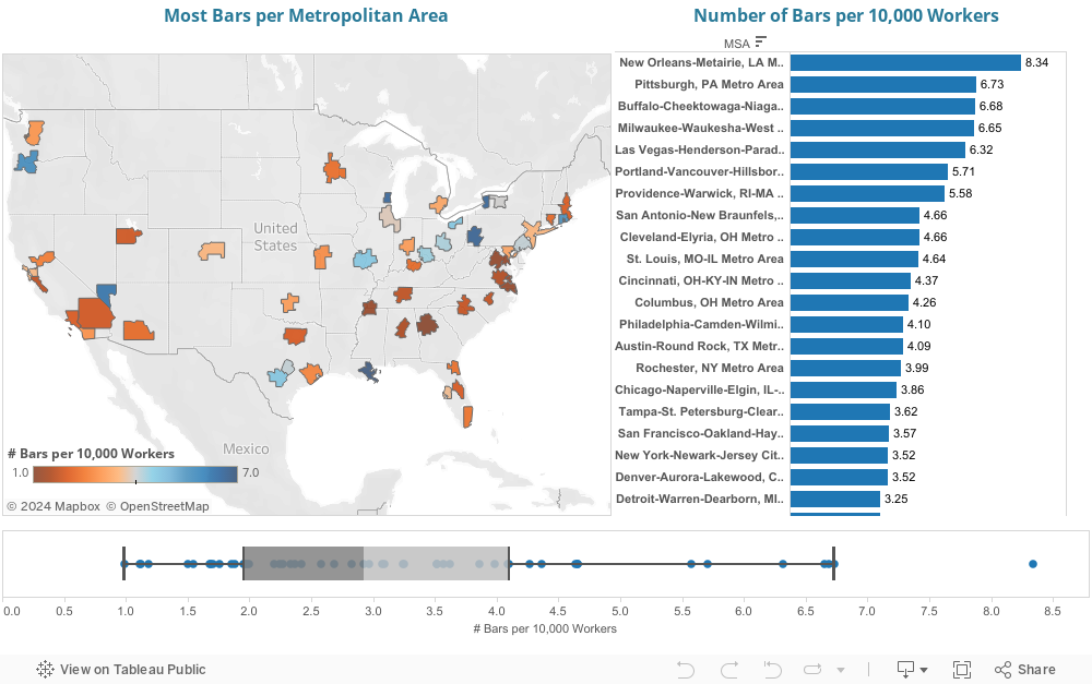
Great public spaces make great cities. But so do great private spaces. They provide opportunities for people to socialize, and provide the character that make a city more livable and unique. We have already talked about how restaurants add value to a city– but thought we’d look at bars in the same way.
Now, what makes a great bar depends on who you talk to- but regardless of if you prefer a wine bar with small plates, a gastropub, or a dive bar with ski ball (or without ski ball)—bars contribute to a city’s livability and an individual’s experience within a city. Trying to argue that one is better than another is, well, a way to start a barroom brawl. So while we can’t resolve which cities have the best bars, we can at least count which cities have the most bars.
We used County Business Patterns data to analyze the number of bars per 10,000 workers each the top 51 most populous metro areas. (The latest data is from 2012, reflected below):
It’s no surprise that New Orleans comes up first—it is renowned for its bars. (In case it wasn’t on your calendar, Mardis Gras is right around the corner..) There’s no particular rhyme or reason for the rest of the ranking; a variety of things can influence bar culture, such as policy and availability of licenses, availability and strength of public transit, age of residents (younger residents will desire more bars than older ones), and weather (colder places have seen higher consumption rates of alcohol).
Of course, the number of bars per capita isn’t a measure of quality (much like it isn’t for restaurants, either). More bars may reflect loose regulations, a higher city-wide per capita income, and of course, a desire for variety. For example, Pittsburgh’s historical blue-collar workforce may desire its older dive bars, but its new population of young engineers and medical workers allow for hip and more expensive wine, whiskey, and champagne bars to flourish.
Bars are just one way in which a city can make itself more livable for its residents. Livability is important—it attracts residents, and therefore tax payers, and helps to retain younger, talented workers. Ed Glaeser, Harvard economist and author, has encouraged the city of Boston in its efforts to allow bars to stay open later. He sees it as a matter of making Boston “livelier.” A city’s liveliness, to which bars certainly contribute, may not be of the utmost importance to all residents—but it’s clear it’s important to some, and can be a strategic advantage to cities. (To read more about how city distinctiveness and its placemaking efforts can benefit cities, go here and here.)
The red state/blue state divide is a persistent feature of American politics. Political differences among states are also associated with important economic differences, and a similar patterns hold across and within metro areas. Big cities are more likely to be blue, and smaller towns and rural areas are red. The more densely populated portions of every metro area are also more likely to be blue. Understanding and eventually bridging these fissures is a major challenge for the nation.
In an article in last week’s New York Times, urbanist Richard Florida seems to have, if perhaps only inadvertently, given aid and comfort to the persistent myth that people are somehow worse off in big cities compared with smaller towns and suburbs.
It could be that this impression is amplified by the headline writer’s provocative question: “Is life better in America’s Red States?” While he doesn’t directly answer this question, Florida seems to imply that because housing is on average cheaper in red states, people who live there must be better off.
But is it the case that cheap housing is a reliable marker of economic well-being?
While it’s true that average home prices are higher in blue states, it’s important to consider why that is, and what it signifies. First and most importantly, blue state housing prices are driven higher because incomes and economic productivity are higher in bluer states and bluer cities. GDP per capita tends to be higher in metro areas that favored President Obama’s re-election by the widest margin, as shown here:
Note: if you hover over the orange trend line, you will see that the p-value is low and significant at the 1% threshold. (The p-value measures the statistical likelihood that the relationship between vote margin and productivity –measured by GDP per capita–is different from zero). It measures correlation and tells us nothing about causality. You can see the now familiar red-blue pattern on the attached map; the size of circles for each city corresponds to GDP per capita:
The question then is, are higher housing prices in blue places an indication that the standard of living is lower?
Focusing on dollars per square foot misses the important fact that, unlike our stone age ancestors, we don’t rely on shelter solely as a means of warding off the cold, dark and wild beasts. We don’t value houses just as boxes—location matters. The reason the price of a square foot of land in Manhattan is worth as much as an acre of farmland in North Dakota has everything to do with the access it provides to a range of services, experiences and goods.
To an economist, if people are willing to pay a higher price for something—like housing in Manhattan or San Francisco or Honolulu—it’s a good indication that it has a higher value. A big part of the reason housing prices are higher in bigger cities than small ones is that we value the personal and economic opportunities that come from being close to lots of other people. As University of Chicago economist and Nobel Laureate Robert Lucas famously put it: “What can people be paying Manhattan or downtown Chicago rents for, if not being near other people?”
Harvard’s Ed Glaeser, author of Triumph of the City, has explored this theme in great depth. Increasingly, he argues, the biggest driver of city growth is the consumption advantages of living in cities, with close proximity to a wide range of goods, services, experiences, social interactions and cultural activities. This “consumer city” theory means that cities increase the well-being of their residents by facilitating all kinds of consumption. Indeed there are whole categories of goods, and especially services that are simply unavailable at any price outside major cities: think of everything from diverse ethnic restaurants to specialized medical care to cutting edge live art and music.
Provocative new work by Jessie Handbury shows once you adjust for the variety and quality of goods available in different places, the cost of living in big cities is actually lower than smaller cities. Her work looks at variations in the price and availability of food. It’s almost certain that differences in services are even more skewed in favor of city residents.
Moreover, looking just at differences in housing costs ignores important city advantages of density, proximity and convenience. Higher rents invariably provide city residents with better physical access to jobs, shopping, culture and social interaction. As Scott Bernstein and his colleagues at the Center for Neighborhood Technology have shown, savings in transportation costs in cities largely, and in some cases fully, offset differences in rents.
Florida makes one point that we all ought to pay attention to: as a nation we’d be much better off if we created more opportunities for people to live and work in blue cities. Because residents in big blue cities are so much more productive than otherwise identical workers in smaller red cities, we take a substantial hit to national economic productivity and growth. Enrico Moretti estimates GDP would be 13 percent or so higher if it weren’t for constrained population growth in these highly productive cities.
There’s an old adage that claims than an economist is someone who knows the price of everything and the value of nothing. Assuming that difference in house prices per square foot across metropolitan areas accurately reflects cost of living differences is arguably wrong. Cheap houses entail high costs for other things—like transportation—and to believe cheap houses automatically equals better quality of life misses the huge and tangible differences in the price and availability of a whole range of goods, services and experiences that make life nicer.
The political message here ought to be the high prices for blue cities generally, and the growing market premium for housing in dense, urban neighborhoods particularly, is a signal that Americans want more cities, and more opportunities for urban living. It’s a fair criticism of blue cities to say that they haven’t done a good enough job of making it possible for more people to live there—and this has a lot to do with local land use planning. But it has also been amplified by decades of federal subsidies to sprawling low-density development.
One final addendum on Richard Florida’s political analysis: as troubling as the persistent red/blue divide is among states and cities, it’s probably wrong to attribute the 2014 election results to this dichotomy. The huge fall off in turnout, especially among younger voters compared to 2012, is clearly the big driver of November’s red tide. Not only was 2014 the lowest off-year election turnout—only 37 percent—in six decades, but the electorate skewed far older in 2014 than in 2012. Voters over 65 made up 22 percent of voters in 2014, up from 16 percent in 2012; voters under 30 made up 13 percent of the electorate down from 19 percent in 2012. The 2014 red surge wasn’t so much geographic as it was demographic.
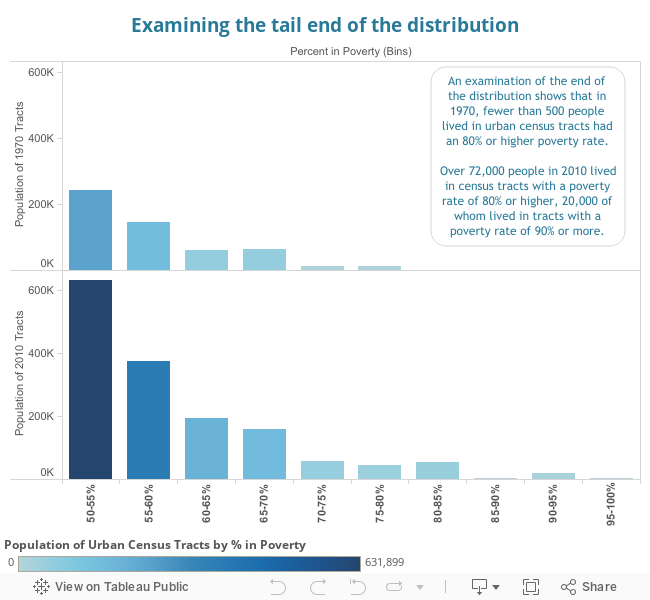
Recently, we discussed the growth in the number of urban high-poverty neighborhoods, which we illustrated by examining the distribution of poverty rates among census tracts. This analysis showed that high poverty neighborhoods are becoming more common in urban areas. Today we will use this distribution to discuss what few of us have directly experienced: extremely concentrated poverty. There is a small but growing segment of the population that lives in significantly differently conditions than the rest of the population; this group is one that sees extreme hardship and the highest rates of poverty nationally.
As you can see, while next to no one lived in urban census tracts had an 80% or higher poverty rate in 1970, over 72,000 people lived in neighborhoods with an 80% or higher poverty rate 40 years later. 20,000 lived in tracts with a 90% or higher poverty rate. It is extremely difficult for many to imagine living in a neighborhood where 1 in 2 people live in poverty (notice that this number tripled 1970 to 2010), but to live in a place where almost no one lives on more than $22,050 a year- for a family of 4- has profound implications for those residents.
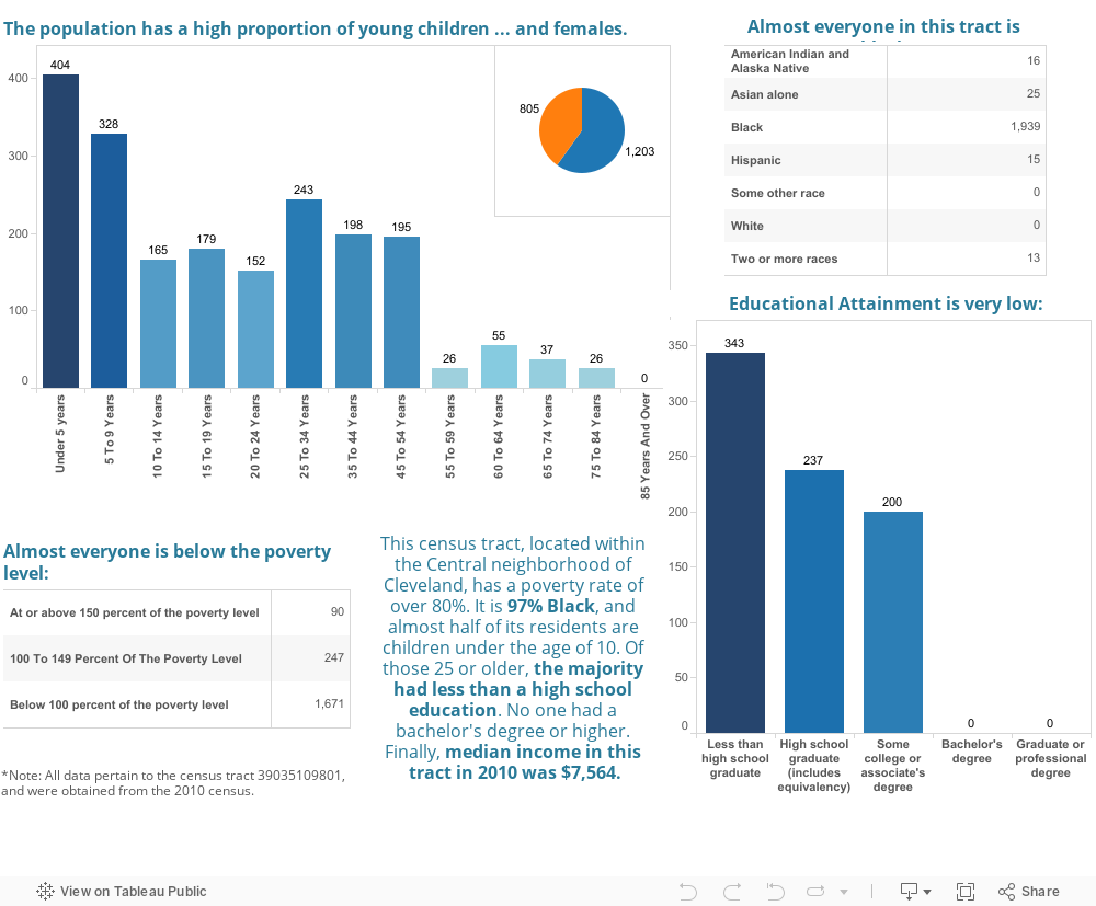
While 72,000 is not a lot in the scope of the millions of residents of urban neighborhoods nationwide, it is still deeply concerning to have that many live in pockets of such highly concentrated poverty. To understand more about what 80% poverty means, I examined a census tract in Cleveland with an 83% poverty rate. It is census tract # 39035109801, and it is part of the Central neighborhood in Cleveland. In 1970, it had over a 50% poverty rate. Google Earth shows this picture of it:
It is a mix of empty land, industrial warehouses, and low-income housing units. The 2010 Census data provides the following demographic breakdown:
These are extremely atypical demographics. For example, the national median household income was $50,046 in 2010, compared to $7,654 in this neighborhood. Even with pictures, numbers, and demographic profiles, it is very difficult for most people to understand how difficult it can be to live in a place with this level of poverty.
We know that high poverty rates– even at the levels of 30% instead of 50% or higher- can have long-lasting implications for residents. Specifically,
“Concentrated poverty is associated with negative social effects (higher crime, worse mental and physical health), and lower economic prospects (both for current residents now and their children over their lifetimes). Concentrated poverty tends to be self-reinforcing: low-income communities have fewer fiscal resources (despite greater needs), producing low-quality public services. A lack of strong social networks undercuts the political efficacy of these citizens. There are a number of studies that review the extensive literature on the negative effects of concentrated poverty (Jargowsky & Swanstrom, 2009; Sard & Rice, 2014; Kneebone, Nadeau, & Berube, 2011).” –Lost in Place: Why the persistence and spread of concentrated poverty—not gentrification—is our biggest urban challenge.
Most troubling is the direct impact on children in poverty. 26% of children are living in poverty, almost double the national rate (14.5%). In the neighborhood I just highlighted, 897 children 14 and younger—or 45% of the population according to the census—grew up in a place where if they were not impoverished, almost all of their neighbors were. The effects of a poor neighborhood, including sub-standard public services, worse schools, a lack of social ties necessary to get better jobs, and the many other well-noted direct social and economic impacts of living in concentrated poverty all mean that a growing number young children are growing up with less of a chance than they would have had 40 years ago.
More unfortunately, this also means that demographically, the growing concentration of poverty and income segregation has resulted in lower opportunities for people of color. Poverty and lowered income mobility disproportionately affects children of color; 71% of black infants and toddlers are low income, as are 67% of Hispanic infants and toddlers. (The Central neighborhood above is an even more extreme example of this disproportionality.) New evidence by Reardon, Fox and Townsend (2014) examines economic integration and racial segregation, noting that:
“The racial disparities in neighborhood income distributions are particularly troubling because these are differences that are present even among households with the same incomes. If long-term exposure to neighborhood poverty negatively affects child development, educational success, mental health, and adult earnings (and a growing body of research suggests it does, as noted above), then these large racial disparities in exposure to poverty may have long-term consequences. They mean that black and Hispanic children and families are doubly disadvantaged—both economically and contextually—relative to white and Asian families.”
Given the self-reinforcing nature of poverty and its effects, this is a very concerning trend for black and Hispanic communities. The more common experience of urban poverty, and its concentration and deepening, doesn’t add up to a promising future- for any of us.
(At CityObservatory, we will continue to explore themes of poverty, economic integration, and policy solutions aimed at alleviating these issues. We also hope to illuminate growing evidence that increasing the welfare of low-income citizens has positive implications for middle and higher-income citizens. To read more about income segregation and economic opportunity, go here. For some links to articles we find particularly relevant go here and here.)
The number of security guards is a good measure of a city’s level of “anti-social” capital
We thought we’d take an updated look at one of our favorite indicators of “social-capital”–the number of private security guards as a share of the local workforce. Having lots of security guards is likely an indicator of distrust and disorder; organizations hire more security guards when they’re worried about crime, theft or property damage.
We haven’t looked at this indicator since before the Covid pandemic, and wanted to see if much had changed. In the aggregate, according to the Bureau of Labor Statistics, the number of security guards (occupational code 33-9032) has increased by more than 100,000 since 2013, from 1,066,730 to 1,202,940, but that increase is roughly in line with total employment growth over the past decade.
Which cities have the most security guards per capita?
Just as the U.S. has a higher fraction of security guards than other nations, some cities have more security guards than others. To understand these patterns, we’ve compiled Bureau of Labor Statistics data from the Occupational Employment Survey on private security guards. BLS defines security guards as persons who guard, patrol, or monitor premises to prevent theft, violence, or infractions of rules, and whom may operate x-ray and metal detector equipment. (The definition excludes TSA airport security workers).
This occupational data reports the number of security guards in every large metropolitan area in the country. Adjusting these counts by the size of the workforce in each metro area tells us which places have proportionately the most security guards–which are arguably the least trusting–and which places have the fewest security guards, which may tend to indicate higher levels of social trust. We rank metropolitan areas by the BLS estimates of the number of security guards per 1,000 workers. For particularly large metro areas, we report BLS estimates for the largest metropolitan division in a metro area.)
Security Guards per 1,000 Workers, 2023
At the top of the list is Las Vegas. While the typical large metro area has about 8 security guards per 1,000 workers, Las Vegas has 18 per 1,000. Memphis ranks second, with not quite twice as many (14 per 1000) as the average large metro. Other cities with high ratios of security guards to population are New Orleans, Miami and Baltimore. Washington D.C., with its high concentration of government offices, defense and intelligence agencies, and federal contractors, also has a high proportion of security guards.
At the other end of the spectrum are a number of cities in which the ratio of security guards to workforce is one-third lower than in the typical metro area. At the bottom of the list are Grand Rapids, Minneapolis-St. Paul, Providence and Portland, all with fewer than six security guards per 1,000 workers. (The Twin Cities and Portland also do well on most of Putnam’s measures of social capital)
Security Guards as Anti-Social Capital
In his book Bowling Alone, Robert Putnam popularized the term “social capital.” Putnam also developed a clever series of statistics for measuring social capital. He looked at survey data about interpersonal trust (can most people be trusted?) as well as behavioral data (do people regularly visit neighbors, attend public meetings, belong to civic organizations?). Putnam’s measures try to capture the extent to which social interaction is underpinned by widely shared norms of openness and reciprocity.
It seems logical to assume that there are some characteristics of place which signify the absence of social capital. One of these is the amount of effort that people spend to protect their lives and property. In a trusting utopia, we might give little thought to locking our doors or thinking about a “safe” route to travel. In a more troubled community, we have to devote more of our time, energy, and work to looking over our shoulders and protecting what we have.
The presence of security guards in a place is arguably a good indicator of this “negative social capital.” Guards are needed because a place otherwise lacks the norms of reciprocity that are needed to assure good order and behavior. The steady increase in the number of security guards and the number of places (apartments, dormitories, public buildings) to which access is secured by guards indicates the absence of trust.
The number of security guards in the United States has increased from about 600,000 in 1980 to more than 1,000,000 in 2000 (Strom et al., 2010). These figures represent a steep increase from earlier years. In 1960, there were only about 250,000 guards, watchmen and doormen, according to the Census (which used a different occupational classification scheme than is used today). The Bureau of Labor Statistics reports that the number of US security guards has increased by almost 100,000 since 2010, to a total of more than 1.1 million. As a measure of how paranoid and unwelcoming we are as a nation, security guards outnumber receptionists by more than 100,000 workers nationally.
Sam Bowles and Arjun Jayadev argue that we have become “one nation under guard” and say that the growth of guard labor is symptomatic of growing inequality. The U.S. has the dubious distinction of employing a larger share of its workers as guards than other industrialized nations and there seems to be a correlation between national income inequality and guard labor.
It seems somewhat paradoxical, but the salaries paid to security guards get treated as a net contribution to gross domestic product. Yet, in many important senses, security guards don’t add to the overall value of goods and services so much as they serve to keep the ownership of those goods and services from being rearranged. As Nobel prize winning economist Douglass North has argued, we ought to view the cost of enforcing property rights as a “transaction cost.” In that sense, cities that require lots of guards to assure that property isn’t stolen or damaged and that residents, workers, or customers aren’t victimized, actually have higher costs of living and doing business than other places. These limits on easy interaction may stifle some of the key advantages to being in cities.
The number of security guards is a good measure of a city’s level of “anti-social” capital
In his book Bowling Alone, Robert Putnam popularized the term “social capital.” Putnam also developed a clever series of statistics for measuring social capital. He looked at survey data about interpersonal trust (can most people be trusted?) as well as behavioral data (do people regularly visit neighbors, attend public meetings, belong to civic organizations?). Putnam’s measures try to capture the extent to which social interaction is underpinned by widely shared norms of openness and reciprocity.
It seems logical to assume that there are some characteristics of place which signify the absence of social capital. One of these is the amount of effort that people spend to protect their lives and property. In a trusting utopia, we might give little thought to locking our doors or thinking about a “safe” route to travel. In a more troubled community, we have to devote more of our time, energy, and work to looking over our shoulders and protecting what we have.
The presence of security guards in a place is arguably a good indicator of this “negative social capital.” Guards are needed because a place otherwise lacks the norms of reciprocity that are needed to assure good order and behavior. The steady increase in the number of security guards and the number of places (apartments, dormitories, public buildings) to which access is secured by guards indicates the absence of trust.
The number of security guards in the United States has increased from about 600,000 in 1980 to more than 1,000,000 in 2000 (Strom et al., 2010). These figures represent a steep increase from earlier years. In 1960, there were only about 250,000 guards, watchmen and doormen, according to the Census (which used a different occupational classification scheme than is used today). The Bureau of Labor Statistics reports that the number of US security guards has increased by almost 100,000 since 2010, to a total of more than 1.1 million. As a measure of how paranoid and unwelcoming we are as a nation, security guards outnumber receptionists by more than 100,000 workers nationally.
Sam Bowles and Arjun Jayadev argue that we have become “one nation under guard” and say that the growth of guard labor is symptomatic of growing inequality. The U.S. has the dubious distinction of employing a larger share of its workers as guards than other industrialized nations and there seems to be a correlation between national income inequality and guard labor.
Just as the U.S. has a higher fraction of security guards than other nations, some cities have more security guards than others. To understand these patterns, we’ve compiled Bureau of Labor Statistics data from the Occupational Employment Survey on private security guards. BLS defines security guards as persons who guard, patrol, or monitor premises to prevent theft, violence, or infractions of rules, and whom may operate x-ray and metal detector equipment. (The definition excludes TSA airport security workers).
This occupational data reports the number of security guards in every large metropolitan area in the country. Adjusting these counts by the size of the workforce in each metro area tells us which places have proportionately the most security guards–which are arguably the least trusting–and which places have the fewest security guards, which may tend to indicate higher levels of social trust. We rank metropolitan areas by the BLS estimates of the number of security guards per 1,000 workers. For particularly large metro areas, we report BLS estimates for the largest metropolitan division in a metro area.)
Security Guards per 1,000 Workers, 2017
At the top of the list is Las Vegas. While the typical large metro area has about 8 security guards per 1,000 workers, Las Vegas has 19 per 1,000. Miami ranks second, with more than twice as many (18 per 1000) as the average large metro. Other cities with high ratios of security guards to population are Memphis, New Orleans, Miami and Baltimore. Washington D.C., with its high concentration of government offices, defense and intelligence agencies, and federal contractors, also has a high proportion of security guards.
At the other end of the spectrum are a number of cities in which the ratio of security guards to workforce is one-third lower than in the typical metro area. At the bottom of the list are Minneapolis-St. Paul, Grand Rapids and Portland, all with fewer than six security guards per 1,000 workers. (The Twin Cities and Portland also do well on most of Putnam’s measures of social capital)
It seems somewhat paradoxical, but the salaries paid to security guards get treated as a net contribution to gross domestic product. Yet, in many important senses, security guards don’t add to the overall value of goods and services so much as they serve to keep the ownership of those goods and services from being rearranged. As Nobel prize winning economist Douglass North has argued, we ought to view the cost of enforcing property rights as a “transaction cost.” In that sense, cities that require lots of guards to assure that property isn’t stolen or damaged and that residents, workers, or customers aren’t victimized, actually have higher costs of living and doing business than other places. These limits on easy interaction may stifle some of the key advantages to being in cities.
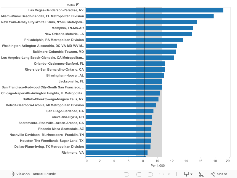
Cops per capita: An indicator of “Anti-social” capital?”
Why do some cities have vastly fewer police officers relative to their population than others?
In the 1966 film “The Thin Blue Line” director William Friedkin explored the role police officers played in protecting the broader populace from violence and disorder. As we’ve frequently noted at City Observatory, there’s been a marked, and in many ways, under-appreciated decline in crime rates in American cities. In the typical large city, crime is less than half what it was when Friedkin filmed. Interestingly, the thickness of the “blue line” varies widely across US metro areas. We think that’s a possible indicator of which places perceive they need more police in order to live safely. The fact that some cities have far fewer police than others suggests that social capital and other factors deterring crime may be more important in explaining variations in crime rates.
If it seems like there are a lot of police in New York, you’re right.
Previously, we’ve used counts of the number of security guards per capita as an indicator of “anti-social” capital. Our measurement built on the idea of social capital explained by Robert Putnam, in his book Bowling Alone. Putnam developed a clever series of statistics for measuring social capital. He looked at survey data about interpersonal trust (can most people be trusted?) as well as behavioral data (do people regularly visit neighbors, attend public meetings, belong to civic organizations?). Putnam’s measures try to capture the extent to which social interaction is underpinned by widely shared norms of openness and reciprocity.
It seems logical to assume that there are some characteristics of place which signify the absence of social capital. One of these is the amount of effort that people spend to protect their lives and property. In a trusting utopia, we might give little thought to locking our doors or thinking about a “safe” route to travel. In a more troubled community, we have to devote more of our time, energy, and work to looking over our shoulders and protecting what we have.
We argued that the presence of security guards in a place is arguably a good indicator of this “negative social capital.” Guards are needed because a place otherwise lacks the norms of reciprocity that are needed to assure good order and behavior. The steady increase in the number of security guards and the number of places (apartments, dormitories, public buildings) to which access is secured by guards indicates the absence of trust.
Might the same notion apply to public safety officers? If some places feel the need to hire more police to feel safe, doesn’t that suggest an absence of social capital? A few weeks back, we were introduced to an analysis of the police to population ratio by state. Compiled by Bill McGonigle, this analysis used data from the FBI’s Crime in the United States, to estimate the total number of police in each state, and then divided the result by population. That got us thinking about creating a similar index for metropolitan areas. The FBI’s data aren’t reported by MSA, so instead we looked to the Census Bureau.
We undertake this comparison at the metropolitan level, using data from the Census Bureau’s American Community Survey. For the most part, using metro data nets out the effects of the wide variations in the demographics of central city boundaries from place to place, which tends to confound municipal comparisons. (For example, the cities of Miami and Atlanta include less than 10 percent of the population of their metro areas, while Jacksonville and San Antonio include a majority, including areas that would be regarded as “suburban” elsewhere.)The ACS asks respondents about their occupation, three occupations correspond to police officers:
3710: First-line supervisors of police and detectives
3820: Detectives and criminal investigators
3870: Police officers
We used the University of Minnesota’s invaluable IPUMS* data source to tabulate these data by metropolitan area. The underlying data are from the 2014-2018 five-year American Community Survey. There’s one underlying quirk of the ACS data to be aware of: respondents are classified according to where they live, rather than where they work. Because most metropolitan areas are large and encompass entire labor markets, that’s a reasonably accurate way of counting; but in some metro areas, where people commute from outside the metro area, this may not accurate count the number of police employed locally.
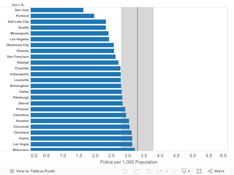
When we tabulate the data for metropolitan areas with a million or more population, and divide the number of police by the population of each metro area, we get the following ranking. (We report the number of police officers per 1,000 population, metro areas with the fewest police per capita are shown at the top of the list).
There’s a wide variation in the number of police per capita across metro areas. While the median metropolitan area has about 3.3 police officers per 1,000 population, some have as few as 2.4, while others have 5 or more.
The cities with the fewest police officers include San Jose, Portland, Salt Lake City, Minneapolis and Seattle. The top cities on our list mostly coincide with the top states on McGonigle’s list of police population ratios. Oregon, Washington, Minnesota and Utah rank first, second, fourth and fifth, respectively, of the state’s with the fewest police officers per capita. (The Twin Cities, Seattle, Salt Lake and Portland also do well on most of Putnam’s measures of social capital).
Recall that our data is on the number of police living in each metro area. We suspect that the relatively low number of police per thousand population in San Jose (1.6) and Los Angeles (2.4) reflects the high cost of housing and long distance commuting in these areas. Riverside, which is adjacent to Los Angeles has a much higher than average number of police per 1,000 population (4.50). It seems likely that proportionately more police officers commute from adjacent areas outside the Los Angeles and San Jose metro areas which have lower housing costs.
The metro areas with the most police officers per capita include Virginia Beach, Las Vegas, and Miami. Some of the cities with high numbers of police fit our media stereotypes: Law and Order (New York) and The Wire (Baltimore) both rank in the top five for police per capita, both have at least 50 percent more police per capita than the typical large metro in the US.
Security Guards and Police Officers
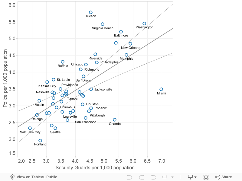
As we mentioned, we’ve previously looked at the number of security guards per capita as another indicator of “anti-social capital.” We thought we’d look at the relationship between the number of police officers per capita and the number of security guards per capita. In theory, it might be the case that private security guards could be filling a gap, i.e. more common in places where the public sector isn’t providing “enough” security. Or alternatively, it could be that fear or security concerns could lead to having both more public police and more security guards in some cities, and fewer in others.
The data strongly support the latter interpretation. The following chart shows the per capita number of police (from the chart above) and the per capita number of security guards (from the same ACS survey from which we drew our police officer counts). Each dot represents one of the largest US metro areas. We’ve excluded three metro areas from our calculations: San Jose and Los Angeles (because of the commuting issue discussed above) and Las Vegas, because it is a wide outlier, with far more security guards per capita than any other city.
There’s a strong positive correlation between the number of police per capita and the number of security guards per capita in a metropolitan area. Places that tend to have more police, also tend to have more security guards. Portland, Seattle and Minneapolis all rank low in both the number of security guards and police per capita. Conversely, New York, Washington, Baltimore and New Orleans have high numbers of both police and security guards. Most cities fall relatively close to the regression line we’ve plotted on the chart, but there are some outliers. Miami and Orlando have relatively more private security guards than police; while Virginia Beach has many more police than security guards. This tends to reinforce our view that out metric is reflecting anti-social capital, or perhaps more accurately, the absence of social capital in some cities. Both the public sector and the private sector spend considerably more resources in some metro areas than others in order to protect persons and property, almost certainly because they believe that localized norms of behavior and reciprocity are inadequate.
* – Steven Ruggles, Sarah Flood, Ronald Goeken, Josiah Grover, Erin Meyer, Jose Pacas and Matthew Sobek. IPUMS USA: Version 10.0 [dataset]. Minneapolis, MN: IPUMS, 2020. https://doi.org/10.18128/D010.V10.0
In his book Bowling Alone, Robert Putnam popularized the term “social capital.” Putnam also developed a clever series of statistics for measuring social capital. He looked at survey data about interpersonal trust (can most people be trusted?) as well as behavioral data (do people regularly visit neighbors, attend public meetings, belong to civic organizations?). Putnam’s measures try to capture the extent to which social interaction is underpinned by widely shared norms of openness and reciprocity.
It seems logical to assume that there are some characteristics of place which signify the absence of social capital. One of these is the amount of effort that people spend to protect their lives and property. In a trusting utopia, we might give little thought to locking our doors or thinking about a “safe” route to travel. In a more troubled community, we have to devote more of our time, energy, and work to looking over our shoulders and protecting what we have.
The presence of security guards in a place is arguably a good indicator of this “negative social capital.” Guards are needed because a place otherwise lacks the norms of reciprocity that are needed to assure good order and behavior. The steady increase in the number of security guards and the number of places (apartments, dormitories, public buildings) to which access is secured by guards indicates the absence of trust.
The number of security guards in the United States has increased from about 600,000 in 1980 to more than 1,000,000 in 2000 (Strom et al., 2010). These figures represent a steep increase from earlier years. In 1960, there were only about 250,000 guards, watchmen and doormen, according to the Census (which used a different occupational classification scheme than is used today).
This trend has led Sam Bowles and Arjun Jayadev to argue that we have become “one nation under guard” and that the growth of guard labor is symptomatic of growing inequality. The U.S. has the dubious distinction of employing a larger share of its workers as guards than other industrialized nations and there seems to be a correlation between national income inequality and guard labor.
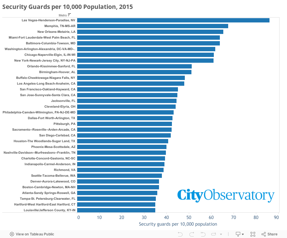
Just as the U.S. has a higher fraction of security guards than other nations, some cities have more security guards than others. To understand these patterns, we’ve compiled Bureau of Labor Statistics data from the Occupational Employment Survey on private security guards. BLS defines security guards as persons who guard, patrol, or monitor premises to prevent theft, violence, or infractions of rules, and whom may operate x-ray and metal detector equipment. (The definition excludes TSA airport security workers). In 2015, there were more than 1,050,000 security guards in the US.
This occupational data reports the number of security guards in every large metropolitan area in the country. Adjusting these counts by the size of the population in each metro area tells us which places have proportionately the most security guards– which are arguably the least trusting, and which places have the fewest security guards. This may be an indicator of higher levels of social trust.
Here are the data:
At the top of the list is Las Vegas. While the typical large metro area has about 39 security guards per 10,000 population, these Miami has more than twice as many (86 per 10,000). Other cities with high ratios of security guards to population are Memphis, New Orleans, Miami and Baltimore. Washington D.C., with its high concentration of government offices, defense and intelligence agencies, and federal contractors, also has a high proportion of security guards.
At the other end of the spectrum are a number of cities in which the ratio of security guards to population is one-third lower than in the typical metro area. At the bottom of the list are Minneapolis-St. Paul, Providence and Portland. (The Twin Cities and Portland also do well on most of Putnam’s measures of social capital)
It seems somewhat paradoxical, but the salaries paid to security guards get treated as a net contribution to gross domestic product. Yet, in many important senses, security guards don’t add to the overall value of goods and services so much as they serve to keep the ownership of those goods and services from being rearranged. As Nobel prize winning economist Douglass North has argued, we ought to view the cost of enforcing property rights as a “transaction cost.” In that sense, cities that require lots of guards to assure that property isn’t stolen or damaged and that residents, workers, or customers aren’t victimized, actually have higher costs of living and doing business than other places. These limits on easy interaction may stifle some of the key advantages to being in cities.
In his book Bowling Alone, Robert Putnam popularized the term “social capital.” Putnam also developed a clever series of statistics for measuring social capital. He looked at survey data about interpersonal trust (can most people be trusted?) as well as behavioral data (do people regularly visit neighbors, attend public meetings, belong to civic organizations?). Putnam’s measures try to capture the extent to which social interaction is underpinned by widely shared norms of openness and reciprocity.
It seems logical to assume that there are some characteristics of place which signify the absence of social capital. One of these is the amount of effort that people spend to protect their lives and property. In a trusting utopia, we might give little thought to locking our doors or thinking about a “safe” route to travel. In a more troubled community, we have to devote more of our time, energy, and work to looking over our shoulders and protecting what we have.
The presence of security guards in a place is arguably a good indicator of this “negative social capital.” Guards are needed because a place otherwise lacks the norms of reciprocity that are needed to assure good order and behavior. The steady increase in the number of security guards and the number of places (apartments, dormitories, public buildings) to which access is secured by guards indicates the absence of trust.
The number of security guards in the United States has increased from about 600,000 in 1980 to more than 1,000,000 in 2000 (Strom et al., 2010). These figures represent a steep increase from earlier years. In 1960, there were only about 250,000 guards, watchmen and doormen, according to the Census (which used a different occupational classification scheme than is used today).
This trend has led Sam Bowles and Arjun Jayadev to argue that we have become “one nation under guard” and that the growth of guard labor is symptomatic of growing inequality. The U.S. has the dubious distinction of employing a larger share of its workers as guards than other industrialized nations and there seems to be a correlation between national income inequality and guard labor.
Just as the U.S. has a higher fraction of security guards than other nations, some cities have more security guards than others. To understand these patterns, we’ve compiled Bureau of Labor Statistics data from the Occupational Employment Survey on private security guards. BLS defines security guards as persons who guard, patrol, or monitor premises to prevent theft, violence, or infractions of rules, and whom may operate x-ray and metal detector equipment. (The definition excludes TSA airport security workers).
This occupational data reports the number of security guards in every large metropolitan area in the country. Adjusting these counts by the size of the workforce in each metro area tells us which places have proportionately the most security guards– which are arguably the least trusting, and which places have the fewest security guards. This may be an indicator of higher levels of social trust.
At the top of the list are Las Vegas and Miami. While the typical large metro area has about 9 security guards per 1,000 workers, these two cities have roughly twice as many (Las Vegas as 21 per 1,000; Miami 17 per 1,000. Washington D.C., with its high concentration of government offices, defense and intelligence agencies, and federal contractors, also has a high proportion of security guards.
At the other end of the spectrum are a number of cities in which security guards make up about one-third less of the workforce than in the typical metro area. At the bottom of the list are Minneapolis-St. Paul, Providence and Portland. (The Twin Cities and Portland also do well on most of Putnam’s measures of social capital)
It seems somewhat paradoxical, but the salaries paid to security guards get treated as a net contribution to gross domestic product. Yet, in many important senses, security guards don’t add to the overall value of goods and services so much as they serve to keep the ownership of those goods and services from being rearranged. As Nobel prize winning economist Douglass North has argued, we ought to view the cost of enforcing property rights as a “transaction cost.” In that sense, cities that require lots of guards to assure that property isn’t stolen or damaged and that residents, workers, or customers aren’t victimized, actually have higher costs of living and doing business than other places. These limits on easy interaction may stifle some of the key advantages to being in cities.
The big idea: housing in desirable city neighborhoods in getting more expensive because the demand for urban living is growing. The solution? Build more great neighborhoods.
To an economist, prices are an important signal about value: rising prices for an object or class of objects signal increasing value relative to other objects. In our conventional supply and demand framework, rising prices are often symptomatic of a growing demand or a limited supply: that consumers now want more of some commodity or product than is currently available in the market.
Trends in housing prices point to some significant shifts in consumer demand, especially in the value that consumers attach to urban, as opposed to suburban, locations. The rising relative price of housing in cities is a strong indication of the growing demand for urbanity–and its unfortunate short supply.
Case in point: Portland, Oregon. Let’s take a quick glance back at housing prices in the Portland area over the past decade (courtesy of Zillow’s comprehensive archive of monthly housing price estimates). For simplicity, we’ll look at four Portland metro area sub-markets–the central city of Portland (home to a little more than a quarter of the region’s population), and the region’s three principal suburban counties–Clackamas and Washington Counties in Oregon, and Clark County, Washington. The following table shows single-family home prices for 2005, 2007 (the peak year for the region’s housing market), 2010 (the bottom of the bust) and the data for the latest quarter (3rd Quarter 2014). To simplify comparison between the city and suburbs, I’ve calculated the un-weighted average price for for the three suburban counties.
In 2005, in the heyday of the housing bubble, the city of Portland’s housing prices were $236,000, on average about $20,000 lower than the three suburban jurisdictions, ranging from $3,000 lower than Clark County, to $30,000 lower than Clackamas County. According to Zillow’s latest estimates the average Portland single family home is now worth about $309,000. Portland’s prices today are about $20,000 higher than the average of the three suburban counties, and its price level is equal to that of the Clackamas, the priciest suburban county.
Not only have houses in the City of Portland re-couped all the value lost to the collapse of the housing market, they are now worth on average about 6 percent more than they were at the peak of the housing bubble. Meanwhile, the average suburban home is still about 7 percent below its peak price.
The verdict of this shift in housing markets is unequivocal: housing in the city is now more valuable, and has appreciated faster than suburban housing. In less than a decade, the city has reversed geographic polarity of the regional housing market: the average city house sold at a nine percent discount to the average suburban house in 2005; today the average city house commands a seven percent premium.
There are doubtless many reasons for this shift. We know that young, well-educated workers are increasingly choosing to live in close-in urban neighborhoods. Over the past decade, the big increase in gasoline prices has made car-dependent suburban locations more expensive and less attractive than urban living. My 2008 CEOs for Cities report “Driven to the Brink,” reported some early evidence that housing prices fell most on the suburban fringe, and held up best in urban centers.
The falling price of suburban housing relative to city housing is the most persuasive evidence possible about consumer preferences. Citing the results of a recent opinion survey, some have claimed that Portland-area consumers allegedly prefer suburban locations to urban ones. But the fact that consumers are not willing to pay as much for suburban housing as they are for urban housing, and that while urban home prices are setting new highs, suburban prices are still well below their peaks, shows that the reverse is actually true: consumers value urban single family housing more than its suburban alternative.
The rising price of urban housing is a market signal that housing in the city has value to consumers–and that we should be making more of it. Prices are rising because the demand for city living is rising faster than we’ve expanded the supply of urban housing. The clear public policy implication of the market data is that city and regional governments should be looking seriously at ways to expand the supply of urban housing. And expanding supply in the city is especially important to addressing concerns about housing affordability: unless supply expands, we can reasonably expect the growing demand for urban living to push prices still higher, reducing affordability.
While this commentary focuses on the city of Portland, there are good reasons to believe that the nation is experiencing a significant and growing shortage of cities as well. As Americans rediscover–and recreate–the attractiveness of urban living, this shortage is likely to grow. Paying close attention to the signals provided by the housing market is key to understanding the nature of this challenge and implementing appropriate solutions.
Technical Notes: Data for this analysis were obtained from Zillow.com’s city and county ZHVI-Single Family Residential index. Values are annual averages of monthly data, rounded to the nearest $1,000. The suburban average presented here is the unweighted average of the price index values reported for the three suburban counties. Since these four areas are all part of a single, larger metropolitan economy that shares the same industrial and job base, its pretty straightforward to interpret the change in relative prices among sub-markets as indicative of the relative change in consumer preference for these areas. Also, because so little new single family housing has been constructed in the past several years, these numbers are not meaningfully skewed by the construction of a large number of new houses in any one jurisdiction.
For decades, the common perception about cities is that they were dangerous, dirty, and crowded. A look at the facts tells a different story: our cities are cleaner, safer, quicker, and healthier than ever. Today I’ll take a look at how urban neighborhoods have become safer despite public attitudes to the contrary.
On the whole, violent crime is declining in the Unites States. The overall murder rate has dropped by more than half since 1991 and property crimes like burglary have been on the decline. As a result, American concern about crime has ebbed: in 1994 a majority of Americans told Gallup crime was the nation’s most pressing issue; only 1 percent gave that answer in 2011. Even though we individually regard crime as less of a problem, people still tend to think of big cities as somehow dangerous. Consider the New York paradox: According to YouGov, Americans who have never been to the Big Apple are evenly divided on whether its safe or not, while those who have traveled their regard it as safe by a two-to-one margin.
This drop in crime has been greatest in the nation’s largest cities. Violent crimes of all kinds declined 29 percent in the central cities of the nation’s 100 largest metropolitan areas — a significantly steeper decline than in the nation’s suburbs (down 7 percent). Property crimes in central cities fell even more — down 46 percent, compared to a 31 percent decrease in suburbs.
Survey evidence demonstrates that the drop in crime is not widely understood by the general public. A September 2014 survey by YouGov found that most Americans believe crime rates have increased over the past two decades. Their data show that 50 percent of Americans think crime rates are up; 22 percent think they are down, 15 percent think crime rates are unchanged, and 13 percent don’t know.
Hollywood continues to peddle the storyline of cities of the future as savage, crime-ridden dystopias (see for example this year’s remake of Robocop). Meanwhile the good news about safer cities goes almost unnoticed. A 2011 study by the Brookings Institution pointing to significant declines in 80 of the nation’s 100 largest cities has gone practically unnoticed, garnering just seven citations in other work, according to Google Scholar. (Google Scholar, August 19, 2014).
While crime has dropped, it’s not the only factor making cities better places to live. Wednesday, I’ll conclude the series by showing how traffic jams aren’t actually as bad as they used to be.
The Reality: Urban air quality has improved dramatically since 1990
For decades, the common perception about cities is that they were dangerous, dirty, and crowded. A look at the facts tells a different story: our cities are cleaner, safer, quicker, and healthier than ever. Today I’ll take look at the story of smog and how smart policy has cleaned the urban air we breathe.
Over the past two decades, the United States has made significant progress in reducing air pollution. Emissions of the six major air pollutants—including nitrogen oxides, carbon monoxide, hydrocarbons and particulates–are collectively down 56 percent since 1990. We’ve also made tremendous progress in reducing toxic air pollutants: lead levels in ambient air have been reduced 84 percent; benzene levels are down 66 percent. This progress has been widespread in the nation’s cities. The number of days in which air quality failed to meet health standards has declined in all 35 of the nation’s largest metropolitan areas.
Every day, the storyline of American cities is changing. We’re hearing more about the social and economic opportunities that cities provide, but it’s important to recognize that urban neighborhoods become some of the best places to raise a family.
On Wednesday Thursday, I’ll take on the myth that criminals are running rampant in the streets of the country’s major cities. Spoiler alert: Robocop isn’t coming to a city near you.
A new report detailing the “costs” of congestion twists the data to become little more than talking points for the highway lobby.
For transportation geeks, Halloween came early this year.
A new report claims that traffic congestion is costing us $124 billion a year and is “draining” our economy. But just as those ghoul and zombie trick-or-treaters are actually the annoying but harmless kids from the neighborhood, the claimed cost of congestion is just an annual prank aimed chiefly at scaring the bejeezus out of the gullible.
Stealing a page from the Texas Transportation Institute, which has been flogging this same scare tactic for the past thirty years, a new report entitled “The future economic and environmental costs of gridlock in 2030,” claims that congestion will impose huge economic costs on the world’s cities. Sponsored by Inrix and written by British economic consultancy Cebr, the report says traffic congestion now costs the US $124 billion and that this will grow to $186 billion by 2030. And in case those numbers aren’t big and scary enough for you, the press release announcing the study adds together twenty years of estimates for the US and other countries in order to be able to push the total cost into the trillions.
The report has had its predictable impact on the media:
Money magazine shouted: Traffic Costs You Even More Than You Think—and It’s Getting Worse
MSN chimed in with “Car-maggedon-the $4.4 trillion traffic problem”
Forbes uncritically echoed the study’s headline claim: “Traffic congestion costs Americans $124 billion a year”
These traffic horror stories are of course hardy perennials. Prompted by a similar report five years ago, Time wrote “America: Still Stuck in Traffic” warning that traffic problems would only get worse.
But the truth is that there’s little evidence that congestion is costly, and if anything, traffic and congestion-related time losses are declining.
Congestion cost claims are based on a discredited methodology that takes some useful data and twists in in ways that produce seriously misleading conclusions. The Inrix/Cber report uses a “travel time index” to compute how much longer trips take in peak hours than non-busy times, and then claims that the number of additional hours that those trips take—valued at a certain number of dollars—represent a “drain” on the nation’s economy.
But this study is flimsier than a cardboard tombstone. Like earlier scare stories, it is riddled with flaws. The details are spelled out in a new CitySubjects card deck at City Observatory.com. Here are the highlights:
The travel time index used to compute costs treats the inability to drive faster than the speed limit due to congestion as a “cost” to commuters.
The report predicts a trivial increase in congestion between now and 2030—delay in the average daily commute will be about 25 seconds longer than it is today.
Predictions of increases in driving and congestion have repeatedly been proven wrong.
Driving is down: the US experienced “peak car” in 2005, and the average number of miles driven per American has fallen seven percent since then from 27.6 miles to 25.6 miles per day.
Inrix’s own data shows that time lost to congestion in the United States has fallen 40 percent since 2010.
Time lost to traffic congestion is so small for most travelers that it isn’t noticed and has little economic value.
Building enough capacity to eliminate rush hour congestion would be virtually impossible and cost many times more than the supposed value of time lost to congestion.
Sadly, while the Inrix report generates plenty of heat, it sheds very little light on the true nature of our transportation system’s performance and how it contributes to—or detracts from—our economy.
But we know how the Inrix/Cber report will be used: as talking points for the highway lobby to plead for additional public subsidies for expanding road capacity. Decades of experience have shown us that investments in additional roadway simply trigger more demand—and no matter how fast we run on the highway construction treadmill, we still end up with congestion, plus more expensive roads to maintain, and generally, greater levels of sprawl. The result is so well understood that its come to be called “The fundamental law of road congestion.”
One of the ironies here is that this year’s report is sponsored by the company Inrix, which operates the technology to track traffic speeds in real time, providing everyone who owns a mobile device with clever, helpful maps showing current traffic levels color-coded for delay. These maps helps us cope with congestion; and the data they’ve gathered show we’ve actually made huge progress in reducing it in the past few years. It’s a shame they aren’t sharing that good news, instead of trying to scare us.