Affordable housing is in short supply in many US cities, perhaps nowhere more chronically than in New York City. Even though New York has more public housing than any other US city, the demand for subsidized units is far greater than supply. As a result, the city regularly conducts lotteries to allocate available units to eligible applicants.
The elusive New York apartment (Flickr: Sharona Gott)
A recent article in DNAInfo describes the demographics of recent lottery winners. They tend to be younger than the overall population (those aged 25 to 34 accounted for 45 percent of the total), and a majority of winners were Hispanic or African-American, according to the article. The article implies that somehow the lottery system is excessively favorable to young adults, but is this the case. Apparently the Housing Authority declined to provide details on the demographics of the applicant pool, so its was difficult for DNAInfo to tell whether the applicants skewed younger because of some bias in the selection process, or whether because younger people are more likely to apply.
When we compare the demographics of lottery winners with those who are currently in the market for an apartment in New York, there’s little evidence of age-related bias. To see why, take a look at data from the American Community Survey on the age of persons who moved into rental apartments in New York City in 2015. We downloaded this Census data, tabulated by the age of household heads, from the University of Minnesota’s invaluable Integrated Public Use Microdata System (IPUMS). The age distribution of lottery winners closely mirrors the demographics of people who’ve moved into an apartment in the past year. (The DNAInfo article reported applicant age for 1,351 of the 1,470 total winners; our table compares the share of movers in each age group with the share of lottery winners. While 25 to 34 year olds make up 44.8 percent of lottery winners, they make up virtually the same share of persons moving into apartments (45.5 percent). Their are slightly more 35 to 44 year olds winning the lottery than their share of recent movers would suggest (19.4 percent vs. 17.1 percent). Older persons were also somewhat less likely to be lottery winners (making up 5 percent of winners, but 8.5 percent of the recent mover population. The final column of our table shows the odds (computed over three years), that a person in each age group moving into a new apartment was a lottery winner. While there’s some variation by age group, overall, lottery winners accounted for about two-tenths of one percent of all renters moving into an apartment in New York City.
Renters who moved in or to New York, 2015, Aged 18 and older
2015
2013-2015
Age Group
All Moving to Rentals
Share
Lottery Winners
Distribution
Odds of Winning
18-24
30,490
11.8%
175
13.0%
0.19%
25-34
117,155
45.5%
605
44.8%
0.17%
35-44
43,926
17.1%
262
19.4%
0.20%
45-61
43,873
17.0%
242
17.9%
0.18%
62+
21,957
8.5%
67
5.0%
0.10%
Total 18+
257,401
1,351
Source IPUMS
Contrary to the headline claim in the DNAInfo article–“City’s Affordable Housing Lotteries Favor Young Single People, Stats Show”–there’s little evidence that the New York City Housing Authority’s lottery unfairly favors 25 to 34 year olds. The people who are in the market for apartments in New York in any given year tend to fall disproportionately into this age group, so its hardly surprising that they would make up a plurality of lottery winners.
While the article focuses on the demographics of winners, and offers tips from those who have successfully navigated the lottery system, the real headline here is the extraordinarily long odds of getting any housing from one of these lotteries. For the period 2013 to 2015 covered in these data, New York City awarded housing to a total of 1,470 lucky households; 99.8 percent of new renters got their housing with no help from the lottery. The housing authority didn’t report the number of applicants, so we don’t know the precise odds. But we know the demand for some apartments was overwhelming: Nearly 200,000 households applied for 14 apartments in Bushwick, for example.
The long odds associated with these lotteries is a reminder that our housing problem is fundamentally one of scale: we have much more demand for housing than supply. Lotteries for affordable housing, like the one’s in New York, and a similar program we profiled that provides discounted condominiums in San Francisco are so small relative to the problem that they really amount to nothing more than token efforts. No one would seriously suggest that we try to redress the nation’s income inequality problems by encouraging people to buy lottery tickets. But given the trivial scale and long odds, that’s effectively what we’re doing with these kinds of housing programs.
As housing affordability becomes an increasingly challenging and widespread problem in many US cities, there are growing calls for the imposition of rent control. While there’s broad agreement among economists that rent control is ineffective and even counterproductive, it still seems like a tempting and direct solution to the problem. In Oregon, State House speaker Tina Kotek has made repealing the state’s ban on municipal rent control laws one of her major legislative objectives for 2017. What happens when a big city imposes rent control? A new study of rent control in Berlin offers some insight.
Nikolaiviertel, Berlin (Flickr: oh_berlin).
Housing affordability has been a big issue in Berlin for the past several years. The city’s economy has grown due to an influx of young adults and the creative class, and the resulting demand has pushed up rents in many neighborhoods. And unlike the US, most Germans are renters, rather than homeowners–in Berlin, 85 percent of households rent their dwellings. As a result, there’s been strong political support for rent control. In June 2015, the city enacted its “Mietpreisbremse”– literally a brake on rents–setting a cap on rent increases. A new paper “Distributional price effects of rent controls in Berlin: When expectation meets reality” from Lorenz Thomschke of the University of Munster looks at what has happened in the first year since the law was enacted.
Berlin’s rent control ordinance is a complex one: it’s not a freeze on rents per se, but rather a limit on rent increases on existing rental units. The city has developed a complex formula based on an apartment’s age, size, number of floors and amenities, that prescribes a rent level and allows only modest increases over time. New construction is exempt from the rent control limits, and apartments that are substantially renovated are also free to charge higher rents as well.
The key finding of the Thomschke paper is that the initial enactment of the law has reduced rents in rent-controlled flats compared to those not included in the scheme, but the effects have been less than the law intended, and are the benefits of rent control are not evenly distributed among different types of apartments. He concludes that the biggest impact of the rent control law has been to lower the prices charged for the largest and most expensive apartments. So, paradoxically, while the law was aimed at easing affordability problems for low and moderate income households, the chief beneficiaries of the law to date have been upper income households. Tomschke concludes:
The original goal of the reform – more affordable rental housing for low- and middle-income households – has therefore not been achieved after one year of the MPB.
While Berlin’s rent control scheme is novel and complex, and the findings of this study may not be directly applicable policy proposals in the US, they are a stark reminder that while posed as a way of promoting affordability for low income households, in practice, rent control may actually provide greater benefits for higher income renters. High income renters may be more savvy in dealing with landlords and exercising their rights, and less subject to the economic dislocations that force low income households to move from rent controlled apartments. Over time, having acquired the “right” to live in a rent controlled apartment, some better off households may choose not to move, or to buy a home, with the result being a lower rate of turnover in apartments: further restricting the supply of housing.
We’ll continue to watch the Berlin experiment with rent control in the year ahead. Its likely to have important lessons for those contemplating rent control on this side of the Atlantic.
1. The rise of global neighborhoods. A new paper published in Demography by Wenquan Zhang and John Logan traces out the changes in the racial and ethnic composition of US neighborhoods over the past three decades. Their chief finding: more and more American’s live in multi-ethnic “global neighborhoods”—places that have a significant representation of whites, African-Americans, Latinos and Asians. Between 1980 and 2010, the number of global neighborhoods in the US tripled, while the number of predominantly white neighborhoods fell by half. And strikingly, almost no minority neighborhoods ever transition to becoming predominantly white: of 3,762 minority census tracts in 1980, exactly 2 had become predominantly white by 2010.
2. Debating the Trump infrastructure plan. Washington is abuzz with talk of a potential Trump infrastructure initiative, which at first glance appears to have a potential for bi-partisan support. But even though the details of the plan are undecided (will it be a generous tax credit for private investment, or some version of Hillary Clinton’s infrastructure bank idea?) the battle lines are already being drawn. Is it a sign that the new administration will be pragmatic and technocratic, or is it a thinly veiled vehicle for cronyism? Opinions differ. We offer a quick tour of the horizon about what’s being said.
Chaotianmen Bridge, Chongqing (Flickr: Robert Cortright)
3. More evidence on how the migration of well-educated young adults is driving economic success. Two new studies released this week shed additional light on the role that location preferences of well-educated adults are playing in reshaping the economic landscape. Data published by the New York Times Upshot team looks at the net migration of under-40 college-educated adults, and finds them systematically moving out of rust-belt states in the upper Midwest, and toward southern and coastal locations. The Brookings Institution takes a somewhat longer term view and looks at the share of college-educated young adults in each metropolitan area who were born somewhere else. For the nation’s 100 largest metro areas, 59 percent of the college-educated were born in a different state (or in another country). In some metropolitan areas it’s even higher: more than 90 percent of the college educated in Las Vegas were born outside Nevada. Because talent is so mobile, building a great place that will retain them and attract others is an indispensable economic strategy.
Must Read
1. Torn apart by the Big Sort. A decade ago, colleague (and friend) Bill Bishop wrote “The Big Sort” documenting the growing division of America, not just along political lines, but by lifestyle, attitudes and beliefs. The trends he documented have continued unabated, and played out prominently in the general election. Today, Bishop’s data shows that 60 percent of American’s live in “landslide counties”—places where the winning candidate’s margin of victory was more than 20 percent points. While our political divisions are very close at the national level, with about 1.5 percent more persons voting for Hillary Clinton, they’re not at all close at the county level. This trend has been accelerating for decades. In 2012, about half of all voters lived in these landslide counties; in 1976 (another close election), if was only 26 percent in such counties. Also worth reading: Governing’s post-election interview with Bishop.
2. Pollyanna and the driverless cars. Much is being said and written about all the marvelous effects of the coming driverless car revolution: they’ll eliminate crashes and traffic deaths, transform parking lots into plowshares (or parks), and generally make life better for everyone. Attending two recent forums on the subject, Aaron Renn has overdosed on the uncritical thinking here, and offers a thoughtful reminder of why remaking our cities for driverless vehicles may not be the best idea. So far, the debate is dominated by self-interested car and tech companies on the one hand, and cities desperate not to be left behind on the other. There’s precious little room here for thinking about how we might avoid the kind of massive problems that we created when we tweaked our cities for cars a century ago. That didn’t turn out so well, largely because we utterly failed to think about the negative consequences this technology might have. Let’s not repeat that mistake.
It’s so cute!
New Knowledge
Do AirBNB listings affect house prices? In the housing sector, the rapid growth of the so-called sharing or peer-to-peer economy may affect affordability. By creating additional demand for housing (from non-residents), the existence of rental services like AirBNB creates the opportunity for those who who use housing primarily for short-term rentals to out-bid households who might using housing only as a personal residence. A new study from Williams College economists Stephen Sheppard and Andrew Udell looks at data on AirBNB listings and changes in home prices for the city of New York. Their preferred methodology suggests that a doubling of AirBNB listings in a neighborhood is associated with an increase of 6 to 11 percent in housing prices, all other things being equal. (Other metrics suggest that the increase might be as high as 18 to 31 percent). While the study strongly supports the view that AirBNB tends to drive up home prices, the authors argue that this isn’t entirely a bad thing, because it enables property owners to make fuller use of their property, and generates additional tax revenues for local governments.
At City Observatory, we’ve long maintained that the location patterns of talented young workers are an economically important signal. (You can read our report on “The Young and Restless here). Well-educated young adults are the most mobile people in our society, and are flexible, adaptable, and have recent vintage human capital, and generally command lower salaries than more senior workers. All these characteristics make them the dream demographic for fast growing companies. And as corporate location and expansion decisions are increasingly driven by the Human Resources department, developing, retaining and attracting talented young workers is an essential element of a metropolitan economic strategy.
Two new studies shed light on the location patterns and economic importance of well-educated workers, especially the highly mobile younger workers.
The New York Times Upshot has examined data on the movement of well educated young adults, looking at “The States that college graduates are most likely to leave.” Quoctrung Bui shows, state by state, which states are the biggest losers, and biggest gainers, in numbers of college graduates. In general, the data show an outmigration from the upper Midwest, and movement toward the East and West coasts and to the South. Bui uses data from the 2015 American Community Survey and Census 2000 to compute the net rate of migration of college graduates under aged 40 between states. (The article doesn’t specify whether this is only graduates with a bachelor’s degree, or those with two-year degrees as well).
The key takeaway here is that despite a decline in the overall mobility of the American population–we’re less likely to move across state lines today that we were in previous decades–its still the case that the best-educated are the most mobile. As a result, the economic prospects of any given metropolitan area hinge, not simply on whether it can educate its own population, but whether it can build the kind of community that retains them–and attracts others.
The migration of talent has important fiscal implications as well. Many “donor” states pay handsomely to educate their own children, both in K-12 education, and through public universities, only to see that valuable human capital migrate away. This is an important externality: the fact that state’s can’t capture the fiscal benefits associated with greater educational attainment means that they have less of an incentive to invest in education, which means that as a nation, we may be spending too little to improve educational attainment.
As the US grows more diverse, so too do its urban neighborhoods. A new paper—“ Global Neighborhoods: Beyond the Multiethnic Metropolis”–published in Demography by Wenquan Zhang and John Logan traces out the changes in the racial and ethnic composition of US neighborhoods over the past three decades. Their chief finding: more and more American’s live in multi-ethnic “global neighborhoods”—places that have a significant representation of whites, African-Americans, Latinos and Asians. Between 1980 and 2010, the number of global neighborhoods in the US tripled, while the number of predominantly white neighborhoods fell by half.
Count of Census Tracts, by Neighborhood Category, 1980 and 2010
Neighborhood Category
1980
2010
Pct. Change
All White
16,254
8,145
-50%
All Minority
3,762
6,408
70%
Semi-Global
4,495
9,346
108%
Global
3,858
10,378
169%
Source: Zhang & Logan, Tables 3-6.
What exactly is a “global neighborhood”?
Zhang and Logan define a global neighborhood as one that has the presence of all of four major ethnic groups (white, black, Hispanic and Asian). Presence is defined as having an ethnic group represented at a level equal to at least one-quarter of the level found in metropolitan areas a whole in the United States. In 2010, metro areas were 42 percent white, so the threshold for white presence was 10.5 percent. Similarly, the thresholds in 2010 were 4.5 percent for black presence, 7.4 percent for Hispanic presence and 2.4 percent for Asian presence. The study includes data for 342 metropolitan areas, all with populations of at least 50,000 persons.
Despite fears that gentrification causes formerly minority-dominated neighborhoods to become “all white,” Zhang and Long’s data show that this almost never happens. Of 3,762 all-minority neighborhoods in 1980 (i.e. census tracts where whites made up fewer than 15.8 percent of the population), only 2 tracts changed to all white in the succeeding 30 years (i.e. a tract where fewer than 7.4 percent were Hispanic, fewer than 4.5 percent were black and fewer than 2.4 percent were Asian.
Some of the growing neighborhood level diversity of US cities and suburbs is baked in the demographic cake. Because the share of the nation’s population that is white, non-Hispanic is decreasing and the share that is Asian, African-American or Latino is increasing, the typical American neighborhood is automatically becoming more diverse. One of the significant findings of Zhang and Logan’s work is that neighborhoods are becoming diverse even faster than is explained by the demographic shift alone.
Invasion-succession versus buffers
One dominant thesis of racial neighborhood change has been the so-called “invasion-succession” model. Neighborhood change happens when a neighborhood dominated by one group (usually whites) is “invaded” by a different group, (usually blacks), and because of white flight, the neighborhood changes from predominantly white to predominantly black. This model of implies that neighborhood change happens, but that integration is an unstable and temporary state, and that ultimately, segregation gets recapitulated with new geographic boundaries.
While the “invasion-succession” model may have done a reasonably good job of explaining neighborhood change in the 1950s, 60s and 70s, it now appears to be far less common. Earlier at City Observatory we reviewed a study looking at neighborhood change which found that once integrated, neighborhoods tend to stay that way.
Zhang and Logan confirm this general trend, and what’s more, offer an interesting insight into how racial buffering is easing the transition to more diverse neighborhoods. They point out that predominantly white neighborhoods with relatively high shares of Latinos and Asians both stay diverse, but then also attract more black residents over time. As they explain
Hispanics and Asians provide an effective social cushion and/or spatial separation between blacks and whites in integrated communities. The buffer in some way absorbs tensions and fosters acceptance between groups, making it possible for blacks and whites to share a neighborhood despite racial barriers in the society at large.
One trend continues to reinforce traditional patterns of segregation: the very low probabilities that majority minority neighborhoods transition to becoming more integrated. Of the predominantly non-white neighborhoods in 1980, more than 80 percent were still non-white neighborhoods in 2010.
There’s a lot of ink being spilled — or is it pixels rearranged? — over the size, shape, merits and even existence of a Trump Administration infrastructure plan. Infrastructure was one of just a handful of substantive policy talking points in the campaign, and the President-elect reiterated this one on election night. It also appears that this might be one area where there is some interest on the part of Democrats in Congress in working with the incoming administration.
Chaotianmen Bridge, Chongqing (Flickr: Robert Cortright)
While there’s one campaign-vintage white paper the sketches out a way that private investors might get tax credits for investing in infrastructure projects, and also some rumbling about using the taxes on repatriated corporate profits now avoiding US taxation by being parked overseas, there isn’t actually a definitive infrastructure proposal. So while will continue to track this issue as it develops, for now, we’ll just give you a quick guide to what is being said, by whom about what might be in the offing.
All we have to go on so far on the outlines of a Trump Administration infrastructure plan is a month-old campaign document. Peter Navarro and Wilbur Ross have produced a sketchy, 10-page white paper asserting that an 82 percent tax credit for private investment in infrastructure could attract about $167 billion in private equity, and leverage enough debt to support $1 trillion in infrastructure spending. It goes on to assert that the cost to the federal government would be offset by the tax revenues paid by workers and businesses, making the plan revenue neutral. The “revenue neutral” claim is almost certainly wrong, because it assumes that none of these workers would be employed in the absence of the plan, and also that workers would pay a 28 percent tax rate on all of their earnings (28 percent is the marginal rate of taxation for many blue collar workers, but not the average tax rate).
The most prominent critic of this proposal to date is Paul Krugman, writing in The New York Times, in an article entitled: “Infrastructure Build or Privatization Scam.” Krugman sees the proposal as dubious and rife with prospects for cronyism. Why, he asks, is it necessary to involve private investors at all–especially when public borrowing costs are so low, and the projects in question are public assets? In addition, requiring projects to repay investors from a stream of revenues effectively excludes the most needed and highest leverage investments–like maintenance and repair–and pushes investment in things we don’t need: like more toll highways. Finally, Krugman points out that little of the investment is likely to be “additional” — i.e. projects not undertaken anyway, which obliterates the claim that the proposal will be revenue neutral.
Similarly, former Clinton campaign adviser, Ronald Klain thinks the Trump infrastructure plan is a trap. In a Washington Post Op-Ed Klain warns that “There’s no requirement that the tax breaks be used for incremental or otherwise expanded construction efforts; they could all go just to fatten the pockets of investors in previously planned projects.” In Klain’s view, the tax breaks would produce little or no new jobs or investment, but they would worsen the deficit, and then be used as an excuse to cut other domestic spending.
Writing at Vox, Brad Plumer concludes “Donald Trump’s infrastructure plan wouldn’t actually fix America’s infrastructure problems.” Plumer offers a good introduction to many of the practical and political pitfalls associated with trying to move to a private investment model for infrastructure. To date, there’s been little actual experience with public-private-partnerships (PPPs), and many have failed. The need to generate project revenues to repay investors skews investment decisions in favor of the kinds of infrastructure that are already relatively well-funded and systematically overlooks other investments that may have larger social or environmental benefits.
The University of Minnesota’s David Levinson is highly skeptical of the utility of public-private-partnerships as a vehicle for addressing our most pressing transportation needs. In a post at his Transportist blog, argues that the fiscal analysis of the tax credit overlooks opportunity costs, that tax credits wouldn’t leverage a substantial pool of tax-free capital (pensions, overseas investors), that many socially valuable infrastructure investments don’t generate the revenue that would attract private investment and that a sale-and-lease-back arrangement might be a better means of privatizing assets than a complex tax credit scheme.
Democratic congressional leaders are succumbing to highway propaganda, at least in the view of Angie Schmidt and Ronald Fried, writing at Streetsblog. The key problem with our transportation system is not so much a lack of resources, but a systematic bias toward projects that aim at expanding highway capacity and neglecting maintenance. The so-called report cards produced by the American Society of Civil Engineers, and others, are a misleading basis for setting investment policy.
Yonah Freemark echoes many of the concerns raised by Krugman, but also questions whether we need a massive increase in transportation spending, especially if it goes to create new road capacity. Even if transit investments continue to get 20 percent of federal transportation funding (and that’s a big “if”), the effect would be strongly biased to subsidizing additional driving; as Freemark writes, far from “a reaffirming of the status quo; it would represent a dramatic incentive to get many more people driving.” Since tax credits are paid for via reduced general fund revenues, the finance scheme amounts to a subsidy for driving paid for by the general population.
Politico takes the temperature of key Republican and Democratic leaders on Capitol Hill. Committee chairs Bud Shuster and John Thune both voiced concerns about “how to pay for it.” It also looks like the Trump Administration may be backing away from the campaign white paper; one set of advisers are calling for the tapping tax revenue repatriation of corporate profits now parked overseas, while another is floating the idea of an infrastructure bank–which was Hillary Clinton’s campaign proposal. The infrastructure debate may end up producing strange political bedfellows, with many Democrats eager to see more transportation spending, and many Republicans leery of the prospect.
While Republicans in Congress are stressing their fiscal skepticism over infrastructure, conservative economists are nearly apoplectic. George Mason University economist Tyler Cowen, sees the Trump proposal as a slightly re-branded version of the Obama stimulus package. In an opinion piece at Bloomberg — “The Trouble with Trump’s Infrastructure Plan”–Cowen argues that the GDP gains associated with greater infrastructure investment will be illusory, because more government spending will crowd out productive private investment, sucha as “[writing] business plans, building client lists, developing marketing strategies, cultivating customer relations” and that the additional debt to finance infrastructure today will necessarily lower GDP growth in future years.
In a piece pitched as a response to Paul Krugman, Tim Worstall takes different tack. Writing for Forbes, “Paul Krugman’s Terrible Misunderstanding of Trump’s infrastructure plans,” Worstall sings the praises of utility privatization, pointing out that in the UK, private water operators are more productive and efficient that public utilities. There’s a robust debate about the merits of privatization, but its hard to claim that if privatization is economically sensible that it would need an 82 percent tax credit for equity investment to pencil out. As Worstall concedes, “such a plan could degenerate into a mad scramble to collect the taxpayers’ cash.”
Economist Brad DeLong, looking for ways to push the incoming Trump Administration in a politically neutral, technocratic direction, thinks that a major investment in infrastructure could be productive common ground. But Delong share’s Krugman’s concerns that the current proposal of a tax credit for private investment would essentially do nothing to either stimulate the economy, nor address the nation’s infrastructure challenges.
.. at the moment it does indeed look like money for nothing: have the government pay for projects most of which would have been built by privates anyway, and then entrench monopoly pricing of what ought to be free public-good infrastructure for a generation: a zero on the short-term Keynesian boost to employment and production, a zero on the medium-term Wicksellian rebalancing to allow the normalization of interest rates, and a zero on boosting America’s long-term potential by filling some of the infrastructure gap.
The first natural place for positive technocratic policy to focus on is, therefore, in making the very strong case for a real and substantial infrastructure construction-led fiscal expansion–and making sure that people remember that investing in the human capital of twelve year olds is a very durable piece of infrastructure indeed. The math that shows that at current interest rates borrow-and-build is indeed a no-brainer for the economy is math that is correct, and math that ought to be very familiar to Donald Trump. (emphasis added).
We’ll continue to follow this issue closely at City Observatory. Stay tuned.
1. Daytime and nighttime segregation. Economic, racial and ethnic segregation are persistent features of the American metropolis. Most studies measure segregation using Census data on place of residence, but that’s at best an incomplete picture of the way different groups interact in urban space. Using data from social media, Taylor Shelton, Ate Poorthuis and Matt Zook have examined patterns of movement in and around the city of Louisville. They find that those who live in predominantly white neighborhoods in the city’s East End seldom travel to predominantly black neighborhoods, but that residents of black neighborhoods travel more widely through the metropolitan area. This is a great example of how new data sources can provide an entirely new perspective on an old issue.
2. Parking: the price is wrong. Donald Shoup has famously written a very thick book on the subject (The High Price of Free Parking), but every once and while there’s a clear-cut real-world example of his thoughts in action. Case-in-point: Portland, Oregon changed its policy of allowing persons with handicapped parking placards to park free at metered parking spaces. Instead, free parking was restricted to those with wheelchairs, and others with handicapped permits were allowed to buy extended time at meters. The result: almost overnight, hundreds of additional parking spaces opened up in the city center. Its a policy that other cities may want to emulate. Even in San Francisco, home to some of the nation’s most innovative parking price experiments, its estimated that 20 percent of metered parking spaces are occupied by vehicles with handicapped permits.
3. Rental supply is starting to catch up to demand. As we and other economists are constantly saying, the nation’s housing affordability problems stem from the demand for housing overwhelming its supply, particularly in desirable urban neighborhoods. One aspect of this problem is the temporal imbalance between demand and supply: demand changes quickly, but it typically takes years to plan, finance and build more housing. But there’s growing evidence that more supply is coming on line, and that it is starting to have an impact on prices. National data for the first half of the year show rental inflation decelerating compared to 2015 in most urban markets. While its too early to declare victory, it is evidence that increasing supply does influence rents.
Must Read
1. Small towns versus big cities. We’re awash in post-mortems of last week’s election, and are likely to be for some time. While the electorate cleaved along many dimensions (race and ethnicity, education, age, and gender), one of the most salient dimensions for City Observatory readers is geography. While much of the focus is at the “red-state/blue-state” level, a more interesting pattern is the division at the neighborhood level. Writing at The Avenue (the Brookings Institution blog) Richard Shearer presents a compelling summary of voting patterns classified by urban/rural geography, entitled “The small town-big city split that elected Donald Trump.” As we and others have noted, the voting margin for Hillary Clinton correlated strongly with urban density: more dense neighborhoods voted more strongly for the Democratic candidate. Compared to the 2012 election, the share of the vote going to the Republican candidate increased most in small towns and rural areas and in the exurbs of metropolitan areas. Donald Trump garnered a larger share of the vote in 2016 than Mitt Romney did in 2012 only in smaller metros and rural areas. His performance was decidedly weaker than Romney’s in large metropolitan areas, in high density suburbs and emerging suburbs.
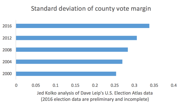
2. More evidence for the Big Sort. As the Brookings analysis makes clear, the urban rural divide was even more pronounced in this election than in 2012. Jed Kolko has summarized the long term trend in political polarization between denser areas and more sparsely settled communities. One way of measuring polarization is to look at the margin in each county (the difference between the share of votes going to the democratic and republican candidates). Kolko does this, and computes the standard deviation (a statistical measure of spread or variation). His data clearly show that the margin is growing more and more dispersed: that county level returns are, on average, less and less like the national level returns. Kolko looked at election data going back to 2000; the 2016 election was the most polarized, and this trend shows no signs of abating.
3. The pattern repeats at smaller geographies. There also seems to be a fractal quality to the relationship between density and democratic vote share: Even within smaller, more rural counties, more dense precincts tend to have a higher vote for Hilary Clinton. An analysis by the Chicago Tribune of voting patterns in Illinois counties shows that higher density neighborhoods in these rural or exurban counties tended to have a higher democratic vote share. The Tribune study shows that the vote pattern within counties on the fringe of the Chicago metropolitan area (McHenry County, which voted for Trump) and in down state counties (Rock Island, which voted for Clinton) exhibit the same red-blue pattern at the precinct level which is correlated with density.
New Knowledge
Visualizing accessibility and walkability. We’re big fans of innovative uses of data, especially new tools that reveal the fabric of urban interaction and accessibility (like Walk Score). The steady advance of open source software tools is making it possible to develop a rich array of accessibility measures. The University of California, Berkeley’s Geoff Boeing demonstrates the use of some advanced GIS techniques to show how we can visualize the access to destinations at the city level. Here’s a compelling map of proximity to bars in Berkeley and Oakland. Boeing uses similar data to show distance to the nearest school. The key point here is that these data and tools can now more easily be used–and customized–to provide more sophisticated and nuanced images of urban structure.
1. A tax credit for renters. The Terman Center for Housing Innovation at the UC Berkeley has come up with three fleshed-out and cost-estimated models for providing tax credits for low income renters. The FAIR tax credit would help rectify the strong tilt in the tax system toward home ownership, and offers a way to address housing affordability that is commensurate with the scale of the problem. We summarize of the key findings of their report.
2. Cities and elections. For election day, we reviewed some of the key literature about cities and elections. We know that density is strongly correlated with the share of the population voting for democrats, cities are blue, and rural areas, even in the same state, are red. Renters are much less likely to vote than homeowners, and there’s a full generation difference between voters in national and local elections. All these factors played out on Tuesday.
3. An Infographic on Economic Segregation. Our report “Less in Common” presets and detailed statistical picture of four decades of neighborhood change in the nation’s 50 largest metros. We’ve boiled its key findings down into a two-page infographic, which you can read, download and share.
Click for full infographic.
4. Great neighborhoods don’t have to be illegal. In most American cities, zoning laws, road standards, and parking requirements have made it essentially illegal to build the kind of dense, diverse walkable mixed use districts that are surging in popularity (and are often the most valuable homes in any metropolitan area). The experience of the rest of the world shows that doesn’t have to be the case. Residential doesn’t have to automatically mean single family; allowing some small fraction of non-residential uses even in “residential” zones doesn’t destroy their livability, and having state or national guidelines for zoning can eliminate or at least minimize “beggar they neighbor” NIMBYISM.
Editor’s Note: Our regular features–Must Read and New Knowledge–will return again next week. Happy Veteran’s Day everyone!
It’s election day, 2016. Here’s some of what we know about cities and voting.
Well, at last. Today is election day. While we’re all eagerly awaiting the results of the vote, we thought we’d highlight a few things we know about voting, especially as they relate to cities. Its food for thought as we get ready to digest and understand the results today’s elections.
It’s time. (Flickr: Amanda Wood).
Democrats and density
In the past few elections, there’s been an increasingly strong relationship between population density and the share of the vote going to the democratic candidate. Dave Troy has plotted county level election returns from 2012 against population density. Low density counties voted overwhelmingly for Mitt Romney; higher density ones voted for Barack Obama. That same pattern is likely to be in evidence today.
As a result, as Emily Badger wrote in The New York Times last week, the Republican party has essentially abandoned cities in presidential elections.
Homeowners are voters
Regular readers of City Observatory are very familiar with the homevoter hypothesis propounded by William Fischel, which observes that homeowners participate actively in the formation of local policies, as a way of protecting and enhancing the value of their homes. The practical implication is that homeowners support density restrictions and other policies that tend to raise home values and rents. In contrast, renters are generally under-represented in the electorate, especially in purely local elections. More data on that point was presented recently by the website ApartmentList.com. According to tabulations of self-reported data from the Census, for voting in the 2012 general election, about 77% of homeowners vote, compared to only 58% of renters – in other words, homeowners are 25% more likely to make their voice heard in an election. Part of the difference is explained by length of tenure—homeowners have generally lived in their houses longer than renters, but homeowners are more likely to vote than renters for any given length of tenure. Homeowners who have lived in their homes for 1-2 years are more likely to vote than renters who have lived in their homes for more than five years.
The gerontocracy of local elections
A new study from Portland State University takes a close look at the demographics of voter turnout in local elections. (Full disclosure: it’s lead authors include our friends and colleagues Phil Keisling and Jason Jurjevich). Their final report, “Who votes for Mayor?” provides a detailed look at turnout patterns in 50 of the nation’s largest cities. A particular virtue of this study is that it uses data from election records—more than 22 million in all–rather than after-the-fact surveys, which can be subject to mis-reporting (respondents may be reluctant to tell pollsters than they didn’t vote). Among their key findings: older people are much more likely to vote, especially in purely local elections than are younger ones. In cities, the variation in turnout by age heavily skews who chooses mayors and other local leaders. In the typical local election, the median voter is a full generation older than the overall electorate. As a result, at the municipal level, we have a gerontocracy, rather than a fully functioning democracy.
Moving and voting
Recent survey data for the current election, collected in September, zeroed in on an interesting aspect of voter preference: whether someone lived in or near the place where they were born. Summarizing the results of the Atlantic/PRRI survey, Daniel Cox and Robert Jones examined the presidential preference of white voters based on how close they lived to where they were born. Whites who reported living in their childhood hometown favored Trump 57 to 31 percent; those who lived outside their home town, but within two hours favored Trump 50 to 41 percent, and those who lived more than two hours away favored Clinton 46 to 40 percent. Of course, migration is a non-random and self-selected behavior, and is strongly correlated with education. But a key point here is that those whites who’ve chosen to move and live in different places are statistically more likely to favor Hillary Clinton than Donald Trump.
In this election—as in every election—many key urban issues, including age, education, migration, density and homeownership—play important roles in shaping electoral outcomes. In the next few days we’ll be examining the results of the 2016 election to see what role each of these factors has played.
A new proposal from Berkeley’s Terner Center aims to broaden favorable tax treatment for housing to include the nation’s renters
Our tax code is highly skewed towards homeownership. Between the deductions for mortgage interest expenses and property taxes, the exclusion of capital gains on sales of homes, and the non-taxation of the imputed rent of owner-occupied homes, the federal government spends the equivalent of about $250 billion per year supporting home ownership.
As a result of these policies, and others (federal guarantees and subsidies for home mortgages, and local land use policies) home-ownership has become our de facto wealth creation strategy in the United States. If you’re a renter, there are virtually no equivalent benefits in the tax code: there’s nothing that helps you reduce your housing costs or build your wealth.
A new proposal from the Terner Center for Housing and Innovation at the University of California, Berkeley, would establish tax benefits for renters. The idea is basically to create an analogue of the existing Earned Income Tax Credit–was favors low income working families–for lower income renters. Called the FAIR credit–“Federal Assistance in Rental Credit”–it would give low income households with high housing costs a federal subsidy averaging between $200 and $400 monthly, depending on the variant of their proposal and local market conditions.
What the Terner Center is proposing is a much more fully fleshed out version of an idea we sketched out at City Observatory earlier this year, “Why not make housing assistance to the low income as easy as assistance to the high income?” Current housing assistance programs reach only a little over one-in-five eligible households, and require an arduous and often lengthy approval process–a sharp contrast to the automatic and nearly effortless provision of tax benefits to homeowners.
Three alternatives
The concept of using the tax code to deliver financial assistance to renters –something we’ve done for decades for homeowners—has been kicking around in policy circles as a provocative, but underdeveloped idea. Kudos to the Terner Center for transforming this rough idea into a practical policy proposal. Their white paper examines different ways to calculate and deliver the FAIR Credit, with varying levels of benefits and eligibility. The program would be targeted at renters who earn less than 80 percent of the local median income, and who pay more than 30 percent of their income toward housing costs.
The FAIR tax credit proposal comes in three flavors. The most ambitious is the “rental affordability” plan: it would basically give all households with incomes of less than 80 percent of the median a tax credit equal to the difference between 30 percent of their household income and the lesser of the actual rent they paid or the small area fair market rent for their neighborhood. This version would cost about $76 billion annually, but would dramatically reduce the affordability problems of 13.3 million households. The average participant would get assistance of about $474 per month.
A more limited—and economical—alternative is the “rent reduction” plan, which would give households a sliding credit of between 12 and 25 percent of their rental payments, again with the maximum tied to the lower of their actual rent or the small area fair market rent for their neighborhood. This plan would provide less relief—average benefits would be about $227 per household, but the aggregate cost to the Treasury would be about $41 billion annually.
A third alternative combines the two approaches, providing more generous voucher-like benefits for the 3 million lowest income households, and a variant of the rent reduction plan for all other eligible households. It would cost about $43 billion per year and reach 15.3 million households.
Making a tax credit for renters work
The analysts at the Terner Center have anticipated many of the practical challenges of implementing the rental tax credit. While in many respects it could work in a fashion very similar to the existing Earned Income Tax Credit, the rental credit poses some additional issues. The basis for calculating income eligibility for the credit would probably have to be broader, incorporating non-wage income and some cash benefits. And because—unlike with wages—there isn’t a well-audited set of data on rents and housing, some additional information collection and verification would be required to preclude fraudulent claims.
The report also proposes tying rental tax credits both to household income levels and to small area fair market rents. They are also suggesting that the credit be distributed monthly or quarterly, rather than annually, so that it better eases the financial stress of low income households. Alternatively, households that receive the credit might be given the option of receiving some or all of it in the form of a contribution to a tax-advantaged individual development account, as a way of encouraging savings.
The report maps out out several ways that the FAIR credit might be phased in, both as a means of limiting its cost, managing the program’s complexity and minimizing its side effects. For example, benefits might initially be restricted to families with children or the tax credit could be figured at a lower initial rate, or eligibility could initially go only to those with the lowest levels of income.
As critical as it is to provide additional resources, its important to recognize that by itself, a renter tax credit won’t solve housing affordability problems. Indeed, in some markets with high demand and a constrained housing supply, providing additional subsidies for low income households may drive up rents–offsetting some of the economic and affordability benefit from the program. The authors of the Terner Center are aware of this challenge, and point to a 35 year old study of the experimental housing voucher program, which found little effect on prices. But it seems likely that a multi-billion dollar program that reaches millions of households would be a significant increment to demand that it would be expected to put upward pressure on rents. In theory, more purchasing power and higher rents should trigger additional construction, and ameliorate the price effect, but this will take time. It may make sense to phase-in the implementation of such a program, and it will still be critical to work to reduce the barriers to new housing construction.
As difficult as it has become to imagine bold national action on any policy because of the partisan gridlock in Washington, we’ve clearly reached the limits of what local governments can do financially address housing affordability. Even generous bond-funded housing affordability programs, like those in San Francisco and Portland, produce too few units to measurably reduce affordability. And some well-intended local policies, like inclusionary zoning, may actually make affordability worse by limiting new housing construction. And many local governments simply opt out of dealing with affordability, by zoning little or no land for multi-family development, or blocking or simply not seeking funds to build affordable housing.
One of the enduring features of American inequality is the wide disparity in homeownership rates between white Americans and Latinos and African-Americans. And because homeownership has — or at least was, historically — a principal means by which families built wealth, this disparity in homeownership translated into or amplified racial and ethnic wealth disparities. There are, of course, many reasons for the disparities in homeownership rates: discrimination in home sales, employment, and education figure as prominent explanations, as does red-lining and exploitative lending practices.
This observation seemingly leads to a straight-forward policy response: if we want to redress our wealth disparity, we ought to be promoting wider homeownership, especially for racial and ethnic groups, like Latinos and African-Americans. And because access to housing finance is central to ownership, that leads to proposals to liberalize or loosen up lending standards. That’s exactly the case that was made recently by the Urban Institute, which said:
For a full mortgage market recovery, we need to expand the credit box again. A number of reforms can be undertaken to encourage lending to creditworthy borrowers who would have qualified before the housing boom. A return to 2005 and 2006 lending practices would be ill-fated, but the pendulum has unquestionably swung too far. Today’s tight standards have locked out many prospective borrowers from homeownership, disproportionately preventing African American and Hispanic families from building wealth and benefiting from the recovery.
The Urban Institute provides copious details on the patterns of mortgage lending, by race and ethnicity over the past decade and a half (with very cool mapping, both nationally and by metropolitan areas). They show that since 2006, mortgage lending to African-Americans and Latinos, as a share of all mortgage originations has fallen sharply.
But would loosening mortgage restrictions and opening up housing finance really result in economic gains to those now shut out of the housing market? Perhaps the most fundamental advice in investing (and the hardest to follow in practice) is “Buy low, sell high.” In a technical sense, this is referred to as “market timing.”
The big lesson of the housing bubble and subsequent bust is that market timing matters a lot to investment results. If you bought your home in 2000 (or better yet, sometime in the previous decade), you not only saw big gains in the bubble, but you probably came out the other side with your head (and your mortgage) above water. But if you bought at the peak of the bubble, in 2005 or 2006, and especially if you purchased your home with a highly leveraged 90 or 95 percent mortgage (as many did) you saw your investment wiped out–and more.
And as the Urban Institute data make clear, the groups most likely to end up in this wealth destroying “buy high, sell low” situation are Latinos and African Americans: “African American and Hispanic borrowers took out a greater share of mortgages as housing prices neared their peak, arguably the worst time to take out a loan.” In 2001, when we were in a recession and house prices (by standards of that decade) were low, these groups made up just 13 percent of all new home mortgages. When lending standards loosened up, the share of minority borrowers surged, and in 2006, African-Americans and Latinos made up almost twice as big a share (23 percent) of new mortgages. And then, as the bubble collapsed, and lending standards tightened, they were again squeezed out of the mortgage market.
As we’ve noted before at City Observatory, rotten market timing is just one of the problems confronting minority borrowers. In addition, they tend to be charged higher interest rates (typically because they have lower credit scores), they tend to buy in neighborhoods with greater volatility and downside risk, and were–as several billion dollar plus settlements attest–victimized by exploitative lending practices.
From the standpoint of policy, and trying to tackle this persistent wealth gap, the question going forward is whether housing investment in the future will out-perform other investments. Plus, as we’ve pointed out, there’s an inherent tension between treating housing as a wealth-building policy and achieving housing affordability. While relaxing lending standards further (and allowing borrowers to take on greater leverage) might help more Latino and African-American families buy homes, its far from clear than its a strategy that will enable them to build wealth. It would be great if housing purchases were a risk-free investment that would guarantee a reasonable rate of return, and if all borrowers had the same opportunity to buy at the same terms and at the same times. But that’s not the way the housing market works, even–or especially–when lending standards are relaxed. If we want to redress the big gaps in wealth among racial and ethnic groups in the US, we’ll probably need to consider other policies to do so.
We love scary stories. That’s what Halloween was all about–dressing up as something terrifying, if only for a day. Being scary one day a year can be fun. But constant scaremongering is one way that attitudes and beliefs become detached from facts, in ways that can have truly negative effects.
Lately, the presidential campaign has gotten scary on the subject of cities. Republican candidate Donald Trump has described inner cities as a life-threatening no-go zones. As Emily Badger reported in The New York Times, inner cities are “a disaster education-wise, job-wise, safety-wise, in every way possible.” “You walk down the street,” Mr. Trump said in his first debate with Hillary Clinton, “you get shot.” As Emily Badger reports, that’s hardly an accurate picture of most inner cities, including those like the Bronx, which were is the most serious shape two or three decades ago.
As we and others have consistently pointed out, crime rates in US cities have declined sharply over the past two decades. In any other field of endeavor, we’d be celebrating an enormous policy success. When it comes to crime, though, most Americans actually believe just the opposite. While we’re on the subject, the data also show that city living is statistically healthier and safer than life in the suburbs, and that our air is much cleaner than it used to be.
Just like scary movies and teasers for the 11 o’clock television news, violence and danger capture our attention. But it can distort our perception. Despite the facts, its effectively the case that the word “urban” as an adjective is a negative intensifier: as our colleague Carol Coletta points out, if you put “urban” in front of any problem, and it becomes even worse – urban crime is worse than crime, urban congestion is worse than congestion, urban poverty is worse than poverty, urban education is worse than education and urban hopelessness is worse than hopelessness.
What’s particularly ironic about Donald Trump’s rhetoric is that on one level, its a stark contrast to the way that Ronald Reagan talked about cities–back in an era when urban problems were decidedly more severe. Reagan frequently described his vision of a future America as “a shining city on a hill,” a phrase borrowed from Jon Winthrop.
Highlighting our fears is a great way to garner attention. But it may not be a good way to advance understanding or actually solve problems. It may simply lead us to be discouraged and fatalistic. Pessimism has no survival value.
At City Observatory, we’ve tried to describe cities in terms of their assets and potential. When we do things right, cities are powerful vehicles for encouraging innovation and economic progress, promoting widespread opportunity, achieving greater sustainability, and bringing people together. If anything, our problem is that we have a shortage of cities: we face housing affordability problems because more people want to live in cities than our current housing stock can accommodate. We really ought to be re-framing our discussion of cities in optimistic and aspirational terms: how do we build cities for everyone that make our nation stronger and better?
In another week, the election season will be over. Maybe then, we can rededicate ourselves to a more fundamentally positive view of what we might accomplish together.
1. The myth of a revealed preference for suburban living. It’s often argued that most Americans must prefer to live in suburbs because so many persons do so. We take a close look at this thesis, and summarize some key research findings from work of Jonathan Levine, which explore the gap between the neighborhoods Americans prefer and what’s actually on offer in most metro areas. The results suggest that a lot more Americans would live in cities, if they weren’t in such short supply.
2. Let’s stop scaremongering about cities. There’s been precious little talk about cities in the presidential campaign, which may be a good thing. Donald Trump has famously called inner cities ““a disaster education-wise, job-wise, safety-wise, in every way possible.” Not only is this objectively not true—America’s cities have experienced substantial drops in crime, gains in population and jobs, and improvements in environmental quality—but talking down cities misses real opportunities to think about how they can play a key role in helping tackle major national problems. Describing cities in “crisis” terms is a poor way to formulate strategy.
3. Housing for the favored few. Some recent housing affordability programs have aimed to address the needs of specific deserving groups. California’s legislature has just enacted a new policy that allows the use of low income tax credits to provide subsidized housing for teachers. A similar provision nationally, allows these same tax credits (and other affordable housing resources) to be used for housing for artists. Meritorious as these groups are, it’s not clear that the affordability issues they face are worse than other Americans. Carving off a portion of the limited resources available for affordability for a favored few does little to solve the broader affordability problem.
4. Homeownership and racial wealth disparities. Over the past decade, the big wealth disparities between whites and people of color have widened. Because much of this disparity is attributable to differences in housing wealth, and because for most families home equity is their largest asset, its long been assumed that promoting home ownership will reduce disparities. A major problem with this assumption is that credit tends to be most easily available to African-American and Latino buyers at or near the peak of the housing cycle, meaning that they’re put in a position of “buying high and selling low.” The cyclical nature of credit availability makes it hard to reduce wealth disparities through homeownership.
This week’s must reads
1. Reimagining the American Civic Commons. In an essay published at Real Clear Policy, our colleague Carol Coletta describes the growing evidence of our nation’s increasing fragmentation along economic, ethnic, and political lines. That problem has manifested itself prominently in the persistence and growth of neighborhoods of concentrated poverty. She describes how we might address this growing challenge by working to reinvigorate the civic commons—the places in our communities where diverse groups come together. Her essay introduces a new effort led by the Kregse Foundation and a group of philanthropic partners to reimagine how our civic commons can help bridge these divides.
2. Americans value diversity. One encouraging sign, despite the many divisions that separate us, is the fact that a wide majority of Americans still attach a positive value to living in a diverse nation. That puts us in a very different class than other economically advanced nations, including most of Europe, according to data from the Pew Research Center. They found that 58 percent of Americans agreed that having an increasingly diverse population makes our country a better place to live; only 7 percent said that growing diversity made it worse. In a handful of European countries a narrow plurality of respondents thought diversity made their country stronger, and in several the predominant opinion was that diversity made the country weaker.
New knowledge
1. Do people shape cities, or do cities shape people? This is the provocative question posed by a team of researchers from Harvard and MIT. The study analyzes Google streetview images of 5 cities (Baltimore, Boston, Detroit, Chicago, and New York) from 2007 and 2014. Each paired set of images is evaluated using computer vision technology and a crowd-sourced scoring system for assessing the appearance of safety in each image. The results show which neighborhoods appear to have gotten safer over time. The good news is the average neighborhood appearance of safety increased significantly over just this seven-year period (by about one half of a standard deviation). But the real story is the authors’ examination of which neighborhoods showed the greatest improvements. Here, for example, is a map indicating the New York City neighborhoods with the greatest improvement in appearance over the seven-year period.
They then analyze the relationship between changes in neighborhood appearance and pre-existing neighborhood conditions. They find the biggest factors leading to visible changes in neighborhood appearance are a high level of educational attainment, population density and proximity to the central business district. They find that some factors that are often treated as predictors of change—like vacancy rates, rent levels and average incomes are not correlated with subsequent changes in a neighborhood’s physical appearance. The study is a tantalizing look at how we might use automation and “big” data to craft entirely new types of urban indicators.
2. Bikes and Health. A new study published in Injury Prevention aims to compute the value of the public health return on investment on from building bike lanes. In an article entitled “The cost effectiveness of bike lanes in New York City.” Jing Gu and her co authors compile data on the growth of bike infrastructure in the city, and trends in bicycle ridership, and correlate this with estimates of the economic gains associated with better health from greater cycling. They estimate that the 45 miles of bike lanes built by the city at a cost of about $8 million increased the probability of bike riding by 9 percent, and that the net health effects of this ridership measured in “quality adjusted life years” were far more economical than many standard public health strategies.
As we all know, 2016 is the year that reality television made its way to the national political stage. Less well noticed is how another idea from reality television has insinuated its way into our thinking about housing policy.
From 2006 to 2011, ABC television featured a popular reality television show called “Extreme Makeover: Home Edition.” In the show, a team of designers led by Ty Pennington worked with a small army of construction workers to completely rebuild one family’s usually tiny and dilapidated house in the space of about 48 hours. The lucky families were chosen based on audition tapes they submitted to the shows producers that showed that the family been victimized by a form of loss or tragic event, experienced a certain hardship.
In many respects, Extreme Makeover was “good” reality television; arguably it did at least tell compelling stories about the hardships and misfortunes that have struck many families, and provided a kind of telegenic barn-raising that made a tangible difference to the lives of those families. It didn’t degrade the participants families, and might have helped educate some viewers to the plight of others less fortunate than themselves.
But in many ways, we’re employing the Extreme Makeover approach to housing policy. A growing number of housing programs aid to address the housing needs of some specific, worthy group. While that’s well-intended, it may be a serious misstep. The key reason is that the problem of housing affordability is one of scale: fixing affordability, not just for a relative handful of people, but making the kind of system level changes that fix the underlying problems of constrained supply.
Unfortunately, too much of what gets labeled as housing affordability policies amount to token efforts to help a few favored groups. We have housing subsidies for the poor, but they reach fewer than a quarter of the eligible households. Inclusionary zoning programs provide so few units relative to the potential need that subsidized housing is allocated by an arcane lottery system that is so difficult to navigate that it gives well-educated applicants a big edge.
Two recent studies have criticized the tendency to carve out set-asides for favored groups for eligibility for subsidized housing. Writing last week at The American Prospect, Rachel Cohen, questioned a California proposal to dedicate a portion of that state’s low income housing tax credits to provide affordable housing for teachers. No doubt, housing is so expensive in many parts of the state that teachers can’t afford to buy the typical home. But as Cohen points out, few teachers fall below the 60 percent of area median income figure used to target low income housing tax credits.
In Minnesota, Myron Orfield has excoriated the use of these same tax credits—as well as other funding dedicated to affordable housing to provide subsidized housing for artists. In a white paper entitled “The Rise of White-Segregated Subsidized Housing.” he argues that artists housing is not only expensive and opulent, especially relative to other public housing, but that it serves mostly white populations, and actually serves to intensify patterns of racial segregation (unlike other public housing, artists public housing tends to get built in disproportionately white neighborhoods).
A good case can be made, of course, that more communities should be affordable to artists and teachers. But an equally strong case can be made that communities ought to be affordable to everyone who earns as much as artists and teachers, perhaps also even those who earn less. Trying to fix this problem for one deserving group at a time strikes us a “solution” that will never approach the scale of the problem.
Ultimately, focusing our attention on the worthiness of various different groups—artists, teachers, veterans and seniors—distracts attention from the underlying problem that we simply aren’t providing enough housing, in the right places, in the face of changing demand. The unseemly competition between these different groups just amplifies the zero sum nature of the current approach, without leading to reform of zoning laws or redressing the inequitable distribution of housing subsidies by income. This is one of those cases where fixing a problem for a few, may mean making the problem worse for everyone else.
Fundamentally, the nation’s housing affordability problems are due to demand outpacing supply: there’s more demand to live in some cities–and especially in great urban neighborhoods–than can be met from the current supply of housing, especially apartments. As demand surges ahead of supply, rents get bid up, which is the most visible manifestation of the affordability problem. But higher rents are also a signal to developers that they ought to build more housing, and when and where local zoning allows it, they do. Over the past two years, rising rents have produced a surge of new apartment construction, and there’s growing evidence–in some markets, and at least for the short-term–these increments to supply are moderating the rate of rent hikes.
There’s no denying that rents in the US have escalated over the past several years. Overall rents are up 4.6 percent in the past year, and the national rental vacancy rate has plunged from more than 10 percent to about 7 percent, signaling that their are relatively more tenants bidding for every available apartment. As a result the share of households spending more than 30 percent of their income on housing has increased.
Nothing, it seems, is more infuriating to those caught in a market of steady rent hikes that being lectured by some economist that what is needed to resolve the problem is an increase in supply. Nice to know, but that’s not going to pay the rent any time soon. But just as after a long winter there are some early signs of spring, there are a few hopeful indicators from housing markets that the long promised relief from increased supply is starting to show up, at least in a small way. Today we look at recent market reports, national and local, that provide some evidence that the predicted market forces are at work.
First, in New York, home to some of the most expensive real estate in the nation, there’s growing evidence that rent inflation is easing, at least at the high end of the rental market. According to Bloomberg, the inventory of vacant, for-rent apartments in New York has increased by between 20 and 30 percent in the past year. As a result, nearly a quarter of all apartments listed for rent in Manhattan in October included landlord-offered incentives or concessions, the highest level recorded in the past decade. Figuring in the value of these concessions, brokers estimate that median rents in Manhattan fell by about one percent, year-over-year. Even in Brooklyn, where rents have been rising rapidly, the number of for-rent units with landlord concessions increased from 8 percent to 12 percent in the past few months.
Credit: Kelly Sims, Flickr
The same pattern observed in New York is starting to play out around the country. Market analyses by Freddie Mac (the federal mortgage agency) and by real estate analytics firm Axiometrics suggest that in most metro areas around the country, rent increases are moderating, and that this trend is likely to continue in the near future. Comparing first half 2016 rent growth with the same period in 2015, the data show that rent increases are slowing in most markets. In 28 of the markets shown below, rent increases are slower now than in the previous year; in three markets they are about the same, and in eight markets, rents are accelerating. (In the chart, white outlined bars indicate 2015 rent growth, and blue bars represent 2016 rent growth). Rent increases are significantly lower in 2016 than the previous year in Portland, Oakland, San Jose, Boston, Austin, Houston and Philadelphia, to name a few.
Looking forward, Axiometrics predicts that for the next couple of years, rent increases will moderate. Rents increased about 4.6 percent nationally in 2015, and are expected to rise a further 3.4 percent in 2016. But the outlook for 2017 is for an increase of 2.1 percent.
While national trends provide a helpful background, like politics, all housing is local. In an important sense, there really is no “national” apartment marketplace: apartments built in Cheyenne Wyoming really aren’t good substitutes for apartments in New York. While there are broad national trends, the trajectory of supply and demand can play out differently in different local markets. But even in San Francisco, where rental inflation has been severe, and where its famously difficult to build new housing, there’s an indication that added supply is also moderating rent increases: according to Freddie Mac, rents there have increased only about 0.9 percent over the past year, just a fraction of the increases being recorded a year ago. And while much of this is attributable to rising supply, at least some of the problem is what the analysts call “renter fatigue”–renters simply can’t afford higher rates than now being charged.
Nobody’s predicting a glut of unoccupied apartments that will push rents down. But slowly, and inexorably, the supply of housing is catching up to the demand, both in the aggregate and in the specific places where demand has grown most rapidly. It’s a reminder that if policy enables housing supply to expand, relief from higher rents can be delivered through the market.
One of City Observatory’s major reports is “Lost in Place,” which chronicles the change in high-poverty neighborhoods since 1970. In it, you’ll find a rich array of data at the neighborhood level showing how and where concentrated poverty grew.
We know it’s a complex and wonky set of data, so we’ve worked with our colleagues at Brink Communication to develop a compact graphic summary of some of our key findings. We’re proud to present that here. And like all material on City Observatory, it’s available for your free use under a Creative Commons-Attribution license, so feel free to incorporate it in your own presentations, email, and social media to help explain the processes of neighborhood change in your city.
You might find it especially useful paired with more local-specific content from “Lost in Place,” such as these interactive city-by-city, neighborhood-by-neighborhood maps. Further down this page, you can also find an interactive dashboard with full statistics for your city, including trends in high-poverty, low-poverty, rebounding, and “fallen star” neighborhoods, and the total number of people living in high-poverty neighborhoods from 1970 to 2010.
Click the thumbnail below for the full infographic. We’ve also included some further narrative context below.
Click for full infographic.
Neighborhood change has been a hot topic in many American cities—and, increasingly, on the national stage—for a number of years. At City Observatory, we’re especially interested in shifting community demographics as they relate to economic and racial integration, which have been shown to have profound impacts on people’s class mobility, longevity, and more.
But while most of the focus has been on gentrification—the process of middle- and upper-income people moving into lower-income neighborhoods—our own research shows that low-income communities are much more likely to suffer from the opposite problem: increasing poverty and severe population decline. Three-quarters of neighborhoods with a poverty rate twice the national average in 1970 still had very high levels of poverty in 2010, and had lost an average of 40 percent of their population. That represents a much larger number of people who have been “displaced” by a lack of opportunity or high-quality public services than have been displaced by gentrification.
Our perceptions of neighborhood change are often shaped by those places that are experiencing the greatest pace of change. The data in “Lost in Place”—available for all of the nation’s 50 largest metro areas—lets anyone look to see how poverty has changed and spread in their city since 1970. And our new infographic helps explain the major components of change. We invite you to use these tools to explore and discuss the process of neighborhood change in your city.
In cities, you’ll sometimes hear people talk about a “daytime population”: not how many people live in a place, but how many gather there regularly during their waking hours. So while 1.6 million people may actually live in Manhattan, there are nearly twice that many people on the island during a given workday.
Most studies on segregation deal with what you might call the “nighttime population,” or actual locations of residence. And of course, that kind of segregation has been shown to have significant negative effects. But it’s also in large part a matter of convenience: the Census means that we have detailed data on where people live. It’s harder to get data on where they happen to spend their time when they’re not at home.
But a fascinating study asks whether, and how, waking mobility affects patterns of segregation. The authors—Taylor Shelton, Ate Poorthuis, and Matthew Zook—used geotagged Twitter and Foursquare data in Louisville, KY to determine whether users likely lived in that city’s West End (predominantly black) or East End (predominantly white). Then they mapped the ratio of the number of tweets by East End residents to the number of tweets by West End residents all across the city.
The results are striking: While the West End is visible as a block of nearly solid purple, indicating virtually no tweets from East End residents, Louisville’s East End appears as various splotches of orange, grey, and purple—indicating a much greater mix of East and West End residents.
The implication is that West End residents, who are mostly black, are much more likely to cross boundaries of segregation than East End residents, who are mostly white. In part, that may be a matter of necessity, as the wealthier East End has more jobs, stores and services.
But it also fits in a pattern of racial stigma and avoidance described by other studies as well. What’s ironic here is that while racial segregation is often described as a limitation on the movement of the disadvantaged population—and in many important ways, from health outcomes to employment, it is—in terms of physical mobility, it turns out that the driver of the West End’s isolation isn’t that West Enders never leave, but that East Enders never visit.
A view of 9th Street, which divides the East and West Ends of Louisville, KY. Credit: Google Maps
That dovetails with research by Ed Glaeser, who suggests that since around 1970, the persistence of “nighttime” residential segregation has been driven primarily by whites’ decisions to avoid neighborhoods that have a significant black population, and to leave their own neighborhoods when blacks move in. It also resonates with research from Robert Sampson, who found a significant stigma attached to predominantly black neighborhoods, and Maria Krysan, who found that while blacks’ knowledge about predominantly white neighborhoods in Chicago depended on their distance and economic class, whites were much more likely to describe themselves as knowing nothing about black neighborhoods, regardless of other factors.
Shelton, Poorthuis, and Zook did find that a few specific activities could draw East End residents west: a cluster appeared near the Churchill Downs racetrack during horse racing season, but then disappeared when the season ended. In other words, while this is a hopeful sign that some kinds of activities clearly generate geographic crossover, these kinds of visits appeared to be to few or limited to have any wider spillover effects in increasing even daytime integration elsewhere in the West End.
That suggests the remedy for this kind of separation will have to go deeper than just an occasional event that draws people from around the city for a few hours. But this paper helps underscore that when we think about segregation, we need to think about more than just where people sleep at night.
Ah, Paris! Perhaps one of the world’s most beautiful cities, a capital of European culture, and prosperous economic hub. What’s its secret? Zoning, of course!
RM-6? Maybe DX-2? Credit: Peter McConnochie, Flickr
Just kidding. Actually, Paris went for the better part of a millennium (until 1967) with nothing that an American might recognize as district-based zoning, a prospect that would surely horrify the planners who have been one-upping not just Paris, but pre-zoning American neighborhoods from brownstone Brooklyn to Midtown Memphis, with postwar sprawl for the last several generations.
Midtown Memphis: Despite the shops on an otherwise residential street, people seem to like it. Credit: Google Street View
Today, we live in cities and neighborhoods where zoning has made the kinds of places we used to take for granted, and that still make up some of our most prized communities, illegal to build. These laws are so pervasive that even relatively small changes are considered radical, experimental, and potentially dangerous methods of social engineering. Partly, that’s because we ignore the lessons in our own cities about what works in neighborhoods built before modern zoning. But it also may have something to do with the fact that our conversations about urban planning tend to be hyper-local: we might try to take cues from other neighborhoods, or another city in our region—or maybe another American city several states away. But even many big-time urban wonks would be hard pressed to tell you much about how cities in other countries do it.
Which is just one reason why Zoned in the USA, a book published by Virginia Tech’s Sonia Hirt last year, is so valuable. An entire section is dedicated to describing the zoning and planning processes of countries from Sweden to Australia, and contrasting them to the American system. It’s absolutely worth reading the entire book—including for her arguments about the origins of American zoning, which seek to modify the property-value-based ideas put forward by writers like William Fischel in The Homevoter Hypothesis—but in the meantime, here are some big conclusions about how foreign zoning is different from our own.
1. The single-family-only district is not king
Hirt’s major claim is that what really sets American zoning apart is its orientation, explicit or implicit, to putting the single-family residential zone at the top of the hierarchy of urban land uses. Not only are single-family zones listed first in many zoning codes, but they make up significant pluralities, or even majorities, of total land area in most American cities. Interestingly, Hirt points out that this wasn’t necessarily true when zoning was first introduced: New York’s famous first zoning law didn’t even have a single-family zone at all.
A zoning map of Marietta, GA. Yellow areas are zoned for single-family homes only; brown areas are set aside for apartments. The large brown area in the southeast corner contains apartments to be razed. Pink is commercial. Source: Marietta, GA website
Cities in other countries remain closer to our origins, then. In Great Britain, for example, local development plans generally set limits on residential density by the number of housing units per given land area, rather than dictate the form that those housing units must take. In the Paris area, too, land use intensity is determined by something like FAR, or the ratio of total floor area to lot area, rather than prescribing apartments or detached homes. The German zoning system, which in some ways appears very similar to ours, does not even have a single-family category.
As Hirt points out, Americans appear to be unique in believing that there is something so special about single-family homes that they must be protected from all other kinds of buildings and uses—even other homes, if those homes happen to share a wall. The recent revolt in Seattle over a proposal to soften that city’s single-family districts, in other words, would not be possible anywhere else in the world, not least because very few people live in single-family districts to begin with.
2. “Residential” doesn’t mean what we think it means
Not only do other countries lack single-family zones, or at least use them much, much more rarely, but the separation of residential from other uses is much softer. Whereas placing a shop in the middle of a residential block would be counter to the very purpose of an American “residential” zone, it’s considered an essential part of neighborhood planning elsewhere.
The “residential protection sector” zone in Paris, for example, allows a certain percentage of buildings to be used for non-residential uses, as long as they don’t create “nuisance.” In Germany, the “small-scale residential” and “exclusively residential” zones—the lowest-density residential designations possible—actually allow a range of retail and other uses as of right. The general principle is that businesses that serve everyday neighborhood needs, like small bank branches, corner stores, or medical offices, ought to be allowed within walking distance of people’s homes. Bigger uses that might attract more regional traffic are separated out. And in Sweden, although amendments (or what we might call “variances”) are needed to place a shop or other commercial use in a residential district, such amendments are regularly granted.
Is this really an “incompatible use” in a residential neighborhood? Credit: Google Street View
3. State and national law is as important as local
In the U.S., states generally have something called a zoning enabling act, which gives municipalities the legal authority to regulate land use through zoning. But these enabling acts tend to be extremely loose in terms of dictating what that land use should look like: the principle here is that planning ought to be done as locally as possible.
In many other rich countries, however, national and state or provincial governments play a much stronger role in urban planning. In Great Britain, the 1947 Town and Country Planning Act sets land use guidelines nationally; local communities are required to create their own land use plans, but using a pre-determined set of categories. Unlike American cities, then, British ones cannot invent their own ultra-exclusionary zones. Even next door, Canada gives its provinces significant power to set the framework of local zoning, resulting in very different systems from one province to the next.
That may offend American ideals about local autonomy. But it also helps prevent some of the problems with hyper-local decision-making, including the tendency for neighbors to use zoning to exclude the kinds of people they don’t want: most often the low-income, or people of color. How to combat that tendency has become one of the central challenges for American housing policy, as evidenced by the recent high-profile Supreme Court case on the Fair Housing Act and the Obama Administration’s new, more aggressive rules around affirmatively furthering fair housing.
4. There are other ways to plan
So zoning laws abroad tend to more flexible and permissive than their American counterparts, which means that many of the things we’ve outlawed here—like a mix of single-family homes and apartments in the same neighborhood, creating homes that are sized and priced appropriately for a diverse range of people; or having local businesses integrated within walking distance of where people live—are still legal in the rest of the industrialized world.
But Hirt points out that this doesn’t mean that other countries necessarily have a more laissez-faire approach to urban planning, letting private actors run wild over the visions that residents have for their communities and cities. Rather, other countries have a broader range of tools at their disposal to shape how their cities work and feel. In the Netherlands, for example, the government purchases land at the edge of a metropolitan area and then uses that ownership to manage the growth of the region. That and other kinds of public ownership, or more aggressive tax and subsidy policies, allows many other wealthy countries to direct their cities’ growth, and meet planning goals, without the kind of limiting prescriptions on land use that prevent our postwar neighborhoods from recreating what works about pre-zoning neighborhoods, while fixing what doesn’t.
Of course, the U.S. can’t, and shouldn’t, just ape other country’s systems; there are very different urban histories and values here that ought to be respected. But it’s worth pointing out that one of the biggest ones—the ideal of homeownership—is actually less uniquely American than we often suppose. In fact, many of the European countries mentioned in this article have higher levels of homeownership than the U.S., even though their land use systems don’t prioritize the homogeneous single-family neighborhood to nearly the extent that we do, or at all.
Source: Eye on Housing
As we recognize the ways that our neighborhoods and cities could be improved, then—by encouraging less segregation by income and race; reducing travel times by bringing destinations closer together; encouraging more walking and physical exercise; and creating more public places where people can gather and build community—it seems only reasonable to look at what’s different in the places that may do some of those things better.
Yesterday was, famously, cyber-Monday, the day in which the nation’s consumers took to their web-browsers and started clicking for holiday shopping in earnest. Tech Crunch reports that estimated e-commerce sales will yesterday were predicted at $3.36 billion, coming on top of almost $5 billion in on-line sales on Thanksgiving and Black Friday.
The steady growth of e-commerce has many people worrying that urban streets will be overwhelmed by UPS and Fedex delivery trucks ferrying cardboard boxes from warehouses to homes. The latest of these is an article published at Quartz: “Our Amazon addiction is clogging up our cities—and bikes might be the best solution.” Benjamin Reider notes–correctly–that UPS delivered some 14 billion packages this year, and asserts–without any actual data–that truck deliveries are responsible for growing urban traffic congestion.
While there’s no question that its really irritating when there’s a UPS truck doubled-parked in front of you–its actually the case that on-balance, on-line shopping reduces traffic congestion. The simple reason: On-line shopping reduces the number of car trips to stores. Shoppers who buy on line aren’t driving to stores, so more packages delivered by UPS and Fedex and the USPS mean fewer cars on the road to the mall and local stores. And here’s the bonus: this trend benefits from increased scale. The more packages these companies deliver, the greater their deliver density–meaning that they travel fewer miles per package. So if we look at the whole picture, shifting to e-commerce actually reduces congestion.
We’ve sifted through the data on urban truck transport and package delivery economics, and here are four key takeaways:
Urban truck traffic is flat to declining, even as Internet commerce has exploded.
More e-commerce will result in greater efficiency and less urban traffic as delivery density increases
We likely are overbuilt for freight infrastructure in an e-commerce era
Time-series data on urban freight movements suffer from series breaks that make long term trend comparisons unreliable.
Delivering packages and reducing urban traffic congestion! Credit: Jason Lawrence, Flickr
Despite the rapid growth of e-commerce, truck traffic has actually been increasing. Last year, the Brookings Institution’s Adie Tomer performed a significant public service by assembling several decades of US DOT data on vehicle miles traveled. A significant weakness of US DOT’s website is that it mostly presents data a single year at a time, which makes it really difficult to observe and analyze trends in the data.
Tomer’s work plots the US DOT data on urban travel by passenger cars, unit-trucks, and combination trucks. He points to the growth of e-commerce, and the recent entry of Jet.com–which aims to be a challenger to Amazon’s dominance of web-based retailing. Tomer speculates that growing e-commerce will lead to more and more delivery trucks crowding urban streets.
He marshals several decades of data on urban truck VMT to claim that urban truck traffic is up an eye-popping 800 percent since 1966.
Another way to see trucking’s urban trajectory is to view aggregate growth since the 1960s. While urban vehicle miles traveled for both passenger cars and trucks grew steadily between 1966 and 1990—in both cases, far surpassing urban population growth—urban trucking absolutely exploded thereafter, reaching almost 800 percent growth until the Great Recession led to reduced demand. That pattern coincided almost perfectly with therise of e-commerce and the use of digital communications to manage shipping for logistics firms like UPS and FedEx and major private shippers like Walmart.
The post concludes by warning us that we need to provide for additional infrastructure for urban freight movement.
With new companies like Jet and continued growth in stalwarts like Amazon, we should expect e-commerce and urban trucking to keep growing. Those patterns bring some significant implications at all levels of government.
On the transportation side, freight investment will need to betargeted at pinch points and bottlenecks. Those specific sites of congestion deliver disproportionate costs to shippers, which get passed along to consumers, and create supply chain uncertainty
But the problems of doing time series analysis with DOT’s VM-1 (vehicle miles traveled) data is not limited to the largely cosmetic problem of web-site layout. The more serious problem is the significant series breaks that underlie the published data. Over time, US DOT has had to make important changes to the way it defines urban and rural areas (as urban development has occurred) and has had to cope with changing data sources. And, to be sure, DOT has tried to improve the accuracy of its estimates over time. The cumulative result of these changes is that it is very difficult to make statistically valid statements about the change in truck traffic in cities. (We’ve spelled out our concerns about the series break in the freight data in a technical appendix, below).
Urban truck travel actually peaked in 2008, and has mostly been declining, except for the past year.
In our view, we ought to heavily discount the published data, and not make comparisons that assume that the pre-2006 data are comparable to the post 2006 data. If we look only at the post-2006 data, a very different picture emerges. For the past six years–a period for which we have apparently comparable estimates, which appear to be not significantly affected by re-definitions of urban and rural areas–there is little evidence that urban truck traffic is increasing. If anything, the data suggest that it is flat to decreasing.
The alarmist implication of the “800% growth” statistic is that urban traffic will be significantly worsened by growing e-commerce sales. For example, the Brookings data prompted bloggers at SSTI to write “Urban truck traffic has boomed alongside the rise in e-commerce. ” and to fret that “If the rapid growth in urban truck VMT is a result of increasing e-commerce deliveries, we are a long way from peak urban truck traffic.”
In our view, such fears are wildly overblown. If anything they have the relationship between urban traffic patterns and e-commerce exactly backwards. The evidence to date suggests that not only has the growth of e-commerce done nothing to fuel more urban truck trips, but on net, e-commerce coupled with package delivery is actually reducing total urban VMT, as it cuts into the number and length of shopping trips that people take in urban areas.
E-Commerce is increasing rapidly; Urban truck travel is flat
The period since 2007 coincides with the big increase in e-commerce in the U.S. From 2007 to 2013, Amazon‘s North American sales increased by a factor of 5, from $8 billion to$44 billion. Between 20007 and 2013, the total e-commerce revenues United States has doubled, from about $137 billion to about $261 billion according to the U.S. Department of Commerce. But over this same time period, according to the US DOT data as tabulated by Brookings, truck traffic in urban areas actually declined. All the increase in e-commerce appears to have no net effect on urban truck traffic.
Does an increase in package deliveries mean increased urban traffic?
It actually seems like that increased deliveries will reduce urban traffic congestion, for two reasons. First, in many cases, ordering on line substitutes for shopping trips. Customers who get goods delivered at home forego personal car shopping trips. And because the typical UPS delivery truck makes 120 or so deliveries a day, each delivery truck may be responsible for dozens of fewer car-based shopping trips. At least one study suggests that the shift to e-commerce may reduce total VMT and carbon emissions. And transportation scholars have noted a significant decrease in shopping trips and time spent shopping.
But there’s a second reason to welcome–and not fear–an expansion of e-commerce from a transportation perspective. The efficiency of urban trucks is driven by “delivery density”–basically how closely spaced are each of a truck’s stops. One of the industry’s key efficiency metrics is “stops per mile.” The more stops per mile, according to the Institute for Supply Management, the greater the efficiency and the lower the cost of delivery. As delivery volumes increase, delivery becomes progressively more efficient. In the last several years, thanks to increased volumes — coupled with computerized routing algorithms — UPS has increased its number of stops per mile–stops increased by 3.6 percent but miles traveled increased by only about half as much, 1.9 percent. UPS estimates that higher stops per mile saved an estimated 20 million vehicle miles of travel. Or consider the experience of the U.S. Postal Service: since 2008, its increased the number of packages it delivers by 700 million per year (up 21 percent) while its delivery fleet has decreased by 10,000 vehicles (about 5 percent).
As e-commerce and delivery volumes grow, stop density will increase and freight transport will become more efficient. Because Jet.com is a rival internet shopping site to Amazon.com, and not a trucking company, its growth means more packages and greater delivery density for UPS and Fedex, not another rival delivery service putting trucks on the street.
So, far from putative cause of worry about transportation system capacity–and inevitably, a stalking horse for highway expansion projects in urban areas–the growth of e-commerce should be seen as another force that is likely to reduce total vehicle miles of travel, both by households (as they substitute on line shopping for car travel) and as greater delivery density improves the efficiency of urban freight delivery.
As David Levinson reports, data from detailed metropolitan level travel surveys and the national American Time Use Study show that time spent shopping has declined by about a third in the past decade. As Levinson concludes “. . . our 20th century retail infrastructure and supporting transportation system of roads and parking is overbuilt for the 21st century last-mile delivery problems in an era with growing internet shopping.”
So the next time you see one of those white or brown package delivery trucks think about how many car based shopping trips its taking off the road.
Technical Appendix: Urban Truck Data
We’re strongly of the opinion that its not appropriate to treat the pre-2006 and post-2007 truck freight data as a single series that represents the actual year to year growth in urban freight mileage. There are good reasons to treat this as a “series break” look separately at the two series. The technical reasons behind this judgment are two-fold.
Series Break 1: Urbanized area boundaries
Tony Dutzik explored this issue last year in a post for the Frontier Group. Briefly, a number of rural roads were re-classified as urban roads (reflecting changes in development patterns over time). This has the effect of biasing upwards later year estimates of urban VMT when compared to previous years. Some part of the apparent increase in “urban” VMT over the past decade has been a result of reclassifying formerly “rural” traffic as “urban”–not more urban traffic.
Series Break 2: Vehicle classifications
US DOT has used different data and different definitions to classify vehicles pre- and post-2007. Methodologically, what USDOT has done is migrated their vehicle classification system from that used in the now discontinued Vehicle Inventory and Use Survey and instead substituted RL Polk data. As a result of this shift in methodology the number of truck miles on urban roads jumped almost 50 percent in one year, from about 102 billion miles in 2006 to about 150 billion miles in 2007. In 2009, USDOT explained how they’d changed their estimating procedures.
The data now on the website for 2000-2006 were estimated using a methodology developed in the late 1990s. FHWA recently developed a new methodology and used it for this year’s Highway Statistics. This methodology takes advantage of additional and improved information available beginning in 2007 when states were first required to report motorcycle data – before that time, the reporting was not mandatory and the data were missing for a few states. Also, the new methodology does not rely on data from the national vehicle inventory and use survey which provided critical data for the original methodology but was not collected in 2007 as planned.
In April 2011, FHWA recalculated the 2000-2008 data along with the 2009 data to estimate trends. However, after further review and consideration, the agency determined that it is more reliable to retain the original 2000-2006 estimates because the information available for those years does not fully meet the requirements of the new methodology. Thus, the original 2000-2006 estimates are now used, whereas the 2007-2009 data are still based on the new methodology.
The author gratefully acknowledges Adie Tomer’s willingness to share the Excel spreadsheets upon which his analysis was based.
One of the great ironies of urban economies is the wide disparity between the price of parking and the price of housing in cities. Almost everyone acknowledges that we face a growing and severe problem of housing affordability, especially in the more desirable urban neighborhoods of the nation’s largest and most prosperous metropolitna areas. As we’ve frequently pointed out at City Observatory, much of this affordability problem is self-inflicted, due to the severe limits that local zoning codes put on new development. In sharp contrast, to the high cost of housing is the low, and mostly zero price we charge for parking in the public right-of-way. This under-pricing of parking is a central and unacknowledged problem in urban transportation: The price is wrong. Underlying traffic congestion, unaffordable housing, and the shortage of great urban places is the key fact that we charge the wrong price for using roads.
Nowhere are the effects of mispriced roads more apparent than on-street parking. Only for car storage do we regularly allow people to convert a scarce and valuable public space to exclusively private use without paying for the privilege. In neighborhoods that don’t charge for on-street parking, we have have a system that can only be described as socialism for private car storage. The public sector pays for the entire cost of building and maintaining roads, and even in dense urban settings with high demand, we allow cars to occupy those without paying a cent.
As chronicled in painstaking detail by the godfather of parking wonks, UCLA professor Don Shoup, free parking encourages additional driving, reduces the vitality of urban neighborhoods, makes it harder for local retailers to survive and needlessly drives up the cost of housing. A growing number of urbanists are coming to embrace Shoup’s viewpoint, spelled out in his 700-page tome “The High Cost of Free Parking,” but many of us still cling to the outdated illusion that parking is and should forever be “free.”
For the most part, the pitfalls of poorly priced parking go unrecognized and unexamined — we get stuck in congestion and complain about the shortage of parking. But we don’t typically recognize how the wrong price is the root cause of these problems.
Every once in a while though, there’s an event that shines a bright light on the consequences of parking socialism, and demonstrates how getting the prices right can fix things in a hurry. The most recent example is Portland Oregon’s reform of its handicapped parking system.
For years, the rampant abuse of Portland’s generous handicapped parking system was obvious and well-known. On downtown streets, a blue handicapped placard traditionally entitled users to park for free, as long as they liked. In Oregon, all that is required to get a handicapped permit is a note from one’s doctor and a trip to the DMV. As casual visitors to downtown have observed, entire blocks were occupied from early morning until night by rows of cars, each with a deep blue handicapped placard hanging in its rear view mirror. In an apparent epidemic of frailty, the number of handicapped permits in use in downtown Portland almost doubled between 2007 and 2012. In September 2013, handicapped placard users occupied fully 1,000 of the central city’s 8,000 metered on street spaces. Portland’s situation is hardly unique, the City of San Francisco reports that 20 percent of its on-street parking spaces are occupied by vehicles with handicapped parking permits.
In July 2014, that all changed. Led by Commissioner Steve Novick (full disclosure: Steve is a long time friend), the city limited free parking to wheelchair users who possessed a special permit. Those with generic handicapped placards can still largely ignore maximum time limits, but they have to pay for the space they use. The city even created special “scratch off” parking tags so that users wouldn’t have to walk to meters to pay: you can see all the details of the new system here.
Overnight, the parking landscape in downtown Portland changed. Spaces occupied by placard users dropped 70%. Getting the price right freed up 720 parking spots for other, paying users, expanding the effective supply of parking by nearly 10%. The results of the change are described in a report prepared by the Portland Bureau of Transportation.
Press reports of the days following the policy reported an eery abundance of vacant on-street parking spaces.
Two weeks after Portland began charging drivers with disabled placards to park in the city’s metered spots, enforcement officer J.C. Udey says he doesn’t recognize his downtown beat. The days of patrolling block after block — after block — lined with the same cars displaying blue placards appear to be over. “It’s open spaces,” he said. “We have so much more parking.”
Brad Gonzalez of Gresham, who was shopping at the Portland Apple Store on Monday, said he couldn’t remember the last time he found a curbside parking spot in downtown so easily. “I found one right away near the store,” Gonzalez said. “It used to be about circling the block and getting lucky, and getting frustrated. Most of the spots were taken by cars with disabled parking signs. It was obvious that there was a lot of abuse.”
The change is even more remarkable in the heart of the central business district. I looked at the six most central parking beats in the city—for those familiar with Portland, an area bounded by Burnside Street on the north, the Willamette River on the east, Jefferson and Market Streets on the south, and 10th and 11th Avenues on the west. (These are beats 1,2,3,4,6 and 11). This area contains a total of about 1,850 on-street metered parking spaces. A year ago, 450 spaces–nearly a quarter of them–were occupied by vehicles with handicapped placards. That’s fallen to 105 placard users–a reduction of 75 percent from the free-parking era. This is the equivalent of adding about 350 parking spaces to the supply of street parking in the heart of downtown Portland.
Freeing up on-street parking spaces makes the transportation system work better: people don’t circle endlessly searching for a “free” parking space; paying customers eager to make purchases can park closer to their destinations, and local governments can use meter revenue to make improvements to the neighborhood that make it more pleasant for residents.
The city’s new report doesn’t spell out how much additional revenue the city stands to make as a result of the change. A good rough estimate would be that the city nets about $10 per meter per business day; if so, it would clear an additional $1.4 million per year (700 meters times $10 times 200 business days). Parking meter revenues help pay for street maintenance and improvements, which the city says are badly under-funded—so this change will help reduce that gap.
Portland’s Bureau of Transportation is currently undertaking an effort to study and recommend new parking tools policies for city neighborhoods. Hopefully they recognize the lessons from pricing handicap spaces downtown and apply sensible pricing schemes in other areas to make the city’s neighborhoods even greater.
The larger lesson here should be abundantly clear: charging users for something approaching the value of the public space that they are using produces a transportation system that works better for everyone. When we get the prices right, or even closer to right, good things happen. We can’t solve our parking problems until we admit that when it comes to city streets, the price is wrong.