City Observatory director Joe Cortright testified to the Oregon Transportation Commission on April 18, 2019, about these issues. A video of his testimony is shown below.
While there’s much to be debated, pro and con, about the merits of freeway widening, there’s a more fundamental point must be resolved before we can have that necessary discussion. If our democracy, if our system of government is going to work, it depends critically on the honesty, transparency and good faith of those who work for the government, in this case the Oregon Department of Transportation. Objectively, the conduct of the Oregon Department of Transportation has failed to conform to the most minimal expectations of professional conduct.
This agency produced an environmental assessment with no data on average daily traffic (ADT) the most fundamental and widely used measure of traffic volumes; essentially the equivalent of presenting a financial report with no dollar figures. This agency concealed the assumption that its traffic projections assumed that the region would build the $3 billion Columbia River Crossing (in 2015). The agency denied its was widening the freeway, but engineered a 126-foot wide right of way, sufficient for an eight-lane freeway. The agency denied it had any engineering plans for the project, and was subsequently forced to release 33 gigabytes of such plans. The agency made false claims that this freeway was the number one crash location in Oregon, when other ODOT roadways in Portland have higher crash rates and fatalities.
These are not random or isolated acts; they’re part of a pattern and practice of concealing, obscuring and distorting essential facts. If Oregon is to make a reasoned decision on a half-billion dollar investment, it needs a more honest, transparent state Department of Transportation. While the the citizen commissioners of the Oregon Transportation Commission aren’t expected to be experts second-guessing arcane engineering details, they can and should insist on basic standards of openness and truthfulness from their staff.
Cortright’s written testimony submitted to the commission is available here.
Gentrification: Here’s your all-purpose list, from artists to zoning, of who and what’s to blame
When bad things happen, we look around for someone to blame. And when it comes to gentrification, which is loosely defined as somebody not like you moving into your neighborhood, there’s no shortage of things to blame. We’ve compiled a long–but far from exhaustive–list of the things that people have blamed for causing gentrification. (This task has been made easier by the now seemingly inexhaustible editorial/journalistic appetite for stories pitched as exploring the gentrification of “X”.)
It may be cathartic to point the finger of blame at someone or something else, but as this list shows, the blame game sheds precious little light on what’s really causing gentrification, and none at all on what we might do to minimize its negative effects. Any discernible symptom of change in a neighborhood is likely to change the way it is perceived by residents and others.
Cities, and their constituent neighborhoods are in effect living social structures–they’re always in a state of change. Sometimes the change is imperceptibly slow, and other times, when new buildings are built, it can be rapid and noticeable. But no neighborhood remains the same. Even places with no new construction see a constant inflow and outflow of residents, driven mostly by the natural course of people’s lives. It’s an illusion to suggest that any neighborhood will remain unchanged, and especially so for low income neighborhoods. As we’ve shown at City Observatory, the three-quarters of urban high poverty neighborhoods that recorded no decline in poverty rates from 1970 to 2010 didn’t remain unchanged, they lost 40 percent of their population over those four decades–and concentrated poverty and all its ills increased and spread.
The challenge with that portion of urban change that people call gentrification is not to stop it, but to figure out ways to make sure it produces benefits, if not for everyone, than for a wide range of current and future neighborhood residents. To do that, we have to do more than complain about the symptoms of change, but instead look deeper to understand its causes, and fashion policies that will minimize its negative effects.
The real problem: A shortage of cities
The real underlying cause of gentrification, affordability challenges, and displacement is our shortage of cities. Now that we’ve rediscovered the long-established virtues of urban living, we don’t have enough great urban neighborhoods, or enough housing in the few great urban neighborhoods that we have, to accomodate all those who would like to live there. This shortage coupled with growing demand is running head on into land use planning systems that make it impossible to build more of the kind of neighborhoods more and more people value. The reason housing prices are rising in great (and improving) urban neighborhoods is that we have so few of them, there’s so much demand for them, and we’ve made it too hard to build more, and build more housing in the ones we have. If we’re looking to reduce displacement from neighborhoods that are becoming nicer, along a whole series of dimensions, the answer isn’t to block change, its to build more housing and more such neighborhoods, so that they’re not in short supply and everyone has a chance to live in one.
As you read through our alphabetic list of the things people blame for causing gentrification, spend a minute to think about what’s really behind urban change, and what we might do to build more inclusive, more equitable cities.
A – B – C
Artists. In this BushwickTED talk, Brooklyn artist Ethan Petit argues that art causes gentrification, based on his personal experience. Petit says that art and gentrification are two heads of the same hydra, a conclusion long litigated in academia.
Banks. Finance and speculation figure prominently in many accounts of what causes gentrification. Forbes’ recent recent article, “What do hipsters and banks have in common: Gentrification.” is an example of how the narrative that greedy developers buy up low-cost housing and raise the rents, with money provided by shadowy banks, has made it even to mainstream financial publications
Climate Change. Rising sea levels are plainly a threat to low-lying places like South Florida. Already, several studies are claiming that Miami is experiencing “climate gentrification,” as real estate developers buy property in higher elevation locations in the city, like Liberty City, which have traditionally been regarded as less desirable, precisely because of their distance from water.
D – E – F
Declining Crime Rates. One of the biggest and most persistent changes in US cities in the past twenty years has been a steady reduction in crime rates. When crime rates decline in a neighborhood, property values tend to rise, and research shows a correlation between declining crime and an increase in the number of higher income and better educated residents.
Environmental improvement. Poor neighborhoods often have worse pollution and less green space than other places in cities, but when these environmental problems are addressed, property values rise. This has led some scholars to argue that we shouldn’t make living conditions in these poor neighborhoods too nice, for fear of increasing rents. Instead, we’re told, we should settle for improvements that make the neighborhoods “just green enough.”
Florida, Richard. Florida’s 2002 book Rise of the Creative Class led cities around the country to pursue strategies of improving urban amenities to attract creative workers. To many that was a recipe for gentrification, a charge that Florida wrestled with in his most recent book, The New Urban Crisis. And last year, a Washington DC lawyer sued the city government for following Florida’s ideas, which he claimed led to gentrification and displacement. The suit alleges the city “catered to what urban theorist Richard Florida famously identified as the “creative class” and ignored the needs of poor and working-class families,” which “lead to widespread gentrification and displacement.”
G – H – I
Galleries. In Los Angeles, Boyle Heights neighborhood, newly opened art galleries have has been ground zero for a sustained battle between neighborhood activists and gallery owners, replete with graffiti, assaults and performance-art like demonstrations. (See also: artists.) Publicly vowing to “stop at nothing to fight gentrification and capitalism in its boring art-washing manifestations, the group has staged protests, called for boycotts and used social media in savvy and withering ways — for example, describing one gallery owner as bearing the “stench of entitlement and white privilege.”
The Highline. In 2009, a decrepit elevated industrial railroad on the city’s West side was saved from demolition and turned into a landscaped, mid-air linnear park. The city also upzoned the area, and development took-off. Metropolis magazine termed it the “Highline effect” and fretted that “our new parks are trojan horses for gentrification.”
Independent shops. A 1992 dissertation looked at change in Southeast Portland’s Hawthorne Boulevard (a street that then and now has almost no national chain businesses) and concluded an influx of independent stores and boutiques had triggered “commercial gentrification.”
Java. The opening of a new coffee shop is often taken as a harbinger of gentrification. Whether it’s Starbucks or an independent local shop, espresso is often equated with upscaling from coast to coast, from Los Angeles, to Washington, D.C.—and even in Berkeley, Calif., where the San Francisco Chronicleimplied that a “fourth-wave” shop opening across the street from Chez Panisse (in a former Philz coffee space) might gentrify a neighborhood where the average household income is over $98,000 per year, and the average home is worth $1,127,100. (Sometimes, though, coffee shops bring it upon themselves: Denver’s Ink coffee shop, rightfully,was a subject of protests for a sign saying “Happily gentrifying the neighborhood since 2014.”)
Kids. Gentrifiers are usually stereotyped as single, young hipsters. But demographically, these people are in (or approaching) their prime child-bearing years, and many are staying in cities and raising their children. The New York Times wrote of a burgeoning number of “strollervilles” popping up in neighborhoods and apartment buildings that previously had few children. “
The El: Improved transit is often blamed for driving up rents and property values and bringing in gentrifiers. As developers race to erect fancy apartment buildings and condominiums that cater mainly to young professionals, longtime residents of neighborhoods adjacent to established or newly planned transit hubs. it is claimed, are increasingly finding themselves priced out of their own communities.
M – N – O – P
Moms riding cargo bikes. In June, the Atlantic published an article entitled: “‘Cargo-Bike Moms’ are gentrifying the Netherlands: In Rotterdam, the bakfiets utility bike has become a symbol—and a tool—of urban displacement.”
Opportunity Zones. The Jobs and Tax Cuts Act Congress passed in 2017 contains a new provision sheltering taxes on capital gains made in designated distressed areas. These opportunity zones are supposed to lead to additional investment that will help poor neighborhoods, but there are widespread concerns that the tax break will just fuel gentrification, by subsidizing the construction of market rate housing in distressed neighborhoods. Houston’s Kinder Institute says the opportunity zone program threatens to be “gentrification on steroids.”
Parks: Poor neighborhoods often suffer from a lack of local parks, but efforts to improve local parks often raise concerns about possibly raising property values. In Los Angeles, “a proposal to improve bike safety and pedestrian access to parks along the Los Angeles River was recently denounced as ‘a gentrification scam.'”
Q – R – S
LGBTQ: By moving in to low and moderate income communities, LGBTQ populations are sometimes labeled as the advance guard of gentrification, and paradoxically, some gayborhoods have themselves been gentrified by others. As Peter Moskowitz wrote at Vice, “When It Comes to Gentrification, LGBTQ People are Both Victim and Perpetrator; The role queer people—and especially white queers—play in the history of urban inequality is thorny, to say the least.”
Restaurants. In Chicago, according to local real estate website DNAInfo, protesters are treating a new restaurant as life-threatening: “Anti-Gentrifiers Say New Pilsen Restaurant Puts ‘Our Lives … In Danger.'”
Smart Phones. Governing magazine reports on a study that easy access to Yelp and other place-based reviews leads swarms of hipsters to quickly colonize and gentrify new spaces. They write: “That smartphone in your pocket just might be speeding up the gentrification of urban neighborhoods.”
Soccer. The Guardian looks at Orlando’s Major League Soccer franchise, which has built a new stadium in a city’s neighborhood, it worries, “the specter of gentrification only grows.” Soccer is turning its back on greenfield, suburban stadiums, because so much of the fan base consists of urban-dwelling young professionals.
T – U – V
Tech firms. In her now-classic 2014 essay, “How burrowing owls lead to vomiting anarchists,” Kim-Mai Cutler described how the demand for housing stimulated by the growth of the Bay Area tech industry ran head on to the highly regulated California housing market.
Urban Renewal: Many urban renewal efforts that consciously targeted “blighted” lower income neighborhoods, did a pretty good job bringing in higher income households, but often fell short in replacing the low and middle income housing that they demolished.
Vouchers. A couple of academic studies have come to the conclusion that school choice, including policies like No Child Left Behind’s option to leave failing schools, boosts housing prices and triggers gentrification. Planetizen reports that one review found, “The ability to opt out of the neighborhood school increased the likelihood that a mostly black or Hispanic neighborhood would see an influx of wealthier residents.”
W – X – Y – Z
Whole Foods. The opening of a Whole Foods Market at 125th and Lenox led one resident to call it “the final nail in black Harlem’s coffin,” noting the Whole Foods effect, “which is shown to drive up property values by as much as 40 percent.”
GenX: While millennials draw much of the attention for current gentrification, the “back to the city movement was propelled by the previous generation. An essay published by Slate argues ” . . among all age groups, the biggest shift toward high-density urban living has been among 35-to-39-year-olds—the younger slice of Gen X.”
You: As City Observatory’s Daniel Kay Hertz has written, “there’s basically no way not to be a gentrifier.” Your demand for living space in a city, regardless of what neighborhood you personally choose to live in, tends to create more pressure on housing markets, including in lower-income neighborhoods, especially if your city has a growing population but has not build more places for those people to live.
Zoning: Arguably, we’ve saved the best and most important cause for last. What prompts affluent people of means to choose to move into what have been low income neighborhoods. A huge and wildly underestimated cause is the fact that we’ve generally prohibited building more dense, affordable housing in the most desirable neighborhoods. Restrictive zoning in high income neighborhoods displaces this demand elsewhere, contributing to gentrification.
While there’s an entire alphabet of factors to blame, we urge our readers to focus on “Y” and “Z.” It is, individually and collectively our demand for urban spaces that’s the key factor fueling gentrification wherever it occurs. We simply need more great urban neighborhoods, and more housing in the great urban neighborhoods we’ve already built. And the chief obstacle to getting more such neighborhoods is that we’ve essentially made it illegal to build dense, new mixed use urban neighborhoods, and zoning (and a host of related restrictions) make it impossible or prohibitively costly to build more housing in these desirable places. When we realize that the challenges that manifest themselves as “gentrification” are problems of our making, and that the solutions are within our control, maybe we can move past a bitter and unproductive blame-game.
Using a data driven approach to understanding the health of the public realm
We know that the civic commons, everything from parks and libraries, to city centers, the streetscape and other public spaces, play vital roles in enabling and promoting social interaction. Communities invest significant resources in these assets, but often find it difficult to track progress and the contribution of these assets to citywide progress.
A new report from Reimagining the Civic Commons shows how investments in parks, libraries, trails and other civic assets in four cities have shifted people’s perceptions of nearby neighborhoods.
The civic commons project is a three-year initiative across five U.S. cities supported by four national foundations—The JPB Foundation, the John S. and James L. Knight Foundation, The Kresge Foundation and The Rockefeller Foundation. It’s made investments in parks, libraries, community centers and other public spaces in selected neighborhoods in Akron, Chicago, Detroit and Memphis. All told, Reimagining the Civic Commons is investing a total of $40 million from national and local sources across the four cities alongside a pilot in Philadelphia to demonstrate how investments in public spaces can reverse recent trends of economic and social fragmentation.
In 2017, Reimagining the Civic Commons measured a variety of data points related to civic engagement, socioeconomic mixing, value creation and environmental sustainability, to establish baseline metrics for the four cities’ projects. Today’s reports represent the first set of interim data from the cities, looking at change in some metrics from the 2017 baseline work. This data-driven approach offers a new method for determining the multi-faceted value of reinvesting in civic assets and provides evidence of the societal benefits of strategic public space investments.
For example, the report tracks perceptions of public safety in areas near civic commons improvement projects. Here’s a snippet of data from the Memphis report, showing changed attitudes about the safety near the city’s riverfront park:
The survey and data tools used to create these measures are being made freely available by Reimagining the Civic Commons. It’s website provides free, downloadable tools like observation maps and intercept surveys you can use in your community. The project has also created a second toolkit called Value Creation in the Commons, which examines policies for capturing the increased value created through investments in civic assets. All of the Reinventing the Civic Commons reports and toolkits are available at: http://civiccommons.us/learn/
Better understanding and measuring the public realm has been a key interest at City Observatory. Our research report, Less in Common, makes the case that the way we’ve built our communities has led to increasing social and economic segregation. We’ve developed measures of the public realm, like our Storefront Index, that can be used to gauge the health of public spaces. City Observatory has contributed to this work by developing a series of socioeconomic indicators, tracking changes in rents and property values, crime rates, and other demographic values.
Portland is weighing whether to spend half a billion dollars widening a mile-long stretch of the I-5 freeway at the Rose Quarter near downtown. We’ve dug deeply into this idea at City Observatory, and we’ve published 25 commentaries addressing various aspects of the project. Here’s a synopsis:
Traffic congestion
Wider freeways don’t reduce congestion. March 4, 2019. The best argument that highway planners can muster for the Rose Quarter freeway widening is that it might somehow relieve congestion by reducing the number of crashes, but when they widened a stretch of I-5 just north of the Rose Quarter a decade ago, crashes not only didn’t decrease, crash rates actually went up.
Rose Quarter freeway widening won’t reduce congestion, March 2, 2019. Wider urban freeways have never reduced congestion, due to “induced demand” a problem so predictable, that experts call it “the fundamental law of road congestion.” Even the experts from ODOT and the Portland Bureau of Transportation concede that the freeway widening will do nothing to reduce daily “recurring” traffic congestion.
Backfire: How widening freeways can make traffic congestion worse, February 26, 2019. It’s an article of faith among highway builders and boosters that adding more capacity will make freeways flow more smoothly. But in reality, widening a road or intersection at one point simply funnels more vehicles into the next bottleneck more quickly–which can lead a road to become congested even faster. That’s what’s happened on I-5 Northbound in Portland, where the I-5 bridge over the Columbia River carry fewer vehicles in the peak hour now because improvements to the freeway and intersections have overwhelmed the bridge bottleneck.
Congestion pricing is a better solution for the Rose Quarter, March 26, 2019. Congestion pricing on I-5 would dramatically reduce congestion, improve freight and transit travel times, and do so at far lower cost than freeway widening, according to . . . the Oregon Department of Transportation. Pricing has been approved by the state Legislature, but ODOT has violated NEPA by failing to include any mention of it in the Rose Quarter Environmental Assessment.
How tax evasion fuels traffic congestion in Portland, March 15, 2019. A big part of traffic congestion on I-5 and I-205 as they cross the Columbia River is due to Washington residents shopping in Oregon to evade Washington’s high retail sales tax (Oregon has none). Vancouver residents evade $120 million in sales tax per year by shopping in Oregon, but account for between 10 and 20 percent of all traffic across the river.
Reducing congestion: Katy didn’t, December 27, 2016. Add as many lanes as you like in an urban setting and you’ll only increase the level of traffic and congestion. That’s the lesson of Houston’s Katy Freeway, successively widened to a total of 23 lanes, at a cost of billions, but with the latest widening, travel times on the freeway are now slower than before it was expanded.
Safety
Safety: Using the big lie to sell wider freeways, March 19, 2019. ODOT claims that the I-5 Rose Quarter is the state’s “#1 crash location.” But that’s not true. Other Portland area ODOT roads, including Barbur Boulevard, Powell Boulevard and 82nd Avenue have crash rates that are as much as 3 times higher, and worse, these streets cause fatalities, which the freeway doesn’t. Crying “safety” is a calculated, “Big Lie” marketing gimmick, that would spend half a billion dollars on a roadway that contributes nothing to the state’s growing traffic death toll.
Safety last: What we’ve learned from “improving” the I-5 freeway, March 21, 2019. ODOT has also “improved” freeway interchanges south of Portland as well. It improved the Woodburn interchange in 2015, hoping to reduce crashes–but they increased instead. The interchange had two serious crashes, producing extensive delays in February 2019.
Carbon and pollution
Climate concerns crush Oregon highway funding bill, March 6, 2015. In 2015, a pending highway finance bill was killed when the Oregon Department of Transportation admitted it had provided estimates of carbon reductions that were wildly exaggerated and could not be verified. With a track record of producing carbon emission estimates that falsely flatter its preferred projects, should anyone trust the estimates contained in the Rose Quarter Environmental Assessment?
Widening the I-5 Freeway will add millions of miles of vehicle travel, March 4, 2019. The University of California Davis has a calculator for estimating the effects of added freeway capacity on travel; it suggests that Rose Quarter freeway widening will produce xx to yy million additional miles of travel per year in Portland, as well as xx to yy thousand additional tons of carbon emissions.
Urban Myth Busting: Congestion, Idling and Carbon Emissions, July 6, 2017. The Rose Quarter project makes unsubstantiated claims that it will reduce carbon emissions, by reducing the number of cars idling in traffic; but the published scientific literature on the subject shows that gains from reduced idling due to capacity increases are more than offset by the increase in emissions due to induced travel demand.
Bike and pedestrian infrastructure and freeway covers
Distorted Images: Freeway widening is bad for pedestrians, March 14, 2019. ODOT has produced a handful of computer-generated renderings to show how its massive freeway widening project would affect surface streets in Northeast Portland. They’re carefully composed to exaggerate some features and conceal others. If you look closely, you can see how the plan is to round off corners at key intersections–speeding car traffic and increasing danger to pedestrians. In addition, ODOT illustrations show dozens of pedestrians and just a handful of cars on this busy city street: proportions that are off by a factor of 200 in showing the real world relationship of cars to people in this space.
The great freeway cover-up, December 13, 2017. ODOT’s freeway widening plans call for two over-sized freeway overpasses to be built (primarily to deal with construction staging in a dense urban environment). While it claims that the overpasses can be developed as public space, they’re too fragmented, noisy and hostile (thanks to thousands of fast moving cars on every side) to be useable public space.
The death of Flint Street, May 12, 2017. The proposed Rose Quarter freeway widening would demolish the existing Flint Avenue overpass, a low speed neighborhood street that runs parallel to a busy North-South couplet, and provides an important bike route with a gentle grade, and limited auto-traffic.
Diverging Diamond Blues, December 19, 2017. A key element of the local street plan for the proposed Rose Quarter freeway widening project is turning a portion of North Williams Avenue into a miniature “diverging diamond” interchange–with traffic traveling on the wrong (left-hand) side of a two-ways street. This disorienting design is inherently pedestrian hostile.
Equity and neighborhood effects
How a freeway destroyed a neighborhood, and may again, March 18, 2019. In 1962, construction of I-5 devastated Portland’s historically African-American Albina neighborhood. Population declined by nearly two-thirds in the three decades after the freeway was built, as the area shifted from a residential area with local-serving businesses, to an auto-dominated landscape. The neighborhood has only started to rebound in recent years, and more auto traffic will likely undermine the area’s attractiveness.
Why do poor school kids have to clean up rich commuter’s pollution?, March 6, 2019. Portland’s Tubman Middle School, built more than a decade before the I-5 freeway sliced through the neighborhood would get an even larger dose of air pollution when the widened freeway is moved closer to classrooms. The school’s students–disproportionately low income and children of color, have had to see public school monies–more than $12 million–spent to clean up the school’s air; commuters on I-5, disproportionately white and higher income, paid nothing toward’s these costs.
Housing reparations for Northeast Portland, April 16, 2018. When it built the I-5 freeway in the 1960s, through the heart of Portland’s African-American neighborhood, it demolished–and never replaced–more than 300 homes. It outlandishly claims that a wider freeway will somehow redress that damage, but it could make a much better start by spending about $140 million to rebuild the housing it demolished.
Freeway widening for whomst? March 6, 2019. There’s a profound demographic disparity between those who benefit from I-5 freeway widening and those who bill bear its costs. Beneficiaries are disproportionately, out-of-state commuters; single occupancy peak hour commuters from Vancouver WAshington earn an average of more than $82,000, 50 percent more than those who live in North and Northeast Portland and who commute by bike, transit or walking, and more than double the income of those households in the area who don’t own cars.
Concealing facts and lying to sell freeway widening
The Black Box: Hiding the facts about freeway widening, March 12, 2019. The most basic metric for understanding a road project is something called “Average Daily Traffic” or ADT, a count of the total number of vehicles that use a stretch of roadway on a typical day. That’s an essential input for estimating congestion, air pollution, carbon emissions and assessing safety. But it’s also one statistic that you won’t find anywhere in the Rose Quarter freeway widening project’s Environmental Assessment or its Traffic Technical Report: all the ADT numbers have been suppressed. It’s like a financial report that has no dollar amounts. Leaving out basic traffic data keeps the public in the dark about key elements of the project.
Orwellian Freeway Widening, March 5, 2019. Don’t call it widening the freeway, it’s an “improvement” project. And those aren’t freeway lanes that are being added they’re harmless “auxiliary lanes.” The Oregon Department of Transportation is torturing logic, common sense and the English language as it relentlessly markets its plans to widen I-5 and the Rose Quarter.
More Orwell from the Oregon Department of Transportation, April 2, 2019. We have always been at war with EastAsia. Within 24 hours ODOT took two entirely different positions regarding the Columbia River Crossing, first denying it had any connection to the proposed $500 million Rose Quarter Freeway widening project, and then saying it was integral to the plans for the freeway widening. Similarly, ODOT first denied the existence of any engineering plans or drawings for the freeway-widening, and then, when pressed conceded that they existed, then ultimately under legal threat, producing 33 gigabytes of such plans. Willfully lying about and concealing key facts about the project is a violation of NEPA and of the public trust.
National transportation experts to Portland: You’re doing it wrong, March 25, 2019. The nation’s leading experts on urban transportation–Janette Sadik-Khan, Robin Chase, Jennifer Keesmaat and others–have some choice words about freeway widening for Portland: Don’t!
ODOT’s real agenda: Massive freeways at the Rose Quarter and Columbia River
The Hidden Rose Quarter MegaFreeway, March 13, 2019. Though its promoted as just adding a couple of “auxiliary lanes” the Rose Quarter project calls for building a massive 126 foot right of way through Northeast Portland, enough to fit a full eight-lane freeway. Once the $500 million is spent at the Rose Quarter, it will only take a few hours with a paint truck to create a much wider freeway.
There’s a $3 billion bridge hidden in the Rose Quarter Project EA, March 27, 2019. Hidden in the plans for the Rose Quarter project is the assumption that Portland will also build an $3 billion, 12-lane wide freeway across the Columbia River–in fact, the Rose Quarter project is needed chiefly to deal with induced demand from this project.
Concealing and lying about key facts regarding the proposed Rose Quarter Freeway widening process is a violation of the National Environmental Policy Act and a betrayal of public trust
In less than 24 hours, ODOT spokes-people maintained with equal assurance that the CRC was “no where on the horizon” and that the Department had clearly disclosed that the project’s traffic projections assumed the project had been built four years ago.
In quick succession last week, ODOT denied the existence of any project plans, then said it would take two weeks to find them, and then produced 33 GB of plan files.
One of the big issues on Interstate 5 between Portland and Vancouver is whether the region was moving ahead with something called the Columbia River Crossing, a now (mostly) dead plan to build a $3 billion, 12-lane, five-mile freeway over the Columbia River between the two cities. Not surprisingly, Oregon’s plan to widen I-5 in the area south of the river got people in Vancouver Washington excited about the prospect of the bridge (which, not incidentally facilitates tax evasion to the tune of $120 million per year). Andy Matarrese, crack reporter for the Vancouver Columbian, asked Oregon Department of Transportation Spokesman Don Hamilton whether there was any connection between the two projects. Here’s what he wrote on Monday, March 25, 2019, in an article entitled “$500 million ODOT plan addresses Rose Quarter bottleneck issue.”
Not linked to bridge
Although the Rose Quarter project might allay the concerns of some bridge critics, there is no conjectural Interstate 5 Bridge project baked into the Rose Quarter plan, ODOT spokesman Don Hamilton said, because there is no interstate bridge project on the horizon.
Pretty clear, huh? Rose Quarter is a separate project. No Columbia River Crossing here.
The very next day, Tuesday, March 26, City Observatory (and Oregon Public Broadcasting) reported that materials found in the in obscure appendices and delayed public disclosures provided by the Oregon Department of Transportation showed that the traffic projections for the Rose Quarter Freeway widening project were built on the assumption that the Columbia River Crossing was completed–in 2015.
That fact was confirmed by ODOT project manager Megan Channell on Tuesday night, at a meeting of the Portland Planning and Sustainability Commission. To her, it was no big deal, they’d never hid that. Oregon Public Broadcasting’s Jeff Mapes reported:
ODOT acknowledged Tuesday that its traffic modeling for another freeway project — a $500 million upgrade to I-5 in Portland’s Rose Quarter area — assumes that the Columbia River Crossing will still be built.
Megan Channell, the manager for the Rose Quarter project, said traffic modeling includes all of the road projects in the Portland region’s transportation plan, “including the CRC … We’re sort of staying with what the adopted projects are.”
Channell disclosed the CRC traffic assumptions after opponents of the Rose Quarter project found hints of it in technical reports that ODOT released under pressure.
(Not only is the Columbia River Crossing not “on the horizon,” the project’s traffic projections assume that the non-existent CRC was completed in 2015, and their model shows it pumping thousands of non-existent vehicles into the Rose Quarter in that year.)
So: Monday: Absolutely no multi-billion CRC was part of ODOT’s plan. And Tuesday: Oh, yeah, it’s always been integral to our plan, as we’ve always said. And in fact, we’re pretending it was built four years ago. We have always been at
As we related at City Observatory on Tuesday, the “notice” of the CRC was, in reality, deeply buried in an obscure appendix to the project’s environmental assessment. One had to navigate a vague cross-reference, dig into a minor footnote, follow a web-link to a non-ODOT website (not part of the EA) and wade through hundreds of lines of fine print in a large Excel spreadsheet to find any reference to the CRC.
As regular City Observatory reader Spencer Boomhower observed, Channell’s attitude bore a striking resemblance to Arthur Dent’s experience in in finding the public notice of the forthcoming demolition of his home–for a highway, naturally–in the opening scenes of Douglas Adam’s “Hitchhikers Guide to the Galaxy?
Mr Prosser:
But look, you found the notice, didn’t you?
Arthur:
Yes, yes, I did. It was on display at the bottom of a locked filing cabinet stuck in a disused lavatory with a sign on the door saying ‘beware of the leopard.’
The half life-of any particular truth at the Oregon Department of Transportation is apparently measured in periods of less than 24 hours. That’s all it took for the official position to flip flop 180 degrees. We have, indeed, always been at war with East Asia.
Plans? We don’t have any plans? . . . Oh, you mean those plans? The 33 GB of plans.
Surely, even that whopper about the Columbia River Crossing is an anomaly, isn’t it? Actually, no.
Lying about basics of the project seems to be pretty much accepted practice at the Oregon Department of Transportation. Let’s go back a week or so further, a bit earlier in the comment process on the Rose Quarter Environmental Assessment.
Iain Mackenzie, editor of the blog Next Portland, which chronicles in detail all of the real estate development projects in Portland (trust us: this is an invaluable resource), looked at the public materials disclosed by ODOT, and saw some interesting computer generated renderings of selected views of the project. An expert in this field, Mackenzie immediately contacted ODOT, to ask for copies of the plans which were used to produce those renderings.
On February 15, 2019, Mackenzie, emailed ODOT to request copies of plans used to produce computer-generated renderings of aspects of the project presented in the EA. Initially, ODOT staff denied that any such plans existed. ODOT staffer Douglas Siu wrote to Mackenzie on February 19, “engineering drawings do not yet exist.”
Mackenzie, based on his technical knowledge of computer rendering, knew that such renderings could not be created without such plans. He pressed his request, and ODOT acceded that such plans, in fact existed. On February 25, 2019, Mackenzie filed a public record request for these files. On March 20, 2019, ODOT finally replied to his public records request, stating that it would take twenty-five business days and $6,000 to supply such records, meaning such data would be unavailable until after the expiration of the EA public comment period. Mackenzie’s attorney then met with ODOT, and following that meeting on March 26, 2019, ODOT released 34 gigabytes of computer data files containing plans of the project. It has only been for the following 5 days prior to the project’s April 1 comment deadline that he and other members of the public have had the opportunity to review this highly technical information.
With just a handful of days to study this giant pile of data, project critics quickly identified issues ODOT had hidden. Mackenzie pointed out the plans show that the freeway will be widened over the top of the Vera Katz Eastbank trail. The freeway itself would be widened over the trail (below), and what the renderings don’t show, is that additional physical support would be needed to support a much wider viaduct, which would likely be a further intrusion into the trail (as shown by the annotation added by Cupola Media).
Source: Cupola Media, via Iain Mackenzie, from withheld ODOT plans/renderings.
Doug Klotz showed that the ODOT plans add an additional travel lane for cars on Weidler Street, and clearly how ODOT will cut-away the corners of several blocks in the Rose Quarter, speeding traffic and endangering pedestrians. These features were invisible or de-emphasized in ODOT’s selective renderings of the project. The top rendering shows the existing Weidler street running left to right, with three travel lanes, and “square’ corners with short crosswalks; the bottom rendering shows the freeway widening project, with four travel lanes, corners cut away and much longer, more vulnerable crosswalks.
Source: Doug Klotz from withheld ODOT plans/renderings.
Withholding these files from public release prevented technical experts like Mackenzie and Klotz from identifying problems like these (and there are undoubtedly more). They also prevented the general public from learning the true nature of the I-5 Rose Quarter freeway widening project before the comment period expired. This clearly frustrates the public’s right to know about the project’s likely impacts, which is the centerpiece of NEPA.
Why this matters
We’ve taken a tongue in cheek attitude toward the serial prevarication of Oregon Department of Transportation, but make no mistake, this is an issue of the utmost gravity. Our citizens and our democracy rely on the honesty of public servants doing their jobs and, at a bare minimum, telling the truth. The hallmark of the National Environmental Policy Act is information and disclosure: its purpose is to reveal to citizens the likely environmental consequences of government actions. When government officials intentionally lie, deceive, and deny the existence of key facts, they undercut the foundation of our democracy.
In the case of both of these lies and deceptions, they’ve both come in the last few days of the very limited comment period set by ODOT. In both cases, the only reason the truth was revealed was because citizen advocates, at their own time and expense, forced the issue. Extracting facts and honesty from public servants shouldn’t be contingent on this kind of heroic effort. Public servants at the Oregon Department of Transportation have an affirmative obligation to tell the truth and reveal the facts. They are doing so only belatedly and grudgingly, if at all, with the evident intent to deny the public the right to know and participate. And in the process they’re damaging our state. We deserve better.
The myth of a freight dependent economy: debunked by a thriving reality
Imagine a port city, whose port went away. It’s economy would surely wither and die, right? That’s what you might expect if you believed decades of civic shibboleths about the Portland having a freight dependent economy.
The symbol of is the marine crane. The icon is the shipping container.
In Portland, the sun is setting on the container business (Image: Container News)
The city’s official creation myth usually began with the sonorous incanantation “A the confluence of two mighty rivers”–the widespread belief that Portland’s destiny was pre-determined by geography and navigable waterways. When “port” is your city’s first name, it hard to escape the idea that moving stuff is what drives your economy. And to be fair, in the 19th century, shipping grain and lumber to markets around the world, and building ships did account for a fair amount of the city’s economy. But that’s changed dramatically. The port’s importance faded, first with the shift from wood and sails, to steam and steel, and then for the past half century, with the advent of larger and more centralized container ports.
Portland was pretty much always a bit-player in the container business–in a good year, it barely handled 1 percent of West Coast container traffic. And in an industry increasingly dominated by large scale–both in port operations and giant post-Panamax container ships–Portland was decidedly uneconomical. In desperation, the Port of Portland subsidized container service for a time, but in 2015, the last two shipping firms pulled out, and in 2017, not a single container was loaded or unloaded from a ship in Portland. Portland which once handled 300,000 containers, now handles barely a thousand in the past year. (Los Angeles and Long Beach can load and unload more than that in a few hours).
And did the city’s or the region’s or the state’s economy collapse? Hardly–the region continues to grow more rapidly, and is larger than ever. The loss of container service had no discernible effect on Portland employment or income growth.
And while local container service disappeared, that had virtually no impact on exports. In fact, the state reported that its exports were a record $18 billion in 2018–chiefly because high value products like transportation equipment, semiconductor machinery, and electronics don’t get shipped by container. Over the past ten years, according to the Brookings Institution, metropolitan Portland has racked up the fifth best performance in terms of economic prosperity of the nation’s 100 largest metropolitan areas, even though its container port essentially disappeared.
Employment data show that since the end of the great recession, Portland’s economy has dramatically outperformed the nation. And unlike the previous economic expansion, which ended in 2007, Portland’s economy has done well through the recovery and pulled progressively further ahead as the expansion matured. Thus, despite losing container service, the economy has flourished.
In truth the city and its principal industries have since long outgrown their dependence on marine traffic. The port hasn’t entirely gone away: while containers and break-bulk traffic have disappeared, there are the trappings of maritime commerce. The marine activities at the Port now consist of moving cars (chiefly unloading imported cars from Asia), and exporting bulk wheat and potash. The city’s marine operations look like those of a resource-dependent third-world country: exporting raw materials, importing finished goods. While that sounds grim, it’s essentially irrelevant to regional economic health because Portland has excelled at growing and creating new knowledge-based industries that are utterly independent of marine commerce.
For example, the region’s two iconic industrial powerhouses–Intel and Nike–ship essentially nothing over the region’s docks. Intel never did–it’s chips move to world markets by air. Nike closed its local warehouses almost two decades ago–it moves its products through the ports of Los Angeles and Long Beach and and a national distribution center in Memphis. The high value work of designing shoes and apparel, and running a global branding and marketing machine is in Portland.
And what of the Port of Portland, the municipality charged with running the region’s marine terminals? While it used to think its business was centered on the movement and storage of metal boxes–the containers that moved on and off ocean liners–it’s business has changed, but in important respects is the same: Perhaps the Port’s biggest money maker is the still the movement and storage of metal boxes–but instead of shipping containers, they are the travelers’ cars moving through and parked at Portland International Airport–where the port collects more than $80 million in revenue annually from its parking garages, and fees in charges rental car operators, taxis and ride-hailing firms.
It’s easy to be mesmerized by the icons of an earlier industrial age, whether its massive factories, or belching smokestacks or container cranes. But the health of metropolitan economies today is really about building great urban spaces that attract and retain smart people, and create an environment where they can easily connect with one another to generate new ideas. Perhaps one day we’ll have a mythological description of that process that is as captivating as the iconography of marine commerce. Until then Portland will have to satisfy itself with having built a thriving economy based on a narrative it hasn’t fully written or embraced.
Not powering Portland’s economy any more (Vintage Portland)
Appendix
For reference, we’ve reproduced the Port of Portland’s 30-year summary of maritime activity below.
Low house prices signify problems, not affordability
There’s a presumption that low housing prices are a sign of affordability, and a related belief that if housing prices rise, that its “a bad thing” because it must mean that a neighborhood is becoming less affordable.
If only it were that simple.
To economists, prices are signals of the value that people attach to things. In the case of housing, the price that someone is willing to pay for a house (or the rent one is willing to pay for an apartment) reflects collectively judgments about the value or utility of that residence. Some cities, and some neighborhoods and some houses command very low prices (or rents) because no one wants to live there. If a house is small, dingy, and poorly maintained, it will have a lower price than one that is roomy, clean, and in good shape. If a neighborhood is polluted, crime ridden and has poor schools, its housing will have lower prices than one that is clean and green, safe, and has high performing schools.
In effect, high or rising prices for real estate tend to reveal collective perceptions about the value and desirability of a house or neighborhood. This thinking is reflected in our analysis of what we call “the Dow of Cities.” We’ve noted that centrally located housing has appreciated relative to suburban housing over the past two decades in the United States. The greater appreciation of housing in close-in neighborhoods reflects in a tangible, monetary way, the growing relative value that Americans attach to being able to live in great urban environments.
Two recent articles explore what the ups and downs of real estate prices signal for housing. Both are drawn from rustbelt cities. First, our friend and City Observatory commentator Jason Segedy, dismantles the illusion that cheap houses are a sign of affordable neighborhoods. Everyone marvels at the affordability of housing in distressed Rustbelt cities. Why, you can pick up a house for at little as $40,000 in some neighobrhoods in Cleveland, Detroit, or Gary. But low housing prices are a mirage and a delusion, according to Segedy. He points out that the mortgage payment is just a fraction of the price of ownership, especially so for older homes. The reason they command such low purchase prices is because they typically have extensive deferred maintenance. He chronicles his own experience fixing up a relatively well-maintained older home in Akron. After replacing the roof, a rotting deck, a worn-out furnace, and attending to painting and other issues, he ended up spending as much on maintenance as on mortgage payments. In contrast, newer homes have higher mortgage payments, but–at least initially–much lower maintenance costs. And the kicker is that low home prices discourage maintenance, leading to the decay, and ultimately demolition of housing. It just doesn’t make sense to spend $10,000 on a new roof if it doesn’t increase the resale price of the house by at least that amount. Consequently, the bargain prices of housing in some older, distressed cities is not a cause of affordability celebrations, but a sign (and a contributor to) deep-seated malaise. As Segedy concludes, somewhat higher prices would actually be a good thing in many of these communities.
The second article comes from Pete Saunders, who relays a recent story from the Detroit News on rising home prices in the Motor City. According to a story in the Detroit Free Press, the median home sale in the city has risen 41 percent to 38,500. Prices of less than $40,000 are still too cheap, as Saunders notes, prices this low “aren’t indicators of an affordable real estate market, but a broken one.” But the good news here is that prices are headed up. That’s a sign of growing demand in Detroit, and also means that homeowners who maintain or fix up their homes may have a reasonable expectation of seeing a financial return for their expenditures. The map of home price appreciation shows that gains have been greatest in neighborhoods close to the central business district.
As we’ve noted before, there’s always a strong geographic component to neighborhood revitalization. Values seldom move upward at the same rate in every neighborhood, even in a broad-based turnaround. Some places will see larger gains, in large part because of the interdependency among different land uses. An area with new housing development is attractive for further housing development because its achieved (or is achieving critical mass). Similarly, such an area will be a favorable location for a new store, and in turn, the presence of a new store makes the neighborhood a more desirable place to live.
There’s a real bifurcation of US housing markets. In some places, housing is expensive, with average home prices well above the cost of replacement, chiefly due to regulatory constraints on new construction. But according to analyses by economists Ed Glaeser and Joseph Gyourko, vast swaths of the nation have housing prices that are below replacement cost, meaning that owners have little incentive to invest in maintenance. They estimate that about a third of all housing in the US is in markets where the median price of housing is less than 75 percent of replacement cost. That’s a good rough estimate of the share of the nation that finds itself in the Akron’s or Detroit’s situation, and which an increase in home prices would actually signal things are getting better.
We have the data: Let’s do a real test of whether Uber and Lyft lead to more crashes
Last year, we asked some hard questions about a study from the University of Chicago’s Booth School of Business that made the provocative claim that the advent of ride-hailing services like Lyft and Uber has actually led to an increase in car crashes, and related injuries and deaths. In our view, the study was based on highly aggregated data, and was likely a spurious correlation, because it didn’t control for changes in gas prices, and used very crude measures of ride hailing activity. We challenged the authors of the study to do a more detailed analysis, correlating the time and location of increased crashes to the times and places where ride-hailed vehicles are most used.
The paper, The Cost of Convenience: Ridesharing and Traffic Fatalities, is written by John Barrios of the University of Chicago and Yael V. Hochberg and Livia Hanyi Yi of Rice University. It looked at the roll-out of ride hailing services to different cities and changes in local crash rates. The key method behind the study is a “difference in difference” analysis of crash trends across cities. The authors basically look at the date at which Uber and Lyft introduced their services in different cities and look to see if there’s any correlation between the addition of service and a change fatality rates. It finds that there has been a positive correlation between these two events. They conclude that the advent of ride-hailing is associated with about a 2-3 percent increase in fatal crashes. Their paper argued that ride-hailing has increased vehicle miles traveled, and therefore led to more crashes.
In our commentary last October, we expressed skepticism about these findings. Trying to draw inferences based on the number of months since ride-hailing was introduced in the market and regionwide crash rates is a crude and potentially flawed way of judging whether ride-hailing affects crashes. Notably, we pointed out that:
The study leaves out the effect of lower gas prices and increased driving on crash rates.
Rural areas–which essentially don’t have ride-hailing services–saw even bigger increases in crashes than cities with ride-hailing.
And the study doesn’t try to correlate the increase in crashes to either the times or the places that ride-hailed vehicles are most used, which would be a much more powerful indicator of a safety effect.
The report has generated a steady stream of uncritical media coverage (for example: Business Insider and CityLab) and regular tweets repeating its key claims. The study was even written up in Science magazine (which also cited City Observatory’s skepticism about the results).
Arguably, in the case of their original work, the kind of detailed data about the time and location of ride-hailed trips wasn’t available when they wrote their paper. It is now, and it’s right in their own backyard. The City Of Chicago has released several gigabytes of data on ride hailing activity in the city, showing the time of day, day of week, and beginning and end points of rides. This is exactly the kind of data that’s needed to resolve any doubts about the impact of ride-hailing on crashes.
Let’s Correlate Crash Times and Locations to Uber and Lyft Trips
Exploiting the rich variation in the time and location of ride-hailed trips will provide a much clearer statistical picture than a time series analysis of region-wide data. Ride hailing trips are heavily concentrated in time (peak hours, and weekend nights) and in space (in downtown areas and near airports). We reviewed a very detailed five city study on this in our commentary “Drinking,Flying, Parking, Peaking, Pricing.” As the report illustrates, there’s a strong pattern to ride-hailing use by time of day and day of week:
Feigon, S. and C. Murphy. 2018. Broadening Understanding of the Interplay Between Public Transit, Shared Mobility, and Personal Automobiles. Pre-publication draft of TCRP Research Report 195. Transportation Research Board, Washington, D.C.
One of the most valuable aspects of crash data is that it is coded with the exact date, time and location at which a crash occurs. There’s copious, publicly available data on crashes for the City of Chicago. Given that the Chicago ride-hailing dataset provides similar detail about the time and location of ride-hailing activity, it should be possible to do a much more precise analysis of the correlation between ride-hailing and crashes than aggregating data at the city level by month or year.
For example, if the thesis of the Barrios-Hochberg-Yi paper is correct, and ride-hailing contributes to increased crashes, it ought to be correlated with the days of the week, times of the day, and locations at which ride-hailed vehicles are most present. For example, a high proportion of all ride-hailed trips occur on Friday and Saturday nights, while only tiny fractions of such trips are taken on mid-days on Tuesdays and Wednesdays. If ride-hailing were responsible for increased deaths, one would expect most of the increase to occur on those times when it was most active.
Similarly, ride-hailing activity is highly concentrated in city centers, and secondarily in and around airports. This pattern has much to do with the fact that parking is priced in cities, and that travelers to and from airports may not own a car in the city in which they are traveling, or find it expensive or inconvenient to rent or park one. Again, if our hypothesis is that ride-hailing has increased crashes, we would expect to find more crashes in those places in which ride hailing was prevalent, and expect no increase or a smaller increase in crashes where ride hailing was rare (i.e. low density suburbs).
“More analysis is needed. . . . we need to make much better use of the detailed temporal and locational data on crashes and determine whether there’s any connection between the times and places where ride-hailing is most used and the increase in crashes.”
The data is now available: We call on Barrios, Hochberg and Yi to download this data, and data for Chicago area crash reports, and take a closer look at this question. If their original hypothesis is correct, they should easily be able to verify it with this data. If not, they should let everyone know. We’ll look forward to what they find. Until then, we think it would be a good idea to suspend judgment on whether we think ride-hailing is causing crashes.
Building more market rate housing sets off a chain reaction supply increase that reaches low income neighborhoods
Households moving into new market rate units move out of other, lower cost housing, making it available to other households; the propagation of this effect produces additional housing supply in lower income neighborhoods
There’s a lot of resistance among many people to what seems blatantly obvious to economists: If housing prices are too high, building more housing will help bring prices down. To economists, it’s a simple matter of supply and demand. If you want to reduce displacement, build more housing. To many non-economists, it seems like a non-sequitur or an impossibility. Building more expensive housing makes housing more expensive.
But there’s a new research paper that offers a powerful explanation of why more market rate housing makes other housing more affordable to lower income households. The paper is by Evan Mast, an economist at the Upjohn Institute. The paper exploits a rich, detailed new set of data about households and migration and uses some pretty sophisticated techniques to work out its results, and Mast is after all, an economist, so rather that emphasize the technical findings, let us translate them using to widely known metaphors: musical chairs and Six Degrees of Kevin Bacon.
Housing markets explained with musical chairs and Kevin Bacon; no economics required.
We all know the old child’s game musical chairs, where children circle a group of chairs (where there’s one less chair than children). The kids constantly move while the music plays. But when the music stops, everyone has to sit down. Whoever doesn’t find a seat and is left standing is removed from the game. Tight housing markets are like that: if they’re aren’t enough houses (chairs) someone ends up on the outside looking in, and in markets it’s not the slowest kid, but the poorest household.
The second game is the Hollywood brain teaser of connecting any actor to Kevin Bacon by way of other actors that they worked with in a particular film. So for example, John Turturro’s “bacon number” is 2: he and Julianne Moore were both in the cast of The Big Lebowski, and Moore in turn played opposite Bacon in Crazy Stupid Love. Six Degrees of Kevin Bacon shows that you can connect almost any two people in show business with fewer than six connections, no matter how widely separated they may be in time or genre. Instead of applying this to movie stars, we can connect houses–when someone moves out of one house, it creates a vacancy in another house, and so on, and this chain of moves produces much more widespread change than we might initially anticipate.
Musical chairs and “Six degrees of Kevin Bacon” shed light on housing markets
Our friends at the Sightline Institute have already applied the musical chairs metaphor to housing markets. Chairs are houses, people are like the kids scrambling to find a seat. It doesn’t matter whether you add fancy overstuffed arm-chairs or or simple folding metal chairs to the game, both make it equally likely at the end of the day that there will be a closer match between chairs and hind-ends than otherwise.
The second part of our model, which we’ll illustrate with Kevin Bacon’s help, shows how adding chairs or houses produces much wider effects. What’s often hidden from view is the chain of connections from one part of the housing market to another. How does it happen that building more units for high income households (fancy arm-chairs) result in more affordable housing for moderate income households. (Some have argued that metropolitan housing markets are somehow rigidly segmented and that building in one tier can have no effect on other tiers). What our six degrees of Kevin Bacon exercise suggests is that movements into new market rate housing by some people, ripples through the marketplace in a series of consecutive moves–like the connection of one actor to another to another–in ways that ultimately generates change in neighborhoods and housing types far removed from the price tier or neighborhood in which new construction occurs.
Economists have accepted this more or less as a matter of faith. But the new paper from Evan Mast uses some remarkable big data to actually trace out those connections (just as the handy, on-line Oracle of Bacon lets you connect any actor to almost any other). Mast uses data from the commercial directory service Infutor Data Solutions, which uses private databases to track changes of address by households. Mast used this data to determine the previous residence of households that moved into new housing units, and then looked to see who moved into the housing units those households had vacated, and so on. Mast used this data to track seven successive moves and model additional rounds of movement. The analysis is complex, and relies on some interpolation to compute the typical characteristics of successive generations of movers, but the end result is a robust estimation of the net effect of successive changes in housing location generated by new market rate construction. Bottom line: building 100 new market rate units is likely to trigger new occupancy in about 60 more affordable units elsewhere in the metropolitan area. These effects extend well outside the area in which the new housing is built, and reaches areas with lower levels of income and different racial and ethnic compositions. Mast explains:
One hundred new luxury units create about 60 equivalent units in below-median income tracts. The estimates are also large for areas that are even less similar to high- income areas, with about 30-40 equivalent units created in black and below-median income, bottom quintile income, and heavily rent-burdened areas. Additionally, the effect extends outside of the multifamily market—about 50 EUs are created in high single-family home tracts. Note that equivalent unit numbers in different housing types should be considered separately rather than summed together, because an equivalent unit in one type starts a migration chain that may nest an equivalent unit in another.
Graphically, Mast shows the successive rounds of new housing being occupied in different neighborhoods.
This chart shows how successive rounds of migration lead to additional units opening up in other neighborhoods. Each of the colored lines corresponds to a different neighborhood characteristic. For example, the gray line with square markers shows the fraction of units in neighborhoods with household incomes below the metropolitan median (labeled “<P50 Inc. (Local)”). Initially, nearly all of the newly occupied housing is in the higher income neighobrhoods where new housing units are built (round 1), but in successive rounds, more and more of the newly occupied housing is in lower income neighborhoods, and by round 10, the number of newly occupied units in below median income neighborhoods is equal to nearly 60 percent of the number of new market rate units built in round 1.
The rate at which new housing occupancy ripples out to other neighborhoods varies by city, and Mast’s work shows that this is directly affected by vacancy rates. In cities with low vacancy rates, the effects are much more pronounced (the supply effect ripples out further), while in cities with high vacancy rates, the effect is slower and more muted. This makes sense: when there are lots of vacancies, adding new units doesn’t trigger as much migration as when housing markets are tight. What this also means is that the beneficial effects of building new market rate housing will be greatest in just those markets that are experiencing the biggest housing shortages. Building more market rate housing say, in San Francisco, will rapidly ripple through the areas housing stock and free up units in lower income neighobrhoods that would otherwise have been occupied by higher income households.
Mast’s findings are roughly comparable to a study undertaken a couple of years ago by U. C. Berkeley’s Karen Chapple and Miriam Zuk. Chapple and Zuk looked at a parallel question, the effect of building market rate and subsidized housing on rates of displacement in California. They found that each two additional market rate units built in a jurisdiction had about the same effect on reducing displacement as building a single unit of affordable housing. Chapple and Zuk’s work confirmed an earlier finding reported by California’s Legislative Analyst Office that building more market rate housing reduced displacement.
Policy implications: The cost of inclusionary requirements
What Mast’s paper shows is that the successive knock-on effect of building more housing at the top end of the market has a significant and measurable effect on housing availability in other neighborhoods and at other price points. This underscores the economist’s argument that building more market rate housing is a critical policy for promoting housing affordability for low and moderate income households. Policies that discourage new market rate housing are likely to worsen affordability. That includes policies like inclusionary housing requirements, that drive up the cost and discourage the construction of new market rate units. Mast’s study shows it doesn’t take a large reduction in market rate construction to wipe out all of the supposed gains from requiring developers to build new affordable units:
. . . the results are also important for evaluating affordability and inclusionary zoning requirements, which require developers to fund a certain number of income-restricted units per market rate unit constructed. My estimates imply that market mechanisms create a larger number of affordable units than such requirements. Moreover, they imply that affordability requirements could lead to a net decrease in the stock of available affordable units under relatively small crowd-out rates. Since each market-rate unit creates 0.6 equivalent units in below-median income areas, lost equivalent units in such areas will outnumber the gain in income-restricted units if each income-restricted unit crowds out more than 1.67 market-rate units.
Mast’s study provides some important insights into the mechanisms at work in the housing market. The process by which households move, one after another, from home to home has essentially been hidden from view from lack of data. This paper shines a bright statistical light on that process and definitively disproves the largely uninformed conjectures of supply skeptics and some journalists, that what happens in one part of the housing market in a metro area has no effect elsewhere. Housing markets are highly inter-connected, and building more units at the top end creates a powerful chain-reaction that ultimately adds supply in neighborhoods throughout the region.
Note: This post has been revised to correct spelling errors in Dr. Mast’s name; we regret these errors.
The “commonly accepted” 30 percent standard for judging housing affordability leaves out transportation and location
At City Observatory, we’ve long been dissatisfied with commonly used measures of describing housing affordability. There are lots of reasons to believe that a single, fixed percentage of income standard does a poor job of reflecting whether housing is priced appropriately, and whether households are being asked to spend too much. We’ve explored some of these issues before, but today we want to focus on one key issue–the tradeoff between cheap rents and costly transportation.
Some sprawl apologists tout the low housing prices of cities like Houston, but invariably they leave out the fact that sprawling cities necessarily imply higher transportation costs. If you have to drive everywhere, and drive further for every trip, what you save in rent or mortgage payments, can be more than eaten up in car payments, gasoline purchases, and time wasted traveling. As we noted in our report on the Sprawl Tax, the added sprawl of cities like Houston cost the typical worker nearly $3,000 per year, not including the value of lost time. The same pattern also holds within housing markets as well as across them.
In virtually every major urban real estate market, a major determinant of rent and housing prices is accessibility. If you live in a dense, walkable urban neighborhood, you might manage to live quite comfortably not owning a car, or having just one car for a two-worker family. If you live on the exurban edge, in a low density subdivision, you might need to own multiple cars just to manage the daily chores of school, shopping and play, as well as commuting to work. It turns out that the value of accessibility gets priced in to the walkable, well-located housing; and conversely, rental and for sale housing that’s located at a distance from everything is priced at a discount to the market.
What this means as a practical matter that you can’t judge whether an individual household’s living situation is affordable just by looking at whether they spend less than 30 percent of their income directly on housing. Consider this example: two otherwise identical households. One lives in a suburb, owns two cars, and drives most places. They spend 30 percent of their income on housing and 20 percent of their income on transportation. The second household lives in a city and owns one car. Their house is more expensive than the suburban one, so they spend 40 percent of their income on housing, and just 10 percent on transportation. Is it really accurate to describe the second (city) household as any more “cost-burdened” than its suburban peer?
This is the essential insight behind the Center for Neighborhood Technology’s “H+T” Housing and Transportation Index, which quantifies the approximate costs associated with housing and transportation in different neighborhoods. They’ve used census data on income and housing costs, and estimates of commuting patterns, transit available and car ownership to estimate what fraction of a household’s income gets spent on housing and transportation in different locations. They show that some neighborhoods with high housing costs are actually more affordable than lower rent areas, once you add in the savings in transportation costs.
A recent report from the Joint Center on Housing Studies at Harvard shines a slightly different light on this question, by revealing differences in spending patterns among households. This report examines data from the Bureau of Labor Statistics Consumer Expenditure Survey, which is constructed from spending diaries completed by a random sample of American households. We’ve taken their analysis from Table W-6, and reformatted it slightly, computing the share of total spending on housing and transportation for each income group. We’ve also truncated the table to exclude a detailed breakout of other types of spending (food, apparel, etc).
The Consumer Expenditure Survey divides households into four quartiles according to household spending. The lowest quartile spends the least (about $1,370 per month); the highest quartile spends about $9,300. Within each quartile, the report divides households into three groups based on how much they spend on housing. Less than 30 percent is the group that is considered not-cost burdened by housing, 30 to 50 percent is cost-burdened by housing, and households spending more than 50 percent are severely cost burdened, according to this rubric.
What’s interesting to note here, is how, within each quartile, households that spend less on housing end up spending a great deal more on transportation. Conversely, households that spend a larger fraction of their income on housing spend, on average much less on transportation. For example, households in the second quartile who spend less than 30 percent of their income on housing spend 12.6 percent of their income on transportation. That falls to less than 10 percent for those who are somewhat cost burdened, and less than 5 percent for those who are severely cost burdened. This pattern across income groups is consistent with the idea of a tradeoff between cheaper rents and higher transportation costs.
Its especially instructive to look at households in the highest spending quartile. These are the 25 percent or so of most affluent households (as judged by their spending patterns), with monthly spending of about $9,300. Households that spend less than 30 percent of their income on housing in this group spend $2,300 per month on transportation. Meanwhile, their peers with higher housing costs spend dramatically less on transportation ($400 to $600 per month).
To be sure, there are important limitations to the Consumer Expenditure Survey data presented here. They aren’t adjusted for household size (small households tend to spend a larger fraction of their income on rent than larger ones), nor do they adjust for age, or exclude households who have paid of their mortgages (which also tends to dramatically affect reported household spending patterns). Nonetheless, the consumer spending data confirm that there’s a connection between lower rents and higher transportation costs.
The practical implication is that we shouldn’t be talking about housing affordability in isolation. We should really be talking about “affordable living” rather than “affordable housing.” If your rent is low, but you have to spend a disproportionately large share of your income on transportation, then your living situation isn’t affordable.
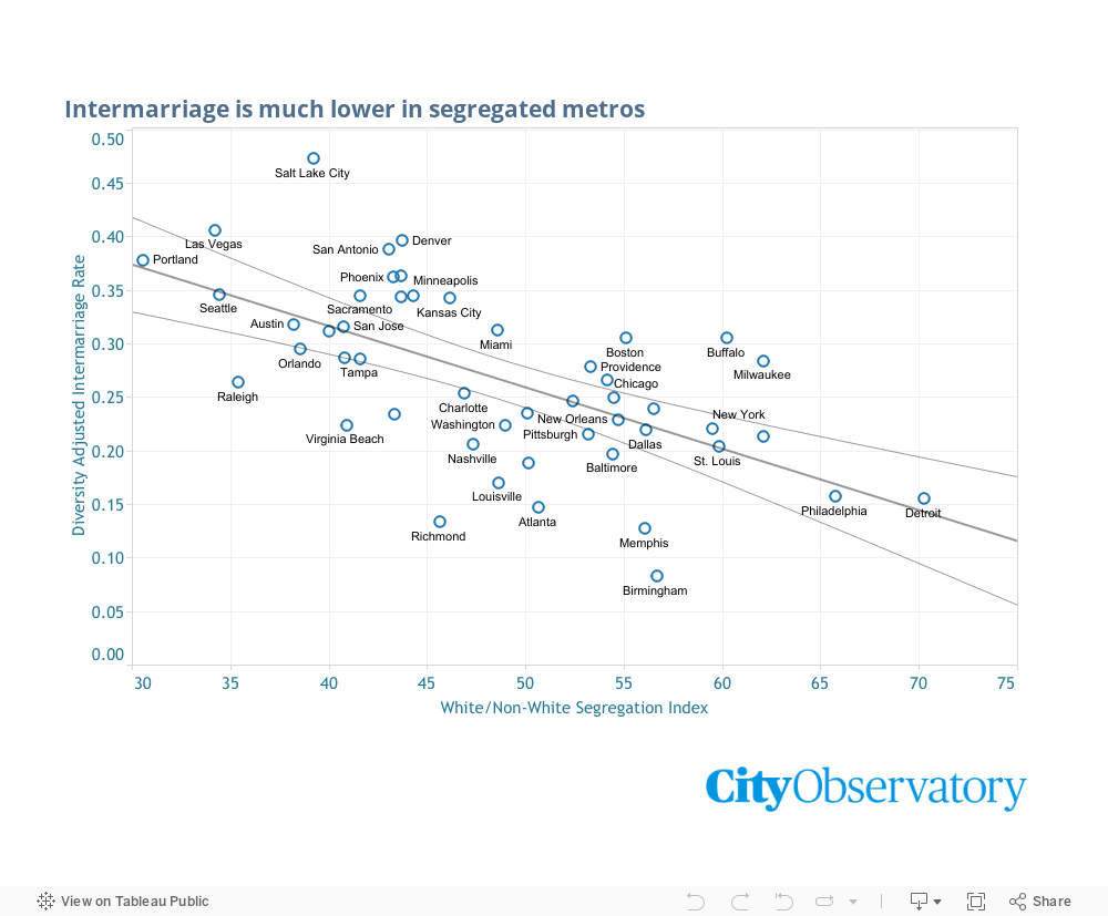
Reducing segregation does seem to result in much more social interaction, as intermarriage patterns demonstrate
Change doesn’t happen fast, but it happens more frequently and more quickly when we have integrated communities
One of the regular critiques of urban integration is that while we might get people from different backgrounds to live in the same neighborhood, that doesn’t necessarily mean that they interact socially on a regular basis. Earlier, for example, we took a close and critical look at Derek Hyra’s claim that mixed-income, mixed-race communities fell short of improving the lot of the disadvantaged because of the persistence of what he called “micro-segregation.” Even though they might live in the same neighborhood, people from these different groups still associated primarily with other people with similar backgrounds. We thought there were a lot of problems with this argument (most notably, that the data show a strong positive impact of mixed income neighborhoods for the lifetime prospects of poor kids, notwithstanding micro-segregation).
Ruth Negga and Joel Edgerton star in “Loving,” the story of a couple that challenged the constitutionality of a Virginia ban on interracial marriage.
While we have some useful measures of residential segregation (compiled from Census data), its harder to come by data that illustrate the extent to which people from different racial and ethnic groups spend time associating with each other. A new report from the Pew Charitable Trusts sheds an interesting light on the most personal inter-group interaction: racial/ethnic intermarriage. It has been half a century since the Supreme Court struck down state bans on interracial marriage in Loving v. Virginia. The data show that intermarriage has increased five-fold from 3 percent of newlyweds in the 1960s to about 17 percent today. The trend has been propelled in part by the nation’s growing diversity, and also due to changing attitudes about intermarriage. Pew used data from the most recent American Community Survey to calculate the rate of intermarriage between people from different racial and ethnic groups in each of the nation’s metropolitan areas. Pew’s ranking shows that intermarriage is much more common in some metros than in others. In the West, intermarriage rates tend to be much higher, for example, than they are in the South. (Urban areas have higher intermarriage rates than rural ones, as well).
In part, these differences reflect the regional variation in attitudes toward intermarriage. But the opportunities for intermarriage also hinge directly on the racial and ethnic composition of a metropolitan area. More diverse areas tend to have greater opportunity for intermarriage than more homogenous ones. The University of North Carolina’s Philip Cohen took the Pew data and compared it to the racial and ethnic diversity of each metropolitan area, and computed an adjusted intermarriage score for each metro area. Given an area’s racial and ethnic composition, how much intermarriage did it exhibit. This ranking gives us a much clearer idea of where intermarriage is common and apparently socially acceptable, and where different racial and ethnic groups are, in practice, mixing. (See Cohen’s blog for full details).
We thought we’d use these data to look at the correlation between metropolitan segregation and intermarriage. Given an area’s racial and ethnic diversity, are people from different groups more (or less) likely to intermarry depending on the segregation of the metro area? The following chart shows the white-non-white segregation index for each metro area (on the horizontal axis) compared to the demographically adjusted intermarriage rate (from Philip Cohen). Higher values on the white-non-white segregation index correspond to higher levels of segregation; the index shows the percent of persons in a region who would have to move to a different census tract so that each tract would have the same white/non-white balance as the metropolitan area of which it was a part. (We extracted the segregation index data from an excellent commentary on housing diversity by Trulia’s Cheryl Young.)
These data show a strong negative correlation between segregation and intermarriage. People who live in highly segregated metropolitan areas are much less likely to marry someone from a different racial and ethnic group than those who live in the least segregated areas. Compare, for example, Philadelphia and Austin. Philadelphia is one of the most segregated large cities (dissimilarity index .65); Austin one of the least segregated (.38). Philadelphia’s intermarriage rate is about half that of Austin’s (.16 vs. .32).
Its possible to imagine that the correlation between segregation and intermarriage reflects both personal opportunities and social values. In less segregated communities, people from different racial and ethnic groups are–by definition–more likely to come into close proximity to one another. But segregation may also reflect (or influence) broader social attitudes about whether interracial relationships are tolerated. These data are very consistent with the notion that greater physical integration of people from different racial and ethnic groups is associated with greater inter-personal interaction.
Of course, the usual caveats about correlation not proving causation apply to this analysis. But it is nonetheless striking that after controlling for the diversity of metropolitan population, intermarriage is much more common in places with low levels of segregation than in places that are more highly segregated. This evidence is highly consistent with the thesis that social interaction among people from different racial and ethnic groups is enhanced by greater integration.
They’ll be lined up around the block because the price is too low–just like every day on urban roads
You can learn everything you need to know about transportation economics today, just by helping yourself to a free ice cream cone. One day a year, and today is that day, Ben and Jerry are giving away free ice cream to everyone who comes by their stores. Whether you’re hankering for Cherry Garcia or Chunky monkey, you can now get it for absolutely zero price.
In addition to free ice cream, there also giving a free lesson in why American roads are perpetually clogged, and why state highway departments are (a) always broke, and (b) always think they need to build more and more and more lanes for traffic.
As you’re standing in line waiting for your “free” ice cream cone, give a little thought to the parallels between that line and your typical rush hour traffic jam. In both cases, you’re waiting in line for the same reason–the price is too low, and demand is overwhelming supply. This is the valuable lesson that Ben and Jerry are providing in the fundamentals of transportation economics.
Gridlock.
You’ll note that unlike the average day at a Ben and Jerry’s, when you might have to wait in line a for a minute or two to get your favorite flavor, now you’re going to end up waiting twenty minutes, or a half hour, or possibly longer. In terms of customers served and gallons scooped, this is going to be their biggest day of the year–last time they gave out a million scoops of ice cream worldwide.
You’ll probably also notice that most of the people standing in line are people who aren’t working nine-to-five. Not many investment bankers or plumbers, but lots of students, moms with small kids, and people who have at least part of the day off from work. (Unlike waiting in traffic, where everyone is isolated in their cars, and experiencing aggravation and road rage, there’s a kind of social, party atmosphere at Ben and Jerrys.
Make no mistake, although you’re not laying out any cash for your ice cream, you are paying for it: with your time. Let’s say that you’d pay $2.50 for that scoop of Phish Food (they’re a bit smaller than regulation on free cone day). If you have to wait half an hour, and you value your time at say, $15.00 per hour, that $2.50 scoop really cost you something like $7.50. It’s a safe bet that most of the people waiting in line value their time at something less than $5.00 an hour if they’re willing to wait that long for a “free” cone. Also, if you really want ice cream, and are pressed for time, there’s no way that you’re going to jump to the head of the line no matter how much you’d be willing to pay.
Free. It only works because its one day a year.
Substitute “freeway” for “free cone” and you’ve got a pretty good description of how transportation economics works. When it comes to our road system, every rush hour is like free cone day at Ben and Jerry’s. The customers (drivers) are paying zero for their use of the limited capacity of the road system, and we’re rationing this valuable product based on people’s willingness to tolerate delays (with the result that lot’s of people who don’t attach a particularly high value to their time are slowing down things for everyone).
If Ben and Jerry’s were run by traffic engineers, instead of smart business people (albeit smart business people with a strong social minded streak), they’d look at these long lines and tell Ben & Jerry that they really need to expand their stores. After all, the long lines of people waiting to get ice cream represent “congestion” and “delay,” that can only be solved by building more and bigger ice cream stores. And thanks to what you might call the “fundamental law of ice cream congestion” building more stores might shorten lines a little, but then it would likely prompt other people to stand in line to get free ice cream, or to go through the line twice. But, of course, with zero revenue Ben & Jerry would find it hard to build more stores.
Tomorrow, Ben and Jerry will go back to charging for ice cream. And the lines at their stores will disappear. In another year or two, Manhattan will be doing pretty much the same thing, when it starts charging a price for private vehicles entering Manhattan. Road pricing can get rid of the lines of cars in New York City just as effectively as it does in front of ice cream shops.
No doubt Ben and Jerry generate enough good will, and probably attract a few new customers with their willingness to give up one day of revenue per year. And they’ll make more than enough money on the other 364 days of the year to cover their losses. But what works for ice cream one day a year is an epic failure when it comes to roads. As long as the price is zero, there will be more demand than you can handle, and you’ll be struggling to pay for the capacity that (you think) is needed.
1. The high cost of low house prices. We generally take low house prices as a sign that housing is affordable, but the reality isn’t that simple. In the case of cities and urban neighborhoods, low house prices may say a lot more about decline and dysfunction than about affordability. Houses, especially older ones, require continual maintenance–everything from paint, to a new roof, repairs to heating systems, plumbing and the like. Major repairs are no cheaper for low cost houses than high costs ones, and the low value of homes can be a major disincentive both to homeowners and landlords to spend money on maintenance. So in many circumstances, rising home prices are actually a positive sign for neighborhood health, signalling that residents and potential buyers put a higher value on living in the area; that in turn provides homeowners, landlords and developers with an incentive to maintain housing and prevent its decline.
2. To tell the truth. A critical ingredient in a sensible and informed policy decision is honesty and transparency by public servants. In testimony to the Oregon Transportation Commission, City Observatory Director Joe Cortright laid out a list of suppressed data, concealed assumptions, hidden plans and calculated misstatements advanced by ODOT to sell the proposed half-billion dollar I-5 Rose Quarter freeway widening project. While second-guessing technical details may be beyond the powers of this citizen commission, they are in a position to insist that the department’s staff provide information in an open and truthful way.
3. You can’t judge housing affordability without knowing transportation costs. Sprawling cities like Houston like to tout their relatively low house prices as an indicator of affordability, but that leaves out a really important part of the equation: transportation costs. If you live in a place where you have to drive everywhere, and drive long distances, then some or all of the advantage of “cheap” housing is offset by higher costs for car payments and gasoline, not to mention the time lost in travel. In Houston, for example, our Sprawl Tax report shows that the average workers pays nearly $3,000 more per year for transportation than in the typical city. Instead of looking narrowly at rents or house prices, we should be looking broadly at housing and transportation. Let’s recast this as a discussion about “affordable living” rather than an incomplete and misleading discussion of affordable housing.
Must read
1. Jason Segedy, on Displacement by Decline. Akron Planning Director Jason Segedy has taken a close look at a recent University of Minnesota Study on neighborhood change, and comes away with some key messages. The report shows that more than 38 million Americans live in urban neighborhoods that have experienced an increased concentration of poverty since 2000, and that despite the headlines it generates, gentrification affects only a pitifully small fraction of poor neighborhoods. He argues that this report should:
serve as a wake-up-call to the many well-intentioned people in our region who worry so much about the potential downside of urban revitalization, that they are overlooking the far greater challenges of inter-generational poverty, uneven economic growth, disinvestment, abandonment, negative-net-growth urban sprawl, and pervasive and entrenched racial and economic segregation.
2. The renter voter hypothesis? Writing in The New York Times, Emily Badger suggests that the nation’s renters could turn out to be a formidable voting block in the 2020 presidential election. Already several democratic candidates have fashioned policy proposals to address rising rents. And in the 2016 election, renters skewed heavily toward the democratic candidate. Elizabeth Warren, Kamala Harris and Corey Booker have all advanced specific proposals to either provide financial aid to renters, encourage the construction of more rental housing or both. While homeowners have traditionally been much more likely than renters to turn out and vote on election day, these candidates may be signalling a shift in the electoral winds.
New Knowledge
Do “Ban the box” laws lessen discrimination? Its long been the case that a prior criminal conviction can have a devastating impact on the ability of a person to even successfully submit and application for a job which they might otherwise be qualified. To deter employers from peremptorily refusing to consider those with conviction records, many jurisdictions have enacted “Ban the Box” laws, which bar employers from asking job applicants to disclose a prior conviction in their employment application (in general, asking about a criminal conviction remains fair game in the interview process).
In theory, “Ban the Box” ought to give otherwise qualified applicants a chance to advance in the screening process. But how does it work in practice. Jennifer Doleac, one of hte nation’s leading criminal justice scholars recently testified to the House Committee on the Judiciary about what research tells us about “ban the box” laws. One concern is that employers may use other factors, including age, race and education to screen out candidates that they perceive as having a higher probability of having been convicted of a crime. Doleac’s review of the literature concludes:
Delaying information about job applicants’ criminal histories leads employers to statistically discriminate against groups that are more likely to have a recent conviction. This reduces employment for young, low-skilled, black men. This negative effect is driven by a reduction in employment for young, low-skilled, black men who don’t have criminal records.
There are a number of studies of the effects of Ban the Box. Doleac’s own work shows that it tends to be associated with a decrease in employment levels for Black and Hispanic youth. Her analysis looked at employment rates before (green) and after (purple) implementing Ban the Box laws. While there was essentially no effect on the employment rates of white, non-hispanic low-skilled men, employment rates declined post implementation for low-skilled Black and Hispanic Men.
Instead of Ban the Box laws, Doleac argues that we should create alternative pathways and credentials for those released from the correctional system to signal their job-readiness, and also take steps to clarify employer’s legal liability when hiring formerly incarcerated persons.
Baltimore Sun columnist Dan Rodricks cited City Observatory’s Young and Restless report in a column calling for the city to reduce its population decline by working to retain more college graduates.
1. Kevin Bacon and Musical Chairs teach us housing economics. It’s an article of faith among economists that more housing, even higher end housing, will help ease rising rents. But to lay-people, that seems counterintuitive. A new paper from the Upjohn Institute shows that the construction of new housing creates a kind of chain-reaction of moves by households that propagates to housing in low income neighborhoods. When a household moves to a newly built, market-rate unit, they move out of the home they previously occupied–and the housheold moving into that unit frees up another unit, and so on. The Upjohn paper uses a detailed private database tracking changes of address to see exactly how moves into one unit create vacancies elsewhere. And like the famous game “Six Degrees of Kevin Bacon,” it turns out that just a few moves connect widely disparate neighborhoods. The paper estimates that building 100 units of new market rate housing generates 60 household moves into housing in low income neighborhoods.
2. Time to dig into the data to see whether ride-hailing leads to increased crashes. Last October, we took a skeptical review of a research paper from the University of Chicago, claiming to find a correlation between the advent of ride-hailing in particular cities and an increase in crash rates. In our view, the paper was based on crude data, and didn’t adequately control for the decline in gas prices and the related increase in driving. The gold standard, we argued, would be to exploit data on the time and location of ride-hailed trips, to see whether these correlated with places where crashes increased. At the time, no such data was available, but this month, the City of Chicago has published detailed data on ride-hailed trip making. Combined with the detailed data already available on crashes, there’s not reason to be making claims about crash rates based on indirect and highly aggregated measures. We’re calling for the Chicago researchers to take a closer look at this data.
3. What causes gentrification from A to Z*. There’s no shortage of people and things that get blamed for causing gentrification, and we’ve compiled a list from A to Z, from Artists to Zoning, that calls out the many suspects. There’s an asterisk here, because while many of these things are correlated with gentrification, it’s more likely that they are symptoms, rather than causes. In our view, you have to read to the very end of the list, to Y and Z, to get to the real causes. Y is you: It’s your demand for housing–whether you actually choose to live in a gentrifying neighborhood or not, that helps propel rents upward. And that demand (from you and others) bumps squarely into Z – Zoning. In most of our cities, we’ve use zoning and related land use requirements to essentially ban building the kind of dense, diverse mixed use, mixed income neighborhoods that we value most, and made it expensive or impossible to build new housing in the places that already have those characteristics. The result: rising rents in under-valued city neighborhoods that have the potential to achieve some level of urban quality.
Must read
1. Alex Baca on the vapid journalism on gentrification. Occasional City Observatory contributor Alex Baca has a commentary at Greater Greater Washington discussing the role of media coverage of gentrification. She notes a recent Washington Post article describing yet another study relating statistics on neighborhood level population change, which shows Washington has experienced some of the most “intense” gentrification of any large US city.” Baca’s point isn’t that this coverage is wrong, but that its just not enough: observing what’s happening, without coming up with something other than superficial reasons why, may generate clicks, but hardly constitutes useful journalism. She writes:
Our public conversation is not helped by writing about gentrification with some sort of wide-eyed wonderment, or with righteous indignation without substance. . . . Journalists should no longer simply highlight a study about gentrification while allowing root problems to go unexplained and responsible actors to continue unchallenged.
While her emphasis is specifically on Washington, DC, much the same could be said more broadly of most reporting on gentrification.
2. Translating Uber’s corporate filing into plain english. Ride-hailing giant Uber is rushing to follow Lyft in placing its public offering. In the process, investment disclosure laws require the company to offer the most detailed and forthright description of its financial results and future business plans. Much of this is written in a obscure dialect meaningful only to financial analysts and corporate securities experts. But helpfully, the Internet has provided a condensed translation, courtesy of Brad DeLong’s Grasping Reality with Both Hands, which we think fairly represents the company’s current and future prospects:
horsesatemymoney: “Abbreviated version of prospectus: We don’t make money. We probably will never make money. Our current business relies on shareholders to fund cheap cab rides in the hope that regulators will let us become a monopoly and charge whatever we want but the regulators are not playing along. We have therefore spent more money expanding into other low margin highly competitive activities like food delivery or trucking despite there being lots of specialist logistics firms so not obvious how we are going to make any money there either. We hope in the future there will be driverless cars and that we can then make money because no drivers but other people are developing them too. We have annoyed lots of regulators so we have lots of disputes and problems with regulators. We don’t pay much tax and have done lots of aggressive tax planning and so we have lots of disputes and problems with tax authorities. We don’t employ anyone (or we say we don’t) but we have lots of de facto employees and so we have lots of disputes and problems with drivers and employment tribunals. We don’t actually own many assets because we managed to get our drivers to provide their own cars. We have an app but other cab companies also have apps. Current investors want to get out and so we hope you will buy some shares anyway because you have heard of us. Also we need more money to fund the businesses that don’t make money. We are expanding into more business lines that don’t make money and we need more money to fund those. We are really big and you have heard of us plus we say we are a tech disruptor so don’t worry that we make no money it will all be great because you will be an Uber investor…
3. Is Portland’s Inclusionary Housing ordinance stifling housing investment? Just over two years ago, Portland’s inclusionary housing requirements, some of the most stringent in the nation went into effect. We and others predicted that they were likely to deter new residential construction, but that effect has been obscured by the land rush of building permit applications filed just before the new requirements took effect. Developers have been building those pre-inclusionary permitted units for the past two years, and there now signs that new investment is dwindling. In the past two years, private development under the inclusionary requirement has produced fewer than 350 units of affordable housing. A report from the Portland Daily Journal of Commerce notes that some developers report Portland is no longer profitable. Some projects are going forward–thanks in part to the fact that the City last year dialed back a scheduled increase in the inclusionary requirements. But rates of return are low enough that only local investors, committed to the Portland market, and willing to accept a lower profit are moving forward, while out of state investors stay away. Similarly, development seems to be moving forward only in the neighborhoods with the strongest demand, where profits from market rate units can cover the costs of building inclusionary units; in weaker neighborhoods, investors can’t make enough from the market units to make projects pencil out. These stories may also be the tip of the iceberg: as we’ve noted before at City Observatory, its nearly impossible to detect the housing units that aren’t built because investors have simply decided its not even worth investigating the market.
4. How the missing middle protects neighborhood character. Sightline Institute’s Michael Andersen has a terrific man-bites-dog housing story. While “neighborhood character” is often thinly veiled code for economic or racial bias, Andersen relates the story of a Portland resident Patty Wentz who wants to see more duplexes, triplexes and similar “missing middle” housing units built in her neighborhood, so that it retains (and perhaps restores) some of the vibrant socioeconomic diversity that it had when she first moved there. Rising housing costs have effectively selected against many households who would have like to live in the neighborhood, especially families with children. Andersen quotes Wentz’s testimony to the Oregon Legislature in favor the the legislation liberalizing missing middle housing.
We can open the possibility for young families, people of color and seniors on a fixed income to join us on our beautiful tree-lined streets close to good schools within blocks of some of the most beautiful public parks in the country. We can start to address racially discriminatory policies that historically kept people of color out of our neighborhoods. Once again allowing a few new duplexes, tri-plexes and four-plexes on single lots on my block with HB 2001 will do more to help people than any charitable contribution I can make, any march or rally I go to or any volunteer activities I can do.
New Knowledge
NACTO report on the growth of shared micromobility. Add a new term to your transportation statistics lexicon, and get ready to see in more frequently. The National Association of City Transportation Officials (NACTO) reports on the explosive growth of “shared micro-mobility”–think shared electric scooters, and docked and dockless shared bikes and e-bikes. Combined, these modes provided more than 84 million trips in 2018, double the number of 2017, due primarily to the introduction of shared e-scooters from Bird, Lime and others.
The report, compiled from data gathered chiefly from NACTO cities, sheds considerable light on the kinds and locations of travel by different modes. Monthly subscribers to shared bikes tend to use them mostly for peak hour, weekday trips, while shared e-scooters tend to be relatively more popular for midday, evening and weekend use. These data suggest that different modes and pricing structures will serve different travel demands. The rapid growth of scooters signals that there’s a rich latent demand for alternative forms of urban mobility.
In the News
Strong Towns re-published Joe Cortright’s commentary about the Ben and Jerry’s annual advanced transportation seminar, demonstrating that charging a zero price for something valuable leads to congestion.
Market Urbanism’s Emily Hamilton cited our essay on the fundamental contradiction between our twin goals of promoting housing affordability and encouraging home ownership as an investment in her analysis of Senator Elizabeth Warren’s latest housing policy proposal.
1. More Orwell from the Oregon Department of Transportation. When it comes to any public policy decision, but especially one that involves spending $500 million (and likely a good deal more), the public has the right to expect that public employees will be truthful and candid. That hasn’t been the case with the I-5 Rose Quarter Freeway widening project. ODOT staff went to great lengths to conceal the fact that their traffic projections assumed the construction of a $3 billion, 12-lane freeway crossing the Columbia River (an assumption that dramatically biased their impact analysis against the no-build option). To help sell the project, ODOT presented a handful of carefully selected computer renderings to make the project appear as benign as possible, and then in response to a public request, denied that any engineering plans existed. Under pressure, the department conceded that engineering plans did in fact exist, and produced more than 33 gigabytes of drawing files. The public deserves better treatment from its servants that such blatant attempts to conceal and lie about fundamental facts about this project.
2. 25 Reasons not to widen Portland freeways. We’ve extensively analyzed the proposal to spend half a billion dollars widening a mile-long stretch of urban freeway in Portland, especially over the past month. Here’s the complete guide to the 25 different reasons why freeway widening is a bad idea, ranging from its failure to reduce congestion, the certainty that it will increase driving and greenhouse gas emissions, to its negative effect on safety and neighborhoods. This particular project will also make life worse for those who walk, bike and take transit in city neighborhoods, and is manifestly inequitable, chiefly benefiting higher income, drive-alone commuters from outside the area, while inflicting more traffic, noise and pollution on those who live in the area.
3. Integration and interaction: Evidence from Inter-marriage. One of the regular critiques of urban integration is that simply having people from different backgrounds (income, race-ethnicity) living in the same neighborhood doesn’t mean that there’s meaningful social interaction. People tend to associate more often with others who are like them, even in the most integrated places. But the evidence from patterns of inter-marriage (marriages between people from different racial and ethnic groups) suggests that residential integration is a powerful force in promoting this, the most personal and enduring form of interaction. Highly segregated cities have little intermarriage; highly integrated ones have much more. Statistically, there’s a strong correlation between integration at the metropolitan level and rates of inter-marriage, suggesting that integration does promote inter-group interaction. Integration doesn’t necessarily produce instant kumbaya, but it does seem to be a pre-requisite for greater social interactions.
Must read
1. Emily Badger on socialism for cars. New York has, finally, authorized congestion pricing for Manhattan, and to many it seems like at affront to a fundamental notion that roads ought to be “free.” But as we’ve noted at City Observatory, there’s nothing “free” about roads, especially urban roads–they’re costly to build, maintain and expand, and their value is appropriated for private use by a relatively small portion of the population that pays far less to use roads than they’re worth. The New York Times Emily Badger has an essay–“The streets were never free; Congestion pricing finally makes that plain,”–underscoring the problems that our implicit policy of socialism for cars and car storage has caused for city living and public budgets, drawing on the expertise of Michael Manville, Yonah Freemark, and others.
2. Freeways without futures. The Center for New Urbanism is back with its biennial report on freeways without futures, those urban roadways that have long since outlived their usefulness (if, indeed they had any to begin with), and which if removed, would heal and grow urban space. The experience of cities that have removed freeways is that it’s generally made urban life better and stimulated housing markets, provided public space and benefited city economies. The report hands down death sentences for urban freeways in Tampa, Dallas, Detroit, Austin and several other cities. Our personal favorite: removing Portland’s Eastbank I-5 freeway, a Robert Moses-relic occupying prime riverfront land in the city’s core.
New Knowledge
Early signs of rising prices in Opportunity Zones. The new opportunity zone law, enacted as part of the 2017 tax cut law, provides a generous capital gains tax break for investments in designated low income neighborhoods around the country. Economic theory suggests that all other things being equal, a tax cut that applies to a particular area and not others should be reflected in the value of the property–a seller would pay more for an otherwise identical property in a tax-advantaged area than one that had a higher tax rate. Economists call this “capitalization”–the value of the tax break gets capitalized into the value of the property. In practice, what that means from a distributional standpoint is that at least some of the value of the tax break is a windfall for the property owner. It will take a good deal of time to figure out whether, and how much capitalization is happening with the opportunity zone program, but real estate analysts at Zillow have an early read, based on their analysis of housing prices. They’ve tracked the pattern of change in home prices in opportunity zones, and compared them to other low income neighborhoods eligible to be designated at opportunity zones, but which weren’t designated.
These data show that prices in such neighborhoods are more volatile than in all neighborhoods, but since the designation of opportunity zones last year, there’s been a noticeable uptick in prices in designated zones (green line) relative to otherwise eligible but not designated zones (yellow line). Again, this is fragmentary evidence and early returns, but it bears watching.
In the News
Willamette Week reported on the serial prevarication by the Oregon Department of Transportation in its attempt to sell the Rose Quarter freeway widening project, publishing project renderings showing how the widened freeway would intrude on riverfront parkland (with renderings generated from previously suppressed data). The article also cites City Observatory’s analysis showing that the freeway-widening project actually proposes to build a right-of-way that would easily accomodate an eight-lane freeway.
1. The annual Ben and Jerry’s advanced seminar in transportation economics. If you love ice cream–who doesn’t?–Tuesday was your chance to get a free cone at Ben and Jerry’s and while you were there, pick up a fundamental insight into transportation economics. Around the country, people were lined up outside Ben & Jerry’s, waiting ten or fifteen minutes in some cases to get the same thing that they could usually walk up to a counter and buy with no most days. The reason for the line up for ice cream is exactly the same as the reason for lines of cars on urban roads: the price is too low. The problem with traffic engineers is that they try to run the road system as if everyday was free ice cream day: with the predictable result that they’re always broke, and they always think they need a lot more capacity. Getting the prices right can both pay for just as much road as we actually need, and make sure roads aren’t too crowded. We’re looking forward to congestion pricing in Manhattan in a couple of years.
2. What happens when you take the “port” out of Portland? In 2015, Portland lost regularly scheduled container ship service. The container crane has long been emblematic of international commerce and an icon of the civic mythology that Portland is somehow a freight-dependent economy. But a funny thing happened after the container ships went away: Portland’s economy kept right on growing robustly, with no visible effects on local employment or income. The key reason: the region had long since transitioned from a resource-dependent entrepot to a vibrant knowledge-creating economy. Leading industries like information technology and athletic and outdoor products are far more dependent on the region’s quality of life and its ability to attract and retain talented workers, than on moving bulky products by container. Clinging to out-dated myths about what drives your economy is a poor guide to policy; nostalgia is not an economic strategy.
Portland’s waterfront a century ago–not its economy today.
3. Measuring the Civic Commons. Parks, libraries, community centers and other parts of the public realm provide opportunities for interaction and building the social capital that is critical to a well-functioning community. While we know that intuitively, we often lack the metrics to assess the health and performance of these civic assets. A new set of tools developed by Reinvigorating the Civic Commons, and piloted in five cities around the country, is available to help community leaders more precisely measure the effectiveness of their efforts to bolster the civic aspects of their neighborhoods.
Must read
1. Mapping Neighborhood Change. The University of Minnesota’s Will Stancil has a great set of maps showing neighborhood change across the nation since 2000. His work classifies neighborhoods based on whether they grew (added population) or not, and whether the number of low income households (defined as those living below 200 percent of the federal poverty line) increased or declined. He categorized growing neighborhoods with declining numbers of low income households as “gentrifying,” and low income neighborhoods with growing numbers of low income households as areas of increasing poverty concentration. Similar to City Observatory’s findings in our 2014 report Lost in Place, Stancil found that the number of declining neighborhoods far outnumbered gentrifying neighborhoods. Their key finding:
By and large, at the regional level, low-income concentration is the dominant trend. In 26 of the 50 largest metropolitan areas, more than one-fifth of the population lives in a neighborhood that has experienced low-income concentration. In the very poor regions of Memphis and Cleveland, that share increases to over two-fifths; in the Detroit region, about half the population lives in a neighborhood that has undergone concentration.
Stancil’s report, published by the Institute for Metropolitan Opportunity, offers nationwide neighborhood level data on population change. You can use the web-based map to view data for an entire metropolitan area, and drill-down to see data values for individual census tracts. Here’s a map for metro Detroit; red- and orange-shaded areas represent increasing concentrations of poverty.
2. Why is housing in Japan so affordable? Tokyo is on of the largest cities in the world, and yet its rents and home prices remain quite affordable. How can that be? The simple answer, according to the Wall Street Journal is that there are relatively few restrictions on building additional housing. Because supply can respond to changes in housing demand, the city regularly builds new housing in desirable locations–and NIMBYs have little power. In 2017, Tokyo built almost as many new housing units as New York, Houston, Los Angeles and Boston combined; housing starts per 1,000 persons are more than double those of New York. As a result, Japan’s home prices are on average about the same level they were a decade ago, and the typical two bedroom apartment rents for about $1,000 per month. Tokyo’s experience is powerful evidence that it is possible to build your way to affordability.
3. Combined Bus & Bike Lanes speed commuting in Chicago. Chicago recently conducted an important traffic experiment with promising results. Because of construction on a major downtown arterial, Chicago street, buses had to be temporarily re-routed to the parallel North Halstead Street. To minimize impacts on traffic, the city took out a lane of parking, and striped one lane of North Halstead Street for bike and bus traffic. The result: a 63 percent increase in bus travel speeds through the half mile long corridor, saving travelers more than two minutes. As we’ve noted elsewhere, this has myriad benefits: not only do current bus travelers enjoy shorter travel times, but bus drivers become more productive (as measured by more passenger miles per bus driver hour). In addition, faster bus travel times make transit a more attractive alternative for others who weren’t riding before, which has the potential to take cars off the road. Re-allocating space from storing cars to moving people makes huge economic sense.
New Knowledge
New metropolitan home price index. The American Enterprise Institute has created a new single family home price index covering the nation’s 60 largest metropolitan areas. This gives data users another alternative to the estimates created by Case-Shiller, Zillow, Redfin, and others. The innovation in the AEI index is creating a hybrid measure that combines aspects of the repeat-sales model and more global averages of current sales data. The index is available on a quarterly basis, going back to 2012, and includes estimates of current year inflation in home prices, as well as estimates of mortgage risk and the number of months of supply.
Pinto, Edward and Peter, Tobias, (2019) American Enterprise Institute, Housing Center, Housing Market Indicators for the Nation: Update for 2018:Q4, https://www.aei.org/multimedia/national-and-metro-housing-market-indicators
In the News
George Abbott of Memphis River Parks Partnership quoted Joe Cortright’s study of changing urban neighborhoods in his Op-Ed, Why we need Memphis 3.0, in the Daily Memphian.