Any Port in a Storm?

Over the past few weeks, there’s been a fair amount of media furor over the slowdown in container traffic handling on the West Coast as dockworkers and shipping companies negotiated the new terms of a labor deal.

You no doubt heard a fair amount of hyper-ventilation about the economic consequences of disruptions to this international supply line. Unsurprisingly, the longshoremen’s union took maximum advantage of its leverage over workflow to drive a hard bargain with the shippers. This is a kind of kabuki show that is repeated whenever these multi-year contracts are up for renewal. And, as almost always happens, the two parties have come to an agreement, and ports, especially the Ports of Los Angeles and Long Beach are working quickly to move the backlogged traffic.

With the prospect of a new wider Panama Canal re-arranging the competitive environment for global shipping, many seacoast cities are giving new thought to how port traffic might influence their future growth prospects.  There’s little question that big “load-center” ports are hubs of commerce, where the economies of scale in shipping seem to be creating a winner-take-all situation.

But how big a deal is container traffic to the typical metropolitan economy? What if your city isn’t the big winner in the container traffic game?  That question is a very live one in Portland. Overshadowed by the furor generated by the coast-wide slowdown was an announcement earlier this month by Korean shipper Hanjin that it was terminating container service to the Port of Portland. Hanjin accounts for three-quarters of Portland’s container traffic.

In a new column in Oregon Business magazine, I examine the economic ramifications of the Portland’s loss of dock-side container service.

For a city whose first name is “port,” the loss of container service seems like an economic body blow. We are constantly being told that Oregon has a “trade-dependent” economy. How will we survive without this iconic connection to the global marketplace?

The answer will surprise you: Just fine.

You can read the rest at OregonBusiness.Com

There’s little doubt that container service is a highly visible icon of any city’s connections to the global economy. It’s the sort of thing that television reporters can stand up in front of a camera and tell visually compelling stories.

But for most city economies, dockside container service has little to do with whether they succeed or fail in the global economy. The ability of cities to compete hinges not on whether they can cheaply move bulk goods, but on whether they can create world-class products. Particularly in high-cost countries like the United States, firms compete on product differentiation and performance, not transportation cost. This is true of the high-value products of advanced industries: everything from commercial jets to computer chips. This is even more true for services–software, motion pictures, financial services–for which physical movement of product is essentially irrelevant.

As we move toward an increasingly intangible, innovation-driven economy, the old metaphors we use to visualize the economy are becoming a less useful guide to thinking about how the world works.

The Perils of Conflating Gentrification and Displacement: A Longer and Wonkier Critique of Governing’s Gentrification Issue

It’s telling that Governing calls gentrification the “g-word”—it’s become almost impossible to talk about neighborhood revitalization without objections being raised almost any change amounts to gentrification. While we applaud the attempt to inject some rigor and precision into a debate that has been too often fueled by emotion and anecdote, Governing’s analysis serves only to muddy the waters of this contentious issue.

The Governing team explains that there is no agreed-upon definition for gentrification, and then go on to choose a definition and use it to measure number of neighborhoods that have, and haven’t, gentrified. The report notes that gentrification is not the same thing as displacement; but then repeatedly describes the harm of gentrification as being the displacement of the existing population.

Is Gentrification About Displacement? Or isn’t it?

The underlying problem confronting Governing’s analysis is the confusion of the terms “gentrification” and “displacement”. The Governing team begins by explaining that their definition of gentrification has nothing to do with displacement, but they then go on to detail how “gentrification signifies displacement of the poor, mostly people of color.”

The reason policy analysts and public officials are concerned about gentrification, to the extent it happens, is because it holds the potential to displace the poor from their longtime neighborhoods. As Governing acknowledges, the original definition by British sociologist Ruth Glass was that the middle class “invade” a neighborhood “until all or most of the working class occupiers are displaced,” and the social character of the neighborhood is changed.

Our own work has shown that over four decades, relatively few high-poverty neighborhoods have seen their poverty rates decline to below the national average. It’s also the case that far more of the long-suffering poor move out of high-poverty neighborhoods that stay poor than move away from high-poverty neighborhoods that see a significant reduction in poverty.

A striking omission from the Governing article is any more than a passing mention of the robust academic literature on the extent of displacement in gentrifying neighborhoods. Columbia University’s Lance Freeman reports that outmigration rates for low-skilled black residents of gentrifying neighborhoods are lower than in otherwise similar, non-gentrifying neighborhoods. The University of Colorado’s Terra McKinnish and Kirk White conclude the demographic flows associated with the gentrification of urban neighborhoods are not consistent with displacement or harm to minority households. New York University’s Ingrid Gould Ellen and Katherine O’Reagan write “. . . original residents are much less harmed than is typically assumed. They do not appear to be displaced in the course of change, they experience modest gains in income during the process, and they are more satisfied with their neighborhoods in the wake of the change.”

It’s also discouraging that this entire discussion of poor neighborhoods isn’t placed in a broader context of income segregation of the U.S. population. Income inequality has achieved a new level of visibility in public discussions in the past few years, thanks to the work of Thomas Piketty and others. A number of scholars—Brown University’s John Logan, Rutger’s Paul Jargosky, the University of Missouri’s Todd Swanstrom, and others—have carefully traced out how income inequality has played out in the form of greater spatial separation by income in the nation’s metropolitan areas. The latest research from Stanford’s Sean Reardon and his colleagues shows that income segregation is increasing, driven by the increasing secession of the rich from neighborhoods of lower- and middle-income households. The focus on gentrification—the very limited and small-scale movement of some higher-income and better-educated households into lower-income communities–completely misses the fact that income segregation is being driven by the decisions of higher-income families to increasingly isolate themselves in higher-income enclaves, often in exclusive suburbs and established high-income areas.

One of the ironies of the fear of gentrification is that is often used as excuse to steer limited dollars for assisted housing predominantly or exclusively into low-income neighborhoods, a practice the University of Minnesota’s Myron Orfield has shown to reinforce historical patterns of racial and economic segregation.

Levels vs. Change

In quantitative analysis, we can measure the level of something (whether incomes are high or low, for example). We can also measure the “change” in something—whether incomes are increasing or decreasing.

The limitation of the Governing definition of gentrification is that it is all about change, and it largely ignores levels. Even if education levels or incomes increase in a poor neighborhood, it still may be much less well-educated and lower-income than the average neighborhood in the metropolitan area of which it is a part. This absence of clearly defined thresholds is a perennial omission of gentrification discussions: if one wealthier, whiter, better-educated person moves into a neighborhood, does that constitute gentrification?

As the University of Pennsylvania’s Mark Stern and Susan Seifert note:

Clearly, there is no objective measure of when neighborhood improvement—or, in Jane Jacobs’ striking phrase, ‘unslumming’—becomes gentrification. But if we see neighborhood revitalization as desirable, we cannot afford to label all population change as gentrification. (2007)

There’s something odd about a measurement that purports to examine the extent of “gentrification,” but excludes from its analysis all city neighborhoods with income levels over 40 percent of the metropolitan average. In San Francisco, a city with 196 census tracts, Governing concluded that only 16 were “eligible” to gentrify, and that only 3 tracts did gentrify. Superficially, this creates the impression that gentrification affects only 3 neighborhoods in San Francisco, as opposed to say, 84 neighborhoods in Philadelphia, and 39 neighborhoods in Baltimore. But is it meaningful to conclude that gentrification, income disparities, and displacement are a tenth as widespread in San Francisco as these other cities, simply because San Francisco already had most of its neighborhoods dominated by “the gentry?” Should we put any stock in a measure that says gentrification is more prevalent in Detroit (7 neighborhoods), Cleveland (10) and Fresno (5), than it is in San Francisco (3 neighborhoods)?

The levels of income and education are still very low, and the levels of poverty still very high, in many of the neighborhoods that Governing says have “gentrified.” Can it be said that a neighborhood has gentrified if it has, by comparison to the rest of its metropolitan area, a higher fraction of low-income households than the rest of the metropolitan area? Is this really a helpful way to describe what’s happening in metropolitan areas?

No Apparent Displacement in “Gentrifying” Tracts

The identifiable harm of gentrification is displacement: if Governing has identified tracts that are gentrifying, and if gentrification is a problem, then we should be able to find evidence of displacement. Or, put another way, if neighborhoods are gentrifying and displacement isn’t happening, is it a serious problem?

Let’s compare what happened to gentrifying and non-gentrifying tracts, according to Governing’s definition. Of a total of 4,750 central city census tracts “eligible” to gentrify, 948 gentrified, but 3,802 did not. The tracts that did not gentrify lost 2.4 percent of their population in aggregate. The tracts that did gentrify actually saw their population increase by 6.7%. (This is consistent with the “up or out” pattern we identified in high-poverty tracts nationally: either poverty rates decline and population increases, or high poverty rates persist and population declines).

One recurring theme in overly simplistic gentrification analyses is housing as a zero sum game. If one whiter, wealthier, or better-educated person moves into a neighborhood, that must necessarily mean that one poorer, less-educated person of color must move out. Both Governing’s report and our analysis of high poverty neighborhoods shows that gentrifying or rebounding neighborhoods are actually seeing population increases.

It’s also the case that more poor people live in the Governing’s “gentrified” tracts today than in 2000: the poverty rate in gentrified tracts declined by 0.7%, while the total population increased by 6.5%. Assuming the poverty rate in these tracts exceeded 13 percent in 2000, the population living below the poverty line in these tracts had to have actually increased between 2000 and 2013; hardly evidence, on its face, of widespread displacement.

Another recurring theme in this kind of analysis is the implication that if a neighborhood doesn’t gentrify, that it somehow stays the same. But our analysis of poor neighborhoods showed that places of high poverty aren’t stable; if these neighborhoods don’t see a reduction in poverty, people leave: on average high-poverty neighborhoods that didn’t rebound lost 40 percent of their population over four decades. The same pattern holds for Governing’s “non-gentrifying” neighborhoods—they lost 2.4 percent of their population. This contrasts with the gentrifying places, which were adding population.

Understanding the Nuance of Neighborhood Change

Rather than just a binary classification of neighborhoods as either “gentrified” and “not gentrified,” it’s worth looking at the actual numbers of people involved, poor and non-poor, to get a sense of what’s really happening and what it means.

At City Observatory, we frequently work with tract-level data, and closely follow developments in Portland, where we’re based. We took a close look at Governing’s data for Portland, in part because they concluded that 58% of “eligible” census tracts gentrified in the past decade.

Here are their headline findings for Portland: According to Governing, 62 of 143 census tracts in the City of Portland were “eligible” to gentrify. Of these, 36 gentrified, and 26 did not, according to their calculations.

We gathered the data on population and poverty for all the City of Portland census tracts for 2000 and 2009-13, and categorized them according to the Governing methodology (we noted the classifications as coded on Governing’s map of Portland tracts). We have one more census tract in the City of Portland (in the not eligible category). We ignore this minor difference for the purpose of our analysis. Here’s what the data show about the gentrifying neighborhoods in Portland in the aggregate:

The total population in “gentrifying” neighborhoods actually increased from about 152,000 to about 165,000. This is consistent with our observation that neighborhood change is not a zero sum game. Neighborhoods can gain new residents without necessarily losing existing ones.

The number of poor persons living in “gentrifying” neighborhoods increased. In 2000, there were 25,037 persons in poverty in these neighborhoods; in 2013 there were 34,499 persons living in poverty, about 9,500 more. Even allowing for the increase in poverty rates in the nation and the region over the decade, it’s hard to argue that there was widespread displacement of the poor from these “gentrifying” neighborhoods if they now have 9,500 more poor residents.

As a result, the poverty rate in “gentrifying” neighborhoods in Portland increased between 2000 and 2013 in the aggregate. In 2000 the poverty rate was 16 percent; in 2013, the poverty rate had risen to 20 percent. Even after “gentrifying,” these neighborhoods had a poverty rate that was higher than the regional average of about 13.5 percent.

Meanwhile, the number of non-poor residents also increased by a net of 3,800, from about 127,000 to about 130,000. The “gentrifying” neighborhoods gained about two-and-a half times more net additional poor residents than net additional non-poor residents. Spread over 36 Census Tracts and about 11 years, (2000 through 2011, the mid-point of the 2009-13 five year census pattern) this works out to a net increase of about 10 non-poor persons per “gentrifying” census tract per year—hardly a sweeping change in typical neighborhood demographics.

Poverty, Population, City of Portland, 2000 and 2009-13

Organized by Governing Magazine Gentrification Typology
Governing Category “Gentrified” “Not Gentrified” “Not Eligible” City Total
Tracts 36 26 81 143
Population 2013 165,436 120,742 317,422 603,600
Calculated Persons in Poverty 2013 34,499 27,948 44,845 107,292
Average Tract Poverty Rate 2013 20.0% 22.7% 13.8% 17.0%
Population 2000 152,168 105,583 280,454 538,205
Calculated Persons in Poverty 2000 25,037 15,000 30,242 70,279
Average Tract Poverty Rate 2000 16.8% 14.0% 10.9% 12.9%
Growth in Poverty, 2000-2013 37.8% 86.3% 48.3% 52.7%
NonPoor 2000 127,131 90,583 250,212 467,926
NonPoor 2013 130,937 92,794 272,577 496,308
Percent Change 3.0% 2.4% 8.9% 6.1%
Change in Non_Poor 3,806 2,211 22,365 28,382
Growth in Population 13,268 15,159 36,968 65,395
Poor 9,462 12,948 14,603 37,013
NonPoor 3,806 2,211 22,365 28,382

This is not to say that all of these neighborhoods experienced this same pattern. By our count, 22 of Governing’s 36 gentrifying Portland census tracts experienced increased numbers of persons living in poverty, and 14 saw decreases in their poverty population. Of these 14, nine had decreases of less than five percent since 2000, four had decreases of between five to ten percent, and only one census tract saw a decrease of more than ten percent in its population living in poverty. Arguably, these tracts may be experiencing a measure of displacement. But for reference, it’s worth noting that the between 1970 and 2010, the typical urban high-poverty tract that stayed high-poverty lost about 40 percent of its population. 31 of the 36 “gentrifying” tracts still had poverty rates above the regional average “post-gentrification.”

Defining the Undefinable

After musing about whether gentrification is synonymous with displacement, Governing concludes that we should treat them as two different things, and cites the Centers of Disease Control as agreeing with this view. The authors quote the CDC as saying: “gentrification is merely the transformation of neighborhoods from low value to high value.” The CDC definition, says Governing, has nothing to do with displacement.

It’s worth looking at the CDC’s work here. It turns out that the Centers for Disease Control hasn’t actually done its own research on gentrification. What you’ll find at the CDC website is one wiki-like page of secondary citations, compiled by an unidentified author: http://www.cdc.gov/healthyplaces/healthtopics/gentrification.htm. The CDC is hardly regarded as an expert or arbiter on the subject: Google Scholar reports a total of four citations to this CDC webpage.

It’s important to note that the CDC website—like the rest of the literature on gentrification—clearly flags the harm of gentrification as displacement of the existing population. They use the term “transformation” in their definition. If you read on in the sentences immediately following the definition cited by Governing, this is clear: “This change has the potential to cause displacement of long-time residents and businesses. Displacement happens when long-time or original neighborhood residents move from a gentrified area because of higher rents, mortgages, and property taxes.”

There’s one more wrinkle here. Notice that the CDC definition refers to the transformation of neighborhoods from “low value to high value.” The CDC definition, unlike Governing’s, is about levels, and not just changes. Governing’s definition is not that formerly poor neighborhoods become “high value” neighborhoods, but that they become “higher” value neighborhoods—that their property values increase faster than for the region as a whole. It is entirely possible for a low-value neighborhood to have a higher percentage increase in prices, and still be a low-value neighborhood.

Is there some reason we might want to be cautious about leaning on housing price data from the past decade or so?

A linchpin of the Governing analysis is its reliance on a decade’s worth of housing price data as reported by homeowners to the Census Bureau. They compare the reported value of owner-occupied housing in the 2000 Census, with data from the 2009-13 editions of the American Community Survey, and use this to identify lower income neighborhoods that have experienced higher than average rates of home price appreciation.

As we all recall, that decade represented the period of the biggest volatility in home prices and housing markets in at least eight decades. Home prices were inflated by a giant bubble through the mid-part of the decade, and collapsed in a downturn that wiped out trillions of dollars of household equity, produced millions of foreclosures, and resulted in 17 million more households renting their homes.

Another important development during the past decade was the big increase in gas prices in 2007-08, which persisted until just the past few months. Arguably, higher gas prices had a big impact on the housing market, depressing the price of suburban and exurban homes that were sold to what the real estate community called the “drive-til-you-qualify” crowd.

It’s obvious that this was a decade where a range of market forces were buffeting housing prices. It’s a stretch to assume that gentrification was the sole cause of higher prices in some previously poor neighborhoods.

There’s another deeper technical issue here: Governing’s estimates are based on median home values data that are subject to bias from composition effects. (For a discussion of the volatility and noise that median measures create for housing price inflation estimates, see Jordan Rappaport, “A guide to aggregate house price measures” Kansas City Federal Reserve Bank, 2007.)  The Census Bureau asks for estimates of home values only for owner-occupied homes—not rentals. As long as the number and mix of these homes doesn’t change from one census to another, this isn’t a problem for using the census data to estimate average prices. But the “median” home value is subject to composition effects: if a different number and mix of homes is in the sample in the base year and the final year, the quality of the estimate is compromised. If many formerly owner-occupied low-value homes are foreclosed upon, and converted to rentals, they are no longer included in the median. Because foreclosure was more common among low-value houses this effect drives up the reported median for the remaining higher-value houses. Foreclosure problems are far more common in lower-income neighborhoods than middle- and upper-income neighborhoods. It’s also the case that if new market rate housing gets built in a neighborhood, it is usually at a higher price point than existing housing; this too tends to cause measured median prices to rise, especially in neighborhoods with lots of older, smaller, lower-value homes.

What do we do?

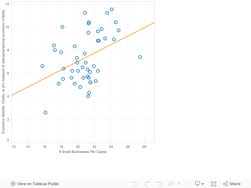
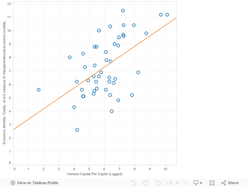
As the Governing team well understands, the metropolitan U.S. is dramatically segregated by income—and income segregation is increasing. An abundance of social science literature shows that concentrated poverty magnifies all of the negative effects of growing up poor (Patrick Sharkey, Jargowsky & Swanstrom). Newly released research on intergenerational mobility shows the devastating effects of concentrated poverty, and that even poor kids that grow up in integrated places have much greater opportunities than their counterparts in neighborhoods of more concentrated poverty (Chetty, Massey and Rothwell).

We live in a nation increasingly segregated by income. Even as racial segregation has waned, income segregation has increased. If we’re serious in our rhetoric about equality of opportunity, we have to do something to tackle the growing spatial class segregation we see in cities.

As Daniel Kay Hertz has observed, critics of gentrification need to say how they expect to achieve a more integrated nation and more integrated cities if they are somehow opposed to some higher-income people moving into what have become lower-income neighborhoods. “The kind of cognitive dissonance that allows someone to decry segregation while they wish to “reverse” the process of integration makes it impossible to articulate a real vision for what a just city might look like. Those who would declare themselves firmly anti-gentrification need to grapple with whether they’re comfortable defending a racial geography born of discrimination and violence.”

Those who raise “gentrification” as an impending threat to American cities owe us a coherent vision of how we can create more just and equitable neighborhoods. Lamenting—and exaggerating—gentrification generates plenty of heat, but precious little light on how cities ought to respond to the twin challenges of income segregation and neighborhood change.

Jobs Return to City Centers

(This post coincides with the newly released report, Surging City Center Job Growth. The report and more details are found here.

For decades, urban economists have chronicled the steady decentralization of employment in our metropolitan areas. First people moved to the suburbs for low density housing, and then businesses followed—especially retail and service businesses that catered to decentralized population. Over time, the manufacturing and distribution business which had traditionally chosen city-centered transportation hubs also moved to more sprawling locations, enabled by the shift to truck transportation and the growth of the nation’s highway system.

A few industries continued to be disproportionately found downtown. Banks, insurance companies, government offices, and many professional service firms still preferred central office locations that facilitated easy face-to-face contact. But retail moved increasingly to suburban malls and highway strip centers, manufacturing and distribution to industrial parks, and many clerical and administrative functions moved from the center to more dispersed office parks.

At City Observatory, we’ve tracked the growing movement of talented young workers back to urban neighborhoods. The growing attractiveness of urban living is leading to measurable increases in skill level of the labor force near city centers. Employers are taking notice: a growing number of firms report that they are choosing downtown locations in order to tap into the growing talent pool of young workers.

We’ve identified dozens of examples of these downtown moves and expansions, which led us to ask whether this was actually moving the needle in city center employment levels. We tapped a novel and relatively new data source, the Census Bureau’s Local Employment and Housing Dynamics (LEHD) series. It maps, block-by-block, the location of jobs in most of the nation’s metropolitan areas. Building on a research methodology developed originally by Ed Glaeser and Matt Kahn, and further applied by Brookings researcher Elizabeth Kneebone, we focused on the number of jobs within a three-mile circle surrounding the center of the central business district of each of the nation’s largest metro areas. We used a similar technique, and different data, as part of our Young and Restless report in October.

Looking back over the past decade, we found a remarkable reversal in the pattern of job growth. During the economic expansion from 2002 to 2007, the historic trend of job decentralization was very much present. City centers saw employment growth of barely one-tenth of a percent per year, while the more outlying areas grew ten times as fast.

But since 2007—the period coinciding with the onset and early recovery from the Great Recession—the picture changed dramatically. In the aggregate, the 41 metropolitan areas for which we have comparable data showed a 0.5 percent per year growth in city center employment and a 0.1 percent decrease in employment in the periphery. While only 7 city centers outperformed their surrounding metros in the 2002-07 period, 21 outperformed the periphery in 2007-11. This is a widespread trend, however the change isn’t yet universal. The growth rate of outlying areas still widely outstrips that of the city center in a half dozen metropolitan areas including Houston, Kansas City, and Las Vegas.

Data documenting this reversal come from an extremely volatile period in our recent economic history—2007 to 2011, covering the time from the peak of the last economic cycle through the trough of the Great Recession, and the first two years of recovery. We know that cyclical factors, particularly the decline in construction and goods-producing industry, caused the economic blow to fall heavily on more decentralized businesses.

To separate out the effects of the economic cycle from underlying trends in city center competitiveness, we developed a shift share analysis that looks at the change in employment by industry sector. This analysis shows that while more centralized industries outperformed decentralized ones, this factor alone didn’t account for the city center growth. Compared to the previous period, city centers actually erased their competitive disadvantage relative to suburbs, and in some industries (arts, entertainment, dining, lodging, and finance, insurance, and real estate) clearly outperformed more peripheral locations.

We think that there are a number of reasons to believe that the relatively strong performance of city centers will be maintained in this economic expansion. As we noted in our Young and Restless report last year, talented young workers are increasingly choosing to live in and near city centers. Just as the outward migration of population propelled employment decentralization in the last century, it may well be that the movement of population back to the center will sustain employment growth in city centers.

We look forward to following this trend as more data becomes available; to read the full report, go here.

How is economic mobility related to entrepreneurship? (Part 2: Small Business)

We recently featured a post regarding how venture capital is associated with economic mobility. We know that these are strongly correlated—and that, if we are concerned with the ability of children today to obtain ‘The American Dream,’ we should be concerned with how to increase economic mobility.

To understand more about how cities can increase intergenerational economic mobility, we wanted to take a look at another measure of entrepreneurship: small businesses per capita.

We follow Glaeser, et al, and measure the number of businesses with 20 or fewer employees per 1,000 population in each of the nation’s largest metropolitan areas. As in the previous post, we measure economic mobility as the probability that children born in the bottom quintile rise to the top quintile as adults.

The chart below shows the results: cities with a larger number of small businesses per capita have higher rates of economic mobility. This relationship is positive, but statistically less strong a fit (R-squared: .16) than venture capital.

The data from this post and the previous one suggest that there a positive relationship between entrepreneurship and higher levels of economic mobility, particularly that economic mobility is somewhat correlated with higher numbers of small businesses and more strongly correlated with venture capital.

This analysis is both partial and preliminary. We know from Chetty, et al, that there are other factors (segregation, schools, family structure) that influence economic mobility. A more comprehensive analysis would consider whether or not after controlling for the variation explained by these other factors there was any remaining variation explained by entrepreneurship. Moreover, these relationships are simple correlations, and do not necessarily indicate cause and effect. For example, it could be that economic mobility causes entrepreneurship. Furthermore, our data on small businesses and venture capital are taken from recent years; a more rigorous analysis would look to see whether small business and venture capital levels of two or more decades ago were correlated with economic mobility over the succeeding time period.

Still, taken as a whole, the data suggest that more entrepreneurial places have higher levels of economic mobility. Why this relationship exists and what implications it may have for policy are questions worthy of further research.

To learn more about innovation and entrepreneurship from a metro perspective, go to our cards here. (We also feature information on economic mobility and opportunity, economic segregation, and more here.)

Urban Employment: How does your city compare?

As chronicled in our report here and commentary here, we are seeing evidence of a shift in employment back to city centers. We believe that this is driven by a number of forces, including the increasing preference of young, talented workers for urban living; some of this shift is cyclical and coincides with the fact that more decentralized industries (construction, warehousing) bore a greater brunt of the pain of the Great Recession. Some of the success has to do with cities gaining competitive advantages over their peripheral counterparts. Regardless of the causes, we are seeing that from 2007-11, aggregate performance of city centers was better than that of their more decentralized peripheries.

Still, there are always outliers– as well as cities that exemplify the trend– so we thought we’d present the following dashboard displaying results for individual metros. It shows the annual growth of employment in the city center (a 3 mile radius from the center of the central business district), as well as in the periphery (defined as the area outside the 3-mile radius).  Data are for two time periods:  2002-07 and 2007-11. Use the dropdown menu to select a metropolitan area.

Our dashboard also allows you to compare, side-by-side, the performance of a selected metro area with the aggregate performance of the 41 metropolitan areas included in our study.  To see this comparative summary, select the right-hand tab at the top of the dashboard.

Surging City Center Job Growth

For over half a century, American cities were decentralizing, with suburban areas surpassing city centers in both population and job growth. It appears that these economic and demographic tides are now changing. Over the past few years, urban populations in America’s cities have grown faster than outlying areas, and our research shows that jobs are coming with them.

Our analysis of census data shows that downtown employment centers of the nation’s largest metropolitan areas are recording faster job growth than areas located further from the city center. When we compared the aggregate economic  performance of urban cores to the surrounding metro periphery over the four years from 2007 to 2011, we found that city centers—which we define as the area within 3 miles of the center of each region’s central business district—grew jobs at a 0.5 percent annual rate. Over the same period, employment in the surrounding peripheral portion of metropolitan areas declined 0.1 percent per year. When it comes to job growth, city centers are out-performing the surrounding areas in 21 of the 41 metropolitan areas we examined. This “center-led” growth represents the reversal of a historic trend of job de-centralization that has persisted for the past half century.

As recently as 2002-2007, peripheral areas were growing much faster (1.2 percent annually) and aggregate job growth was stagnant in urban cores (0.1 percent). While the shift of metropolitan job growth toward services is aiding job centralization, the strong central growth of 2007-11 appears to be driven by the growing competitiveness of central cities relative to peripheral locations.

Our analysis shows that city centers had unusually strong job growth relative to peripheral locations in the wake of the Great Recession. Some of the impetus for central city growth comes from the relatively stronger performance of industries that tend to be more centralized, such as finance, entertainment, restaurants, and professional services.  The story is not just that job growth in central cities is improving when compared to outlying areas – city centers have also erased their competitive disadvantage relative to peripheral locations.

We undertook a shift-share analysis that allowed is to separate out the effects of changing industry mix from relative competitiveness. The data make it clear that city centers are more competitive in 2011 than they were in 2007. While city centers had a negative competitive effect in the 2002-07 period, their relative competitiveness for industry has been equal to peripheral locations from 2007-11.


The strength of city centers appears to be driven by a combination of the growing attractiveness of urban living, and the relatively stronger performance of urban-centered industries (business and professional services, software) relative to decentralized industries (construction, manufacturing) in this economic cycle. While it remains to be seen whether these same patterns continue to hold as the recovery progresses, (the latest LEHD data on city center job growth are for calendar year 2011), there are structural forces that suggest the trend of center-led growth will continue.

To hear a podcast on the report and its ramifications, go here. 

Download the full report on this page to learn more about this shift and read our complete analysis.

How Governing got it wrong: The problem with confusing gentrification and displacement

Here’s a quick quiz:  Which of the following statements is true?

a) Gentrification can be harmful because it causes displacement

b) Gentrification is the same thing as displacement

c) Gentrification is a totally different thing than displacement

d) All of the above

If the only studying you did was a reading of the latest series on gentrification from Governing Magazine, you’d have answered “d.” And of course, you’d have a tough time defending your answer.

In attempting to assemble a strong, data-driven definition of this controversial buzzword, a set of feature articles in its February 2015 issue entitled “The ‘G’ word—a special report on gentrification,” Governing succeeds only in making the tortured debate over gentrification even more contentious and unclear.

The most basic flaw of its analysis is coming down squarely on all sides of whether “gentrification” is the same thing as “displacement.”  While the authors claim that these two terms are different things, all of the harms from gentrification that they point to involve displacement: the problem of previous, generally poor residents being forced out of a neighborhood as it changes.

Governing has impressive maps and data—but maps and data are only as sound as the assumptions they are built on. The assumptions here—that gentrification can be accurately measured solely by looking at changes in house prices and education levels in relatively poor city neighborhoods—are flat out wrong, if we are concerned, as Governing tells us we should be, about the displacement of the poor.

There’s precious little evidence that there has been, in the aggregate, any displacement of the poor from the neighborhoods Governing flags as “gentrifying.”  If there were displacement, you’d expect the number of poor people in these neighborhoods to be declining.  In fact, nationally, there are more poor people living in the neighborhoods that they identify as “gentrifying” in 2013 than there were in 2000. Here’s the math*. Governing’s gentrifying neighborhoods have gained poor AND nonpoor residents according to Census data. And even after “gentrifying,” these neighborhoods still have higher poverty rates, on average, than the national average.

Careful academic studies of gentrifying neighborhoods, by Columbia’s Lance Freeman and the University of Colorado’s Terra McKinnish, show that improving neighborhoods actually do a better job of hanging on to previous poor and minority residents than poor neighborhoods that don’t improve. The University of Washington’s Jacob Vigdor has estimated that even when rents go up, existing residents generally attach a value to neighborhood improvements that more than compensates for the higher costs.

This confirms our own analysis of 1,100 urban high-poverty neighborhoods over the past four decades. Only about one in twenty of the census tracts we analyzed saw their poverty rate drop below the national average, and three-quarters stayed very high poverty, but didn’t improve or stay the same: they continued to deteriorate, losing on average 40 percent of their population over 40 years.

In contrast to gentrification, which is rare and seems to be seldom associated with actual displacement, concentrated poverty is real—a growing and devastating challenge that is damaging the futures of millions of Americans, especially children of color. In the past forty years, the number of high-poverty urban neighborhoods has tripled and their population has doubled, to 4 million. Growing up poor is difficult; growing up in neighborhoods where a large fraction of your neighbors are also poor is worse, exposing kids to higher crime and lower quality schools, results in increased mental health issues, fewer job and educational opportunities, and— according to new research by Patrick Sharkey, Raj Chetty and Jonathan Rothwell & Doug Massey— permanently lowers life prospects relative to otherwise similar kids who grow up in mixed income neighborhoods.

Raising a false alarm about gentrification is the policy equivalent of shouting “fire” in a crowded theatre: it promotes mindless panic and does nothing to help us understand and tackle our real urban problems. A magazine that calls itself “Governing” should know the difference between sensationalism and thoughtful analysis.


*:  Here’s the math:

Mathematically it’s clear that more poor people live in the Governing’s “gentrified” tracts today than in 2000: according to Governing between 2000 and 2009-13, the poverty rate in gentrified tracts declined by 0.7%, while the total population of these tracts increased by 6.5%.  Assuming the poverty rate in these tracts exceeded 13 percent in 2000, the population living below the poverty line in these tracts had to have actually increased between 2000 and 2013:  hardly evidence, on its face, of widespread displacement.


How is economic mobility related to entrepreneurship? (Part 1: Venture Capital)

The work of Raj Chetty and his colleagues at the Equality of Opportunity project has spurred intense interest in the extent of economic mobility, measured by the likelihood that children born to low-income parents achieve higher economic status when they are adults. Their work shows a remarkable degree of geographic variation in intergenerational economic mobility. In many communities, the chances of measurably improving one’s economic prospects are dramatically lower than in others. The variations aren’t random: their analysis finds that intergenerational economic mobility is correlated with a number of community characteristics, such as residential segregation, income inequality, school quality, social capital, and family structure.

In theory, we believe that entrepreneurship is a key mechanism for promoting economic mobility. Entrepreneurs can create new businesses that give themselves—and their employees—the chance to improve their economic position. We already know that entrepreneurship is one of the critically important factors in stimulating metropolitan economic growth. Job growth is strongly correlated with an abundance of small firms. Across metropolitan areas, metro areas with more small firms relative to the size of their population see faster employment growth (Glaeser, Kerr, & Ponzetto, 2010).

Fast growing, entrepreneurial firms may be particularly important for providing opportunities for upward mobility because they tend to hire more younger workers than other bigger firms (Ouimet & Zarutskie, 2013). Having a large number of young, small, entrepreneurial firms may create more opportunities for young workers from all economic strata to progress through the economic spectrum.

So, what is the relationship between entrepreneurial activity and economic mobility? One way we look at this is to examine venture capital per capita. (For this analysis, like most others we produce, we focus on the nation’s 51 largest metropolitan areas—those with populations larger than 1 million in 2012.)

Venture capital investments are a key indicator of entrepreneurial activity. We tabulate data from the National Venture Capital Association on the dollar value of venture capital in 2011 divided by the population of the metropolitan area. Because of the very large disparities in venture capital per capita among metropolitan, we took the log of this variable.

We compare the venture capital per capita in each metropolitan area with the level of intergenerational mobility by metropolitan area. We use Chetty, et al’s measure of intergenerational economic mobility: the probability that children born to families in the lowest income quintile had incomes as adults that put them in the highest income quintile. Among the nation’s largest metropolitan areas the probability of moving from the lowest quintile to the highest varied by a factor of about three: a four percent chance in the least economically mobile areas to a nearly 12 percent chance in the most economically mobile areas.

The chart below shows the relationship between venture capital and economic mobility for these large metropolitan areas. The data show a positive relationship between venture capital and economic mobility: cities with higher levels of venture capital have higher levels of economic mobility. (The R2 of .31 suggests that this is a statistically significant relationship.)

This strong positive relationship is not something we can immediately claim as a causal link—however, it has implications for further study. It also raises interesting questions: if cities attract more venture capital, will they be able to attract more young talent? And how will that impact economic mobility and inequality within the city?

In a future post we will examine the link between the number of small businesses in a metro and economic mobility, and conclude this segment. (To read more on economic opportunity, go here, and to read more about innovation and entrepreneurship, see our work here.)

Best Bar Cities

Great public spaces make great cities. But so do great private spaces. They provide opportunities for people to socialize, and provide the character that make a city more livable and unique. We have already talked about how restaurants add value to a city– but thought we’d look at bars in the same way.

Now, what makes a great bar depends on who you talk to- but regardless of if you prefer a wine bar with small plates, a gastropub, or a dive bar with ski ball (or without ski ball)—bars contribute to a city’s livability and an individual’s experience within a city. Trying to argue that one is better than another is, well, a way to start a barroom brawl. So while we can’t resolve which cities have the best bars, we can at least count which cities have the most bars.

We used County Business Patterns data to analyze the number of bars per 10,000 workers each the top 51 most populous metro areas. (The latest data is from 2012, reflected below):

It’s no surprise that New Orleans comes up first—it is renowned for its bars. (In case it wasn’t on your calendar, Mardis Gras is right around the corner..) There’s no particular rhyme or reason for the rest of the ranking; a variety of things can influence bar culture, such as policy and availability of licenses, availability and strength of public transit, age of residents (younger residents will desire more bars than older ones), and weather (colder places have seen higher consumption rates of alcohol).

Of course, the number of bars per capita isn’t a measure of quality (much like it isn’t for restaurants, either). More bars may reflect loose regulations, a higher city-wide per capita income, and of course, a desire for variety. For example, Pittsburgh’s historical blue-collar workforce may desire its older dive bars, but its new population of young engineers and medical workers allow for hip and more expensive wine, whiskey, and champagne bars to flourish.

Bars are just one way in which a city can make itself more livable for its residents. Livability is important—it attracts residents, and therefore tax payers, and helps to retain younger, talented workers. Ed Glaeser, Harvard economist and author, has encouraged the city of Boston in its efforts to allow bars to stay open later. He sees it as a matter of making Boston “livelier.” A city’s liveliness, to which bars certainly contribute, may not be of the utmost importance to all residents—but it’s clear it’s important to some, and can be a strategic advantage to cities. (To read more about how city distinctiveness and its placemaking efforts can benefit cities, go here and here.)

New Findings on Economic Opportunity (that you should know)

Our recent report, Lost in Place, closely tracks the growth of concentrated poverty in the nation’s cities; this is particularly important because of the widespread evidence of the permanent damage high-poverty neighborhoods do to children of poor families.

Two new studies shed additional light on the importance of economic and racial integration to the life chances of poor students and children of color.

Writing in the journal Social Problems, Lincoln Quillan explores the question “Does Segregation Create Winners and Losers?”

Quillian uses data from the Panel Study of Income Dynamics, a federal survey program that gathers longitudinal data on a representative group of Americans over several decades.

Quillian shows that increases in segregation at the metropolitan level are associated with lower rates of high school completion for poor and black students. Poor and black students that live in more segregated metropolitan areas are less likely to graduate from high school after controlling for other observable factors that influence individual success, such as the level of their parents’ education. Significantly, higher rates of segregation do not appear to have any statistically significant effects on the high school completion rates of whites or the non-poor. Taken together, these findings suggest that increasing racial and economic integration improves the educational outcomes for black and poor students without any negative effect on the educational outcomes of white and non-poor students.

This is important. If increased economic integration does not affect educational prospects for higher-income students, then the myth that having more integrated neighborhoods will “drag down” the potential success for the current residents is just that: a false myth. The implication of this research for housing policy is particularly salient.

In another article, due for publication in a forthcoming issue of the Annals of the American Academy of Political and Social Science, Sean Reardon, Lindsay Fox, and Joseph Townsend look at the trends in income segregation. Using data from the American Community Survey, they look at the trends behind the growing overall levels of income segregation in most metropolitan areas.

Their analysis finds that aggregate household income segregation has increased mostly because of the increasing isolation of the highest income households from low- and moderate-income households. Higher-income households are more likely to live in neighborhoods with other high-income households than was true two three decades ago. The authors also estimate changes in income segregation for each of the 50 largest metropolitan areas in the nation. They point out wide variations across the country.

Differences in income levels and residential segregation patterns among metropolitan areas produce very different experiences for the urban poor in different metros. In some higher income metro areas with less segregation, the poorest residents live in neighborhoods with noticeably higher incomes than the poorest residents of poorer, more segregated metros. For example, those in the tenth percentile of household income in Washington D.C. and Minneapolis live in neighborhoods that have average household incomes equal to the levels experienced by the median-income households in Atlanta and Los Angeles. You can see these differences in the figure below, excerpted from the paper:

Reardon Figure 4

This plots household income against neighborhood income. Most metros are similar, with the typical low-income family living in a neighborhood with a median income of $45K. Washington and Minneapolis have higher average incomes and are more economically integrated than other large metropolitan areas. Families in the lowest 25th percentile in these cities live in neighborhoods with median incomes of $60,000 (Minneapolis) and $70,000 (Washington). In the typical large metro area, you have to have an income of $75,000 (or more) to have such well-to-do neighbors.

Finally, this paper also presents major findings on racial integration and associated effects on economic integration. Black and Hispanic households tend to be highly concentrated into black and hispanic neighborhoods, which has implications for poverty and economic mobility that we outline in our report here and blog post here. Most importantly, households with the same yearly income live in very different neighborhoods depending on their race: “Black middle-class households (with incomes of roughly $55-$60,000), for example, typically live in neighborhoods with median incomes similar to those of very poor white households (those with incomes of roughly $12,000). For Hispanic households the disparity is only slightly smaller. Moreover, even high-income black and Hispanic households do not achieve neighborhood income parity with similar-income white households.”

While the growing gap between rich and poor is capturing greater policy attention, these two studies remind us that the spatial patterns of integration within metropolitan areas have a big impact on the quality of life and life prospects, especially of low-income households. It also indicates that how we build and inhabit our cities influences educational attainment and economic success, have an important role in ameliorating the effects of income inequality, which can have long-lasting impacts on city-wide educational attainment and economic success.

A hat tip to City Observatory’s friend Bridget Marquis for flagging these articles.

Keeping it Weird:  The Secret to Portland’s Economic Success

Note: This article appeared originally in the February 13, 2010, edition of The Oregonian. Forgive any anachronistic references.

These are tough economic times. Although economists tell us the recession is officially over, a double-digit unemployment rate tells us something different. The bruising battle over the economic consequences of tax Measures 66 and 67 underscored deep disagreement — and uncertainty — about Oregon’s economic future.

What will we do for a strategy? I think you can find the answer hidden in plain sight. Keep Portland Weird. You’ve seen the bumper sticker around town. It’s funny and controversial. It’s spawned imitators (Keep Portland Beered, Keep Portland Wired) and competitors (Keep Vancouver Normal). But it’s not just a bumper sticker — it’s an economic strategy.

In a turbulent economy, being different and being open to new ideas about how to do things are remarkably important competitive advantages.

The bumper sticker may not be original — apparently the idea was imported from a buy-local campaign in Austin, Texas — but it is popular, with more than 18,000 of the stickers sold. And make no mistake, Portland is weird, at least compared with other major U.S. metropolitan areas.

We developed a weirdness index for the national organization CEOs for Cities that measures the differences in behavior based on 60 different indicators of what people do, watch, read and consume.

We used this data to rank the 50 largest metro areas, based on how closely their patterns tracked the overall national average. Portland ranks 11th of the 50.

The most normal places in the country are in the Midwest. Consumption patterns, attitudes and behaviors in St. Louis, Kansas City, Cincinnati and Columbus almost exactly match national norms.

Trying to summarize weirdness in a single index is, of course, a contradiction in terms. Every weird city is weird in its own unique way. San Francisco and Salt Lake City rank among the weirdest — most different from the U.S. average in attitudes, activities and behaviors –but are nothing alike. So it makes sense to drill down to find out what makes each place distinctive.

In what ways is Portland weird? As you might expect, recreation, environmentalism, and great food and drink figure prominently. Compared with the U.S. average, Portlanders are twice as likely to go camping, 60 percent more likely to go hiking or backpacking and 40 percent more likely to golf or hunt. Portland has the highest per-capita ownership of hybrid vehicles of any city, and more people belong to environmental groups. We also rank above average in consumption of alcohol, coffee and tea.

Another way to track local weirdness is to look at what terms people are searching for on the Internet. According to Google over the past year, Portland ranks first among U.S. metro areas for the search terms “sustainability,” “vegan,” “farmers market,” “cyclocross,” “microbrew” and “dragonboat,” and second — after Seattle — for “espresso.”

But aside from winning bar bets or playing Trivial Pursuit, what’s the economic importance of being weird?

As it turns out, a lot.

When it comes to economic success in today’s economy, the key is to differentiate yourself from your competitors. Harvard Business School’s Michael Porter counsels businesses that “competitive strategy is about being different.” And the late, great urbanist Jane Jacobs told us, “The greatest asset that a city can have is something that’s different from every other place.”

Practical examples of how distinctive local behaviors translate into economic activity are right in our own backyard.

Back in the ’60s, at a time when most adults didn’t sweat in public if they could avoid it, people in Oregon started the trend of jogging and running for health. One guy started selling these people Japanese sneakers out of the back of his station wagon: Phil Knight. The company he founded is a global powerhouse.

A similar story could be told about two avowed ex-hippie home brewers, who as soon as it was legal to do so, started selling kegs of their beer to local restaurants out of the back of their Datsun pickup. Kurt and Rob Widmer, and a host of other amateurs turned entrepreneurs, ignited a trend that is even today reshaping the brewing industry.

The conventional business wisdom of the 1960s or 1970s would never have forecast that Portland would become a hotbed for two industries that were either in steep decline (shoes) or increasingly monopolized by giant corporations (beer). But with local consumers who were willing to take a flier on something new — and whose tastes anticipated a much larger shift in global attitudes — athletic apparel and microbrewing both became signature industry clusters in metropolitan Portland.

True entrepreneurship is about deviant behavior: starting a business that makes a product that no one else has thought of or thinks there’s a market for. Entrepreneurs and open-minded, experimental customers go hand-in-hand.

Openness to change isn’t just about new products or services; it’s about community and government as well. Oregonians’ willingness to test novel or untried ideas of all kinds — urban growth boundaries, modern streetcars, vote-by-mail, death-with-dignity — is both representative of a widely held attitude towards change and a powerful advantage in a fast-moving world.

And in many cases, innovative public policies are essential to growing new industries. Microbrewers owe their early start, in part, to Oregon’s decision to be one of the first states to legalize craft brewing. Many Portland businesses are exporting the knowledge gained from the region’s pioneering work in urban planning, streetcars, green buildings and cycling.

Openness to new ideas also is critical to attracting and retaining mobile, talented young people — the college-educated 25- to 34-year-olds I call the “young and restless.” Our in-depth national study of migration trends showed that over the past decade, Portland has seen a 50 percent increase in this group, the fifth-fastest growth of any large metro area.

Portland’s special character, and the sense that one can live their values and make a mark, are key to this migration. As one interviewee put it: “This place communicates to newcomers that it ‘isn’t done yet’ and that there’s an opportunity for me to contribute to what it will become.”

To be sure, the Keep Portland Weird mantra has spawned detractors and wags: Keep Vancouver Normal. Keep Portland Sanctimonious. We shouldn’t do things just to be different, but we should never be dissuaded from trying something simply because it is different or would make us different from other places.

Decades ago, Gov. Tom McCall understood and gave voice to this sense of Oregon exceptionalism, when he famously said, “Come visit, but don’t stay.” Our pioneering spirit runs deep. Remember, the state’s motto is “She flies with her own wings,” which in today’s parlance would be translated as marching to the beat of a different drum.

Keeping Portland Weird ought to be the theme of our economic strategy. Especially today. As Hunter S. Thompson advised, when the going gets weird, the weird turn pro. We can be reasonably certain that the U.S. and world economies will need to change dramatically to meet the challenges we face in coping with climate change, providing health care and building livable communities. In the days ahead, being weird can be a competitive advantage.

Making weirdness your marketing slogan turns the usual logic of boosterism on its head. The conventional wisdom prescribes emphasizing a “good business climate” — usually consisting of the same things you find everywhere else, just cheaper. Traditional strategies chiefly involve clinging to the past or shamelessly clumsily copying what everyone else is doing.

If one buys into the view that the “world is flat” — the metaphorical reference to a level playing field in a global market — the temptation is to focus on making yourself “flatter.” In reality, the world though smaller and more tightly linked, isn’t flat. There are giant spikes of industry, creativity and inventiveness in particular places. So the key is to understand what your “spikes” are and capitalize on them. The alternative strategy — make Portland flatter — is a recipe for mediocrity and failure in a global knowledge-based economy where the ability to generate new ideas and turn them into businesses and better communities is the only source of sustainable competitive advantage.

No one can predict what will be the industries of the future. They have to be invented and created through trial and error — lots of trials, and almost as many errors. A place that is open to new ideas — especially weird ones — is by its nature better positioned to generate the kinds of trials that lead to these new industries.

Data

At CityObservatory, we strive to make data the driving force behind our operations. We know that many of you share our keen interest in digging through the data, and we strongly believe that everyone benefits when data sources and methods are as transparent as possible.  In the spirit of open data, we’ve created this page as a one-stop shop for the data we’ve used to generate our CityReports.  We invite you to download and use this data in your city to further explore the factors that drive city success.

If you have any further questions, please don’t hesitate to email info@cityobservatory.org.

Young and Restless

Our Young and Restless report provides data on the number of four-year college graduates aged 25-34, and 25 and older for the nation’s 51 largest metropolitan areas, and for close-in urban neighborhoods in those metros.  Data are from Census 2000, and the American Community Survey.  Data can be downloaded here.

Posts: The report is here, and the overview blog post is here.


Lost in Place

Our Lost in Place data is a subset of the Brown University US 2020 Longitudinal Tract Data Base.  We present tract level data on population and poverty for 1970, 1980, 1990, and 2000 for areas within 10 miles of the center of the nation’s 51 largest metropolitan areas.

Data can be downloaded here.

Posts: The report is here, and the overview blog post is here. An individual city dashboard is featured here, and maps for each metro are available here.

Other content: A post explaining how we did our analysis is here, our technical appendix here, and a deeper dive into the data is here and here.


Surging Center City Growth

We used the Census Bureau’s Local Employment and Housing Dynamics (LEHD) dataset to compile employment statistics for 41 of the nation’s 51 largest metropolitan aras for the years 2002, 2007, and 2011.  Here we report data for the city center of each metro (an area encompassed by a 3-mile radius around the center of the region’s major central business district).  Our techniques and methodology are spelled out in the appendix to this report.

Data can be downloaded here.

Posts: The report is here,  the overview blog post is here, and the city dashboard (comparing individual cities to the whole sample) is here.

List of Companies Moving to the City Center:

Metro Company
Atlanta Coca Cola, NCR
Austin Cirrus Logic
Boston Acquia, Biogen/IDEC
Chicago Archer Daniels Midland, Motorola, Hillshire Brands, United
Cincinnati Omnicare
Dallas Active Network
Detroit Quicken Loans, Blue Cross Blue Shield, Fifth Third Bank
Kansas City MindMixer
Las Vegas Zappos
Nashville Bridgestone
New York UBS, Hugo Boss
Pittsburgh Jawbone, Michael Baker, True Fit
San Diego Bumble Bee Seafoods
San Francisco PinterestVISA, Yahoo
Seattle AmazonTableau, Weyerhauser