The key to flattening the curve is reducing the daily rate of growth in Covid-19 cases
We’ve charted the daily average growth rate for the counties with the most cases.
The results are mixed: Covid-19 growth is slowing in some areas, but accelerating in others
As City Observatory readers know, we’re very focused on the geography of Covid-19. The virus is transmitted by close contact, and as a result is much more concentrated in some places than others–a fact concealed by national data, and only partly illuminated by state data. We want to encourage everyone to get access to much more finely detailed data that shows the geography of the virus.
In addition, we need to move beyond simply counting cases. The real issue is the slope of the line: is it increasing or decreasing? The conventional way this is presented, with the exponential curves of cumulative case counts is difficult to interpret. Several analysts instead started charting the five-day or seven-day moving average of the growth of infections. This provides us with the simplest clearest indication of whether we’re flattening the curve or not.
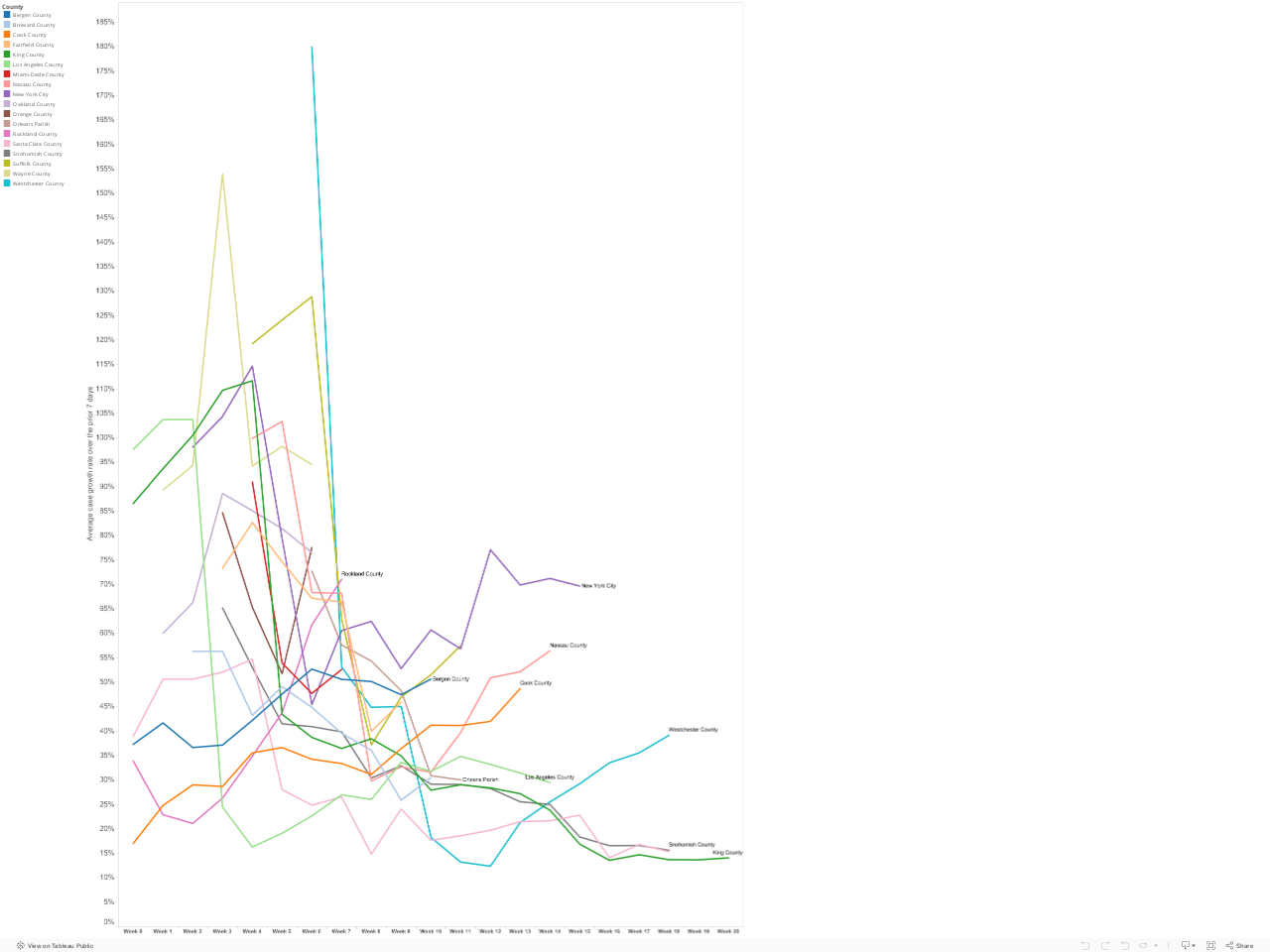
Growth rates for US counties
We’ve obtained data through 23 March for the number of diagnosed Covid-19 cases in each US county. The usual caveats apply about the completeness and comparability of case data. These data are from USAFacts.org, which provides a clear and transparent compendium of daily data on county-level cases.
We’ve identified all the US counties with 200 or more Covid-19 cases as of 23 March. This includes 18 counties in nine states. Together these counties account for almost nearly half (just less than 20,000 of the nation’s diagnosed cases on that date). We computed the 7-day average daily growth in case counts for each county, and below, we’ve charted these rates starting on the first day in which that county had 15 or more diagnosed cases. The number of days shown on the horizontal axis is the number of days elapsed since the first day with 15 or more cases. (Our chart follows the approach developed by Lyman Stone (see below). (Data for indeterminate growth rates (i.e. base period with a zero value) are suppressed). Each line corresponds to a US county.
The data show mixed results. A hopeful sign is the steady decline in case growth rates in King and Snohomish Counties in the Seattle Metro area. Case growth rates in both these counties have declined to 15 percent per day, down sharply for earlier weeks. Meanwhile in New York City and its surrounding suburbs (Westchester, Rockland and Nassau Counties) the growth rate is still trending upward. (It is possible that this trend is somewhat affected by our choice of a 15 case threshold for the zero week). The growth of the number of cases in Cook County (Chicago) is still accelerating; the growth rate in Los Angeles is decelerating slightly.
Its important to stress that while a focus on growth rates is vital, and decline in the growth rate doesn’t mean that the number of cases is decreasing–its just growing more slowly. This is a first step toward fighting the disease. Even at a 20 percent daily growth rate, the number of cases doubles every four days. But pushing the growth rate steadily downward is a sign that we’re making progress in “flattening” the curve.
US States
Our inspiration for this work comes from Lyman Stone has, via twitter, charted the change of the growth rate for US states. The important thing to pay attention to on this chart is not so much the level, but the slope: if its heading down, that means that the rate of new cases is declining. The bad news here is that the trend in New York, for example, is headed up. Washington’s rate is nearly flat, which is a relatively good sign.
Growth rates for Italian Provinces
For a useful international comparison, we can look to Italian provinces, which are experiencing the highest rates of Covid-19 cases and deaths, and which are several weeks ahead of the US in the progression of the pandemic. Michele Zanini has an excellent Tableau page documenting trends in Italy. Again, with this chart, you want to see the lines sloping downward, which they are.
Since last week, when we wrote our first thoughts about the geographic spread of the Covid-19 virus, people around the globe have been doing a lot of work. Here’s a quick synopsis of what we’ve seen.
National dashboards now have county data
Two of the leading US map resources (Johns Hopkins University and the New York Times) have both added county level data to their reporting.
The Johns Hopkins University Map of US Covid-19 infections has been expanded to allow a drill-down to county level data.
The New York Times now has a county-by-county listing of the number of Covid-19 cases for the nation.
At City Observatory, we computed county level prevalence rates for virus infections in the state’s with the highest levels of confirmed cases.
Data current as of 19 March 2020.
We should focus on the growth rate of cases
The real issue is the slope of the line, is it increasing or decreasing. The conventional way this is presented, with the exponential curves of cumulative case counts is difficult to interpret. Several analysts instead started charting the five-day or seven-day moving average of the growth of infections. This provides us with the simplest clearest indication of whether we’re flattening the curve or not.
US States
Lyman Stone has, via twitter, charted the change of the growth rate. The important thing to pay attention to on this chart is not so much the level, but the slope: if its heading down, that means that the rate of new cases is declining. The bad news here is that the trend in New York, for example, is headed up. Washington’s rate is nearly flat, which is a relatively good sign.
Italy
Michele Zanini has an excellent Tableau page documenting trends in Italy. Again, with this chart, you want to see the lines sloping downward, which they are.
France
Gavin Chait has mapped the incidence of cases in France by region, and computed the growth rate. (Chait’s estimates of growth rates and doubling times for cases are shown in tabular, rather than graphic form, so we haven’t reproduced them here).
High definition mapping: South Korea does it best
In our commentary last week, we said that the Covid-19 pandemic calls out for the kind of neighborhood-level geographic mapping that John Snow used in London in the 1850s to pin down the source of the city’s typhoid epidemic. The most detailed map of the disease anywhere comes from Korea, where address-level data on the incidence of disease is compiled by public health officials. This map shows the locations of Covid-19 cases in metropolitan Seoul; the dots are color-coded to show the recency of diagnosis: red dots are less than 24 hours old, yellow dots are up to four days old, and green dots are 4-9 days old.
The closest we come to the Korean neighborhood-scale maps are estimates of the prevalence of Covid-19 by county. The Columbia Missourian has used Tableau with state health department data to compute the number of Covid-19 cases per 100,000 population for Missouri Counties:
Maps and Charts, or Words?
ESRI’s Ken Field has some very smart advice on how to make informative maps about Covid-19. Looking at maps of China drawn almost a month ago, he warned that mapping common mapping approaches may obscure more than they reveal:
Often, the simplest techniques, done well, provide a sound cartographic approach. The key to informing is to work with the data and to not imbue it with misguided or sensationalist data processing or symbology, and to deal with some of the cartographic problems different techniques are known for. And what are the key points? As of 24th February:
Hubei has 111 cases per 100,000 people (0.1% of the population);
everywhere else in China is less than 2.5 cases per 100,000 people;
for other countries reporting cases, the rate is even lower; and
maps mediate the message to a greater or lesser extent, and some that appear well-intentioned are often unhelpful.
Maybe words are all that’s needed? But if you’re going to make a map, think about these key aspects, pick a technique that supports the telling of that story, process the data and choose symbols that are suitable, and avoid making a map that misguides, misinforms . . .
Accurately understanding and communicating the spread of the Covid-19 virus is going to be difficult, but is essential to getting the widespread support for the measures needed to defeat this pandemic.
Regardless of how your area is doing, you need to aggressively work to block virus spread
City Observatory presents here its estimates of the prevalence and recent growth of reported Covid-19 cases in large US metropolitan areas. Our website, www.cityobservatory.org posts regular updates with the most recent available data. This “how to” guide to the data was prepared with data on counts of cases through March 29, 2020.
Be cautious using these data: The reported number of cases can vary from the actual incidence of Corona virus infections due to differences in testing regimes and availability across jurisdictions, as well as other factors.
Importantly, the fact that your metro area may be doing better than average, or other metro areas on one on or both these metrics is not an indication that it can or should be lax in dealing with the pandemic. The virus is spreading rapidly: no US metro area had more than 15 cases per 100,000 on March 13; just 16 days later, more than two-thirds of large metro areas had a rate higher than that level. We estimate that at current rates of growth the typical US metro area is only about 1-2 weeks behind the hardest hit metropolitan areas in terms of the incidence of reported cases. Social distancing and other measures to reduce virus spread are essential to slowing the spread of the pandemic.
Metric #1: Prevalence – Reported Covid-19 cases per 100,000 population
Prevalence measures how big the pandemic is in your area. You’ll want to start by understanding what fraction of your metro area’s population has been reported to have the virus. We standardize the comparison across metropolitan areas by adding up the number of cases reported at the county level in each county in a metropolitan area, and dividing that total by the total metro area population. We express our result as reported Covid-19 cases per 100,000 population. The county level data come from from USAFacts.org.
New York, New Orleans, Seattle and Detroit have the highest number of cases per capita of US metro areas. New York’s rate is currently 340 cases per 100,000. New Orleans (192), Detroit (108) and Seattle (91) have the next highest rates of reported cases. The median large metropolitan area has about 20.9 cases per 100,000 population.
What these data show: You can scroll through this list to see where your metropolitan area ranks in terms of the number of reported cases per 100,000 population. You can see which cities have a similar level of reported cases as yours, and how far ahead (or behind) your metro is compared to the hardest hit metropolitan areas.
Metric #2: The daily percentage increase in the number of cases over the past week
Growth measures how fast the pandemic is spreading in your metropolitan area, gauged by the increase in the number of reported cases. The key strategy in fighting the Covid-19 pandemic is reducing social distancing to slow the rate of transmission of the virus. A key indicator of whether we are “flattening the curve” is whether the growth rate of the number of cases is increasing or decreasing. The following chart shows the growth in the number of cases for selected metropolitan areas from March 13 through March 29.
A chart that simply shows the growth rate makes it difficult to discern whether (and by how much) the growth rate is increasing or decreasing. We’ve boiled the analysis of growth down to a single number. For this analysis, we’ve computed the average daily growth rate over the past seven days. This is expressed as a percentage increase per day: A 25 percent increase means that if you have 100 cases on day 1, you have 125 cases on day two. Because of compounding (the exponential part of the growth pattern), a 25 percent daily rate of increase means that the total number of cases doubles in a little over three days, and quadruples in a week.
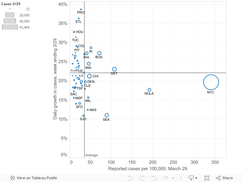
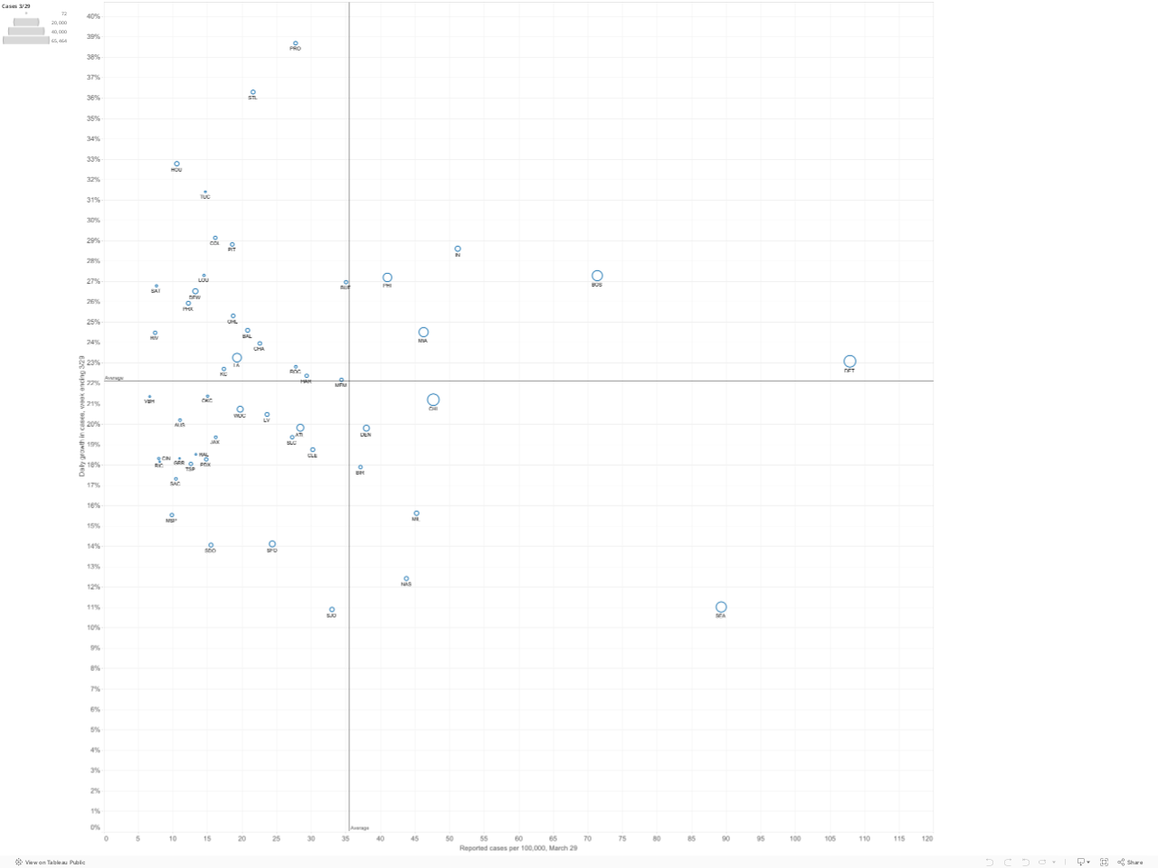
Prevalence versus Growth: Four Quadrants
Slowing or stopping the spread of the virus depends on steadily decreasing the growth rate in the number of cases. This is especially important as the prevalence of the virus becomes more widespread. Here we’ve plotted the current prevalence of reported cases in each metropolitan area (shown on the horizontal axis) against the growth rate of reported cases in the past week in that metropolitan area (on the vertical axis). The number of cases in each metropolitan area is proportional to the size of the circle representing each metro area. You can mouse-over individual circles on the chart to fully identify each metro area, and see the underlying data for numbers of cases, cases per 100,000 and the growth rate in cases over the last week.
How to interpret the four quadrants: We’ve used the means of the two variables (growth rate (22% daily) and number of cases per 100,000 (31), to divide the chart into four quadrants. These quadrants help sort out which metro areas are experiencing the crisis to a greater or lesser degree. The following chart summarizes the meaning of the four quadrants
Metro areas in the upper right hand quadrant (shaded red in this diagram) are clearly most afflicted: they have both higher than average rates of cases per capita and are growing faster than the average metro area (in the past week). As of March 29, there were 5 metro areas in this red quadrant: Boston, Detroit, Miami, Philadelphia and Indianapolis. These metros have more cases per capita and have experienced higher growth than average in the past week. The lower right hand quadrant identifies metro areas with relatively higher rtes of cases per capita, but slower rates of increase. Ideally, one wants to be in the lower left hand quadrant (low number of cases per capita, low growth rate). The upper left hand quadrant is uncertain, but with cause for concern: these cities (so far) have lower rates of cases per capita, but are seeing the virus spread faster than in the average metro area. Over time, the strategy of flattening the curve should lead individual metropolitan areas to progress from the upper left hand quadrant (low rates and fast growth) to the lower right hand quadrant (higher rates but a slower rate of growth).
To see the relative position of most metro areas, we’ve shortened the horizontal scale to exclude the two cities–New York and New Orleans–with the highest numbers of cases per capita. This chart makes it clearer which cities are in which quadrants.
The table and map rely on published data from state health departments, aggregated by USAFActs.org. Please use caution in interpreting these data. It is likely that in some areas, the number of cases is under-reported due to the lack of available testing capacity, or pressing medical conditions. There are widespread differences in the number of tests administered relative to the size of the population in each state, and tests are not given randomly, and may be restricted solely to persons with symptoms, likely exposure or high risk in some states. As a result, the ratio of reported to unreported, undiagnosed cases may vary across geography. Moreover, changes in reported numbers of cases from day to day or week to week may reflect changes in the availability or application of testing over time, rather than the true rate of growth in the number of persons affected.
Among the 53 metro areas with a million or more population:
New York, New Orleans, Detroit and Seattle have the highest incidence of pandemic among large metros.
Seattle’s rate of new cases has declined to the lowest level among large metro areas
Detroit, Boston, Philadelphia, Miami and Indianapolis have higher than average incidence, and are experiencing faster than average growth in cases
New York had the highest level of reported cases per 100,000: 390
The typical (median) large metropolitan area had a rate of about 24 cases per 100,000
Half of all metropolitan areas had between 15 and 42 cases per 100,000.
The number of cases in the typical (median) metro area has increased by about 20 percent per day in the past week.
The typical metro is only about 1-2 weeks behind leading cities in the progression of the virus.
For more information on how to interpret these charts, read our explainer.
City Observatory presents here its estimates of the prevalence and recent growth of reported Covid-19 cases in large US metropolitan areas. We update this page regularly with the most recent available data. The data on this page was last updated with data on counts of cases through March 30, 2020. Caution should be used in interpreting these figures. Case data can vary from the actual incidence of Corona virus infections due to differences in testing regimes and availability across jurisdictions, as well as other factors. We believe that metro area levels and trends may be a useful geography for understanding the spread and intensity of the pandemic: most published data are available at only the state or county level. States are too large to accurately capture the the incidence of the pandemic; and counties are often too variable and too small. Metro areas capture labor markets and commuting sheds, and are defined consistently, making them more appropriate geographic units for judging the spread of the virus. As is our common practice at City Observatory, our focus is on metro areas with populations of 1 million or more.
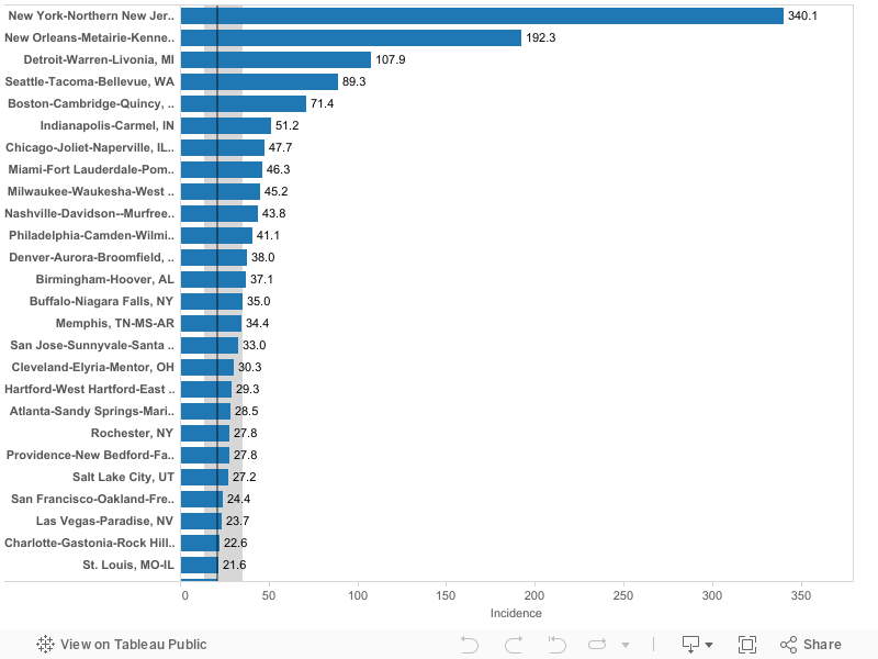
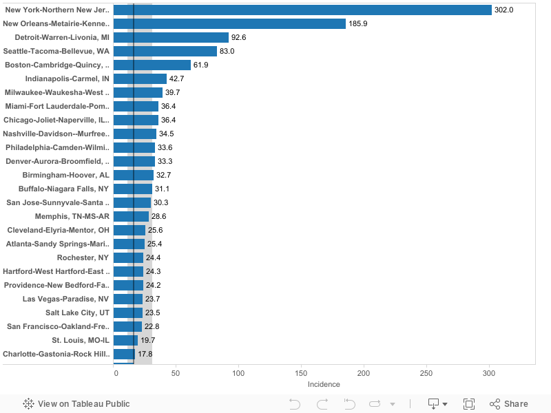
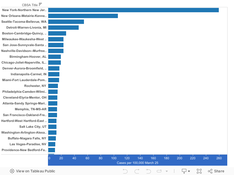
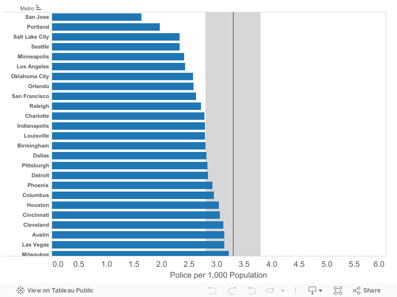
Metro areas ranked by reported Covid-19 cases per 100,000 population
The following chart shows the number of reported cases of Covid-19 cases per 100,000 population is US metropolitan areas with a population of 1 million or more as of March 30, 2020. Metropolitan data are computed by aggregating county level data available from USAFacts.org. Metropolitan areas are ranked highest to lowest according to the number of reported cases per capita.
New York, New Orleans, Seattle and Detroit have the highest number of cases per capita of US metro areas. New York’s rate is currently 390 cases per 100,000. New Orleans (215), Detroit (127) and Seattle (98) have the next highest rates of reported cases. The median large metropolitan area has about 24 cases per 100,000 population.
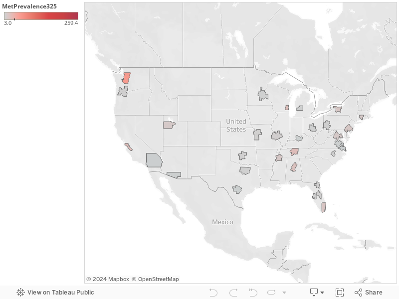
Map of metro areas, reported Covid-19 cases per 100,000 population
The following map illustrates the relative number of reported Covid-19 cases per capita among large US metropolitan areas. Darker red colors indicate metro areas with the highest reported incidence of cases. Numbers on each metro area represent cases per 100,000 on March 30.
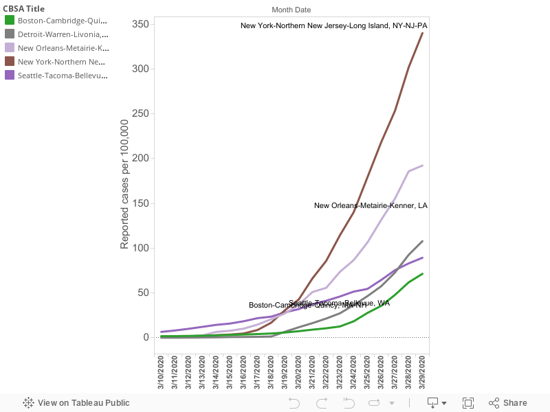
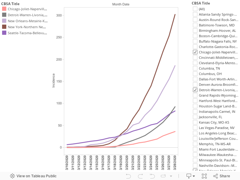
Growth rates in the number of cases
The key strategy in fighting the Covid-19 pandemic is reducing social distancing to slow the rate of transmission of the virus. A key indicator of whether we are “flattening the curve” is whether the growth rate of the number of cases is increasing or decreasing. The following chart shows the growth in the number of cases for selected metropolitan areas from March 13 through March 30.
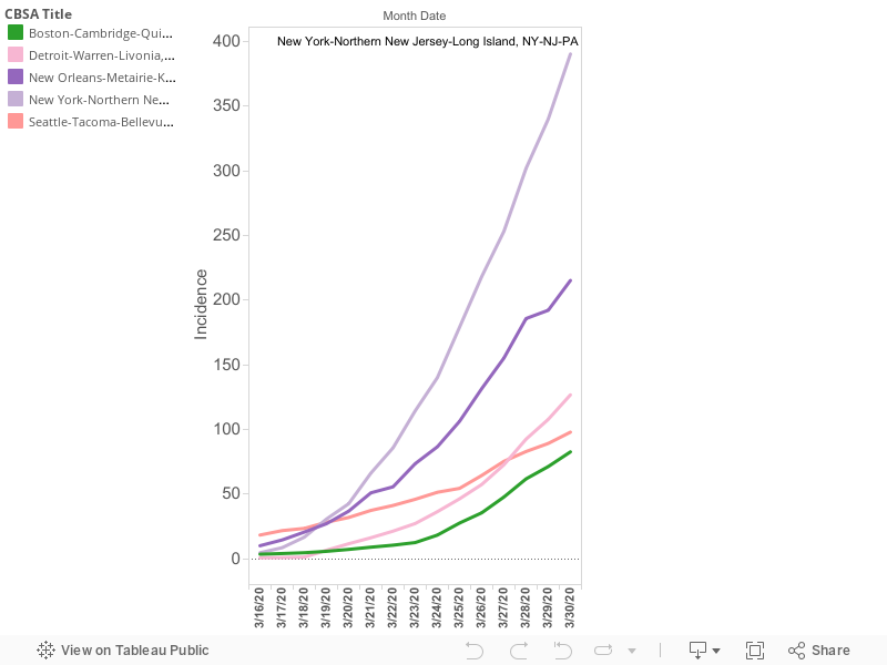
The growth rates of the four cities with the highest rates of reported cases per capita paint divergent and interesting patterns of the pandemic. For a time, Seattle had the highest rate of cases per capita of any US city. That has changed in the past two weeks. New York, New Orleans, and Detroit have surpassed Seattle. On March 19, Seattle, New York and New Orleans all had nearly the same number of reported cases per 100,000 (about 30 per capita). Since then, their growth paths have diverged: New York has grown most rapidly, followed by New Orleans; Seattle’s growth has been subdued. Meanwhile, over that same period of time, the growth of cases in Detroit has increased sharply: On March 18, Detroit had just 1.4 reported cases per 100,000 population, essentially the same as the median of all large metro areas. By March 29, that had increased to 108 cases per 100,000; the third highest rate among large US metro areas. (Please note that there seems to be a weekly anomaly with New Orleans reported cases: the growth trend flattened on both Sunday March 22 and Sunday March 29: this may reflect non-reporting on Sundays by some sources).
To put the spread of the pandemic in context, it is worth noting on March 16, no large US metro had a prevalence of reported Covid-19 cases of more than 15 per 100,000 population (Seattle was 12.2). Today, roughly four-fifths (42 of 53) of the nation’s largest metro areas have a reported prevalence of more than 15 cases per 100,000. Over the past few weeks, it appears that there’s about two weeks difference between the worst afflicted metro, and the typical large metro. Whether that continues to be the case depends on the efficacy of social distancing and other measures.
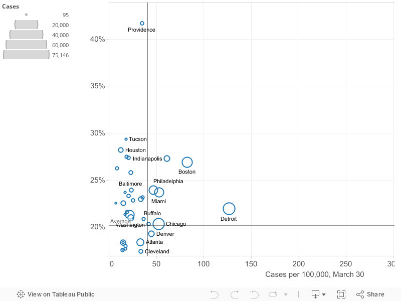
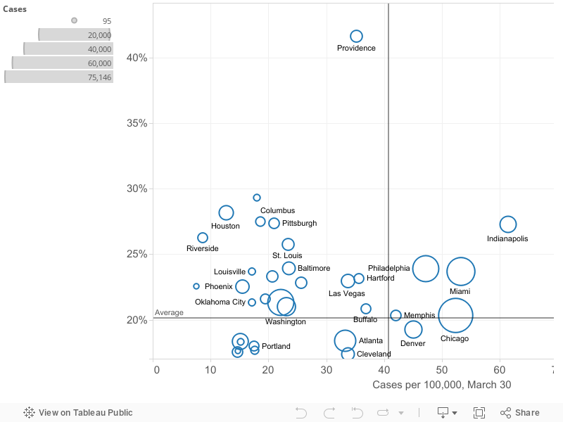
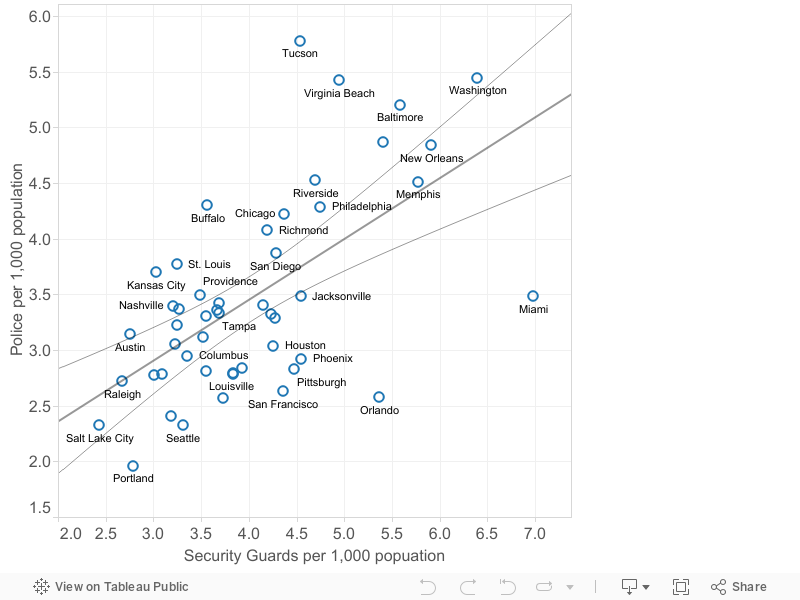
Prevalence versus Growth
Slowing or stopping the spread of the virus depends on steadily decreasing the growth rate in the number of cases. This is especially important as the prevalence of the virus becomes more widespread. Here we’ve plotted the current prevalence of reported cases in each metropolitan area (shown on the horizontal axis) against the growth rate of reported cases in the past week in that metropolitan area (on the vertical axis). The number of cases in each metropolitan area is proportional to the size of the circle representing each metro area. You can mouse-over individual circles on the chart to fully identify each metro area, and see the underlying data for numbers of cases, cases per 100,000 and the growth rate in cases over the last week.
We’ve used the means of the two variables (growth rate (20% daily) and number of cases per 100,000 (41), to divide the chart into four quadrants. These quadrants help sort out which metro areas are experiencing the crisis to a greater or lesser degree. Metro areas in the upper right hand quadrant are clearly most afflicted: they have both higher than average rates of cases per capita and are growing faster than the average metro area (in the past week). The lower right hand quadrant identifies metro areas with relatively higher rtes of cases per capita, but slower rates of increase. Ideally, one wants to be in the lower left hand quadrant (low number of cases per capita, low growth rate). The upper left hand quadrant is uncertain, but with cause for concern: these cities (so far) have lower rates of cases per capita, but are seeing the virus spread faster than in the average metro area. Over time, the strategy of flattening the curve should lead individual metropolitan areas to progress from the upper left hand quadrant (low rates and fast growth) to the lower right hand quadrant (higher rates but a slower rate of growth).
To make this picture a bit clearer, we’ve shortened the horizontal scale to exclude the three cities–New York,New Orleans and Detroit–with the highest numbers of cases per capita. This chart makes it clearer which cities are in which quadrants.
The table and map rely on published data from state health departments, aggregated by USAFActs.org. Please use caution in interpreting these data. It is likely that in some areas, the number of cases is under-reported due to the lack of available testing capacity, or pressing medical conditions. There are widespread differences in the number of tests administered relative to the size of the population in each state, and tests are not given randomly, and may be restricted solely to persons with symptoms, likely exposure or high risk in some states. As a result, the ratio of reported to unreported, undiagnosed cases may vary across geography. Moreover, changes in reported numbers of cases from day to day or week to week may reflect changes in the availability or application of testing over time, rather than the true rate of growth in the number of persons affected.
Notes and revisions
This post updates and supersedes our earlier posts with data through March 30.
Among the 53 metro areas with a million or more population:
New York, New Orleans, Detroit and Seattle have the highest incidence of pandemic among large metros.
Detroit has now surpassed Seattle in cases per capita
New York had the highest level of reported cases per 100,000: 340
The typical (median) large metropolitan area had a rate of about 21 cases per 100,000
Half of all metropolitan areas had between 13 and 35 cases per 100,000.
The number of cases in the typical (median) metro area has increased by about 23 percent per day in the past week.
The typical metro is only about 1-2 weeks behind leading cities in the progression of the virus.
City Observatory presents here its estimates of the prevalence and recent growth of reported Covid-19 cases in large US metropolitan areas. We update this page regularly with the most recent available data. The data on this page was last updated with data on counts of cases through March 29, 2020. Caution should be used in interpreting these figures. Case data can vary from the actual incidence of Corona virus infections due to differences in testing regimes and availability across jurisdictions, as well as other factors. We believe that metro area levels and trends may be a useful geography for understanding the spread and intensity of the pandemic: most published data are available at only the state or county level. States are too large to accurately capture the the incidence of the pandemic; and counties are often too variable and too small. Metro areas capture labor markets and commuting sheds, and are defined consistently, making them more appropriate geographic units for judging the spread of the virus. As is our common practice at City Observatory, our focus is on metro areas with populations of 1 million or more.
Metro areas ranked by reported Covid-19 cases per 100,000 population
The following chart shows the number of reported cases of Covid-19 cases per 100,000 population is US metropolitan areas with a population of 1 million or more as of March 29, 2020. Metropolitan data are computed by aggregating county level data available from USAFacts.org. Metropolitan areas are ranked highest to lowest according to the number of reported cases per capita.
New York, New Orleans, Seattle and Detroit have the highest number of cases per capita of US metro areas. New York’s rate is currently 340 cases per 100,000. New Orleans (192), Detroit (108) and Seattle (91) have the next highest rates of reported cases. The median large metropolitan area has about 20.9 cases per 100,000 population.
Map of metro areas, reported Covid-19 cases per 100,000 population
The following map illustrates the relative number of reported Covid-19 cases per capita among large US metropolitan areas. Darker red colors indicate metro areas with the highest reported incidence of cases. Numbers on each metro area represent cases per 100,000 on March 28.
Growth rates in the number of cases
The key strategy in fighting the Covid-19 pandemic is reducing social distancing to slow the rate of transmission of the virus. A key indicator of whether we are “flattening the curve” is whether the growth rate of the number of cases is increasing or decreasing. The following chart shows the growth in the number of cases for selected metropolitan areas from March 13 through March 29.
The growth rates of the four cities with the highest rates of reported cases per capita paint divergent and interesting patterns of the pandemic. For a time, Seattle had the highest rate of cases per capita of any US city. That has changed in the past two weeks. New York, New Orleans, and Detroit have surpassed Seattle. On March 19, Seattle, New York and New Orleans all had nearly the same number of reported cases per 100,000 (about 30 per capita). Since then, their growth paths have diverged: New York has grown most rapidly, followed by New Orleans; Seattle’s growth has been subdued. Meanwhile, over that same period of time, the growth of cases in Detroit has increased sharply: On March 18, Detroit had just 1.4 reported cases per 100,000 population, essentially the same as the median of all large metro areas. By March 29, that had increased to 108 cases per 100,000; the third highest rate among large US metro areas. (Please note that there seems to be a weekly anomaly with New Orleans reported cases: the growth trend flattened on both Sunday March 22 and Sunday March 29: this may reflect non-reporting on Sundays by some sources).
To put the spread of the pandemic in context, it is worth noting that just sixteen days ago, no large US metro had a prevalence of reported Covid-19 cases of more than 15 per 100,000 population (Seattle was 12.2). Today, more than two-thirds (36 of 53) of the nation’s largest metro areas have a reported prevalence of more than 15 cases per 100,000. Over the past few weeks, it appears that there’s about two weeks difference between the worst afflicted metro, and the typical large metro. Whether that continues to be the case depends on the efficacy of social distancing and other measures.
Prevalence versus Growth
Slowing or stopping the spread of the virus depends on steadily decreasing the growth rate in the number of cases. This is especially important as the prevalence of the virus becomes more widespread. Here we’ve plotted the current prevalence of reported cases in each metropolitan area (shown on the horizontal axis) against the growth rate of reported cases in the past week in that metropolitan area (on the vertical axis). The number of cases in each metropolitan area is proportional to the size of the circle representing each metro area. You can mouse-over individual circles on the chart to fully identify each metro area, and see the underlying data for numbers of cases, cases per 100,000 and the growth rate in cases over the last week.
We’ve used the means of the two variables (growth rate (22% daily) and number of cases per 100,000 (31), to divide the chart into four quadrants. These quadrants help sort out which metro areas are experiencing the crisis to a greater or lesser degree. Metro areas in the upper right hand quadrant are clearly most afflicted: they have both higher than average rates of cases per capita and are growing faster than the average metro area (in the past week). The lower right hand quadrant identifies metro areas with relatively higher rtes of cases per capita, but slower rates of increase. Ideally, one wants to be in the lower left hand quadrant (low number of cases per capita, low growth rate). The upper left hand quadrant is uncertain, but with cause for concern: these cities (so far) have lower rates of cases per capita, but are seeing the virus spread faster than in the average metro area. Memphis and Providence both have high rates of increases in the number of cases in the past week, but on a very low base, so the weekly growth rate may not be representative of the longer term trend. Over time, the strategy of flattening the curve should lead individual metropolitan areas to progress from the upper left hand quadrant (low rates and fast growth) to the lower right hand quadrant (higher rates but a slower rate of growth).
To make this picture a bit clearer, we’ve shortened the horizontal scale to exclude the two cities–New York and New Orleans–with the highest numbers of cases per capita. This chart makes it clearer which cities are in which quadrants.
The table and map rely on published data from state health departments, aggregated by USAFActs.org. Please use caution in interpreting these data. It is likely that in some areas, the number of cases is under-reported due to the lack of available testing capacity, or pressing medical conditions. There are widespread differences in the number of tests administered relative to the size of the population in each state, and tests are not given randomly, and may be restricted solely to persons with symptoms, likely exposure or high risk in some states. As a result, the ratio of reported to unreported, undiagnosed cases may vary across geography. Moreover, changes in reported numbers of cases from day to day or week to week may reflect changes in the availability or application of testing over time, rather than the true rate of growth in the number of persons affected.
Notes and revisions
This post updates and supersedes our earlier posts with data through March 28.
Among the 53 metro areas with a million or more population:
New York, New Orleans, Detroit and Seattle have the highest incidence of pandemic among large metros.
Detroit has now surpassed Seattle in cases per capita
New York had the highest level of reported cases per 100,000: 302
The typical (median) large metropolitan area had a rate of about 17 cases per 100,000
Half of all metropolitan areas had between 11 and 31 cases per 100,000.
The number of cases in the typical metro area has increased by about 25 percent per day in the past week.
The typical metro is only about 1-2 weeks behind these cities in the progression of the virus.
City Observatory presents here its estimates of the prevalence and recent growth of reported Covid-19 cases in large US metropolitan areas. We update this page regularly with the most recent available data. The data on this page was last updated with data on counts of cases through March 28, 2020. Caution should be used in interpreting these figures. Case data can vary from the actual incidence of Corona virus infections due to differences in testing regimes and availability across jurisdictions, as well as other factors. We believe that metro area levels and trends may be a useful geography for understanding the spread and intensity of the pandemic: most published data are available at only the state or county level. States are too large to accurately capture the the incidence of the pandemic; and counties are often too variable and too small. Metro areas capture labor markets and commuting sheds, and are defined consistently, making them more appropriate geographic units for judging the spread of the virus. As is our common practice at City Observatory, our focus is on metro areas with populations of 1 million or more.
Metro areas ranked by reported Covid-19 cases per 100,000 population
The following chart shows the number of reported cases of Covid-19 cases per 100,000 population is US metropolitan areas with a population of 1 million or more as of March 28, 2020. Metropolitan data are computed by aggregating county level data available from USAFacts.org. Metropolitan areas are ranked highest to lowest according to the number of reported cases per capita.
New York, New Orleans, Seattle and Detroit have the highest number of cases per capita of US metro areas. New York’s rate is currently 302 cases per 100,000. New Orleans (186),Detroit (93) and Seattle (83) have the next highest rates of reported cases. The median large metropolitan area has about 16.6 cases per 100,000 population.
Map of metro areas, reported Covid-19 cases per 100,000 population
The following map illustrates the relative number of reported Covid-19 cases per capita among large US metropolitan areas. Darker red colors indicate metro areas with the highest reported incidence of cases. Numbers on each metro area represent cases per 100,000 on March 28.
Growth rates in the number of cases
The key strategy in fighting the Covid-19 pandemic is reducing social distancing to slow the rate of transmission of the virus. A key indicator of whether we are “flattening the curve” is whether the growth rate of the number of cases is increasing or decreasing. The following chart shows the growth in the number of cases for selected metropolitan areas from March 13 through March 28.
The growth rates of the four cities with the highest rates of reported cases per capita paint divergent and interesting patterns of the pandemic. For a time, Seattle had the highest rate of cases per capita of any US city. That has changed in the past two weeks. New York, New Orleans, and Detroit have surpassed Seattle. On March 19, Seattle, New York and New Orleans all had nearly the same number of reported cases per 100,000 (about 30 per capita). Since then, their growth paths have diverged: New York has grown most rapidly, followed by New Orleans; Seattle’s growth has been subdued. Meanwhile, over that same period of time, the growth of cases in Detroit has increased sharply: On March 18, Detroit had just 1.4 reported cases per 100,000 population, essentially the same as the median of all large metro areas. By March 28, that had increased to 93 cases per 100,000; the third highest rate among large US metro areas.
To put the spread of the pandemic in context, it is worth noting that just fifteen dayws ago, no large US metro had a prevalence of reported Covid-19 cases of more than 15 per 100,000 population (Seattle was 12.2). Today, more than 60 percent (32 of 53) of the nation’s 53 largest metro areas have a reported prevalence of more than 15 cases per 100,000. Over the past few weeks, it appears that there’s about two weeks difference between the worst afflicted metro, and the typical large metro. Whether that continues to be the case depends on the efficacy of social distancing and other measures.
Prevalence versus Growth
Slowing or stopping the spread of the virus depends on steadily decreasing the growth rate in the number of cases. This is especially important as the prevalence of the virus becomes more widespread. Here we’ve plotted the current prevalence of reported cases in each metropolitan area (shown on the horizontal axis) against the growth rate of reported cases in the past week in that metropolitan area (on the vertical axis). The number of cases in each metropolitan area is proportional to the size of the circle representing each metro area. You can mouse-over individual circles on the chart to fully identify each metro area, and see the underlying data for numbers of cases, cases per 100,000 and the growth rate in cases over the last week.
We’ve used the means of the two variables (growth rate (25% daily) and number of cases per 100,000 (31), to divide the chart into four quadrants. These quadrants help sort out which metro areas are experiencing the crisis to a greater or lesser degree. Metro areas in the upper right hand quadrant are clearly most afflicted: they have both higher than average rates of cases per capita and are growing faster than the average metro area (in the past week). The lower right hand quadrant identifies metro areas with relatively higher rtes of cases per capita, but slower rates of increase. Ideally, one wants to be in the lower left hand quadrant (low number of cases per capita, low growth rate). The upper left hand quadrant is uncertain, but with cause for concern: these cities (so far) have lower rates of cases per capita, but are seeing the virus spread faster than in the average metro area. Memphis and Providence both have high rates of increases in the number of cases in the past week, but on a very low base, so the weekly growth rate may not be representative of the longer term trend. Over time, the strategy of flattening the curve should lead individual metropolitan areas to progress from the upper left hand quadrant (low rates and fast growth) to the lower right hand quadrant (lower rates and lower growth).
To make this picture a bit clearer, we’ve shortened the horizontal scale to exclude the two cities–New York and New Orleans–wit the highest numbers of cases per capita. This chart makes it clearer which cities are in which quadrants.
The table and map rely on published data from state health departments, aggregated by USAFActs.org. Please use caution in interpreting these data. It is likely that in some areas, the number of cases is under-reported due to the lack of available testing capacity, or pressing medical conditions. There are widespread differences in the number of tests administered relative to the size of the population in each state, and tests are not given randomly, and may be restricted solely to persons with symptoms, likely exposure or high risk in some states. As a result, the ratio of reported to unreported, undiagnosed cases may vary across geography. Moreover, changes in reported numbers of cases from day to day or week to week may reflect changes in the availability or application of testing over time, rather than the true rate of growth in the number of persons affected.
Notes and revisions
An earlier version of estimates for the New York Metropolitan area reported on March 25 included an incorrect estimate of the rate of reported Covid-19 cases per 100,000 population. The actual reported incidence for that date was 179.2, not 259 City Observatory originally reported. City Observatory regrets this error, and has adjusted its population aggregation methodology to resolve this problem. Data for New York City are reported as a single entity in the USA Facts database and are not disaggregated by county (borough); Our original tabulations included all cases from all five boroughs but mistakenly excluded population for the boroughs of Queens, Bronx, Brooklyn and Staten Island from the denominator, inflating our reported estimate of the rate per capita.
A note to our readers: This post has been superseded by new analysis published on March 28. In addition, the original post contains an error: The original version of estimates for the New York Metropolitan area reported on March 25 included an incorrect estimate of the rate of reported Covid-19 cases per 100,000 population. The actual reported incidence for that date was 179.2, not 259 City Observatory originally reported. City Observatory regrets this error, and has adjusted its population aggregation methodology to resolve this problem. Data for New York City are reported as a single entity in the USA Facts database and are not disaggregated by county (borough); Our original tabulations included all cases from all five boroughs but mistakenly excluded population for the boroughs of Queens, Bronx, Brooklyn and Staten Island from the denominator, inflating our reported estimate of the rate per capita.New York, New Orleans and Seattle have the highest incidence of pandemic among large metros.
The full content of our original post is provided here, but readers are directed to the latest information here.
The typical metro is only about 1-2 weeks behind these cities in the progression of the virus.
Yesterday, we presented our first estimates of the incidence of Covid-19 by US metro area. Today, we’re updating these figures to show the incidence of diagnosed cases per 100,000 population as of March 25, 2020.
Up until now, most data has been available at only the state or county level. States are too large to accurately capture the the incidence of the pandemic; and counties are often too variable and too small. Metro areas capture labor markets and commuting sheds, and are defined consistently, making them more appropriate geographic units for judging the spread of the virus.
Among these metros, the incidence of Covid-19 is highest in the New York metropolitan area (260 cases per 100,000 population), New Orleans (106), Seattle (55). New York’s rate is up from 82 cases per 100,000 3 days ago; New Orleans was 55 and Seattle was 41.
Other large metros with relatively high rates of incidence include: Detroit (47), Boston (28) Milwaukee (24), San Jose (23) and Nashville (23).
Among metropolitan areas with one million or more population, on March 25, the median metropolitan area had a reported infection rate of about 9 cases per 100,000 population (up from 4 three days ago). For reference, the New York metro had just four cases per 100,000 on March 15, just seven days prior to these estimates. Seattle had 4 cases per 100,000 on March 9, and New Orleans crossed that threshold on March 14. At the rate the virus has been spreading, the worst-affected cities are about one to two weeks ahead of typical (median) large metro area in the progression of the virus.
As of March 25, the lowest rates of reported Covid-19 cases per capita among these large US metropolitan areas were in San Antonio, Houston, Riverside and St. Louis, which each had between 3 and 4 cases per 100,000. Three days ago, the least affected cities had rates of 1.5 or fewer cases per 100,000 residents.
The following map illustrates the relative number of reported Covid-19 cases per capita among large US metropolitan areas. Darker red colors indicate metro areas with the highest reported incidence of cases
The table and map rely on published data from state health departments, aggregated by USAFActs.org. Please use caution in interpreting these data. It is likely that in some areas, the number of cases is under-reported due to the lack of available testing capacity, or pressing medical conditions.
New York, New Orleans and Seattle have the highest incidence of pandemic among large metros.
The typical metro is only about 1-2 weeks behind these cities in the progression of the virus.
Editor’s Note: As of 26 March, we have produced updated estimates with data through 25 March: These data are here.
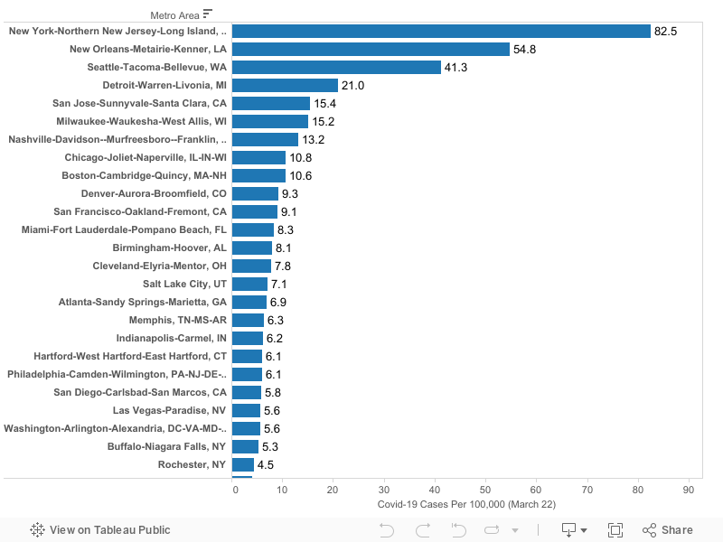
We’ve estimated the incidence of Covid-19 for the 53 most populous US metro areas as of March 22, 2020. Incidence is calculated as diagnosed cases per 100,000 population. Data are shown for metro areas with 1,000,000 population or more.
Up until now, most data has been available at only the state or county level. States are too large to accurately capture the the incidence of the pandemic; and counties are often too variable and too small. Metro areas capture labor markets and commuting sheds, and are defined consistently, making them more appropriate geographic units for judging the spread of the virus.
Highlights:
Among these metros, the incidence of Covid-19 is highest in the New York metropolitan area (82 cases per 100,000 population), New Orleans (55), Seattle (41).
Other large metros with relatively high rates of incidence include: Detroit (21), San Jose (15), Milwaukee (15) and Nashville (13).
Among metropolitan areas with one million or more population, the median metropolitan area had a reported infection rate of about 4 cases per 100,000 population. For reference, the New York metro had just four cases per 100,000 on March 15, just seven days prior to these estimates. Seattle had 4 cases per 100,000 on March 9, and New Orleans crossed that threshold on March 14. At the rate the virus has been spreading, the worst-affected cities are about one to two weeks ahead of typical (median) large metro area in the progression of the virus.
As of March 22, the lowest rates of reported Covid-19 cases per capita among these large US metropolitan areas were in San Antonio, Houston, Riverside and St. Louis, which each had 1.5 or fewer cases per 100,000 residents.
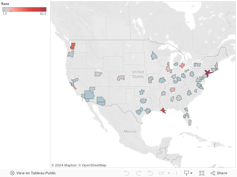
The following map illustrates the relative number of reported Covid-19 cases per capita among large US metropolitan areas. Darker red colors indicate metro areas with the highest reported incidence of cases
The table and map rely on published data from state health departments, aggregated by USAFActs.org. Please use caution in interpreting these data. It is likely that in some areas, the number of cases is under-reported due to the lack of available testing capacity, or pressing medical conditions.
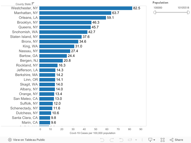
We’ve estimated the incidence of Covid-19 by county in states with 200 or more cases as of March 19, 2020. Incidence is calculated as diagnosed cases per 100,000 population. Data are shown for counties with 100,000 population or more.
Highlights:
Among these counties, the incidence of Covid-19 is highest in New York City (all five boroughs and Westchester County), New Orleans (Orleans Parish), Seattle (King and Snohomish Counties).
The highest rate recorded among these counties is 82.5 cases per 100,000 population in Westchester, New York. Twelve counties have rates of 20 cases per 100,000 or higher.
(This table omits counties with zero cases).
County level data on the incidence of Covid-19 per 100,000 population for states with more than 200 cases, 19 March 2020. These data show only states with 200 or more diagnosed cases of Covid-19. Data are drawn from county level estimates aggregated by Live Science. Data for California from Wikipedia. Data downloaded from these sites on 20-March 2020. States = CA, CO, FL, GA, LA, MA, MI, NJ, NY, TX, WA.
We’ve truncated our estimates to show only counties with 100,000 or more population because rates estimated for smaller areas may be unreliable and un-representative.
Editors Note (3:30 PM PDT 20 March: The New York Times (version updated 5.40 pm EDT 20 March) has also published county level counts of Covid-19 cases. Details here. https://www.nytimes.com/interactive/2020/us/coronavirus-us-cases.html
The Coronavirus pandemic is already worse in several American states than anywhere in China outside Hubei Province
The pandemic is all about geography, and we need to do more to pinpoint hotspots and contagion
The very thing that makes cities special–their ability to bring people together–is their kryptonite in the Coronavirus pandemic
The harsh and largely unforeseen reality of Coronavirus has changed everyone’s daily lives, and promises to be a major disruption for months and years to come.
Covid-19 is a contagious viral disease, its spread by close and direct contact between humans. It started in Wuhan China late last year, and spread rapidly throughout China in the aftermath of the lunar new year celebrations, with thousands traveling to or from Wuhan.
What do we know about the geography of Covid-19?
What we find disappointing so far is the crude geography of most of the maps of Coronavirus in the US. The real geography is not that of states, or counties, but rather the particular locations–the homes, businesses, hospitals, hotels, restaurants, airplanes or cruise ships, where infected people interacted directly with the previously unaffected. These maps would provide a much more useful and accurate picture of the geography of Covid19 if they were dot maps on a fine geography.
We know this kind of picture can provide essential insights on disease. More than 150 years ago, in perhaps the canonical instance of geographic epidemeoology, John Snow mapped the location of cholera cases in London, and quickly deduced that a particular well was the source of the outbreak.
London, 1856. It’s 2020. Where is this map for Covid-19?
None of the maps published, for example, by the New York Times, show this level of detail. And for the most part, this map, with circles scaled to the number of cases, mostly resembles a map of the nation’s largest metro areas.
A similar map prepared by the World Health Organization, aggregates data at the country level.
In a way, the most helpful information in the New York Times is the list of the locations or sources of transmission of the largest number of cases. These hotspots help us visualize where the disease has had its largest impact. The clusters in New Rochelle and in a Seattle area nursing home are apparent, as are the outbreaks in cruise ships.
Covid-19 is a disease of hotspots. And understanding where the hotspots are (and where they were 6 days ago) is an essential ingredient in ascertaining who’s most at risk, and using our all too scarce diagnostic and treatment resources to the greatest effect.
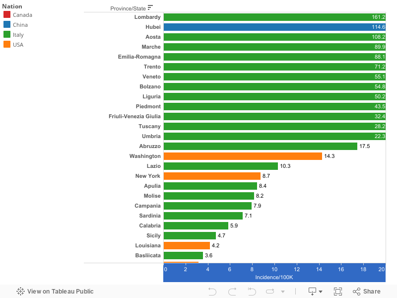
The incidence of Covid-19 in US States and Subnational regions in China, Italy and Canada
The reason a finer geographic fix on the progress of the virus is so important is underscored by looking at the incidence of Covid-19 in US states, Canadian provinces and Italian regions. China’s one and a half billion people live in 34 provinces; America’s 330 million people live in 50 states (and the District of Columbia). These are generally the finest subnational geographic units for which data are available. We’ve used WHO data for Chinese provinces and Johns Hopkins University data for US states to compute the incidence of Covid-19 in cumulative cases per 100,000 population as of mid March (Chinese data are for 12 March, Canadian and US data are through 17 March). Italian regional data for 17 March are from Statista. Chinese provinces are shaded blue, US states are shaded orange, Italian regions are green, Canadian provinces are red.
(To better show the differences between most states and provinces, we’ve truncated the scale at 20 cases per 100,000 population; the correct bar for Hubei province and several Italian provinces would extend far off your computer screen to the right, with more than 100 cases per 100,000 population).
This chart makes it clear how severe and widespread the virus has been in Italy. Lombardy reports the highest incidence of Coronavirus of any subnational region in our chart, with more than 160 cases per 100,000 population. Italian regions account for 13 of the 14 highest rates of coronavirus cases per capita among the four countries shown here. Alarmingly, the incidence of Covid-19 in eight states and the District of Columbia is already higher than in any Chinese province outside Hubei (the epicenter of the virus). The median incidence of Covid-19 in US states (.73 per 100,000) is already nearly as high as the median incidence of Covid-19 in Chinese Provinces. On a population-adjusted basis, the incidence of reported Coronavirus cases in Washington, Massachusetts and New York is currently higher than in Beijing or Shanghai. If anything, the US numbers may understate the extent of the virus, because so few persons have been tested due to a shortage of diagnostic capacity in the US. (The data underlying this chart, as well as charts showing non-truncated values for coronavirus incidence, and country maps of incidence rates are avaialable on our Public Tableau site.
This disparity is both a testament to the effectiveness of the the Chinese efforts to restrict travel and its social distancing measures, and also an indication of how much time the US has squandered; the disease first manifested in China in November; months before the first case in the US.
Chinese Cities and Covid-19
While the Covid-19 virus started in the city of Wuhan, it quickly spread to other provinces in China. Hubei province, which includes Wuhan accounts for 67,800 of the roughly 81,000 cases of Covid-19 reported in China, and for 3,056 of 3,173 reported deaths (data as of 12 March).
When you exclude Wuhan and its surrounding Hubei Province, which together account for 83 percent of all Chinese cases of Covid-19, the Chinese have done a remarkable job in making sure that the disease did not grow exponentially elsewhere: Here’s a chart from Thomas Pueyo, showing Covid-19 flatlining in every Chinese province outside Hubei after February 10.
And within these other provinces, the disease was also highly localized. The experience of Gansu province is instructive, and has been closely studied in a recent paper. Gansu province has a population of about 28 million, slightly more than Texas; at about 175,000 square miles, it is about two-thirds the area of Texas a well. The research paper provides some clear insights about the geography of the virus’s spread. The authors used GIS to map the locations of identified cases, and distinguished between initial and secondary infections.
In Gansu province, nearly all of the cases were confined to the provinces largest cities, with few or no cases in outlying areas.
Our study demonstrates a significant spatial heterogeneity of COVID-19 cases in Gansu Province over this 2-week period; cases were mostly concentrated in Lanzhou and surrounding areas. LISA analysis findings are in agreement with the spatial distribution of COVID-19 at the county levels of Gansu Province. This analysis confirms that the distribution of cases was not random: hot spots were mainly restricted to the Chengguan District of Lanzhou, the most densely populated and most developed area. This case aggregation is closely associated with the development characteristics of Gansu Province, which is at the high end of economic, medical, population, and cultural development.
Again, unlike Hubei province, they had time to implement social distancing to limit the further spread of the disease.
For reference, as of 12 March, Gansu Province had recorded 127 cases and 2 deaths from Covid-19. For reference, as of 17 March, Texas had recorded 110 cases and 1 death.
Outside China, the most severe outbreak of Covid-19 has been in Italy. As in China, while the infection has spread nationally, it is highly concentrated in a few hotspots in Lombardy. Here, health researchers have compared the experiences of two provincial cities, Lodi and Bergamo. The virus first struck Bergamo several days earlier, and consequently Lodi was able to implement social-distancing tactics earlier in the outbreak cycle.
Jennifer Beam Dowd, Valentina Rotondi, Liliana Andriano, David M. Brazel, Per Block, Xuejie Ding, Yan
These two studies notwithstanding, there’s a paucity of geographically detailed information about the spread and intensity of the Corona virus. This seems like the ideal opportunity to deploy the much vaunted tech-driven big data infrastructure. Most adults in most developed countries (including China, Italy and the United States) have cell phones, and majority of these are smart phones. Both the cell network and various web-based apps track user location (through cell triangulation or device GPS or both). It is technically possible to use the location history of an individual device to track its users movements. Given the communicability of this disease, it seems like it would be useful to be able construct a dataset of the past couple of weeks of movements of those who have tested positive for Covid-19 to identify possible hotspots and paths of infection. This information might be helpful in prioritizing others with few or no symptoms to be tested as additional testing capability becomes available. We’re sensitive to the privacy concerns here, but its a long established protocol in the case of infectious diseases that the afflicted are expect to reveal to health authorities others they might have infected. In addition, the most valuable insights would come from aggregated data (i.e. identifying the common locations of multiple individuals) rather than data or specific only to a single individual.
Likewise, it seems like it would be of considerable value to researchers if CDC were to prepare a geo-coded database of the locations of persons diagnosed with the Covid-19 virus. Such data could be coded at a block, census tract or zip code level, to more narrowly identify the geography of the diseases spread, without disclosing the identity of any individual. Such data would make it possible to create much more detailed, informative maps than are possible with today’s highly aggregated data.
Cities are the absence of social distance
The particular irony of a viral disease like Covid-19 is that it is so closely related to a city’s core function: bringing people together. The flourishing civic commons that brings people from all over China to xxxxx for the Lunar New Year, or which makes cities like Seattle closely connected to a global community, are exactly the characteristics that expose them to greatest risk. (It’s little surprise that West Virginia is the last US state to be infected with Covid-19.) The strength of cities emanates from the fact that ideas, like viruses, spread easily in a dense urban environment.
The response to Covid-19, social distancing, is a signal opportunity to visualize what the absence of these connections does to our daily lives. When we can quickly, easily, frequently and serendipitously (and safely) interact with other people, the productivity and joy of urban live shrivels immediately. When cities work well, its because, in all their spaces, they overcome or bridge social distance. That’s true whether we’re talking public spaces and the civic commons, like parks and libraries, or whether we’re talking the nominally private spaces where we socialize and interact with others (bars, restaurants, workplaces). The reason we find social distancing so difficult, and so off-putting is that it runs counter to so much of what makes life, especially city life, worthwhile.
The Corid-19 outbreak, and our collective response to it are evolving quickly, and this post will be updated as our knowledge of the pandemic becomes clearer. Comments, additions and corrections are welcome. This commentary was originally posted at 9:52pm Pacific Daylight Time on 17 March 2020, and updated a 1:20 pm Pacific Daylight Time on 18 March 2020.
We know what’s responsible for declining bus ridership: Cheap gas
And now, its about to get worse, thanks to $30 a barrel oil
Prices matter.
Last Friday’s New York Times has a nice data-driven article by the paper’s very smart Emily Badger and Quoctrung Bui, illustrating the decline in bus ridership in cities across the nation since 2013. It’s called “The Mystery of the Missing Bus Riders.” As usual, they have a great Upshot graphic showing the decline:
And they explain that the decline is widespread:
Sometime around 2013, bus ridership across much of the country began to decline. It dropped in Washington, in Chicago, in Los Angeles, in Miami. It dropped in large cities and smaller ones. It dropped in places that cut service, and in some that invested in it. It dropped in Sun Belt cities where transit has always struggled to compete with the car, and it dropped in older Eastern cities with a long history of transit use.
There’s no question that bus ridership is down since 2013. But, with due respect to the authors: There’s no mystery here. We know exactly “who dunnit.” We have a smoking gun: It was gas prices.
That’s clear when you look at the historical record. HIgh and rising gas prices bumped up transit ridership in the decade prior to 2013. And the collapse of gas prices in 2014 coincides exactly with the decline in ridership. A simple and powerful economic rationale explains what’s going on with transit ridership: There is no mystery. But you’ll be hard pressed to learn this in the Times article.
True, the Times article does mention gas prices: once, in passing, with no data, in the 26th paragraph of the story.
Past research has suggested that transit riders are even more sensitive to changes in gas prices than they are to changes in transit fares. Recently gas has been cheap, and interest rates on auto loans low.
Instead, the story spends most of its time highlighting a number number of other possible explanations: the movement of young people to cities, the increasing share of the white population in some neighborhoods, the growth of Uber and Lyft, the aging of the pre-boomer population and their replacement with boomers, who have little experience with transit. Save possibly for the advent of ride-hailing, the timing of those trends hardly coincides with the decline in bus ridership: There wasn’t a sudden shift in demographic trends in 2014. What did change, suddenly and dramatically was the price of gasoline.
The data on gas prices and transit ridership
Here, we’ve plotted the relationship between gas prices and transit ridership for the nation since 2000. The blue line shows total transit ridership; the red line shows the national average of the price of gasoline. At the turn of the millenium, transit ridership was flat to declining. After 2004, as gas prices started rising, transit ridership rose as well. There was a brief decline in gas prices (and transit ridership) during the Great Recession, but as the economy recovered, from 2009 through 2013, gas prices remained relatively high, and transit ridership continued growing. But, as we’ve noted before at City Observatory, there was a precipitous decline in gasoline prices in the third quarter of 2014, and that coincides exactly with the downturn in transit ridership.
In the second quarter of 2014, retail gasoline prices were more than $3.60 per gallon, and transit agencies carried about 900 million monthly riders. In the first quarter of 2015, gas prices had fallen to about $2.10 per gallon, and ridership was down to 850 million.
Expensive gasoline explains why transit ridership was rising after 2005. Cheap gasoline explains why transit ridership was falling after 2014.
Can we kindly suggest a kind of economist’s Occam’s Razor here: If you have a salient price that drops by a third or so, wouldn’t you expect that to be the principal reason for the effect you observe? There’s little question that income and demography influence transit ridership, but those are not the factors that changed abruptly in 2014. What did change was the price of driving, and cheap gas is what’s produced the sharp decline in transit ridership in the US.
And that makes this month’s cratering in world oil markets an ominous development for transit agencies. The advent of $30 a barrel oil likely means a 50 cent per gallon reduction in gas prices, which makes driving even more affordable and attractive relative to bus or train travel. If you think bus ridership trends are bad now, just wait. It’s going to get worse.
Gasoline prices will drop 50 cents per gallon in the next week or so, and cheap gas will fuel more bad results: more air pollution, more greenhouse gases and more road deaths
Now is the perfect time to put a carbon tax in place
Lower gas prices mean more driving, more pollution, more road deaths
While the Coronavirus has dominated the headlines, there’s been another major global development: the collapse of oil prices. Saudi Arabia and Russia have stopped holding back their oil supplies to prop up the price of oil, and world oil prices have plummeted. A barrel of oil that cost a little bit more than $60 in early January now goes for about $32. That, in a very predictable way, will trigger a decline in gas prices. With a slight lag, gasoline prices (red) closely follow crude oil prices (blue).
The Energy Information Administration now predicts that gas prices will drop about 50 cents per gallon, from about $2.60 last year to a little over $2.10 this summer.
Based on the lower crude oil price forecast, EIA expects U.S. retail prices for regular grade gasoline to average $2.14 per gallon (gal) in 2020, down from $2.60/gal in 2019. EIA expects retail gasoline prices to fall to a monthly average of $1.97/gal in April before rising to an average of $2.13/gal from June through August.
Lower gas prices stimulate more driving. As we’ve explored at City Observatory, the price elasticity of demand for gasoline means that a 10 percent decline in gas prices is associated with about a 3 percent increase in driving. That means the roughly 20 percent decline in gas prices we can expect this year will, all other things equal, lead to about 6 percent more driving. Cheaper gas translates in a straightforward way into more air pollution and greenhouse gases, and increased driving has been the principal cause of the increase in road deaths in the past five years.
Of course, especially in the short term, all things aren’t equal. For the next few months, we’ll be dealing with the social distancing required to limit the rapid spread of the Covid-19 virus. And it now seems likely that economic growth will slow, if not actually tip into a recession, in spite of the best efforts of policy makers to assure markets, add to liquidity, and stimulate economic activity. With luck, we manage a short, “V-shaped” downturn. Lower levels of economic activity will reduce driving, traffic and pollution, at least temporarily.
But cheaper gas seems likely to persist for some time. And as it does, its macroeconomic effects will be largely negative according to energy economist Jim Hamilton. To be sure, consumers will have more money to spend, but the evidence from previous gas price declines (like 2014) is that it provides relatively little stimulus. Part of the reason is that lower oil prices will devastate domestic oil production, especially the fracking industry, and the job losses and decline in investment there will more that offset the stimulus from cheaper gasoline.
Time for a carbon tax
We, like most economists, have long advocated for pricing carbon as a way to reflect back to consumers the environmental costs of their decisions. The predictable political opposition to that idea arises from the fact that no one wants to pay more for energy, particularly a gallon of gas (which is perhaps the most visible price in the US economy). Implementing a carbon tax as oil prices are falling would cushion the blow. A twenty-five center per gallon carbon tax would capture something like half of the value of the decline in oil prices–and could produce $35 billion in annual revenue to support projects to fight climate change. A carbon tax would also diminish somewhat the increase in vehicle miles traveled, air pollution, and greenhouse gases that would otherwise be triggered by cheaper gasoline. Similarly, it would serve as a valuable incentive to consumers not to purchase less fuel-efficient vehicles (which would likely happen if gas prices are consistently lower than $2 per gallon.
It’s never easy to implement a new tax. But there’ll never be a better opportunity to implement a carbon tax than when oil prices are dropping.
It now looks like Oregon DOT’s $450 million freeway widening project will cost over a billion dollars
Whales aren’t the only than blow up on ODOT
One of the most viewed clips on YouTube depict the handiwork of Oregon Department of Transportation engineers. Nearly 50 years ago, in the fall of 1970, confronted with the rotting corpse of a 45 foot long sperm whale on a Pacific beach, ODOT engineers planted half a ton of dynamite under the carcass; when detonated it created a rain of blubber that sent bystanders running for their lives–a a huge chunk that crushed a nearby car. ODOT has subsequently given up on exploding stranded whale carcasses (it now carefully buries them). But it has found another thing to explode, and something it does regularly: project budgets.
The latest news from the Oregon Department of Transportation is that they have new refined cost estimates for their proposed 1.7 mile I-5 Rose Quarter Freeway Widening Project. The department for years had been telling the public and the Oregon Legislature that the project would cost $450 million. The latest estimate is higher– a lot higher. As Oregon Public Broadcasting reported:
Back in 2017, ODOT estimated the project would cost $450 million. Now, a new report from ODOT pegs the cost at between $715 million and $795 million – and that doesn’t include some key changes to the project sought by local leaders. Add all of that up and it could easily top $1 billion.
And the justifications the department offered were feeble:
When ODOT gave legislators the $450 million cost estimate back in 2017, the agency didn’t bother to forecast the impact of inflation. That accounts for about half of the increase. Metro’s [President Lynn] Peterson, who has a graduate degree in engineering, shakes her head at this. Figuring in inflation is something you’d find in a fundamentals of engineering exam, she said.
But wait, there’s more
But that’s not all. This estimate doesn’t include other likely costs. First and foremost, local elected leaders in Portland, including Mayor Ted Wheeler and Metro President Lynn Peterson have tied their support for the project to proposals to make sure that the covers built over the wider freeway will be buildable locations–so as to support the Albina Vision plan to revitalize the district. ODOT estimates that the cost of these covers could be another $200 to $500 million.
ODOT also says that if the project is delayed, that will further increase its cost. They’ve specifically tried to use this cost to make a case for not undertaking a full Environmental Impact Statement, which they say could add up to three years and $66 to $86 million to their preferred timetable (which assumes ignoring objections and bulldozing ahead based solely on the current flawed Environmental Assessment (a kind of EIS-lite).
The trouble with that argument is that the project is virtually certain to attract a legal challenge due to demonstrable flaws in the EA. As we’ve chronicled here, it is based on flawed traffic projections, assumes a $3 billion Columbia River Crossing was built in 2015, ignores induced demand, understates greenhouse gas emissions, and failed to consider less expensive, more environmentally benign alternatives. And these are just a few of the legal weaknesses of the EA. The bigger cost risk to this project is that the agencies put off doing a full EIS until they after they are ordered to do so; adding time for litigation (and appeals) could stretch out the timeline by another 2 or 3 years, further increasing costs–something ODOT conveniently ignores. (Plus, ODOT could have elected to do a full EIS starting two or three years ago and avoided these cost and legal risks).
Finally, the $800 million (or more) is just the sticker price of the project; ODOT doesn’t actually have the money in hand, so it will have to borrow it. That borrowing will entail a considerable additional expense for interest. This is a part of the fiscal reality of the Oregon Department of Transportation that no one talks about: Prior to 2000, it was nearly debt free, and spent less than 1.5 percent of its budget on interest expense. Since then, its gone on periodic borrowing binges, that like consumer credit, let you enjoy shiny new things now, and push the cost off (with interest) into the distant future. No one’s bothered to spell out the interest costs of borrowing for the Rose Quarter project, but that, too is likely to run into the additional hundreds of millions of dollars.
Buildable covers, the costs of delay (especially if ODOT puts off doing a much-needed EIS), and interest expense: All of these will serve to inflate the ultimate cost of the Rose Quarter project.
ODOT: Where cost overruns are just the way we do things
To some, a cost increase of this magnitude may seem like an aberration. For anyone who has followed ODOT closely, its apparent this is very, very common. Over the past decade and a half at least, ODOT has blown through the budget estimates of virtually every large project they’ve undertaken.
Like other highway agencies, ODOT has consistently underestimated the cost to complete its major highway projects. A review of ODOTs own reports for the largest projects its undertaken in the past 20 years shows a consistent pattern of cost overruns, as summarized here:
Source: Compiled from ODOT reports. Note: Newberg Dundee estimates are for entire project, which is only partially complete. Other projects latest cost reflect total cost as completed.
There’s abundant academic evidence about the consistent tendency of “megaprojects” to overrun early cost estimates. Bengt Flyvberg has literally written a book about it.
The problem isn’t unique to Oregon. Two of the biggest bridge projects nationally (rebuilding the Tappan Zee Bridge N. of NYC, and SF’s Bay Bridge West Span both produced colossal overruns).
No Accountability for Overruns
There have been furtive efforts to oversee ODOT. In November 2015, Governor Brown said she was commissioning an performance management audit of ODOT.
ODOT did nothing for the first five months of 2016, and said the project would cost as much as half a million dollars. Initially, ODOT awarded a $350,000 oversight contract to an insider, who as it turns out, was angling for then ODOT director Matt Garrett’s job. .
After this conflict-of-interest was exposed, the department rescinded the contract in instead gave a million dollar contract to McKinsey & Co, (so without irony, ODOT had at least a 100 percent cost overrun on the contract to do their audit.)
And what McKinsey produced amounted to a whitewash, as I explained at Bike Portland. The audit covered up a long series of ODOT cost overruns, and instead focused on a long series of meaningless measures of internal administrative processes, such as the average time needed to process purchase orders. Meanwhile, the state’s million dollar auditors excluded from their cost overrun calculations the US20 Pioneer Mountain project, the single most expensive project that ODOT had undertaken, and even though excluding it, managed to understate and mis-label the 300 percent cost-overrun.
The final report from McKinsey recommended that ODOT could become more efficient by giving more money to consultants like McKinsey (as humourist Dave Barry would say “I’m not making this up.”)
Which, in a way, brings us full circle: Dave Barry was one of those principally responsible for popularizing the exploding whale story. With ODOT, the explosions just keep coming, but now they’re confined mostly destroying project budgets, rather than raining blubber. At least with whales, ODOT learned from its mistakes. When it comes to massive cost overruns, its simply become the way this agency does business. We give the last word to Barry, who narrates the whale explosion:
So they moved the spectators back up the beach, put a half-ton of dynamite next to the whale and set it off. I am probably not guilty of understatement when I say that what follows, on the videotape, is the most wonderful event in the history of the universe. First you see the whale carcass disappear in a huge blast of smoke and flame. Then you hear the happy spectators shouting “Yayy!” and “Whee!” Then, suddenly, the crowd’s tone changes. You hear a new sound like “splud.” You hear a woman’s voice shouting “Here come pieces of… MY GOD!” Something smears the camera lens.
1. The thickness of the blue line. Robert Putnam popularized the notion of social capital in his book “Bowling Alone,” which he illustrated with a number of indicators of social interconnectedness, like membership in non-profit organizations and clubs, including bowling leagues. We have our own indices of “anti-social” capital, including the number of security guards per capita, suggesting that we feel like we (and our property) need more protection in some places than others. This week we’ve computed the number of “cops per capita” in different metro areas. Some cities have many more (Baltimore and New York are both in the top five) while others have far fewer police per 1,000 residents (Minneapolis, Seattle and Portland).
We have a complete ranking of cops per capita for the 50 largest metro areas, and also find that there’s a strong correlation between the number of security guards in a region (per capita) and the number of police, suggesting that some places really are more concerned about safety and security than others.
2. Are Uber & Lyft causing more traffic crashes? A year and half ago, a research paper suggested a correlation between the advent of ride hailing and increased crash rates. We questioned the first draft of the paper, and a new version has just come out, which repeats some of the original claims. We’re skeptical of the case for ride hailing causing more crashes; a better explanation is that the big decline in gas prices–which happened exactly as ride-hailing took off–triggered more driving, which led to an increase in crashes. That’s borne out by the fact that crashes increased even more in rural areas, where ride-hailing is rare. Finally the revised paper now has some data on when crashes occur: the increased rate of crashes occurs both at times when ride-hailing is common (Friday and Saturday nights) and when it is infrequent (weekdays), which suggests that ride-hailing is not the cause of increased crashes. We still regard the case as “not proven.”
Must read
1. You can spell congestion without “con.” Transportation for America has a new report that comprehensively skewers the highway engineer’s conventional wisdom about roads and traffic. Entitled “The Congestion Con: How more lanes and more money equals more traffic,” the report shows that contrary to common belief, we’ve been building roads faster than population has been growing, but the only result is to generate additional car travel and even more congestion. Our obsession with moving cars faster is at the root of these problems, as the report explains:
Car speeds don’t necessarily tell us anything about whether or not the transportation network is succeeding at connecting as many people as possible to the things they need, as efficiently as possible. Yet a narrow emphasis on vehicle speed and delay underlies all of the regulations, procedures, and cultural norms behind transportation decisions, from the standards engineers use to design roads to the criteria states use to prioritize projects for funding. This leads us to widen freeways reflexively, almost on autopilot, perpetuating the cycle that produces yet more traffic.
The culprit, as City Observatory readers know well, is induced demand, which comes in two waves. First, in most urban settings, when new capacity becomes available, motorists rapidly change their travel patterns to occupy it–nature abhors a vaccum, and cars fill empty urban road space. Second, and more insidiously, over a period of years, the pattern of land uses becomes progressively more sprawled, as people move to homes further from jobs, and as businesses decentralize. The result: everyone’s trips become longer and the entire area becomes even more car-dependent. And recurring congestion is then used as an excuse to build even more roads, repeating the cycle at ever larger costs (and scales). It’s a con-game that has hollowed out our cities, lengthened our commutes and menaces our planet.
The Congestion Con is a remarkably comprehensive synthesis of the case against road widening. It shows that we’ve spent nearly half a trillion dollars on roads, and congestion has only become worse. It explains in detail why engineer’s crude mental models, and the obsession with car speeds predictably produces strategies that make the problem worse. It dismantles the pseudo-science behind traffic delay measurements that are often used to justify highway widening. It’s a must, must read.
2. Can hyper local zoning solve our housing shortage? Sightline Institute director Alan Durning is continuing his thoughtful and provocative series into the political of housing, trying to figure a way out of the corner that we’ve painted ourselves into by our dependence on local zoning. The latest installment considers a radical, and in some ways counter-intuitive solution: hyper-local zoning. The idea would be to let the landowners of a single block choose, but some supermajority requirement, to rezone themselves, for example, by increasing the height limit from three-stories to six. The idea is that if everyone on the block can benefit from higher values, that they would bear both the costs and the benefits of the action. It’s an interesting thought experiment in how we might change the incentives and rewards in redeveloping neighborhoods.
3. Confused and conflicting definitions of gentrification. Everyone knows what gentrification is, right? In concept, maybe. But when it comes time to mark down the status of particular neighborhoods, there’s widespread disagreement. Sidewalk Labs Eric Jaffe reports on a new paper comparing several different academic studies of gentrification. It finds that depending on the methodology one uses, you get very different pictures of the extent and pattern of gentrification. Here are maps of Boston, using the definitions of gentrification from four different studies; red hues indicate gentrifying areas. (All the maps are of Boston; the city names in the upper right hand corner of each panel identify the source of the methodology used to compute gentrification or gentrification risk).
As Jaffe explains, the four different methods produce very different pictures:
There was very little overlap in terms of gentrification areas, with only seven common census tracts (out of 180 tracts in all of Boston) marked as gentrifying or “at risk” of gentrifying across the four map methods. There was also a very wide range of map coverage: the most conservative map method identified 25 at-risk tracts, while the most lenient identified 119.
This study complements a similar analysis published last year by Rachel Bogardus Drew of Enterprise Community Partners. If we can’t fully agree on what constitutes gentrification, and when, where, and whether its happening, its difficult to have a useful conversation, and perhaps impossible to reach a well-informed consensus about what to do. Gentrification may be one of those terms which has goes from obscurity to meaninglessness with no intervening period of clarity.
New Knowledge
The Young and Restless in Europe. One of our research interests at City Observatory has been the growing concentration of well-educated young adults in US cities. A new report from Center for European Reform explores a similar theme for the European Community.
As in the US, there’s a growing correlation between the educational level of the population and the productivity of local economies. The CER report finds that:
The most important question is: what makes a successful region? With a new regression analysis, we show that high productivity levels in regions are associated with three factors: they are part of – or geographically close to – successful cities; a larger proportion of their workforce are graduates; and their populations are younger. The association of a high share of graduates with productivity levels is also rising over time.
Young, well-educated workers are increasingly concentrating in the capital cities of European countries (which in general, tend to also be the most populous urban centers in their respective countries). The report conclude: “Successful city-regions are gobbling up graduates and young people, and this trend seems to be increasing.” The following chart shows the increase in the share of the population with university degrees in each European country (the blue bars) contrasted with the increase in each nation’s capital city (the red squares). In every case–save Brussels–the capital city has recorded a faster increase in educational attainment than the country as a whole.
And just as in the US, the movement of talent to cities is creating additional demand for housing, with the predictable result that rents are increasing faster in and near large cities than in other places. The report shows data across several countries, but its most compelling illustration of this effect is data on the change in rents in the UK based on the relative distance from London. The closer one is to London, the more rents have risen since 2010.
This is powerful evidence that the key phenomena we’ve highlighted at City Observatory–the movement of talented young adults to cities, and the collision of increasing demand for urban living with a slowly changing urban housing stock–is producing a kind of shortage of cities that underlies housing affordability issues.
Exploding whales and cost overruns. For years, the Oregon Department of Transportation has been pushing a mile-and-a-half long freeway widening project at Portland’s Rose Quarter, telling the Legislature in 2017 that it would cost $450 million. That number has now ballooned to nearly $800 million, and could easily go over a billion dollars with the cost of making freeway overpasses strong enough to support buildings. Our review of recent largest ODOT projects shows that overruns aren’t so much a bug as a regular feature, with most large projects being 200 percent or more over budget by the time they’re completed.
Explosive cost-overruns are reminiscent of ODOT’s experience trying to move stranded whale corpse off an Oregon beach, an event still ranked as one of the most viewed youtube videos of all time. Once again, ODOT has miscalculated and it’s raining blubber.
1. Freeway revolts are back. You may think of freeway revolts–widespread public opposition to building and expanding freeways in urban areas–as a relic of the 1960s or 1970s, but thanks to the dinosaur like tendencies of state highway agencies, they’re back. CityLab’s Laura Bliss describes plans to widen freeways in Houston and Portland, and the emergence of citizen efforts to push back, in the name of protecting the climate, health and safety, and urban spaces. Houston is planning to spend upwards of $7 billion to widen I-45; Portland is looking at $800 million (and possibly more than a billion) to widen I-5. In both cities, coalitions of citizens and neighborhood groups are fighting these efforts. Houston City Council member Letitia Plummer clearly sees the freeway decision as pivotal to the city’s future:
“This is the moment in Houston’s history where the decisions we make now will affect every single thing we do for the next three to five generations.”
And the idea that Portland, a self-styled environmental leader, would be widening a freeway in the face of climate change is a shocker.
Players in Houston’s freeway fight said that they were surprised to hear that the Oregon city is struggling with the same problems.[Michael Skelly, a local businessman and founder of the Make I-45 Better Coalition] said. “You’d think in Portland they’d be over it,.
The institutional inertia of the highway building bureaucracies, and their ability to deftly forget the role that their freeways played in decimating cities and neighborhoods decades ago, and their willingness to ignore the threat of climate change means that bitter freeway battles are likely to play out in more and more places in the years ahead.
2. Privacy, Transparency, and Accuracy challenge big data. The growing avalanche of location-based information gathered by telecommunications companies, financial institutions, and internet providers is a potential treasure trove of information about travel behavior. Alphabet spinoff Replica is selling a sanitized and synthesized version of its location data to cities for use in transportation planning. One of the early adopters is Portland’s metro, which hopes to use the data to plan roads and transit. But the usefulness of the data is clouded by a combination of privacy concerns, and the company’s secrecy. As Kate Kaye relates at Fast Company, Replica has been far from transparent in explaining where its data comes from. And while the data is anonymized, and is further massaged to create “synthetic” data on trip origins, destinations, and speeds, there are concerns it could be used in a way that violates user’s privacy. And because Replica won’t share the original data or fully explain how its modeled, its difficult or impossible for Metro to independently verify its accuracy: Does it fully reflect trips by every demographic group, and accurately capture trips by non-car modes of travel? Big data could potentially be useful, but not if it comes from a black box process that makes it possible to check for incompleteness or bias.
3. Frank talk about climate change and vehicle miles traveled in California. California is leading the nation in thinking seriously about the kinds of changes that will be needed to reduce greenhouse gas emissions. For years, California has regulated vehicle emissions more stringently than the federal government, and is actively promoting vehicle electrification. But despite the hopes of some that EVs will be a magical technical fix, all of the evidence from California suggests that the state will also needed to dramatically reduce the number of car miles driven. Air Resources Board Chair Mary Nichols and Transportation Secretary David Kim agreed that while electrification will help, vehicle travel has to be reduced. Kim said:
“Promoting greater use of EVs is clearly a key strategy, but also: reducing VMT and encouraging mode shift. We need to have safe, accessible, affordable, reliable, and frequent ways of traveling. The more people walk, bike, and use shared mobility including transit the better it will be for everyone.”
The state has done its homework on this question. University of California, Davis professor Susan Handy, who’s done the math for the state, says that California will need to significantly reduce VMT by a combination of promoting denser development and providing alternatives–transit, walking, cycling–and also adopt policies that reflect to car drivers the physical, social and environmental cost of driving, through parking pricing and road pricing. Streetsblog explained:
“It’s pretty clear we will also need to wield a stick,” said Professor Handy. That means making driving less attractive by making it more expensive–“pricing parking, cordon pricing, it all needs to be on the table”–as well as less convenient. One place to start would be replacing parking minimums with parking maximums–that is, instead of requiring the provision of free parking everywhere, capping the number of parking spots that encourage people to drive by giving them a free place to store their car. Another strategy is closing streets to private vehicles, as San Francisco recently did on Market Street. Handy also pointed out that “congestion itself is a deterrent to driving. Clogged roads is an incentive for people to get out of cars.” This is especially true if transit is not stuck in that traffic.
New Knowledge
Social distancing is key to beating the Corona Virus: A tale of two cities. The novel corona virus, aka Covid19, is now a global pandemic. The US has been caught flat-footed, and we’re racing to catch up. The chief problem now is dealing with “community spread” of the virus. Some of the most insightful work on how to fight a pandemic comes from retrospective research into the Spanish Flu pandemic of 1918.
Researchers compared the progress of the disease in two cities, Philadelphia and St. Louis. The two cities reacted very differently to the outbreak of the flu, with Philadelphia allowing large public events, including a parade with 200,000 persons to continue, while St. Louis acted quickly to limit large public gatherings. The net effect was that the death rate in Philadelphia was several times higher than that in St. Louis:
Social distancing in St. Louis radically slowed the rate of the flu’s spread through population, and avoided overwhelming the city’s health care system. Our challenge with the Corona virus is to do everything we can to make sure it follows the dashed line rather than the solid one.
At City Observatory, we’re keen to emphasize the role of the civic commons, this is one of those paradoxical times when close and frequent social contact isn’t a good thing. Given our strong tendency to interact with others in our daily lives, it will require considerable effort on all our parts to observe the social distance needed to fight the corona virus. We’re all in this together.
Richard J. Hatchett, Carter E. Mecher, and Marc Lipsitch, Public health interventions and epidemic intensity during the 1918 influenza pandemic.
Houston’s Kinder Institute published a version of our commentary on the missing counterfactuals in gentrification research as “Is non-gentrification the real threat to neighborhoods?”
1. Cheap gas means more pollution and more road deaths. Russia and Saudi Arabia have engineered a big decline in oil prices in the past few weeks, and as a result, US gas prices are now expected to decline by about 50 cents a gallon in the coming months. While that sounds like a bargain, we know that cheaper gas translates directly into more driving, more pollution and more crashes. While that will likely be blunted by an economic slowdown because of the disruption caused by Covid-19, the long run effects of cheap gas are negative–the likely fall off in domestic oil production and investment will overwhelm the economic boost from cheaper gas. The decline in oil prices is a great opportunity to do something we should have done long ago: impose a carbon tax.
2. It’s no mystery: Bus ridership has declined because gas is so cheap. And its going to get worse. A story in last week’s New York Times posed a widespread decline in bus ridership nationally over the past five years as a mystery. While they line up some interesting suspects (demographics, the changing population of transit-served neighborhoods) they allowed the real criminal to escape scot-free. But we have the smoking gun. The decline in gas prices from 2014 onwards matches exactly the decline in bus ridership.
Its also worth noting that the increase in transit ridership between 2004 and 2013 was propelled by the increase in gas prices; it shouldn’t be any surprise that once gas prices declined that ridership would stop growing, and actually decline. Given oil dropping into the $30 per barrel range, it seems likely that bus ridership is headed for another leg down–and no one should be surprised when that happens.
3. The Oregon Department of Transportation finally admits its been lying about I-5 Rose Quarter crash rates. For years, the Oregon DOT has been promoting its now $800 million I-5 Rose Quarter Freeway project with the phony claim that its “the #1 crash location” in Oregon. We and others have been pointing out that’s a lie–based on ODOT’s own statistics–for more than a year. We even provided evidence of this lie in public testimony to the Oregon Transportation Commission–but nothing changed. Until, earlier this month, when we challenged the agency through its “Ask ODOT” email address. The agency finally conceded we were right and removed the false claim from the project’s website–but its still using a false and deceptive claim about safety to sell this wasteful project.
Must read
1. Bill de Blasio, Climate Troll. Charles Komanoff doesn’t pull any punches when it comes to grading Mayor Bill de Blasio’s tenure as Mayor of New York City. While the Mayor gets plaudits from some national enviornmental leaders for promoting divestment and opposing (some) new fossil fuel infrastructure, Komanoff views this as just posturing. When it comes to actual city policies that might reduce the nation’s biggest source of greenhouse gases (driving), and capitalize on the intrinsic greenness of dense urban living, de Blasio is either clueless or missing in action. Komanoff writes:
New Yorkers by the thousands are organizing to win better subways, safe bicycling and vital public spaces — both for their own sakes and because they enable a city with fewer cars. The fossil fuel infrastructure confronting us daily is a hellscape of cars and trucks. Livable-streets advocates are counting down the 22 months left in de Blasio’s second and final term. We’re weary of his inane climate pronouncements and his cluelessness about what being a climate mayor really means.
2. Ed Glaeser on “Urbanization and its Discontents.” Just a few years back, Ed Glaeser wrote “The Triumph of the City.” While he’s still bullish on cities (as are we) he recognizes that urbanization, as it is occurring is not an unalloyed good and that there are many things we need to do better to realize the benefits of cities for everyone. Glaeser acknowledges that the private sector dynamics of talent migration and agglomeration are moving faster than the public sector response to a fundamental “centripetal” shift in economic activity. In particular, the politics of cities is now less conducive to growth, especially an expansion of the housing supply in high demand cities. And this in turn has important implications for the nation, blocking the access to opportunity for those with fewer skills, and encouraging a brain drain from less successful areas:
The limits on moving into high wage urban areas also means that migration becomes more selective and that imposes costs on the community that is left behind. When less skilled people can find neither jobs nor homes in high wage areas, then only high skilled people leave depressed parts of the U.S. The selective out-migration of the skilled means that these areas suffer “brain drain” and end up with even less human capital. If local economic fortunes depend on local human capital then this leaves these areas with even less of an economic future.
The end of job decentralization in large metro areas. A new study from the federal reserve bank of boston uses data from County Business Patterns to track the trends in growth between urban, suburban and rural areas. It finds that in the largest metro areas, the long term pattern of decentralization essentially stopped after 2005. This chart shows the share of total commuting area employment located in the denseset county in the commuting area. The thick black line corresponds to the metro areas with the denseset urban cores. For many decades, they experienced a steady decline in their share of employment, but that trend essentially stops in 2005.
These data are consistent with a pattern we’ve traced at City Observatory for several years. Its apparent that large metro economies and urban centers have performed better in the past decade than in previous decades. Its strong evidence for the importance of agglomeration economies in production, and also in consumption. If anything, the county level data used for this study tend understate the role of urban centers because counties are such large and variable units and don’t correspond well with urban cores.
The study also looks at patterns of manufacturing job growth. The decline in many urban economies was tied to the decentralization of manufacturing. For a time, rural areas benefited from this trend, but particularly after 2000, the decline in manufacturing employment affected rural areas in the same way it had rust belt cities in the 1960s and 1970s.
It is easy to forget that the exodus of manufacturing jobs from big cities near the middle of the 20th century caused significant problems both for the affected workers and for the cities themselves. Smaller cities experienced less-severe manufacturing losses during this period, and in some cases substantial absolute increases in manufacturing employment. Our regression analysis indicates that this spatial pattern changed in the 1990s, with outlying manufacturing clusters of counties experiencing large losses as well. The challenges now faced by these more-rural areas closely parallel the challenges faced by New York, Detroit, and other large industrial cities in previous years.
1. The Geography of Covid-19. A week ago, we issued a call to get much more granular with our statistical analysis of the pandemic’s spread. In just the past few days, a number of new localized measures have emerged. We highlight some of the best practices from around the world. South Korea has a government database that geocodes the location of individual cases. They’ve mapped the locations of cases in a way that helps people avoid risky locations. We also highlight excellent data analyses from France and Italy.
2. County-level growth rates of Covid-19 cases. The big issue with Corona is flattening the curve. But the usual way we present the data (with the ominous upward sloping exponential curve) makes it difficult to pick out whether we’re making progress. There’s an alternative: computing the average percentage increase in the number of diagnosed cases over the last 5 to 7 days. Others, like Lyman Stone have generated these charts for US states: We’ve calculated them for the US counties with the highest numbers of diagnosed cases. This measure shows which places are starting to flatten the curve, and which ones are behind the curve.
3. Metro Covid-19 rates March 22. Between state level data (which are widely published) and county level data (which are noisy and hard to digest) lies data for metropolitan areas. We’ve taken county level data and aggregated it up to the metropolitan level for the 53 metro areas with a million or more population. We’ve also calculated the incidence of the pandemic in each metro: the number of diagnosed cases per 100,000.
4. We updated our metro level analysis to include data for March 25. New York, New Orleans and Seattle, still topped the list for cases per capita, but showed wildly different growth trajectories. The rate in New York nearly tripled from about 80 cases per 100,000 on March 22, to 250 on March 25. Seattle’s growth rate attenuated, with cases per 100,000 increasing from about xx on March 22, to about yy on March 25 (up xx percent). The number of cases per 100,000 in the median large metropolitan area more than doubled in three days, from about 4 cases per 100,000 on March 22 to about 9 cases on March 25.
Must read
1. Policy Advice on dealing with the Corona Virus. Many of our wonky urbanist friends have put their minds to thinking about what the nation ought to be doing to tackle the pandemic, and mitigate the economic damage from the necessity of social distancing. Richard Florida and Steven Pedigo have their eyes on how cities come out of this crisis and have outlined eight steps we ought to be taking. Xavier de Souza-Briggs, Amy Liu and Jenny Schuetz have outlined the need for a large and comprehensive program to buffer state and local governments from promises to be a brutal fiscal shock, which if not addressed could worsen the pandemic and prolong the economic suffering, as well. Upjohn Institute’s Tim Bartik and colleagues have some useful suggestions about what needed to be in a federal fiscal response. Time will tell whether the measures now emerging from Congress will measure up to the solid advice we’re seeing here.
2. No, Joel, this doesn’t mean the end of cities. Emily Badger delivers your antidote to the “end of urbanism” talk emanating from some quarters. In her article at the New York Times, she points out that cities have long encountered–and always overcome–infectious diseases. There’s a lot about our urban environment that could be strengthened, in ways that would less vulnerable, while also making them even better places to live during normal times.
But if the earlier history of American cities is full of public-health horror stories about substandard housing, factory pollution and poor sanitation, more recent history tells of the health and resiliency density can provide. In practical ways, density makes possible many of the things we need when something goes wrong. That is certainly true of hospital infrastructure — emergency response times are faster, and hospitals are better staffed in denser places. When one store is closed or out of toilet paper, there are more places to look. When people can’t leave home for essentials, there are alternative ways to get them, like grocery delivery services or bike couriers. When people can’t visit public spaces, there are still ways to create public life, from balconies, porches and windows.
3. Trying times: Will they temper us? Ryan Avent, who writes for The Economist, asks some important questions about how the Covid-19 Pandemic will reshape our politics and possibilities. His essay at “The Bellows” challenges us to think about the opportunities this crisis presents:
Not to say that the short-run economic or health consequences of the pandemic aren’t a terrible thing to face. But changes to the system which once looked impossible to achieve increasingly seem within reach, maybe even inevitable. It is just possible to imagine badly needed changes—mandated paid sick leave, the end of the employer-based health insurance system—becoming reality. Something like a universal basic income, the fantastic underpinning of a techno-utopian future, may well emerge as a means to protect people against the economic damage wrought by the pandemic.
4. Corona is reaching rural areas much more slowly. Perhaps density has something to do with it, but rural areas are generally less connected to the rest of the country and the world, than are cities. This probably explains why rural areas have much lower incidence of Covid-19 than the nation’s cities. Our friend, Bill Biship, at the Daily Yonder has mapped incidence of the virus in the nation’s non-metro counties. The hotspots? They turn out to be disproportionately recreational areas, like those near ski areas in Colorado, Idaho and Utah.
New Knowledge
Partsanship and Covid: If there was any doubt we listen to the news (and presidential statements) with a strong partisan filter, the response to the Covid virus should put that to rest. A clever analysis of the varied Google search trends and the share of the electorate who voted for Donald Trump in 2016 shows just how much skepticism “Red” America harbored for about the virus.
Throughout January and February, Trump repeatedly downplayed the significance of the disease. His public statements insisted that the outbreak was “under control” and would affect “a very small number of people.” That message clearly resonated with some Americans–but not with others.
Political scientist Brian Schaffner, gathered Google data on the incidence of searches for the term “hand sanitizer” for each of the major media markets (roughly corresponding to metro areas and their hinterlands). Google reports the geographic intensity of searches, normalized for population, on a scale of 0 to 100, where 100 represents the market with the highest level of searches, and lower amounts represent the population-adjusted relative search activity for that term in other markets. He then charted that data against the fraction of a market’s population that voted for Trump in 2016.
For calendar year 2019, there was essentially no correlation between the prevalence of hand sanitizer searches and the 2016 vote. But in early March, there was a strong negative correlation between hand sanitizer searches and the partisan voting. Markets that voted strongly for Trump were far less likely to search for “hand sanitizers” than were markets where Trump got a small fraction of the vote. Its a good indication that Trumps remarks blunted concern in areas where he had strong support, and either had no effect (or perhaps heightened alarm) in the areas where he had few supporters.
Interestingly, Schaffner continued to chart Google search data week by week, and as the virus spread more widely, the partisan division in searches for hand sanitizer declined sharply–the line “flattened out” so that there’s relatively less difference now in searches between red and blue markets. That’s neatly shown by an animation available here:
Oregon’s Department of Transportation concedes it was lying about crashes on I-5 at the Rose Quarter
For more than a year, we and others have been calling out the Oregon Department of Transportation for its false claims wider freeways are needed to improve road safety. And we’ve repeatedly show that ODOT’s claim that I-5 at the Rose Quarter in Portland is the state’s “#1 Crash Location” is contradicted by ODOT’s own crash data. Willamette Week exposed the lie in a story they wrote in 2017. That lie was an intentionally chosen tag line for the project’s marketing campaign, as ODOT’s internal documents show.
Despite repeatedly being informed of this falsehood by City Observatory (as well as others), the agency never corrected these claims, and continued to say the same thing in public presentations and to the media.
Earlier this month, ODOT’s project website displayed exactly the same false claim.
How we finally got ODOT to retract its lie (at least on its website)
But as of Monday March 2, the website has been changed.
The reason: On February 21, we sent an email to the agency’s “Ask ODOT” email address, which is apparently run by something called the “Citizen’s Representative Office of ODOT.” We emailed “Ask ODOT”, asking why the agency made this false claim. On February 28, the agency replied:
Thank you for your recent question about the I-5 Rose Quarter Improvement Project. In researching your question, we noticed the project website included some inconsistent language regarding the crash rate on I-5 in the Rose Quarter. To clarify, I-5 between I-405 and I-84 has the highest crash rate on an urban interstate in the state of Oregon. This has been corrected– thank you for bringing this to our attention.
That day (February 28), we checked ODOT’s website, and it turns out that the agency had done nothing to correct the headline finding displayed prominently on the website. Anyone who opens the project website gets a short slide show, with one slide featuring this message:
Rose Quarter Freeway Widening Website, February 28, 2020
So that same day, we wrote ODOT, asking why once the agency had conceded our point, that it had not revised the website accordingly. On March 2, the agency responded:
Here is the revised website page, shown as it appeared on March 2.. The words “highest crash rate in Oregon” have been deleted.
Rose Quarter Freeway Widening Website, March 2, 2020
So, after a year of pointing out their falsehood, ODOT has, in the most grudging way possible, admitted that its been lying about the safety problems of this stretch of I-5. It’s a classic example of what one Oregon legislator referred to as “malicious compliance.” While we’re delighted that the record has been corrected, it shouldn’t have been necessary in the first place, had the agency been honest, and it certainly shouldn’t have required more than a year of repeated attempts to get it to change. And notice that even though the blatant lie has been excised, the image still promotes the project as a safety enhancement, which is at best a dubious claim.
Too little, too late: Too much lying
Its reprehensible that ODOT touts its now $800 million freeway widening project as a safety measure, when the other highways it operates in Portland are far and away more lethal to Oregonians, and when this project will do nothing to stem the rising death toll on Portland area streets and highways. The enormity of this lie was clearly illustrated earlier this month in Michelle DuBarry’s op-ed in The Oregonian. DuBarry lost her child in a road crash in North Portland in 2010. She was at first pleased to hear that ODOT would be devoting hundreds of millions of dollars to improving safety, but then as she learned that it was to go into a wider freeway, she was incensed:
“Finally!” I thought. The agency is going to address the lethal roads it manages across the region: North Lombard Street/North Columbia Boulevard (29 deaths since 2010); Southeast Division Street (23 deaths since 2010); Southeast Powell Boulevard (21 deaths since 2010); Southeast 82nd Avenue (15 deaths since 2010). . . . But my relief turned to confusion once I learned the details of the safety project. Known as the I-5 Rose Quarter Improvement Project, it does not address any of ODOT’s most dangerous roads. Instead, the agency is using taxpayer money to add a lane to both sides of a 1.7 mile stretch of freeway. . .
I don’t know what political mountains need to be moved for the agency to repurpose that money, but I am hoping our local leaders and advocates can apply enough pressure to convince them to invest in real traffic safety. They might start with the intersection of North Lombard Street and North Interstate Avenue where my son was killed in his stroller on a two-block walk from our house to the grocery store. If the state has nearly a billion dollars to invest in safety, surely we can do better than a freeway expansion.
Widening the I-5 freeway has nothing to do with safety. This section of roadway has no fatalities and few serious injuries. Widening the freeway in this area actually led to an increase in crashes following ODOT’s last construction project a decade ago. This isn’t even a new lie: ODOT was shown to be lying when it made exactly this same “highest crash location” claim to market the failed $3 billion Columbia River Crossing. Metro’s Regional Transportation Plan officially describes the the freeway widening’s purpose as to “reduce minor and non-injury crashes.” And all this was no accident or mere “inconsistency.” The claim was intentionally chosen as part of the project’s marketing plans.
It’s a welcome, if minor, concession that someone at ODOT bent to reality and corrected the obvious (and intentional) error on their website. But the fact that the agency embraced this falsehood, and that it continues to characterize an $800 million dollar freeway widening as a “safety” measure shows how relentlessly cynical they are in promoting this project.
We’re still skeptical about an updated study claiming ride-hailing increases crashes and deaths
In the Fall of 2018, we took a close look at a draft study from the University of Chicago’s Booth School of Business which made the provocative claim that the advent of ride-hailing services like Lyft and Uber has actually led to an increase in car crashes, and related injuries and deaths. If true, this is a pretty stunning downside to this new technology.
We expressed skepticism the original paper for a number of reasons, which we’ll review in a minute. The authors of have revised their paper, and published it as a Working Paper at the National Bureau of Economic Research. The revised paper, The Cost of Convenience: Ridesharing and Traffic Fatalities, is written by John Barrios of the University of Chicago and Yael V. Hochberg and Livia Hanyi Yi of Rice University. It looks at the roll-out of ride hailing services to different cities and changes in local crash rates. The key method behind the study is a “difference in difference” analysis of crash trends across cities. The authors basically look at the date at which Uber and Lyft introduced their services in different cities and look to see if there’s any correlation between the addition of service and a change fatality rates. It finds that there has been a positive correlation between these two events. They conclude that the advent of ride-hailing is associated with about a 2-3 percent increase in fatal crashes. Their paper argues that ride-hailing has increased vehicle miles traveled, and therefore led to more crashes.
We’ve reviewed the revised paper, and while it addresses some of the questions we raised in our original critique, we’re still skeptical, for four reasons:
The paper still fails to allow for the effect of lower gas prices on driving during the period which ride-hailing was adopted in most US cities.
Rural areas, which lacked ride-hailing, had even larger increases in crashes; this paper doesn’t use these areas as a control group.
Time-of-day and day-of-week data show that the increase in crash rates in urban areas during this time period did not occur disproportionately in those time periods in which ride-hailing was most prevalent.
The authors still have not used more detailed data on the location of crashes to evaluate the correlation between ride-hailing and crashes; ride-hailing is heavily concentrated in city centers and near airports, and its rare in suburban and exurban locations–if there thesis were correct, crashes should increase disproportionately in these locations.
Leaving out gas prices and vehicle miles traveled
First, to be clear, this is a study that shows correlation, rather than causation. Essentially, at the time that cities were adopting ride-hailing, there was an increase in fatal crash rates. Clearly, it’s possible that ride hailing was a contributor to the increased volume of traffic. But other things were increasing traffic during that time, and moreover, the roll-out of ride hailing happened pretty much everywhere in a relatively short period of time. So one challenge for the statistical analysis is the actual dearth of difference among cities in introduction dates. Following the well established “S-curve” of innovation, nearly all cities saw ride-hailing service introduced in just two years. The fact that the service spread so rapidly means that there isn’t a huge amount of variation among cities on that factor. As the Barrios-Hochberg-Yi paper makes clear virtually all of the uptake in ride-hailing took place between early 2014 and the end of 2016.
Barrios, Hochberg & Yi
More importantly though, there was another big change that happened at exactly the same time that has a lot to do with crash rates. In the third quarter of 2014, gas prices fell precipitously. And, as we’ve chronicled at City Observatory, the decline in gas prices led directly to an increase in driving. Here’s the data from the US Department of Energy (gas prices, red line) and US Department of Transportation (per person vehicle miles of travel (VMT), blue line). When gas prices fell, driving increased.
More driving is a key reason why there’s been more dying. Moreover, there’s good work (pre-dating the existence of ride-hailing services) that shows that at the margin, the increase in driving occurs at those times and among those drivers who are riskiest. When gas prices get cheaper, both those who drive more, and the times at which they drive, are more prone to crashes. A detailed study of gas prices and crashes in Mississippi found that a 10 percent increase in gasoline prices was associated with a 1.5 percent decrease in crashes per capita, after a lag of about 9-10 months.
The decline in gas prices is a much more powerful explanation for the increase in vehicle miles traveled (and death rates) than is the advent of ride-hailing. A study that observes a correlation between higher crash rates and ride hailing, and asserts that the mechanism by which ride-hailing has increased crash rates is higher VMT should sort out the contribution of gas prices. The Barrios-Hochberg-Yi paper doesn’t include gas prices as an explanatory variable in their modeling of crash rates. This seems like a major limitation in this paper.
A counterfactual: Rural fatality rates rose even more
The Barrios-Hochberg-Yi paper makes much of the fact that crash and fatality rates were falling prior to the introduction of ride-hailing services and have increased since then. As we’ve argued that has a lot to do with the big decline in gas prices.
A logical way of dis-entangling the relative contributions of gas prices and the advent of ride hailing to the increase in crashes and fatalities is to look at variations in crash trends between urban and rural areas. Uber and Lyft are almost exclusively urban phenomena, and so rural areas, as a group, should be almost immune from whatever negative effects they cause on traffic crashes and deaths.
These show a couple of things. First, there’s a decline in fatality rates from 2007 through 2013, in both rural and urban areas, followed by an uptick afterwards. Second, the increase in crash death rates in rural areas is actually even higher between 2014 and 2016 (up 7.7 percent from 1.82 to 1.96) than it is in urban areas (up 3.9 percent from .76 to .79).
If ride-hailing were responsible for an acceleration in crashes and deaths beyond that attributable to increased driving generally because of lower gas prices, one would expect just the opposite pattern (i.e. that the urban crash death rate would rise faster than the rural crash death rate where Uber/Lyft were not available).
The fact that rural crash death rates also rose, and actually rose faster than urban crash death rates is a reason to be skeptical of the claim that ride-hailing caused more crashes and deaths in cities.
Time and date effects
Ride hailing trips are heavily concentrated in time (peak hours, and weekend nights) and in space (in downtown areas and near airports). We reviewed a very detailed five city study on this in our commentary “Drinking,Flying, Parking, Peaking, Pricing.” As the report illustrates, there’s a strong pattern to ride-hailing use by time of day and day of week:
Feigon, S. and C. Murphy. 2018. Broadening Understanding of the Interplay Between Public Transit, Shared Mobility, and Personal Automobiles. Pre-publication draft of TCRP Research Report 195. Transportation Research Board, Washington, D.C.
One of the most valuable aspects of fatal crash data is that it is coded with the exact date, time and location at which a crash occurs. Given that we know a great deal about the time and location of ride-hailing activity, and also about the time and location of fatal crashes, it should be possible to do a much more precise analysis of the correlation between ride-hailing and crash deaths that aggregating data at the city level by month or year. Micro-data would be much more persuasive than highly aggregated data.
In our 2018 analysis of the earlier draft of this paper, we wrote:
For example, if the thesis of the Barrios-Hochberg-Yi paper is correct, and ride-hailing contributes to increased crashes, it ought to be correlated with the days of the week, times of the day, and locations at which ride-hailed vehicles are most present. For example, a high proportion of all ride-hailed trips occur on Friday and Saturday nights, while only tiny fractions of such trips are taken on mid-days on Tuesdays and Wednesdays. If ride-hailing were responsible for increased deaths, one would expect most of the increase to occur on those times when it was most active.
The new NBER paper does provide a partial analysis of crash trends by time of day. The paper models the increase in crash rates for four broad time periods: weekdays, weeknights, weekends, and Friday and Saturday nights. Here is the authors’ chart of the estimated change in crash rates pre- and post-introduction of ride-hailing.
The data show that the estimates for each time period are statistically of the same magnitude, about plus 2-3 percent; that is crash rates (right panel) and fatality rates (left panel) were about 2-3 percent higher post introduction of ride hailing compared to pre-introduction. The vertical lines illustrating the confidence intervals (+/- 1 percent) of these estimates shows that they overlap, which means that there’s essentially no statistical difference in the increase in crash rates by time of day. If anything, the increase in crash rates on Friday and Saturday evenings appears to be less than at other times.
This finding poses a major challenge for the claim that ride-hailing is responsible for the increase in crashes between these time periods. If ride-hailing were responsible, one would expect a much larger effect when more ride-hailed vehicles were in service (especially on Friday and Saturday evenings). In a statistical sense, the regular temporal variation in ride-hail activity is a much better instrument for the effect of ride hailing than is a count of the elapsed calendar time since ride-hailing was introduced or the number of google searches for ride-hail terms.
Location effects
Similarly, ride-hailing activity is highly concentrated in city centers, and secondarily in and around airports. This pattern has much to do with the fact that parking is priced in cities, and that travelers to and from airports may not own a car in the city in which they are traveling, or find it expensive or inconvenient to rent or park one. Again, if our hypothesis is that ride-hailing has increased crashes, we would expect to find more crashes in those places in which ride hailing was prevalent, and expect no increase or a smaller increase in crashes where ride hailing was rare (i.e. low density suburbs).
More analysis is needed
The advent of ride-hailing is undoubtedly having some major effects on urban transportation, and deserves to be studied closely. We hope that Uber and Lyft would recognize their interest in making more data available to researchers so that more precise analyses could be undertaken.
While this paper raises important and provocative questions, it fails to convince us that ride-hailing is responsible for the increasing in crash rates in the US. Its proxy for ride-hailing activity is weak, and it relies on heavily aggregated data that are unlikely to directly reflect the effects of ride-hailing, and which are likely to be contaminated by other factors, notable higher gas prices. Specifically, this paper needs to address four key questions before its conclusions can be taken seriously.
First, we need to explicitly address the role of declining gas prices on vehicle miles traveled and crash rates.
Second, we need to explain why rural crash death rates went up even more than urban ones.
Third, we need to explain why crash rates went up as much during the times when ride-hailing was least used (weekdays) as when it is most used (weekend nights).
Fourth, we need to make much better use of the detailed temporal and locational data on crashes and determine whether there’s any connection between the times and places where ride-hailing is most used and the increase in crashes.
John M. Barrios, Yael Hochberg, & Hanyi Yi, The Cost of Convenience: Ridehailing and Traffic Fatalities, NBER Working Paper 26783, February 2020, http://www.nber.org/papers/w26783
Editor’s Note: Portions of the text of this commentary appeared in our original 2018 post reviewing the earlier draft of this study.
Cops per capita: An indicator of “Anti-social” capital?”
Why do some cities have vastly fewer police officers relative to their population than others?
In the 1966 film “The Thin Blue Line” director William Friedkin explored the role police officers played in protecting the broader populace from violence and disorder. As we’ve frequently noted at City Observatory, there’s been a marked, and in many ways, under-appreciated decline in crime rates in American cities. In the typical large city, crime is less than half what it was when Friedkin filmed. Interestingly, the thickness of the “blue line” varies widely across US metro areas. We think that’s a possible indicator of which places perceive they need more police in order to live safely. The fact that some cities have far fewer police than others suggests that social capital and other factors deterring crime may be more important in explaining variations in crime rates.
If it seems like there are a lot of police in New York, you’re right.
Previously, we’ve used counts of the number of security guards per capita as an indicator of “anti-social” capital. Our measurement built on the idea of social capital explained by Robert Putnam, in his book Bowling Alone. Putnam developed a clever series of statistics for measuring social capital. He looked at survey data about interpersonal trust (can most people be trusted?) as well as behavioral data (do people regularly visit neighbors, attend public meetings, belong to civic organizations?). Putnam’s measures try to capture the extent to which social interaction is underpinned by widely shared norms of openness and reciprocity.
It seems logical to assume that there are some characteristics of place which signify the absence of social capital. One of these is the amount of effort that people spend to protect their lives and property. In a trusting utopia, we might give little thought to locking our doors or thinking about a “safe” route to travel. In a more troubled community, we have to devote more of our time, energy, and work to looking over our shoulders and protecting what we have.
We argued that the presence of security guards in a place is arguably a good indicator of this “negative social capital.” Guards are needed because a place otherwise lacks the norms of reciprocity that are needed to assure good order and behavior. The steady increase in the number of security guards and the number of places (apartments, dormitories, public buildings) to which access is secured by guards indicates the absence of trust.
Might the same notion apply to public safety officers? If some places feel the need to hire more police to feel safe, doesn’t that suggest an absence of social capital? A few weeks back, we were introduced to an analysis of the police to population ratio by state. Compiled by Bill McGonigle, this analysis used data from the FBI’s Crime in the United States, to estimate the total number of police in each state, and then divided the result by population. That got us thinking about creating a similar index for metropolitan areas. The FBI’s data aren’t reported by MSA, so instead we looked to the Census Bureau.
We undertake this comparison at the metropolitan level, using data from the Census Bureau’s American Community Survey. For the most part, using metro data nets out the effects of the wide variations in the demographics of central city boundaries from place to place, which tends to confound municipal comparisons. (For example, the cities of Miami and Atlanta include less than 10 percent of the population of their metro areas, while Jacksonville and San Antonio include a majority, including areas that would be regarded as “suburban” elsewhere.)The ACS asks respondents about their occupation, three occupations correspond to police officers:
3710: First-line supervisors of police and detectives
3820: Detectives and criminal investigators
3870: Police officers
We used the University of Minnesota’s invaluable IPUMS* data source to tabulate these data by metropolitan area. The underlying data are from the 2014-2018 five-year American Community Survey. There’s one underlying quirk of the ACS data to be aware of: respondents are classified according to where they live, rather than where they work. Because most metropolitan areas are large and encompass entire labor markets, that’s a reasonably accurate way of counting; but in some metro areas, where people commute from outside the metro area, this may not accurate count the number of police employed locally.
When we tabulate the data for metropolitan areas with a million or more population, and divide the number of police by the population of each metro area, we get the following ranking. (We report the number of police officers per 1,000 population, metro areas with the fewest police per capita are shown at the top of the list).
There’s a wide variation in the number of police per capita across metro areas. While the median metropolitan area has about 3.3 police officers per 1,000 population, some have as few as 2.4, while others have 5 or more.
The cities with the fewest police officers include San Jose, Portland, Salt Lake City, Minneapolis and Seattle. The top cities on our list mostly coincide with the top states on McGonigle’s list of police population ratios. Oregon, Washington, Minnesota and Utah rank first, second, fourth and fifth, respectively, of the state’s with the fewest police officers per capita. (The Twin Cities, Seattle, Salt Lake and Portland also do well on most of Putnam’s measures of social capital).
Recall that our data is on the number of police living in each metro area. We suspect that the relatively low number of police per thousand population in San Jose (1.6) and Los Angeles (2.4) reflects the high cost of housing and long distance commuting in these areas. Riverside, which is adjacent to Los Angeles has a much higher than average number of police per 1,000 population (4.50). It seems likely that proportionately more police officers commute from adjacent areas outside the Los Angeles and San Jose metro areas which have lower housing costs.
The metro areas with the most police officers per capita include Virginia Beach, Las Vegas, and Miami. Some of the cities with high numbers of police fit our media stereotypes: Law and Order (New York) and The Wire (Baltimore) both rank in the top five for police per capita, both have at least 50 percent more police per capita than the typical large metro in the US.
Security Guards and Police Officers
As we mentioned, we’ve previously looked at the number of security guards per capita as another indicator of “anti-social capital.” We thought we’d look at the relationship between the number of police officers per capita and the number of security guards per capita. In theory, it might be the case that private security guards could be filling a gap, i.e. more common in places where the public sector isn’t providing “enough” security. Or alternatively, it could be that fear or security concerns could lead to having both more public police and more security guards in some cities, and fewer in others.
The data strongly support the latter interpretation. The following chart shows the per capita number of police (from the chart above) and the per capita number of security guards (from the same ACS survey from which we drew our police officer counts). Each dot represents one of the largest US metro areas. We’ve excluded three metro areas from our calculations: San Jose and Los Angeles (because of the commuting issue discussed above) and Las Vegas, because it is a wide outlier, with far more security guards per capita than any other city.
There’s a strong positive correlation between the number of police per capita and the number of security guards per capita in a metropolitan area. Places that tend to have more police, also tend to have more security guards. Portland, Seattle and Minneapolis all rank low in both the number of security guards and police per capita. Conversely, New York, Washington, Baltimore and New Orleans have high numbers of both police and security guards. Most cities fall relatively close to the regression line we’ve plotted on the chart, but there are some outliers. Miami and Orlando have relatively more private security guards than police; while Virginia Beach has many more police than security guards. This tends to reinforce our view that out metric is reflecting anti-social capital, or perhaps more accurately, the absence of social capital in some cities. Both the public sector and the private sector spend considerably more resources in some metro areas than others in order to protect persons and property, almost certainly because they believe that localized norms of behavior and reciprocity are inadequate.
* – Steven Ruggles, Sarah Flood, Ronald Goeken, Josiah Grover, Erin Meyer, Jose Pacas and Matthew Sobek. IPUMS USA: Version 10.0 [dataset]. Minneapolis, MN: IPUMS, 2020. https://doi.org/10.18128/D010.V10.0