Our “how to” guide to interpreting metro level Covid-19 data
- Here”s our explainer for understanding where your metro area stands compared to others
- A word of caution: Reported case data can be noisy and potentially misleading
- You’ll want to understand two metrics:
- prevalence (the number of cases per capita) and
- growth (how fast the number of cases is increasing)
- We regularly update metro area prevalence and growth data at City Observatory. Our latest data is for March 31.
- Regardless of how your area is doing, you need to aggressively work to block virus spread
City Observatory presents here its estimates of the prevalence and recent growth of reported Covid-19 cases in large US metropolitan areas. Our website, www.cityobservatory.org posts regular updates with the most recent available data. This “how to” guide to the data was prepared with data on counts of cases through March 29, 2020.
Be cautious using these data: The reported number of cases can vary from the actual incidence of Corona virus infections due to differences in testing regimes and availability across jurisdictions, as well as other factors.
Importantly, the fact that your metro area may be doing better than average, or other metro areas on one on or both these metrics is not an indication that it can or should be lax in dealing with the pandemic. The virus is spreading rapidly: no US metro area had more than 15 cases per 100,000 on March 13; just 16 days later, more than two-thirds of large metro areas had a rate higher than that level. We estimate that at current rates of growth the typical US metro area is only about 1-2 weeks behind the hardest hit metropolitan areas in terms of the incidence of reported cases. Social distancing and other measures to reduce virus spread are essential to slowing the spread of the pandemic.
Metric #1: Prevalence – Reported Covid-19 cases per 100,000 population
Prevalence measures how big the pandemic is in your area. You’ll want to start by understanding what fraction of your metro area’s population has been reported to have the virus. We standardize the comparison across metropolitan areas by adding up the number of cases reported at the county level in each county in a metropolitan area, and dividing that total by the total metro area population. We express our result as reported Covid-19 cases per 100,000 population. The county level data come from from USAFacts.org.
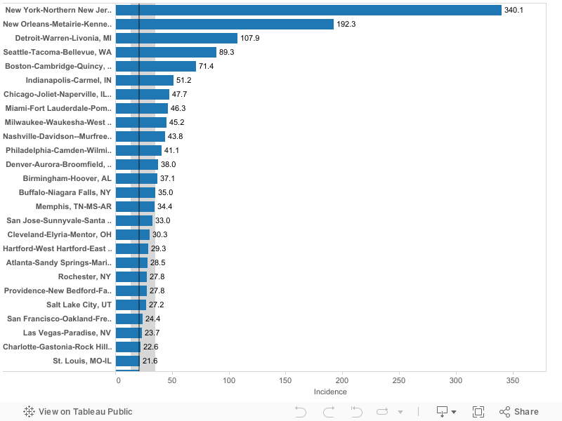
New York, New Orleans, Seattle and Detroit have the highest number of cases per capita of US metro areas. New York’s rate is currently 340 cases per 100,000. New Orleans (192), Detroit (108) and Seattle (91) have the next highest rates of reported cases. The median large metropolitan area has about 20.9 cases per 100,000 population.
What these data show: You can scroll through this list to see where your metropolitan area ranks in terms of the number of reported cases per 100,000 population. You can see which cities have a similar level of reported cases as yours, and how far ahead (or behind) your metro is compared to the hardest hit metropolitan areas.
Metric #2: The daily percentage increase in the number of cases over the past week
Growth measures how fast the pandemic is spreading in your metropolitan area, gauged by the increase in the number of reported cases. The key strategy in fighting the Covid-19 pandemic is reducing social distancing to slow the rate of transmission of the virus. A key indicator of whether we are “flattening the curve” is whether the growth rate of the number of cases is increasing or decreasing. The following chart shows the growth in the number of cases for selected metropolitan areas from March 13 through March 29.
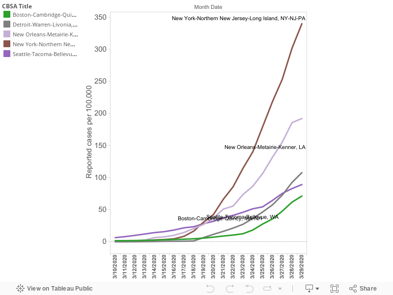
A chart that simply shows the growth rate makes it difficult to discern whether (and by how much) the growth rate is increasing or decreasing. We’ve boiled the analysis of growth down to a single number. For this analysis, we’ve computed the average daily growth rate over the past seven days. This is expressed as a percentage increase per day: A 25 percent increase means that if you have 100 cases on day 1, you have 125 cases on day two. Because of compounding (the exponential part of the growth pattern), a 25 percent daily rate of increase means that the total number of cases doubles in a little over three days, and quadruples in a week.
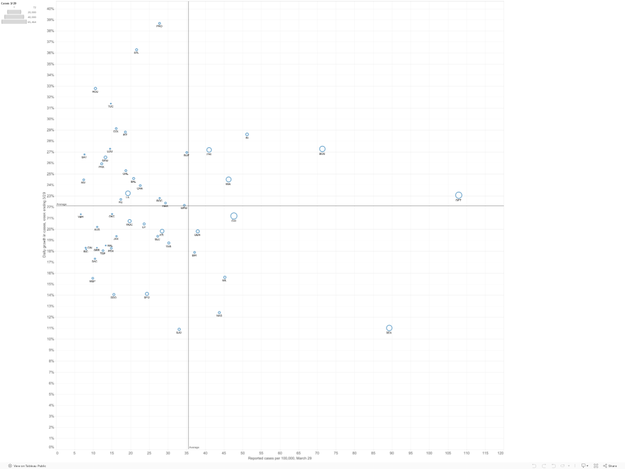
Prevalence versus Growth: Four Quadrants
Slowing or stopping the spread of the virus depends on steadily decreasing the growth rate in the number of cases. This is especially important as the prevalence of the virus becomes more widespread. Here we’ve plotted the current prevalence of reported cases in each metropolitan area (shown on the horizontal axis) against the growth rate of reported cases in the past week in that metropolitan area (on the vertical axis). The number of cases in each metropolitan area is proportional to the size of the circle representing each metro area. You can mouse-over individual circles on the chart to fully identify each metro area, and see the underlying data for numbers of cases, cases per 100,000 and the growth rate in cases over the last week.
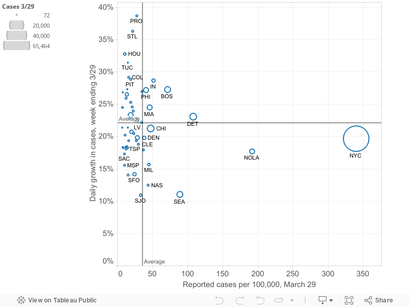
How to interpret the four quadrants: We’ve used the means of the two variables (growth rate (22% daily) and number of cases per 100,000 (31), to divide the chart into four quadrants. These quadrants help sort out which metro areas are experiencing the crisis to a greater or lesser degree. The following chart summarizes the meaning of the four quadrants
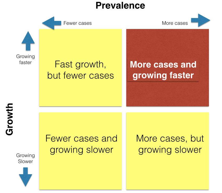
Metro areas in the upper right hand quadrant (shaded red in this diagram) are clearly most afflicted: they have both higher than average rates of cases per capita and are growing faster than the average metro area (in the past week). As of March 29, there were 5 metro areas in this red quadrant: Boston, Detroit, Miami, Philadelphia and Indianapolis. These metros have more cases per capita and have experienced higher growth than average in the past week. The lower right hand quadrant identifies metro areas with relatively higher rtes of cases per capita, but slower rates of increase. Ideally, one wants to be in the lower left hand quadrant (low number of cases per capita, low growth rate). The upper left hand quadrant is uncertain, but with cause for concern: these cities (so far) have lower rates of cases per capita, but are seeing the virus spread faster than in the average metro area. Over time, the strategy of flattening the curve should lead individual metropolitan areas to progress from the upper left hand quadrant (low rates and fast growth) to the lower right hand quadrant (higher rates but a slower rate of growth).
To see the relative position of most metro areas, we’ve shortened the horizontal scale to exclude the two cities–New York and New Orleans–with the highest numbers of cases per capita. This chart makes it clearer which cities are in which quadrants.
The table and map rely on published data from state health departments, aggregated by USAFActs.org. Please use caution in interpreting these data. It is likely that in some areas, the number of cases is under-reported due to the lack of available testing capacity, or pressing medical conditions. There are widespread differences in the number of tests administered relative to the size of the population in each state, and tests are not given randomly, and may be restricted solely to persons with symptoms, likely exposure or high risk in some states. As a result, the ratio of reported to unreported, undiagnosed cases may vary across geography. Moreover, changes in reported numbers of cases from day to day or week to week may reflect changes in the availability or application of testing over time, rather than the true rate of growth in the number of persons affected.
