What maps and charts can–and can’t–tell us about the spread of the pandemic
- National dashboards now have county data
- We need to shift our focus to changes in rates of growth at smaller geographies
- South Korea shows its possible to do high-definition, point-mapping of Covid-19 cases
- NOTE: City Observatory’s has tabulations of metropolitan data through March 31
Since last week, when we wrote our first thoughts about the geographic spread of the Covid-19 virus, people around the globe have been doing a lot of work. Here’s a quick synopsis of what we’ve seen.
National dashboards now have county data
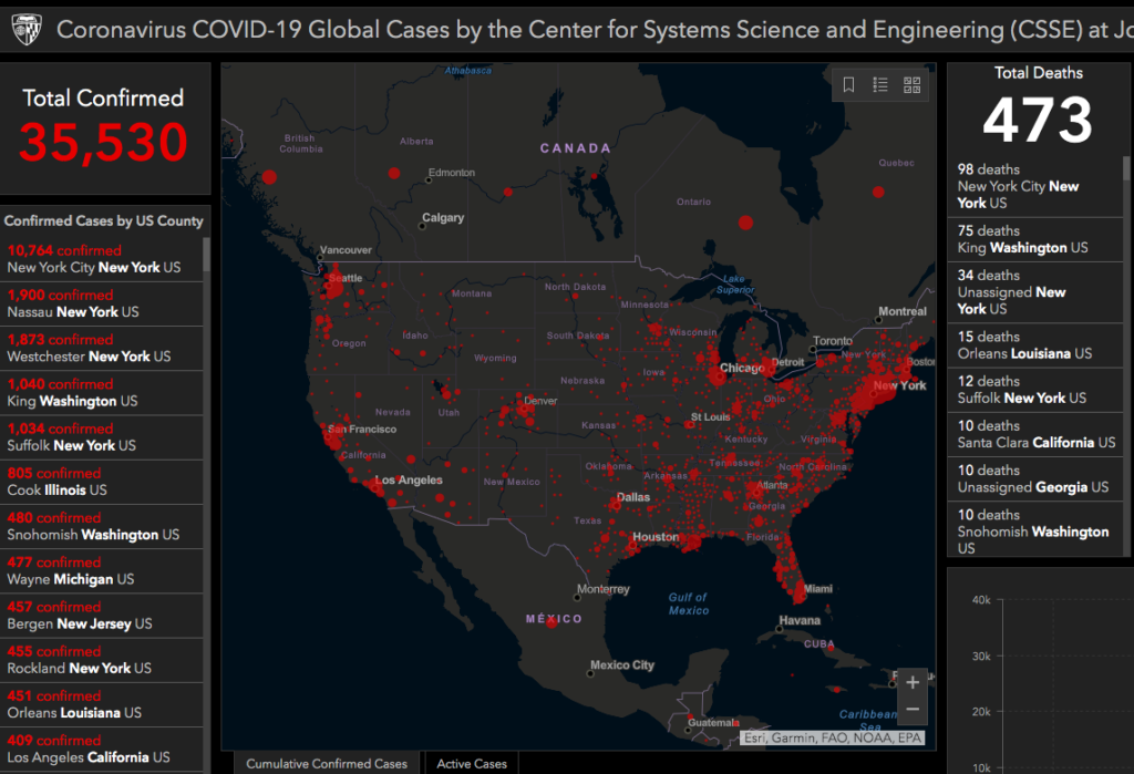
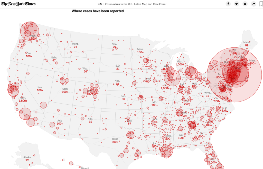
Two of the leading US map resources (Johns Hopkins University and the New York Times) have both added county level data to their reporting.
The Johns Hopkins University Map of US Covid-19 infections has been expanded to allow a drill-down to county level data.
The New York Times now has a county-by-county listing of the number of Covid-19 cases for the nation.
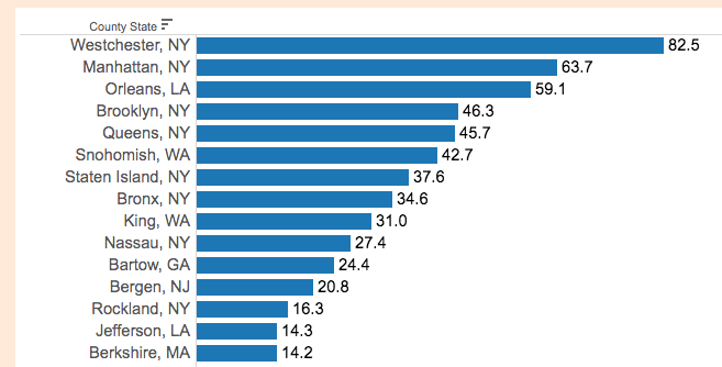
At City Observatory, we computed county level prevalence rates for virus infections in the state’s with the highest levels of confirmed cases.
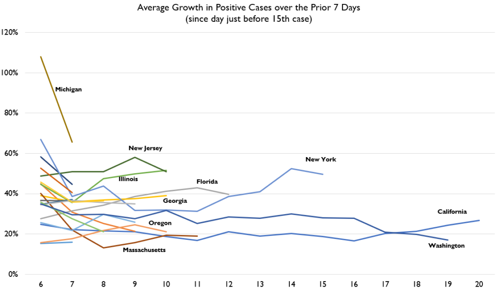
We should focus on the growth rate of cases
The real issue is the slope of the line, is it increasing or decreasing. The conventional way this is presented, with the exponential curves of cumulative case counts is difficult to interpret. Several analysts instead started charting the five-day or seven-day moving average of the growth of infections. This provides us with the simplest clearest indication of whether we’re flattening the curve or not.
US States
Lyman Stone has, via twitter, charted the change of the growth rate. The important thing to pay attention to on this chart is not so much the level, but the slope: if its heading down, that means that the rate of new cases is declining. The bad news here is that the trend in New York, for example, is headed up. Washington’s rate is nearly flat, which is a relatively good sign.
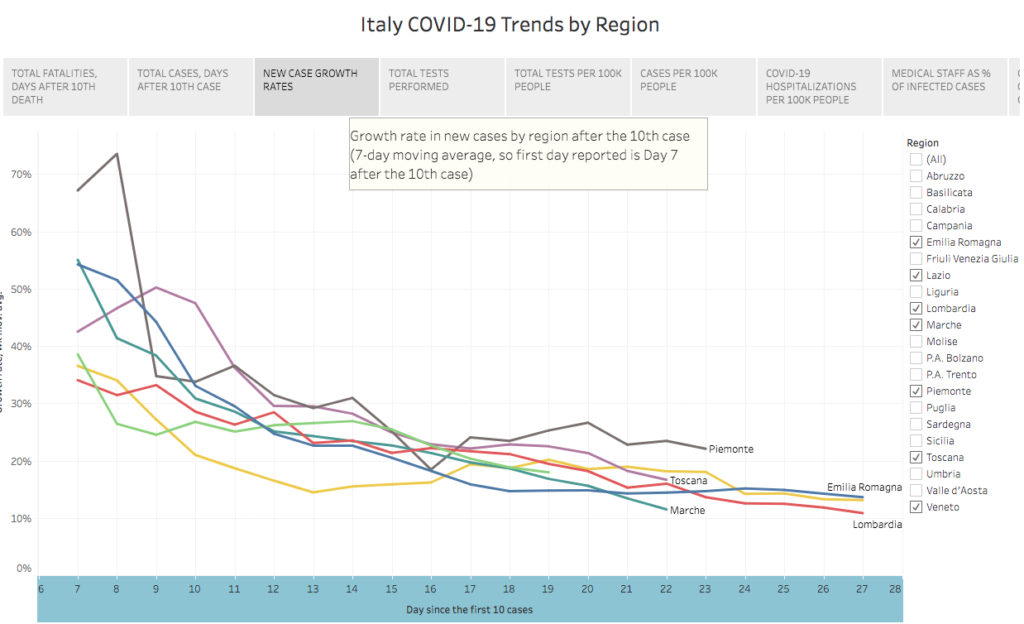
Italy
Michele Zanini has an excellent Tableau page documenting trends in Italy. Again, with this chart, you want to see the lines sloping downward, which they are.
France
Gavin Chait has mapped the incidence of cases in France by region, and computed the growth rate. (Chait’s estimates of growth rates and doubling times for cases are shown in tabular, rather than graphic form, so we haven’t reproduced them here).
High definition mapping: South Korea does it best
In our commentary last week, we said that the Covid-19 pandemic calls out for the kind of neighborhood-level geographic mapping that John Snow used in London in the 1850s to pin down the source of the city’s typhoid epidemic. The most detailed map of the disease anywhere comes from Korea, where address-level data on the incidence of disease is compiled by public health officials. This map shows the locations of Covid-19 cases in metropolitan Seoul; the dots are color-coded to show the recency of diagnosis: red dots are less than 24 hours old, yellow dots are up to four days old, and green dots are 4-9 days old.
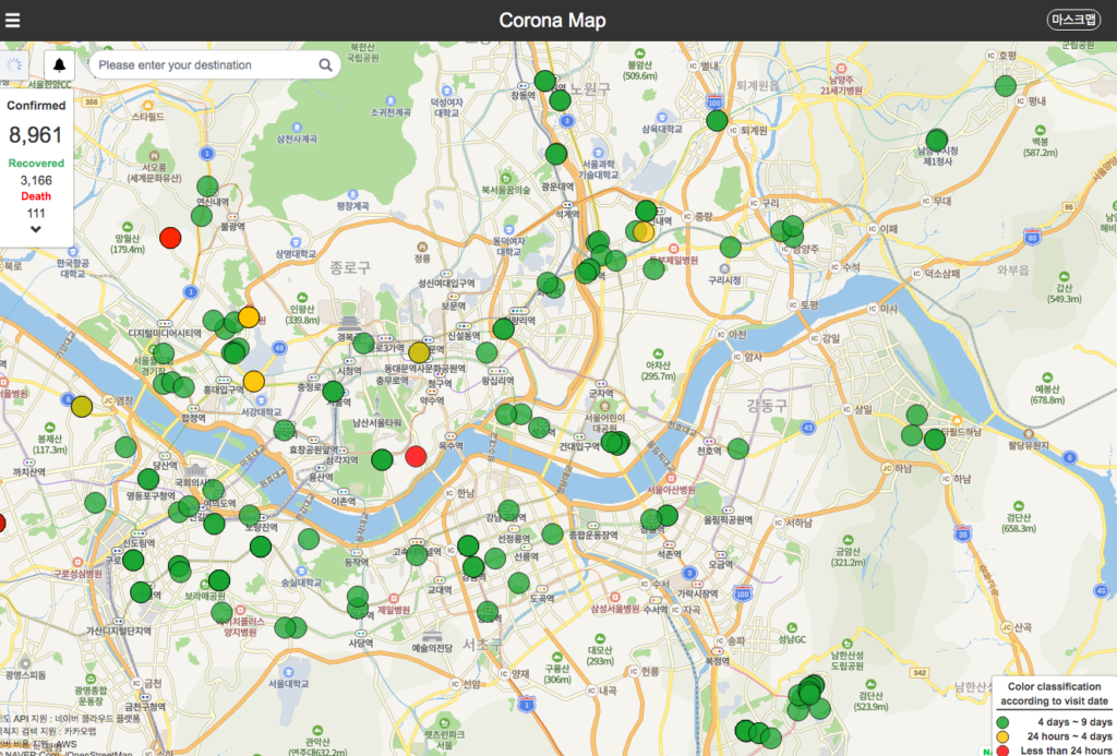
(Hat tip to CityFix for flagging this site).
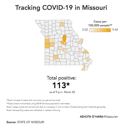
County-level Incidence Mapping
The closest we come to the Korean neighborhood-scale maps are estimates of the prevalence of Covid-19 by county. The Columbia Missourian has used Tableau with state health department data to compute the number of Covid-19 cases per 100,000 population for Missouri Counties:
Maps and Charts, or Words?
ESRI’s Ken Field has some very smart advice on how to make informative maps about Covid-19. Looking at maps of China drawn almost a month ago, he warned that mapping common mapping approaches may obscure more than they reveal:
Often, the simplest techniques, done well, provide a sound cartographic approach. The key to informing is to work with the data and to not imbue it with misguided or sensationalist data processing or symbology, and to deal with some of the cartographic problems different techniques are known for. And what are the key points? As of 24th February:
- Hubei has 111 cases per 100,000 people (0.1% of the population);
- everywhere else in China is less than 2.5 cases per 100,000 people;
- for other countries reporting cases, the rate is even lower; and
- maps mediate the message to a greater or lesser extent, and some that appear well-intentioned are often unhelpful.
Maybe words are all that’s needed? But if you’re going to make a map, think about these key aspects, pick a technique that supports the telling of that story, process the data and choose symbols that are suitable, and avoid making a map that misguides, misinforms . . .
Accurately understanding and communicating the spread of the Covid-19 virus is going to be difficult, but is essential to getting the widespread support for the measures needed to defeat this pandemic.
