The key to flattening the curve is reducing the daily rate of growth in Covid-19 cases
We’ve charted the daily average growth rate for the counties with the most cases.
The results are mixed: Covid-19 growth is slowing in some areas, but accelerating in others
As City Observatory readers know, we’re very focused on the geography of Covid-19. The virus is transmitted by close contact, and as a result is much more concentrated in some places than others–a fact concealed by national data, and only partly illuminated by state data. We want to encourage everyone to get access to much more finely detailed data that shows the geography of the virus.
In addition, we need to move beyond simply counting cases. The real issue is the slope of the line: is it increasing or decreasing? The conventional way this is presented, with the exponential curves of cumulative case counts is difficult to interpret. Several analysts instead started charting the five-day or seven-day moving average of the growth of infections. This provides us with the simplest clearest indication of whether we’re flattening the curve or not.
Growth rates for US counties
We’ve obtained data through 23 March for the number of diagnosed Covid-19 cases in each US county. The usual caveats apply about the completeness and comparability of case data. These data are from USAFacts.org, which provides a clear and transparent compendium of daily data on county-level cases.
We’ve identified all the US counties with 200 or more Covid-19 cases as of 23 March. This includes 18 counties in nine states. Together these counties account for almost nearly half (just less than 20,000 of the nation’s diagnosed cases on that date). We computed the 7-day average daily growth in case counts for each county, and below, we’ve charted these rates starting on the first day in which that county had 15 or more diagnosed cases. The number of days shown on the horizontal axis is the number of days elapsed since the first day with 15 or more cases. (Our chart follows the approach developed by Lyman Stone (see below). (Data for indeterminate growth rates (i.e. base period with a zero value) are suppressed). Each line corresponds to a US county.
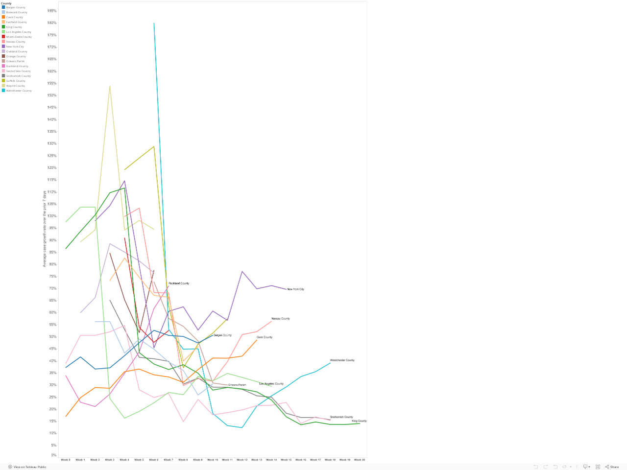
The data show mixed results. A hopeful sign is the steady decline in case growth rates in King and Snohomish Counties in the Seattle Metro area. Case growth rates in both these counties have declined to 15 percent per day, down sharply for earlier weeks. Meanwhile in New York City and its surrounding suburbs (Westchester, Rockland and Nassau Counties) the growth rate is still trending upward. (It is possible that this trend is somewhat affected by our choice of a 15 case threshold for the zero week). The growth of the number of cases in Cook County (Chicago) is still accelerating; the growth rate in Los Angeles is decelerating slightly.
Its important to stress that while a focus on growth rates is vital, and decline in the growth rate doesn’t mean that the number of cases is decreasing–its just growing more slowly. This is a first step toward fighting the disease. Even at a 20 percent daily growth rate, the number of cases doubles every four days. But pushing the growth rate steadily downward is a sign that we’re making progress in “flattening” the curve.
US States
Our inspiration for this work comes from Lyman Stone has, via twitter, charted the change of the growth rate for US states. The important thing to pay attention to on this chart is not so much the level, but the slope: if its heading down, that means that the rate of new cases is declining. The bad news here is that the trend in New York, for example, is headed up. Washington’s rate is nearly flat, which is a relatively good sign.

Growth rates for Italian Provinces
For a useful international comparison, we can look to Italian provinces, which are experiencing the highest rates of Covid-19 cases and deaths, and which are several weeks ahead of the US in the progression of the pandemic. Michele Zanini has an excellent Tableau page documenting trends in Italy. Again, with this chart, you want to see the lines sloping downward, which they are.

