New York, New Orleans and Seattle have the highest incidence of pandemic among large metros.
The typical metro is only about 1-2 weeks behind these cities in the progression of the virus.
Editor’s Note: As of 26 March, we have produced updated estimates with data through 25 March: These data are here.
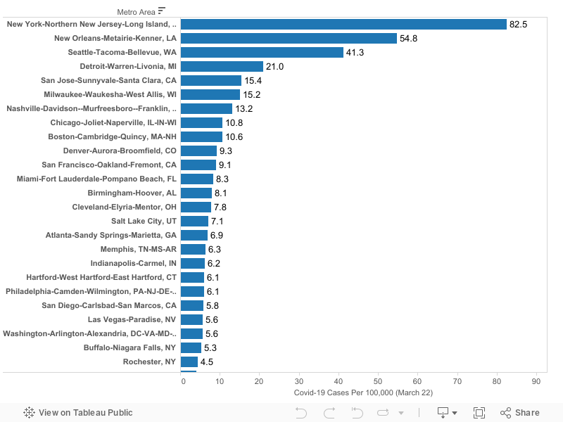
We’ve estimated the incidence of Covid-19 for the 53 most populous US metro areas as of March 22, 2020. Incidence is calculated as diagnosed cases per 100,000 population. Data are shown for metro areas with 1,000,000 population or more.
Up until now, most data has been available at only the state or county level. States are too large to accurately capture the the incidence of the pandemic; and counties are often too variable and too small. Metro areas capture labor markets and commuting sheds, and are defined consistently, making them more appropriate geographic units for judging the spread of the virus.
Highlights:
Among these metros, the incidence of Covid-19 is highest in the New York metropolitan area (82 cases per 100,000 population), New Orleans (55), Seattle (41).
Other large metros with relatively high rates of incidence include: Detroit (21), San Jose (15), Milwaukee (15) and Nashville (13).
Among metropolitan areas with one million or more population, the median metropolitan area had a reported infection rate of about 4 cases per 100,000 population. For reference, the New York metro had just four cases per 100,000 on March 15, just seven days prior to these estimates. Seattle had 4 cases per 100,000 on March 9, and New Orleans crossed that threshold on March 14. At the rate the virus has been spreading, the worst-affected cities are about one to two weeks ahead of typical (median) large metro area in the progression of the virus.
As of March 22, the lowest rates of reported Covid-19 cases per capita among these large US metropolitan areas were in San Antonio, Houston, Riverside and St. Louis, which each had 1.5 or fewer cases per 100,000 residents.
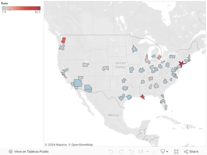
The following map illustrates the relative number of reported Covid-19 cases per capita among large US metropolitan areas. Darker red colors indicate metro areas with the highest reported incidence of cases
The table and map rely on published data from state health departments, aggregated by USAFActs.org. Please use caution in interpreting these data. It is likely that in some areas, the number of cases is under-reported due to the lack of available testing capacity, or pressing medical conditions.
