Shape of the urban/suburban divide: Views differ
There’s a lot of debate about the relative merits and performance of cities and suburbs. You’ll read that the migration to cities has come to a halt, that suburbs are growing faster than cities or that cities have a higher rate of Covid-19 infections than suburbs.
All those statements hinge on being able to draw neat, clearly understandable lines between what constitutes a city and a suburb. As is so often the case, the conceptual differences may be clear, but drawing lines, in practice, is fraught with confusion and complexity. And this matters because where one draws these lines has a big impact on what kind of numerical answers one gets.
Today we’ll take a look at three widely used urban/suburban definitions, developed by three different researchers–all of whom we greatly respect and admire. What we find is that, as the saying goes, they’re all over the map. Consequently, a degree of care and caution is needed in interpreting data that make “urban vs. suburban” claims based on county data.
Geography and data availability necessarily straight-jacket any analyst looking to craft a solid picture contrasting cities and suburbs. Cities are political subdivisions (municipalities, or ‘places” in Census parlance). But the geographies that compose cities are defined by local law and custom, and vary widely from state to state and around the country. The principal city is nearly all of the metropolitan area in Jacksonville or Phoenix, but is just a fragment of a much larger metropolitan area in Atlanta or Miami.
While one can get a much finer look at geography by cobbling together customized and uniformly defined clusters of census tracts, these data are available in the form of five-year pooled estimates (the latest being from the 2014-2018 versions of the American Community Survey). For those interested in the most recent data, that’s frustratingly old. Two researchers at Harvard’s Joint Center for Housing Studies devoted an entire paper to the question, but there analysis focuses on slicing the urban/suburban divide within counties, so we don’t explore it further here.
The most convenient and timely data is county level estimates published by the Census Bureau. It annually estimates the population of every county in the US, along with the components of population change (births, deaths, migration), and estimates the age structure as well. Because the sample size is larger for counties than for census tracts, the Census Bureau also produces annual tabulations of the American Community Survey for counties. And of interest today, Covid-19 data are generally reported on a county-level by public health authorities.
As a result of the convenience of data availability, and the fact that the entire nation is divided into about 3,200 counties (or county-like units), analysts routinely tap census data to describe geographic trends.
Within the past few weeks, three terrific analysts, Bill Frey of the Brookings Institution, Jed Kolko of Indeed and Bill Bishop of the Daily Yonder, have been using these county level data to look at the relative prevalence of Covid-19 across the nation’s geography–from central cities and suburbs of large metro areas, to smaller metros, to rural areas.
Conceptual differences
There are a variety of ways to characterize the “urban-ness” of a place. One is centrality: is a county at the center of a metropolitan region. Another is density: how many people per square mile live in a county? One can also look at how developed an area is: is a county mostly developed to some minimum level of density, or is much of it relatively lightly developed or undeveloped? The three definitions presented here lean on different concepts: Brookings uses a measure of urban development, Kolko looks at weighted population density and Yonder emphasizes centrality. These different underlying concepts lead to differing categorizations of counties as urban or suburban.
Our focus–as it usually is at City Observatory–is on the nation’s 53 largest metropolitan areas, all those with a million or more population. Although their taxonomies cover the whole gamut of metro and rural areas, we’re most interested in here, in where each of these researcher’s has used county boundaries to partition these large metro areas into “urban” and “suburban” components.
In all, about 181 million Americans live in one of the 53 largest US metro areas. How many of them live in urban as opposed to suburban locations? Each of these methods proposes to answer that question but they come up with answers that are quantitatively and compositionally quite different. Of the 181 million people living in these large metro areas in 2018, depending on the definition one chooses, the number that in “urban” counties are about 76 million (Kolko), 91 million (Yonder) or 100 million (Brookings).
Classification of Counties in Metro Areas with Population of 1,000,000 or more.
| Brookings | Counties | Population |
| 1-Urban Core | 96 | 99,667,019 |
| 2-Mature Suburb | 111 | 61,943,681 |
| 3-Emerging Suburb | 77 | 14,308,473 |
| 4-Exurb | 121 | 5,253,680 |
| NonMetro | 4 | 118,497 |
| Grand Total | 409 | 181,291,350 |
| Kolko | ||
| 1-Urban | 55 | 75,949,521 |
| 2-SuburbanHigh | 91 | 69,104,197 |
| 3-SuburbanLow | 263 | 36,237,632 |
| Grand Total | 409 | 181,291,350 |
| Yonder | ||
| 1-Central counties | 59 | 90,665,117 |
| 2-Suburban Counties | 238 | 86,288,760 |
| 3-Exurban | 108 | 4,218,976 |
| 4-Rural Adjacent to Large MSA | 4 | 118,497 |
| Grand Total | 409 | 181,291,350 |
That might not seem like such a large discrepancy, until you find that each of the definitions designate distinctly different sets of counties counties as urban. Overall, the three methodologies agree on 21 counties in the 53 largest metropolitan areas are urban. These counties are home to less than half of the people labeled as living in “urban” areas under any of the three definitions. These common counties work out to a little bit more than half of the people counted as living in “urban” areas by Kolko, and less than half of the people counted as urban by Brookings and Yonder. So these are largely differences in kind, rather than degree.
Comparing different definitions
One way to illustrate the differences among these three definitions is via a Venn diagram showing where these definitions coincide and where they differ. The red (upper left) circle shows Kolko; the yellow circle on the right shows Yonder, and Brookings is the pale green circle on the bottom.
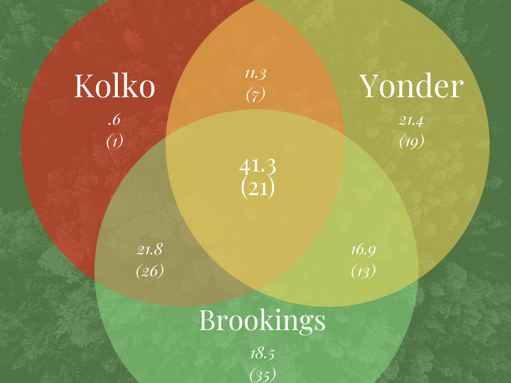
The are where the three circles overlap shows that the three rubrics agree that 21 counties are “urban,” these contain about 41.3 million people. Conversely, if you add together all of the counties that at least one of the three methods categorize as urban, you find that 62 counties, with a total population of 132.8 million are “urban.”
Remarkably, when classifying counties as urban or suburban in each of the 53 most populous metropolitan areas, the three methods are in complete agreement on what constitute the “urban” counties in only four metro areas: Cleveland, Milwaukee, Pittsburgh and San Jose.
Two of the three methods imply that almost a third of large US metro areas have no counties that qualify as “urban.” The Brookings and Kolko methods find that 16 metro areas, including Austin, Charlotte, Cincinnati, Kansas City, Memphis, Nashville, Oklahoma City, Phoenix, Raleigh and San Antonio, have no counties that are “urban”. Kolko characterizes the most populous county in each of these metro areas as “high density suburban,” while Brookings generally classifies them as “mature suburbs.”
It’s interesting to see what two out of the three sources says is “urban” that the other one leaves out:
Brookings and Kolko agree on 26 counties (with 21.8 million people, that Yonder leaves out of its definition. These are mostly populous counties in large Eastern Metros, Queens, and Nassau Counties in New York
Brookings and Yonder agree on 13 counties with 16.9 million people, that don’t meet Kolko’s criteria, chiefly because they’re not dense enough.
Yonder and Kolko agree on 7 counties with 11.3 million people. The difference here is that the Brookings methodology says that five large MSAs in the West— Las Vegas, Portland, Sacramento, Seattle and San Diego—have no urban counties–classifying their densest, most central county as “mature suburban.” In contrast, both Kolko and Yonder identify the central county in each metro as urban.
Each method has its own unique choices–counties it classified as urban that were not classified urban by either other source. Kolko had just one such county. Brookings had 35 counties that it alone designated as urban (mostly the second and third most populous counties in a metro area). Yonder had 19 counties that were designated urban only by its methodology–reflecting its rule of designating the most populous county in each metro as “central.”
A Rosetta Stone
For our own use, and with the hope that it may be of some utility to other researchers, we’ve crafted a kind of Rosetta Stone illustrating these three different definitions of urban and suburban counties. We’ve shown, side-by-side how each of these three method’s classifies each county in the nation’s 53 most populous metropolitan areas.
This Excel file identifies the name and FIPS Code of each metro area, the name and FIPS code of each constituent county in that area, and the population of that county in 2018. In three separate columns, we show how the county is classified by Brookings, Kolko and Yonder. We’ve also appended Kolko’s estimates of the tract-weighted population density of these counties (a key metric in his classification system).
At a minimum, if you’re interested to see how your metropolitan area is parsed among these different definitions, you can use this as a reference. We also hope it lets researchers more easily decode and compare statistics compiled
There is no “right” definition
The purpose of this comparison is not to prove any one definition is superior to the others, but rather to illustrate the complexity and ambiguity of using county-level data to make strong statements about what constitutes “urban” and “suburban.” As a practical matter, the lumpiness and varying size of county units makes them a problematic choice for drawing these boundaries. Is none of King County Washington (which includes all of Seattle), urban? Should single county metropolitan areas (San Diego and Las Vegas) be classified as core or suburban? These are questions about which reasonable people can disagree, but in the interests of transparency, we offer up our Rosetta Stone so that people can use these data with a clear understanding of the difficult choices their authors made.
References
Jed Kolko, How suburban are big US cities? , FiveThirtyEight.Com, May 2015.
William Frey, Even before coronavirus, census shows US cities growth stagnating.
Bill Bishop, Major City growth slows, but that doesn’t mean a rural rebound,
Acknowledgements: City Observatory is grateful to Jed Kolko, Bill Frey and Bill Bishop for graciously sharing their worksheets showing their classification systems. City Observatory is responsible for any errors in this analysis.
