What City Observatory did this week
Bad data. What appears, at first glance, to be a big decline in trip-making is really an object lesson in failing to read the footnotes. Every five years or so, the US Department of Transportation produces the National Household Travel Survey (NHTS), which provides essential information about American travel patterns. The latest data from the 2022 survey was just released, and the USDOT trumpeted its publication with a clever, but fundamentally flawed infographic.
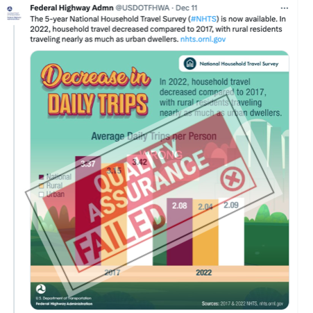
US DOT claims that we went from making almost three and a half trips per person per day in 2017 to barely two trips per day in 2022. The problem is that the apparent decline in trip-making almost certainly has a lot more to do with a major change in the methodology of the NHTS since 2017. The survey used to provide respondents with a “trip diary” to contemporaneously record daily travel. The survey has since shifted to the web, and relies on after-the-fact recollections, which previous survey work has shown substantially under-report total trip making. Unfortunately, that critical detail doesn’t appear in the infographic, which gives the inaccurate impression that one can directly compare the 2017 and 2022 data (You can’t). The pandemic and work-from-home have undoubtedly triggered major changes in travel behavior. It’s too bad the NHTS can’t tell us much about the size or permanence of these changes.
Must Read
Full disclosure: Highway departments need to report their carbon footprint. A key provision of the Inflation Reduction Act, which shovels hundreds of billions of dollars to states for infrastructure is direction to try to reduce greenhouse gas emissions. The US Department of Transportation has a new rule requiring state transportation departments to measure their greenhouse gases, and set goals for reducing emissions. The goals are aspirational and toothless, but that hasn’t stopped a bunch of states from actively opposing the rule.
But as Kevin DeGood, of the Center for American Progress writes, you can’t solve a problem you don’t acknowledge:
The premise of the rule is simple: it’s nearly impossible to reduce something you don’t measure. Moreover, by measuring the greenhouse gas emissions from vehicles traveling on the National Highway System, states will be able to assess how different transportation projects and policies would affect climate emissions. Reporting this data to US DOT will allow for some much-needed public accountability.
What this amounts to, in reality, is simply climate change denial. Highway agencies don’t want to admit that cars and driving are responsible for climate change, even though transportation is now the largest source of greenhouse gas emissions.
Where are the 15 minute neighborhoods? Notwithstanding the hysterical pushback from the far right, most people instinctively understand the convenience and economy of living in a place where you can take care of most of your daily needs without being required to drive a car. Fifteen-minute living is a planning goal for many, but has is actually already a feature of some of the most desirable neighborhoods in any city. Geographer Nat Henry has a detailed analysis of Seattle neighborhoods, showing which ones offer 15 minute living. Significantly, Henry’s work estimates the fraction of households in each neighborhood that can walk to common destinations within 15 minutes. It’s all or nearly all residents in a handful of dense, central neighborhoods, and none or vanishingly few in more outlying places.

Henry’s analysis is both transparent and flexible: It spells out the criteria used to determine what destinations are within walking distance, and allows the end user to select for other important destinations (like light rail stations and grocery stores, restaurants and parks). Henry’s interactive application generates maps (like the one shown above) and can answer basic questions, like, how many residents live within 15 minutes of a supermarket. This is the kind of tool that can demystify the concept of 15 minute living–and hopefully, defuse the silly and extreme opposition.
Sahm Rules. At City Observatory, we mostly focus on urban economics. But urban economies swim either with or against the tides of the larger macro-economy. The rate of inflation, the unemployment rate and interest rates all play out directly in urban labor markets and housing markets. As we emerged from Covid pandemic, there were serious (but temporary) supply disruptions (coupled with opportunism) that triggered a spike in inflation. Many economists, apparently drawing on the experience of the late 1970s argued that a recession was either a necessary or desirable way to break an emerging inflationary spiral. A handful fo economists, including Claudia Sahm, took a contrary view, arguing that the surge in inflation was short-lived, not deep seated.
The experts who say “we need a recession” or big payroll numbers might be a “nightmare” are those who warned that the Rescue Plan would spark high inflation. Inflation did pick up a lot. They were right about the direction. But, while the Rescue Plan played some role, it is not the reason for the inflation. Covid and the war in Ukraine caused massive, ongoing disruptions once you accept that it’s time to back away from the Phillips Curve.
The record of the past year–with a steady decline in inflation to the 2 percent target set by the Fed, and continued job growth and record low unemployment–shows Sahm was right. Engineering a “soft-landing” and avoiding a recession has been a blessing in 2023, and may set the stage for further improvement in the coming year. If you want macroeconomic analysis that is incisive, clear, and for this year quite prescient, you should read Claudia Sahm’s work.
Happy Holidays—See you next year!
The Week Observed will return in January 2024.