Walkable density mapped for the nation’s largest metropolitan areas
by DW Rowlands
Editor’s Note: We’re pleased to offer this guest commentary by DW Rowlands. DW Rowlands is a human geography grad student at the University of Maryland, Baltimore County. Her current research focuses on characterizing neighborhoods based on their amenability to public transit and on the relationship between race and the distribution of grocery stores in the DC area. She also writes on DC transportation, history, and demographic issues for Greater Greater Washington and the DC Policy Center. Follow DW on twitter at @82_Streetcar or contact her by email at d.w.rowlands<at>gmail.com.
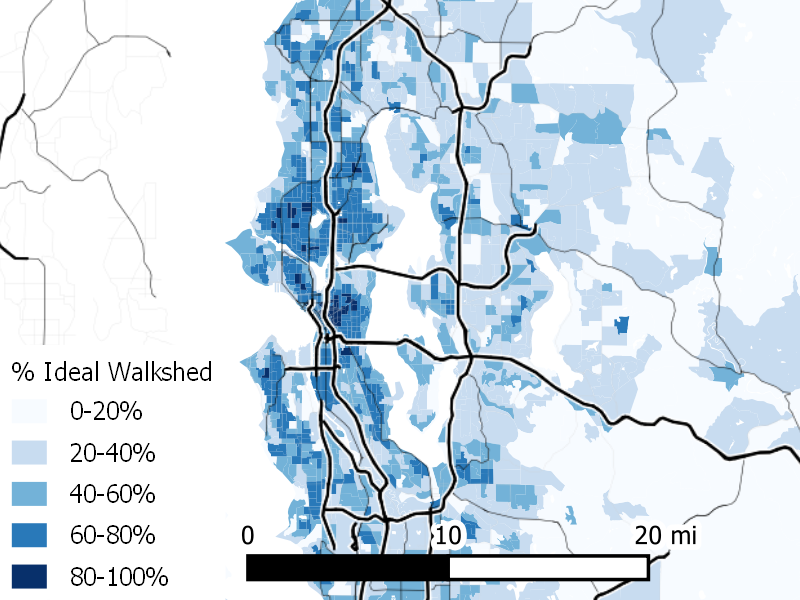
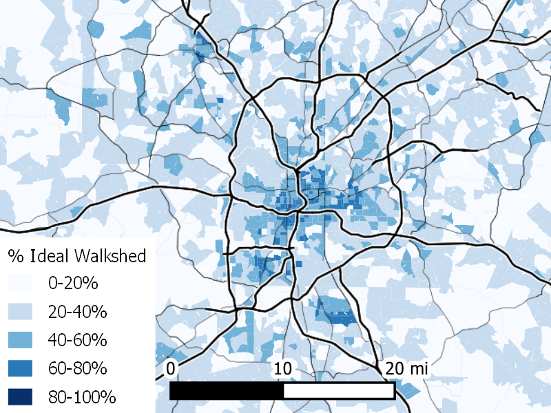
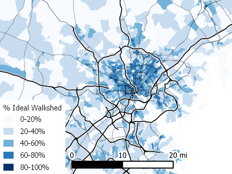
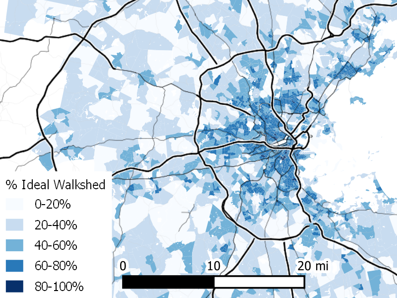
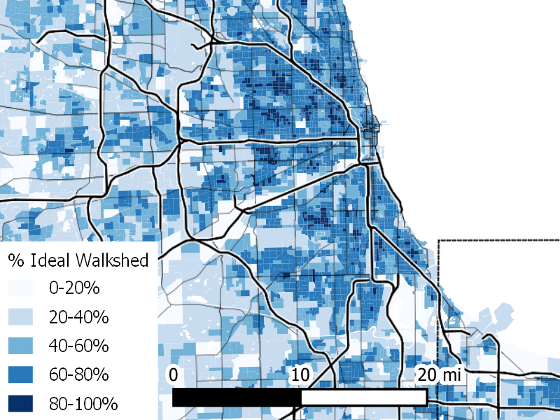
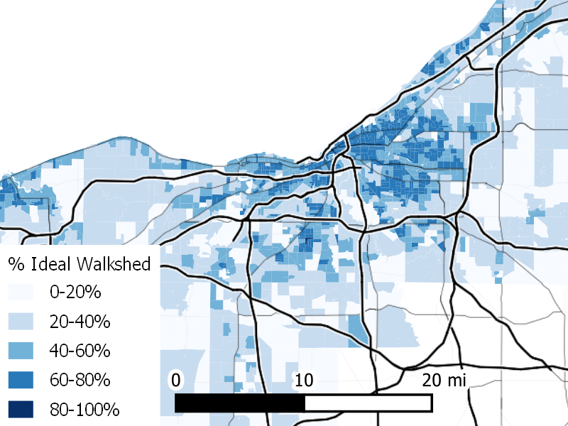
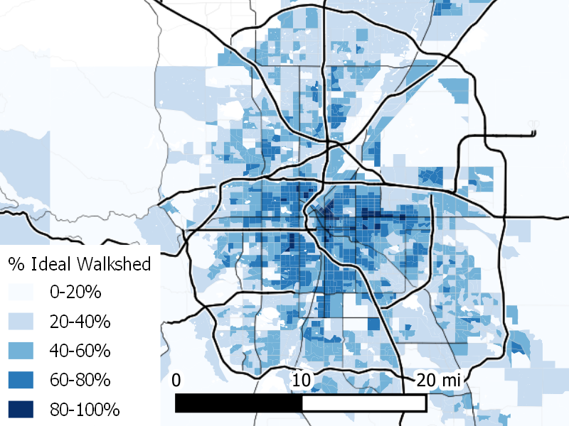
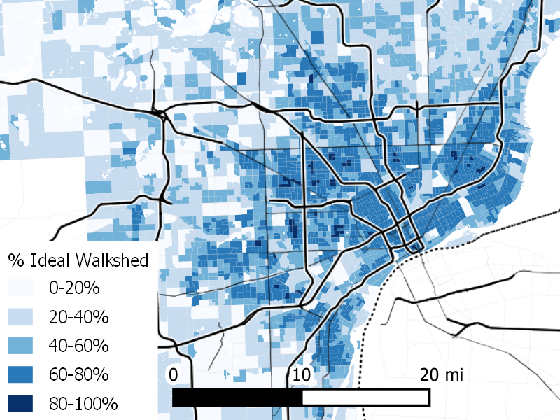
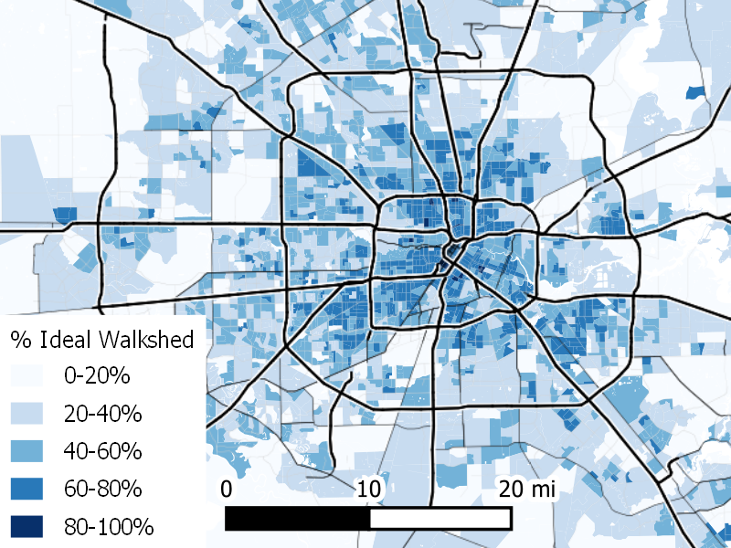
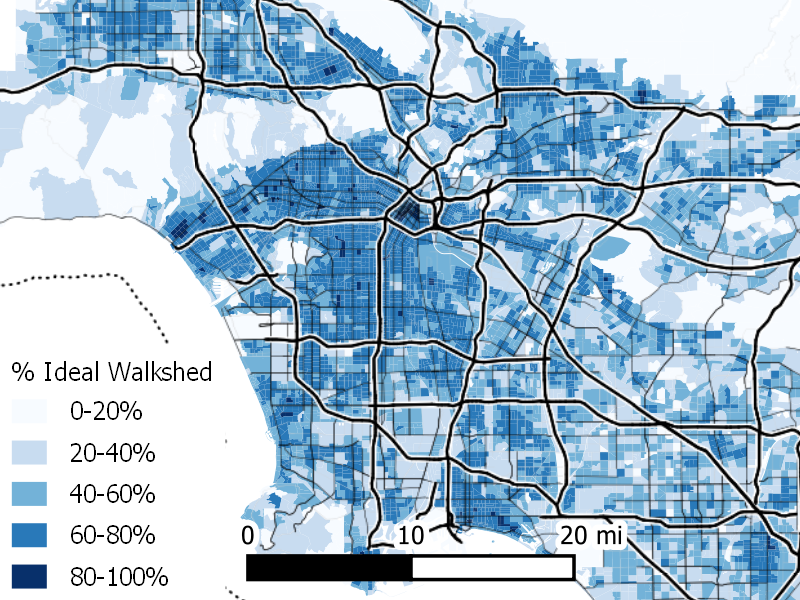
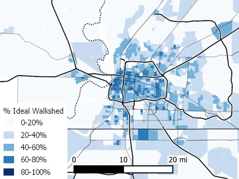
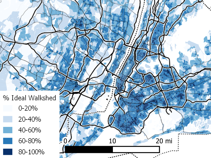
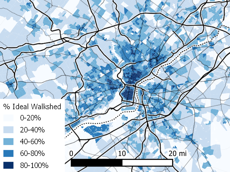
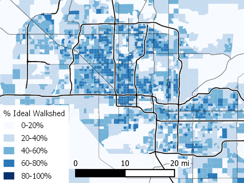
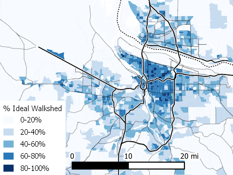
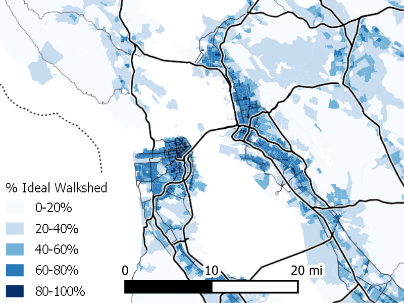
In a companion commentary, DW Rowlands describes a technique for adjusting density measurements to account for the connectedness of local street networks. This measurement shows the difference between the actual walkable density (how many people live nearby based on how far one can walk) rather than straight-line or “ideal” density (how many people are nearby based on a measure that considers only straight-line distances). The difference between the two measures (walkable density vs. ideal density) is an indicator of how well connected a neighborhood is for people walking. This page shows maps of each of the nation’s largest metropolitan areas, with census tracts shaded based on how closely each neighborhood’s actual walkable density approaches its ideal (straight-line) density. Areas shaded dark blue are those where realized walkable density comes closest to ideal density; areas shaded light blue are those where the disconnectedness of the street network means that actual walkable density is dramatically less than idea density.
Atlanta
Baltimore
Boston
Chicago
Cleveland
Denver
Detroit
Houston
Los Angeles
Memphis
New York
Philadelphia
Phoenix
Portland
San Francisco
Seattle