What City Observatory Did This Week
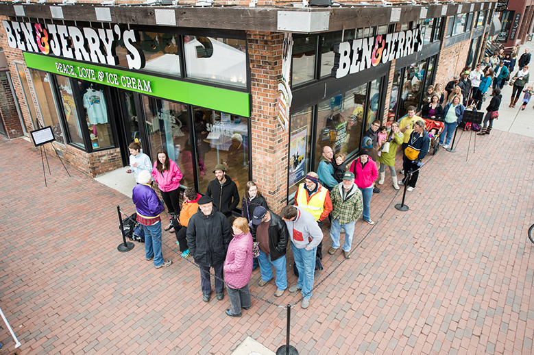
A teachable moment: Free Ice Cream Day. Traffic was lined up around the block last Tuesday at your local Ben and Jerry’s, for the same reason roadways are clogged most weekday afternoons: the price is too low.
April 16 was Ben and Jerry’s annual free ice cream day. In addition to free ice cream, they’re also giving a free lesson in why American roads are perpetually clogged, and why state highway departments are (a) always broke, and (b) always think they need to build more and more and more lanes for traffic.
Charging a fair price for using roads, just like charging a fair price for ice cream, is the best way to allocate resources and eliminate lines. In a few months, Manhattan will run the experiment of starting to charge for the scarce and valuable space on its streets, which should be another teachable moment. Stay tuned.
The end of the cargo cult? For the second time in less than a decade, the Port of Portland is shutting down its money losing T-6 container terminal. Container operations were revived to handle a spurt of shipping during the pandemic, but as supply chains have normalized, the demand for services to secondary ports like Portland has collapsed.
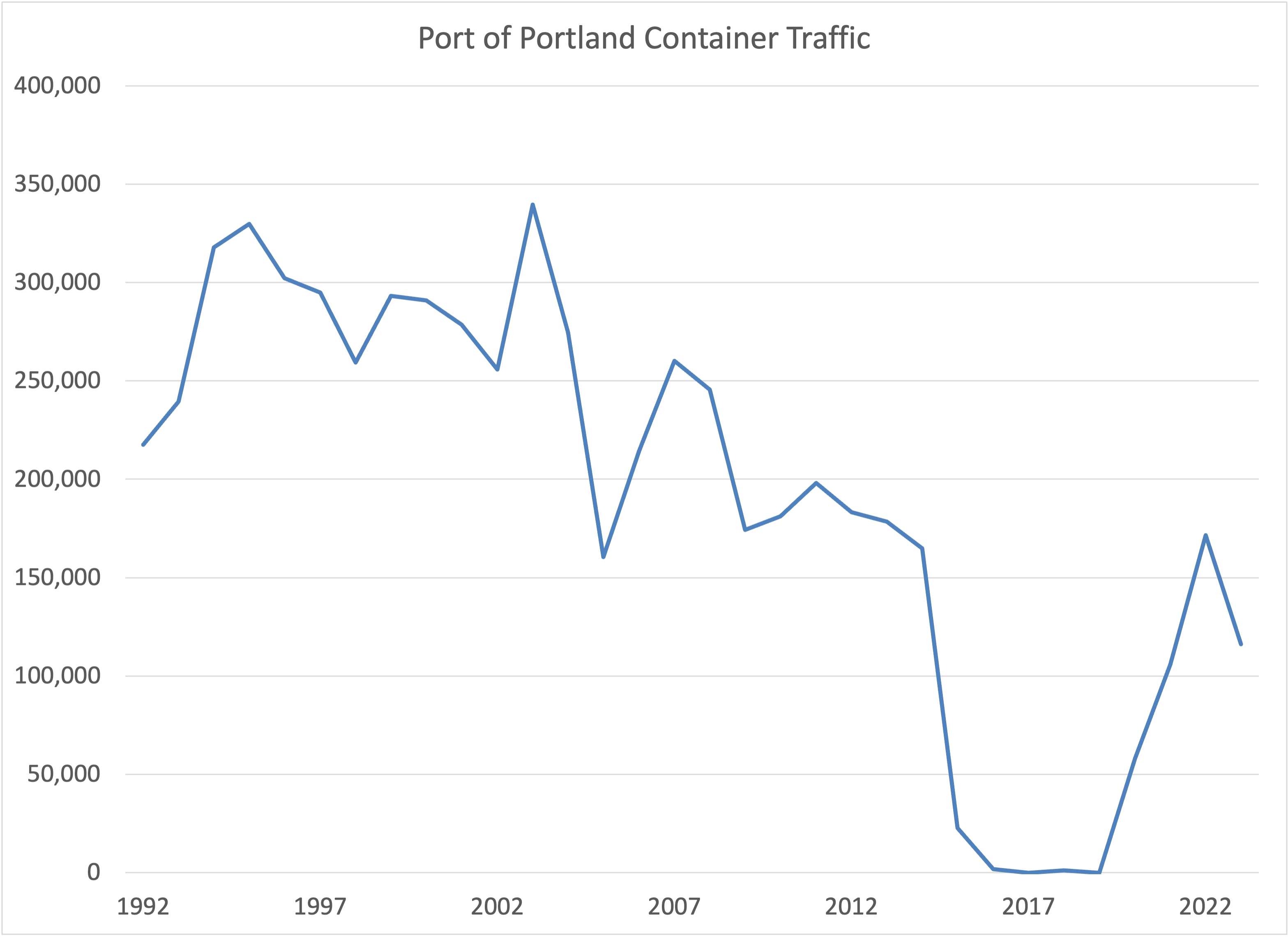
Container ships are a potent symbol of global commerce, and many assume you can’t have a great city or successful economy without freight infrastructure. The reality is that in the 21st Century, the factors driving economic success are bound up with less visible factors: notably a region’s endowment of human talent and its ability to generate new knowledge. Portland never accounted for more than about 2 percent of West Coast container traffic, and after losing $14 million on container operations in the last year, wisely chose to fold. The good news is the regional economy will scarcely notice: Portland has consistently outperformed the US economy, and most other large US metro areas in the years since container service first stopped. Nostalgia isn’t an economic strategy.
Must Read
The future of downtown: More than just a workplace. Richard Florida has a column in Toronto’s Globe and Mail highlighting a key change in the dynamics of downtown. Going forward, downtown’s won’t simply be workplaces, but they’ll be places to socialize, have fun and live.
. . . the downtown of the future will be less about working and shopping and much more about living, socializing and consuming experiences. “Downtowns must deliver opportunities for fun, discovery, and beauty to appeal to a broad audience of city dwellers,” the Gensler survey found.
What it all comes down to is that work is no longer the No. 1 reason people go downtown. If it hopes to thrive as a great city in our new era, downtown Toronto must become a safer and more balanced place to live, raise children, and, most of all, to experience new things and connect with others.
Think of it as the Petula Clark vision as a place for people to socialize: . . things’ll be great when you’re downtown, no finer place for sure; Downtown everything’s waiting for you.
Single-stair buildings and fire safety: Writing at Greater Greater Washington, Payton Chung takes head-on concerns that single-stair buildings are more dangerous that requiring two stairways. Building codes frequently require two separate exits for multi-story residential buildings, which essentially requires a central hallway, lower space efficiency, and units that face only one-side of the building. But Chung argues that the second stairway is an increasingly anachronistic and unnecessary requirement, given improvements in other technology, particularly smoke detectors and sprinkler systems.
Some people’s initial fear is that requiring only one staircase would roll back safety regulations to cut costs. But in fact, single-stair reforms have the potential to get more people into safer buildings. Multifamily buildings are now particularly safe from fire deaths, largely due to building code requirements for sprinklers. The National Fire Protection Association notes that in 1980, house and multifamily fires had comparable chances of causing deaths; by 2022, the death rate for multifamily fires had fallen 17% while those for house fires had actually risen.
Because second stair requirements drive up costs, they mean that fewer, new and safer buildings get built, and more people end up living in structures that are less safe (either older buildings or new buildings built to the less stringent safety requirements that apply to townhouses and single family homes).
A consumer’s guide to promotional stadium studies. While it’s billed as a resource for reporters, everyone ought to pay attention to a new report from Harvard’s Shorenstein Center on Media that dissects the troubling and arcane world of sports stadium studies. Across the nation, local and state governments are regularly asked to dump hundreds of millions in tax-funded subsidies into constructing new stadia, purportedly because of the huge economic payback they provide. The trouble is that no objective, peer-reviewed science supports the claim that stadia actually add to regional economies; at best they tend to re-distribute income among local entertainment businesses. That hasn’t stopped a cottage industry of consultants from ginning up impressive sounding claims that stadia will add millions or even billions to the local economy—something we call “hagiometry.” The Shorenstein Center’s report provides a clear-eyed and readable synthesis of the flaws underlying these studies, and is a must read for any community contemplating a stadium project.
New Knowledge
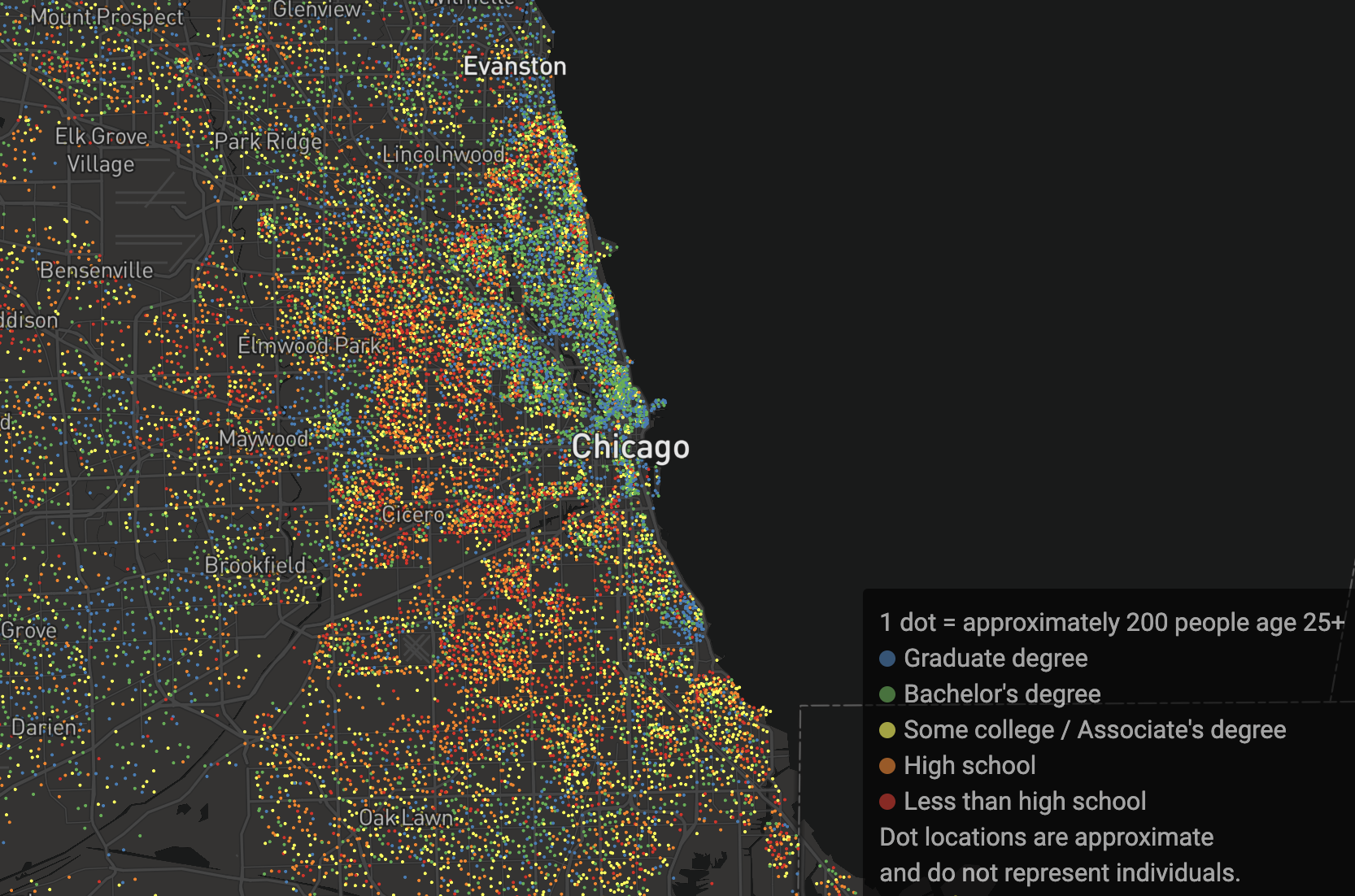
Educational Attainment in America Mapped. The educational attainment of the population is one of the key drivers of metropolitan success, and an indicator of neighborhood vitality. TCU professor Kyle Walker is a master of the data analysis program “R” and has used some of the latest tools to generate a detailed, dot-density map showing the concentration of population by educational attainment, using the latest American Community Survey data.
The map shows those with bachelors and masters degrees as cooler, blue or green dots, and those with less education as yellow, orange or red dots. The maps clearly illustrate those places that skew heavily either to more or less educated populations. The map of Chicago, for example, shows a strong concentration of well educated adults in the city’s downtown and Northside, and lower levels of education to the South and West.
Walker’s map encompasses the entire nation, and allows users to quickly zoom to any particular geography. It’s a great resource, and a tour-de-force illustration of the power of the R program.