What City Observatory this week
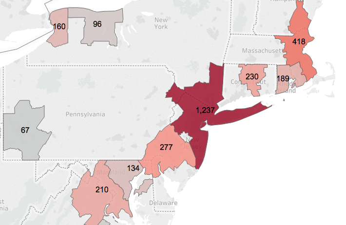
1. Regional Patterns of Covid-19 Incidence. The pandemic has struck every corner of the nation, but has clearly hit some areas harder than others. We’ve focused on those metro areas, like New Orleans and New York, that have the highest rates of reported cases per 100,000 population. But stepping back and looking at the national map of metro areas shows that there are some distinct regional patterns to this pandemic. One hotspot is the entire Northeast Corridor, from Washington to Boston. Six metro areas in the corridor rank among the top 12 metros for incidence of reported Covid cases. Three Great Lakes region cities, Chicago, Detroit and Indianapolis are also in the top ten. Meanwhile, aside from Seattle, rates in the West tend to be much lower than in other metro areas.
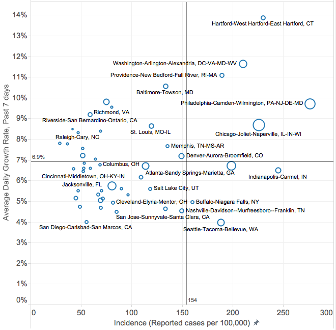
2. Updated Metro Area statistics on reported Covid-19 cases per capita. We’ve continued the daily updates to our estimates of the number of reported cases per 100,000 population in each of the nation’s 53 largest metro areas. A key part of our analysis has been tracking the relationship between the incidence of the virus with its rate of growth to show where we’re making progress in fighting the pandemic. Metros in the upper-right hand sector of our matrix have higher prevalence and higher growth; those in the lower left have lower prevalence and lower growth.
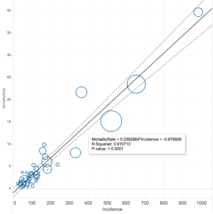
3. How useful are Covid-19 case data? According to the New York Times, as of April 14th, there were over 600,000 reported cases of Covid-19 in the US. But, as we all know, the diagnosis of the virus has been hampered by a lack of testing capacity, and there are good reasons to believe that there are many undiagnosed cases. While that hampers our ability to understand the scale of the pandemic, its less of a problem for judging its geographic concentration. We take a close look at the correlation between case counts and deaths (which are less influenced by testing capacity), and find that cases are a good proxy for deaths at the metro level. That gives us confidence that the case data are a useful way of judging the relative severity of the pandemic in across metropolitan areas.
Must read
1. The Covid-19 recession will put a big dent in global greenhouse gas emissions. Its hard to know at this point exactly how big the reductions will be, but we have a range of estimates that ballpark the likely change. The Carbon Tax Center’s Charles Komanoff estimates that the Covid response (and recession) could reduce global carbon emissions by more than 20 percent, enough to lower the atmospheric concentration of CO2 by about 1 part per million compared to what it would otherwise be.
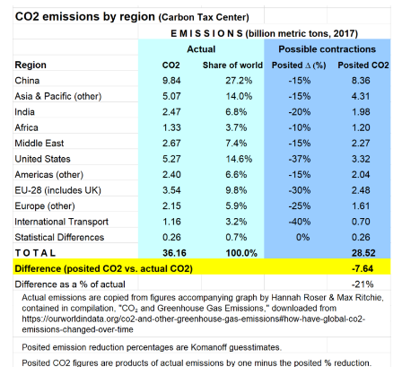
Other estimates suggest a smaller effect–a decline of about 4 percent in greenhouse gas emissions. Which forecast is correct probably depends on the severity and duration of the Corona pandemic and its economic aftermath.
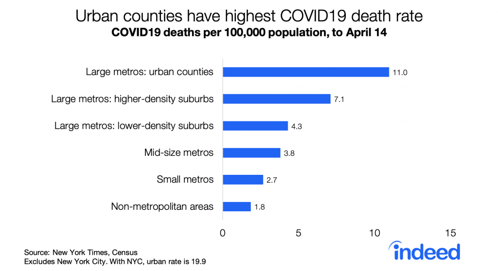
2. Jed Kolko’s statistical analysis of county-level Covid-19 death data. Indeed economist Jed Kolko has a detailed regression analysis of the correlation between county characteristics and the rate of reported Covid-19 deaths. He finds that the death rate has been higher in more populous and denser counties, specifically:
Death rates are higher in counties with a higher share of 60-plus, Black, Hispanic, or Asian residents, and in places where March 2020 was colder. Death rates are higher in denser counties and in more populous metros, but also in counties with a lower share of college-educated residents — and education, density, and metro size are all strongly positively correlated.
He reports that much of the effect of density on the observed results is attributable to the large number of cases in New York City and its surrounding counties, but he finds that the death rate still varies along the urban/rural continuum when one excludes New York City.
3. Todd LItman on cities and health. There’s a lot of speculation that pandemic-inspired health concerns will propel an exodus from cities. But a careful look at health data shows that cities are conducive to better health. Todd Litman has, as usual, a methodical summary of the literature and data. The key takeaway:
In fact, most people are far better off before, during and after a disaster living in an urban area that provides convenient access to essential services and activities than moving to an isolated rural area. Cities are significantly safer and healthier overall, resulting in lower mortality rates and longer lifespans than in rural area . . . Rural residents have shorter lifespans due to higher rates of cardiovascular, respiratory and kidney diseases, unintentional injuries lung and colorectal cancer, suicide, diabetes, Alzheimer’s disease and birth defects. These urban-rural differences are even greater for poor and minority groups.
New Knowledge

In the News
Portland’s KXL radio interviewed City Observatory director Joe Cortright about the likely impacts of the economic downturn trigger by the Covid-19 pandemic.
The Chicago Tribune cited City Observatory’s report “Less in Common” in an article addressing the ways that the pandemic is likely to change our inter-personal relationships.
