Reported case data correlate strongly with Covid-19 deaths, and provide a reasonable basis for assessing the geographic pattern of the pandemic across US metro areas.
A critical question in judging the state of the Covid-19 pandemic is understanding how many people have the virus, and how fast it is spreading. Because of a shortage of testing capacity, because of medical prioritization of testing, and because we simply aren’t testing people randomly, we can’t be sure how many people actually have the virus, which is problematic because many who are infected are asymptomatic, and at the same time, contagious. What that means is, that as some very sharp analysts like Nate Silver have pointed out, their are real limitations to the case data.
At City Observatory, we’ve been using the case data with open-eyes about the limits of the data. We’ve restricted our analysis of data to compiling metropolitan area estimates of the cumulative number of cases and the daily growth rate in reported cases (averaged over a 7-day period). Our purpose with these estimates is to better understand the relative geographic incidence of the pandemic across large metro areas. That’s a less challenging task that estimating the “true” number of infected persons.
Its highly likely that the reported cases in any metro area are influenced by testing capacity, medical decisions (i.e. not testing obviously sick persons when tests are in short supply), and other factors. There are also lags in daily reporting that may influence statistics.
The best way we have of validating the reliability of the case data for the purpose of geographic comparisons is to ask how well they correlate with other objective measures of the relative geography of Covid-19. Arguably, reported deaths attributed to Covid-19, though far less numerous than cases, may be a more reliable measure, albeit a lagging one. These mortality statistics are less likely to be affected by other factors (like lack of tests), and systematic under-counting. As Nate Silver recommends, you’ve got to look beyond the case counts to more robust measures of how the diseases is progressing, which is what the death data tell us:
I hope you’ll be a more educated consumer of COVID-19 data instead of just looking at case counts ticking upward on cable news screens without context. That context includes not only reporting about the amount of testing, but also indications such as hospital strain, which are more robust since they aren’t subject to as many vagaries about how tests are conducted.
So, how do reported cases compare to deaths? Here we plot the number of reported cases per 100,000 population against the number of reported deaths per 100,000 population for US metro areas with one million or more population.
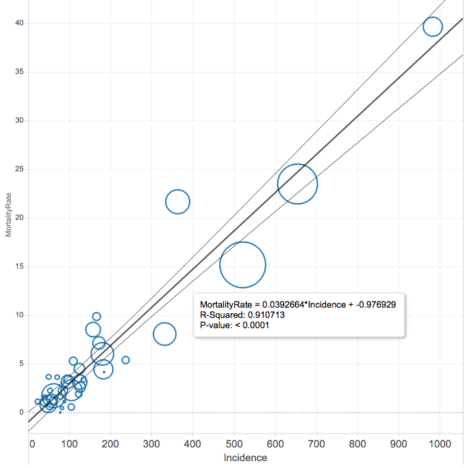 There is an extremely strong correlation between the two figures: the coefficient of determination is 0.91. The regression line implies an overall death rate of about 4 percent of reported cases. As we’ve already stipulated, that’s not necessarily a valid estimate of the death rate for those infected, because testing may systematically under-estimate the total number of persons infected by the virus. But this very high level of correlation suggests that, despite the vagaries of the testing process, the reported number of tests in a metropolitan area is a good predictor of the number of deaths due to Covid-19.
We get similarly strong correlations whether we look at state-level data (the coefficient of determination is also 0.91 between tests per capita and deaths per capita for states, and also for counties (restricting our sample to counties with a population of 100,000 or more produces an r-squared value of 0.82.
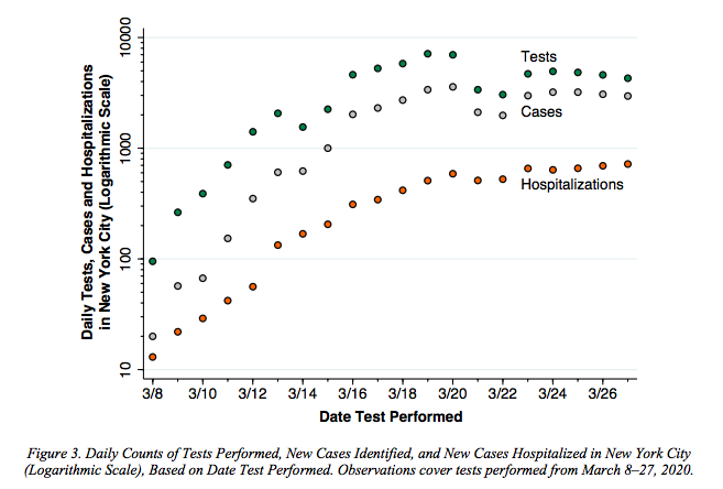
Other research finds similar symmetries among these data sources. Jeffrey Harris, in a new paper focusing on New York, examines the various indicators of the pandemic and concludes that there is sufficient evidence to conclude that the curve is flattening. He writes:
As in the case of most pandemics, scientists and public officials don’t have complete, accurate, real-time data on the path of new infections. Despite these data inadequacies, there already appears to be sufficient evidence to conclude that the curve in New York City is indeed flattening.
His analysis shows that tests and cases closely track hospitalizations:
For what it’s worth, other analysts, including The New York Times (from which we draw our county-level data), Indeed’s Jed Kolko, and Yonder’s Bill Bishop and Tim Marrena, and the Marron Institute’s Solly Angel and his colleagues are also making use of these county level estimates to assess the relative geographic prevalence of the virus across the US.
There’s a lot case data can’t tell us about the true breadth of the pandemic and the actual number of people now infected. But for the narrow purpose to which we’ve put the data at City Observatory: estimating the variation in the pandemic’s prevalence across large metropolitan areas, we’re confident that it provides a good deal more signal than noise.
