The states with the worst diets voted disproportionately for Donald Trump
A powerful new study from uses big data to shine a powerful light on our eating habits. Using data from grocery store scanner records, Hunt Allcott, Rebecca Diamond, and Jean-Pierre Dube (researchers from the New York University, Stanford and the University of Chicago, respectively) developed a detailed profile of what consumers buy in different parts of the country. Linking this information with the nutritional labeling of products, they were able to characterize the variations in the fat, calories and protein of the various products we buy.
The purpose of their work was to examine the food desert hypothesis–to see whether proximity to full-line grocery stores shapes purchasing habits and actual diets. (It doesn’t; personal characteristics, like income and education are much more important in determining diet than distance to healthy food outlets; opening more full-line grocery stores has almost no impact on shopping and diets in so-called food desert neighborhoods.).
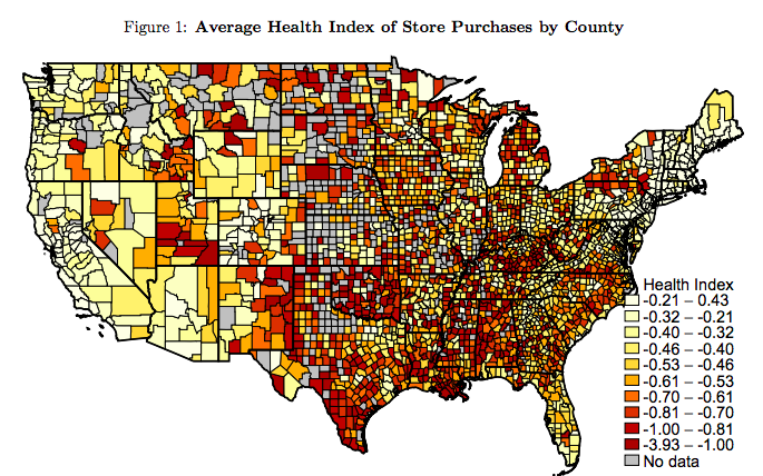
Their data allow us to paint a very detailed picture of the geography of nutrition in the US. Here’s their county level map, with the healthiest eaters shown in the light colors and the least healthy in the darker colors. It shows that the most healthy eaters are concentrated on the East and West Coasts, and that those in the interior states, and especially in the south, eat the least healthy diets. Just as with many things, it looks like our nation is highly polarized.
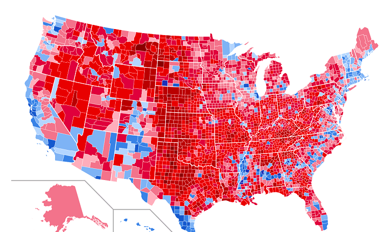
It struck us that we’ve seen this pattern before: in county-level election maps. Here are the results of the 2016 presidential election, coded with the familiar red/blue republican/democrat shading. Darker colors signify relatively larger margins for the dominant party. As you can see, there’s a strong similarity between this map and the one on nutrition.
We don’t want to place too much reliance on visual evidence; so we’ve done a quick bit of statistical analysis. We don’t have access to the county level data, but Alcott, Diamond and Dube did publish a color-coded map showing state-level nutritional scores. We took the values indicated on this map and compared them with Donald Trump’s electoral margin in each of the 48 contiguous states (positive values indicate a victory for Trump). The following scatter chart show’s Trump’s victory margin (on the horizontal axis) and the state’s relative nutritional score on the vertical axis). Higher scores on the nutritional axis correspond to a healthier diet.
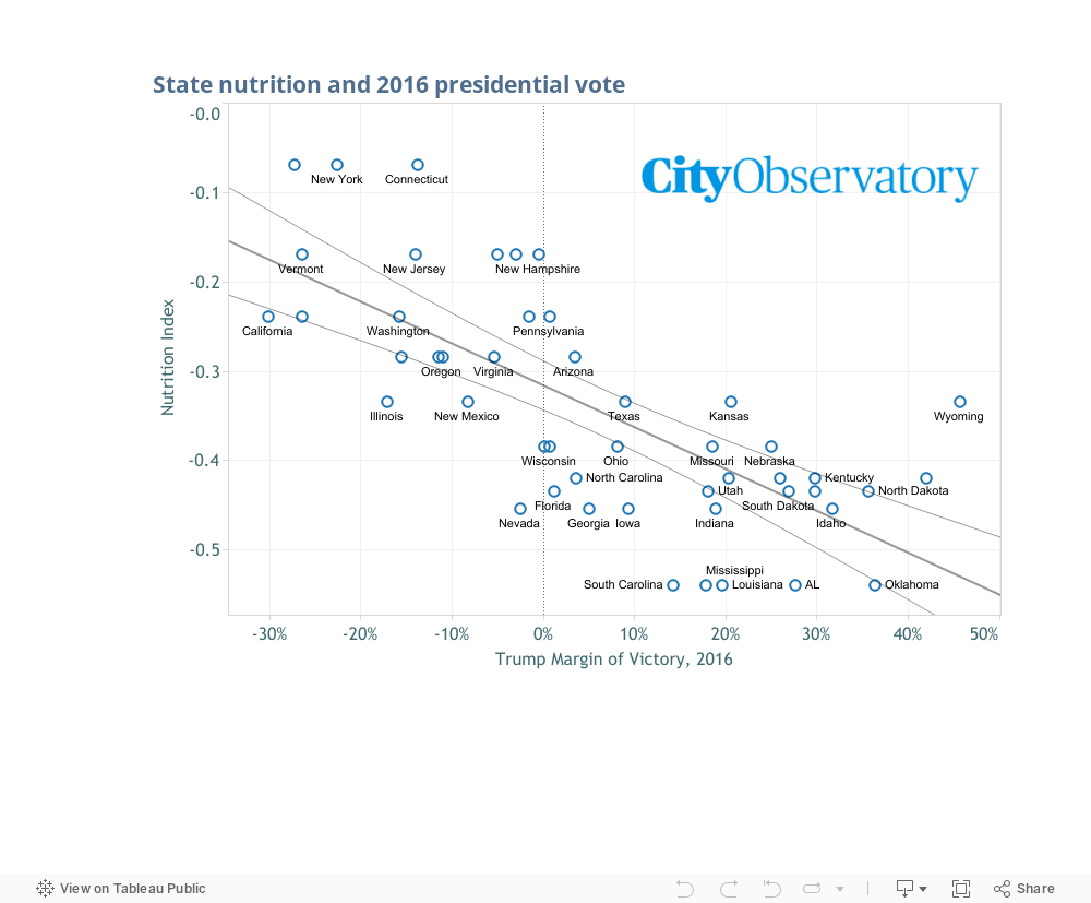
Overall, there’s a pretty strong correlation between the two data series. Statistically, the coefficient of determination (r-squared) between the two data series is .51, suggesting that nutrition alone explains about half the variation in state voter margin. The healthier a state’s eating habits (at least as evidenced by the shopping data) the more likely they were to vote for Clinton. Conversely, the least healthy states (we’re looking at you Alabama, Oklahoma and Louisiana) had the largest margin of victory for Trump. There’s a clear pattern here: 16 of the 18 healthiest states voted for Clinton; 24 of the 25 least healthy states voted for Trump.
The usual caveat, that correlation doesn’t mean causation, definitely applies here. You might be tempted to assume that voters in states with less healthy diets feel a special affinity for a candidate with a well-documented weakness for junk food. But it’s just as likely, as in the case of Alcott, Diamond and Dube’s study, that there are other factors–notably education and income–that influence both one’s dietary choices and one’s presidential preference. That said, there’s a certain symmetry between recent reports about the President’s eating habits and the dietary patterns of his electoral support.

It’s food for thought.