Part 2: A curious discrepancy between two major congestion reports using the same data
Yesterday, we explained why one of the most common takes on the Texas Transportation Institute’s “Urban Mobility Report” is actually totally unjustified: Though many media outlets repeat the UMR’s claim that traffic delays are worse today than it has been since 1982, TTI completely changed the way it measured congestion in 2009, making comparisons before and after that date impossible. Moreover, its pre-2009 data are based on estimates that have shown to be biased in favor of showing more congestion than actually existed.
Since then, TTI has walked away from its pre-2009 approach, when it couldn’t measure speeds directly and so used traffic volume data to estimate them instead. Since 2009, TTI has used data from Inrix, a company that uses data from vehicles connected to electronic networks to measure travel speeds in real time. In theory, at least, the switch to Inrix data should be more reliable.
But there’s a problem—a very big problem.
There’s a profound and unexplained discrepancy between the travel trends in TTI’s latest report and those reported by Inrix. For the period 2010 to 2014, Inrix says that traffic congestion is down by 29 percent—while TTI says it’s up by 4.7 percent.
The TTI report neither acknowledges nor explains the discrepancy between its tabulation of the Inrix data and and that reported by Inrix.
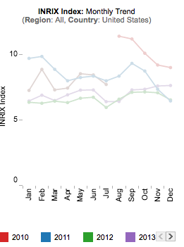
For years, Inrix has regularly published monthly metro- and national-level data on its National Traffic Scorecard. We’ve been following these data for years, as they provide an unique perspective on shifting travel patterns. The Inrix website reported these data monthly from January 2010 through July 2014. Like the Texas Transportation Institute, Inrix reported both a “travel time index”—ratio of travel times in peak to off-peak hours, and the additional amount of time in hours trips took due to traffic congestion.
Inrix’s National Traffic Scorecard data show that traffic congestion peaked in 2010, declined through 2011 and 2012, and has risen slightly in 2013 and 2014. In a May 2012 press release entitled: “Traffic Congestion Plummets Worldwide: INRIX Traffic Scorecard Reports 30 Percent Drop in Traffic Across the U.S.” Inrix said its Annual Traffic Scorecard revealed “a startling 30 percent drop in traffic congestion in 2011.” According to data on the Inrix website, average congestion levels, as measured by the travel time index from August 2013 to July 2014 (the latest 12-month period for which Inrix disclosed this data on its website) were 29 percent lower than recorded in calendar year 2010 (the earliest 12 months in its data reported on the website). A direct reading of the Inrix data suggests that time lost to traffic congestion in 2014 was lower, by nearly a third, than in 2010.

Moreover, it’s interesting to note that INRIX reported widespread declines in traffic congestion in almost all major metropolitan areas between 2010 and 2012. A majority of large metropolitan areas saw traffic decline by more than a third; only one metropolitan area—Austin—recorded an increase in congestion.

(Monthly Inrix data compiled from the Inrix National Traffic Scorecard; see postscript for further details)
In contrast, the Texas Transportation Institute’s 2015 Urban Mobility Report claims that the average peak hour trip took 21 percent longer than a non-peak trip in 2010, and 22 percent longer in 2014—an increase of 4.7 percent over four years. Their annual figures suggest that congestion was flat through 2010 and 2011, and increased in 2014.
To be clear, we don’t doubt that TTI’s numbers are in fact based on the underlying Inrix data. But the fact that they come to such different conclusions from Inrix’s publicly available numbers suggests that something else is going on—some notable set of assumptions, for example. Unfortunately, TTI’s report does not itself explain how it reached these figures, even though this is not the first time we (or others) have pointed out this discrepancy.
On top of this, there’s another issue: in addition to finding different trends, Inrix and TTI suggest very different current levels of congestion, with Inrix’s estimate being much lower than TTI’s. Inrix says that in 2014, congestion caused the average trip taken in the peak hour to be 7.9% longer than the same trip taken at another time. TTI says that in 2014, congestion caused the average peak-hour trip to be 22% longer than off-peak. As a result, TTI claims the average traveler experiences 42 hours of delay per year, while Inrix estimates that number at just 13.7 hours.
The fact that two different summaries of the same underlying data produce such remarkably different results demands an explanation. There is probably some clear, explicable reason why the two studies produce different results. Again, it’s likely that the two studies used different assumptions. But the fact that different assumptions can produce such wildly different—and in this case, conflicting—results tells us that the conclusions presented here are highly sensitive to the assumptions used. And in neither case are the assumptions or the calculations sufficiently transparent that any independent third party can verify these claims.
And that’s important because the researchers at the Texas Transportation Institute, despite their residence in an academic institution (Texas A&M University), have repeatedly declined to submit their work for peer review. Given the wide variation in the results, the absence of clarity in the methodology and assumptions, and the lack of peer review, no one should put any weight on the claims of the Texas Transportation Institute that it can accurately measure or faithfully report the level or trend of traffic congestion in the nation.
A Post-Script: Disappearing Data
Unfortunately, the Inrix website no longer displays monthly data showing the Inrix calculation of the travel time index and hours of time lost for the US and metropolitan markets. It appears that the link to this data was removed from the Inrix website on August 27, 2015.
At City Observatory, we’ve bookmarked and regularly visited the Inrix National Traffic Scorecard page. For several years, the page has featured a Tableau data presentation which allows users to view current and historic traffic congestion data for entire nations and for selected metropolitan areas. The Tableau page is interactive and shows line charts indicating the travel time index for a selected geography for several months and years. Inrix stopped updating the monthly market-level travel time index data with July 2014. (These data are the source of the monthly national Inrix congestion numbers reported in the first chart in this commentary).
On August 26th the Scorecard page included data from 2010 through 2014, including an interactive chart that looked like this:
Following the release of the Texas Transportation Institute’s report, the link to the Tableau data was removed from this page and replaced with a page of text with links to the Texas Transportation Institute’s urban mobility scorecard page.
Relying on our cache of the original website, and links identified by the Wayback Machine, we identified the address of the Tableau files containing the National Transportation Scorecard. They are located here.
