How brain drain measures can mislead

A new measure purports to gauge city attractiveness by measuring whether local college graduates stick around. But these raw numbers can be a misleading indicator, and we’ll show how it can be adjusted to more accurately measure how good a job a city is doing of producing and retaining talent.

There’s powerful evidence that the educational attainment of population is the single most important factor affecting a region’s economic success. We’ve observed that you can explain about 60 percent of the variation in per capita incomes among metropolitan areas simply by knowing what fraction of the adult population has completed a four-year college degree. While there are many ways to increase a region’s talent base, one core strategy is doing a great job in educating your own young people—and then building the kind of community that they will want to stay in.

Is Detroit doing particularly well in fighting brain drain? Credit: Bryan Debus, Flickr


Does retaining local graduates mean you’re stemming brain drain?

But measuring the migration of talented workers can be tricky. In a recent article in CityLab, “The U.S. Cities Winning the Battle Against Brain Drain,” Richard Florida presents some findings on the tendency of college graduates to stay in the metropolitan areas where they got their degrees. Using data cleverly assembled by the Brookings Institution’s Jonathan Rothwell and Siddharth Kulkarni from LinkedIn profiles, Florida shows which cities have the highest and lowest levels of retention of college graduates.

Some of the results are, at least at first glance, surprising. According to the Brookings figures, the Detroit metro has retained 70.2 percent of its graduates—one of the highest figures in the nation. This seems surprising, because the Detroit metro area actually experienced a 10 percent decline in the number of 25- to 34-year-olds with a four-year degree between 2000 and 2012 (as we documented in our report, “Young and Restless”).

Conversely, fast-growing tech powerhouse and hipster haven Austin, Texas ranks among the ten lowest cities, handing on to just 38.2 percent of its recent college graduates.

What’s going on here?

Well, it turns out that this particular set of college graduate retention statistics tell us a lot more about the size and characteristics of the local higher education system than they do about the attractiveness of the local city, either in terms of its amenities or its job prospects. In other words, it’s more about the supply of college graduates produced by local colleges and universities than the demand of college graduates for living in a particular city.

Different cities have different kinds of higher ed systems

To understand why, think about two kinds of cities. In a college town like Madison, WI or State College, PA—or even larger cities with high concentrations of college students, like Boston or Austin—the local colleges or universities are effectively a big export industry, producing far more degrees than the local economy demands, and then shipping them out to a statewide, regional or national market. Students come to Austin from all over to get a degree at the University of Texas, and many return to their hometowns—or relocate somewhere else for a job—immediately after graduating.

The University of Wisconsin exports graduates all over the state, country, and world. Credit: Ron Cogswell, Flickr


In other cities, the local colleges and universities aren’t so “export-oriented.” In these cities, local higher education mostly serves the local market. As a result, graduates in these cities are more likely to remain in the city where they studied, because that’s where they started out. These cities will have a much higher “retention rate” than export-oriented higher education markets, but that has everything to do with who’s coming in, and much less to do with how attractive graduates find the city when they get out. The key here is that the difference is in thehigher education institutions, not the cities they’re located in.

As part of our research for the Talent Dividend Prize—a competition funded by the Kresgeand Lumina Foundations—to see which US metropolitan area could achieve the largest increase in the number of two- and four-year college degrees awarded to local students over a four-year period, we assembled data from the Integrated Post Secondary Education Data System (IPEDS) on the number of college degrees awarded in large metropolitan areas. Among the 50 largest metropolitan areas, the number of BA and higher degrees awarded in 2012 varied from a low of 2.8 (in Riverside, California) to a high of 17.5 (in Phoenix, Arizona). The typical large metropolitan area grants about 8 BA or higher degrees per 1,000 population on an annual basis.

In the following table, we’ve matched our BA degree award rate data with the information provided by Brookings on the BA retention rate for the ten highest rated and ten lowest rated metropolitan areas.


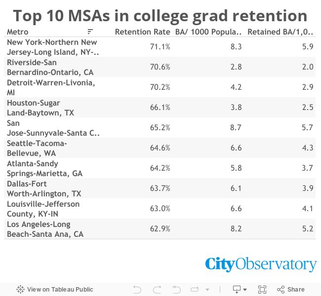
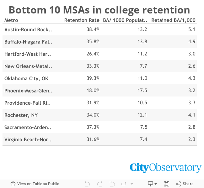
There’s an obvious pattern here: Metropolitan areas with high levels of BA retention have very small higher education establishments (as measured by the number of BAs awarded per 1,000 population. Conversely, metro areas with low levels of BA retention have, on average, much higher levels of BA award granting. This is exactly what we’d expect when thinking about cities that are home to large universities that attract many students from elsewhere.

To get a better sense of whether a metro area is experiencing a brain drain or a brain gain, when can combine these data. The final column of the tables does that by multiplying the number of BA degrees issued per 1,000 population by the BA retention rate. This is a rough estimate of the number of additional BA degree holders (per 1,000 population) who reside in a metro area after graduation.

These data come closer to our intuition about which places are gaining talent. Larger metropolitan areas (New York, Los Angeles) have relatively high rates of local BA growth (5.9 and 5.2 per 1,000 population respectively. Cities with strong tech economies, like San Jose (5.7) also do well on this measure. Conversely, economically challenged places don’t do as well—Detroit’s local BA per 1,000 population rate is 2.9; even though it does a relatively good job of retaining those who graduate locally, the size (or at least output) of local higher education institutions is so small (relative to the size of the region), that it is not gaining talent as much as the other areas on this list.

So, as it turns out, the retention rate of college graduates is at best an incomplete indicator of whether cities are stemming the tide of a brain drain (or not). If local higher education institutions are small, and chiefly serve students from local high schools, a high retention rate is not necessarily a sign of success. Conversely, if your area colleges and universities are large and attract students from around the nation, a low retention rate may not be a sign that you’re doing poorly.

Cities matter even before graduation

As these data make clear, the competition for talent begins long before students receive their bachelor’s degree. The number and kind of local colleges and universities is a decisive asset in positioning a city to attract talent.

At least a portion of the brain drain dynamic occurs when students decide where they are going to college. For metros like Detroit, where there are relatively fewer local universities than in the typical metropolitan area, more students are going to leave the local metro area to get a degree. And even if a high number of those who study locally stick around (as appears to be the case) that effect can easily be swamped by those who leave for college and never return. (Detroit’s college and universities award about 4 degrees per 1,000 population annually; compared to about twice that many for the typical metropolitan area). Because local universities and colleges are so small, relative to the average, Detroit has to retain 100 percent of its graduates to have as many new BA degree holders, proportional to its population, as a metro see half of its graduates migrate away.

For some students, the city in which their university is located can be an important factor in deciding where to enroll. Part of Philadelphia’s “Campus Philly” recruiting program—aimed at out of town students— has been to promote the city’s urban amenities as one of the advantages of choosing one of its many local colleges and universities. The program follows up with activities and internships that look to connect students to the community while in school and after graduation.

Nurturing, attracting and retaining talent are all mutually reinforcing strategies for bolstering the regional economy. Cities need to pay attention to the size and quality of their colleges and universities, as well as to build the kind of communities that they (and other well-educated persons) will want to live in. Because this process is so multi-faceted, no single measure captures all of the dynamics at play. What we’ve provided here shows that a simple retention rate is not enough to understand whether a city is doing well in attracting and retaining college grads.

Data notes

The numbers for Phoenix are something of an anomaly. The University of Phoenix, the nation’s largest distance learning institution reports its BA degrees to IPEDS as being awarded in the Phoenix metropolitan area, even though nearly all of its students are located in other metropolitan areas. This tends to greatly exaggerate its local output of graduates.

What works, and what doesn’t, with housing vouchers

Earlier this month, a report in Chicago pointed to some of the tensions implicit in a desegregation-oriented federal affordable housing program.

The Sun-Times, with that city’s Better Government Association, published a “watchdogs” feature on housing choice vouchers. The big news: while some voucher holders pay relatively large proportions of their rents, others pay much less, or nothing, for apartments that cost much, much more—sometimes well over what an employed, working-class family could afford.

These findings aren’t necessarily scandalous: different voucher holders living in very different neighborhoods and paying different amounts of money is how the system is designed to work. But it’s a good excuse to take a closer look at a program that serves over five million people in 2.2 million households, but whose details remain muddy to many people.

Housing choice vouchers, previously known as Section 8, were created by Congress in 1974 as a response to perceived failures in the traditional public housing program, whose modernist towers had been tarnished with poor construction and maintenance, extreme economic and racial segregation, and high crime rates. (Notably, however, some academics have challenged this narrative of failure—for one example, look to Nicholas Bloom’s Public Housing that Worked.)

The Pruitt-Igoe public housing complex in St. Louis, before its 1972 demolition. Credit: US Geological Survey


The idea was that rather than living in government-owned buildings, low-income people would receive rental subsidies to live in privately-owned buildings of their selection. That way, they could—in theory—choose where to live, and break the patterns of segregation that public housing projects had often reinforced. For the architects of the program, then, the news that some voucher holders were living in wealthy downtown neighborhoods while others lived in more modest communities would have been exactly what they hoped for.

And what about paying different amounts? Well, what vouchers are worth depends on two things: how much rent is, and how much income the voucher holder has. In general, voucher holders pay 30 percent of their income towards rent, and the voucher picks up the difference between that and the total cost of their apartment up to a HUD prescribed maximum limit, calculated to reflect the price of a modest apartment in the local market. So if you make $1,000 a month, and your rent is $1,000, you pay $300 and the voucher will cover the other $700. If you make $500 a month and your rent is $1,200, you pay $150 and the voucher covers $1,050. Because the point is to help low-income people expand their housing choices while requiring them to pay according to their financial ability, different people receiving very different amounts of money for their voucher is pretty much built into the DNA of the program.

But there is a wrinkle. Vouchers are only supposed to allow their recipients to live in “reasonable” apartments, and so each year HUD calculates a “fair market rent” (or FMR) figure for each metropolitan area, which is supposed to roughly approximate the cost of a slightly below-average apartment in the region. Vouchers will only cover rents up to this FMR.

But FMR essentially averages rents across what can be vast geographic, social, and economic distances, including far-flung suburbs, tony downtown districts, and very poor neighborhoods. As a result, the final number might be too low to afford many neighborhoods with good access to jobs, high-performing schools, and other amenities—the very places that vouchers are supposed to allow low-income people to live.

One strategy for getting around this problem has been “exception rents.” Several public housing authorities, under a little-appreciated demonstration program called Moving to Work, have received permission to give vouchers for apartments with rents above FMR. In some cases, the limit is 120 percent of FMR; in others, 150 percent. Chicago appears to be an outlier in having granted permission for payments going up to 300 percent of FMR, leading to situations in which a handful of voucher recipients could afford to live in extremely high-end new buildings—though the Chicago Housing Authority has announced that it is phasing out those rents and lowering the limit to 150 percent of FMR over the next few years.

While reporting on these “exception rents” has led to hand-wringing about how well voucher recipients “deserve” to live, the policy is responding to a serious problem: namely, the failure of vouchers to actually challenge the patterns of segregation they were meant to dismantle. (We would also point out that, if the question is about “fairness” of housing subsidies, the entire voucher program is smaller than tax giveaways to relatively affluent homeowners.) Voucher recipients do live in neighborhoods that are somewhat less racially segregated, and have lower levels of poverty, and better access to some resources than residents of traditional public housing projects, but the differences are far more modest than proponents might have hoped.

Part of the problem, surely, is discrimination against voucher holders—which is perfectly legal in most places, and rampant even where it’s illegal. Another issue is transportation costs, which can make some suburban, car-dependent locations unaffordable even if the housing costs themselves are not. Another issue may simply be that voucher recipients have social support networks in their current neighborhoods that they can’t afford to give up by moving away. But as important as these other issues may be, to the extent that HUD’s “fair market rents” are simply too low to reach many neighborhoods, that’s clearly a barrier.

Besides “exception rents,” HUD is also testing a new strategy for getting around this problem: “small-area FMRs.” Essentially, instead of calculating fair market rents for entire metropolitan areas, they’ll be determined by ZIP code. So in Chicago’s south suburb of Thornton, vouchers would only cover 78 percent of FMR, or $830 for a two-bedroom apartment. In the wealthier West Loop neighborhood, vouchers would cover about 148 percent of FMR, or $1,560 for a two-bedroom apartment.

But even here, “small area” FMRs would be capped at 150 percent of the regional average, even if local rents are far higher. So in north suburban Lincolnwood, vouchers will cover no more than $1,590 for a two-bedroom apartment—even though HUD’s own figures suggest that local rents are nearly $500 higher.

Of course, some would argue that vouchers don’t need to make every neighborhood available. Much of the outrage generated by the Sun-Times/BGA piece revolved around the idea that some living conditions are too good for people receiving vouchers.

Ironically, though, what counts for some people as “abuse” of the federal voucher program is exactly what one of the most popular local affordable housing policies is all about. Inclusionary zoning is premised on the idea that new, often luxury buildings should be setting aside some units for low-income people. The difference isn’t the kind of units that low-income people get to live in—it’s whether there’s any direct cost to taxpayers.

But as we’ve written before, there’s no getting around it: below-market housing is necessary, and it costs money. When it comes to other major social priorities, like food stamps, public schools, or Medicaid, most people realize that the only way to fund the necessary programs is with broad-based taxes: “impact fees” on grocery stores or doctors just don’t cut it.

But when it comes to housing, we too often expect that if developers are just squeezed a little more, we’ll have all the low-cost housing we need. It’s not true. As it is, funding is so sparse that only a quarter of households that qualify for low-income housing assistance receive it; meanwhile, voters are happy to approve much larger subsidies for middle- and upper-class homeowners. Figuring out how to make vouchers as the poverty- and segregation-fighting tools they were intended to be, in as financially efficient a way as possible, is an important goal. But whatever the answer is, it will require us to decide we care enough about affordable housing to pay for it.

Why mixed-income neighborhoods matter: lifting kids out of poverty

There’s a hopeful new sign that how we build our cities, and specifically, how good a job we do of building mixed income neighborhoods that are open to everyone can play a key role in reducing poverty and promoting equity. New research shows that neighborhood effects—the impact of peers, the local environment, neighbors—contribute significantly to success later in life. Poor kids who grow up in more mixed income neighborhoods have better lifetime economic results. This signals that an important strategy for addressing poverty is building cities where mixed income neighborhoods are the norm, rather than the exception. And this strategy can be implemented in a number of ways—not just by relocating the poor to better neighborhoods, but by actively promoting greater income integration in the neighborhoods, mostly in cities, that have higher than average poverty rates.

In the New York Times, economist Justin Wolfers reports on groundbreaking work by Eric Chyn of the University of Michigan that found previous research may have understated the effect of neighborhoods on lifetime earnings and employment. The paper shows that moving low-income children in very poor neighborhoods to less poor neighborhoods can have a major positive effect on their life chances.

Most media outlets have covered this story as reinforcing the importance of “mobility programs”: that is, policies that encourage residents of very low-income neighborhoods to move to more economically integrated areas, usually with some form of direct housing assistance like vouchers. And the ability to move to neighborhoods with good amenities and access to jobs, without having to pay unsustainable amounts for housing or transportation, is a crucial part of creating more equitable, opportunity-rich cities.

But the coverage may be missing the other half of the policy equation: Chyn’s paper adds to the evidence about the value of mixed-income neighborhoods in general, not just mobility. That means it’s just as important that cities find a way to invest in low-income neighborhoods to bring opportunity to them, rather than simply trying to move everyone out.

Why the new research is so important

The results of the voucher demonstration illustrate that there can be large benefits from even modest changes in economic integration. The average household moved about 2 miles from their previous public housing location, and still lived in a neighborhood that had a higher than average poverty rate. Chyn’s results show the effects of moving from neighborhoods dominated by public housing (where the poverty rate was 78% on average), to neighborhoods that had poverty rates initially 25 percentage points lower, on average. Most participants still lived in neighborhoods with far higher levels of poverty than the typical American neighborhood. But compared to their peers who remained in high poverty neighborhoods, they enjoyed better economic results later in life.

This chart shows that children who moved out of very low-income neighborhoods were about 5-10 percentage points more likely to be employed as adults.


In this chart, you can see the growing earnings benefit to children who left very low-income neighborhoods in their adult years.


This study—on the heels of a widely-cited study led by Harvard economist Raj Chettyreleased last year—adds even more heft to the growing body of evidence that helping people with lower incomes move to mixed-income neighborhoods can play a huge role in spreading economic opportunity.

The new research improves on older studies by getting rid of an important confounding factor that affected some earlier research by more closely replicating a true “natural experiment.”

The experiment was made possible by the decision to demolish large scale public housing in Chicago in the early 1990s. The families dislocated from the old style public housing—which were in neighborhoods of extremely concentrated poverty—had to find new housing. The Chicago Housing Authority (CHA) provided the families with vouchers to move to privately operated rental housing, typically in neighborhoods with far lower levels of poverty. The kids who moved to new lower-poverty neighborhoods saw a significant increase in their lifetime earnings compared to otherwise similar kids who remained in the public housing that wasn’t torn down.

This natural experiment has an important advantage over the “Moving to Opportunity” (MTO) housing experiment conducted by the federal government in the 1990s. In MTO, public housing households had to apply for a voucher lottery. This created the possibility that the people who had applied were particularly motivated and able to make the transition to a new neighborhood. That would mean that even those households that lost the lottery might have better-than-average outcomes, reducing the gap between those who moved and those who didn’t, and making the effect of moving appear smaller than it really was.

But unlike MTO, the participants in the CHA relocation program were not self-selected. They represented a more or less random cross-section of public housing residents, and so the differences between the outcomes of treatment groups (those who got vouchers) and those who didn’t (control groups) could be treated as purely the result of the voucher program.

The policy implication: Mixed-income neighborhoods promote opportunity

But it’s important to put this finding in a broader context. Evidence about mobility programs, in turn, are part of a larger body of research that neighborhoods matter for economic opportunity. While the focus has been helping people leave neighborhoods with high concentrations of poverty, it’s also possible to bring investments and resources to these communities.

Of course, when that happens, it often happens in conjunction with—or even because of—a return of middle- and upper-income people to the neighborhood. In other words, gentrification.

For some, that’s enough to reject that policy avenue. But some research suggests we ought to give it another look. While news from neighborhoods in San Francisco and Brooklyn, where incredibly high levels of demand and tight supply have led to spiraling housing costs, makes it sound like gentrification inevitably and utterly displaces all a neighborhood’s residents, other research suggests that displacement is far less widespread than commonly thought. While housing costs can be an issue, a recent study from the Philadelphia Federal Reserve suggests that displacement is much less common than we might expect—and another study of New York public housing residents in gentrifying areas showed an increase in earnings and school test scores.

This research also occurs against a backdrop of widening inequality and economic segregation. And inequality has an important spatial dimension: low-income and high-income households are increasingly segregated from one another in separate neighborhoods. As we’ve documented in our research at City Observatory, the effects of this segregation on the poor, in the form of the growing concentration of poverty, are devastating, and the number of Americans living in neighborhoods of concentrated poverty in large metropolitan areas hasmore than doubled since 1970, from 2 million to 4 million.

While the spatial response, as we’ve said, has focused on mobility, enabling the poor to move to higher income neighborhoods is challenging for a number of reasons. The raison d’etre of many suburbs is exclusion—using zoning requirements to make it essentially impossible for low income households to afford housing—and efforts by outside organizations or governments to reduce these barriers have been difficult. If we want to make the biggest difference in economic integration, we need to try to integrate low-income neighborhoods as well as high-income neighborhoods.

Neighborhoods for everyone

Taken together, the new Chyn results add to the growing body of literature on neighborhood effects and strongly suggest that we ought to be looking for all kinds of opportunities, large and small, to promote more mixed-income neighborhoods. Even the small steps—like lowering the poverty rate in a kid’s neighborhood from 75 percent to less than half—pays clear economic dividends.

But we also need to remember that integration isn’t just about moving around people with low incomes. We can reinvest in neighborhoods of concentrated poverty in ways that improve quality of life and enhance opportunity in place.

The Week Observed: March 25, 2016

What City Observatory did this week

1. When supply catches up to demand, rents go down. While stories about crazy housing markets tend to focus on big, coastal metropolitan areas, it turns out there’s a lot to learn from looking at Williston, ND. That sleepy town began to boom thanks to oil, and its housing market responded the way markets respond to rapidly growing demand: prices spiked. But in Williston, housing supply could also respond, and the number of building permits increased by nearly 1,200 percent between 2009 and 2012. Thanks to a combination of growing supply and falling demand as a result of the fall of oil prices, rents have also dropped dramatically. The lesson is that supply and demand matter—but also that there is a structural lag in supply. Demand can change much more quickly, and until supply can catch up, it will push prices upwards.

2. It’s time for a “big short” in parking. In the popular movie “The Big Short,” investors who predicted the bursting of the housing bubble made a killing by betting against rising housing prices. We think there’s a case to be made that we should be “shorting” investments in parking garages: between changing preferences for urban, car-lite living and the implications of widespread self-driving cars, demand for parking may crash in the near future. That would leave many cities with outstanding bonds backed by parking revenue in a pickle.

3. It’s time for a “big short” in parking. In the popular movie “The Big Short,” investors who predicted the bursting of the housing bubble made a killing by betting against rising housing prices. We think there’s a case to be made that we should be “shorting” investments in parking garages: between changing preferences for urban, car-lite living and the implications of widespread self-driving cars, demand for parking may crash in the near future. That would leave many cities with outstanding bonds backed by parking revenue in a pickle.

4. A field guide to median rent statistics. We’ve written before that journalists and readers should be extremely wary of apartment listing companies claiming to know what median rents are in different cities or neighborhoods. Very often, companies just publish statistics based on their own listings, as a way of generating PR, and not recognizing the strong, if inadvertent, biases in such an approach. As a result, much of what’s published on the web varies wildly, both in terms of rent levels, and how much (or even in what direction) rents are moving.

5. Here’s your definitive field guide to median rent statistics. We break down several of the most common sources for median rent statistics, explaining how they’re created, what they’re good for, and what they aren’t. We end with three questions you can ask as a journalist or a reader when you come across someone claiming to have median rent information: Where is your data from? Is this just an average of your listings? And why is your data different from others’?

6. The beat goes on: More misleading congestion rankings from TomTom. This week, TomTom released another update of its rankings of cities’ traffic congestion, based on readings from the navigation devices it sells to drivers. But, as we’ve pointed out, this data can be deeply misleading. To begin with, there’s the fact that it ignores differences in commute trip lengths between cities, so that Portland can have a higher congestion index than Houston, even though Portland’s more compact development means that people there have shorter (in terms of both time and geography) commutes. But at least, this time, TomTom admits in its report that policymakers shouldn’t expect they can build themselves out of congestion, however it’s measured.


The week’s must reads

1. Let us now praise “low-quality” housing: At Market Urbanism, Emily Washington argues that many of the types of market-rate housing that used to house low-income people without the need for subsidies, like single-room occupancy hotels, have been legislated out of existence. While we disagree that those kinds of housing would ever eliminate the need for subsidies, it’s true that they could dramatically expand the supply of low-cost homes. For another iteration of this argument, see Alan Durning at Slate.

2. “The Baltimore riot of April 27, 2015, started with a shutdown of public transportation,” Alec Macgillis begins his deep dive into how disinvestment in public transit in the Baltimore area has helped define that region’s inequality. It’s a story whose outlines may be well known, but which Macgillis tells in richer detail than you’ll see almost anywhere else. A plan for a three-line subway system for the city was announced at nearly the same time as the plan for the DC Metro—but while Washington has built out an extensive system, Baltimore has only completed a single line.

3. Should urban rail stations have park-and-ride lots? In Seattle, Sound Transit is considering a plan to build 18,000 parking spaces near transit stations—at a cost of nearly a billion dollars. (This might be a good time to remind everyone thatparking garages are incredibly expensive—whether or not you ever see their cost in parking fees.) Seattle’s The Urbanist blog makes a strong case that even if some parking is necessary, public transit dollars should not be spent on large amounts of parking in dense neighborhoods. Housing and other destinations should be built near transit, allowing people to use it without driving; parking lots, where necessary, can be some distance away, with shuttles where demand makes that reasonable.


New knowledge

1. Public input is crucial for good, equitable, democratic planning. But traditional community meetings are not necessarily the best way to get public input.Planetizen’s new series, the Fiasco Files, takes “failed” public meetings and tries to wrest some lessons from them. Up first, Dave Biggs recounts one organized disruption of a meeting he helped lead, and some of the takeaways: multiple paths for comments (including online); clear established rules for communication; and some anonymous input that allows people to vote without being intimidated by louder members of the audience.

2. This week, the Census released its 2015 county-level population estimates. AtCityLab, Jed Kolko breaks down his analysis of the winners and losers, arguing that the new numbers suggest that long-term trends, including growing population in low-density Sun Belt metro areas, are reasserting themselves as the recovery to the Great Recession continues. We wrote our own post about using county-level population figures to infer trends in urban cores, of course—which we think is trying to fit a square peg in a round hole.

3. News you can use: If you want intelligent birds, go to the city. Researchers from Montreal’s McGill University have concluded that urban birds are smarter than their country bumpkin cousins. The city birds were better at problem-solving tasks, including opening drawers to get food—and were healthier, with stronger immunity systems to boot. Urban humans who have had to deal with overly clever or insistent pigeons might not see this as a benefit, however.


The Week Observed is City Observatory’s weekly newsletter. Every Friday, we give you a quick review of the most important articles, blog posts, and scholarly research on American cities.

Our goal is to help you keep up with—and participate in—the ongoing debate about how to create prosperous, equitable, and livable cities, without having to wade through the hundreds of thousands of words produced on the subject every week by yourself.

If you have ideas for making The Week Observed better, we’d love to hear them! Let us know at jcortright@cityobservatory.org, dkhertz@cityobservatory.org, or on Twitter at @cityobs.

Not peak Millennial: the coming wave

It’s an eye-catching, convention-tweaking claim: We’ve reached peak Millennial. And, so the argument goes, because Millennials have hit their “peak,” it’s time to junk all these crazy theories about Millennials not wanting to own cars, and not buying homes, especially in the suburbs. Sure, they had a youthful dalliance with city living, and the numbers of city-dwellers was temporarily pushed up by the now receding demographic wave, but now city living is now bound for a fall.

That, in a nutshell, is the argument being made by USC Professor Dowell Myers, who made the “peak Millennial call” in a lecture at the University of Texas in February. His argument was picked up and amplified by the Kinder Institute in “What if City-Loving Millennials Are Just a Myth?”, and most recently echoed by CityLab’s “Have U.S. Cities Reached ‘Peak Millennial’?

Have we hit peak Millennial? Does “peak Millennial” actually mean anything? Are we looking at a demographic ebb-tide for city living?

As it turns out, the answer to all of these questions is no.

We’ll explain the answers at greater length below, but the short synopsis is this:

The roughly 75-million-person group often called “Millennials” (those born 1980 to 1999) are now between 15 and 34 years of age. Just this year, for the first time, these Millennials made up 100 percent of those persons aged 25-34 (the age cohort that’s been fueling city growth). The number of 25 to 34 year-olds (all Millennials) will continue to increase from now through 2024, growing from 44.1 million to 47.6 million. Their impact on housing markets, in particular, is only beginning to be felt, and will grow in the decade ahead.

There’ll be more 25-to-34-year-old Millennials Every Year through 2024

Let’s start at the beginning. The core claim about the “peak” made by Professor Myers is based on one factoid: the highest number of births recorded in any year of the Millennial generation (those born between 1980 and 2000) occurred in 1990. The number of Millennials born in years after 1990 declines (slightly). So, by Myer’s math, the number of Millennials turning 25 has peaked in 2015. Myers core graph—reproduced here from Ryan Holyfield’s Kinder Institute blog, has a peculiar representation of the Millennial “peak.”

Credit: Kinder Institute


What it shows is the number of births in the US in each year from 1960 to 2013. Between 1980 and 2000, there’s a very soft peak in 1990, when 4.2 million people were born, as compared to an average of 3.8 million over the rest of the period. The people born during that soft peak turned 25 last year, which is what Myers is referring to as “peak Millennial.”

But why Myers picked age 25 to represent the “peak” of anything is unclear. For most young adult Americans, 25 is just the age where most (though not all) have finished their formal education, fewer than half have married, and most still don’t have children. It may be for some the end of an extended adolescence, but for most it’s essentially early onset adulthood.

More importantly, one year is never representative—it’s better to look at a larger age cohort. So as we go forward with our analysis, we’ll look at a 10 year wide age cohort, and lean on the Census Bureau’s forward-looking projections of the US young adult population. And in fact, we think it’s much more useful to talk about specific age cohorts (persons 25 to 34) than it is to talk about birth cohorts (those born in a particular time period), especially in undertaking time series analysis of economic trends. As we pointed out in our commentary debunking the National Association of Realtors claims about home buying trends, trying to deduce inter-generational changes by comparing Millennials when they are very young to those same people when they are older, inherently produces misleading results.

At City Observatory, we’ve focused keenly on the key 25- to 34-year-old age group. They’re highly mobile, likely to change jobs and homes, have generally completed their education, and have what economists would call “recent vintage human capital.” For all these reasons—and because they generally command lower wages than more experienced workers—they compose the dream demographic of fast-growing companies. They’re the most likely to move across state lines, and their migration decisions play a disproportionate role in determining which places experience a brain gain, as opposed to a brain drain.

What’s interesting is that in 2015—for the first time—Millennials (those born between 1980 and 2000) constitute all of the persons aged 25-34. At the time of the last decennial census (2010), about half of the 25- to 34-year-old age group was composed of people in the tail end of generation X, and half were the early wave of Millennials. So strikingly, what the Census data shows is that the total number of 25 to 34 year olds in the US will increase from now through 2024. This chart shows the Census Bureau’s estimates of population aged 25 to 34 based on historical data through 2014 and its projections through 2035.

Screen Shot 2016-03-31 at 12.51.15 PM


During the 1990s the number of 25 to 34 year olds actually declined as Baby Boomers aged out of this age group and were gradually replaced by the numerically smaller Generation X. .Between 2000 and 2010 the number of gen xer 25 – 34 year-olds increased slowly, with all of the aggregate increase in this age group being recorded after 2008. So, to the extent there was a movement back to the city in the 1990s, and the first half of the 2000-2010 decade, it was propelled not by an aggregate increase in the number of 25-to-34 year olds in the nation, but the changing relative preference of young adults for urban locations.

So, what we—and others—have recorded as the movement of young adults back into cities has, until very recently, little to do with the preferences of the Millennial generation. In fact, as they turn 25, and as they now dominate this age cohort, the next decade will be the time when the Millennial generation’s effect on cities will be most fully felt. Rather than declining, the number of 25-to 34 year olds in the United States will increase each year from now through 2024, rising from 44.1 million in 2015 to 47.6 million in 2024. In reality, the Millennial wave of urbanism is just now hitting the beach.

The outlook after 2024 (when the 25-34 year olds will increasingly be “post-Millennials”) is not for a dramatic demographic collapse. Rather than a peak, the young adult population stabilizes at a fairly high plateau above 47 million 25 to 34 year olds through 2035. So there is little basis for forecasting a decline in the key population group that has driven urban growth.

The Preference of Young Adults for Urban Living is Increasing

As far as cities and city living are concerned, we’re just now seeing the full impact of Millennials in this key 25-34 year old age group. And the 25 to 34 year old age group will be composed entirely of Millennials for the next decade (and then the oldest Millennials (those born in the late 1990s) will age out of this young adult category in the early 2030s. So Millennials and their preferences—whatever they are—will essentially determine the behavior of the “young adult” demographic for the next 15 years, or so.

While it’s fashionable to describe the trend toward city living as something caused by the unique preferences of Millennials, the shift toward city living both predates the maturation of the Millennial generation—and promises to continue as their places among the young adult age group are taken by the post-Millennials (or whatever name is attached to the succeeding generation).

The relative preference for urban living for 25 to 34 year-olds has been increasing over the past two decades.

  • 1980: 10 percent
  • 1990: 12 percent
  • 2000: 32 percent
  • 2010: 51 percent

(These figures are drawn from Table 5 of our Young and Restless report; we’ve computed relative preference by dividing the probability that a person aged 25 to 34 lives within a three-mile radius of the center of the CBD of one of the 51 largest metropolitan areas, and compared it to the probability that the average resident of a metropolitan area live in this radius. If 11 percent of 25 to 34 year olds live in the 3 mile radius, and 10 percent of the population as a whole lives inside that radius, the relative preference is 10 percent (11 percent/10 percent)=110 percent, meaning that a 25 to 34 year old is 10 percent more likely than the typical resident to live in this area.

Interestingly, the relative preference of young adults for urban living tripled during the 1990s—a time when the total number of 25- to 34-year olds was actually in decline in the US (down about 7.7 percent). And even though the number of 25- to 34- year olds was increasingly only slowly during the decade 2000 to 2010 (+3.2 percent), the preference for urban living grew substantially. In the coming decade (2015-2025) the size of the 25-34 year will growth by 7.7 percent.

Far from peaking, the Millennial generation is hitting the sweet-spot for urban living, plus their numbers will continue to grow, according to the Census, between now and 2024.

The implication of the Myers analysis is that the growth in urban living is tied somehow to the size of the Millennial generation rather than its growing relative preference for urban living. His thesis is that as the number of persons turning 25 declines by about 400,000 this will lead to a reduced number of Millennials moving to cities. But as the evidence of the 1990s shows, it’s entirely possible to see as sustained decline in the numbers of young adults and also to observe an increase in the relative preference of those young adults for urban living.

The Takeaway: More Young Adult Urban Growth is Coming

The number of 25 to 34 year olds—the key group driving urban living, will not decline, but will growth between now and 2024. The urban wave we’ve experienced starting in the 1990s, and accelerating in the past decade wasn’t propelled by generational growth, so much as by a growing preference for urban living by young adults.

Data Notes

The Census data for our of estimates of the 25 to 34 year old population come from three sources. Data for the period prior to 2010 comes from the archive of historical Census population estimates (https://www.census.gov/popest/data/historical/index.html).

Data for the period 2011 to 2014 comes from Annual Estimates of the Resident Population for Selected Age Groups by Sex for the United States, States, Counties, and Puerto Rico Commonwealth and Municipios: April 1, 2010 to July 1, 2014, Source: U.S. Census Bureau, Population Division, Release Date: June 2015. See: https://www.census.gov/popest/data/. Census projections of the population by year and age for the period 2015 through 2035 come from the 2014 Census Population Estimates series http://www.census.gov/population/projections/data/national/2014.html.

* Note the discontinuity in the data between 1999 and 2000 reflects the disparity between the Census Bureau’s annual intercensal estimates of the 25-34 year-old population and the actually higher number of 25-34 year olds enumerated by the 2000 decennial Census. It’s likely that the actual number of 25-34 year olds was underestimated in the intercensal estimates, during a period of significant immigration).

Here’s your definitive field guide to median rent statistics

Even the most casual consumer of urban news can’t avoid reading articles about whether rents in their city are up, or down, and how they compare to other cities around their country. Unfortunately, the vast majority of these rent estimates are completely made up.

As we’ve written, the proliferation of these rent stories seems to be driven by a growing number of online real estate startups, who have figured out that they can get free publicity by using their listings to create “median rent reports.” The problem is that, for a number of reasons, even the most comprehensive listing agency will be missing a lot: many apartments aren’t officially listed anywhere, renting by word of mouth or a simple sign hanging on a front gate. Moreover, most of these sites are targeting younger, higher-income renters, which might go some way to explaining why they have hundreds or thousands of listings in some neighborhoods, and only a small handful in others. And even beyond that, the fact that apartments listed above market price will tend to stay unrented longer, while relatively cheaper apartments will get quickly snatched up, will bias any simple average upwards.

Screen Shot 2016-03-23 at 10.47.19 AM

Screen Shot 2016-03-23 at 10.47.31 AM
Simply comparing rental figures from different companies—like these infographics from Abodo and Zumper—shows wildly differing rents.


For both journalists and news consumers, then, we’ve put together a short field guide for rent statistics: who makes them, and the advantages or disadvantages of each.

HUD Fair Market Rents

How it’s made: HUD creates “fair market rent” estimates for metropolitan areas in order to determine how much money Housing Choice Vouchers can be worth in each region. The estimates are for rental units at the 40th percentile of price—that is, cheaper than 60 percent of all units—by number of bedrooms, for the entire metro area. The formula is complicated, but involves taking the most recent American Community Survey 5-year estimate, and then adjusting it based on the most recent ACS 1-year estimate for recent movers, a local inflation measure, and forecasted national rent trends.

Advantages: Theoretically, the ACS samples that Fair Market Rents are based on really do contain the entire universe of apartments (with one caveat—see below), removing the problem of units that are never listed. The estimates are also designed to estimate the median price of a newly rented unit, as opposed to all units—which include a number with longstanding tenants who are probably paying less than those who recently moved—like American Community Survey figures.

Disadvantages: ACS numbers come out with quite a bit of lag, so the 2016 Fair Market Rent calculations are based on ACS figures collected no later than 2013—and the 5-year estimate began collection in 2009. The adjustments are meant to make up for that gap, but obviously that introduces quite a bit of room for error. It also makes FMR unhelpful for trying to track up-to-the-minute trends. For a long time, FMRs were also only made at the metropolitan area level, so neighborhood-to-neighborhood comparisons were impossible. More recently, that has changed—see the next entry. Also, FMR is calculated in a way that is designed to filter out subsidized units, which pushes its figures up a bit. Finally, it can’t tell you about relatively low-cost or high-cost housing.

Can answer: What are the most expensive metropolitan areas to begin a new lease in?

Can’t answer: What are the most expensive neighborhoods in my city? Which metropolitan areas have seen the fastest rent growth in the last year?

HUD Small Area Fair Market Rents

How it’s made: HUD began calculating sub-metropolitan area rent estimates in order to make it easier for voucher holders to move into “opportunity areas,” where market prices were too far above the regional median for vouchers to be usable. The “small areas” are ZIP codes, whose Fair Market Rents are otherwise calculated in a similar way as the metro area estimates.

Advantages: Like regular FMRs, coverage of non-listed apartments and an attempt to measure the cost of beginning a lease now, as opposed to including longtime leaseholders. And, obviously, the ability to compare neighborhood-to-neighborhood prices.

Disadvantages: The same time-lag issues as regular Fair Market Rent calculations. Also, as you go to smaller levels of geography, ACS margins of error become much larger. HUD considers an estimate “reliable” if its margin of error is less than half of the value of the estimate itself—that is, if the ACS says a ZIP code’s median rent for one-bedroom apartments is $1,000, HUD considers that “reliable” if the margin of error is less than $500—and while margins of error are much lower than that in most urban neighborhoods, caution is advised. Detecting small differences between neighborhoods, or from one year to the next, isn’t really possible. Still can’t tell you about relatively low-cost or high-cost housing.

Can answer: Broadly speaking, what are the most expensive ZIP codes in my metropolitan area, and how do they compare with the most expensive ZIP codes in another metropolitan area?

Can’t answer: Is the median apartment in this ZIP code $20 more or less expensive than the median apartment in that ZIP code? What does the typical low-income person pay in this ZIP code?

American Community Survey

How it’s made: The Census’ American Community Survey replaced the long-form decennial questionnaire, and surveys US residents every year on a variety of issues, including rent. The responses are rolled up into three main products: 1-year estimates, 3-year estimates, and 5-year estimates. The 3- and 5-year estimates are necessary to increase sample sizes, and create more reasonable margins of error, for smaller geographic areas.

Advantages: Like Fair Market Rents, the ACS theoretically gets around the problem of unlisted apartments. Perhaps most valuably, it publishes more than just median figures, allowing you to compare estimates at, say, the 25th percentile, which gives more of an insight into what lower-income people might be paying. Using IPUMS, you can also cross-reference ACS data to find median rents by particular demographics. Also, because the Census has been using similar data for a number of years, you can do some historical analysis.

Disadvantages: The ACS has quite a time lag—at the moment, the most recent data released is from 2014—and if you’re interested in smaller levels of geography, like neighborhoods or even smaller suburbs, you probably need to use multiyear estimates that include survey responses from over five years ago. Also, because the estimates include all renters, they may be biased downwards compared to the rents facing someone looking to begin a lease.

Can answer: Roughly, how do rents for low-cost apartments compare from one city, or one neighborhood, to the next? How has the geography of high-rent apartments changed over the last 10 or 20 years?

Can’t answer: How much did rents increase in my neighborhood, or my city, last year? What is the median rental price facing people on the rental market today?

Zillow

How it’s made: Zillow’s rental estimates are based on their own listings, but crucially, they also add their own proprietary modeling that adjusts for the changing mix of listings available at any given time.

Advantages: Unlike FMR or the ACS, Zillow’s numbers are based off of nearly real-time data on rental listings, allowing for much more timely estimates. The modeling also introduces a necessary corrective to straight averages from available listings, which can vary wildly based on what happens to be available at any given time. Especially in larger markets, Zillow also makes available lots of breakdowns of the data, including by metro area, ZIP code, number of bedrooms, and “market tier,” allowing you to compare relatively low- or high-cost apartments in different areas. You can download the entire national dataset as a CSV file.

Disadvantages: Because Zillow’s figures are based on listings, they are missing any unlisted units, which will probably tend to bias Zillow’s estimates upwards. Rental estimates are also only available going back to about 2010 in most areas.

Can answer: Roughly speaking, how have rents changed over the last year in my city compared to another city? What are the most expensive parts of my city? How has that changed in the last few years?

Can’t answer: What is the long-term trend in rents in my city? What is the exact median rent for my neighborhood or city?

Most apartment listings services (Zumper, Abodo, etc.)

How it’s made: Many of these services appear to simply use the median rent from their own listings without any adjustments. We say “appear to” because the descriptions of the methodologies that they use to generate their rents are typically quite sketchy, and simply make very vague references to their database listings.

Advantages: Avoid the guesswork that comes with modeling.

Disadvantages: Suffers from all of the biases and problems of raw listings, including a tendency to dramatically over-sample higher-end neighborhoods and apartments because of selection and survivorship biases (see the top of this post for more), and a vulnerability to random changes in the composition of available apartments from one time period to the next.  

Can answer: What is the median price of apartments currently listed by this company?

Can’t answer: Anything else.

Market analysis firms (Yardi Matrix, Rainmaker Insights, CoStar, etc.)

Unlike apartment listings services, whose main product is the ability to search for particular apartments, market analysis firms specialize in giving big-picture snapshots of the real estate market to businesses. Perhaps because their livelihood is their data analysis, they are somewhat less forthcoming about their proprietary methodologies on their websites (and most of their actual data is behind a paywall), and so there isn’t as much we can say about them. We have reached out to several to ask about their methodologies, and if we receive responses, we will update this post with them.


Three questions to ask

Obviously this isn’t a comprehensive list of all the people who might try to tell you what median rents are. But if you’re a journalist (or an enterprising reader), and somebody is trying to tell you that they have rental figures, here are three questions to ask:

  1. Where did the data come from? The answer will generally be either surveys or listings. Surveys have margins of error, which can get quite large, especially for smaller geographic areas; they should be willing to tell you what they are, and how big the samples are. If it’s listings, they should be able to tell you how they dealt with all the biases we’ve talked about that are inherent to listings.
  2. If it’s listing data, is this just an average of all your listings? If the answer is yes, you can safely ignore any “median rent” claims. If not, they should be able to explain how they deal with under-representation of low-rent, unlisted apartments; survivorship bias that over-representation of high-rent apartments that take a long time to lease; and noise in the basket of apartments that happen to be available at any given time.
  3. Why are your numbers different from other sites’? This is the bottom line: Given that there are many different rental figures, they should have a good answer for why theirs are the most accurate. And “we have the most listings” is not a good answer, any more than the most accurate poll is the one with the most respondents. Quality—including ways to address all the pitfalls we’ve brought up in this post—matters more than quantity.

County data is great, but it can’t tell us much about urban living

You’re on your couch, streaming the latest episode of Broad City on your Mac laptop, just like a good millennial. But all of a sudden, your wifi connection goes bad, and the screen goes all pixelated. Instead of Abbi and Ilana at an art gallery, all you can see is big blocks of seemingly random color—you know it’s based on what the screen is supposed to look like, but at such a coarse level that it doesn’t actually contain any of the information you’re interested in.

Is this a flower? An octopus? Who knows. Credit: AJC, Flickr


County-level data—at least for some purposes—is a bit like your pixellated screen. Since the Census released its 2015 county-level population estimates last night, we’ve seen a number of analysts try to deduce from them information that they just don’t contain: whether the trend of urban living’s growing popularity is continuing, slowing, or reversing.

To understand why counties aren’t a useful measure for this question, take a look at the following charts, which were put together by Luke Juday at the University of Virginia. They show how demographics have changed in a number of metropolitan areas based on distance from the central business district. But rather than being based on arbitrary, coarse political boundaries—counties or even municipalities—they’re based on Census tracts, which allows for a much finer-grained analysis.

Screen Shot 2016-03-24 at 4.54.30 PM

As you can see, there’s a clear trend of growing demand for inner-city living, as represented in this case by growing population density. In many cases, there’s also a counter-trend of decline between that booming inner city and healthier outer suburbs. Using this methodology, those trends are clear as day.

But if you used counties, you would likely be able to detect neither the booming inner cities nor the declining second ring. Why? Because in many cases, both the booming core and the declining second ring are in the same counties.

Look at Charlotte, for example. There’s a clear boom in its central city (here depicted by growing income levels) followed by a trough at about five miles out from its CBD. But Mecklenburg County, where Charlotte is located, contains neighborhoods that are 10, 15, even close to 20 miles from its CBD—meaning both the peak and the trough are averaged out in its county numbers.

Screen Shot 2016-03-24 at 4.57.20 PM

Or take Memphis, TN. It also has a peak-trough pattern (this chart shows college graduates, but the income chart is very similar) that goes about five miles out from its CBD. But Shelby County, where Memphis is located, goes for up to 28 miles from downtown Memphis. Again, county-level numbers combine two diametrically opposed trends into one number that accurately reflects neither.


Screen Shot 2016-03-24 at 4.58.18 PM

Finally, look at this map of population growth in Chicago in the 2000s. No one could look at this map and conclude that central Chicago wasn’t booming—and that much of the rest of the city was really hurting. But you can erase both of these facts by adding them together. (Not to mention that all of Chicago would be added to the rest of suburban Cook County in the county-level statistics.)

Blue areas saw population growth; red areas saw decline. Credit: City of Chicago.


And Charlotte, Chicago, and Memphis are hardly atypical. Phoenix is centered in Maricopa County, which encompasses wide swaths of suburbs, as does Seattle’s King County, and Austin’s Travis County. True, some counties correspond more closely to the urban core: New York County corresponds to the Manhattan, but that’s the exception, rather than the rule. On top of that, counties vary wildly in size, with substantially larger geographies in the West compared to the East.  

There are things that county-level data is good for, of course. It can tell us what population growth is for metropolitan areas as a whole, for example, which is a good indicator of regional health.

But claims about the growing economic and demographic strength of urban centers have always been about just that—urban centers. Those centers—and the weakening inner-ring suburbs around them—simply don’t correspond geographically to counties.

Fortunately, we have tract-level data from before 2015, and we can use it to test our actual hypotheses. Juday’s work is an excellent example of that. We will also eventually have tract-level data for 2015, and then we can do the same with those updated numbers.

But in the meanwhile, we shouldn’t let our hammer make us think every question is a nail. There are a lot of interesting things to learn in the new county population numbers—but the question of urban growth, or inner-ring decline, simply isn’t one of them.

A field guide to median rent statistics

How much does a one-bedroom apartment cost in Chicago, my hometown? A quick Google search comes up with an article claiming that median rent is $1,970, according to the real estate company Zumper.

But wait—according to real estate company Trulia, the median rent in Chicago was just $1,400 in January 2016, and that includes apartments with two or more bedrooms.

How much should you pay for this? Sources disagree. Credit: JohnPickenPhoto, Flickr


And the real estate company Zillow reported that the median rent was $1,647 just a few months ago.

And HUD says that “Fair Market Rent” in the Chicago metro area was just $922 for a one-bedroom apartment in 2015.

Not only can these different sources not agree on how much a “typical” apartment costs, they give very different pictures of how much (and in what direction) prices are changing. For example, Abodo claims that Boston is one of the cities where rents increased the most in February 2016—5 percent month over month. (By the way, that’s an increase of nearly 80 percent a year, which is by itself a red flag that something might be up with these numbers.) But in the same month, Zumper says that rents in Boston fell by 2.1 percent.

Screen Shot 2016-03-23 at 10.47.19 AM
Abodo


Screen Shot 2016-03-23 at 10.47.31 AM
Zumper


What’s going on?

Over the last few years, there’s been an ever-growing number of articles and lists of the most expensive rental cities in the county, the most expensive neighborhoods, and which cities are seeing their rents climb the fastest—and even where rents might be starting to fall. But what are presented as clear, objective findings are in fact coming from many different sources, most of which disagree with each other substantially. And while many sources are just fine for their original intended purpose—being a place to sift through real estate listings—they’re not so good as a statistical research database.

How, then, can journalists and readers know which sources to trust, for which questions, in what areas?

The first step is to acknowledge that none of these sources have the definitive, “correct” answer. All of them involve some guesswork and data that’s limited, biased, or somewhat out of date—and often all three. The advent of online listing agencies with massive databases has brought us the mixed blessing that is big data. While it’s a simple matter to query your big database and compute the median value of rental listings, there are a lot of reasons why every organization’s particular collection of listings is an incomplete and statistically biased sample.  Unlike home purchases, landlords don’t have to report their rent figures to to any public agency, so collecting broad, representative data on rents can be extremely challenging. As we wrote back in November:

For a number of reasons, just taking the average of all the listings you can find is likely to produce extremely skewed results, with numbers much higher than true average home prices. For one, many apartments, especially on the lower end of the market, aren’t necessarily listed in places that are easy to find—or at all. Instead, landlords find tenants with a sign on a fence or streetlight pole, local (and not necessarily English-language) newspapers, or just word of mouth. On top of that, if you have two homes of similar quality but even slightly different prices, you would expect the cheaper one to rent or sell more quickly. As a result, it would spend less time listed than the more expensive home; any given sample of listings, then, would tend to over-represent those more expensive, harder-to-rent homes. (If this doesn’t make sense, read the “visitors to the mall” example here, explaining a similar statistical problem with attempts to measure prison recidivism.)

But that doesn’t mean you have to throw up your hands in rental-data nihilism. There are important differences in the reliability of rental price statistics from different sources—and, just as crucially, different sources are best for different questions.

Tomorrow, we’ll publish a sort of field guide to rental statistics, meant to help both journalists getting a barrage of press releases, as well as readers trying to wade through the swamp of contradictory rental figures that are published on a regular basis.

The beat goes on: More misleading congestion rankings from TomTom

Yesterday, TomTom released its annual rankings of the levels of congestion in world and US cities. Predictably, they generated the horrified, self-pitying headlines about how awful congestion is in the top-ranked cities. Cue the telephoto lens shots of bumper-to-bumper traffic, and tales of gridlock.

As we’ve long pointed out, there are big problems with the travel time index TomTom and others use to compare congestion levels between cities. Most importantly, some cities have much shorter commute distances than others—meaning that even if traffic moves slower at the peak hour, people spend less time commuting. For example, Houston has an average commute distance of 12.2 miles, while Portland has an average commute distance of 7.1 miles, according to the Brookings Institution. So even if Portland’s “congestion index number” is slightly higher (26 percent) than Houston’s (25 percent)—at least according to TomTom—average commute times are much shorter in Portland because of its more compact land use patterns. In effect, the travel time index, expressed as a percentage of total commute times, discounts the pain of traffic congestion in sprawling, car-dependent cities. That’s why its a lousy guide for talking about how well transportation systems work. The same problems plague the rankings released by Inrix two weeks earlier.

Credit: Nick Douglas, Flickr


Plus, as Felix Salmon pointed out a couple of years ago, the TomTom data has a special bias: it’s chiefly gathered from people who’ve bought the devices, who almost by definition are not typical commuters. It’s highly likely that they represent those who drive the most, and who drive most in peak traffic (hence the value of Tom-Tom’s services); but data gathered from these devices is not necessarily typical of the experience of the average commuter.

TomTom, as you know, is in the business of selling real-time traffic data and navigation assistance to motorists. So in many respects, its rankings may be less a serious and balanced effort to assess congestion than they are to drum up demand for its product. The company’s top three suggestions for coping with traffic congestion are use a real time navigation system (like a TomTom device), “dare” to try alternate routes suggested by . . . your Tom Tom device, and “check traffic before you leave”—you get the picture.

Refreshingly, TomTom admits in its press release that building more highway capacity will do nothing to alleviate the congestion it identifies—we doubt that this is the part of the study that highway advocates will share with a wider audience. Nick Cohn, the company’s “traffic expert,” tells us:

Traffic congestion is a fact of life for every driver. And as we reveal the latest Traffic Index results this year, we can see that the problem is not going away.

We should not expect our transport authorities to simply ‘build away’ congestion. Studies have shown over the years that building new motorways or freeways does not eliminate congestion.

Even though Nick Cohn apparently knows better—and really just wants us to buy his company’s product—what TomTom and its peers are doing is just feeding a profoundly distorted view of traffic congestion problems. Those in the highway lobby routinely use this kind of data to try and scare us into spending billions for new highway construction projects that are often un-needed, or which do nothing to reduce congestion.

It’s time for a “big short” in parking

Last year’s hit film The Big Short depicted various investors who, realizing that there was a housing bubble in the years before the 2000s crash, found ways to “short” housing, betting against the market and ultimately making a killing when the crisis hit. Looking forward, there’s a plausible case to be made that this might be the time for a “Big Short” in parking, as a confluence of the growing popularity of walkable neighborhoods and the arrival of self-driving cars may make our current levels of parking way over-supplied compared to demand in the near future.

There’s a lot of speculation that the advent of self-driving vehicles could create a huge surplus of parking. A recent paper by University of Texas Professor Kara Kockelman and her colleagues estimates that in urban environments, self-driving cars could eliminate the need for about 90 percent of parking. The theory is that fleets of on-demand autonomous vehicles would substitute for most private car ownership, that cars would nearly always be in use—and when not in use could be stored in peripheral low value locations—with the result that the demand for parking, especially in urban centers would collapse. If that’s the case, a whole lot of private parking structures may suddenly find themselves with fewer customers, less revenue, and a badly broken business model: exactly the conditions for “shorting” this industry.

The parking garage of the future: empty? Credit: Joe Shlabotnik, Flickr


So who, exactly is “long” in the parking market? Well, there are some private firms who build and operate parking lots. But in many places around the country, the entities that have made substantial future bets on parking are local governments. Since the 1930s, city governments have been borrowing money to build and operate municipal parking lots for public use. Most big cities operate a substantial parking enterprise. Not only to most communities provide copious amounts of under-priced parking in the public right of way—with devastating impacts on travel behaviour and urban form—but many cities build off-street parking lots and structures, often in central commercial districts. For example, The city of Los Angeles owns 118 parking facilities with more than 11,500 parking spaces. And cities have been regularly expanding the supply of parking, often relying on debt financing, on the expectation that parking revenues will be sufficient to cover the costs of bond interest and principal. For example, the City of Miami Beach is issuing $67 million in in revenue bonds to expand its convention center parking garage. Like home mortgages, circa 1999, this mostly seems like a boring, low risk business. Cities borrow money on the bond market and then pay it back out of parking revenues. And so far, at least, municipalities have had little trouble making payments.

Given that the expected lifetime of parking structures—and perhaps even more critically, the repayment period for the bonds used to finance them—is measured in decades, the potential advent of autonomous vehicles is a live issue. So what happens if there’s a sea change in the market for parking, and if parking revenues fall—or perhaps fail to live up to municipal expectations? A couple of recent case studies show that shortfalls in parking demand are not purely an academic concern.

In New York, the $238 million parking garages built next to Yankee Stadium has gone bankrupt—it failed to meet its expected occupancy levels—and the local government is out more than $25 million so far in expected revenue from the garage—in addition to more than $100 million in public subsidies that supported its construction.

In Scranton Pennsylvania, a local parking authority issued millions of dollars in bonds backed up by the city’s guarantee of its full faith and credit. When demand for parking slumped, the parking authority could no longer pay debt service, and in 2012 came to the city to make up the shortfall. Initially, the city balked at making the payments, but found its credit rating jeopardized, and ultimately relented, using other city funds to make the bond payments. Even so, the crisis hasn’t abated: demand is still depressed, the garages are deteriorating, and the city is now looking at demolishing the top levels of two of the older garages rather than repairing them.

The financial viability and implied risk of borrowing millions to build parking garages hinges directly on the accuracy of forecasts of the demand for parking. That issue is a live one in Portland, where the city’s urban renewal authority is issuing $26 million in bonds to finance an 425-space parking structure adjacent to the city’s convention center and a proposed headquarters hotel. The site is also adjacent to the city’s most traveled light rail lines and is served by the newly built streetcar. It is just a few blocks from an apartment building with the nation’s largest off-street bike parking facility.

But the big question, raised by the Portland Shoupistas, is whether, ten or 20 years from now, there will be any market for hundreds of additional off-street parking spaces in a neighborhood that already has 3,300 on-street and structured spaces.

Already, according to Bike Portland, car rental demand is lagging far behind growth in hotel occupancy. Visitors to Portland—and especially attendees at convention events—choose not to drive, and instead take advantage of the city’s diverse transit system. In a brilliant bit of statistical journalism, Bike Portland’s Michael Anderson pulled together data showing how even as the city has recorded increasing numbers of tourists and convention attendees, visitor car rentals have been in steady decline.

Credit: Bike Portland


In addition to growing uncertainty about the demand for parking in the future, the other factor which makes it hard to answer our question about whether now is the time for a “Big Short” in parking is the paucity of data about our public sector parking infrastructure. In a growing world of big data and smart cities, one thing that is surprisingly difficult to find is the total number of municipally owned and operating parking lots and structures. While some data sources show the location of publicly accessible parking—like Parkme.com—they don’t provide data in a way that allows one to easily discern the total number of spaces in a city or their ownership.

One hint as to the scale of the municipal parking enterprise comes from the Census, which tabulates data on city budgets. It reports (2013 State and Local Government Finances) that in 2013, the total parking revenues of municipal governments nationally totaled $2.7 billion.

There’s a good chance that many of these parking lots will become stranded assets: expensive, debt-financed projects that no longer generate enough revenue to cover their costs of construction and operation. When we add in the considerable social costs of subsidized parking and driving, newly constructed parking structures in cities may be the urban equivalent of new coal-fired power plants: obsolete, value-destroying activities. There’s not a lot cities can do about previous decisions to take on debt to build parking garages, but going forward, it seems like they ought to take a very careful look at whether it’s a sound investment, or whether they’re setting themselves up to be on the wrong side of tomorrow’s “Big Short.”

The Week Observed: March 18, 2016

What City Observatory did this week

1. Finding nuance in the housing supply arguments. A new article from Rick Jacobus at Shelterforce helps resolve some of the tensions in the growing debate about whether and how housing supply is behind the affordability crisis—and the answer hinges on understanding how demand and supply can change at local and regional levels. But zooming out also allows us to explain our skepticism some of the claims about new luxury housing creating its own high-end demand where it wouldn’t otherwise exist.

2. Super long commutes: a non-big, non-growing, non-problem. A slew of articles have told readers that “mega commuters”—people who travel at least 90 minutes in each direction—are a growing, and troubling, indicator of problems with our transportation systems. But in fact, the number of these extreme commutes have not been growing, and make up less than three percent of all commuters. Moreover, many of these commuters may actually be doing something more akin to telecommuting than actually physically going into the office each day.

3. Like Uber, but for redistribution. Last year, two researchers suggested that cities might soon begin subsidizing Uber trips—and this month, an Orlando suburb became the first municipality to make good on that prediction. What’s in it for cities? The authors argue that Uber can produce “public goods” by intensifying the agglomeration benefits that cities exist for to begin with—and improve efficiency by using a smaller number of vehicles (and parking spaces) more intensively. But there are also questions, like whether subsidizing trips is the most cost-effective way to reach those goals, and the fact that Uber cars face the same problems of geometry as regular cars—in short, they take up way more space per person than buses or trains—and so can’t help, and may even hurt, road congestion.

4. Why the new Inrix Traffic Scorecard deserves a “D.” We’ve criticized Inrix and the Texas Transportation Institute’s traffic reports before; unfortunately, a new report—issued by Inrix without TTI—takes several steps back even from that low bar. The new “traffic scorecard” is stripped of context from previous years, and it’s not clear if this report’s numbers are comparable to past statistics, making trends impossible to discern. Inrix has some amazing data, with great potential for analysis—but it needs to be open, consistent and transparent if it’s going to help us better understand and address our transportation problems.

The week’s must reads

1. In some good news, Baltimore County and the US Department of Housing and Urban Development have come to an agreement to help reduce segregation in that region. It took half a decade to negotiate, but the deal, which was spurred by a legal complaint from the NAACP and local groups, will result in more low-income family housing being constructed in primarily white, high-income areas in the county. The complaint indicated that these places were using their federal low-income housing money disproportionately for age-restricted buildings that tended to house elderly white residents.

2. The Bay Area transit agency BART’s Twitter account got real this week, tweeting in the wake of an electrical malfunction that “much of our system has reached the end of its useful life.” Vox suggests that this problem is bigger than just BART, pointing to the DC Metro’s decision to shut down entirely for 29 hours to take care of potentially fatal equipment problems and a 2010 FTA study that found that 26 percent of the country’s rail mass transit was in “poor or marginal” condition.

3. We’re a little late on this, but if you missed it, you owe it to yourself (and maybe your grandkids) to read it: The New Yorker goes deep on how global warming is flooding Miami—not in 2100, or 2050, but today. Though the Army Corps of Engineers predicts sea levels could rise five feet in the next century, waters are already inundating Miami Beach with such frequency and severity that the city has spent $100 million in mitigation. As one of the world’s most vulnerable urban areas to climate change-related flooding, the region is on the front lines of figuring out what can be done for coastal cities in the coming years.


New knowledge

1. What’s the effect of technology on mode choice decisions? A report from University of Minnesota professor Yingling Fan uses data from the American Time Use Survey to identify behaviors that might be done during commutes as self-driving car technology improves and becomes more common. One big takeaway is that if the “cost” of travel time is reduced because more activities can be undertaken during a trip, people may take many more, and longer, trips.

2. Though it has so far produced few headlines, in some areas, financial firms are creating securities backed by the rental income of large bundles of single-family homes. The Federal Reserve Bank of San Francisco scrutinizes the geography of these homes, and find that they largely, though not perfectly, map those neighborhoods that were hardest hit by the foreclosure crisis. They also raise the question of the relationship to these securitized rental homes and access for Section 8 voucher holders, and the effect of securitization on the broader market, including non-securitized homes. They conclude that available data is insufficient for understanding the impact of this trend on US cities, and much further research and transparency is needed.

3. Demolition of vacant properties has become a common tactic for cities that have seen significant depopulation of some of their neighborhoods. A study from researchers at Harvard and the Federal Reserve Board of Governors looks at these teardowns in three cities—Cleveland, Chicago, and Denver—and measures outcomes like crime and rehab investments. They find that demolitions were associated with a small but statistically significant reduction in local property crimes (burglaries and thefts), but found no impact for rehabilitation projects. Their data suggest the reductions were highly localized (within 250 feet of the demolished property), and may be temporary.


The Week Observed is City Observatory’s weekly newsletter. Every Friday, we give you a quick review of the most important articles, blog posts, and scholarly research on American cities.

Our goal is to help you keep up with—and participate in—the ongoing debate about how to create prosperous, equitable, and livable cities, without having to wade through the hundreds of thousands of words produced on the subject every week by yourself.

If you have ideas for making The Week Observed better, we’d love to hear them! Let us know at jcortright@cityobservatory.org, dkhertz@cityobservatory.org, or on Twitter at @cityobs.

When supply catches up to demand, rents go down

Today, we spend a few minutes reviewing the recent history of housing markets in rural North Dakota. In a microcosm, we can see how the interplay of demand and supply drive housing market cycles. The speed and scale of changes in North Dakota dwarf what we usually see, but provide an illustration of the forces at work in many cities around the country.

For most of the past decade, the real estate market in Williston, North Dakota has been on an amazing tear. The region, home to the Bakken shale formation, has been the epicenter of the U.S. oil fracking industry. With sustained oil prices in the $100 a barrel range, everyone from global energy companies to independent producers have been drilling exploratory and production wells, and state’s oil output increased by a factor of ten, from about 100,000 barrels per day to more than 1,000,000 barrels per day.

Williston, ND. Credit: Andrew Filer, Flickr


Job growth quickly overwhelmed the local housing supply, spiking rents, and leading landlords to rent out travel trailers, garages, storage units, and outbuildings to oil workers—and those in the local service industry that grew in response to the population influx. Williston even became famous for “man camps”—quickly assembled fields of trailers and modular housing units, inhabited almost entirely by male oil workers.

But in the past year, everything has changed. First, the oil market has gone bust, with prices falling from more than $100 to recent lows of less than $38. In response, oil companies have drastically cut back on exploration and new well-drilling. The industry is shedding jobs.

Second—and importantly for our story—the local market has seen an incredible surge of new housing construction. The number of building permits issued in Williston grew ten-fold between 2009 and 2013.


The combination of flagging demand and a newly abundant supply has rental prices in Williston dropping like a rock. According to real estate analytics firm Zillow, average rents in the area have declined by 23.4 percent over the twelve month period ending in January 2016. Reuters reports that new apartments which were commanding rents of as much as $3,200 per month have now discounted rents sharply, added communal hot tubs and are providing free alcohol and snacks for residents.

The Williston experience provides a dramatic, but very clear, example of the dynamics of local real estate markets. The critical issue here is what you might call a “temporal mismatch” between demand and supply. Demand is the hare; supply is the tortoise. Demand can change in an instant—as quickly as new jobs open up, and as quickly as U-Hauls and moving vans deliver new residents to a city (or neighborhood). Supply takes time: planning, gaining financial and zoning approvals for new units, and then actually building and finishing out apartments and houses takes as much as 18 to 24 months. And when demand continues to change, supply can be struggling to keep up.

That’s just what happened in Williston. Developers did respond early on (building permits more than quadrupled in 2009 and then doubled in 2010) but demand grew even more, with the result that there continued to be a rise in rents.

Now, finally, due to the combination of flagging demand and the relentless (if comparatively plodding) increase in supply, the market is much closer to balance.

Williston is, in a supercharged microcosm, a metaphor for the housing market in US cities. In the past decade, the demand for rental housiing and urban locations has far outstripped the growth in supply. Lots more people have decided for economic reasons (or because they prefer city neighborhoods that they want to rent in cities. And housing supply, at least initially, has hardly budged—first because of the aftermath of the Great Recession, and still, in many cities because of local zoning restricts and slows the number of new housing units that can be built. But in true tortoise fashion, supply is beginning to catch up to demand. As we’ve seen in Denver, Seattle, and Washington, when a sufficient number of new apartments are built, they begin to shave rent inflation. The Williston story is also playing out in another oil-town: Houston, where new apartments are going begging and landlords are offering free first month’s rent to new tenants.

We think there are two key takeaways here. First, supply and demand do operate: building more housing is the key to addressing rental affordability. Second, housing markets are inevitably subject to a temporal mismatch between supply and demand. Unlike the neat whiteboard drawings of supply and demand curves that you may have seen in an undergraduate economics lecture, which can be erased and redrawn in a moment, in the real estate market, demand is fast, but new supply is slow.

Like Uber, but for redistribution

In a January 2015 paper, the Yale Law professor David Schleicher and Yale Law student Daniel Rauch published a paper on how local governments might regulate “sharing economy” companies, such as Uber, in the future.

Among their more startling predictions, perhaps, was that the very cities that have been battling to regulate startups like Uber—which have been accused of ignoring laws requiring their competitors to, for example, license their drivers or ensure a certain proportion of their fleet is accessible to people with physical disabilities—would soon spend public money subsidizing Uber trips.

Why would they do such a thing?

Well, we might ask the Orlando suburb of Altamonte Springs, which this month became the first US city to fulfill Schleicher and Rauch’s predictions by announcing that it would begin subsidizing Uber trips within its borders. The city will cover 25 percent of the cost of trips that begin or end at the city’s SunRail commuter station, and 20 percent of other trips. The idea is to make help solve the “first/last mile problem” with the rail station, since there are few homes, jobs, or stores close enough to the station to make walking reasonable, and even the city admits that bus service is too spare to be relied on.

The view from the Altamonte Springs SunRail station. Credit: Google Maps


The Yale paper makes the case that there are good economic reasons for this kind of subsidy. In particular, they argue that low-cost Uber trips might create a “public goods” surplus by, among other things, allowing residents to make trips—and potentially buy more goods and services, or reach more jobs, or even just visit more people—that they otherwise wouldn’t be able to, ultimately improving on the “agglomeration effects” that are the economic basis of city living to begin with. Subsidizing ride-hailing services might also have a decongesting effect, by allowing a smaller number of vehicles to be used more intensively, and reducing the need for each household to keep one or more cars sitting idle for 23 hours a day. That would also reduce the need for homes, stores, and offices to hold large amounts of land for peak-use parking capacity, which also sits idle outside of work hours, or on low-shopping days.

Finally, they point out that there is a strong redistributive angle to this: Uber as a sort of public transportation. While the Altamonte Springs policy is not explicitly aimed at redistribution, it might conceivably be disproportionately used by lower-income people with limited car access. Other cities might attempt to target their subsidies more carefully, either by directly subsidizing trips for people below a certain income threshold—think of the reduced-fare transit cards that many agencies provide for low-income riders—or by simply requiring that ride-hailing companies provide a certain amount of reduced-fare rides in exchange for permission to operate. Think of it as inclusionary Uber.

But if this is going to become a broader trend, there are still a lot of questions to resolve.

One is simply cost. One of the biggest expenses in public transit is the cost of paying the driver or operator of the train—and if the ratio of drivers to passengers is essentially one to one, that cost skyrockets. The Fortune article about Altamonte Springs’ policy quotes an economist who predicts that the policy will “blow [the city’s] budget out of the water.” And a federal program that does something similar—a Medicaid policy that reimburses “non-emergency transportation” for patients who lack other options to reach a doctor—costs $3 billion a year to cover 3.6 million Americans, or roughly $833 per person, most of whom are presumably not taking subsidy-eligible trips as often as, say, commuters to the SunRail station. According to the GAO, nationally, the average cost of providing a paratransit trip is $29. Meanwhile, the total cost per bus ride in the Orlando area is about $4.07. (Of course, in its first year, SunRail itself apparently cost about $38 per trip, which raises its own set of questions about the cost-effectiveness of commuter rail lines in very low-density metropolitan areas.)

Another is access. Particularly if subsidized ride-hailing services are considered a redistributive measure, it matters if they are only usable by people with smartphones and credit cards—things a substantial portion of low-income people still don’t have.

Third, there’s the question of ownership. Some “sharing” services, most notably bike share systems, are owned by cities or transit agencies themselves. If a local government decides to use ridesharing as a part of its public transportation system, does it make sense to contract that out to a private company—or create “inclusionary” exactions requirements for those companies—or run its own system? For that matter, to what extent does subsidizing rideshare companies like Uber simply replace paratransit, and is that a trade worth making?

Finally, there’s the issue of geometry, as Jarrett Walker might say. Orlando—and certainly its suburbs—have been built and regulated in such a way that traditional transit services, like fixed-route buses or trains, are extremely hard to operate, precisely because population, job, and commercial densities are so low that there aren’t enough places to walk to around any given transit stop. In that scenario, subsidizing low- or single-occupancy vehicle trips might make sense. But it will still be the case that a person in a car will take up vastly more room than a person on a bus or train. Ridesharing may help decongest urban areas in the sense of reducing the total number of vehicles, or reducing the amount of land dedicated to parking. But it won’t allow more people to use the same amount of roadspace more efficiently—and in fact, if lower prices encourage people to switch from public transit to ridesharing, it might make congestion worse.

Credit: International Sustainability Institute and Seattle Bike Blog


Ironically, by making it easier to live in far-flung locations, these subsidies might end up tilting the scale on people’s housing decisions, pushing people further out into the suburbs and ultimately making urban transportation more difficult and costly. As Reid Ewing and his colleagues have shown, some public housing that has low rents has high levels of embedded transportation costs due to the remoteness of workplaces and daily destinations, meaning that on the whole, it’s actually less affordable for the families living there than more central locations with somewhat higher rents.

While there has been a lot of discussion about how ride-hailing services like Uber and Lyft—and, combined with them, driverless vehicles—might affect American cities. But the truth is that the answer depends, just as it does with regular old owner-driven cars, on how cities decide to regulate the built environment, the vehicles themselves, and the prices of using public rights of way. As we begin what might be a wave of new kinds of regulation aimed at subsidizing the use of ridesharing services, it’s important that we ask what we hope to accomplish, and what the best way to do it might be.

Why the new Inrix Traffic Scorecard deserves a “D”

At City Observatory, we’ve long been critical of some seemingly scientific studies and ideas that shape our thinking about the nature of our transportation system, and its performance and operation. We’ve pointed out the limitations of the flawed and out-dated “rules of thumb” that guide our thinking about trip generation, parking demand, road widths and other basics. One of the most pernicious and persistent data fables in the world of transportation, however, revolves around the statistics that are presented to describe the size, seriousness and growth of traffic congestion as a national problem. This week saw the latest installment in a perennial series of alarming, but actually un-informative reports about traffic congestion and its economic impacts.

The same old story

On March 15, traffic data firm Inrix released its 2015 Traffic Scorecard, ranking travel delays in the largest cities in Europe and North America. As is customary for the genre, it was trumpeted with a press release bemoaning the billions of hours that we waste in traffic. That, in turn, generated the predictable slew of doom-saying headlines:

But at least a few journalists are catching on. At the Los Angeles Times, reporter Laura Nelson spoke with Herbie Huff from the UCLA transportation center who pointed out that “Aside from an economic downturn, the only way traffic will get better is if policymakers charge drivers to use the roads.”

And GeekWire headlined its story “Study claims Seattleites spend 66 hours per year in traffic, but some say that number’s deceptive” and reported Greater Greater Washington’s David Alpert as challenging the travel time index methodology used in the Inrix report.

Headlines aside, a close look at the content of this year’s report shows that on many levels, this year’s scorecard is an extraordinary disappointment.

As we’re constantly being told by Inrix and others, we’re on the verge of an era of “smart cities,” where big data will give us tremendous new insights into the nature of our urban problems and help us figure out better, more cost-effective solutions. And very much to their credit, Inrix and its competitors have made a wealth of real time navigation and wayfinding information available to anyone with a smart phone—which is now a majority of the population in rich countries. Driving is much eased by knowing where congestion is, being able to route around it (when that’s possible) and generally being able to calm down by simply knowing about how long a particular journey will take because of the traffic you are facing right now. It’s quite reassuring to hear Google Maps tell you “You are on the fastest route, you will arrive at your destination in 18 minutes.” This aspect of big data is working well.

By aggregating the billions of speed observations that they’re tracking every day, Inrix is in a position to tell us a lot about how well our highway system is working. That, in theory, is what the Scorecard is supposed to do. But in practice, it’s falling far short.

As impressive as the Inrix technology and data are, they’re only useful if they provide a clear and consistent basis for comparison. Are things measured in the same way in each city? Is one year’s data comparable with another? We and others have pointed out that the travel time index that serves as the core of the Inrix estimates is inherently biased against compact metropolitan areas with shorter travel distances, and creates the mistaken impression that travel burdens are less in sprawling, car-dependent metros with long commutes.

The end of history

For several years, it appeared that the Inrix work offered tremendous promise. They reported monthly data, on a comparable basis, using a nifty Tableau-based front end that let users track data for particular markets over time. You could see whether traffic was increasing or decreasing, and how your market stacked up against other cities. All this has simply been disappeared from the Inrix website—though you can still find it, with data through the middle of 2014, on an archived Tableau Webpage.

Screen Shot 2016-03-17 at 10.39.09 AM

This year’s report is simply a snapshot of 2015 data. There’s nothing from 2014, or earlier. It chiefly covers the top ten cities, and provides a drill down format that identifies the worst bottlenecks in cities around the nation. It provides no prior year data that let observers tell whether traffic levels are better or worse than the year before. In addition, the description of the methodology is sufficiently vague that it’s impossible to tell whether this year’s estimates are in fact comparable to one’s that Inrix published last year.

Others in the field of using big data do a much better job of being objective and transparent in presenting their data. Take for example real estate analytics firm Zillow (like Inrix, a Seattle-based IT firm, started by former Microsoft employees). Zillow researchers make available and regularly update a monthly archive of their price estimates for different housing types for different geographies, including cities, counties, neighborhoods and zip codes. An independent researcher can easily download and analyze this data to see what Zillow’s data and modeling show about trends among and within metropolitan areas. Zillow still retains its individual, parcel-level data and proprietary estimating models, but contributes to broader understanding by making these estimates readily available. Consistent with its practice through at least the middle of 2014, Inrix ought to do the same—if it’s really serious about leveraging its big data to help tackle the congestion problem.

A Texas divorce?

For the past couple of years, Inrix has partnered closely with the Texas Transportation Institute (TTI), the researchers who for more than three decades have produced a nearly annual Urban Mobility Report (UMR). Year in and year out, the UMR has had the same refrain: traffic is bad, and it’s getting worse. And the implication: you ought to be spending a lot more money widening roads. Partly in response to critiques about the inaccuracy of the data and methodology used in earlier UMR studies, in 2010, the Texas Transportation Institute announced that henceforth it would be using the Inrix data to calculate traffic delay costs.

But this year’s report has been prepared solely by the team at Inrix, and has no mention of the the Texas Transportation Institute or the Urban Mobility Report in its findings or methodology. Readers of the last Inrix/TTI publication—released jointly by the two institutions last August—are left simply to wonder whether the two are still working together or have gone their separate ways. It’s also impossible to tell if the delay estimates contained in this year’s Inrix report are comparable to those in last year’s Inrix/TTI report. (If the two are comparable, then the report is implying that traffic congestion dropped significantly in Washington DC from 81 hours reported by TTI/Inrix last August, to the 75 hours reported by Inrix in this report).

Have a cup of coffee, and call me in the morning

As we pointed out last April, the kind of insights afforded by this kind of inflated and unrealistic analysis of costs—unmoored from any serious thought about the costs of expanding capacity sufficiently to reduce the hours spent in traffic—are really of no value in informing planning efforts or public policy decisions. We showed how, using the same assumptions and similar data about delays, one could compute a cappuccino congestion index that showed Americans waste billions of dollars worth of their time each year standing in line at coffee shops.

Inrix data have great potential, but a mixed record, when it comes to actually informing policy decisions. On the one hand, Inrix data was helpful in tracking speeds on the Los Angeles Freeway system, and showing that after the region had spent $1.1 billion to widen a stretch of I-405, that overall traffic speeds were no higher—seeming proof of the notion that induced demand tends to quickly erase the time-saving benefits of added capacity. In Seattle, Inrix’s claim that high occupancy toll lanes hadn’t improved freeway performance were skewered by a University of Washington report that pointed out that the Inrix technology couldn’t distinguish between speeds on HOT-lanes and regular lanes, and noted that Inrix had cherry-picked only the worst performing segments of the roadway, ignoring the road segments that saw speed gains with the HOT lane project.

This experience should serve as a reminder that by itself, data—even, or maybe especially, really big data—doesn’t easily or automatically answer questions. It’s important that data be transparent and widely accessible, so that when it is used to tackle a policy problem, everyone can be able to see and understand its strengths and limitations. The kind of highly digested data presented in this report card falls well short of that mark.

Our report card on Inrix

Here’s the note that we would write to Inrix’s parents to explain the “D” we’ve assigned to Inrix’s Report Card.

Inrix is a bright, promising student. He shows tremendous aptitude for the subject, but isn’t applying himself. He needs to show his work, being careful and thorough, rather than excitedly jumping to conclusions. Right now he’s a little bit more interested in showing off and drawing attention to his cleverness than in working out the correct answer to complicated problems. We’re confident that when he shows a little more self-discipline, scholarship and objectivity—and learns to play well with others—he’ll be able to be a big success.

Super long commutes: a non-big, non-growing, non-problem

Last week, the Washington Post published an article repeating an old-refrain in transportation journalism—the horror of long commutes.

According to the Post, more and more Americans are commuting longer and longer distances to work each day. There’s growing scientific evidence that long commutes are bad for your physical and mental health, reduce happiness, and even cut into civic participation.

But if you look closely at the data cited in the Post article, it’s pretty clear that long commutes are quite rare, and aren’t really becoming more common.

A 2013 Census study defined “mega commuters” as those traveling more than 90 minutes and more than 50 miles each way. They found that while mega commuting grew from about 1.6 percent of all commuters to 2.7 percent between 1970 and 2000, the share of such long commutes was flat to declining from 2000 to 2011.

Source: US Census
Source: US Census


Who are these mega-commuters? The Census report says that they’re most likely to be male, with a higher than average salary, older, and married to a spouse who doesn’t work. Also, most mega-commuters are commuting from one metropolitan (or micropolitan) area to another one—not just traveling from a very far-flung suburb to a business district in their own region.

In just the last two years, stories detailing the horrors of long commutes or describing strategies for coping have appeared in:

The Atlantic: The rise of the outrageously long commute

Fortune: 6 Ways to Survive a Hellishly Long Commute

Men’s Fitness: Long commutes can kill

US News: 3 Strategies for Surviving a Long Commute

While articles about mega commuting imply that it’s a stable, externally imposed lifestyle, we don’t know that mega commuting isn’t temporary, isn’t a lifestyle choice, and isn’t closely related to telecommuting for many of these workers. Census data are snapshots of a single point in time—if a person living in one metropolitan area accepts a far away job, and chooses to commute a long distance while looking for housing, but later moves closer to work, that wouldn’t be captured in the Census data.

It’s surprising how much attention mega-commuting gets given how uncommon it is. About eight times as many Americans have “micro-commutes”—they either work at home or have a commute of five minutes or less—as mega commutes. The 2014 American Community Survey reports that nearly 20 million Americans, about 16 percent of all commuters, have self reported commute times of 0 to 5 minutes. Instead of fretting about the problems of an extremely small group of commuters, maybe we should be thinking about how we build communities and arrange work so that at even larger fraction of the population can enjoy the benefits of micro-commutes. That would be the best way to reduce the “human cost” of commutes.

One of the regular findings of historical analyses of commuting times is that despite huge variations in wealth and technology, humans have generally commuted an average of about half an hour to work—an observation generally termed “Marchetti’s constant.” More formally, several scholars have modeled commuting behavior using a “travel time budget” to reflect these seemingly consistent time choices.

To be sure, some people, in some very large metropolitan areas, travel long distances to work—at least for a time. Whether these patterns are temporary or stable is another question. The author of a Grist story citing the Washington Post’s lament recorded that she, herself, once suffered a long period of driving excessive distances to work in North Carolina—before she decided to move to Seattle, where she now has a pleasant and relatively short walk to work.

Part of what this should highlight is the important role that personal choice plays in commuting. Most people consciously make choices about where they want to live, where they will look for work, and how long a commute they can endure. For some people, the appeal of a particular job, or the the special amenities of a particular house or neighborhood, and our tolerance for hours spent in a car or bus may mean that a long commute is a reasonable choice. For many households, the extra time a prime breadwinner spends commuting may be the functional equivalent of “sweat equity” because frequently by commuting a longer distance a family can afford a bigger house—a phenomenon real estate professionals call “drive ‘til you qualify.”

Or paddle till you qualify. A commuter ferry in Australia. Credit: Rae Allen, Flickr


In a sense, house prices, home sizes and commute times are like the famous shop sign: “Low Price, High Quality, Fast Delivery: Choose Any Two.” It would be great if everyone could get big houses at low prices with short commutes, but in reality, in most large metropolitan areas every household has to make its own decisions about how to trade-off one or more of these characteristics to get more of the things it wants. And, as we never tire of pointing out, the demand for urban living (and shorter commutes), in the face of a relatively slowly expanding supply of great urban neighborhoods has lead to a shortage of cities. The solution to our travel problem may be more in building cities than building roads and transit.

While we think the Post has mis-stated the trend, it’s hard not to agree with the basic premise of the article: Americans waste lots of time commuting. Some of that is the product of personal choices—some of which may make sense, and other less so. But a lot of it has to do with how we build our communities, and the kind of options we create about where people can live, and how they can travel from home, to work and other common destinations.

Finding nuance in the housing supply arguments

On the one hand, over the last few years, the growing debate about the root causes of affordable housing crises in high-income, coastal American cities has been robust, passionate, and often nuanced. On the other, there have been precious few “breakthrough” moments, and the rhetoric today often looks pretty similar to what it was a few years ago: one side (including City Observatory) arguing that the basic issue is too little housing; another arguing that new housing is itself the cause of higher prices.

Which is why a new essay by Rick Jacobus at Shelterforce was so refreshing. Writing at an outlet that has published writers who are critical of new market-rate construction, Jacobus’ headline reads: “Why we must build,” but its subheading suggests an unusually nuanced position: “We can’t build our way out of the housing crisis…but we won’t get out without building.”

That sort of “necessary but insufficient” position isn’t new—it’s the one we’ve taken on multiple occasions, for example—but it’s still surprisingly rare, and Jacobus does a particularly good job of articulating it.

More market-rate housing: Necessary but insufficient

The basic idea is this: at a macro scale, the interplay of supply and demand is the biggest influence on average housing prices. Addressing the fact that the median home in the San Francisco metro area costs nearly $800,000 is all about building more housing; the reason Phoenix or Houston can see huge population booms while keeping prices under control (median price in Phoenix: just over $200,000) isn’t that landlords and developers there are so humanitarian, it’s that building more housing is easy, and so the overwhelming competition for housing that drives up prices in the Bay Area just doesn’t exist.

But while more housing can reduce the price of the median home, the median home isn’t all that matters. People at the low end of the US income scale simply don’t make enough money nearly anywhere, and never have, to afford decent market-rate housing—the cost of maintenance, and certainly of construction, keeps a price floor well above what someone living at the poverty line can pay. Direct housing assistance, then, will be necessary—and substantially more of it than we currently provide. Importantly, though, the effectiveness of that assistance depends on having a reasonable “baseline” market price, or else public budgets end up drowning in the massive gaps between what low-income (or even moderate-income) people can pay, and what housing actually costs. Just ask San Francisco, where a historic $300 million affordable housing bond issue is purchasing precious little actual affordable housing.

Geographic scale matters

Jacobus also addresses another important nuance: the question of scale. Again, at a regional level, more housing unambiguously reduces housing prices: we know that not just because we believe in Econ 101, but because all the real-world evidence suggests that’s the case.

But at a neighborhood scale, things are a bit more muddled. New luxury housing might signal to high-income residents that a neighborhood they previously wouldn’t have considered living in is safe, or hip, and increase demand by more than it increases supply. It might bring in high-end retailers that wouldn’t have previously considered the neighborhood, similarly attracting more wealthy residents. Even Stephen Smith, a staunch defender of the idea that more housing is key to solving the affordable housing crisis and writer for the website Market Urbanism, has written about these contradictory dynamics.

That said, we are skeptical about the extent to which this theoretical problem is actually a real-world issue in cities with major housing problems. Why? Well, look at how high-income neighborhoods have spread across the North Side of Chicago over the last several decades, bringing high rents with them:

incseggif

For the last 40 years, gentrification has followed a very predictable pattern: demand rises in one neighborhood until prices begin to cause people who might have moved to there to move to the next neighborhood over, getting as close to the amenities and jobs in the high-rent neighborhood as they can. As more and more people decide they want to live in central city communities with high-quality amenities, that process repeats over and over, expanding the high-rent zone not in fits and jumps, but continuously out from its center.

As a result, the idea that some neighborhoods might be “saved” from the interest of high-income people if only developers wouldn’t signal the value of the neighborhood by building luxury housing seems far-fetched. By zooming out a bit, we can see that the geography of demand is determined by proximity to the amenities of the high-income zone; not building new housing right next to the edge of the zone isn’t going to convince anyone that they don’t want to live there, and even the most pristine new luxury apartment far away from the zone isn’t going to bring a bunch of people clamoring to pay top dollar.

The temporal mismatch is worse at the neighborhood level

But even if new housing isn’t going to provoke more demand that wouldn’t have shown up anyway, there’s another neighborhood-level problem that Jacobus identifies. Namely, housing demand can change much, much faster, and more dramatically, than housing supply. This is actually true at the regional level as well: an economic boom like the one the Bay Area has experienced can bring in many more jobseekers, much more quickly, than developers can respond with housing, simply because the development process in large, built-up cities is slow, and can take several years to respond to shifts.

But it’s much worse at the neighborhood level. Changes in neighborhood reputation, driven by the sort of spillover process I described above, can take place extremely rapidly—and once they do, an area that previously had nearly no demand from higher-income residents can see interest from a huge proportion of the region’s population that wants to be in the high-amenity urban core.

At the same time, adding housing in a particular neighborhood can be more challenging than adding it at the regional level. For one thing, if we’re talking about the urban core, there’s no suburban greenfield fringe to build on. And in most high-rent cities, even low-rent neighborhoods have few empty lots to build on. Neighborhood politics, obviously, also make building more housing very challenging.

The massive swings in very local demand mean that adding supply might have little effect in that immediate neighborhood, even as it lowers prices in the region more broadly, or allows filtering to take place closer to the urban core than it would otherwise. Here, then, is another “necessary but not sufficient” point: cities need to build more housing to keep regional prices reasonable, and to come as close as possible to meeting the demand for living in high-amenity urban cores. But in the neighborhoods with the greatest demand in the American cities with the greatest demand—New York, San Francisco, Chicago, and a handful of others—it’s likely that demand is simply too high for any realistic amount of new construction to bring market prices down to, say, Phoenix-like levels.

So what?

One takeaway is that there’s an intersection of policy and politics here: the problem of geographic scale matters not just as a matter of technocratic interest to planners, but because it means that local activists who care not about median regional prices, but whether they and their neighbors will be able to afford their particular neighborhood in a few years, may have less reason to support more housing supply there—even though that would be by far the best outcome for affordability in the region as a whole. That means it’s even more important for planners and housing advocates to have something to offer them.

The challenge is that any realistic solution will require dramatically increasing the resources we devote to housing assistance. While we’ve pointed out that we could probably pay for housing vouchers (or a refundable tax credit) to every qualifying household just by getting rid of the mortgage interest tax deduction for people making over $100,000, that would require federal action that simply isn’t forthcoming from the current Congress. And at the local level, the focus on inclusionary zoning and impact fees has both fed on and promoted the fantasy that all we need to do to solve the affordable housing crisis is squeeze developers hard enough. In reality, only a broadly-funded commitment to funding housing assistance has any shot at reaching the required scale. And even that won’t have the needed effect unless we build enough market-rate housing to get prices down and reduce the per-unit cost of subsidies.

How should cities approach economic development?

Everyone interested in state or local economic development should read “Remaking Economic Development: The Markets and Civics of Continuous Growth and Prosperity.” In it, the Brookings Institution’s Amy Liu neatly synthesizes important lessons from the field about how metropolitan centered economic strategies are vitally important not just to revitalizing city economies, but to national economic progress. The report outlines a cogent list of lessons and sound advice for implementing a successful metro strategy.

There’s so much this report gets right that it’s difficult to find fault. But on a few key issues—mostly having to do with emphasis, rather than fundamentals—more could be said. Here are a six further thoughts about what remaking economic development ought to include, based on my own observations and experience.

Talent is central to economic development

“Remaking Economic Development” gives a vigorous nod to talent development as an economic strategy, but in our view, it should be front and center. We know that the educational attainment level of the population is the single most important factor shaping regional economic success: we can explain fully 60 percent of the variation in per capita incomes among metropolitan areas simply by knowing what share of the adult population has a four year degree. This relationship has grown steadily stronger over the past few decades, and promises to become even more important in the decades ahead.

While the report acknowledges the importance of education and skills, talent is third on the Brookings list of action principles. It should be number one, because it is something that applies everywhere, and without it, no economic strategy is likely to succeed. Unless you have a plausible approach to bolstering talent, anything else is irrelevant.

Placemaking is a key to anchoring talent

The Brookings report speaks to connections within the community as a broad umbrella for thinking about everything from widespread inclusiveness to infrastructure. But increasingly, placemaking—especially building great urban spaces and tackling issues of livability and housing affordability—is vital to attracting and retaining talent and growing the economy.

Placemaking is important because talent is mobile. Talented workers have choices of where to live, and are increasingly exercising their choices, disproportionately choosing to live in places that build great urban communities. The number of college-educated young adults is increasing twice as fast in close-in urban neighborhoods as in the rest of metro areas. That’s driven by the growing demand for dense, diverse, interesting, transit-served, bikeable, walkable neighborhoods. Companies are increasingly moving to be close to the workers living in (or seeking) these neighborhoods. Placemaking is essential to attracting and anchoring talent in place.

Exporting goods is best viewed as an indicator of success, rather than a tactic.

Brookings has worked with a number of cities, including Portland, to promote export strategies. There’s little question that a strong and growing export base is a correlate of a healthy economy. But simply telling cities to promote exporting glosses some important steps. In general, US-based firms and regional industry clusters aren’t successful because they export, they export because they are successful. In a high-cost location, facing global competition, US firms can be successful in global markets generally only if they are have demonstrably better products, more efficient production, and more continuous innovation. Portland’s largest exporter is Intel, which exports not because Portland has a particularly good export strategy or infrastructure (full disclosure: I was a state government official charged with trade policy for a dozen years in the 1980s and 1990s), but because Intel is utterly world-class in its research and manufacturing processes—regularly getting more patents for its Oregon-based technologies than from the rest of its US operations combined. The upshot: rather than focusing on raising exports, strategies should ask what it will take for a region’s industry clusters to be world class (better skills, improved technology, more entrepreneurs & innovation); these will be the places where the region should act.

In addition, especially for smaller and medium-sized firms, exporting is neither the best nor most profitable means to exploit global markets. Exporting can be risky and uncertain: smaller firms face formidable barriers to dealing with global logistics, trade finance, currency fluctuations, product localization, and market development. In many cases they may be better off licensing intellectual property or pursuing joint ventures with international partners, rather than exporting directly themselves. Note that Nike, based in Oregon, barely registers in the state’s export totals (and is actually a big net importer): but it’s a formidable global player because Portland is the hub of its design, marketing and finance functions.

I’d edit Brookings third principle for economic strategies to stress working to improve the health of traded sector clusters (the traded sector consists of businesses that sell their goods or services in competition with firms from other states or nations, regardless of whether they export them from their state of origin or the nation). Expanding exports is just one measure of how clusters are performing.

It’s better to have fewer goals than too many.

Brookings calls for economic development plans to have clear, measurable goals. No doubt this is good advice. But if you have 50 goals, you really don’t have any goals. Goals ought to help decision-maker set priorities. In practice, a laundry list of goals means that there no clear basis for choosing any one alternative action over others. A few key goals, including raising per capita income and assuring that opportunities to learn and earn are widely and equally available to everyone in the community, are key.

Strategy is about choosing what not to do.

There are a wealth of tactics, best practices, and exemplary case studies of how to do economic development. Brookings and others do a good job of cataloging such success stories, and retelling them to other cities. But while this can be informative, every city has its own distinct opportunities and liabilities, and what worked for one city, with one set of industries and resources at one time, may be simply irrelevant or unavailable to another city. As Brookings and others have documented, much economic development practice is rife with fads: witness the profusion of cities pursuing—at great expense, and with no evident results—the development of biotechnology industry clusters. It’s tempting to pursue a “one of each” economic development effort that shows that whatever set of model policies anyone has cataloged, your city has at least a token effort that qualifies. The essence of strategy is choosing—ruling out inappropriate or low-return efforts and focusing on the things that matter.

None of this is likely to work if federal macroeconomic policy doesn’t facilitate robust growth.

While it’s laudable, as well as necessary, that communities pursue their own economic strategies, it’s also important to recognize—especially from the perspective of those working in DC—that these are unlikely to be collectively successful unless national economic growth continues, and indeed accelerates. The backdrop to this entire policy environment is still a demonstrably weak recovery from the worst economic downturn in eight decades. The relatively small size and quick withdrawal of fiscal stimulus, and more recently, the Federal Reserve’s renewed hawkishness about non-existent inflation, signal that the macroeconomic environment in the next few years will work against many of these local economic initiatives. The increasingly metropolitan locus of competitive advantage may mean that a few places continue to prosper while many American metros languish—simply because the national economy isn’t expanding faster enough to power growth in any but the most adept and advantaged places. In addition to providing advice to Mayors and metro residents, it would be helpful if Brookings also spoke truth to the powerful in the federal government that all of these local economic development efforts hinge on a more ambitious macroeconomic policy.

There’s a growing recognition that many of the most important economic opportunities and decisions will be realized at the metropolitan level. “Remaking Economic Development” explains how past practice is simply inadequate to capitalizing on these opportunities and lays out the steps that cities (and metropolitan regions) will need to take. In many respects these efforts are still in their infancy, and more learning and evolution is needed (and will occur).

Additional disclosure: I’ve written three research papers published by Brookings on industry clusters and regional development, and for several years was a non-resident Senior Fellow at Brookings.

How is driving mode share changing in your city?

Last week, we published an interactive tool for exploring how commuting has changed by different age groups over the last decade or so. One of the big takeaways was that even among younger people, there’s been only miniscule shifts away from driving, or towards transit and biking, despite the huge surge of youth to more urban locations.

As we wrote, a big issue is that transportation choices depend on transportation options—and in most neighborhoods in America, those options lean heavily towards cars. Distances are too far, and roads are too dangerous, for biking or walking; and transit services are often unreliable or are themselves located beyond walking distances from the jobs or homes people are trying to get to.

But by separating this data out by metropolitan area, we can see some more movement, especially in places that do have a stock of pre-zoning “illegal neighborhoods” and solid public transit, where the growing number of downtown jobs and growing population, especially of young people, has increased the number of people who want—and, importantly, can—use non-car means of transportation to commute.

So while nationally, the proportion of young people driving has dropped by only one or two percentage points, in the San Francisco metro area, the share of 16-to-24-year-olds who drove to work fell from 71.0 percent in 2006 to 64.8 percent in 2014.

Screen Shot 2016-03-10 at 11.02.54 AM


And while driving declines were fairly consistent across age groups in San Francisco, in many places, the urban generation gap is very apparent. In the Chicago region, the share of young people driving to work decreased from 78.1 percent to 74.3 percent, even as it held steady among people 45 to 54.

Screen Shot 2016-03-10 at 11.02.11 AM


The Minneapolis-St. Paul region also saw very different trendlines by age, with younger people reducing driving, even as older workers saw little to no change:

Screen Shot 2016-03-10 at 11.01.11 AM


On the other hand, some metro areas aren’t looking so good in any age group. For example, here’s Houston:

Screen Shot 2016-03-10 at 10.58.34 AM


You can play around with the numbers below, looking at mode shifts by age in the 25 largest metropolitan areas. As before, we have allowed the scales to change depending on the inputs you select to make it as easy as possible to see trends—note, though, that the scales can change dramatically from one metropolitan area to another.


The Week Observed: March 11, 2016

What City Observatory did this week

1. Muddling income inequality and economic segregation. What does it mean to be a prosperous city? What does it mean to be a city with high economic inequality? These questions can be difficult because they apply statistics we’re used to using at a national level to municipalities or neighborhoods—and that context makes all the difference. At a local level, indicators of great prosperity, like very high income levels, often means that a city or suburb has simply managed to push out the poor. And indicators of inequality that are unambiguously bad at a national level may actually be good at a local level, because they suggest a measure of integration. As journalists increasingly bring the important questions of economic opportunity and inequality to local contexts, it’s crucial to understand those differences.

2. How we shut the door on housing. Among policy analysts and urban observers, there’s growing recognition that major shortages of housing in high-job-growth cities are behind skyrocketing housing prices. But there’s less understanding of how we got to this point. In a new paper, the Dartmouth professor William Fischel, long a leading scholar on the subject, brings out data suggesting that concern about housing prices suddenly spiked in the early 1970s—around the very same time as zoning laws became much more restrictive about new housing construction. He speculates that a period of high inflation, combined with broader homeownership and tax laws that gave preferences to homes as financial vehicles over other investments, increased demands from homeowners for assurance that their greatest assets wouldn’t lose their value.

3. How should cities approach economic development? A new report from the Brookings Institution is a must-read primer for local officials and stakeholders interested in state or local economic development. We add a few caveats and notes of our own, including the centrality of talented, highly educated young people; the importance of providing the kind of high-quality urban spaces that attract those young people; how strategy is about choosing what not to do, and why the federal government has a crucial role to play, even in state and local success.

4. How is driving mode share changing in your city? Last week, we published a tool for exploring how commuting patterns have changed in the US since 2006 by age cohort. We pointed out that despite the real movement of young people to urban centers, the national changes in commutes by cars, transit, and other modes of transportation have been surprisingly small, because of how dependent those choices are on a slow-changing built environment. This week, we published another tool that breaks down changes in driving by age for the 25 largest metropolitan areas—which shows the importance of having those options. Especially in regions with walkable urban cores and higher-quality transit systems, the shift away from driving is more pronounced, and generally even more so among younger cohorts.


The week’s must reads

1. Much has been written about whether, and how, ride-hailing services like Uber and Lyft will affect public transportation. This month, an Orlando suburbs will become the first city in the country to actually attempt to use Uber as a substitute for some public transit trips, subsidizing 20 to 25 percent of the cost of the on-demand service. While officials say they hope that the subsidies will solve some residents’ “first and last mile problems” getting to SunRail commuter train stations, they will also subsidize trips that do not intersect with transit. The Fortune article also quotes an economist concerned that the subsidies may encourage more trips, and end up costing more than the municipality of 43,000 can afford.

2. At Shelterforce, Rick Jacobus has written one of the more nuanced interpretations of the “to build or not to build”debates on housing affordability. He argues that blocking the construction of luxury housing, which has become a prime tactic of anti-gentrification activists across the country, can’t solve the problem—but that allowing more housing isn’t the whole answer, either. Jacobus also makes an important distinction between the ability of more housing supply to produce “filtered” affordable housing at the regional level, as opposed to in a particular hot neighborhood. He also makes some points we would take issue with, including on rent control. Look for a longer City Observatory response to Jacobus’ post soon.

3. Journalists Deborah and James Fallows of The Atlantic talk about their travels around the US, and how many of the “forgotten” cities they visited are thriving, far from the coastal hubs that get the lion’s share of media attention. They highlight the importance of having a distinctive downtown, even in smaller towns: “To a surprising degree,” James Fallows says in his interview with PBS, “just the identity of a place…depends on having a downtown with restaurants and with not just a shopping mall. It was amazing to go see how many parts of the country are attracting really ambitious, really well-educated, really first-rate people who think that the best arena for their ambitions and their whole life prospect is someplace where they can do work of the very first tier, but also have some effect on the local community.”


New knowledge

1. New York University’s Furman Center has released a new study, the “National Affordable Rental Housing Report.” Looking at the 11 largest metropolitan areas in the US, the report finds a growing renter population in both central cities and the suburbs, with a majority of central city residents renting in each of the regions except for Houston and Philadelphia. Increasingly, renters are living in single-family homes, in addition to multifamily buildings. And a “considerable” gap between supply and demand has pushed down vacancy rates and contributed to the affordability crisis.

2. “The Case for Age-Friendly Communities” is a new report from Grantmakers in Aging and researchers at Portland State University and Boston College, explaining what urban design and policy can do to create neighborhoods where you can both “grow up and grow old.” That’s an increasingly important challenge given the interest both in retaining and attracting families with children to urban neighborhoods, as well as accommodating America’s growing elderly population. The paper underscores the importance of accessible transportation, including public transit; a variety of affordable housing types; and access to public and inclusive social events.

3. The real estate company RedFin gave the public a peek at a new “Opportunity Index” tool this week. The Index computes the number of jobs paying at least $40,000 a year that are accessible to any given neighborhood within a 30 minute bike, walk, or transit commute, and displays the results on a heatmap reminiscent of David Levinson’s maps at the University of Minnesota. (Levinson’s, however, just track transit commutes, and don’t have an income screen.) While the full interactive tool has yet to be released, the screenshots are worth checking out.


The Week Observed is City Observatory’s weekly newsletter. Every Friday, we give you a quick review of the most important articles, blog posts, and scholarly research on American cities.

Our goal is to help you keep up with—and participate in—the ongoing debate about how to create prosperous, equitable, and livable cities, without having to wade through the hundreds of thousands of words produced on the subject every week by yourself.

If you have ideas for making The Week Observed better, we’d love to hear them! Let us know at jcortright@cityobservatory.org, dkhertz@cityobservatory.org, or on Twitter at @cityobs.

How we shut the door on housing

Note: Tomorrow, NYU’s Furman Center will hold a seminar with Dartmouth professor William Fischel on his new paper,”The Rise of the Homevoters: How OPEC and Earth Day Created Growth-Control Zoning that Derailed the Growth Machine.” This post contains some of our reactions to the paper.


There’s increasing recognition that laws preventing the construction of new housing in high-demand neighborhoods—”the new exclusionary zoning” (a phrase coined in this excellent paper by John Mangin)—is a problem, driving up housing prices across entire metropolitan areas and increasing segregation. Less talked about is where these regulations came from.

Last November, we wrote about one influential theory on that count, from Dartmouth professor William Fischel. His 2015 book, Zoning Rules!, suggested that the big shift to broadly exclusionary zoning happened in the 1970s, and that there were five big culprits:

  1. Highways that greatly increased housing demand in suburban communities
  2. The Civil Rights Movement, which threatened to integrate previously segregated areas
  3. The granting of more powerful legal standing to opponents of development
  4. The creation of more complicated development processes with multiple veto points
  5. The rapid growth of housing prices in 1970s, combined with a period of high inflation

In a new paper, Fischel again addresses how, and why, American cities became so much more restrictive on housing growth in the 1970s. The broad outlines are the same: Rapid inflation in the beginning of the decade, combined with tax policies that favored housing investments over other financial vehicles like the stock market (think the mortgage interest tax deduction and capital gains exemption) made homeowners start thinking of their homes as “growth stocks” rather than stable investments. Those expectations drove homeowners to more aggressively pursue policies that would protect their investments, including preventing new developments that might drive down prices either by creating disamenities like traffic or noise, or simply creating more competing sellers.

A Google Ngram of mentions of “housing prices” in American books shows how quickly housing values became an issue at this time:

Screen Shot 2016-03-07 at 11.44.16 AM

…and how talk of “growth controls,” “downzoning,” and “farmland preservation”—all ways to reduce housing construction and inflate prices—took off at exactly the same time:

Screen Shot 2016-03-07 at 11.44.42 AM

He also expands on some of the regional aspects of “the new exclusionary zoning,” as this shift has been called. Notably, large metropolitan areas on the East and West coasts have seen the most dramatic move to building restrictions. These changes have resulted in drastically different regional housing prices; while the difference in real estate values between, say, metropolitan Atlanta and metropolitan San Francisco was relatively small prior to the 1970s, it has since widened substantially. Perhaps more strikingly, even non-coastal areas that have seen huge increases in jobs and population over that period—say, Phoenix or Houston—have kept housing prices relatively low. And while natural barriers to construction have often been cited as a reason for low housing production and high prices in coastal cities, Fischel points out that there are many interior cities with similar barriers: Washington, DC, for example, is not meaningfully more hemmed in by the Potomac than Chicago is by Lake Michigan, or than St. Louis is by the Mississippi.

Rather, Fischel points to institutional factors. Metropolitan areas in the Northeast are generally made up of many geographically small municipalities, which allows homeowners to heavily influence the local bodies that make zoning decisions. Sunbelt local governments, by contrast, are generally much larger, making hyper-local anti-development politics harder to organize. (Previously, we’ve covered the evidence that more fragmented governments tend to be more restrictive on development. Finally, although the West Coast generally lacks the Northeast’s extreme jurisdictional fragmentation, Fischel argues that ballot referenda still allow homeowners to directly exert their influence. Another factor is the prisoner’s dilemma:  if some local jurisdictions effectively put in place growth controls, other jurisdictions have strong incentives to implement their own growth controls to avoid becoming a “dumping ground” for unwanted residents or land uses.  

And yet, evidence also suggests that housing price growth itself leads homeowners to demand more restrictive housing laws. And while the Northeast and West Coast are not the only regions to see rapid population and employment growth, they have seen the fastest growth in high-paying jobs that require high levels of education, attracting the sort of workers with the ability to bid up prices. “This suggests,” Fischel concludes, “that if economic shifts occur that make Chicago and St. Louis the favorite destinations of high-skilled, college-educated workers, the cities of the Midwest will become the centers of growth controls and rising housing prices.”

As before, the big takeaway is that restrictive zoning is not an accident, nor a policy imposed by top-down planners, but something that is demanded by voters—particularly homeowners—who are, at least in part, responding to their own financial incentives. Any plan to reform zoning needs to address those voters and their interests. That’s why the path to more plentiful and cheaper housing may begin with measures that aim to reduce the weight homeowners put in their homes as financial investments, including rolling back the mortgage interest tax deduction and treating capital gains on housing like other capital gains for tax purposes.

Muddling income inequality and economic segregation

The big divides between rich and poor in the US are drawing increased attention, which is a good thing. Income inequality has been steadily growing in the US, and it’s a big problem.

As we’ve pointed out, this problem has an important spatial dimension as well. The concentration of poverty, in particular, amplifies all of the negative effects of poverty—and unfortunately, over the past four decades, the number of high poverty neighborhoods has been increasing. Poor people are now considerably more likely to live in neighborhoods where a large fraction of their neighbors are also poor.

But some of what’s being written about inequality at the city level is misleading, meaningless, or simply wrong.

There’s a kind of conundrum that confronts us when we talk about income inequality. Judged at a national level, a wide diversity of income levels is a bad thing. But in any particular neighborhood, having a diversity of incomes is pretty much the opposite: an indicator of economic integration. Conversely, lower levels of variation in income at the national level could be taken as a sign of a more equal society. But if there are very low levels of variation in income in a particular neighborhood, that’s pretty much a sure sign of strong economic segregation (whether that’s a neighborhood composed largely of the well-to-do or of the poor). The key point is this: while greater equality is generally a good thing at a national level, it can be a bad thing at a highly local level.

The reason of course is that at the neighborhood level, the distribution of income is shaped not by the overall distribution of income in the economy, but by the price of housing and the desirability of neighborhoods.

The confusion generated by this conundrum is very much in evidence in an article that appeared in Next City last week. Entitled “Five Charts that Detail Wealth and Inequality in U.S. Cities,” the article summarizes a new report by the Washington, DC-based Economic Innovation Group using a range of zip code level Census data to assess levels of economic distress among and within metropolitan areas.

Screen Shot 2016-03-06 at 9.49.58 PM


The featured table in this report lists the “ten most prosperous cities.”

This is less a list of “most prosperous cities” than it is a list of “most exclusive suburbs.” In each case, these are suburban cities on the periphery of one of the nation’s larger and more successful metropolitan areas. The reason they score so low on the distress indicator is not because they’ve created lots of jobs, but because their land use planning systems and high priced housing effectively exclude poorer residents from locating there.

For example, consider Flower Mound, Texas. According to the Census Bureau’s “On the Map” data service, of the 32,152 workers who lived in the city in 2013, 28,482 (88 percent) worked outside the city limits. Flower Mound’s story is not about its localized economic success, but rather about being a bedroom community for relatively high income people who work somewhere else—and not being a place that many low income people can afford.

Flower Mound, TX. Credit: Google Maps


Describing such places as “the country’s most prosperous cities” isn’t so much wrong as it is incomplete and misleading.

And it diverts our attention from the fact that the creation of such exclusive enclaves is one of the factors that is amplifying the spatial economic segregation of metropolitan areas. Within a single metropolitan area—Phoenix—some suburban cities are classified as being prosperous and equal (Gilbert and Scottsdale) while another suburb a few miles away (Glendale) is among the most distressed.

This is clear when you look at the data in the EIG report: the two cities with the highest levels of “equality” are Cleveland and Detroit—essentially because poverty is so severe and widespread.

Just because we can compile data on income levels and economic inequality at the city level doesn’t mean that these are the useful units to use to assess or diagnose these problems.

In an important sense, municipalities are simply the wrong units for measuring economic performance—they don’t correspond to entire functioning economies, and they vary so widely in how their defined from region to region that comparisons simply aren’t meaningful.

The Week Observed: March 4, 2016

What City Observatory did this week

1. Cities can’t solve all our problems. Like other people who think and work about cities and urban issues, we’re often focused on how ground-level changes can make cities better—things neighborhood groups or local government can do. But though local actors are important, we can’t lose sight of the fact that cities don’t exist in a vacuum—they very much depend on state and federal policy for everything from the condition of the macro economy to climate change. We’re fast reaching the point where if they are to succeed, cities need to federal government to step up.

2. Explore national transportation change trends by age group. As we’ve written before, even with the move of young  highly-educated people and jobs to cities, moving the needle on transportation use is incredibly hard, because it depends in large part on the slowly-changing built environment. In this post, we built an interactive tool to look at exactly how much transportation behavior has changed (at least in commutes) by age over the last decade or so. In a future post, we’ll break it down by metropolitan area—where the news is a bit rosier.

3. The problem with how we measure housing affordability. By far the most common benchmark for whether housing is “affordable” is whether a household spends more than 30 percent of its income in rent or mortgage payments. But there are some problems: 30 percent is a very different burden for someone on a very low income compared to higher incomes; it doesn’t include other location-based costs, like transportation; and it doesn’t take into account what people get for that housing: a substandard apartment in a neighborhood with few amenities, or a better unit with access to good jobs and amenities?

4. CBO on highway finance: The price is wrong. A new report from the Congressional Budget Office confirms something we’ve known for a while: drivers don’t pay the full price of their use of roads, and as a result, drive much more than if they weren’t being shielded from the true costs of driving. Other financial arrangements that took into account the costs of congestion and maintenance—not to mention environmental and human costs—might lead to more efficient use of our car transportation system. The report also warns that the stimulative impact of new highways appears to be waning.


The week’s must reads

1. We’ve expressed reservations about inclusionary zoning as an affordable housing strategy for a variety of reasons, including its effect on the market and its limited scale. At streets.mn, University of Minnesota Professor Evan Roberts offers a cogent synthesis the skepticism, breaking his arguments into four parts: 1) IZ puts all the funding burden for affordable housing on a very small number of people—developers and purchasers of new housing; 2) IZ makes the financing of affordable housing opaque; 3) IZ is a passive response to the problem of affordability that makes no affirmative commitment to provide a certain amount of housing; 4) and IZ discourages new market-rate housing.

2. Donald Shoup’s The High Cost of Free Parking is one of the most influential urban policy books of the last ten years, forcefully arguing that city residents suffer for the sake of plentiful, ostensibly free parking supply. In the Washington Post, he updates his arguments about how parking requirements hurt the poor by driving up housing construction costs. He points out that a single parking space can cost $24,000—several times the median net household worth among Hispanics ($7,700) and black Americans ($6,300). Forcing all residents, whether or not they own a car, to help subsidize required parking spaces at their homes, businesses, and shops is an unnecessary burden. It’s counterintuitive, but free is a bad price if you’re concerned about the poor.

3. The New Yorker covers the growing number of “micro-unit” apartment developments in its hometown, interviewing Brookings’ Alan Berube and the Furman Center’s Ingrid Gould Ellen. While these newly-built homes aren’t affordable to lower-income renters—something that shouldn’t be a surprise, as we’ve written—they do help meet the growing demand for housing for single-person households, including young people and the elderly, making for more flexible neighborhoods that allow people to “age in place” and allow larger units to filter to younger families.


New knowledge

1. The debate over streetcars often focuses on their perceived shortcomings, including whether their added expense is worth the limited time and capacity savings over bus routes, or their usefulness as instigators of infill development. A newly published study from two Florida State researchers looks at the issue from another perspective: whether, and how, the kinds of people who ride streetcars are different from people who ride light rail, another popular form of rail that tends to run in its own right-of-way, as opposed to on the same roadbed as cars, like streetcars. They find that ridership sources are different for each type: light rail tends to attract more “utilitarian” riders going to, for example, jobs, while streetcars appear to attract riders motivated by “tourism and special activity” centers.

2. Though transportation conversations often pit different modes against one another—”bicyclists” and “drivers” and “bus riders” and so on—most people depend on multiple modes over the course of a typical week, if not a typical day. A new survey of BART riders in the San Francisco Bay Area has a lot of interesting information, but perhaps the most interesting is the breakdown of how people arrive to BART stations: over a third walk, about 6 percent bike, a little under a tenth take the bus, and just under 40 percent either drive themselves or get dropped off. It’s a good reminder that most transportation environments depend on the interplay of multiple modes.

3. Governments make sure to measure how many people use major pieces of road infrastructure, like highways, and transit agencies are able to release detailed ridership information, but we hear far less often about “walkership” (feel free to insert your own made-up word there). But new sensors installed in Chicago’s Loop have an estimate for us: over the course of the last week of February, more than 1.61 million trips were taken on foot on a 4,000-ft. stretch of State Street. While we don’t think of walking as “mass transportation,” that represents 230,000 trips per day—more than all but one of Chicago’s eight heavy rail lines.


This week, The Direct Transfer, Jeff Wood’s daily roundup of all the urbanism news that’s fit to print—from Brookings Institution reports to updates about local zoning and transportation debates—went to a “premium” model, worth $15 a month or $150 a year for the full daily email. We’ve always seen The Week Observed as a complement, rather than a competitor, to The Direct Transfer—a digest from a particular perspective, rather than a comprehensive link rundown—this newsletter offers great value for money if you need to stay on top of the country’s urbanist news.


The Week Observed is City Observatory’s weekly newsletter. Every Friday, we give you a quick review of the most important articles, blog posts, and scholarly research on American cities.

Our goal is to help you keep up with—and participate in—the ongoing debate about how to create prosperous, equitable, and livable cities, without having to wade through the hundreds of thousands of words produced on the subject every week by yourself.

If you have ideas for making The Week Observed better, we’d love to hear them! Let us know at jcortright@cityobservatory.org, dkhertz@cityobservatory.org, or on Twitter at @cityobs.

The problem with how we measure housing affordability

This is the first in a three-part series on the flawed way that we measure housing affordability. This post looks at exactly what’s wrong with one of the most common ways we determine what “affordable” means. The second part looks at an alternative measure, and the third examines the particular challenges of understanding “affordability” for owner-occupied homes.


Given how much time media outlets, policy shops, and community groups have spent talking about America’s affordable housing crisis over the last few years, you might think that we’ve at least settled on a pretty good way to define what housing affordability actually is. After all, how can we talk about solving a problem if we don’t have a reliable way of determining who’s suffering, and where, and why?

Unfortunately, you’d be wrong.

As an illustration, picture yourself as an employee of a local supermarket, making $1,500 a month. You live with a friend in an outlying neighborhood, and your share of rent is $400, plus $300 a month for car expenses. After all that, you have $800 a month left over – which dwindles pretty quickly between child care, groceries, and prescriptions. When you get sick or your car breaks down, you can’t avoid racking up some credit card debt.

The front page of Craigslist for apartments in San Francisco.


Across town, a man who works as a VP in marketing makes $8,000 a month. He pays $3,000 in rent for a brand new loft apartment near downtown. Because he can walk to work and takes public transit most other places, he buys a monthly pass for $100 and doesn’t own a car. After those costs, he’s got $4,900 to spend every month, which buys lots of nice meals out and international vacations while leaving room for healthy retirement savings.

You’re having trouble making rent, and the marketing VP can make their payments easily. But according to our most common standard of housing affordability, it’s the VP who’s rent-burdened, and you’re doing fine.

That’s because those standards rely on a simple ratio: if you pay more than 30% of your income in housing costs, your housing is unaffordable. If you don’t, it’s not. And the supermarket worker pays just 27% ($400 of $1,500), while the marketing VP pays 38% ($3,000 of $8,000).

The supermarket/VP story is an extreme example, but it demonstrates several of the fundamental problems with the 30% threshold as a measure of housing affordability.

1. Equity. Most obviously, it doesn’t take into account that, depending on how much money you start with, leaving 70% of your income for all non-housing expenses may be plenty – or not nearly enough. Affluent people have the luxury of deciding whether to spend relatively large proportions of their incomes to buy housing in a better location, or with particular amenities, without sacrificing other necessities like food or clothing. Low-income people generally don’t. In that way, comparisons between people with different earnings can turn out misleading or unfair, as in the example above.

Craigslist apartments in Boston.


But it can also fail in analyzing the burden of housing costs on people with similar incomes. Not everyone, after all, has the same non-housing obligations: for a healthy, childless twentysomething, a salary of $40,000 might easily cover housing, food, insurance, and other necessities. But someone who has to do much more non-housing spending – because of a chronic medical condition, say, or children with special needs – might struggle on the same income.

2. Other location-based costs. On top of that, there’s increasing recognition that housing choices are closely tied to other costs, which need to be considered part of the package. In other words, the cost of housing is less relevant than the total cost of a location. By far the most important of these other costs is transportation. While housing closer to the center of a metropolitan area is often more expensive, it also requires less driving – and often no driving at all, thanks to public transit – which saves a lot of money. According to Harvard’s Joint Center for Housing Studies, low-income people who manage to spend less than 30% of their income on housing actually end up paying $100 a month more on getting around, which eats into their savings, and sometimes erases them entirely.

Some organizations, like Chicago’s Center for Neighborhood Technology, have tried to take this into account. CNT’s H+T Index shows the total housing and transportation costs for various locations, set against a combined affordability standard of 45% of income. That’s a major step forward – but using a ratio like 45% still has all the other problems of the 30% ratio we’ve already covered.

3. Quality of housing. The 30% threshold can’t tell us anything about what a given household is getting for their money. Few of us would say that affordable housing needs are met by homes that are low in cost but lacking in basic modern amenities like heating or indoor plumbing. While those problems are now relatively rare in major metropolitan areas, many cities have a stock of affordable housing that is predominantly located in neighborhoods with high crime rates, failing schools, few options for fresh food, or other major quality of life issues. Do that housing satisfy our need for affordability?

Craigslist apartments in Memphis.


This is an especially important question if we care about housing for its effects on opportunity and mobility. As recent research from Raj Chetty has reinforced, the kind of neighborhood you live in can dramatically change your prospects for living a comfortable middle-class life. It seems odd, in light of those findings, to measure housing access without taking into account whether that access includes communities that offer a shot at economic stability in addition to cheap rent.

In conclusion, the way that we currently measure housing affordability – a simple 30% ratio of cost to income – is simply inadequate to the task. It fails to give us an equitable picture of who is in need and who isn’t; fails to consider the total cost of a location, missing housing-dependent payments, like transportation, that can add a significant burden to low-income households; and fails to consider questions of housing and neighborhood quality that exert significant influences on the life chances of the people who live there.

(Why, then, do we use it? This Bloomberg piece from last year, also pointing out the 30% ratio’s flaws, is probably correct that its durability has to do with simplicity.)

Tomorrow, we’ll look at an alternative way to measure housing affordability that addresses some of these problems.

CBO on highway finance: The price is wrong

A new Congressional Budget Office (CBO) report confirms what we’ve known for a long time: our nation’s system of assessing the costs of roads—and paying for their construction and maintenance—is badly broken.

Entitled “Approaches to Making Federal Highway Spending More Productive,” the new CBO report is a treasure trove of details about the recent history of transportation finance in the United States. Though couched in the careful technocratic language of the budget analyst—you’ll read about how alternative financial arrangements would enable better “performance” and create greater “efficiency”—the translation is straightforward: the big cause of our transportation problems is that we’re charging road users the wrong price.

Collectively, road users are paying too little for what they use, which is why taxpayers have had to chip in more than $140 billion over the past seven years to make up shortfalls in the Highway Trust Fund. The Trust Fund is the repository of gas taxes and other road user fees and is supposed to cover the cost of building and maintaining the nation’s roads. But the underlying problem isn’t just that there’s too little money: it’s that the way we allocate costs to users, and the way we distribute funding among alternative investments produces lousy results.

Screen Shot 2016-03-03 at 9.49.21 AM

As the report puts it: “Spending on highways does not correspond very well with how the roads are used and valued.”

Translation: The price of roads is wrong. Drivers who use lots of expensive capacity (urban roads at peak travel times) don’t pay their costs, and money gets allocated to spending that produces limited value for the nation.

Under the current system of fuel taxes, all users pay basically the same amount whether they travel on highly congested roads or nearly empty ones. That means users have no incentive to adjust their travel times, routes, or modes to reduce the costs that their travel imposes on everyone else. The fact that many road users face prices that are far lower than the costs they impose on the system means that highways are over-used, and that there isn’t enough money to maintain or improve them. Getting prices right would lead to less peak demand (shifting travel to un-congested periods, when it can be accommodated with the existing infrastructure) and thus improving service for users who value travel time improvements.

It’s also important to keep in mind that this report only addresses the direct financial costs to government for constructing and operating the highway system. There are also huge social and environmental costs—from air pollution, climate change, and injuries and deaths associated with crashes—that aren’t reflected in the prices that that roads users pay. In an earlier report, CBO estimated that trucks were subsidized to the tune of $57 to 128 billion a year because of these costs and road damage.

The CBO has three recommendations: price roads, especially to reflect congestion, allocate funds based on a cost-benefit basis, and link spending to performance. TheCBO points out that road pricing would not only provide badly needed funds, but would provide valuable information about which highway system improvements would generate the largest economic benefits. They report that according to FHWA, pricing might reduce the expenditure needed to achieve a given performance level by 30 percent.

And—almost in passing—the CBO report casts doubt on the accepted wisdom that highway building triggers economic growth. They say: “Research suggests that increase in economic activity from spending for new highways in the United States have generally declined over time.” Translation: highway investment experiences diminishing returns. The nation gets a big gain from building the Interstate Highway system when there was none, but each successive increment to the system produces a smaller and smaller return.

Highway construction in Seattle, 1962. Credit: Seattle Municipal Archives, Flickr


We’ll grant that critics might point out that other modes, like transit or biking or walking, don’t cover their own costs with user fees, either—there’s no sidewalk maintenance toll, and nor should there be. But there’s a critical difference between car travel and these other modes. Users of those modes don’t create the same costs, either, and not just because sidewalks cost a tiny fraction of a tiny fraction of what roads cost. Each additional driver, for example, creates congestion for every other driver on the road at the same time, up to the point that travel times can be doubled or tripled at peak use. Additional riders on a subway, on the other hand, create only very modest increases in travel times because of the time it takes for them to board—and perhaps none at all, if more ridership causes the transit agency to run more trains, and their boarding time is canceled out by less waiting time. We’re not confronting the cost of multi-billion dollar sidewalk investment projects due to peak hour congestion caused by under-priced foot traffic. Just as importantly, transit riders, bikers, and riders don’t create any, or very, very small amounts, of the major social costs of driving, from deaths and injuries in crashes to pollution.”

Simply pumping more money into the existing highway finance system will produce limited economic benefits. Many projects are only needed because drivers don’t confront anything close to the actual costs of the roads they drive on—and if they did, demand would be far smaller. Congestion pricing would improve the flow of traffic and enable us to meet the nation’s transportation needs at much lower costs. And investments in the highway system face real diminishing returns, so that additional money invested in highways produces less and less economic benefit.

Explore national transportation change trends by age group

In some ways, the urban renaissance of the last decade or two has been quite dramatic. Downtown or downtown-adjacent neighborhoods in cities around the country have seen rapid investments, demographic change, and growth in amenities and jobs. Even mayors in places with a reputation for car dependence, like Nashville and Indianapolis, are pushing for big investments in urban public transit.

Because many of those who work in urban planning live in or near these walkable, transit-served neighborhoods, it may be easy to imagine that their changes are representative of the overall pace of transition to a more urban-centric nation. But as we and others have discussed before, in at least one way—transportation—change has actually been excruciatingly slow at the national level.

According to the American Community Survey, from 2006 to 2014, the proportion of people using a car to get to work declined—from 86.72 percent to 85.70 percent. Even among young people, the shift seems underwhelming: from 85.00 percent to 83.94 percent. (Though, as we stressed last week, these Census data only cover journey-to-work trips and tend to overstate the extent to which households rely exclusively on cars for their transportation needs.)

The changes for transit, biking, and walking are, obviously, similarly small. Transit mode share increased from 4.83 percent to 5.21 percent; among those 20 to 24, the increase was 5.53 to 6.35 percent. The overall share of walking commutes actually fell.

In fact, we’ve built a little tool to let people explore these data in an interactive way, selecting mode type and age ranges to see how things have changed, and haven’t, over the last almost-decade. The tool displays the same data in two ways: first, as a graph, and then as a simple table, for those who find that easier to read. (On the graph, yes, we have allowed the y-axis to begin at numbers larger than zero—in large part because the changes are so small that a chart that began at zero would be unintelligible. We will trust our readers to be sophisticated enough at reading graphs to understand.)


So what’s going on here? Well, as we wrote about just last week, the single greatest determinant of people’s transportation choices isn’t what mode they think is the coolest—or even whether there’s a train or bus station nearby, though that obviously helps. The most important factor is their city’s land use pattern: are there things close by to walk to? Is the city compact enough—and pedestrian-friendly enough—that there’s an fast, safe, and pleasant way to get from a transit stop to their place of employment? When you step out of a train station, do you see this:

The terminus of the Green Line light rail in downtown St. Paul. Credit: Google Maps


…or this:


The Arapaho light rail stop in Dallas. Credit: Google Maps


This kind of built environment doesn’t change nearly as fast as attitudes—or as quickly as jobs can relocate from suburban office parks to downtown lofts. But it does change, and it’s why we insisted last week that thinking about “the future of urban transportation” in terms of apps and hacks, rather than fundamental urban design, is a huge mistake.

There is more encouraging news, however: if you drill down to mode shifts by metropolitan area, the changes are much more pronounced, especially among younger people. In a follow-up post, we’ll let you see exactly how much has changed in your city.