What City Observatory this week
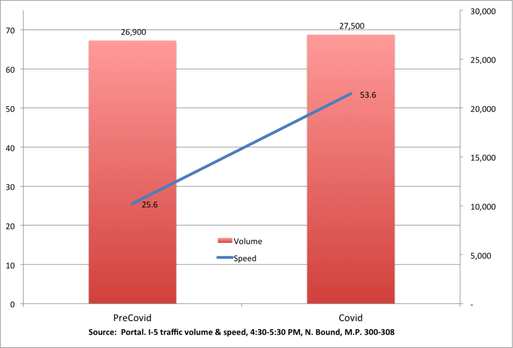
1. What the Covid-19 Shutdown teaches us about freeways. Everyone knows that speeds are up on urban roadways around the nation because of the stay-at-home orders to fight the pandemic. But there’s a hidden lesson here. In Portland, for example, one of the most regularly congested roadways is not only moving twice as fast, but is actually carrying more traffic at the peak hour than before the pandemic. The reason? Stay-at-home has worked like a demand management policy to keep the traffic from reaching a “tipping point” where the freeway actually loses capacity.
This shows that actually managing freeways, through policies like congestion pricing–can move more traffic, faster. If highway engineers really cared about congestion, they’d be taking this lesson to heart, and better managing the multi-billion dollar assets they’ve built, rather than wasting billions on unneeded (and environmentally destructive) freeway widening.
2. Is Covid-19 the end of cities? We don’t think so. A New York Times story last weekend argued that city living had “lost its allure” and migration away from cities was likely to be accelerated by the pandemic. We beg to differ on both these points. It’s true that cities aren’t growing as fast as they were in the middle of the last decade, but as we’ve pointed out before, this has less to do with diminished allure, than it does with the shortage of housing in cities, and our widespread failure to build enough to meet demand (and keep rents affordable). So its not diminished allure, so much as unrequited ardor. And as we–and others–have pointed out, simple-minded claims of a connection between density and Covid-19 don’t seem to square with the facts. Plenty of extremely dense cities have managed to largely avoid the pandemic, and studies of the US evidence show little reason to believe that urban density is a key cause of its spread.
3. Suburbs aren’t immune from Covid-19. As the New York Times story implies, there’s a kind of working assumption that if one were to move from a higher density urban neighborhood to a lower density suburban one, you could minimize your risk of exposure to the virus. While in the aggregate, per capita reported cases seem to be somewhat higher in central counties than surrounding suburban ones, the difference isn’t large.
Our analysis of data for the largest metro areas shows it makes a lot more difference which metro you live in than it does whether you live in the suburbs or the central county: there’s about a .9 correlation between city and suburban Covid-19 rates within large metro areas. And in the aggregate, the rate of reported cases per capita in suburbs lags about 6 days behind the comparable rate in central counties.
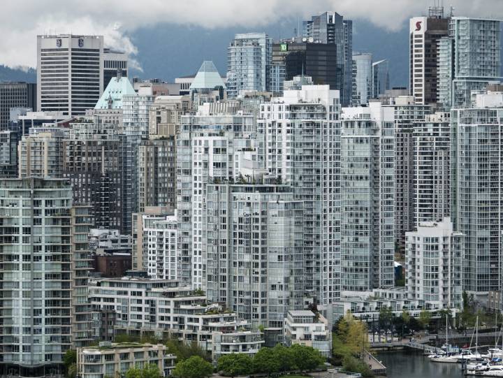
4. A worthwhile Canadian example. Those who want to blame urban density for vulnerability to pandemics often dismiss the very low rates of infection in highly dense cities like Hong Kong, Taipei, Seoul and Tokyo as an Asian anomaly. But right hear in North America, we have a very dense city, with high transit ridership, that has a way below average rate of reported Covid-19 cases: Vancouver, British Columbia.
We compare Vancouver’s experience with its two US neighbors, Seattle and Portland, and find despite greater density–and a much closer connection to China–Vancouver has the lowest rate of reported cases per capita of the three cities (and Portland’s rate, as we’ve noted is in the bottom five of all large US metros.
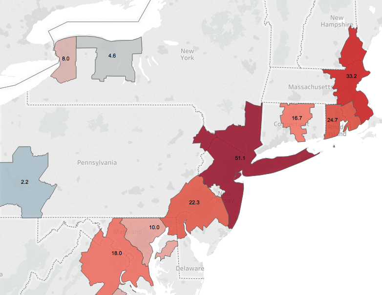
5. The Covid-Corridor? We’ve been compiling and closely analyzing data on the incidence of Covid-19 in the nation’s 53 largest metro areas. One alarming pattern is the relatively high incidence of cases in the Northeast Corridor. Its well know that the New York City metro area is the US epicenter of the pandemic, but nearby metros are also suffering disproportionally.
All four of the metros with the highest number of new cases–New York, Boston, Providence and Philadelphia–are all in the Northeast Corridor. The corridor also accounts for six of the top eight metros on this measure (adding Hartford and Washington). Each of these metro areas is reporting new cases per capita at a rate 2-3 times higher (and in Boston’s case, 6 times higher) than the median large metro area in the US.
Must read
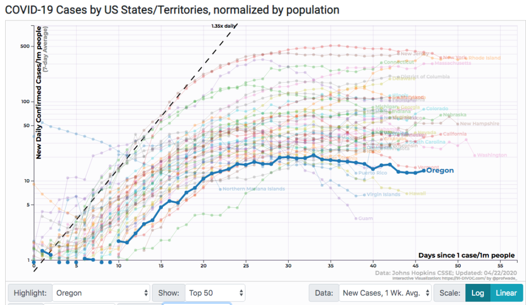
The best visualization dashboard for state level Covid-19. We’ve spent a lot of time looking at pandemic data. There are many different data visualizations out there, but we think the best one for stat data is “91-DIVOC.” It’s been put together by computer science professor Wade Fagen-Ulmschneider of the University of Illinois and uses the county level database assembled by Johns Hopkins University. It gives you a series of charts that you can easily customize (looking at cases, deaths, cumulative, weekly and daily data, and it also allows you to highlight and filter the data quickly and easily. Here’s a snapshot showing new daily cases for all 50 states with Oregon highlighted.
Other dashboards contain much of the same information, but its often hard to pick out particular datapoints in a spaghetti of dozens of lines, and you’re often left to simply accept the choices made by the dashboard’s designer. DIVOC-91 puts you in control: it’s clean and fast. Now if they had a dashboard for metro areas . .
In the News
Willamette Week wrote about our analysis of the impact of the Covid-19 shutdown on Portland-area traffic in their story, “The Biggest Bottleneck on the West Coast is handling traffic at double the normal rush hour speeds; Covid-19 has shown what could happen if tolls were placed on Portland highways.


