Lost in Place: Why the persistence and spread of concentrated poverty–not gentrification–is our biggest urban challenge.
A close look at population change in our poorest urban neighborhoods over the past four decades shows that the concentration of poverty is growing and that gentrification is rare.
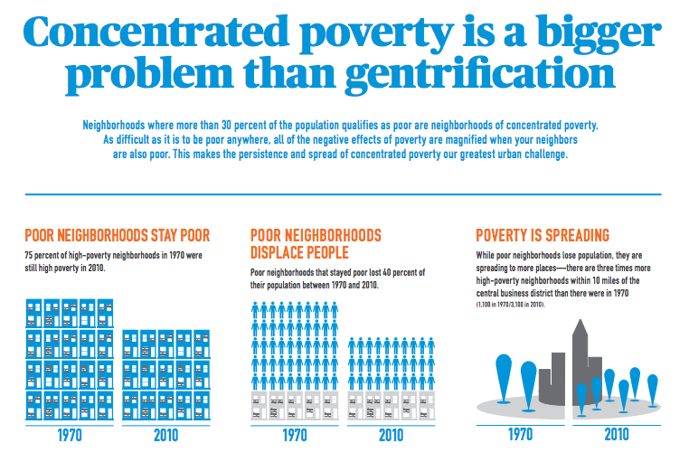
While media attention often focuses on those few places that are witnessing a transformation, there are two more potent and less mentioned storylines. The first is the persistence of chronic poverty. Three-quarters of 1970 high-poverty urban neighborhoods in the U.S. are still poor today. The second is the spread of concentrated poverty: three times as many urban neighborhoods have poverty rates exceeding 30 percent as was true in 1970 and the number of poor people living in these neighborhoods has doubled.
The result of these trends is that the poor in the nation’s metropolitan areas are increasingly segregated into neighborhoods of concentrated poverty. In 1970, 28 percent of the urban poor lived in a neighborhood with a poverty rate of 30 percent or more; by 2010, 39 percent of the urban poor lived in such high-poverty neighborhoods. The data, methodology and results of our study are spelled out in our full report, available in PDF format here. The highlights are as follows:
- High poverty is highly persistent. Of the 1,100 urban census tracts with high poverty in 1970, 750 still had poverty rates double that of the national average four decades later.
- Though poverty persisted, these high-poverty neighborhoods were not stable—in the aggregate they lost population, with chronic high-poverty neighborhoods losing 40 percent of their population over four decades.
- Moreover, few high-poverty neighborhoods saw significant reductions in poverty. Between 1970 and 2010, only about 100 of the 1,100 high-poverty urban neighborhoods experienced a reduction in poverty rates to below the national average. These 100 formerly high-poverty census tracts accounted for about five percent of the 1970 high-poverty neighborhood population. In contrast to chronically high-poverty neighborhoods, which lost population, these “rebounding” neighborhoods recorded an aggregate 30 percent increase in population.
- Urban high-poverty neighborhoods proliferated between 1970 and 2010. The number of high-poverty neighborhoods in the core of metropolitan areas has tripled and their population has doubled in the past four decades. A majority of the increase in high-poverty neighborhoods has been accounted for by “fallen stars”—places that in 1970 had poverty rates below 15 percent, but which today have poverty rates in excess of 30 percent.
- The growth in the number of poor persons living in “fallen star” neighborhoods dwarfs the decrease in the poverty population in “rebounding” neighborhoods. Since 1970, the poor population in rebounding neighborhoods fell by 67,000 while the number of poor persons living in fallen star neighborhoods increased by 1.25 million.
- The data presented here suggest an “up or out” dynamic for high-poverty areas. A few places have gentrified, experienced a reduction in poverty, and generated net population growth. But those areas that don’t rebound don’t remain stable: they deteriorate, lose population, and overwhelmingly remain high-poverty neighborhoods. Meanwhile, we are continually creating new high-poverty neighborhoods.
To be poor anywhere is difficult enough, but a growing body of evidence shows the negative effects of poverty are amplified for those who live in high-poverty neighborhoods—places where 30 percent or more of the population live below the poverty line. Quality of life is worse, crime is higher, public services are weaker, and economic opportunity more distant in concentrated poverty neighborhoods. Critically, concentrated poverty figures prominently in the inter-generational transmission of inequality: children growing up in neighborhoods of concentrated poverty have permanently impaired economic prospects.
Our analysis focuses on the 51 largest US metropolitan areas–all those with a population of 1 million or more in the latest Census. The following tables summarize, by metro area, the key variables in our research–the number of high poverty neighborhoods in 1970 and 2010, and the numbers of neighborhoods transitioning between various categories over time.
Listen to the author speak about the report on Think Out Loud, Oregon Public Broadcasting, December 9, 2014:
The Strong Towns Podcast also had the author on to speak about the report.
For people interested in tracking the performance of a single metropolitan area across all of our measures of concentrated poverty, we offer a Metro-level dashboard. You can select an individual metropolitan area and see how it performs on each of our indicators.
Finally, you can drill down to the level of individual census tracts to examine population change, and the change in the number of persons living in poverty in each metropolitan area covered in our report. (See the full-sized version here)
You can also see the findings in this easy-to-share infographic:

