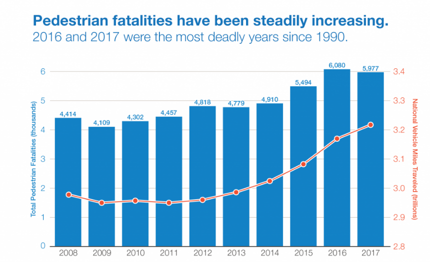
More driving and our car-oriented transportation system killed 50,000 pedestrians in the past decade
Each year, Smart Growth America produces its annual report Dangerous by Design looking at pedestrian deaths and injuries. Once again, this is grim reading, but the report, as always, is a vital public service that brings home just how serious this problem is. It also shows that the problem has gotten steadily worse. This is no accident. When we optimize urban environments for rapid vehicle travel, we incentivize behaviors that put pedestrians at risk. The good news, if there is any, is that some cities have much lower rates of pedestrian death and injury, and by studying what they do, and especially the way they’re built, we can see how we might reduce this devastating toll.
The Trend: More Driving = More Dying
The major takeaway is that as driving has increased in the US over the past decade, more pedestrians have been killed, even though the number of car occupants dying in motor vehicle crashes has decreased over that same period. Our road safety problem is increasingly a problem of pedestrian deaths. That means that getting a reduction in fatalities–much less achieving vision zero–will require much stronger efforts to improve pedestrian safety.
Cross-sectional evidence: Sprawling, car-dependent cities kill pedestrians
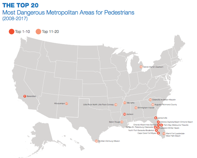
Although pedestrian deaths are up almost everywhere, there are still enormous variations across cities in pedestrian death rates. It’s tempting to focus on a ranking of the “worst” and “best” cities for pedestrians, but the real value of this report comes not from blaming and shaming cities, but by providing a clear understanding of what features of cities and urban development are correlated with pedestrian safety.
In general, it’s sprawling, car-dependent cities that have the highest pedestrian death rates. One of the big challenges in evaluating the rate and prevalence of pedestrian fatalities is coming up with a good denominator for pedestrian activity. While we have copious data on car volumes–every city and state gathers data on ADT (“average daily traffic”) on major roadways, pedestrian counts are irregular, rare and incomplete. This particular data blindness is yet another sign of the car-centric nature of our “transportation” data.
Dangerous by Design proxies for this by looking at the share of the population that walks to work. Though work trips are only a fraction of all walk trips, its undoubtedly a good way of distinguishing places where walking is fairly common from places where it is not. The report combines its estimates of the number of pedestrian fatalities per 100,000 persons with the data on the share of the population that commutes to work on foot to compute a “pedestrian danger index” which we think best represents the relative safety of different places for people who are walking.
What’s really striking about the statistic is that there’s a truly enormous variation among metropolitan areas. The pedestrian danger index in the worst cities is an order of magnitude greater than it is in the best cities. For example, Orlando has a Pedestrian Danger Index of 313, which is more than ten times greater than in metropolitan New York City, where the index is 27.
In epidemiological terms, this wide variation is a strong signal of the importance of geography as a hazard. If these were deaths from cancer, for example, there’s little question that we would regard cities with a high pedestrian death index as “hot spots” and look for ways to immediately reduce the risks from these environmental factors.
Multi-lane arterials are especially deadly for pedestrians
The persistent geographic pattern of high pedestrian death rates, concentrated in the sunbelt, signals that the very design of the road system is responsible for higher death rates. Dangerous by Design observes:
Part of the reason for this may be because much of the growth in these places occurred in the age, and the development scale of, the automobile. Previous research by Smart Growth America found that in general, the most sprawling metropolitan areas with wider roads and longer blocks typically cluster in the southern states. Furthermore, academic research has consistently linked these sprawling growth patterns to higher rates of both traffic-related deaths for people walking and traffic-related deaths overall
One type of roadway seems to be especially dangerous for pedestrians: multi-lane arterials. Unlike local streets with only one travel lane in each direction, multi-lane arterials pose numerous hazards. They have higher speeds and encourage cars to pass one another. They complicate turning movements at intersections, and also increase the distance that pedestrians have to travel to cross streets. And in many cities, marked pedestrian crossings are so widely spaced that many will cross mid-block.
Detailed analysis of crash locations in Portland, Oregon shows that these arterials are the big killers. In its most recent State of Safety report, Portland’s Metro (the regional planning agency) says:
Arterial roadways comprise 73% of the region’s serious crashes, 77% of the serious pedestrian crashes, and 65% of the serious bicyclist crashes, while accounting for 12% of road miles.
Streets with more lanes have an especially high serious crash rate for pedestrians, producing higher crash rates per mile and per VMT as compared to other modes.
Too often, pedestrian safety gets treated as a communication or education problem: If we just got people driving and walking to pay more attention, there’d be fewer fatalities. But the data tell a very different story: We’ve designed a transportation system, that by prioritizing car travel and emphasizing speed, predictably kills people who walk and bike. It will take much more fundamental changes that a glitzy campaign or a catchy slogan to change that reality.

