Last summer, we flagged a fascinating study by Fitch Investment Advisers which tracked twenty five years of home price data, stratified by the “urbanness” of housing. Fitch showed that particularly since 2000, home prices in neighborhoods in the center of metropolitan areas increased in value relative to all other metropolitan housing. We termed the price premium that central neighborhoods command “the Dow of Cities” because like the Dow Jones index, it serves as an indicator of the market valuation of urban locations.
Last month, the Federal Housing Finance Agency (FHFA) produced a new data series, a repeat sales index of housing. (For more about ways of measuring housing prices, check out our stats guide.) They analyzed over 100 million property transactions from 1975 through 2015 and produced an index of home prices that can be used to track neighborhood level price changes, and to disaggregate the effects of location from other factors (like home size). A new research paper—Local House Price Dynamics: New Indices and Stylized Facts—based on that data, authored by Alexander Bogin, William Doerner, and William Larson looks at the relationship between urban location and price increases within metropolitan areas. You’ll find a summary of the report and maps for several metropolitan areas in Emily Badger’s Wonkblog analysis.
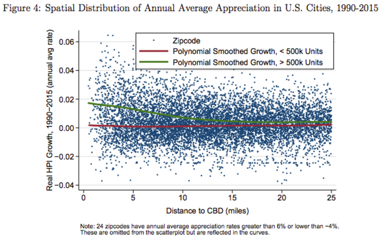
Their key finding is that more centrally located homes—those closer to a metropolitan area’s central business district—have experienced higher rates of appreciation over the past twenty five years. You can see those findings in the following chart, which shows the appreciation rate by zip code, between 1990 and 2015, based on distance to the central business district. The results are surprisingly strong: in large U.S. metropolitan areas, homes within 5 miles have appreciated, in real terms, at an annual rate of about 1.5 to almost 2.0 percent per year over the past 25 years, while homes 10 or more from the center have appreciated at a fraction of one percent per year. (See the green line in figure four). In smaller metropolitan areas (those with fewer than 500,000 housing units), the relationship is nearly flat, suggesting that the big gains in home values in the center have been in the largest metropolitan areas.

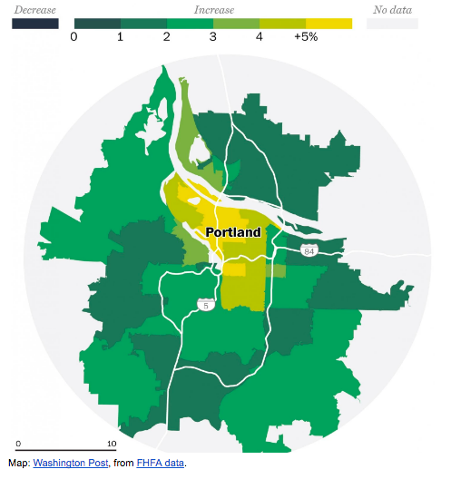
Maps of several metropolitan areas make the pattern clear. In these maps, zip codes with the highest relative rates of housing appreciation have the darkest blue shading. Those zip codes with the lowest relative levels of appreciation have the lightest shading. In each case, appreciation rates are normed to metropolitan level averages. For example, the Washington Post prepared the following map of housing price appreciation in Portland, showing that the neighborhoods with the highest levels of appreciation are in or very near the center of the metropolitan area, and the rates of appreciation are lower on the suburban periphery. Similar patterns show for metropolitan areas like Houston, Minneapolis, Chicago, Denver and Phoenix.

Map Credit: Washington Post, from FHFA data.
The authors are making their complete data set of 5-digit zip code level data available for download. You can also explore on-line maps of individual metropolitan areas which allow you to see the rate of price appreciation since 1990 and 2000.
As the authors note, the size and detail of the FHFA transaction database gives it some technical advantages over other ways of measuring home prices. The FHFA data covers more transactions that private databases like the Case-Shiller data used by Fitch, and has the added advantage of being publicly available. And in contrast to analyses of area home price data (such as Zillow’s zip code level price estimates), is able to distinguish between changes in home price and home quality. That said, the FHFA analysis substantially confirms the trends spotted using these other data sources.
The effect is clear, but what’s the cause?
While there’s little question about the trend—housing closer to the city center is appreciating significantly relative to that in peripheral suburbs—there’s still some debate about the causes. One of the FHFA studies authors, William Larson, maintains that the shift in demand back to cities doesn’t necessarily represent a change in preferences, but is instead driven simply by growing higher incomes, traffic congestion, improved urban amenities, and reduced crime. While economists generally want to explain everything in the context of market variables—and we include ourselves in this category—this seems like a stretch. As we’ve shown in our studies of the Young and Restless, well-educated young adults are today dramatically more likely to choose to live in close-in urban neighborhoods than their predecessors of 10, 20 and 30 years ago. Moreover, the growth urban amenities is as much a result as a cause of the shift to urban living—the growing number of well-educated urban residents provides the demand for restaurants and the experience economy. In a forthcoming paper, Jesse Handbury and Victor Couture attribute the rise of central city property values directly to “a diverging preference for consumption amenities” particularly by well-educated workers.
It’s also doubly hard to square the evidence on accessibility, commute times, and travel modes with a claim that preferences haven’t changed. Central locations have always had an accessibility advantage to jobs, congestion and travel times have not increased appreciably—and in fact have decreased in recent years. And as one indicator of a fundamental change in preferences, far more Americans choose to cycle to work in cities today than a decade or two ago; something they could have easily done then—but didn’t, most likely because that generation had a different preference for driving as opposed to cycling; just as it has a different attitude toward urban living. Indeed, the willingness of consumers to pay higher prices to live in cities today, relative to the price of suburban living, is a key indicator of the change in values we attach to great urban places.
And, as we’ve noted before, it’s an indication that we have, nationally “a shortage of cities”—the demand for housing in urban neighborhoods is rising faster than the supply, resulting in steadily escalating relative home prices in dense, central neighborhoods. It’s both a major contributor to the growing challenge of housing affordability and an economic signal that we ought to be doing more to build additional housing in cities.