What City Observatory did this week
1. Carmaggedon stalks Atlanta. Following an arson-caused blaze, a key section on Interstate 85 in Atlanta collapsed, and is likely to be out of service for at least a couple of months. Since the roadway carried about a quarter million cars every day, the media were quick to predict that Atlanta was in for a hellish dose of carmaggedon. But the lesson from other freeway closures in Los Angeles and Minneapolis is that travel demand actually adjusts pretty quickly to the reduced capacity. The regularity with which this occurs is a reminder that car travel is not an ineluctable force of nature, but a product of the incentives and investments that we make, and that we can change it without the world coming to an end.
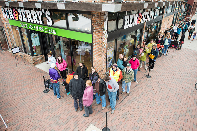
2. Ben & Jerry’s crash course in transportation economics. April 4 was the annual “free cone day” at Ben & Jerry’s ice cream parlors across the country. The company dished up more than a million free scoops of ice cream. But the low price had a downside: long lines of people waiting to get Chunky Monkey and Cherry Garcia. Whats going on here is the perfect metaphor for how our road system operates every day. The price is set to zero, so demand overwhelms supply and we have long lines at rush hour. The lesson: if we priced the road system–like Ben & Jerry’s price ice cream 364 other days a year–we could eliminate the lines and be sure our transportation finance system was solvent.
3. Migration is making counties more diverse. A new study of county level migration trends since 1990 shows that the net effect of migration, especially by white young adults has been to make American counties more racially and ethnically diverse. Young whites are disproportionately moving from whiter suburban counties to less white urban ones, and the net effect of their migration is to increase diversity in both places. In contrast, the numerically much smaller migration of older Americans tends to reinforce existing racial and ethnic patterns. But on balance, the much larger migration of young adults is increasing racial and ethnic diversity at the county level.
4. New York City isn’t shrinking, it’s growing. Some commentators, focusing on data showing net domestic out-migration from some cities, like New York, are calling the end of the back to the city movement. But especially in the case of New York, this view ignores the critical roles of foreign immigration and natural population increase. Not only is New York still an immigrant gateway to America, its population structure is now younger than the rest of the US, and as a result, the city has many more births than deaths. Every borough of New York has recorded a population increase since 2010. As a result of the demand for urban living, New York, like many cities, is bumping up against the limits of its housing supply. Out-migration says more about our failure to increase that supply than it does about any growing disenchantment with cities.
Must read
1. No more roads. With a Republican health care plan in limbo, it looks like the next major legislative priority of the Trump Administration may be infrastructure. Writing at Slate Henry Grabar says the last thing that America needs is more roads and bridges. Looking back over the past couple of decades, Grabar reports that in urban areas, we’ve been building roads faster than we’ve been growing population, with the net effect that the maintenance burden is increasing. Urban road mileage has grown at exactly twice the rate of population. Today, there’s a mile of urban road for every 215 residents, in 1980, it was one mile per 273 residents. Highway advocates routinely play bait-and-switch with the maintenance backlog–decrying the cost of growing decay, but then using added funds to further expand the road network.
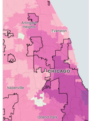
2. Why car insurance costs more in minority neighborhoods. In an in-depth piece of statistical investigative journalism, Pro Publica drills into the differences in auto insurance rates in different neighborhoods in California, Texas, Missouri and Illinois. It finds that otherwise identical drivers in predominantly minority neighborhoods pay higher auto liability insurance rates than those in white neighborhoods. The difference in rates isn’t explained by differences in losses: even controlling for claims expense, insurance rates are higher in minority neighborhoods. While Pro Publica highlights the racial dimension of this disparity, there’s a distinct city/suburb split here, as their map of metro Chicago makes clear. Premiums charged relative to claims paid are much higher in the city than in the suburbs (darker colors on this map). This seems to indicate that insurers charge city residents more for car insurance than is warranted by the losses in cities.
New ideas
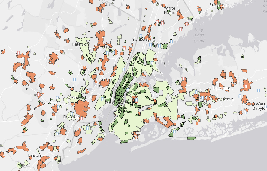
1. New York Walk up report. Smart Growth America and George Washington University have collaborated on a new report that classifies New York area neighborhoods based on their index of walkability. The report uses four broad categories, from most walkable (Walkable Urban Places, or WalkUps), to car dependent ones. Like earlier reports, this one points out the big value differences between the most walkable neighborhoods and suburban, car dependent ones. “The average square foot of walkable urban real estate is valued at $541, a 150 percent premium, or two and a half times more than region’s drivable suburban real estate.” While its fair to say that some of this is related strictly to “walkability” there are also big differences in transit access, and most importantly centrality, between these property types–the most walkable areas are chiefly in Manhattan, while driveable suburban areas are mostly outside the five boroughs of New York City. Much of what’s being measured here isn’t just walkability, but rather a classic urban rent gradient; people are willing to pay much higher rents to live close to the center than on the periphery.
2. Market-timing & credit availability make housing a bad investment for low income households. As we’ve noted at City Observatory, low and moderate income households tend to suffer from a “buy high/sell low” tendency in the housing market. A new study of credit availability and the timing of home purchases adds some additional evidence to this theory. In a study entitled, “Housing Wealth Reallocation Between Subprime and Prime Borrowers During Recessions,” Ayse Sapci and Nam Vu find that higher income households tend to purchase homes disproportionately in recessions (when prices are lower and credit is less available) and sub-prime borrowers tend to do the reverse (buying housing when prices are high and credit standards have been relaxed. Their key conclusion:
Even after controlling for demographic and financial differences across groups, we find that prime borrowers are more likely to buy investment homes during recessions compared to recoveries, whereas subprimers are more likely to lose their primary homes. These results point to a dramatic difference between subprimers and primers: while subprimers are most harmed by the collapse of the housing market, primers can take advantage of lower house prices.
Given these dynamics, its really hard for owning a home to be a ticket to wealth creation for those of modest means–and in fact, as the collapse of the housing bubble shows, it can be a powerful wealth-destroying strategy.
City Observatory in the news
If Atlanta can weather the loss of a freeway segment that carries a quarter of a million cars a day, maybe that’s a signal that Syracuse could live without an obsolete stretch of Interstate freeway that slices through the center of town, writes Charley Hannegan, a columnist for Syracuse.com.
