What City Observatory did this week
1. The annual Ben and Jerry’s advanced seminar in transportation economics. If you love ice cream–who doesn’t?–Tuesday was your chance to get a free cone at Ben and Jerry’s and while you were there, pick up a fundamental insight into transportation economics. Around the country, people were lined up outside Ben & Jerry’s, waiting ten or fifteen minutes in some cases to get the same thing that they could usually walk up to a counter and buy with no most days. The reason for the line up for ice cream is exactly the same as the reason for lines of cars on urban roads: the price is too low. The problem with traffic engineers is that they try to run the road system as if everyday was free ice cream day: with the predictable result that they’re always broke, and they always think they need a lot more capacity. Getting the prices right can both pay for just as much road as we actually need, and make sure roads aren’t too crowded. We’re looking forward to congestion pricing in Manhattan in a couple of years.
2. What happens when you take the “port” out of Portland? In 2015, Portland lost regularly scheduled container ship service. The container crane has long been emblematic of international commerce and an icon of the civic mythology that Portland is somehow a freight-dependent economy. But a funny thing happened after the container ships went away: Portland’s economy kept right on growing robustly, with no visible effects on local employment or income. The key reason: the region had long since transitioned from a resource-dependent entrepot to a vibrant knowledge-creating economy. Leading industries like information technology and athletic and outdoor products are far more dependent on the region’s quality of life and its ability to attract and retain talented workers, than on moving bulky products by container. Clinging to out-dated myths about what drives your economy is a poor guide to policy; nostalgia is not an economic strategy.

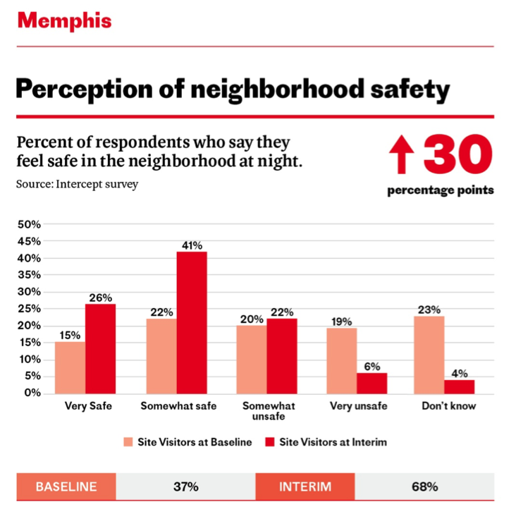
3. Measuring the Civic Commons. Parks, libraries, community centers and other parts of the public realm provide opportunities for interaction and building the social capital that is critical to a well-functioning community. While we know that intuitively, we often lack the metrics to assess the health and performance of these civic assets. A new set of tools developed by Reinvigorating the Civic Commons, and piloted in five cities around the country, is available to help community leaders more precisely measure the effectiveness of their efforts to bolster the civic aspects of their neighborhoods.
Must read
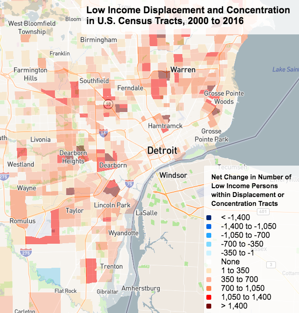
1. Mapping Neighborhood Change. The University of Minnesota’s Will Stancil has a great set of maps showing neighborhood change across the nation since 2000. His work classifies neighborhoods based on whether they grew (added population) or not, and whether the number of low income households (defined as those living below 200 percent of the federal poverty line) increased or declined. He categorized growing neighborhoods with declining numbers of low income households as “gentrifying,” and low income neighborhoods with growing numbers of low income households as areas of increasing poverty concentration. Similar to City Observatory’s findings in our 2014 report Lost in Place, Stancil found that the number of declining neighborhoods far outnumbered gentrifying neighborhoods. Their key finding:
By and large, at the regional level, low-income concentration is the dominant trend. In 26 of the 50 largest metropolitan areas, more than one-fifth of the population lives in a neighborhood that has experienced low-income concentration. In the very poor regions of Memphis and Cleveland, that share increases to over two-fifths; in the Detroit region, about half the population lives in a neighborhood that has undergone concentration.
Stancil’s report, published by the Institute for Metropolitan Opportunity, offers nationwide neighborhood level data on population change. You can use the web-based map to view data for an entire metropolitan area, and drill-down to see data values for individual census tracts. Here’s a map for metro Detroit; red- and orange-shaded areas represent increasing concentrations of poverty.
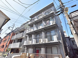
2. Why is housing in Japan so affordable? Tokyo is on of the largest cities in the world, and yet its rents and home prices remain quite affordable. How can that be? The simple answer, according to the Wall Street Journal is that there are relatively few restrictions on building additional housing. Because supply can respond to changes in housing demand, the city regularly builds new housing in desirable locations–and NIMBYs have little power. In 2017, Tokyo built almost as many new housing units as New York, Houston, Los Angeles and Boston combined; housing starts per 1,000 persons are more than double those of New York. As a result, Japan’s home prices are on average about the same level they were a decade ago, and the typical two bedroom apartment rents for about $1,000 per month. Tokyo’s experience is powerful evidence that it is possible to build your way to affordability.
3. Combined Bus & Bike Lanes speed commuting in Chicago. Chicago recently conducted an important traffic experiment with promising results. Because of construction on a major downtown arterial, Chicago street, buses had to be temporarily re-routed to the parallel North Halstead Street. To minimize impacts on traffic, the city took out a lane of parking, and striped one lane of North Halstead Street for bike and bus traffic. The result: a 63 percent increase in bus travel speeds through the half mile long corridor, saving travelers more than two minutes. As we’ve noted elsewhere, this has myriad benefits: not only do current bus travelers enjoy shorter travel times, but bus drivers become more productive (as measured by more passenger miles per bus driver hour). In addition, faster bus travel times make transit a more attractive alternative for others who weren’t riding before, which has the potential to take cars off the road. Re-allocating space from storing cars to moving people makes huge economic sense.
New Knowledge
New metropolitan home price index. The American Enterprise Institute has created a new single family home price index covering the nation’s 60 largest metropolitan areas. This gives data users another alternative to the estimates created by Case-Shiller, Zillow, Redfin, and others. The innovation in the AEI index is creating a hybrid measure that combines aspects of the repeat-sales model and more global averages of current sales data. The index is available on a quarterly basis, going back to 2012, and includes estimates of current year inflation in home prices, as well as estimates of mortgage risk and the number of months of supply.
Pinto, Edward and Peter, Tobias, (2019) American Enterprise Institute, Housing Center, Housing Market Indicators for the Nation: Update for 2018:Q4, https://www.aei.org/multimedia/national-and-metro-housing-market-indicators
In the News
George Abbott of Memphis River Parks Partnership quoted Joe Cortright’s study of changing urban neighborhoods in his Op-Ed, Why we need Memphis 3.0, in the Daily Memphian.


