Seattle and San Jose had the first outbreaks of Covid-19 but now have the slowest rates of growth of any large US metro area
Their progress seems closely related to the fact that they’ve cut back on travel more than nearly every other metro area.
For the past several weeks, City Observatory has been compiling the data on reported cases of Covid-19 in the nation’s largest metro areas, and like everyone, looking for signs that we’re “flattening the curve”–reducing the explosive exponential rate of growth of the number of cases to levels that won’t overwhelm the nation’s (or any city’s) health care system.
There’s been a lot of attention focused–appropriately so–on the metro areas with the highest number of cases. New York accounts for more cases (92,000) than any other metro area; but on a population adjusted basis, the pandemic has hit New Orleans about 60 percent harder. Its rate of reported cases per 100,000 is 856, compared to about 523 in New York.
From the standpoint of understanding how to combat the pandemic, it may be more useful (and more hopeful) to look at metro areas that seem to have made progress in slowing the reported increase in the number of cases. Just three weeks ago, Seattle and San Jose had the highest rates of reported Covid-19 cases of any large metros in the US. On March 18, Seattle reported 21 cases per 100,000 residents and San Jose had 9 cases per 100,000, ranking them first and third among the nation’s large metros.
San Jose and Seattle are now slowest growing in reported cases
Today, just three weeks later, both cities have among the lowest rates of growth of the pandemic. San Jose has the lowest rate of growth (about 5 percent on a daily basis over the past week) and Seattle the second lowest (about 6 percent daily over the past week). San Jose has also managed to go from having the third highest rate of reported Covid-19 cases per capita, to having the 24th highest of 53 metro areas (essentially at the median). Seattle is still well above average, but after having more cases per capita than any metro area, it now ranks seventh on this measure among large metro areas. The key has been lowering the rate of increase in the number of cases. The following chart shows Seattle (pink) and San Jose (red) compared to New Orleans, New York and Indianapolis, which have all had higher rates of increase, and have managed slower declines in daily growth.
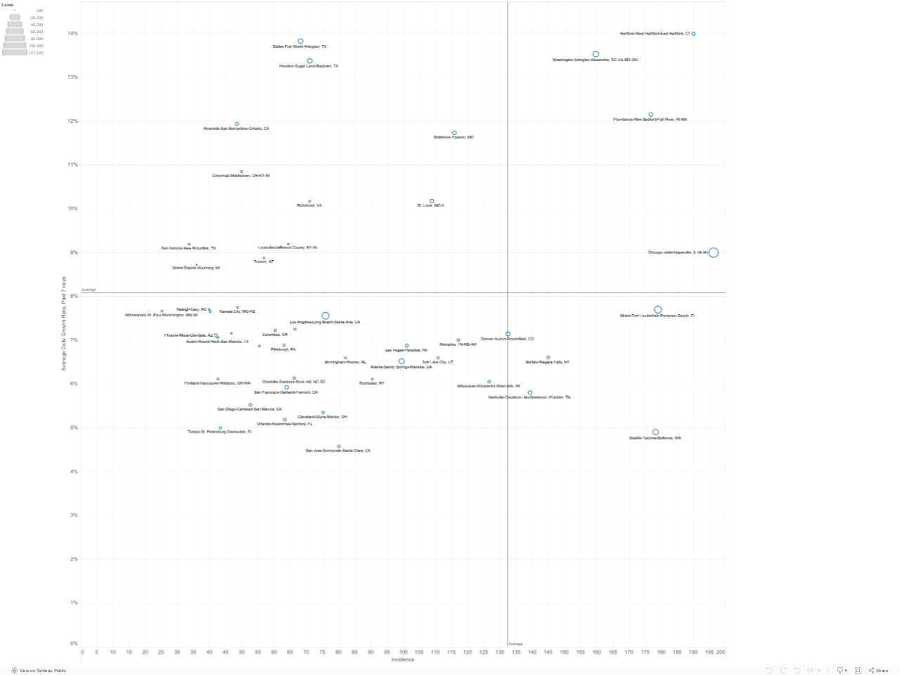
It’s helpful to look at the incidence (cases per 100,000) and the growth rate at the same time. Our analysis of metro area performance is distilled into this matrix, which shows the incidence of reported cases per capita (on the horizontal axis) and the rate of daily growth in reported cases over the past week in the vertical axis. Ideally, you want your metropolitan area to be in the lower left-hand corner of this chart (low incidence, and relatively slow growth). San Jose arguably has the second best performance after Minneapolis on our combined measures. Seattle, as noted, has the second lowest rate of growth.
This is evidence that Stay-at-Home is working
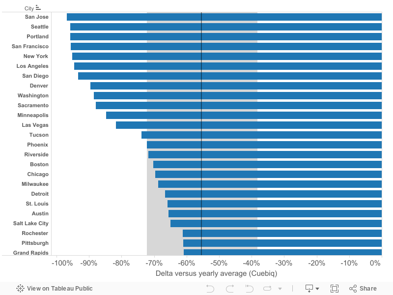
Why have these two cities performed so (relatively) well? Part of the reason may be the effectiveness of the stay-at-home policies in these two metro areas. As we examined earlier, location services company Cuebiq is using cell-phone data to measure changes in travel behavior among US counties. We’ve compiled that data for the principal counties of US metro areas as an indicator of how much travel has declined since the advent of stay-at-home policies in March. According to our analysis of Cuebiq’s data, Seattle (King County) and San Jose (Santa Clara County) rank number one and number two as the two counties with the biggest declines in travel compared to the typical annual volume.

Seattle and San Jose also rank near the top of the charts according to Google’s parallel measure of visitation of workplaces. The two cities ranked fifth and sixth respectively, out of the 53 most populous metropolitan areas in reducing workplace related travel. The strong performance of these cities probably reflects some combination of the effectiveness (and relatively early implementation of these policies) and the fact that with strong high tech sectors and a large well-educated workforce, its likely that a relatively high fraction of workers were readily able work at home.
These are some dark days in the Covid-19 pandemic. It’s a hopeful sign that two cities that were among the first-hit by the virus have improved their relative position so much in just a few weeks. There’s still a huge amount of work to be done, but their experience suggests that limiting travel and practicing social-distancing can blunt the pandemic’s spread.
Notes
The charts and information presented here on published data from state health departments, aggregated by The New York Times. Please use caution in interpreting these data. It is likely that in some areas, the number of cases is under-reported due to the lack of available testing capacity, or pressing medical conditions. There are widespread differences in the number of tests administered relative to the size of the population in each state, and tests are not given randomly, and may be restricted solely to persons with symptoms, likely exposure or high risk in some states. As a result, the ratio of reported to unreported, undiagnosed cases may vary across geography. Moreover, changes in reported numbers of cases from day to day or week to week may reflect changes in the availability or application of testing over time, rather than the true rate of growth in the number of persons affected. The fact that some places are performing relatively better than others due to reported case data does not mean that the Covid-19 pandemic is under control, or that stay-at-home policies and social distancing are no longer needed.
