SUPERSEDED: Please see latest data here.
Original post below is for archival purposes.
REVISED April 9; Data through April 8, 2020
Among the 53 metro areas with a million or more population:
- The situation in New Orleans is the worst of any large metro area: Its rate of reported cases is now 50 percent higher than in New York and the number of reported cases is increasing 30 percent faster than in the typical metro area.
- New Orleans, New York, Detroit, Boston and Indianapolis have the highest incidence of pandemic among large metros.
- New Orleans, Detroit, Boston, Philadelphia and Indianapolis have higher than average incidence, and are experiencing faster than average growth in cases
- The typical (median) large metropolitan area had a rate of about 64 reported cases per 100,000
- Half of all metropolitan areas had between 40 and 116 cases per 100,000.
- The mean rate of increase in the number of cases in large metro areas has increased by about 11 percent per day in the past week.
- For more information, read our analysis of what the varying experience of different cities tells us about the trajectory of the pandemic, and our explainer on how to interpret these charts.
City Observatory presents here its estimates of the prevalence and recent growth of reported Covid-19 cases in large US metropolitan areas. We update this page regularly with the most recent available data. The data on this page was last updated with data on counts of cases through April 8, 2020. Caution should be used in interpreting these figures. Case data can vary from the actual incidence of Corona virus infections due to differences in testing regimes and availability across jurisdictions, as well as other factors. We believe that metro area levels and trends may be a useful geography for understanding the spread and intensity of the pandemic: most published data are available at only the state or county level. States are too large to accurately capture the the incidence of the pandemic; and counties are often too variable and too small. Metro areas capture labor markets and commuting sheds, and are defined consistently, making them more appropriate geographic units for judging the spread of the virus. As is our common practice at City Observatory, our focus is on metro areas with populations of 1 million or more.
Metro areas ranked by reported Covid-19 cases per 100,000 population
The following chart shows the number of reported cases of Covid-19 cases per 100,000 population is US metropolitan areas with a population of 1 million or more as of April 8, 2020. Metropolitan data are computed by aggregating county level data available from The New York Times. Metropolitan areas are ranked highest to lowest according to the number of reported cases per capita.
The progression of the pandemic in March. Our bar chart that shows the growth in the prevalence of reported Covid-19 cases in each metropolitan area since March 1. The controls in the upper left hand corner of the chart allow you to play, stop and examine the animation.
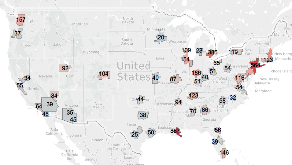
New Orleans, New York, Detroit and Boston have the highest number of cases per capita of US metro areas. New Orleans’s rate is currently 887 cases per 100,000. New York (564), Detroit (384) and Boston (260) have the next highest rates of reported cases. Indianapolis (186) has passed Philadelphia (181) for the fifth most cases. Seattle, which had the most reported cases per 100,000 of any metro in Mid-March is now seventh (157 cases per 100,000) The median large metropolitan area has about 64 cases per 100,000 population.
Map of metro areas, reported Covid-19 cases per 100,000 population
The following map illustrates the relative number of reported Covid-19 cases per capita among large US metropolitan areas. Darker red colors indicate metro areas with the highest reported incidence of cases. Numbers on each metro area represent cases per 100,000 on April 7.
Growth rates in the number of cases
The key strategy in fighting the Covid-19 pandemic is using social distancing to slow the rate of transmission of the virus. A key indicator of whether we are “flattening the curve” is whether the growth rate of the number of cases is increasing or decreasing. The following chart shows the growth in the number of cases for selected metropolitan areas from March 10 through April 8.
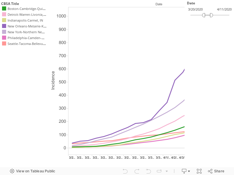
The growth rates of the four cities with the highest rates of reported cases per capita paint divergent and interesting patterns of the pandemic. For a time, Seattle had the highest rate of cases per capita of any US city. That has changed in the past two weeks. New York, New Orleans, and Detroit have surpassed Seattle. On March 19, Seattle, New York and New Orleans all had nearly the same number of reported cases per 100,000 (about 30 per capita). Since then, their growth paths have diverged: New Orleans has grown most rapidly, followed by New York; Seattle’s growth has been subdued. Meanwhile, over that same period of time, the growth of cases in Detroit has increased sharply: On March 18, Detroit had just 1.4 reported cases per 100,000 population, essentially the same as the median of all large metro areas. By March 29, that had increased to 108 cases per 100,000; the third highest rate among large US metro areas.
To put the spread of the pandemic in context, it is worth noting on March 16, no large US metro had a prevalence of reported Covid-19 cases of more than 15 per 100,000 population (Seattle was 12.2). Today, all of the nation’s largest metro areas have a reported prevalence of more than 15 cases per 100,000. Over the past few weeks, it appears that there’s about two weeks difference between the worst afflicted metro, and the typical large metro. Whether that continues to be the case depends on the efficacy of social distancing and other measures.
Growth Rates
To more readily compare changes in growth rates over time for individual metropolitan areas, we’ve charted the average daily growth rate over the past week for the period from March 8 to April 8. This chart shows which cities have made progress in reducing the growth rate of the number of reported cases. This chart shows growth rates for the metro areas with the greatest prevalence of reported Covid-19 cases in March.
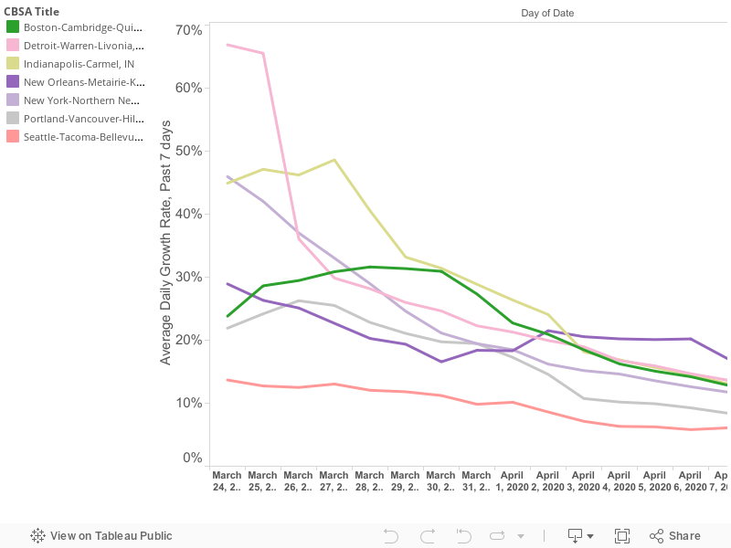
Notice that Seattle has succeed in driving down its average daily rate of increase in cases over the previous seven days, and now has the second lowest rate (6 percent) of daily increase of any large metro area (San Jose’s growth over the past week has been about 5 percent). Rates are trending down for nearly all cities, but still must fall much further to blunt the pandemic.
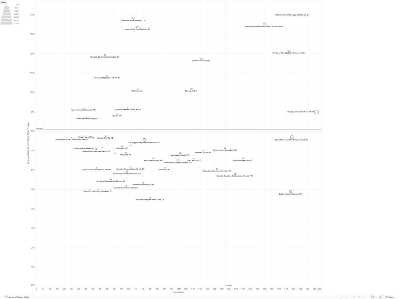
Prevalence versus Growth
Slowing or stopping the spread of the virus depends on steadily decreasing the growth rate in the number of cases. This is especially important as the prevalence of the virus becomes more widespread. Here we’ve plotted the current prevalence of reported cases in each metropolitan area (shown on the horizontal axis) against the growth rate of reported cases in the past week in that metropolitan area (on the vertical axis). The number of cases in each metropolitan area is proportional to the size of the circle representing each metro area. You can mouse-over individual circles on the chart to fully identify each metro area, and see the underlying data for numbers of cases, cases per 100,000 and the growth rate in cases over the last week.
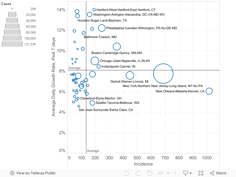
We’ve used the means of the two variables (growth rate (11 percent daily) and number of reported cases per 100,000 (108), to divide the chart into four quadrants. These quadrants help sort out which metro areas are experiencing the crisis to a greater or lesser degree. Metro areas in the upper right hand quadrant are clearly most afflicted: they have both higher than average rates of cases per capita and are growing faster than the average metro area (in the past week). The lower right hand quadrant identifies metro areas with relatively higher rates of reported cases per capita, but slower rates of increase. Ideally, one wants to be in the lower left hand quadrant (low number of cases per capita, low growth rate). The upper left hand quadrant is uncertain, but with cause for concern: these cities (so far) have lower rates of cases per capita, but are seeing the virus spread faster than in the average metro area. Over time, the strategy of flattening the curve should lead individual metropolitan areas to progress from the upper left hand quadrant (low rates and fast growth) to the lower right hand quadrant (higher than average rates but a slower rate of growth).
To make this picture a bit clearer, we’ve shortened the horizontal scale to exclude the four cities–New Orleans, New York, Detroit and Boston–with the highest numbers of cases per capita. This chart makes it clearer which cities are in which quadrants.
Notes and revisions
This post updates and supersedes our earlier posts with data through April 8. Please note that we have begun using The New York Times database of county level reported Covid-19 cases effective April 1. All of the data used in this commentary, dating back to January, 2020, is from the NY Times database. Numbers presented in this commentary may differ from estimates presented in previous commentaries because of differences in reporting and aggregation decisions between the two data sources.
The charts and information presented here on published data from state health departments, aggregated by The New York Times. Please use caution in interpreting these data. It is likely that in some areas, the number of cases is under-reported due to the lack of available testing capacity, or pressing medical conditions. There are widespread differences in the number of tests administered relative to the size of the population in each state, and tests are not given randomly, and may be restricted solely to persons with symptoms, likely exposure or high risk in some states. As a result, the ratio of reported to unreported, undiagnosed cases may vary across geography. Moreover, changes in reported numbers of cases from day to day or week to week may reflect changes in the availability or application of testing over time, rather than the true rate of growth in the number of persons affected.
