What City Observatory did this week
1. Counting Women Entrepreneurs. The Census Bureau has just released the results of its new survey of entrepreneurs, and we report its key findings on the extent and geography of women-owned businesses. There are more than 1.1 million women-owned businesses with more than 5 million employees; about one in five businesses is now headed by a woman owner. Female-headed businesses are still more common in the West and in some Southern cities than in the Northeast and Midwest.
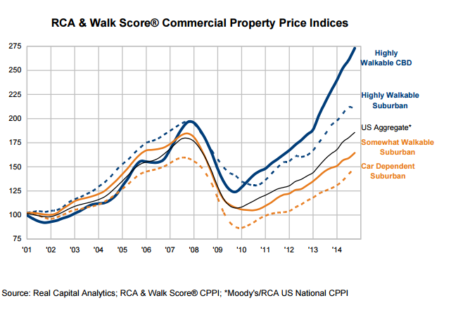
2. Back to School: Three charts that make the case for cities. Recognizing that students may not be the only one’s who may have taken a summer break, City Observatory offers a quick refresher on the economic case for urbanism. It comes in the form of three charts that show the growing importance of walkability to commercial land values, the key role that transit access places in promoting residential values, and more data that show the movement of young adults to city centers. These three charts underscore the economic momentum behind the move to cities.
3. Why the median rent is a misleading indicator of housing affordability. Its pretty standard practice to use median rent (or housing prices) to compare the affordability of housing in different locations. But this misses the key fact that while some cities and neighborhoods have a wide variety of housing, others are much more homogenous. It turns out that having more variety generally means greater affordability. We show how to use data on the 25th percentile of rents as an alternative measure of affordability.
The week’s must reads
1. Welcome to Uberville. Are transportation transportation network companies (aka ride-sharing) the solution to transit’s last mile problem or an existential threat to public transit service? Altamonte Springs, Florida, a suburb of Orlando has formed a partnership with Uber and is subsidizing some trips. At The Verge, Spencer Woodman examines how this new public private arrangement is playing out, and what it might mean for other communities.
2. Parking reform hits bureaucratic resistance in Seattle. Parking requirements have increasingly been identified as a key contributor to rising rents and fights over neighborhood parking impacts are a key objection to higher density. As part of its housing affordability “grand bargain,” Seattle endorsed the establishment of parking benefit districts, which would establish pay parking in some areas and return a portion of the net revenues to local neighborhoods. The idea is to promote more efficient use of on-street parking, and buffer local residents from the impact of pay parking. Pilot implementation of the idea has been stymied by bureaucratic opposition from the city’s transportation department. Sightline Institute’s Alan Durning describes the controversy and offers up a point-by-point rebuttal of the objections that the agency has raised to the parking benefit district plans.
3. The geography of poverty in Boston. Concentrated poverty amplifies all of the negative effects of poverty on the well-being and economic opportunities of the poor. The Boston Globe explores how the location of public housing and the allocation of Section 8 housing vouchers actually reinforces the segregation of the poor. More than two-thirds of public housing and vouchers go to house families in neighborhoods classified as “low” or “very low” opportunity areas. The opposition to a more balanced distribution of affordable housing is a key factor in perpetuating these historic patterns. The Globe story is a terrific combination of data-based reporting, first-hand accounts of how a better neighborhood can change a family’s opportunities, and insights into the seemingly insurmountable obstacles that reluctant jurisdictions can employ to block affordable housing.
New knowledge
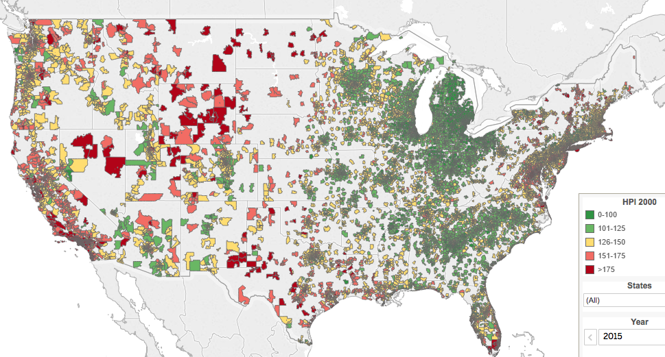
1. Forty years of zip code level home price data. The Federal Housing Finance Agency has posted four decades worth of zip code level data on housing prices. FHFA has calculated a quality-adjusted, repeat-sales home price index for 1975 through 2015. The data also include an interactive map that allows quick comparisons of home price changes. This map shows changes since 2000, with the biggest increases colored red. Dark green represents the biggest declines.
2. The Transport DataBook. Yonah Freemark of Transport Politic has compiled an impressive list of trend and ranking data for urban transportation. You’ll find data and clearly presented charts on vehicle miles traveled, modes of travel, transit ridership, operations and finances. Yonah regularly updates these charts as new data becomes available.
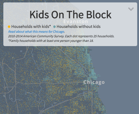
3. Where the kids are. Chicago public radio station WBEZ has taken block-level Census data and used it to identify the pattern of households with and without children under 18. You’ll see a recurring pattern here: households without children (light blue dots) tend to predominate in city centers; households with children (yellow dots) are disproportionately in less central locations. You can zoom to any location in the country.The Week Observed is City Observatory’s weekly newsletter. Every Friday, we give you a quick review of the most important articles, blog posts, and scholarly research on American cities.
Our goal is to help you keep up with—and participate in—the ongoing debate about how to create prosperous, equitable, and livable cities, without having to wade through the hundreds of thousands of words produced on the subject every week by yourself.
If you have ideas for making The Week Observed better, we’d love to hear them! Let us know at jcortright@cityobservatory.org or on Twitter at @cityobs.
