What City Observatory did this week
This week, we published five posts taking a critical look at how a recent Urban Institute report, Measuring Inclusiveness, illustrates the problems and pitfalls of defining and measuring “inclusion.”
1. Why inclusive is so elusive, Part 1: Parallax distortions in applying equality concepts to small geographies. It seems like it ought to be a simple thing to define and measure inclusiveness. While there’s widespread agreement that income inequality and broad disparities in group performance are a problem at a national level, its far from straightforward to apply those same measures to smaller areas like cities. It’s actually the case that a city or neighborhood is more inclusive if it has people from different income and racial and ethnic groups than if that same area is entirely homogenous along these dimensions. Statistically, inclusive areas will always be less equal. The Urban Institute report “Measuring Inclusiveness” fails to address this conundrum.

2. Part 2: The limits of city limits. The second part of our critique of the Urban Institute report “Measuring Inclusiveness” focuses on the use of city boundaries to assemble data on disparities. Municipalities are poor units for comparison: they vary widely size and are often different fractions of metropolitan areas, from widely varying central cities, to suburbs of different incomes. More deeply, in many metropolitan areas, city boundaries were drawn to recognize or enforce racial and class divisions. Ignoring the intrinsic exclusion that’s baked in to city boundaries produces a myopic and inaccurate picture of racial and economic disparities. Most analysts examine entire metropolitan areas, which are defined consistently across the country, encompass entire labor and housing markets, and which overcome the limits of city limits.
3. Part 3: Does Annexation equal economic growth? The Urban Institute report attempted to identify cities with strong economies, in order to judge the relationship between inclusion and economic success. They ranked cities based on job growth between 2001 and 2013, but critically, did not adjust job growth figures to account for the effects of municipal annexations and jurisdictional mergers. For example, they scored Louisville, Kentucky as the nation’s fastest growing city, but that result was driven entirely by its merger with surrounding Jefferson County. Using a common boundary suggests that the city actually lost employment. Other highly ranked cities chosen for case studies, including Columbus, Ohio and Midland Texas, also grew substantially via annexation. The fact that city boundaries shift over time for some cities and not for others means that city boundaries are a poor choice for ranking inter-regional job growth.
4. Part 4: Metropolitan Context. A key feature of the Urban Institute Measuring Inclusion report is that it only looks at data on disparities within cities. As a result, if nearly everyone in a city is rich (or nearly everyone is poor), there will be very small disparities within that city, and it will rank high on the report’s measure of inclusion. What this approach misses is the role that city boundaries play in codifying exclusion in metropolitan areas. That’s the reason nearly all studies of segregation look at entire metro areas, rather than just cities.
5. Part 5: Are expensive suburbs really America’s most inclusive cities? One of the startling claims in the Urban Institute’s Measuring Inclusion report is that of the ten most inclusive cities, nine are some of the nation’s toniest suburban cities, including Naperville, Illinois, Overland Park, Kansas and Bellevue Washington. The reason these cities score well under the Urban Institutes rubric is that there are relatively small disparities across income groups or by race and ethnicity within these cities. But the reason they achieve these scores has everything to do with exclusion: These places mostly prohibit affordable housing alternatives (small lot residential and apartments), and are simply too expensive for lower income households. Those households of color who can afford housing in these places are demographically similar to white households. These places are equal, not because they’re inclusive, but because they’re exclusive.
Must read
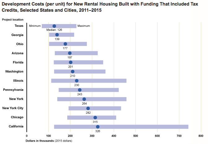
1. The widely varying cost of affordable housing. We often hear anecdotes about the high cost of affordable housing projects in some constrained markets. The US Government Accountability Office (GA0) has a new audit that compares project costs among a dozen jurisdictions nationally. The cost of a typical (median) unit in the GAO study ranges from as little as $126,000 in Texas to more than $326,000 in California. GAO didn’t pinpoint all the reasons for the cost variance, but did not that larger projects tend to experience economies of scale. A project with 100 or more units, on average cost 85,000 per unit less than one with 37 or fewer units. More generally, GAO noted that there’s little effective oversight of the Low Income Housing Tax Credit program, either by the federal government or state agencies that dispense the credits. The highlighted several aspects of the program that are potentially susceptible to fraud or provide weak incentives to control costs.
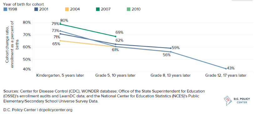
2. Enrollments rising in DC schools. Demographic change has been sweeping the District of Columbia. For the past two decades, increasing numbers of young adults have moved into the District. Despite predictions that they would move to the suburbs in the fashion of previous generations, that’s not happening, and more and more young adults are starting families in the District, which is swelling enrollments at DC public schools. A new report from the DC Policy Center, “Will children of Millennials become future public school students,” projects that total K-12 enrollments in the district could increase almost 25 percent in the next decade, thanks to a combination of more young adults in the district, increased child-bearing, and a growing tendency of families to keep their kids in the DC schools. On this latter point, the data show that for all racial and ethnic groups that the “cohort continuation”–the tendency of kids born in the district to matriculate locally, has increased.
At City Observatory, we’ve charted the move of the young and restless to city centers. What’s happening in DC will increasingly affect other cities as well, making the quality of urban education a key to retaining the human capital that cities have gained in the past decade.
3. More evidence that new highway capacity just isn’t worth the cost. Ben Ross, writing at Streetsblog, has a detailed story about the sad financial picture for high occupancy toll lanes in the District of Columbia. The story points out that despite variable tolls that can be quite high, the toll lanes aren’t coming anywhere close to covering their costs of construction and operation. While this poses an existential threat to the private companies that built and operate the lanes, the Streetsblog story buries the lede: As Ross notes,
These two facilities earned $169 million in toll revenues last year. This did not even cover operating costs and interest on loans taken out to pay for construction, let alone pay back principal on the loans or give Transurban a return on its investment. The loss last year, before taxes, was $64 million.
What that signals is that highway users don’t value the additional roadway capacity (even with faster speeds, thanks to tolling) enough to cover the costs of constructing and operating the roadways. Ross cites a University of Virginia study estimating that a toll rates of $1 to $1.50 per mile, road users have to value time savings at between $100 and $160 an hour to justify paying the toll to use the express lanes on I-95. And even this level of tolls doesn’t pay the cost of the roadway. This is strong economic evidence that we shouldn’t be spending more money widening roads, because users don’t value the benefits of additional roadways or faster travel at anything approaching the costs of providing them.
New (Non)Knowledge
Does anybody really know how many households there are in the US? This Week Observed feature is usually headlined “New Knowledge,” but this week we’ve retitled it, to reflect a recent analysis that reminds us of how little we actually know. Housing stats expert Tom Lawler, writing at the Calculated Risk economics blog, zeroes in on the significant discrepancies in official government estimates of the number of households in the US. Depending on which survey you take, you’ll see esitimates of anything from 118 million to 112 million US housheolds. And it isn’t just the total number that are in question: there are big variations across surveys in the age structure of the household population, with the Current Population Survey coming up with nearly 2 million more under 35 household heads than other sources. Comparisons to decennial census counts (the standard for benchmarking these things) suggests that the CPS significantly overstates households, while other surveys, like the American Community Survey slightly understate them. This is important because these data are used to frame the debate and make pronouncements about whether we’re ill-housed or over-housed.
In the News
The Eugene Weekly has a critical review of generous subsidies and lax oversight of the Enterprise Zone program in Oregon’s Lane County. It quotes City Observatory director Joe Cortright on the steady scope-creep that has diluted the value of the program. Originally restricted to hard-hit areas, a combination of designating more zones, especially in urban areas, and continually adjusting zone boundaries has turned the program into an inefficient and poorly focused business subsidy.
Writing in the Washington Business Journal, Brookings Institution’s Amy Liu cites our analysis of the key factors likely to influence Amazon’s HQ2 location decision.
In his blog, Confessions of a Supply Side Liberal, University of Michigan economist Miles Kimball points his readers to our recent commentary, “If you want less displacement, build more housing.”
