The “commonly accepted” 30 percent standard for judging housing affordability leaves out transportation and location
At City Observatory, we’ve long been dissatisfied with commonly used measures of describing housing affordability. There are lots of reasons to believe that a single, fixed percentage of income standard does a poor job of reflecting whether housing is priced appropriately, and whether households are being asked to spend too much. We’ve explored some of these issues before, but today we want to focus on one key issue–the tradeoff between cheap rents and costly transportation.
In virtually every major urban real estate market, a major determinant of rent and housing prices is accessibility. If you live in a dense, walkable urban neighborhood, you might manage to live quite comfortably not owning a car, or having just one car for a two-worker family. If you live on the exurban edge, in a low density subdivision, you might need to own multiple cars just to manage the daily chores of school, shopping and play, as well as commuting to work. It turns out that the value of accessibility gets priced in to the walkable, well-located housing; and conversely, rental and for sale housing that’s located at a distance from everything is priced at a discount to the market.
What this means as a practical matter that you can’t judge whether an individual household’s living situation is affordable just by looking at whether they spend less than 30 percent of their income directly on housing. Consider this example: two otherwise identical households. One lives in a suburb, owns two cars, and drives most places. They spend 30 percent of their income on housing and 20 percent of their income on transportation. The second household lives in a city and owns one car. Their house is more expensive than the suburban one, so they spend 40 percent of their income on housing, and just 10 percent on transportation. Is it really accurate to describe the second (city) household as any more “cost-burdened” than its suburban peer?
This is the essential insight behind the Center for Neighborhood Technology’s “H+T” Housing and Transportation Index, which quantifies the approximate costs associated with housing and transportation in different neighborhoods. They’ve used census data on income and housing costs, and estimates of commuting patterns, transit available and car ownership to estimate what fraction of a household’s income gets spent on housing and transportation in different locations. They show that some neighborhoods with high housing costs are actually more affordable than lower rent areas, once you add in the savings in transportation costs.
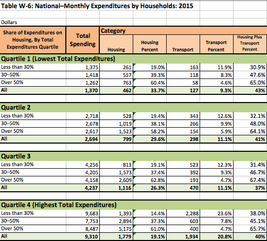
This year’s report The State of the Nation’s Housing from the Joint Center on Housing Studies at Harvard shines a slightly different light on this question, by revealing differences in spending patterns among households. This report examines data from the Bureau of Labor Statistics Consumer Expenditure Survey, which is constructed from spending diaries completed by a random sample of American households. We’ve taken their analysis from Table W-6, and reformatted it slightly, computing the share of total spending on housing and transportation for each income group. We’ve also truncated the table to exclude a detailed breakout of other types of spending (food, apparel, etc).

The Consumer Expenditure Survey divides households into four quartiles according to household spending. The lowest quartile spends the least (about $1,370 per month); the highest quartile spends about $9,300. Within each quartile, the report divides households into three groups based on how much they spend on housing. Less than 30 percent is the group that is considered not-cost burdened by housing, 30 to 50 percent is cost-burdened by housing, and households spending more than 50 percent are severely cost burdened, according to this rubric.
What’s interesting to note here, is how, within each quartile, households that spend less on housing end up spending a great deal larger share of their income on transportation. Conversely, households that spend a larger fraction of their income on housing spend, on average much less on transportation. For example, households in the second quartile who spend less than 30 percent of their income on housing spend 12.6 percent of their income on transportation. That falls to less than 10 percent for those who are somewhat cost burdened, and less than 5 percent for those who are severely cost burdened. This pattern across income groups is consistent with the idea of a tradeoff between cheaper rents and higher transportation costs.
Its especially instructive to look at households in the highest spending quartile. These are the 25 percent or so of most affluent households (as judged by their spending patterns), with monthly spending of about $9,300. Households that spend less than 30 percent of their income on housing in this group spend $2,300 per month on transportation. Meanwhile, their peers with higher housing costs spend dramatically less on transportation ($400 to $600 per month).
To be sure, there are important limitations to the Consumer Expenditure Survey data presented here. They aren’t adjusted for household size (small households tend to spend a larger fraction of their income on rent than larger ones), nor do they adjust for age, or exclude households who have paid of their mortgages (which also tends to dramatically affect reported household spending patterns). Nonetheless, the consumer spending data confirm that there’s a connection between lower rents and higher transportation costs.
The practical implication is that we shouldn’t be talking about housing affordability in isolation. We should really be talking about “affordable living” rather than “affordable housing.” If your rent is low, but you have to spend a disproportionately large share of your income on transportation, then your living situation isn’t affordable.
