What City Observatory did this week
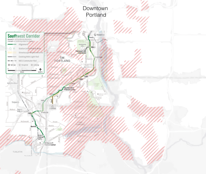
Equity and Metro’s $5 billion transportation bond. This week, Portland residents are voting on a proposed $5 billion payroll tax/bond measure to fund a range of transportation projects. A favorite talking point of advocates is that the measure advances equity, because it will expand transit to black and brown communities. But the measure’s single largest project, the $3 billion expansion of light rail, chiefly serves some of the region’s wealthiest and whitest neighborhoods, and has as its destination a tony suburban shopping center.
The bulk of the package essentially subsidizes car travel by paying for projects located in highway corridors. While the measure does some good things, like subsidizing transit fares for low income populations, it may also jeopardize the use of the payroll tax, which for a half century has underwritten transit operations. A quest to build shiny new capitla projects may undercut the essential work of maintaining bus service, which is very much at issue in the post-Covid era. Fraught and subjective claims about “equity” are mudding the discussion of transportation policy. In the absence of a clear definition of what we mean by equity, and specific metrics for measuring progress, this term is clouding public debate, rather than advancing it.
Must read
1. Driving down emissions. An important new report from Smart Growth America and Transportation for America puts changing the way we get around front-and-center in our efforts to tackle climate change. Excessive driving is the key reason for America’s growing greenhouse gas emissions.The report lays out a clearly explained, cleverly illustrated explanation for how we got in this mess: Building more and more road capacity has induced more driving, and progressively led to the sprawling of homes, stores, and jobs, that have made us more car-dependent.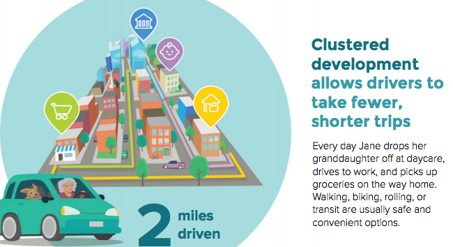
The focus on transportation as transportation distracts us from a more fundamental truth: we’ve made in uneconomical and illegal to build the kinds of places where people don’t need a car to live:
Yet the deep irony is that there is huge unsated demand for communities where it’s safe and convenient to take transit, walk, and bike to get around, but policy decisions that prohibit building or adding housing to those types of places and require streets designed for cars to move quickly have artificially constrained the supply of these places.
The report lays out five key steps that federal, state and local governments should be keeping foremost in mind, and it also punctures the notion that we can solve our greenhouse gas problems solely with the technical fix of electrifying cars.
- Getting onerous government regulations out of the way of providing more homes where people naturally drive less;
- Making safety the top priority for street design to encourage more short trips;
- Instituting GHG reduction and less driving as goals of the transportation system;
- Investing heavily in other options for getting around; and
- Prioritizing access to destinations
2. Los Angeles delays a freeway expansion. Like many state DOTs, the California highway department advanced with plans to widen the 5 and 605 freeways in Souther California. It’s now apparent that the highway-widening will lead to the demolition of hundreds of homes, and that has prompted Metro, the region’s transportation planning body, to call a time out. Importantly, the Metro Board directed the highway planners to specifically add a transportation system management/demand management alternative to the project’s environmental impact statement. Making better use of the existing roadway can lower pollution, lessen costs and avoid destroying even more of adjacent neighborhoods. It’s an alternative that should get much higher priority in every city.
3. More institutional racism in transportation: insurance rates. (Hat-tip to Streetsblog USA for highlighting this study). Auto insurance website Insurify has a study looking at differences in rates charged to drivers by race. It concludes that:
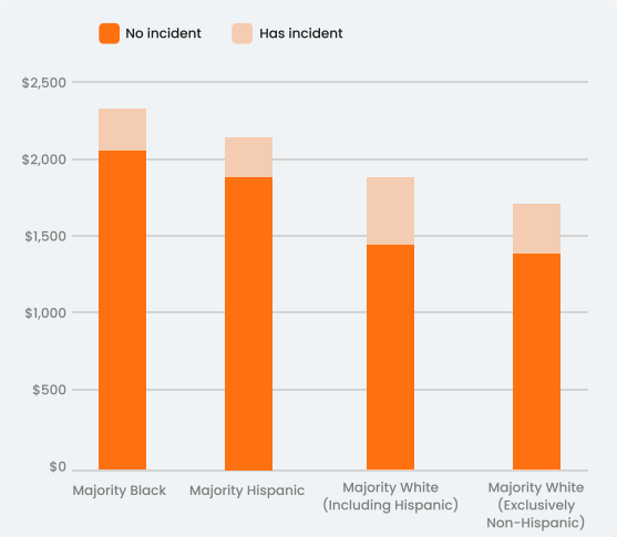
Cities and towns with majority black residents experience among the highest quote prices compared to cities of any other racial makeup, regardless of how clean their driving record is. A driver with a clean record living in a majority-black neighborhood pays almost 20 percent more for car insurance on average than a driver living in a majority-white neighborhood who has prior driving offenses.
What’s perhaps most offensive about these disparities, is the fact that who your neighbors are has a bigger impact on your insurance rates than how safe you are as a driver. Drivers with good records in majority black neighborhoods pay about $2,100 per year, or $800 more than the $1,300 similarly safe drivers in majority white, non-Hispanic neighborhoods. But as Insurify notes drivers with bad records pay only about $400 more on average than drivers with a tarnished driving history. It’s a system that puts a bigger premium on where you live than how you drive, and does so in a way that systematically penalizes people of color.
New Knowledge
Distressed Communities Index. Which cities and neighborhoods are doing well and which are struggling? The Economic Innovation Group has a useful new tool that ranks the nation’s communities from healthiest to most troubled on a series of socioeconomic indicators. They’ve created versatile web-based tool that lets you quickly access data for a range of geographies.
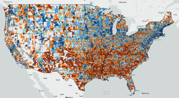
The EIG tool groups communities into five broad categories from “prosperous” and “comfortable” to “at-risk” and “distressed.” The categorizations are based on seven indicators, including income, poverty rates, educational attainment, and employment and establishment growth. The tool allows users to view data for counties, congressional districts and zip codes. The zip code level data is the most illuminating and covers 25,000 zip codes which include 99 percent of the US population.
The reports findings are summarized in a live map of the nation, and you can drill down to specific geographies. Blue colors are most prosperous, reds are most distressed.
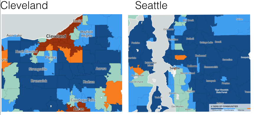
The Distressed Communities Index is a convenient, and transparent tool for quickly visualizing geographic patterns of neighborhood economic performance. Here, as an example, are two metro scale maps showing Seattle and Cleveland.
Nearly all of Cleveland’s core zip codes are classified as distressed; none of the zip codes in the Seattle area are distressed. In both cities, most suburbs are classified as either prosperous or comfortable; much of Seattle’s close-in area is likewise classed as prosperous. These data clearly illustrate the different economic geographies of thriving and struggling metro areas.
In the News
Oregon Public Broadcasting‘s Jeff Mapes has an in-depth analysis examining how the Trump Administration’s policies have affected the Oregon economy. City Observatory’s Joe Cortright is quoted as pointing out that despite claims that tax cuts and deregulation would fuel growth, Oregon’s economy continued on the same trajectory it established during the Obama years, at least until the mishandling of the Coronavirus epidemic produced the sharpest and deepest downturn in a century.

