Back in June, we catalogued how riders weren’t really abandoning buses—buses were abandoning their riders, with significant cuts to service in many metropolitan areas that appeared to be driving declines in ridership.
Further analysis of transit data since 2000 suggests that bus riders may have another problem: not only are there fewer buses on their route, but when they do show up, they’re slower.
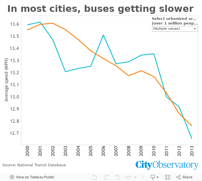
In this chart, we’ve used data from the National Transit Database to compute the average system-wide bus speed, by dividing the total number of revenue miles traveled by the total number of revenue hours operated. This gives us a single, highly aggregated measure of how fast a “typical” bus is moving in each city in each year.
Since 2000, the median urbanized area of a million people or more has seen their average public bus speed drop from 13.6 mph to 12.7 mph, or about 6.6%. That might not seem like a lot, but it adds up to about 20 minutes a week for someone whose commute used to be half an hour each way. Especially if the wait for the bus is longer, adding another few minutes for each trip, that could be significant.
Interpreting these numbers is difficult, though. There are any number of reasons that average speed might decline. The most obvious possibility, perhaps, is simply that there’s more general traffic, slowing buses along with all other motorized vehicles on the road. In some ways, this makes sense. It’s clear that for the most part, larger cities and those with more congested roads have slower buses: the average bus speed in New York in 2013 was 9.5 mph, while Phoenix’s buses traveled at a much faster 12.2 mph. (Of course, as with private vehicle congestion, slower doesn’t always mean worse accessibility: if New York buses are 25% slower, but your destinations in New York are 50% closer, you’ve got better access to where you’re going in New York.)
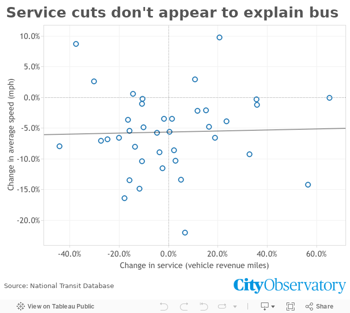
On the more nefarious side, cutting service could end up slowing buses down if there are now more passengers per pickup, forcing the bus to wait longer at its stops for everyone to get on and pay. While that may be a problem for some lines and in some metropolitan areas, there doesn’t appear to be any overall correlation between cutting service and slower buses:
It’s also possible that average speeds could decline without any clearly negative impacts on service. Our measure of system-wide bus speeds will pick up changes in the mix of route types that a city runs, so some year-over-year changes may reflect that, rather than changes in the speed of any particular route. Imagine, for example, a transit agency that decides to cut back on suburb-to-city commuter express buses with little ridership and instead focus on local routes in neighborhoods where residents, jobs, and amenities are more densely packed. That would almost certainly reduce the agency’s average bus speed, but might at the same time increase the number of people with access to useful transit service.
Still, though it’s impossible to know with this data, that explanation seems unlikely to be behind the change across the more than forty urbanized areas with over a million people included in this analysis. To know for sure, you’d have to look metro by metro—and probably agency by agency—and look at their service changes over the last thirteen years.
At the very least, though, these numbers should give transit advocates pause. While vehicle speed isn’t the only, or even most important, factor in good bus service, it does matter—and slow speeds are hardly inevitable. Better stop spacing, all-door or proof-of-payment boarding, and bus lanes can all dramatically improve speeds. The current downward trend suggests that these interventions may be increasingly needed.
