Uber’s lifting the veil–just a little–to provide data on urban transportation performance
Uber’s new Movement tool provides valuable new source of data about travel times in urban environments. We’ve gotten an early look at Movement, and think its something that you’ll want to investigate, if you’re interested in urban transportation.
Uber likes to bill itself as a technology company, rather than a transportation company: technically, it’s the independent driver-owners of vehicles that provide the transportation service; Uber uses an array of information technology to arrange, monitor, finance, and evaluate the transaction. In the process, Uber generates a huge amount of data about the trips that people take and the level and speed of traffic in cities. Access to this ride data has been hotly debated for a number of reasons. Customers, rightly, are interested in protecting their privacy. Ride-hailing companies naturally are seeking to keep this valuable market information from their competitors.
Ride-hailing companies have also been reluctant to share this data with public authorities. New York has managed to force disclosure of some information (which has served as the basis of the Bruce Schaller’s report, which shows ride hailing having a material impact on New York travel speeds). San Francisco working with IT experts from Northeastern University, figured out how to scrape information about ride-hailing trips within the city based on the company’s public facing web sites. Now Uber has stepped forward and started making at least some of its data directly available to everyone.
Movement: a portal to Uber’s travel time data
Uber’s made its new Movement data analysis tool open to the public this week. Initially it’s just providing data for a handful of cities including Boston, Washington, Manila and Singapore, but the company promises to add more cities as time goes by.
The Movement interface is straightforward and simple to use. Its greatest utility is the ability to easily generate data on actual travel times for a given route over a number of different dates. This kind of simple time-series analysis tool can help identify where travel times are increasing or decreasing compared to some base period. This can be extremely useful for diagnosing the effect of transportation investments or observing the effects of system disruptions (like the Atlanta Freeway collapse).
An Example: How has a typical Washington DC commute changed in the past year
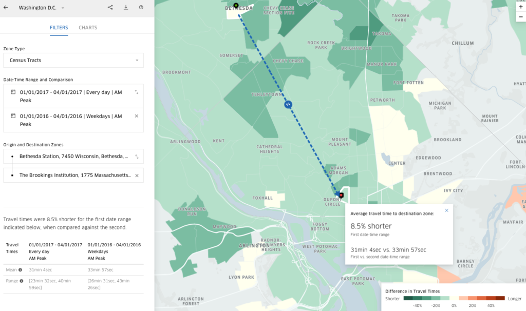
Suppose you live in Bethesda Maryland, and commute by car to the Brookings Institution near Dupont Circle in Washington. How has your commute changed in the past year? We used the Movement tool to select an address in central Bethesda and 1775 Massachusetts Avenue NW as our origin and destination, respectively. We chose two time periods (the first quarter of 2017 and the first quarter of 2016), and restricted our search to weekdays, and the AM Peak period (from 7 am to 10 am). The results are shown below:
On average it takes about 31 minutes and 4 seconds to take this morning commute, down almost 3 minutes from the time required in the previous year (33 minutes 57 seconds). The map’s color coding shows that most commute destinations from Bethesda are shorter trips (shaded green) than they were in the previous year. Helpfully, the interface also shows the range of travel times for trips taken during these periods; this range reflects the geometric standard deviation about the arithmetic mean of the travel time data. Morning commutes on this route ranged from 23.5 to 41.0 minutes in the first quarter of 2017, compared to a range of 26.5 to 43.5 minutes in the prior year. So while the mean commute is down nearly three minutes, the range is still broadly the same as it was in the prior year.
There are some important limitations to this data. The Movement interface reveals trip times only for origin-destination pairs that have a sufficient number of trips (undertaken by Uber drivers) to enable them to calculate average trip times. While this is not a problem in the dense, urban environments which are the richest market for ride-hailing companies, data are sparse in lower density areas, and don’t appear at all for some suburb-to-suburb trips. While this is understandable (Uber can’t generate data for trips that no one buys from it), it’s important to keep this in mind when looking at the data. Fortunately, Uber has disclosed the threshold it uses for presenting data for any set of origin-destination pairs: in general, there have to be at least 5 trips between the origin and destination during the time period examined, and for privacy purposes, the trips have to be made by at least 3 different customers. In addition, Uber filters out origin-destination pairs that have fewer than 30 observations in a given month. (And for those concerned about privacy, the origins and destinations of actual Uber trips aren’t disclosed in the Movement interface, just the estimates of how much time a trip would take based on the average of all trips recorded by Uber along these routes.)
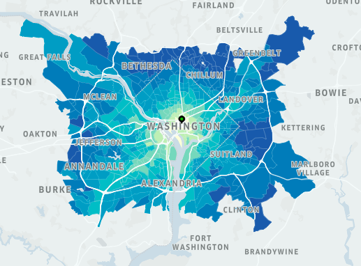
As a result of its service patterns and these filtering provisions, Uber’s data has a heavily urban focus. Their data for the Washington DC area covers the entire area within the Beltway. (Areas shaded blue, green and yellow are reported in Movement; areas shaded gray are not).
It’s also worth remembering that Movement data tell us a lot about traffic speed, but essentially nothing about traffic volumes. Uber vehicles are essentially a sample of vehicles traveling at different times, but Uber lacks data about how many other vehicles are on the road. So essentially, we’ll still have to rely mostly on old-school traffic counting technology for vehicle counts.
Keeping it smart: Transparent and consistent
Going forward, we hope Uber extends its Movement tool to all the major markets it serves. It’s a great example of how “big data” can be made easily available for ordinary citizens, and its a terrific public service for Uber to share this. That said, we have a couple of pieces of advice for Uber.
First, in order to be useful, especially for time series analysis, it has to be consistent. For now, the data in Movement goes back to 2015, but not earlier. Future data availability hinges in part on the company’s continued existence, but another risk is that methodology changes and “series breaks” may make it difficult to track change accurately over time. Much as we appreciate Uber’s civic mindedness in sharing this data, we’re also aware of how vulnerable this makes us. For several years, Inrix–another major provider of real time travel data,similarly derived from vehicle based GPS measurements–published monthly data on travel times in major US markets. But then abruptly in 2014, the company simply discontinued publication of its city-level data. Since then, the company has produced a series of reports decrying the congestion problem, but not presenting data that was consistent with its early methodologies, making it impossible to independently verify its claims. There’s little doubt that the performance data generated by Uber and other ride-hailing companies will be central to public policy debates about transportation and the impact of ride-hailing; we hope they’ll be willing to provide this data on an ongoing basis in an open format, using consistent methodologies.
Second, and relatedly, the definitions and methodologies used to produce the data need to be as transparent as possible, allowing for appropriate concerns about customer privacy and the competitive value of this data. In our beta testing of Movement, Uber did a terrific job of answering our questions. You can download the data from their website for use in other programs, and as noted above, the site reports the range of observed travel times, as well as averages, so that users can get a sense of the variance in travel times as well. All these details make the data more useful for meaningful analysis.
How do I get access to the data?
Access to Uber’s momentum data is available to anyone with a free Uber account. If you already have an account, navigate to movement.uber.com.
Editors note: Uber provided City Observatory with the opportunity to be a beta tester of the Movement data and interface. City Observatory was not compensated for this testing.


