A new report from the Urban Institute shows the stark costs of economic and racial segregation
Long-form white paper policy research reports are our stock in trade at City Observatory. We see dozens of them every month, and usually read them with great interest, and flagging the best one’s for the “must read” list we publish as part of the Week Observed. Usually that’s enough. Yesterday’s report from the Urban Institute–The Cost of Segregation– is different. It’s not just a must read: It’s a must read, digest, understand, and use.

We’ve known for a long time that segregation is “a bad thing.” But the new Urban Institute report offers a stark, comprehensive and compelling calculation of the economic and social costs that segregation imposes every day on the residents of nation’s large metropolitan areas. Higher levels of segregation are associated with lower levels of black per capita income, lower rates of educational attainment, and higher levels of crime. As a result, segregation is more than just wrong or unfair, it imposes serious economic costs. Conversely, more inclusive metropolitan areas are more prosperous.
Urban Institute has computed how large the gains might be from simply reducing the level of segregation in some of the more segregated cities to the level typically found in large metro areas. In the case of Chicago–one of the dozen or so most segregated metro areas–lowering economic and racial segregation to the national median would have these effects:
- raising black per capita income $3,000 per person (for a total metro gain of $4.4 billion)
- increasing the number of college graduates by 80,000
- reducing the number of homicides by almost one-third (from about 6.6 per 100,000 to 4.6 per 100,000 per year.
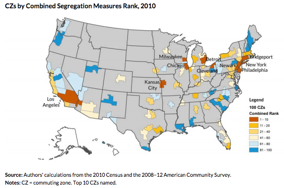
While the report is ostensibly about the Chicago metropolitan area, what you’ll really find in a careful tabulation of segregation data for all of the nation’s 100 largest metropolitan areas, plotting trends over the 20 year period from 1990 through 2010. As a quick summary, they’ve mapped the ranking of metro areas based on a composite measure the combines economic and racial ethnic segregation. On this map, reddish brown areas have the highest levels of segregation, and dark blue areas have the lowest segregation.

Some Technical Details
The report has a wealth of data on segregation. It uses a slightly different geography than most other analyses of segregation, reporting data for commuting zones, city-centered regions that are somewhat larger that federally defined metropolitan statistical areas. (Economist Raj Chetty and his colleagues used this same geography for their Equality of Opportunity analysis). The report also uses two new measures of segregation. Its measure of racial and ethnic segregation is the Spatial Proximity Index, which is computed for pairs of groups (Whites and Blacks and Whites and Latinos). The SPI is one if two groups are clustered in the same neighborhoods, values higher than one indicate the degree to which members of each group are more clustered with others in their group (whites with whites, and so on). Higher values indicate greater degrees of segregation between groups.
For economic segregation, the report uses the Generalized Neighborhood Sorting Index, which measures the extent to which high income and low income groups tend to live in the same or different parts of a metropolitan area. The GNSI runs from zero (evenly distributed) to 1 (completely segregated). The index has a spatial component, considers whether, for example, poor neighborhoods are primarily adjacent to other poor neighborhoods, or are more intermingled with higher income neighborhoods.
The report includes detailed data for each of the nation’s 100 largest commuting zones, as well as a clearly constructed on-line calculator that illustrates where a selected metropolitan area stands in relation to all others. Here are the calculator’s data for Chicago:
This is just a quick overview of what’s in the report. We’ll be digging into its content more in the next few days, and sharing some of our thoughts. But don’t wait for our analysis, there’s lots to learn by downloading the report and pouring over the data for your metro area.

