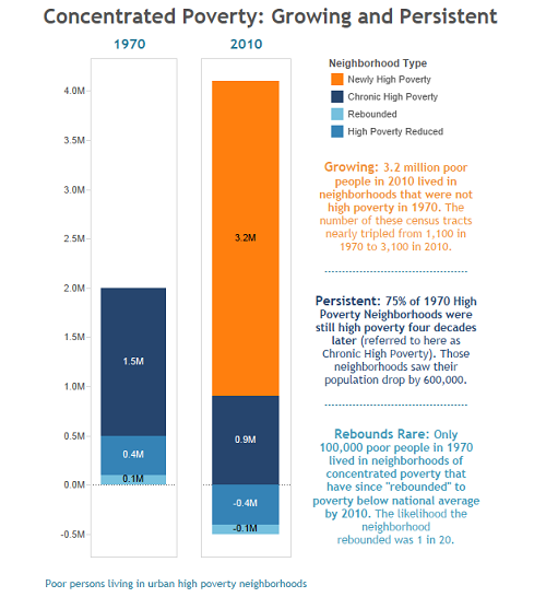
Many talk about poverty—its causes, its effects, and its possible remedies. There is literature on this issue from almost every social science, and no one can summarize it all in one blog post. However, there’s one aspect of our most recent report that I wanted to highlight: the deepening of poverty. Not only are we seeing much more highly concentrated poverty than we used to–but this has the most profound effect on children.
As a quick background if you haven’t read it: the report looks at concentrated poverty in urban neighborhoods (census tracts within 10 miles of the central business district), and concludes that a full three-quarters of neighborhoods that were high-poverty neighborhoods 40 years ago are still mired in poverty today. Additionally, the number of new high poverty neighborhoods has tripled, and the number of poor people in them has doubled, a figure that amounts to 3.2 million people.
Another way to look at this change is to examine the distribution of poverty rates across both neighborhoods (or census tracts), and population within those neighborhoods. (For those of you that aren’t stats-oriented: a distribution– generally graphically shown as a histogram—gives you an idea of what ‘normal’ looks like, and what kind of variation you would see. The highest point on the histogram is the most common outcome of any given variable.) The following histograms chart out the poverty rate both in terms of population and census tracts. (So, there were 15 million people in neighborhoods with a 0-5% poverty rate in 1970, 5,000 neighborhoods with a 5-10% poverty rate in 1970, and so on.)
As you can see, the general shape is the same across both time periods, and both peak at the 5-10% poverty rate range. However, there seems to be a spreading of both distributions in 2010. That is, while the majority of urban census tracts were in the 5-10% poverty range, the height of this norm was smaller, and there were more people and neighborhoods in the 10% and over bins. This is an indicator that not only are more people in poverty—and economically segregated into high-poverty neighborhoods—but that the experience of high poverty had become more common. The Equality of Opportunity Project has found that intergenerational income mobility is much lower in places with high levels of income segregation; the growing income segregation that we see over this time period means that millions of Americans will not be able to achieve the American dream.
To see the extent of this shift, we examined the tail end of the distribution—basically, the most impoverished neighborhoods. We will discuss this—and its implications—in a post later this week.

