The proposed I-5 Rose Quarter freeway widening project creates a bike- and pedestrian-hostile environment
The Oregon Department of Transportation has crafted distorted images that exaggerate pedestrian use by a factor of 200
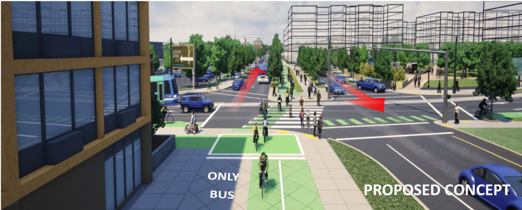
As part of its effort to sell its $500 million dollar project to widen Interstate 5 at the Rose Quarter, the Oregon Department of Transportation has prepared some computer generated renderings of what area streets will look like. At first glance, they seem to buttress the notion that this will be a pedestrian and bike friendly environment, with lots of space devoted to non-car travel. Project staff are is fond of repeating the words “36-foot wide multi-use path.”
But if you take a close look a the computer rendering, what you’ll see is both some troubling design flaws that actually make this a bad place for people who aren’t in cars. And if you turn a critical eye on the way the rendering is constructed, you’ll see that ODOT has intentionally distorted the perspective to make things seem rosier than they actually are.
Wrong Way Traffic
The first thing you should notice is the two-way street in the center of the diagram. It’s got lanes of traffic on either side of a combined bike-pedestrian multi-use path. But unlike every other road in the city of Portland or the state of Oregon, traffic is driving on the left-hand side of the road. It is a miniature diverging diamond. Diamonds are used by traffic engineers explicitly to facilitate the faster movement of cars. But they’re disorienting to pedestrians and cyclists, because instinctively, they tend to look in the wrong direction to detect traffic. That’s why diverging diamond intersections regularly have “Look Left” and Look Right” stenciled on the pavement to warn pedestrians that traffic is coming from an unexpected direction. There’s also a bus only lane that appears to run on the sidewalk.
Two freeway on-ramps
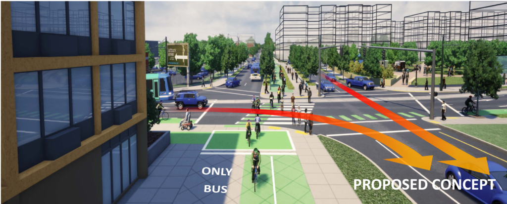
Again, because this is a still image rather than a moving one, it isn’t clear what the cars on the wrong way diverging diamond are doing. Where they’re going, in both cases is directly onto freeway on-ramps. In both cases, the traffic light at the end of the diverging diamond (the southbound one is over Williams Avenue, immediately in the foreground, another one, not shown is at the other end of the diverging diamond) is the last traffic signal before vehicles enter the I-5 freeway both north and south bound. Vehicles on the diverging diamond will be accelerating to freeway speeds. So not only will the cyclists and pedestrians in the center of diverging diamond be disoriented by heavy traffic going in the wrong direction, they’ll also be confronting drivers intent on accelerating to freeway speeds. The arrows on the following chart show the movement of cars, both from the west and from the north which will be accelerating on to the Southbound I-5 freeway on-ramp.
High Speed Corners
Throughout Portland, as part of the city’s efforts to improve safety, the city is building curb-extensions, bumping the corner of intersections out further into the street, to shorten crossing distances, to make pedestrians more visible to drivers, and critically, to force drivers to slow down to make turns–because the curb extension sticks out further into the junction of two roads, it forces drivers to make a sharper, and therefore slower turn. These drawings are from Portland’s Pedestrian Design Guidelines, and the photo shows a curb extension in practice:
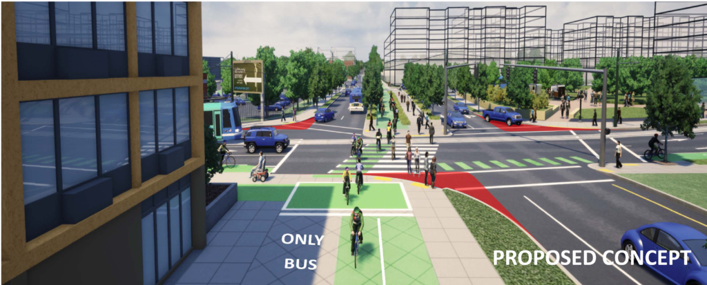
But look closely at the corners of this intersection–in every case they’ve been cut back and rounded off, moving the corner further away from the street–the exact opposite of curb extensions. The following illustration shows the portion of the corners of each of these intersections–the red triangles–that would be cut away to speed car turning movements.
By making these turns wider–in engineering parlance “increasing the radius of curvature”–this encourages cars to drive faster, increasing the hazard to pedestrians. In addition, it makes pedestrians less visible, and increases crossing distances. At each of these corners, pedestrians in crosswalks will be confronting fast moving cars.
Distorted Images
While a close look at these renderings reveals some of the flaws in the design of this intersection, it’s important to remember that the image itself was crafted by the Oregon Department of Transportation, which made a number of editorial decisions which are clearly designed to influence the viewer. Consider first the perspective and vantage point chosen for this image. The viewer is floating 20 or 30 feet in the air, looking down at the bike path and sidewalk. This doesn’t represent how actual humans will encounter and perceive the project. The foreground (which due to the rendering is shown much larger) is filled with bikes, pedestrians and green-painted spaces. Nearly all of the car lanes are shown in the background and thereby made to seem much smaller. In a sense, that’s how perspective works, but the decision to put bike/pedestrian infrastructure in the foreground, and cars in the background conveys the impression that one is big, and the other small. Imagine for example, the cars were in the foreground and the bikes in the background–one would have a much different sense of how much space was devoted to cars as opposed to bike-riders and pedestrians.
Invisible cars
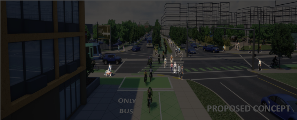
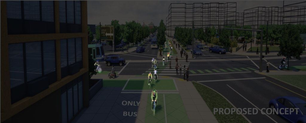
Another distortion comes from what’s shown–and what isn’t shown–in the renderings. This seems to be a very pedestrian-oriented space because ODOT has chosen to show only a handful of cars. The easiest way to detect bias in this image is simply to count things. How many cyclists are there? How many pedestrians? How many cars? We can do that. Here are 25 pedestrians (and we didn’t count ones that weren’t shown on sidewalks.
In addition there are 8 cyclists.
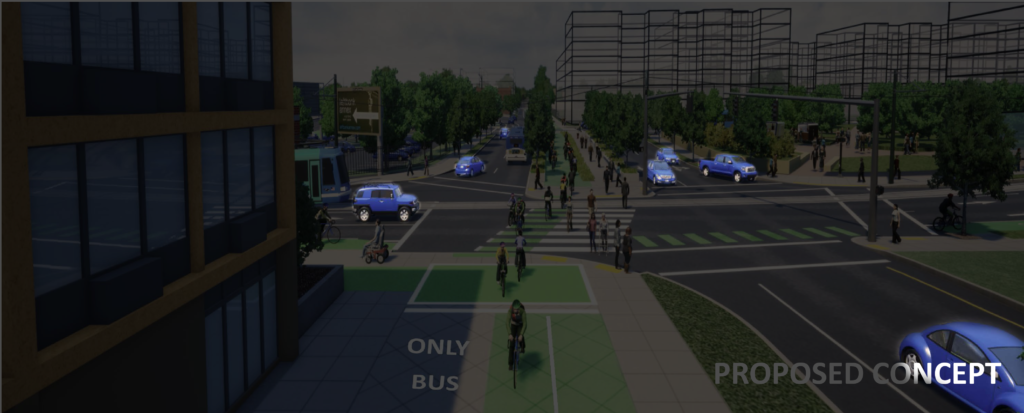
But there are only 5 cars.
On one of the busiest intersections in Portland, at the convergence of two major north-south and east west arterials, as well as the I-5 freeway, there are almost no cars. But there are huge numbers of bike riders and pedestrians. Bikes and pedestrians outnumber cars 5 to 1 in this illustration. That’s a wild distortion of reality. Consider the actual evidence of who uses this intersection. The City of Portland’s traffic counts, last taken on a typical afternoon in June, showed that in the afternoon rush hour, cars outnumbered pedestrians by about 40 to 1. Here’s the data:
The data show that between 4 and 6 pm, there were 4,228 cars and trucks that traveled through this intersection and just 96 pedestrians: In round numbers there were about 40 times more cars than pedestrians used this intersection. What that means is that ODOT’s rendering has distorted the actual use of this intersection by a factor of about 200. The ODOT rendering shows five times as many pedestrians as cars. Reality is that there are about 40 times as many cars as pedestrians. This is distortion on an epic scale. If one were to take this image as a depiction of reality, you would have to wonder, why are we widening the freeway when there are virtually no cars in this neighborhood?
Imaginary buildings
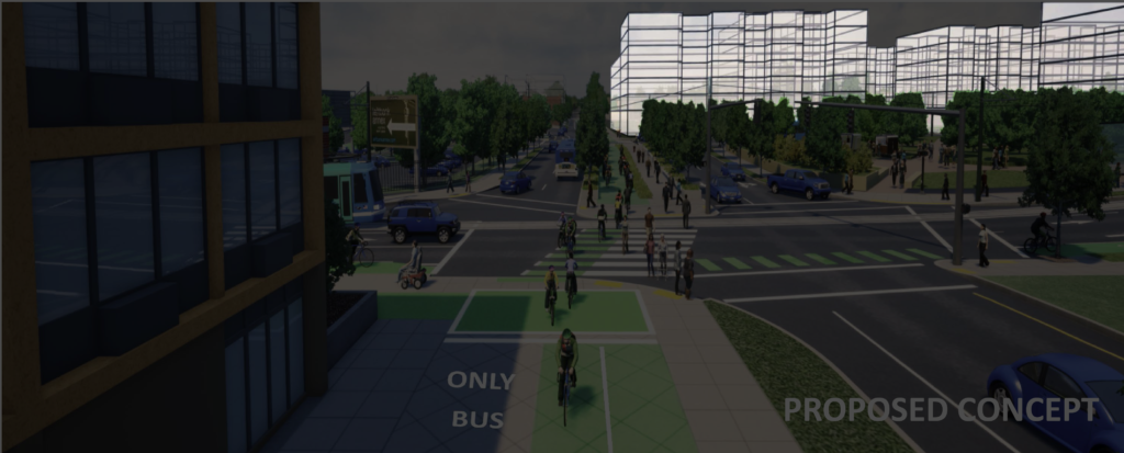
Like so many freeway interchanges, this is a hardly a pleasant urban environment. In addition to freeway on-ramps, desolate and unkempt patches of land next to the roads and abutments, the most prominent commercial uses are a gas station, a car dealership and a paint store. But this image has improved the area by adding several imaginary wireframe buildings. Of course, the project doesn’t actually involve building any buildings, and there are no plans to make the freeway covers strong enough to support buildings, but that hasn’t stopped ODOT from making its project look more urban and inviting by installing fictional buildings that simply aren’t there.
The renderings prepared by ODOT masquerade as objective information, but are deeply biased. If you look closely, you can see the projects flaws–wrong way traffic, high speed corners, bus lanes running on the sidewalk, city streets functioning as acceleration lanes for freeway on-ramps. More tellingly, though, the renderings are drawn in a particular way to present a misleading view of the project and its impacts, the viewer is looking at the seen from a kind of video-game viewpoint floating in air, perspective is used to make people and bikes look large, and cars look small, non-existent buildings are conjured out of thin air, to make the area seem more urban and inviting, and the entire scene is populated with people and bikes, while almost no cars are shown.

