We confess: we’re data geeks. We love data that shows how cities work, and that give depth and precision to our understanding of policy problems. But truth be told, most data we — and other analysts — work with is second-hand: its data that somebody else gathered, usually for some other purpose, that uses definitions and methods that don’t quite capture what we’re trying to get at. Information about employment and wage trends, for example, is gleaned from tax and administrative records. Working with this “secondary” data means that you’re always trying to extract meaning from something that doesn’t exactly measure what you’re interested in; this is why data analysis is often as much an art as it is a craft.
So when a new technology comes around that let’s us generate our own personalized, customized data, we get pretty excited. (For you foodies, its kind of like going from only having store-bought industrial tomatoes, to growing sun-ripened heirloom varieties in your own backyard–sort of). But what we’re talking about here is our own, home-grown, artisanal data.
Placemeter, a New York based startup has developed image processing software to count cars, people and bikes in urban environments. Their technology uses existing cameras (it can analyze a stream of real time data) or you can buy one of their Placemeter devices (currently $90) or use any fairly standard wi-fi enabled web-cam. Placemeter then sells their monitoring and data services for between $30 and $90 per month per location counted (locations can be a street, sidewalk, building entrance or area).
For the past several months we’ve been experimenting with the company’s Placemeter device. Placemeter is a small, plastic box, slightly larger than a deck of playing cards. It has a camera, a wifi tranceiver and an embedded processor. It attaches to the inside of a window and is powered by a small AC-power brick. You point it out the window, connect it to your local wifi network, and then log into a web page that lets you see the camera’s eye-view of the area outside your window. Using your web-browser, you identify cordons (Placemeter calls these “turnstiles”) by using a mouse to draw lines on the image from the camera. Then Placemeter starts counting the number of people, bikes and vehicles that pass through the turnstile. It logs this information, by turnstile and by direction, and also provides a handy set of diagnostics that let you view counts by hour or by day and by direction. (You can also export a CSV formatted log file that can be used by any standard spreadsheet or analysis program). The company has squarely addressed privacy concerns: the Placemeter analyzes the data stream in real time, and doesn’t store personally identifying information or images, just the results of its own computations of the numbers of people and vehicles it has counted.
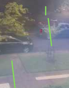
For our CityObservatory test, we positioned the sensor to face a residential street with two-way traffic and with paved sidewalks on either side of the street. As shown in the grainy, low-resolution photo below–captured through the Placemeter device camera, we established three turnstiles, one for the street, and one for each sidewalk. Turnstiles are shown as bright green lines. A vehicle is just crossing Eastbound through the turnstile that crosses the roadway. Our camera has an oblique view across the street.
Placemeter Turnstiles on a Residential Street (webcam image)

A key limitation of our version of Placemeter is that it doesn’t distinguish between the type of object that goes through a turnstile: so whether its a car, truck, or bicycle, any vehicle traveling through our street-centered cordon would be recorded as a single vehicle. On a street with a marked bike lane, it would be possible to establish separate turnstiles for the general travel lane and the bike lane, but accurate counts would require a camera angle that allowed you to see both lanes clearly. Placemeter has recently come out with a new version of its software that is designed to distinguish between people, bikes and cars; we have not tested that version yet.
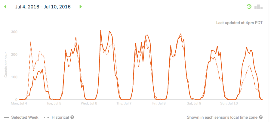
Placemeter’s dashboard shows hour by hour counts and provides a historical baseline computed from the previous three weeks of data. Here’s a chart for early July. The weekday traffic shows a common “double hump” pattern, reflecting morning and evening rush hours and a mid-day dip. Weekend traffic is lower, with a single mid-day to evening peak. Traffic on this residential street falls to nearly zero over night. The much more subdued traffic (especially in the morning hours) is apparent on the July Fourth holiday: Instead of the usual 257 vehicles between 8am and 9am, there were just 50.

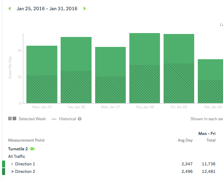
In addition to these hourly counts, Placemeter’s dashboard also summarizes counts by day and direction in a bar chart format. Here what that looks like:

To judge the accuracy of the Placemeter vehicle counts, we compared them to a vehicle count conducted by the City of Portland. The most recent city data were from January 2015, and were recorded on five weekdays on the same street and block face as that covered by our Placemeter setup. For comparison purposes, we examined our daily data for the same week in January 2016 (one year later). The city statistics show an average daily traffic of 5,233 vehicles while our Placemeter count is 4,843 ADT. The two counts also show a similar directional pattern (the city figures show a 52%/48%westbound to eastbound split; our figures also show 52%/48%.
We’re awash in claims about how big data will transform the world. But there’s also an important role for little data, especially when its data that can be precisely focused on the places and issues you find interesting.
It levels the playing field for bikes and pedestrians. As we’ve pointed out, when it comes to some modes of transportation, especially biking and walking, they’re effectively invisible and therefore disenfranchised from policy discussions, simply because we have no data about them. We’re awash in data about how many cars are traveling and how fast–or slowly–they travel, but have precious little information about the use of active modes.
Placemeter can be a boon to planners and transportation agencies. Its less expensive–and by our very crude reckoning–roughly as accurate as other methods of traffic counting. It provides basic analysis tools and archived data. Placemeters are flexible and easy to set up, and its possible to use existing web-cams to generate data.
It can be a terrific tool for evaluating projects and events. One of the toughest evaluation tasks is judging the impact of limited duration events (rallies, festivals and concerts, traffic associated with football games). Placemeter lends itself to recording activity in very small geographies–like the entrance to a building or a single pathway in a park.
Finally, while its not free, its also not terribly expensive. So this provides the opportunity to democratize access to data. If a civic group, a neighborhood organization, or just an individual citizen wants to get their own data on how a roadway or other public space is being used, they don’t have to depend on anyone else to get it. Easy access to lots of “little data” may be just as disruptive as the much ballyhooed “Big data.”
