Its early September, and most of the the nation’s students are (or shortly will be) back in the classroom. There may be a few key academic insights that are no longer top of mind due to the distractions of summer, so as good teachers know, now is a good time for a quick refresher–something that hits the highlights, and reminds us of the lesson plan. So it is today, with City Observatory.

There’s a growing tide of data illustrating the economic importance of vibrant urban centers. Here are three charts we’ve collected in the past year that underscore the importance of city centers, walkability and transit access—some of the critical factors behind city success.
Chart 1: Walkability drives commercial land values
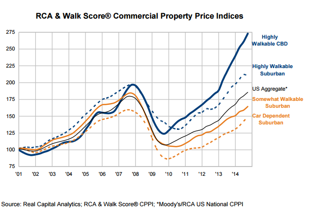
Real Capital Analytics tracks commercial real estate values in cities across the United States. Like many of us, they’ve noticed the growing importance that businesses place on being located in walkable areas—because that’s where their customers and workers increasingly want to be. And the desirability of walkable areas gets directly reflected in land values. RCA constructed a price index for US commercial real estate that compares how values are growing in highly walkable areas compared to car-dependent ones. No surprises here: over the past 15 years commercial real estate located in the most walkable areas has dramatically outperformed less walkable areas.
RCA uses a repeat sales index to track changes in property values over time. Their data show that not only have property values in highly walkable central business district locations fully recovered since the 2008 recession, they’ve gained more than 30 percent over their previous peak. Meanwhile, commercial property values in car-dependent suburbs languish at pre-recession levels. As we’ve noted at City Observatory, the growing disparity between central and suburban property values is a kind of “Dow of Cities” that shows that illustrates the economic importance of centrality.
Chart 2: Transit access boosts property values
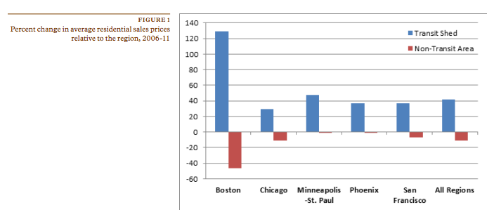
In addition to walkability, another aspect of great urban spaces—transit accessibility—is also a strong predictor of property values. The Center for Neighborhood Technology looked at trends in residential real estate values in Boston, Chicago, Minneapolis-St. Paul, Phoenix, and San Francisco, between 2006 and 2011, and found that property in transit served locations dramatically out performed property values in places with limited transit. They found strong evidence to support the view that “access to transit” is the new real estate mantra. Over this five-year period, transit-served locations outperformed the typical property in their region by about 40 percent, while property values in non-transit served areas underperformed the regional average.
Chart 3: People are increasingly moving to urban centers
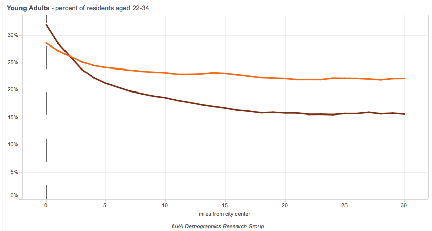
Luke Juday at the University of Virginia’s Demographics Research Group has done a terrific job of compiling Census data to map the relationship between population trends and centrality—how close to the center of the central business district do people live. Juday’s work can show whether specific population groups are, in the aggregate, moving closer to the urban center, or are decentralizing. His interactive charts show data for the top 50 metropolitan areas, and clearly illustrate the centralizing trend that characterizes well-educated young workers—something that we’ve explored in our reports on the Young and Restless. For example, consider this chart of the location of 22 to 34 year olds by distance from the central business district in 2000 and 2012.
The data in this chart are a composite of the 50 largest metropolitan areas in the U.S. In 2012, the fraction of the population within a mile of the center of the central business district (the darker line) in this key young adult demographic approached 30 percent, a substantial increase from 2000 (the lighter line). Meanwhile, the share of the population in more outlying areas declined. This is powerful evidence of the growing preference of young adults for urban living.
At City Observatory, we’re data-driven. These three charts, taken together with four others we highlighted earlier, make a strong case for the growing economic importance of cities. Walkability, transit access and the movement to city centers are big economic drivers. That’s the lesson that all of us–students and urban leaders alike–need to be keeping in mind.


