Last Friday’s Wall Street Journal came out with another eye-catching headline story in the city versus suburbs battle of the bands: “Suburbs outstrip cities in population growth, study finds.
Big cities may be getting all the attention, but the suburbs are holding their own in the battle for population and young earners. . . . research shows that suburbs are continuing to outstrip downtowns in overall population growth, diversity, and even younger residents.
On its face, the article seems to imply that much of what has been written in recent years about a rebound in cities is either wrong or somehow overstated. While the Wall Street Journal rushed to position the report calling the city-suburb horserace for suburbs, the ULI press release was more guarded:
Suburban housing markets across the United States are evolving rapidly and overall remain well positioned to maintain their relevance for the foreseeable future as preferred places to live and work, even as many urban cores and downtown neighborhoods continue to attract new residents and businesses, according to a new publication from ULI.
The full report on which the WSJ article was based was published on the Urban Land Institute website on Monday, December 5, so we’ve all had to wait a few days to see how ULI reached this conclusion. The full report, “Housing in the evolving American suburb,” prepared by RCLCO, is available here, and there’s also a companion website, which shows how they’ve classified individual census tracts in each of the 50 largest metro areas. It’s an ambitious undertaking, classifying every census tract in the 50 largest US metropolitan areas according a a new and quite complicated neighborhood taxonomy. While we haven’t had a chance to vet the data in detail, we do have some observations based on our first reading of the report. Here are some initial thoughts.
Grading on the curve
The ULI report uses its own custom-crafted definition of cities and suburbs. And it’s quite unlike that used by other researchers. They look at data for the 50 largest metropolitan areas and group individual metropolitan areas into one of six categories, including “gateway,” “sunbelt” and “legacy.” New York gets its own category. Each category has its own definition of what constitutes “urban”, as well as five different flavors of suburb, ranging from “established high end suburbs” to “greenfield value suburbs.” You can think of this as “grading on a curve” because what constitutes urban in one metropolitan area might be considered suburban in some other metropolitan area. The report’s Appendix A explains that each category of metropolitan areas had a set of rules for classifying tracts as urban or suburban, and for suburban tracts, their exact sub-category, based in part on the distribution of data for that category of metropolitan areas, but there’s no reporting of the exact cut-off points for each category. The Appendix states (page 43) “For more information on the absolute cuts for any given MSA category, see the table in this appendix,” but no such table appears in either of the report’s two appendices.
This classification system and its varying statistical thresholds for assigning neighborhoods to different categories in different metros produces some head-scratching results for individual metropolitan areas. According to the ULI report, as measured by population, a higher fraction of neighborhoods in Milwaukee (24 percent) are urban than in Chicago (12 percent); San Jose (40 percent) is more urban that either San Francisco (20 percent) or New York (35 percent), and Houston (10 percent) is slightly more urban than Seattle (9 percent). Looking at the report’s maps of the pattern of urban and suburban categories, suggests that they have things roughly right; the center of every metro area is urban, and its surroundings suburban. That said, its not always clear that you would necessarily agree where they draw the boundary between urban and suburban in any particular metro areas. For example, it would probably also come as something as a shock to those who live in this Chicago neighborhood to realize that they are classified as a “suburb” according to the ULI report:
Even if we might disagree with the results in some particular places, ULI deserves full marks for trying something different. As we have pointed out at City Observatory, there are some serious limitations to using municipal boundaries to distinguish between cities and suburbs. A common practice is to treat the largest municipality in a region as the “city” and everything else as “the suburbs.” In some places–Phoenix, Austin, Jacksonville–great swaths of low density development are in the city limits of the largest city. Its also the case that in some metro areas, the largest city represents only a tiny fraction of the metro area–the cities of Atlanta and Miami are only about 10 percent of their respective metros, for example. The ULI methodology is a serious attempt to avoid this particular problem, by looking at density, housing types and neighborhood characteristics. And, thankfully, its transparent: you can navigate their map of the US to see how they’ve classified each census tract in the US. Its a complex and in many ways subjective task to separate urban from suburban, and there’s plenty of room for honest disagreement. To their credit, the authors have been pretty clear about their approach (although it would be great if they had included a table showing the actual definitions used in each category of metropolitan areas). But in our view, grading on the curve–using different rules to define what constitutes urban and suburban in different metro areas–makes it difficult to interpret their national level results.
Moving beyond a binary classification
The key claim the Wall Street Journal article is that this ULI study sheds new light on the relative attractiveness and success of cities compared to suburbs. One of the problems with this style of analysis is that it insists on dividing the metropolitan world into just two parts “city” and “suburb.” In our view it’s much more illuminating to look at finer grained data on where people are actually choosing to live. One of the most helpful tools available is a set of charts generated by the University of Virginia’s Luke Juday. He’s taken census data and plotted population and demographic characteristics of the population by drawing a series of concentric rings around the center of each large US metro area. Like the ULI report, he’s done this for the 50 largest US metropolitan areas. His analysis shows how things looked in 1990, and how they’ve changed through 2012. Here’s a table showing where young adults lived in 1990 and in 2012.
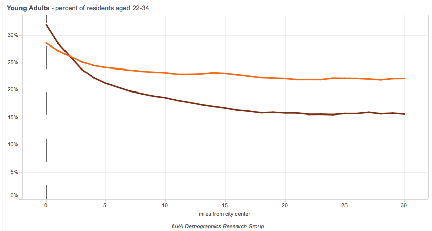
This chart shows the distribution of young adults (those aged 22 to 34 years of age) by distance of their neighborhood from the center of the central business district. The brown line shows the distribution in 2012, the orange line shows the distribution in 1990. A couple of observations are in order. First, both lines slope down to the right: young people are more likely to live close to the center of the metropolitan area than other Americans. Second, the line for 2012 is decidedly steeper than the line for 1990. This shows that young adults have a much stronger preference for central neighborhoods now, relative to other Americans, than they did two decades ago. We think that this is much more nuanced and more powerful evidence of the locational preferences of young adults than the very summary data presented in the ULI report.
The housing bubble is over
The ULI report treats the entire period 2000 to 2015 as if it were a single phase or cycle. But for anyone who has been paying attention to housing markets, or indeed, the overall economy, this period is really breaks down into two very different cycles. The first, from 2000 to about 2007, corresponded to the expansion of the housing bubble, which resulted chiefly in the construction of lots of suburban and exurban single family homes. The second half, from 2008 through 2015, corresponds to the Great Recession and the slow recovery, a period during which single family, suburban housing has languished, and nearly all of the action in housing markets has been in multi-family units, and chiefly apartments in urban locations. Conflating those two distinct periods overstates the growth of suburbs and understates the rebound in cities.
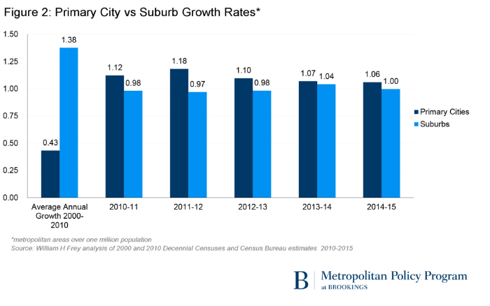
Its very clear that the trend has been quite different before and after the recession. Take the Brookings Institution analysis of city-suburb population trends compiled by Bill Frey. While it uses a central city definition tied to the most populous municipalities in each metro area (“primary cities”), which has some limitations, it clearly shows that performance in the 2000-2010 period was very different than in the subsequent five years. For 2000-2010, suburban population grew faster than city population 1.38 percent per year to 0.43 percent. In each of the years since 2010, city population growth has exceeded suburban growth.
Our own analyses of city and suburban job growth trends show the same kind of sea change between 2001-2007 (when suburbs grew faster) and since then (when city centers had higher growth).
Despite the headline claims in the report, buried in a single paragraph in the report’s Appendix B there’s an acknowledgement that things were very different after the Great Recession than before: “Using the RCLCO classification, suburban areas were found to have seen a somewhat lower share of growth since 2010, at only 80 percent of population and 76 percent of household growth.” (Page 43) Recall that the report’s main finding about the dominance of suburban areas was that they accounted for 91 percent of population growth over the 15-year period. Arithmetically, this means that suburbs accounted for something like 95 percent of population growth in the 2000 to 2010 period. By subtraction, that implies that the share of population growth not in suburbs (i.e. mostly in cities) went from about 5 percent in 2000-2010, to roughly 20 percent in the 2010-2015 period–a very substantial increase. The ULI report could shed much more light on the question of city versus suburban growth if it had focused on the period since 2007, rather than simply presenting results that largely recount the unsustainable growth patterns recorded during the housing bubble.
The myth of revealed preference
The implicit argument behind statistically based stories that report that more American’s live in suburbs (however classified) than live in cities, is that this represents a kind of revealed preference for suburbs. There’s a strong body of evidence that more people would live in cities if there were more housing there. The rise in urban home prices relative to suburbs is the strongest indicator. We also know that NIMBYism and the substantial obstacles to building more housing in cities mean that fewer people can find urban homes that would like to live in them. And, as Jonathan Levine pointed out in his book, Zoned Out, matched comparisons of consumers and neighborhoods in different metropolitan areas show that more Americans would prefer to live in urban locations.
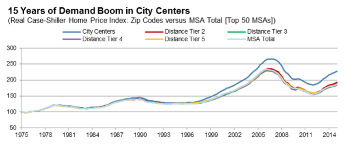
As we’ve pointed out, the rising relative price of housing in the urban core shows a growing demand for urban living. Fitch Investment Advisers has used zip code level data on housing prices in the nation’s largest metropolitan areas to plot the price of housing in close-in urban neighborhoods relative to the rest of the metropolitan area over the past 25 years. Their data show that the premium that buyers are willing to pay to live close to the center has accelerated in recent years. (Fitch divided up large metro areas into five concentric circles based on their distance from the center of the CBD; prices in the closest tier outperformed all other tiers from 2000 onward; The Fitch finding has been separately corroborated by studies from Zillow and the Federal Housing Finance Agency.
In Appendix B of their report, the authors briefly address the issue of lagging relative suburban home prices. They reference the study conducted by the Federal Housing Finance Agency showing that home prices appreciated twice as fast in neighborhoods close to town as in neighborhoods ten miles from the central business district, and that even more peripheral places saw still slower price increases. They argue that we shouldn’t be tempted “to treat these price trends as demonstrating a shift in housing preferences.” (Page 44). But what’s offered as counter evidence isn’t so much a refutation of the growing demand for urban locations relative to suburban ones, as an explanation for this trend. Suburbs, we’re told, are becoming less attractive because of lengthy commutes, while urban amenities are growing. They also argue that its easier to build new housing in suburbs than cities. We’re in agreement with all these points, but what this essentially shows is that we have a shortage of cities, and an unrequited demand for urban living.
About diversity
The ULI report claims that suburbs are also nearly as diverse as cities. The report says:
American suburbs as a whole are racially and ethnically diverse. Fully 76 percent of the minority population in the 50 largest metro areas lives in the suburbs— not much lower than the 79 percent of the population in these metro areas as a whole.
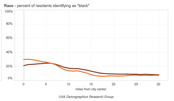
If all suburbs were alike, this might be an almost convincing point. But a key part of the ULI report is its observation that there are many different kinds of suburbs. Reporting data at such a high level of aggregation greatly obscures the differences within suburbs. According to the ULI report, 62 percent of the population of “economically challenged suburbs” are racial or ethnic minorities, roughly double the fraction of the population in either “established high end suburbs” (34 percent) or “greenfield lifestyle suburbs” (27 percent). (The report doesn’t describe its data source, nor does it cite the exact definition of minorities that it uses–we assume that this is the American Community Survey, and they’re treating everyone other than non-Hispanic whites as minorities, but we honestly can’t tell from the data in the report). Again, the data from Luke Juday’s “Changing Shape of the American Metropolis” sheds a much more nuanced light on the pattern of racial and ethnic diversity across the metropolitan landscape. Here’s a chart showing the fraction of the population that is black by distance from the center of the central business district, aggregated for the 50 largest US metropolitan areas. The closer you are to the center, the great the fraction of the population that is black, the further from the center, the lower the fraction. While its true that African-Americans are more decentralized now (brown line) than they were in 1990 (orange), it remains the case that Blacks are about three times more likely to live within 5 miles of the city center than they are to live 15 or more miles away.
While racial segregation has eased in the United States, it’s still the case that cities are more diverse than suburbs in aggregate, and that suburban minorities tend to be disproportionately concentrated in economically distressed suburbs, and are far less likely to live in up-scale suburban neighborhoods.
The verdict: Not proven
The three principal claims in the Wall Street Journal article, that suburbs are growing faster than cities, that they are “outstripping” them in the growth of young residents, and that they are more diverse, are all incorrect. Cities have grown faster than suburbs in the 2010-2015 period; close-in urban neighborhoods have attracted a disproportionate share of young adults, and cities remain more diverse, in the aggregate, than suburbs. Its unfortunate that the the media, and the authors of the report have positioned it as trying to declare a winner in some imaginary city vs. suburb horserace. That perspective obscures a genuinely interesting effort to describe the wide variety of differing suburban environments in the US, from wealthy and prosperous ones, to poorer ones, and from low density neighborhoods relatively close to the urban center to the more distant greenfield exurbs. That more nuanced picture could serve as the basis for a more productive conversation about cities, suburbs, and future opportunities for development.
