Contrary to what you think you may have read in last week’s Washington Post, rental housing markets at all levels still conform to the laws of supply and demand
Monday’s Washington Post ran a provocative headline: “In expensive cities, rents fall for the rich–but rise for the poor.” Citing data from one of the nation’s most authoritative real estate analytics firms, Zillow, it claims not only that rents are falling for the rich while rising for the poor, but also implies that building new apartments (chiefly at the high end) hasn’t done anything to help affordability.
It’s a classic “rich get richer, poor get poorer” story.
But in our view, it’s not quite right.
We follow these same data sources and housing markets closely, and what the article claims doesn’t square with our observations. That’s particularly true for the Portland market, which the Washington Post uses as a signal example of its claims.
As we explain below, in our view the story’s key claims can’t be supported by the data presented, and it presents a distorted and incomplete view of what’s happening in rental markets around the country. When examined closely, it’s clear that increased supply–even at the high end of the market–is bringing down rental inflation in all segments of the rental marketplace.
For technical reasons, the Zillow data series presented in this story really can’t be used to convincingly answer the questions posed. For example, the “three tier” data relied upon in the Washington Post story don’t include any of the nation’s apartments; and in fact they’re made up primarily of estimates of how much single family homes would rent for, if they were rented (which most of them aren’t). In addition, the three tier data is constructed in a way that is subject to composition effects (the composition of each tier changes over time as new housing is built, and this can bias upward estimates of inflation in the lowest tier if housing is added primarily in upper tiers.)
Looking more closely at Portland, the city profiled in the Washington Post story, we find that there’s actually a very strong correlation between changes in rents in the high, medium and low tiers of the market. (Conversations with Zillow staff suggest that the connections between the high and low end of the market are actually especially strong in Portland). What that means is that rent inflation has closely followed the same path in all market segments. The Post story makes much of the fact that rents for the least expensive housing tier rose 42 percent from 2011 to 2018; but doesn’t tell readers than in the same time period rents for the middle tier rose 40 percent, and rents for the highest tier rose 33 percent. Rents have gone up for everyone.
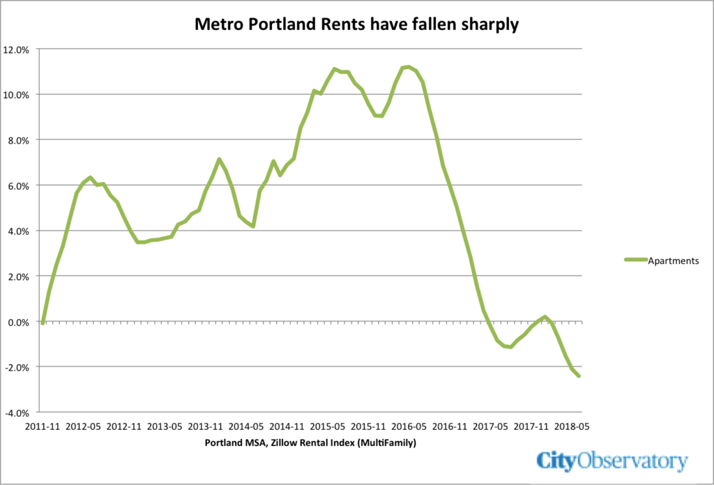
More importantly, as new housing supply has come on line in the past two years, rental inflation has declined sharply in every segment of the Portland housing market, according to Zillow’s data (again, the series that leaves out apartments). As we reported earlier at City Observatory, Zillow’s separate apartment data (not stratified by price tier) show a 3.5 percent decline in apartment rents in the City of Portland since June 2017.
Taken as a whole, Zillow’s data shows housing markets, particularly Portland’s working in much the way that standard economic theory would suggest. As new supply comes on line, rental inflation abates. And while increases may initially be stronger and more pronounced in one segment (like high priced dwellings), the prices and rents in different segments of the market tend to move in parallel to one another. And the observation that rental inflation falls first and fastest in the market segment in which new units are being completed is fully consistent with economic theory.
In our view, the Washington Post’s story would have been much more accurate if it had said the following:
- Estimated rents for housing (excluding apartments) are up across the board in Portland since 2011, and may have risen somewhat more for low and middle price tiers than for the highest price tier.
- Monthly year-over-year price changes in the high, middle and low tiers of the Portland housing market are strongly correlated, suggesting that prices changes in one segment of the market affect other segments and/or that all segments are affected by common factors.
- Over the past two years, rental price inflation in Portland has decelerated sharply in all segments of the housing market as large amounts of new housing, especially apartments, have been completed.
- City of Portland apartment rents have now declined 3.5 percent over the past 12 months.
We’re grateful to Washington Post reporter Jeffrey Stein for answering our questions about his story, and to Zillow’s Matt Kreamer and Aaron Terrazas for engaging in a detailed discussion of the construction and interpretation of Zillow’s data (which we regard as some of the best available). The opinions expressed here are ours, not theirs.
The limits of Zillow data: “All Homes/Three Tiers” omits apartments
Zillow gathers and publishes lots of data about housing, but the particular data series that the Washington Post used for its analysis leaves out estimates of the rents for apartments. As a result, may be invalid to make claims based on this data about whether rents have increased, decreased or stayed the same for the poor. Here are the wonky details.
The Washington Post article relies on a Zillow data series called the “ZRI All Homes 3 Tier” estimates. A little explanation is in order. If you’ve visited the Zillow website, you know that the company publishes, and regularly updates its estimates of the current market value of nearly all the single family homes and condominiums in the US. It calls these its “Zestimates.” Based on an analysis of the home’s characteristics and the sales prices of similar properties in the area, Zillow’s model estimates how much that house would sell for this month. The critical input into the Zillow model is data on publicly recorded sales of single family homes, condominiums and cooperatives.
To track different levels of the “for sale” market in each geographic area it covers, Zillow divides these properties up into three equal groups, called “Tiers”. They are ranked by price, with the most expensive third in the top tier, the middle third in the second tier, and the lowest priced homes in the bottom tier. The critical thing about the three tiers is that they are based on those properties (single family homes, condos and coops) for which individual unit sales transaction data are available. This data series, somewhat misleadingly labeled the “All Homes” data does not include apartments. See the methodology section of the Zillow website.
In addition to the home value Zestimate, Zillow has estimated how much these same houses would rent for, if instead of being offered for sale, were offered for rent. These “Rent Zestimates” are prepared for all houses, including owner-occupied ones that aren’t listed for sale. So “All Homes, 3 Tier” ZRI estimates reported in this series do not include the nation’s for-rent apartments. What the three tier rental data show is variation only within the single family, condo and coop portion of the market, and not the rents of multifamily apartments. In addition, a majority of the homes in these three tiers are owner-occupied, not rented, so the three tier data don’t reflect what renters are actually paying.
This is problematic because it is exactly this three-tier All Homes data that Jeff Stein is relying on to draw conclusions about the variation in trends by income groups.
Poorer city residents have experienced significant rent increases over the past several years. In Portland, average rents for the poor have risen from about $1,100 to $1,600 — or by more than 40 percent — since 2011.
As we’ve noted, the cited data don’t support this claim because they leave out all multifamily apartments. Also: Its misleading to cite this 40 percent increase without saying what the estimates were for the other tiers for the same time period. Between 2011 and 2018, Portland All Homes” ZRI in the lower tier rose 44 percent, in the middle tier rose 42 percent and in the highest tier rose 33 percent. If you take that longer term view, the data (even ignoring its limitations) don’t support the headline claim that rents went up for the poor and down for the rich. They went up for everyone. (In addition, as we explain below, there’s one other technical problem that confounds using the three tier data for making claims about relative price inflation: they are subject to composition effects as the homes in each group change over time).
Rents move in tandem across all tiers
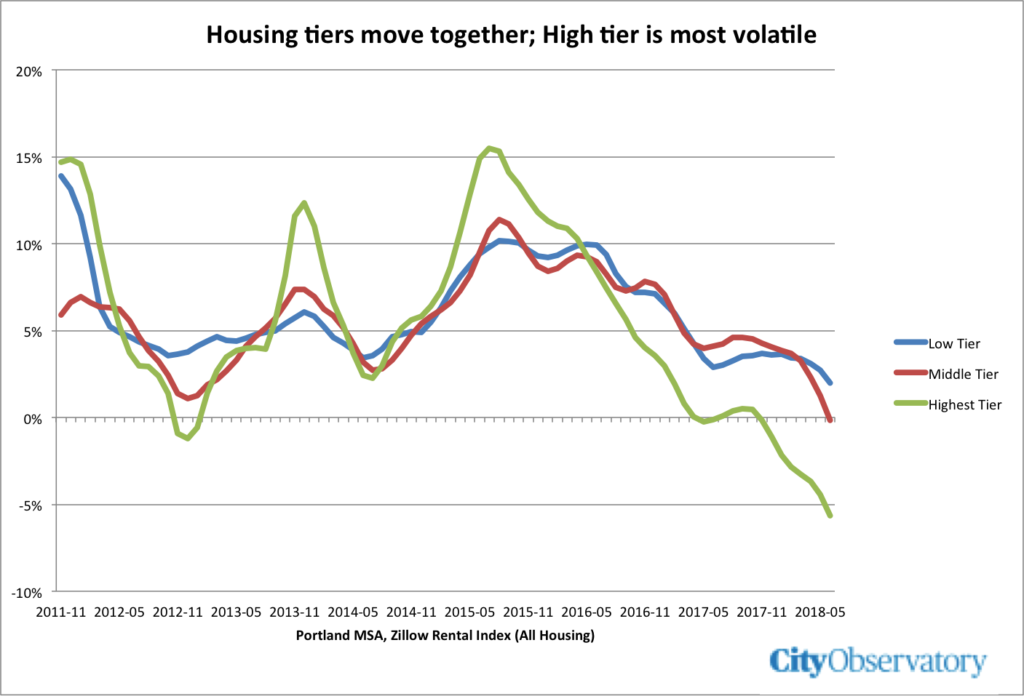
A central premise of the article is that cities like Portland have futilely pursued building higher income apartments which have essentially no effect on the rents paid by low income renters. Despite its limitations, let’s take a closer look at the ZRI index for the three tiers to see what it shows. The following chart shows the “All Housing” data for the Portland Metropolitan area.
This chart shows the year-over-year monthly monthly inflation rate based on ZRI data for each of the three tiers for the period 2011 through June 2018. As you can see, these lines move very closely together, with similar seasonal and cyclical patterns. The high, middle and low tiers all record both peaks and troughs at very nearly the same time. The highest tier appears to be somewhat more volatile than the others, the highest tier has higher inflation in the peaks and lower inflation in the troughs. Statistically, the correlation between the monthly year-over-year price changes between the highest and lowest tiers is .86, meaning that they are either closely inter-related or determined by common factors. These data do not square with the article’s headline claim that rents are increasing for low tier houses and decreasing for high tier houses. From mid-2015 onward, rental inflation is heading down across the board. (It’s possible to cherry-pick one or two months of data at the point where low tier inflation dips below zero to claim that in that time period rents went down in the low tier and up in the other tiers, but that ignores the strong parallel downward trend in all three tiers.)
The key point, though, for the purposes of this article is whether a decline the the estimated rents of higher end homes was associated with a decline in the estimated rents of lower end homes. And that’s exactly what the data show: Since the peak in 2015, the year-over-year rental increase for the highest tier has fallen from 15 percent to -5 percent, and for the lowest tier it has fallen from 10 percent to 2 percent.
Finally, although we believe these data are too incomplete to make such a determination, the greater volatility of higher tier properties (especially their steeper decline) is actually consistent with economic theory: If we’re adding units at the high end of the market, they will be closer substitutes for other high end properties than they are for lower end properties, and so the price effects of adding supply will be felt first and most in the highest tier. But as the strong parallel trajectory of these three tiers shows, adding supply in the high tier drives down rent inflation in the highest tier, and also in the middle and lowest tiers. Far from disproving the economic prediction, these data (though limited) are consistent with it.
More Supply = Lower Rent Inflation
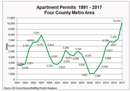
There’s a very simple way to make sense of what’s going on in Portland’s housing market. Look at how many new apartments are built and what subsequently happens to rents. In the wake of the Great Recession, apartment building in Portland fell off a cliff. Metro Portland had been adding 4,000 to 5,000 apartments per year, and that fell to just a 1,000 annually in 2009 and 2010.

Portland’s economy rebounded quickly, but apartment construction did not. As the building permit data show, it took several years for things to get going (and typically there’s a year or more between the time a permit is issued and a project is ready to rent).
In 2015, Portland experienced very low vacancy rates and double digit rent increases. But since then, as more units have been built, that pressure has eased. And its apparent that rents are declining. Zillow’s data on apartment rents have shown negative year over year changes for more than a year.
From 2011 through 2014, as supply dried up, rents went up, peaking at double digit levels in 2015. When supply finally caught up, rent inflation declined, and over the past year, rents went down. As we’ve frequently stressed, these things play out with a lag. During the recession, when new apartment construction slowed to a trickle, it took a while for vacant apartments to fill up and put pressure on rents. Similarly, once rents spiked, it took a while for new units to come on-line and exert downward pressure on rents. (Editor’s note: the data in this chart are for the City of Portland).
A technical note: The composition effect
Interpreting the Zillow All-Homes 3-tier rental data is complicated by a subtle problem called the composition effect. Zillow creates its three tiers by dividing its all homes database into three equal parts, and then computing the average prices for each part. The problem arises because the number of units in the database, and in each tier changes over time. If we add units primarily in one tier and not the others, some of the shift we observe in prices among tiers is due to the change in the composition of the tiers, rather than a change in the prices of individual houses. This is particularly a problem based on the observation made in the Washington Post story that much new housing has been added in the top tier of the market. Adding more homes to the top tier causes a shift in the composition of the lower tiers, which, independent of any price changes tends to push the average of lower tiers upward. The problem for the Washington Post story is that we don’t have a good way to know how much the composition effect is driving the observed changes in prices among different tiers.
Editor’s note: The original version of this post was changed to correct a word transposition in the first paragraph.


