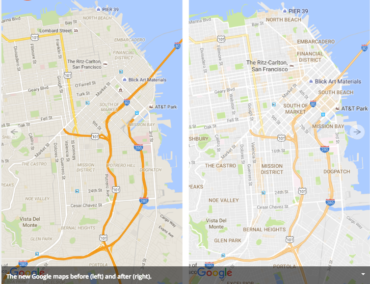
Where are the most interesting streetscapes and popular destinations in your city? Even among your friends and colleagues, there might be some lively disagreement about that question. But recently, search giant Google weighed in on this question when it overhauled Google Maps this summer. Now it has a new feature, an creamsicle orange shading in certain city neighborhoods, that it calls “areas of interest.” But what makes a neighborhood interesting? And do Google’s new peachy orange blobs correspond to anyone’s idea of what constitutes interesting?

The addition was part of a graphic facelift for Google Maps, which was generally applauded in the design community. The new maps are a bit lighter, more prominently include neighborhood names, and highlight notable landmarks. Freeways and major arterials, parks, and the new peachy areas of interest are the outstanding features on these maps.

But not everyone was enamored of the new orange blotches. Writing at CityLab, Laura Bliss detected a bias. Could it be she asked, that Google was only interested in areas with certain levels of income, ethnic compositions and levels of internet access? Examining data for selected neighborhoods in Washington, Los Angeles, and Boston, she argued that low income neighborhoods of color tended to be less likely to get Google’s peachy designation.
For example, while Westlake, a neighborhood towards the east side of Los Angeles is dense, relatively low-income, predominantly Latino area, with many restaurants, businesses, and schools only a few lots are highlighted in orange. In contrast, the mostly residential, mostly white neighborhood of Sawtelle, on the wealthier, west side of Los Angeles includes Wilshire and Santa Monica boulevards and a wide residential area, but the “nearly the entire area is shaded orange, for no clear reason.”
It’s a fair point to suggest that not everyone will find the same set of destinations “interesting,” and it’s likely given capitalism, demographics and math, that any algorithm-based means of identifying interesting areas will tend to select places that appeal to the masses, the mass market and the majority, and may leave out or fail to detect places that have appeal to subgroups of the population. And the fact that Google–while acknowledging that the presence of commercial activities influences its scoring– has been mostly vague about how it has identified areas of interest can add to the concern.
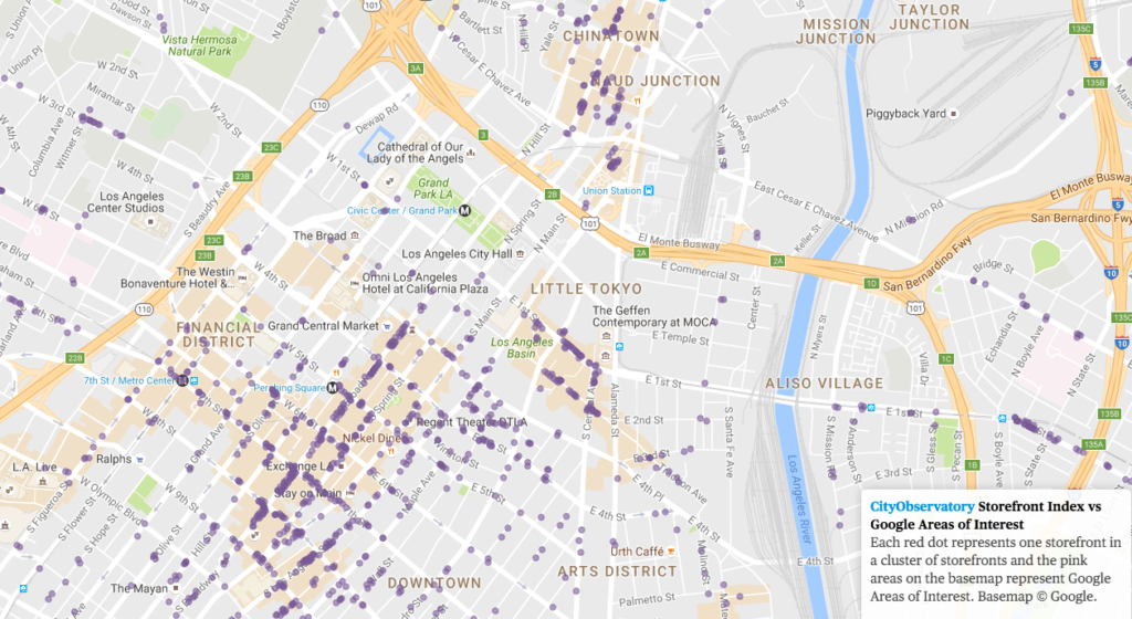
Earlier this year, at City Observatory, we set about tackling a similar question, using data on the location of customer-facing retail and service businesses to create a Storefront Index. Essentially, we used a business directory database to map the locations of millions of retail and service businesses, in the process identifying places that have strong clusters of these businesses that form the nuclei of walkable areas. The special sauce in the index is the use of a nearest neighbor algorithm that provides that we map a business only if it is within 100 meters of another storefront business.
Because our algorithm is transparent (you can see each dot on the map) and because we’ve made our methodology public (details here), we thought it would be interesting to compare the Storefront Index clusters with Google’s Areas of Interest. And in the process, perhaps we can marshal some evidence that will bear on Laura Bliss’s concern that there’s some latent bias hiding in the Google approach.
We’ve overlaid our storefront index map on Google Maps, so you can see how closely the two concepts align. We haven’t undertaken any kind of statistical analysis, but a casual visual inspection shows that most areas of interest do in fact have high concentrations of storefronts. Our City Observatory colleague, Dillon Mahmoudi has mapped storefronts in the 50 largest US metropolitan areas, and you can use this map to see how storefront clusters correspond to areas of interest. Here’s downtown Los Angeles. (Click on the image to visit our interactive web page, with maps of other metropolitan areas).
Let’s take a closer look at a couple of the neighborhoods that Laura Bliss felt were slighted by Google Maps. The first row shows two neighborhoods in Los Angeles, the second row two neighborhoods in Boston. The neighborhoods on the left were ones with very few and small areas of interest according to Google (and perhaps under-appreciated, according to Bliss); the ones on the right have relatively large shaded areas of interest. The dots on each map correspond to our measure of storefronts–cluster of customer facing retail and service businesses. Both of the “slighted” neighborhoods do have some clusters of storefront businesses (though their numbers are smaller, and there concentrations less dense than in the corresponding “favored” neighborhoods in the right hand column. While we’ve come up well-short of reverse engineering Google’s algorithm, these data do suggest that storefronts are a key driver of areas of interest.
[table id=2 /]
It’s a fair question to ask as to whose preferences are reflected in any description of an “area of interest.” Given the diversity of the population and the heterogeneity of tastes and interests, what will be interesting to some people will be banal or off-putting to others. Or maybe its a semantic problem: by describing some areas as “interesting,” it seems like Google may be implicitly characterizing other areas as “uninteresting.” Many of these concerns could be assuaged, we think, if Google chose to be a little more transparent about its basis for describing these areas, and if it called them by a different and more narrowly descriptive name, like “most searched” or “most popular.”
Ultimately, the solution to the problem Laura Bliss has identified may be democratization and competition. The more data (including everything geolocated on the web, including Google maps and listings, tweets, user reviews, and traffic data) are widely available to end users, and the more different people are crafting their own maps, the better we may be able to create images that reflect the diversity of interests of map users.


