What City Observatory did this week
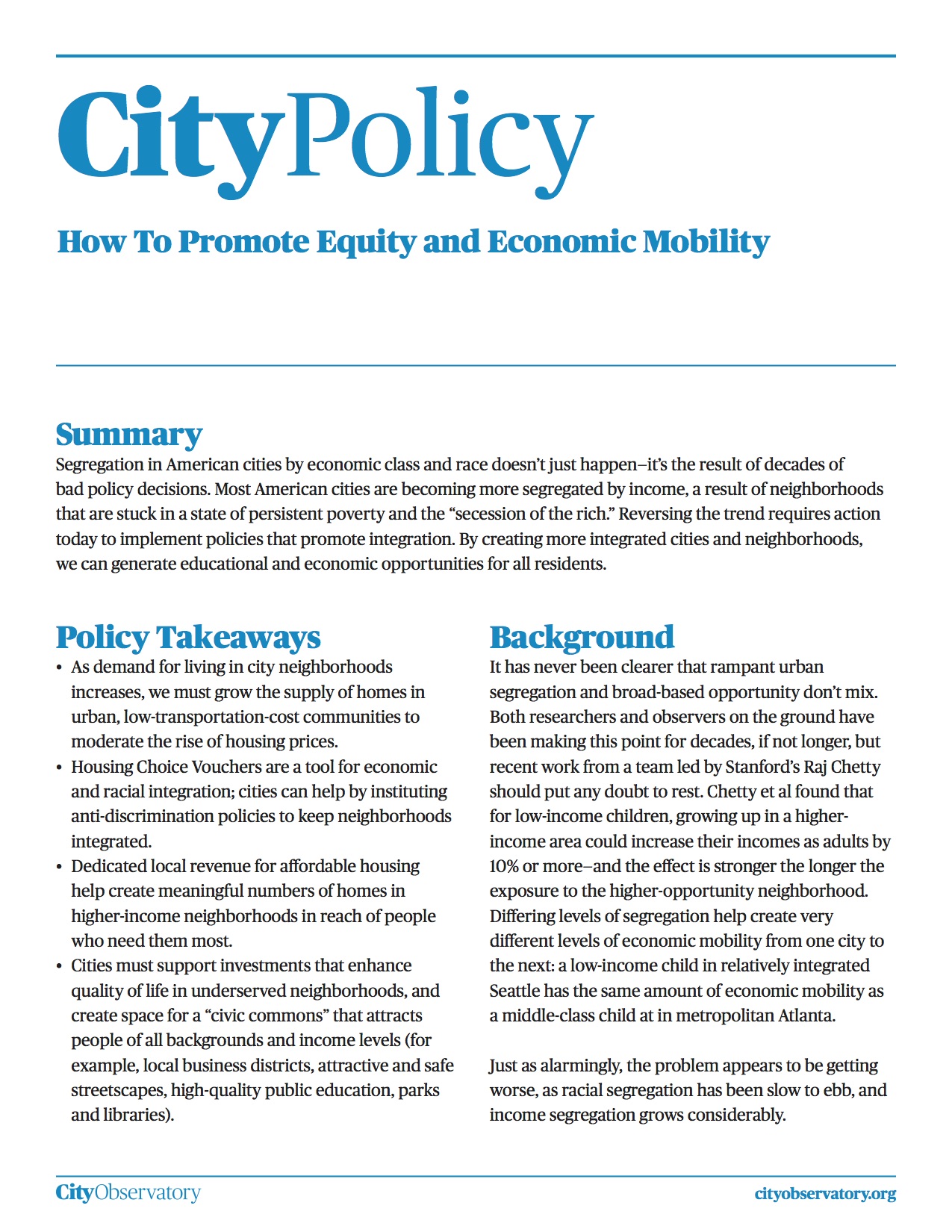
1. Introducing City Observatory policy memos. At City Observatory, one of our goals is to translate the best and latest urban policy research for advocates, organizers, and practitioners so it can inform their work. To better do that, we’re introducing the first of a series of policy memos: short, action-oriented, and highly readable documents meant to summarize the best evidence we have on a particular issue relevant to cities. Our first is on how to promote integration and economic opportunity. You can click here for a formatted PDF that’s easily sharable online or in hard copy.
2. Higher-inequality neighborhoods reduce inequality. While neighborhoods with close juxtapositions of the rich and poor extremes of our society can be jarring, and pose some special challenges, they’re ultimately a much healthier way to organize our neighborhoods than keeping everyone more “comfortably” separate. Recently, we got another piece of evidence to support this conclusion: New York University’s Furman Center published a report on how rising neighborhood incomes—often associated with gentrification—have affected local residents in public housing. Although there have been problems—including more difficulty finding affordable retail and a sense of belonging—there’s also much encouraging news. The highlights: public housing residents in affluent neighborhoods earn more than $4,000 a year more than those in low-income neighborhoods; suffer from less violent crime; and their children go to higher-performing local public schools, and perform better on tests themselves.
3. What’s really going on in gentrifying neighborhoods? Following up on the Furman Center study, we look at research from the Federal Reserve of Philadelphia that tries to answer the question: What happens to residents in gentrifying neighborhoods who live not in rent-protected public housing, but housing whose prices are set by the market? The results, perhaps surprisingly, are also encouraging: the study’s authors find little evidence of widespread displacement, with residents of gentrifying neighborhoods just 0.4 percentage points more likely to move in a given year, and those in the most rapidly gentrifying communities 3.6 points more likely. Just as important, those who leave are not more likely to go to lower-income communities. Those who stay are also likely to see an improvement in their financial condition, as measured by their credit score. Finally, it’s worth noting what happens to the poor neighborhoods that don’t gentrify. While it’s commonly assumed that they remain stable, this study shows that they actually experience severe decline, with average incomes falling 20 percent, and as a result—ironically—housing cost burdens rising by 10 percentage points.
4. Truthiness in gentrification reporting. In the last two posts, we looked at new evidence, echoing older evidence, that “gentrification”—the process of average neighborhood income and rents rising in otherwise lower-income communities—results in much less displacement of existing residents that commonly believed, and gives those residents, on average, some economic benefits. But despite this well-established and growing body of research, media narratives about gentrification continue to foreground stories of displacement while downplaying or dismissing positive stories. A New York Times piece about public housing residents in Chelsea, for example, spends its opening paragraphs on the challenge of traveling further to find more affordable groceries—and only reveals at the very end of the piece that the same resident considers herself “lucky” to have been in a neighborhood that has gentrified.
5. Knight Cities podcast. City Observatory founder Joe Cortright sat down with Carol Coletta of the Knight Foundation to talk about the latest research on neighborhood change, economic opportunity, housing policy, and more. Have a listen!
The week’s must reads
1. When cities set minimum parking requirements in their zoning codes, those estimates of parking needs are based on rigorous, reasonably accurate studies. Ha ha, just kidding. At the Dallas Morning News, Brandon Formby reports on research by University of Utah professor Reid Ewing, which showed that actual vehicle trip generation at a residential development near a suburban Seattle transit center was just 37 percent of what guidelines developed by the Institute of Transit Engineers predicted. As a result, the 441-space parking lot could have been reduced to 278, representing a huge unnecessary expenditure. Reducing these requirements where appropriate (which seems to be most places) can save money, potentially reduce housing prices, and lead to more efficient development—not to mention drop an unnecessary and costly subsidy to car ownership.
2. At Business Insider, Amir Sufi and Atif Mian explain “why debt fuels bubbles.” In short, price bubbles—in anything from housing to tulips—are driven by “optimists,” who believe that the true market value of a good will continue to rise, or by people who believe there are enough “greater fools” to buy at higher prices, even if the “correct” market price is lower. Easy debt increases the ability of optimists to continue to buy, and to buy at higher prices—which in turn increases other players’ optimism that there will be “greater fools” to buy from them. As the authors put it, “even rational spectators may enter the market if they belive that irrational optimists can still get loans as the bubble expands.”
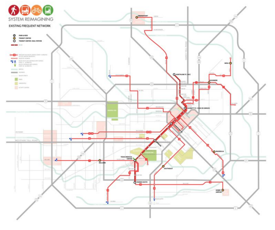
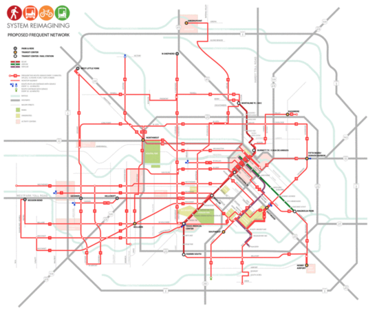
3. One of the biggest urban transportation reforms to fly under the radar is the reorganization of Houston’s local bus network, masterminded by Portland-based consultant Jarrett Walker. Two months after the debut of the new system—based on maximizing the number of frequent, “show up and go” lines, and encouraging transfers through a grid of routes to enable travel from almost anywhere to anywhere, rather than just downtown—Walker surveys the ridership changes and sees good news. Though weekday rides are down, Walker says that’s to be expected as people adjust to the new routes (and because Houston opened a new light rail service designed to replace some routes at the same time). Most encouragingly, the massive increase in weekend service has already paid off: Sunday ridership is up nearly 20 percent.
Houston’s frequent bus network before (top) and after (bottom) the reorganization.
New knowledge
1. Though we recently argued that affordable housing policy ought to be more like food stamps (now known by the acronym SNAP), new research from the University of Chicago shows that together, housing vouchers and SNAP are already performing much more poverty-eliminating work than we previously thought. As Vox explains, by using more reliable administrative data (rather than surveys), it turns out that these two programs alone have helped push down poverty rates by almost double previous estimates: from 13.6 percent to 8.3 percent, instead of only 10.8 percent. And this is just the direct effect; as we’ve covered extensively, housing vouchers that allow low-income people to live in mixed-income neighborhoods have massive, and multi-generational, long-term impacts on economic mobility. These programs work—and if we’re looking for effective public investments to reduce poverty, they should feature prominently on our list.
2. JPMorgan Chase digs through their own customers’ (anonymized) credit and debit card data to answer a question of great importance to urbanists, planners, and the broader economy as a whole: When gas prices go down, how do people use the money they save? The answer: they spend about 80 percent of it. Almost a fifth of the not-gas-anymore money went to restaurants. Importantly, the study suggests that Americans spend much more of their gas savings than previously thought—stimulating the economy. The report is also full of interesting tidbits, like the fact that the median American spends $101 a month on gas—but those in the top 20 percent of consumers spend $359 a month.
3. Do “creative class” workers actually use neighborhood diversity as a major factor in deciding where to live, and if so, what kind of diversity? A new paper from researchers at the University of Nebraska at Omaha suggests that this tendency may be overstated. Using data from Chicago, they find the strongest relationship to be diversity in sexual orientation, with the density of gay couples explaining about 6.5 percent of the variation in computer/engineering/science worker locations. Linguistic diversity also helped explain 3.2 percent of the variation in education/library/training workers. Other “fundamentals” seemed to matter much more. Median home value, for example, explained up to 65 percent of the variation in creative class worker density.
The Week Observed is City Observatory’s weekly newsletter. Every Friday, we give you a quick review of the most important articles, blog posts, and scholarly research on American cities.
Our goal is to help you keep up with—and participate in—the ongoing debate about how to create prosperous, equitable, and livable cities, without having to wade through the hundreds of thousands of words produced on the subject every week by yourself.
If you have ideas for making The Week Observed better, we’d love to hear them! Let us know at jcortright@cityobservatory.org, dkhertz@cityobservatory.org, or on Twitter at @cityobs.


